


by GaryG
As these things go, Parmigiani Fleurier and I go back a pretty long way. I bought the first of several watches I’ve purchased from the brand (a Kalpa in steel) around 2005, and MrsG still wears each of her two Kalpa Piccolas with some regularity.
So, it was with significant interest that I took up the opportunity to handle, photograph, and evaluate Parmigiani’s latest introduction, the Tondagraph GT. It’s a relatively rare combination of two useful complications in what the brand calls “all-occasion” packaging, and it is offered at a quite reasonable price relative to other pieces of its kind.
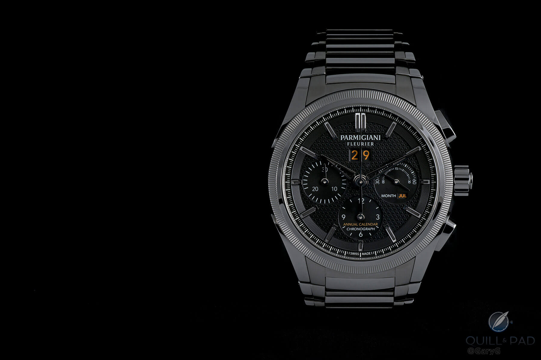
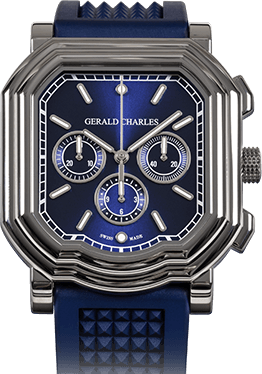
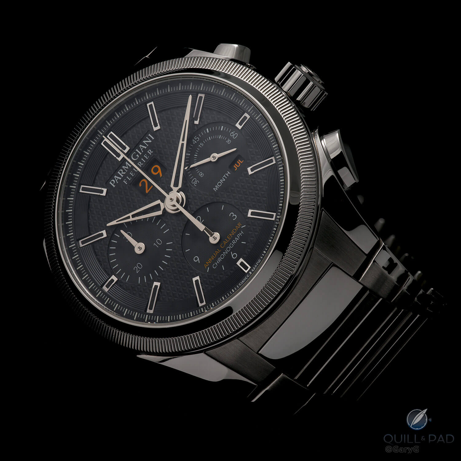
Limited edition Tondagraph GT in steel from Parmigiani Fleurier
Spoiler alert: I like it
As regular readers know, my role here at Quill & Pad centers mostly on pieces in my own and friends’ collections, with occasional musings on industry developments – and less frequently on reviewing new introductions that I haven’t previously considered.
When I do check out a new timepiece, there’s always that moment when I first open the box and hope that I haven’t signed up to generate several pages of prose on why the watch in question is a dud. Happily, this piece immediately struck me as solidly made, attractive, and, with its combination of annual calendar and chronograph, horologically interesting.
Looking good: Parmigiani Tondagraph GT
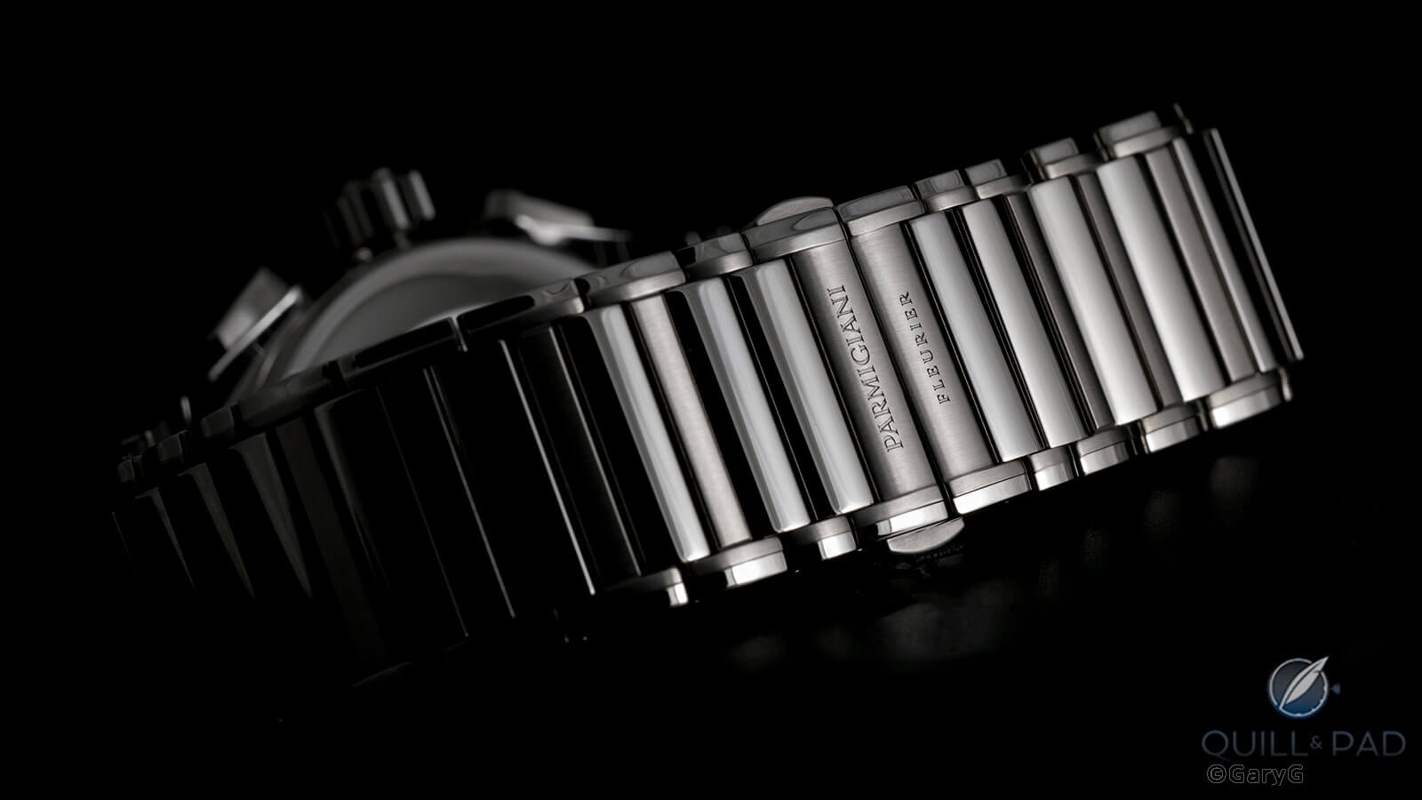
I’ll start in what might seem an odd place, a feature that for me really helps define the appeal of the Tondagraph GT: the bracelet. As with some other designs we’ve seen recently (the A. Lange & Söhne Odysseus prominent among them), the GT utilizes what I’ll call a semi-integrated design, with a bracelet that flares out to match the outer profiles of the lugs on the case and then notches in to fit between them.
Smooth profile: semi-integrated Parmigiani bracelet
On the Parmigiani, there’s nothing jarring about this arrangement. Among other things, if you look closely at the photo above you’ll see that there is a largely unbroken curve from the outer edge of one lug all the way across the joining line where the bracelet meets the case and out to the edge of the far lug, minimizing the visual impression of lug versus bracelet.
Seen from the side, the look is equally organic with updated yet brand-characteristic teardrop lugs featuring similarly profiled pushers tapering into the first link of the bracelet.
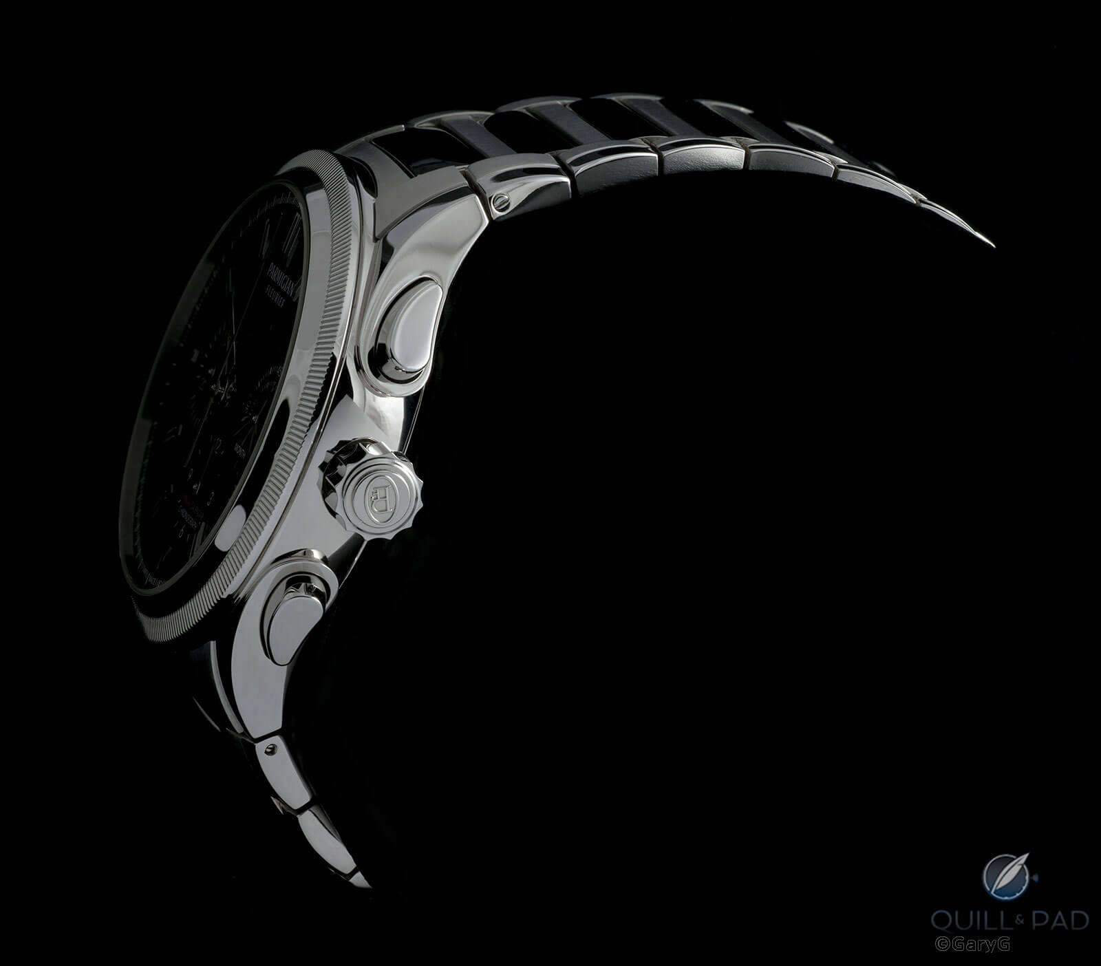
Going with the flow: lug-to-link transition, Parmigiani Tondagraph GT
And as with other Parmigiani bracelets I’ve worn (for my views on bracelets from Parmigiani and others, see Heavy Metal: Great (And Not So Great) Watch Bracelets), this one flows around the wrist with no unsightly gaps or sharp edges to distract from the visual impression.
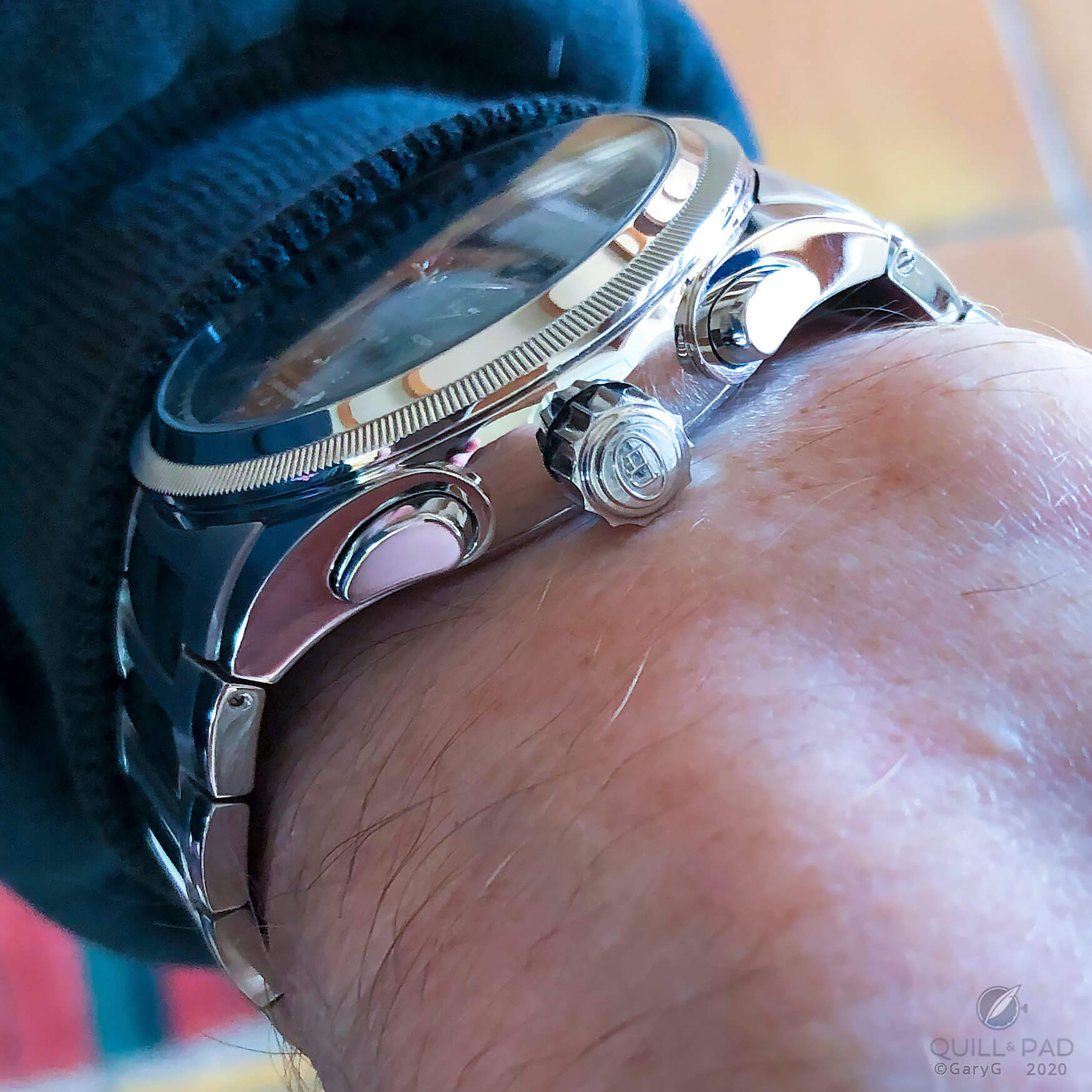
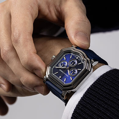
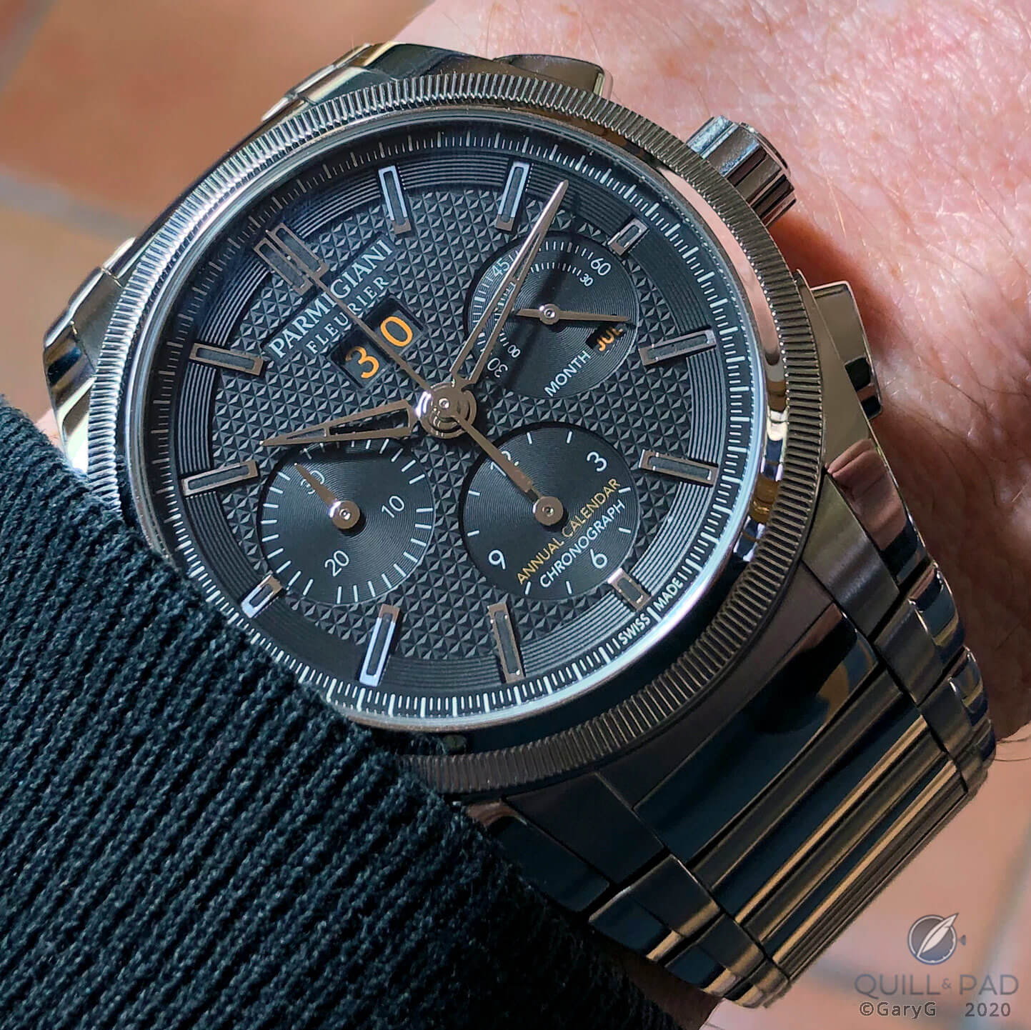
On the wrist: Parmigiani Tondagraph GT
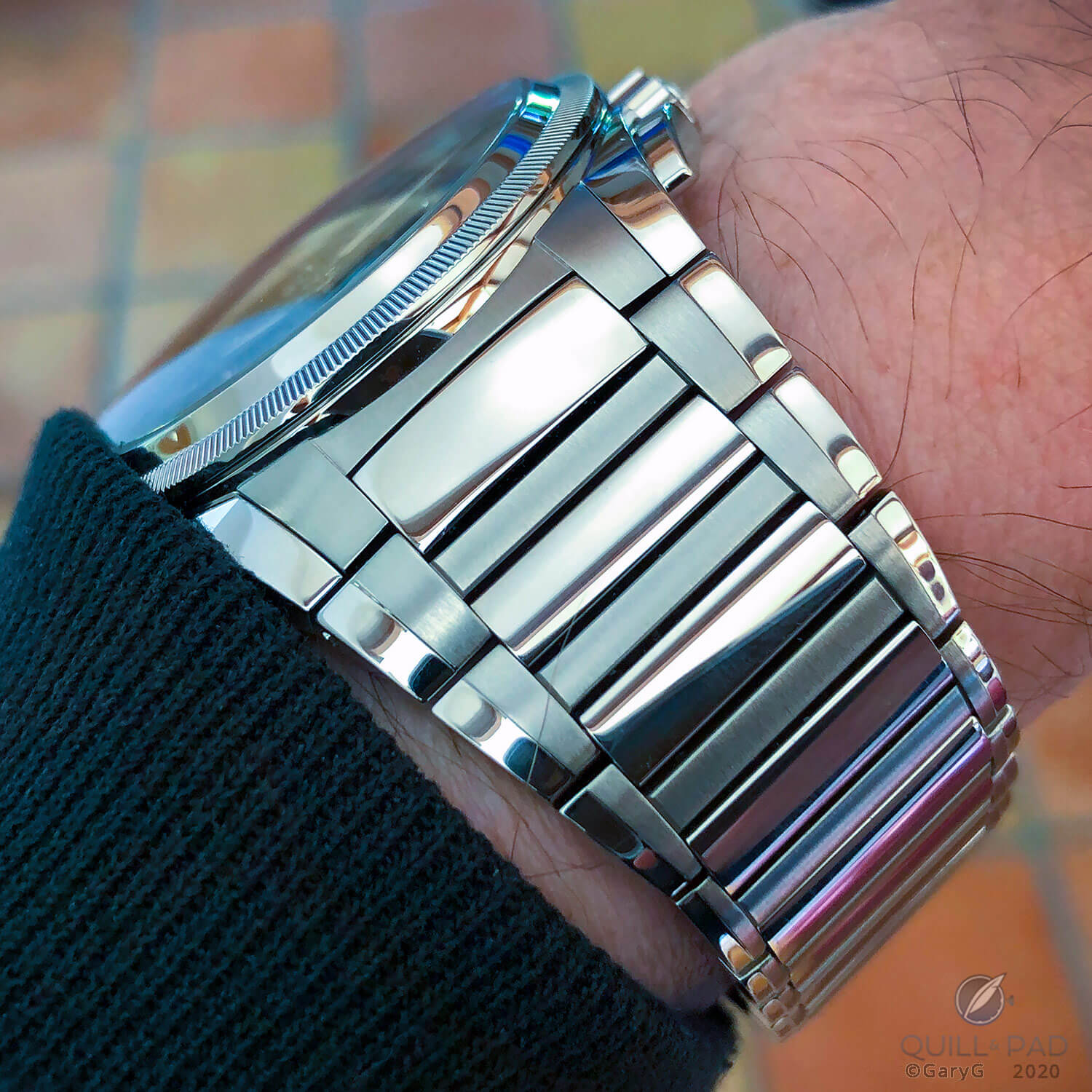
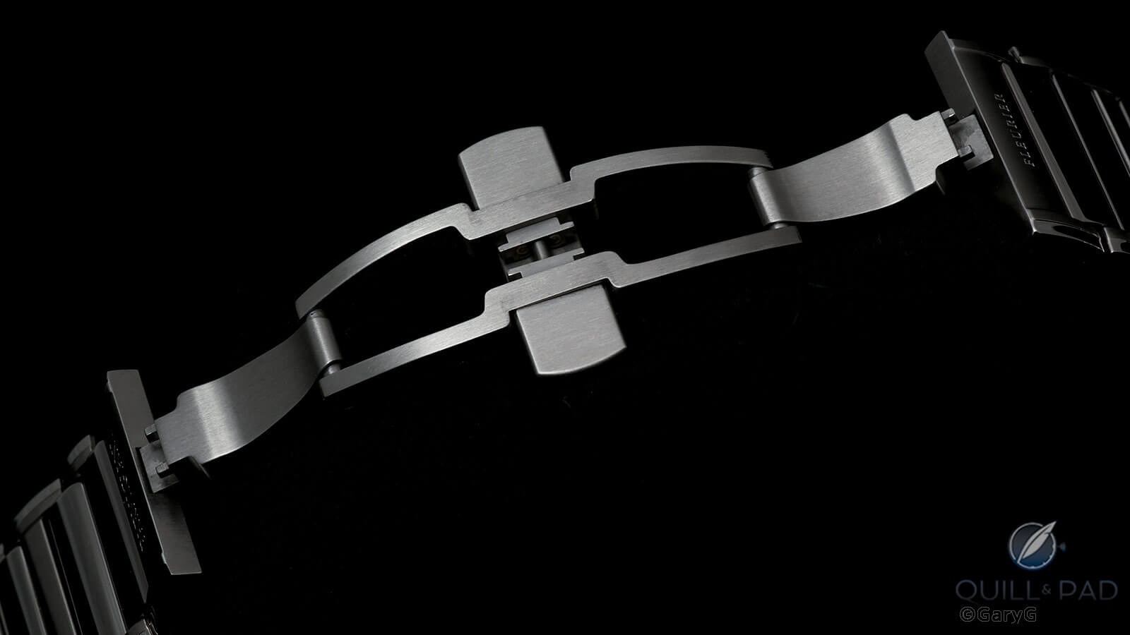
Around the back, the bracelet looks simple and clean with a hidden, two-sided clasp that sits comfortably under the wrist and helps to stabilize the weight of what is, especially for a steel piece, a notably hefty watch. Two half-links help with precise sizing.
You’ll look at the underside of your wrist: elegant Parmigiani bracelet
Smooth profile: semi-integrated Parmigiani bracelet
There is a watch involved, as well
Of course, a good bracelet without a good watch is just a bracelet – and this is a seriously attractive watch, too.
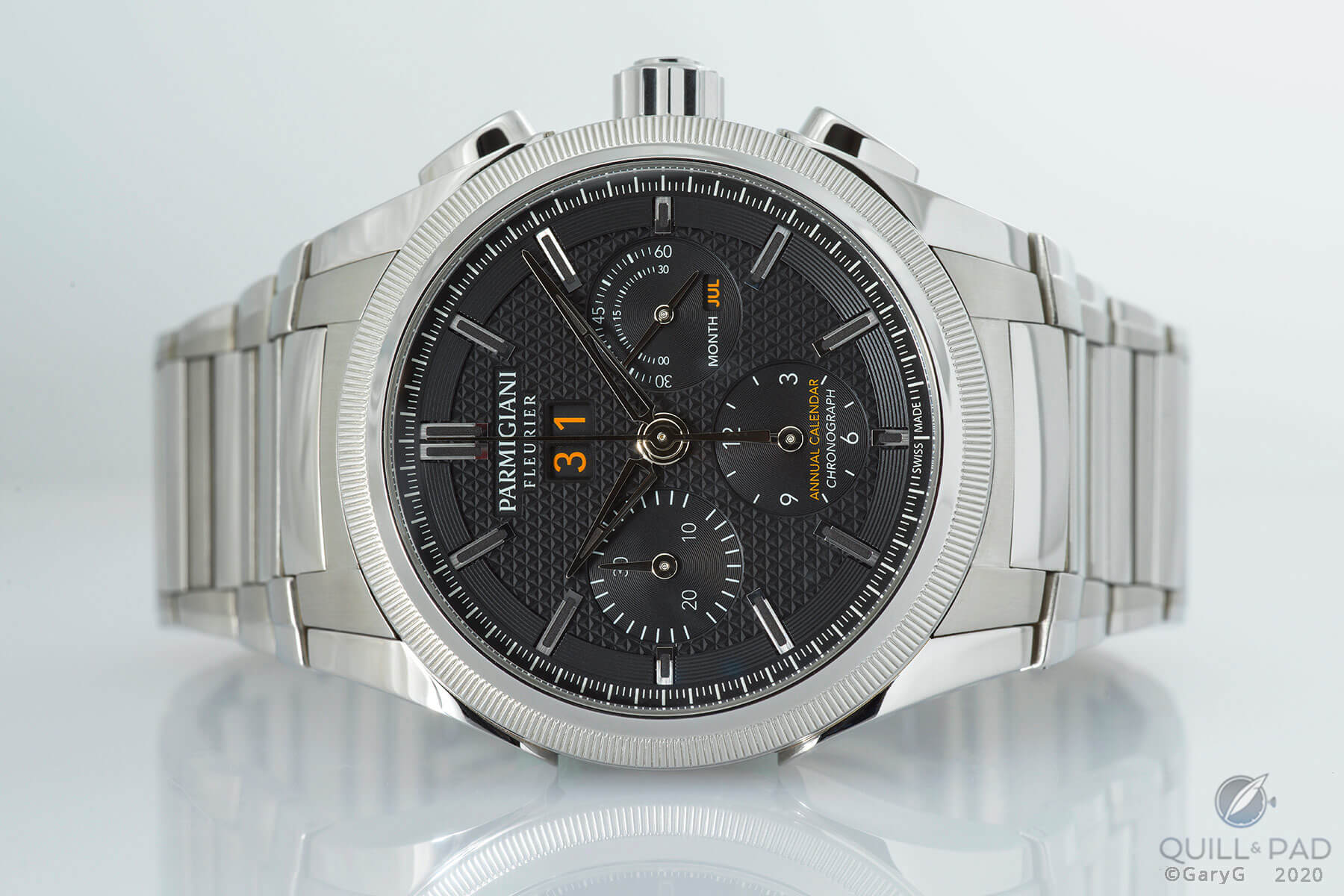
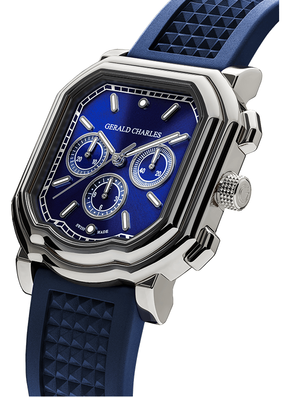
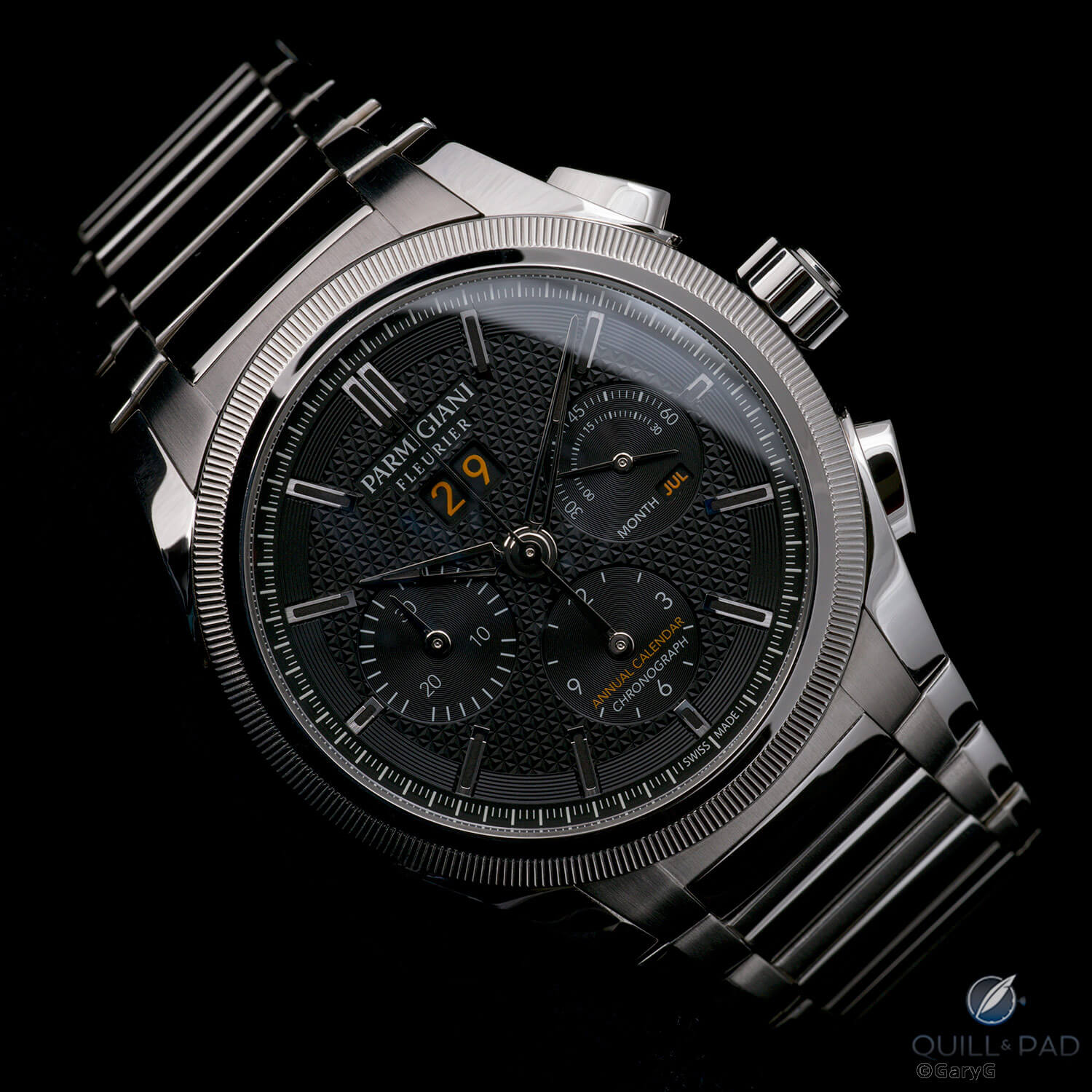
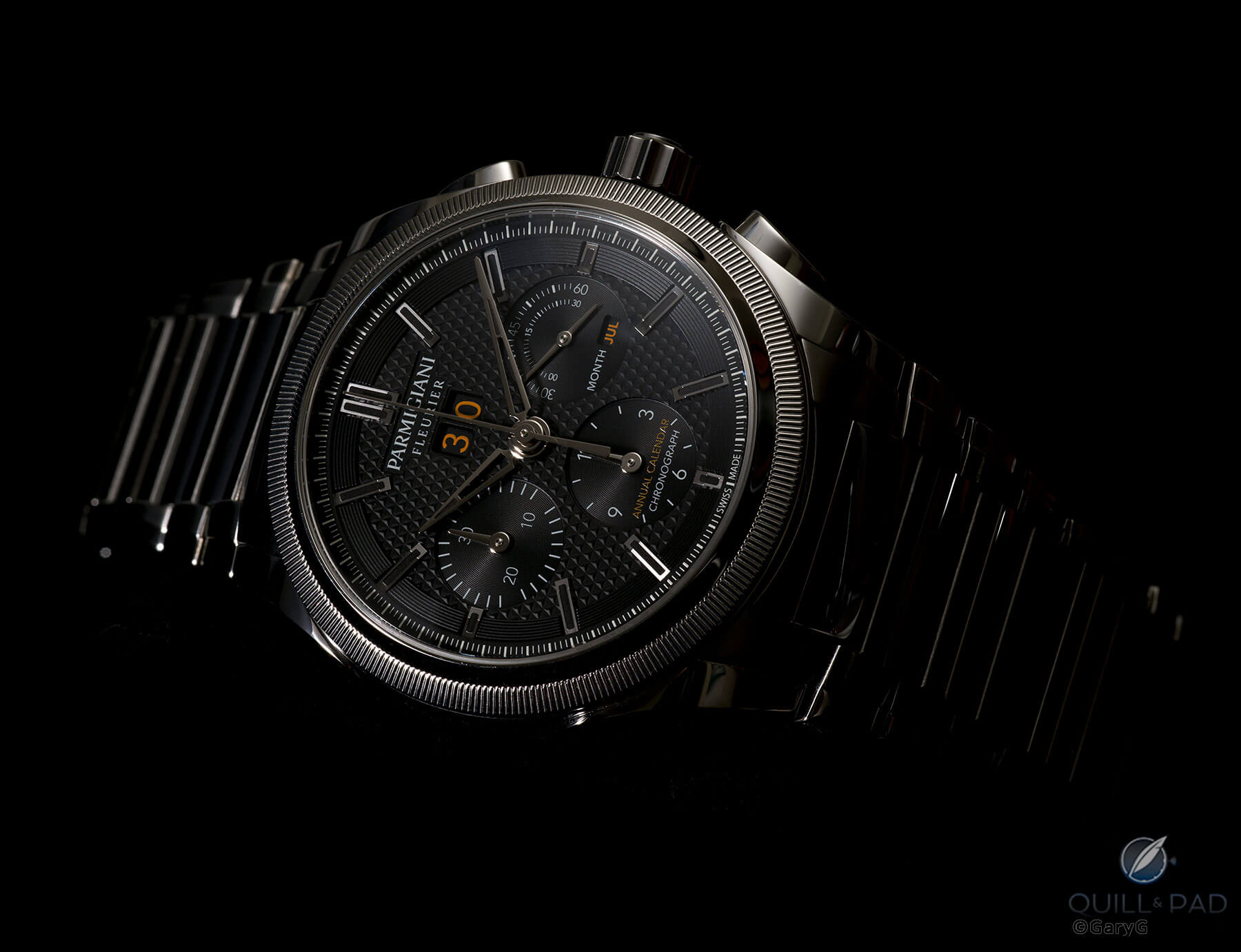
Orange on black on white: Parmigiani Tondagraph GT
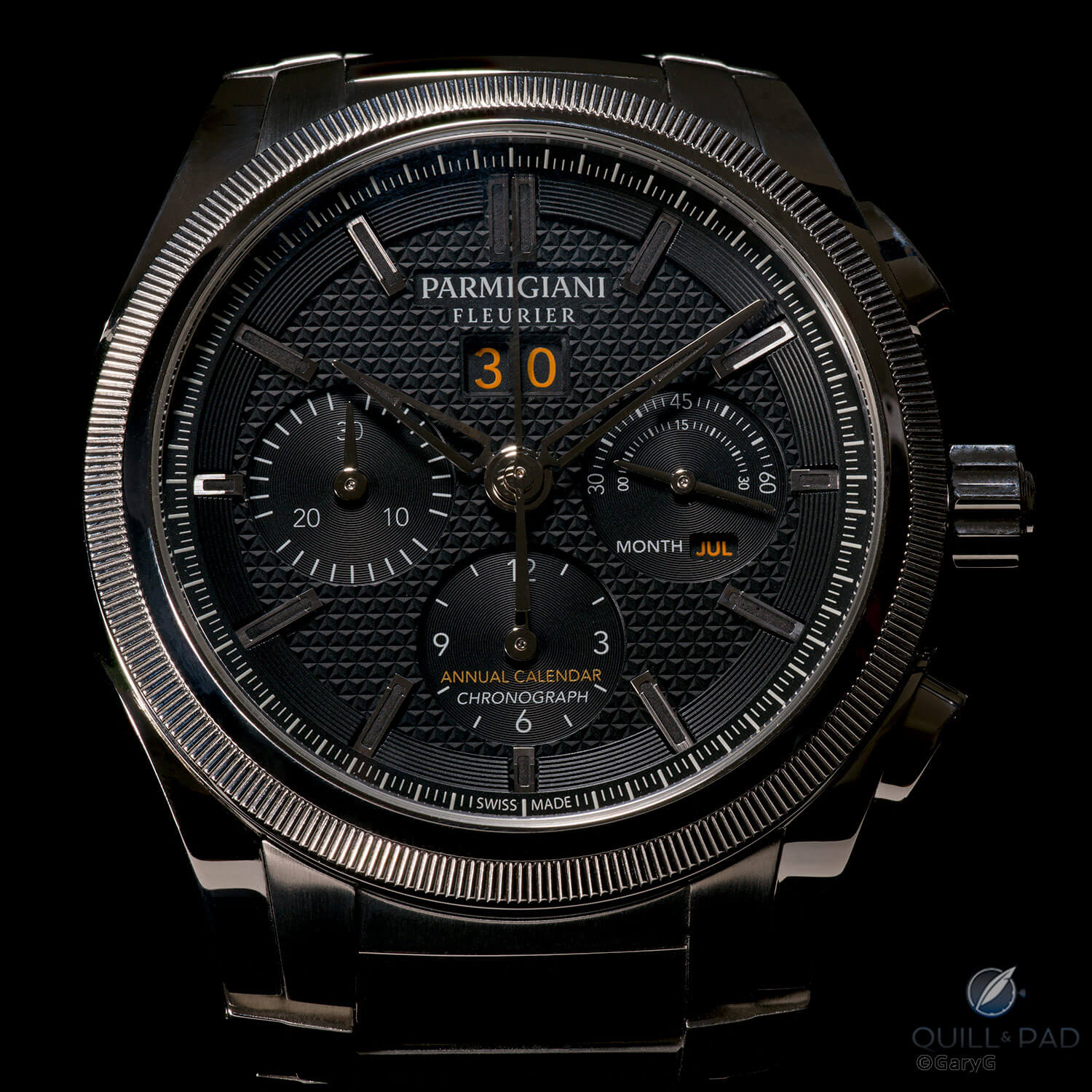
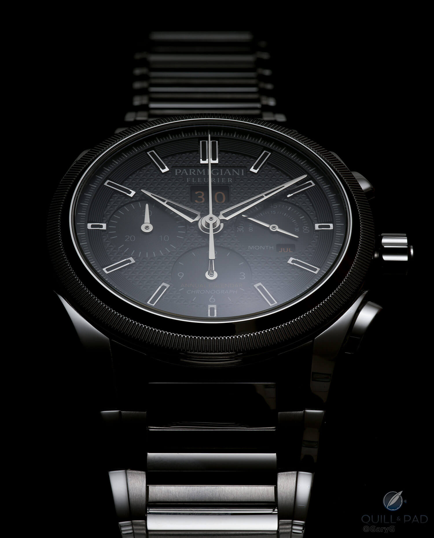
For me, the dial side is busy enough with its machined triangular guilloche, circular grooves, outer chapter ring, and applied indices to keep me interested. And I like the use of flashes of orange highlighting the date and month of the annual calendar and distinguishing those indications from those of the chronograph.
Some folks I’ve talked with find the amount of script on the dial to be excessive, but to my eye it’s not out of the acceptable range and actually helps to give a bit of an informal look to the watch.
Dial detail, Parmigiani Tondagraph GT
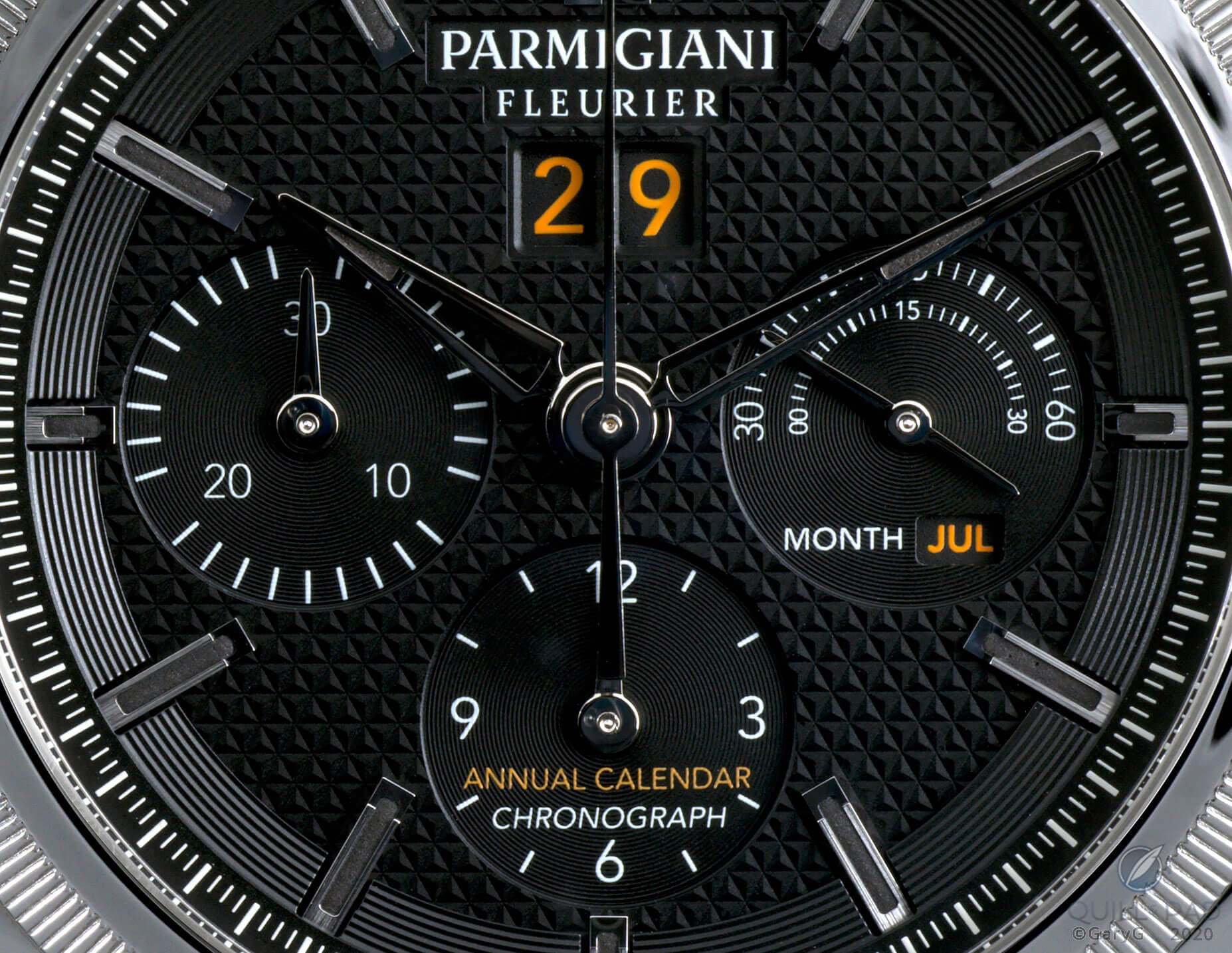
A closer look at the detail shot above suggests that Parmigiani has taken several steps to simplify the dial-side look. Note the absence of printed indices at 10, 20, and 30 on the chronograph minutes’ subdial and the use of two half-circular arcs to track the running seconds on the right-hand subdial while freeing up space for the month indicator below.
The black luminescent coating on the applied markers and hands also reduces the clutter factor relative to white or colored lume options while providing a suitable glow once darkness falls.
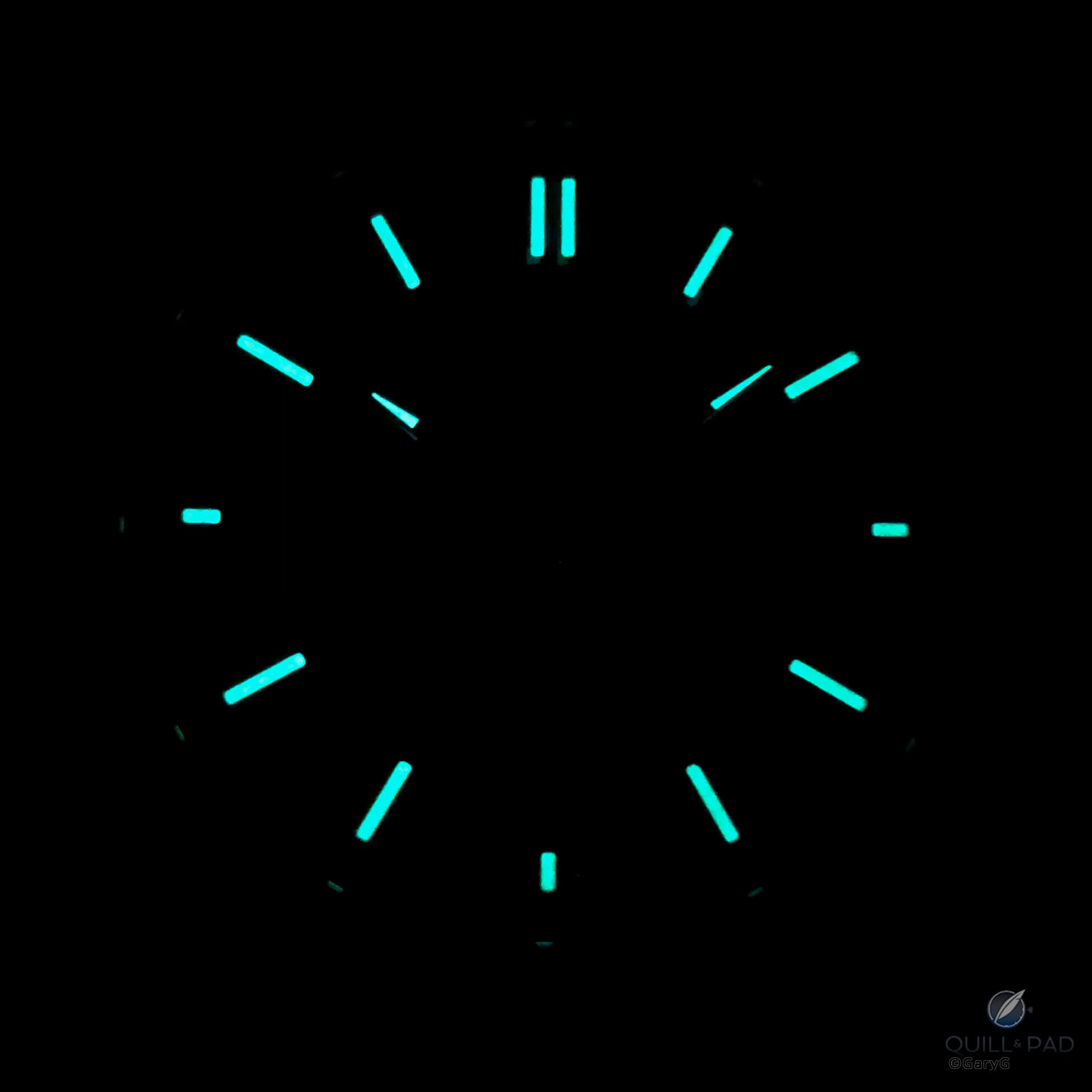
Luminous hands and indices, Parmigiani Tondagraph GT
Working with Italian designer Dino Modolo, Parmigiani has both retained elements of its traditional design codes and updated them to good effect. The massaged profiles of the lugs and pushers are one example; another is incorporating Parmigiani’s characteristic “Toric” fluting on the bezel.
On the dial itself, the brand logo and its font remain the same as before, but the oval surround we’ve come to associate with Parmigiani has been removed to provide a cleaner look (although the ovals around the “PF” initials remain on the crown and movement).
Refreshed traditions: dial and case of the Parmigiani Tondagraph GT
In the engine room
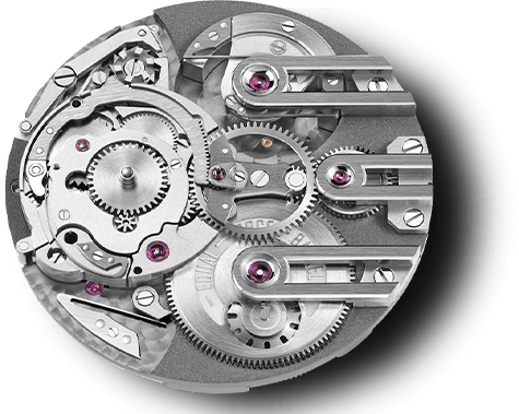
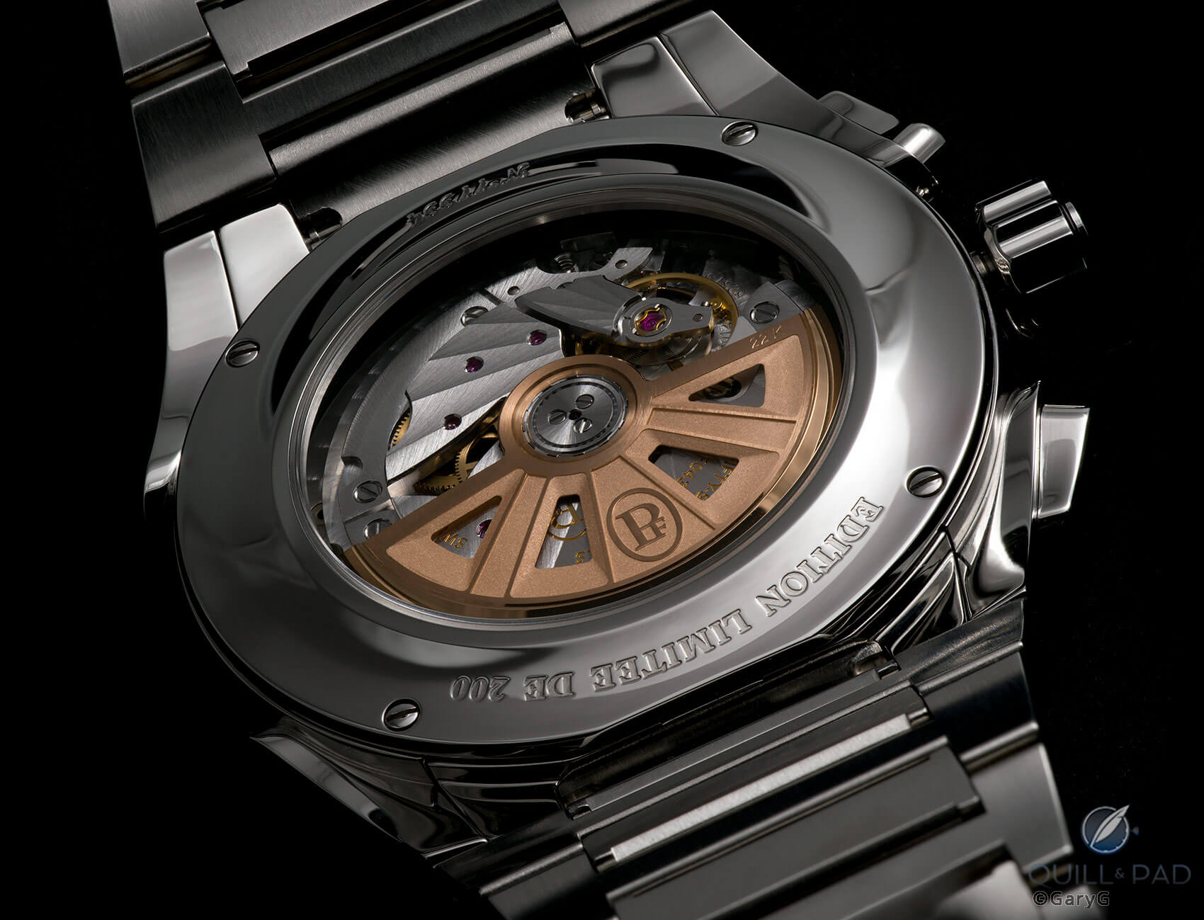
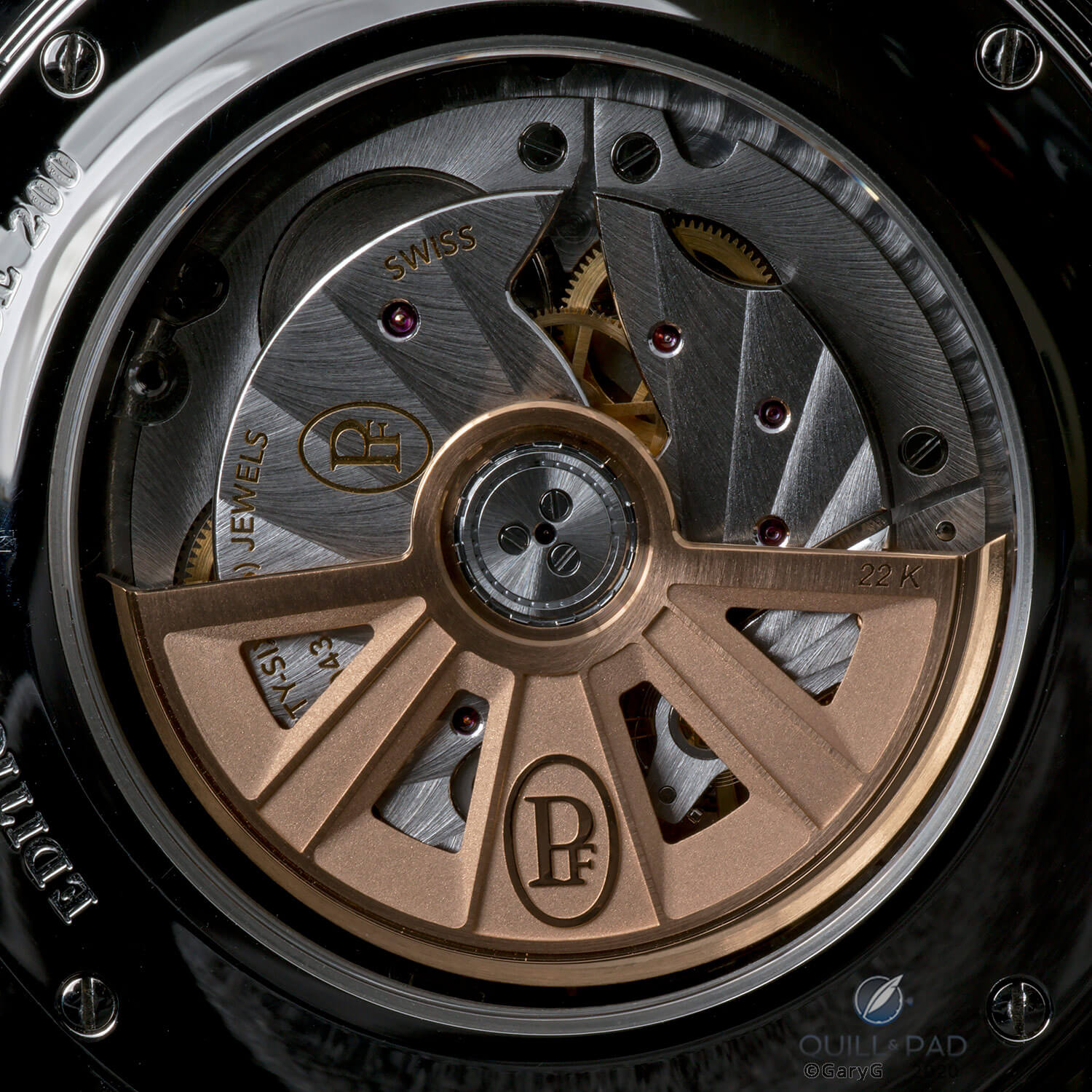
Behind the scenes, the Vaucher-developed Caliber PF043 keeps things ticking while also providing chronograph and annual calendar functions.
Parmigiani Fleurier Caliber PF043
The annual calendar chronograph is a pretty rare combination in the world of horology, but I think it’s just the right choice for the Tondagraph GT as it keeps the watch out of the rarified air of the perpetual calendar ranks. For me, the everyday usefulness of the annual calendar complication is a good match for the watch’s chronograph.
Date, time, and elapsed time: useful complications of the Parmigiani Tondagraph GT
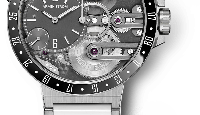
I think the visual look of the PF043 movement is consistent with the rest of the watch: the soleil-style striping and chunky rotor relief are sufficiently sporty; and I’m particularly glad that Parmigiani went with a more assertive rotor design than its more floral traditional look.
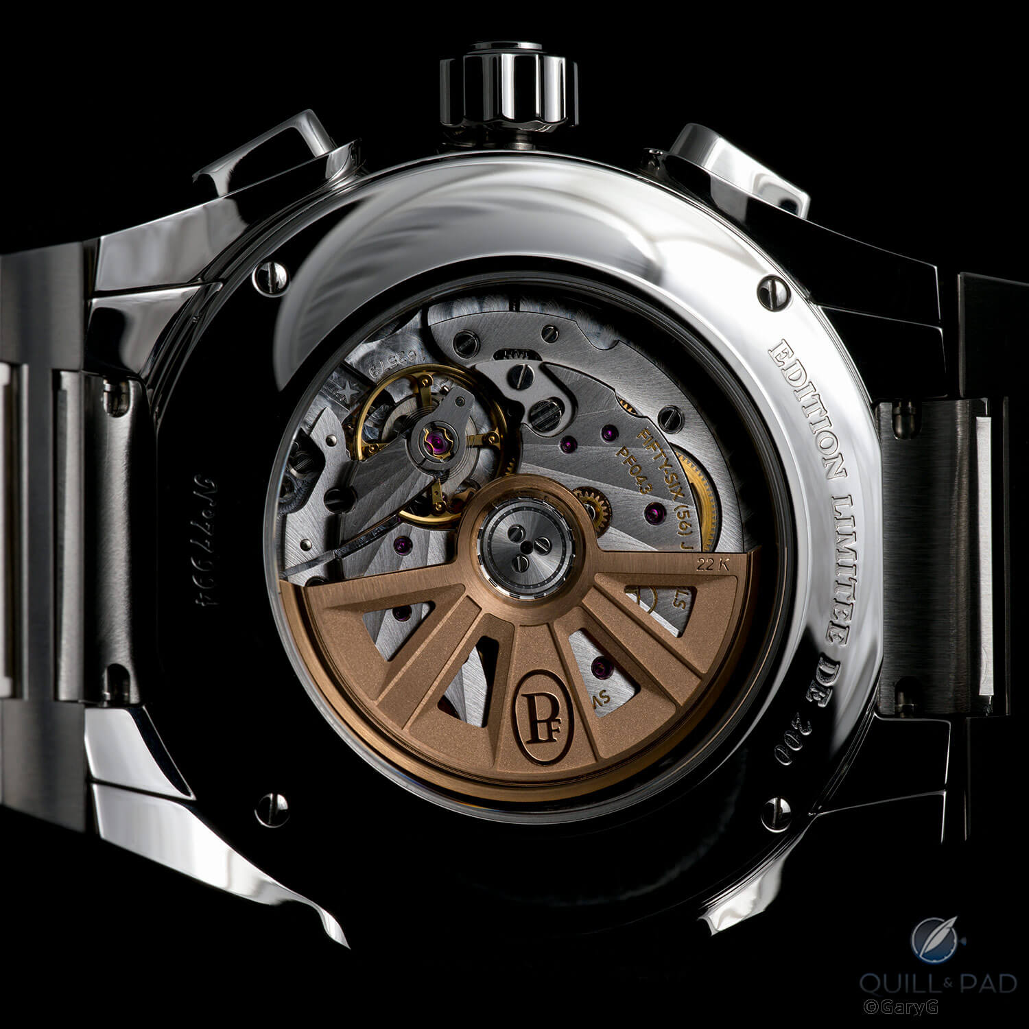
Appropriately bold: Caliber PF043 from Parmigiani
That said, the finishing, while completely adequate, pales in comparison to that on many of Parmigiani’s other offerings. The contrast with the multiple interior angles, subtle stripes, and nearly invisible sub-plate of the Caliber PF111 movement of the brand’s Pantographe Ovale that I reviewed in 2017 is clearly evident from the image below, suggesting some of the tradeoffs that were required to keep the Tondagraph relatively affordable.
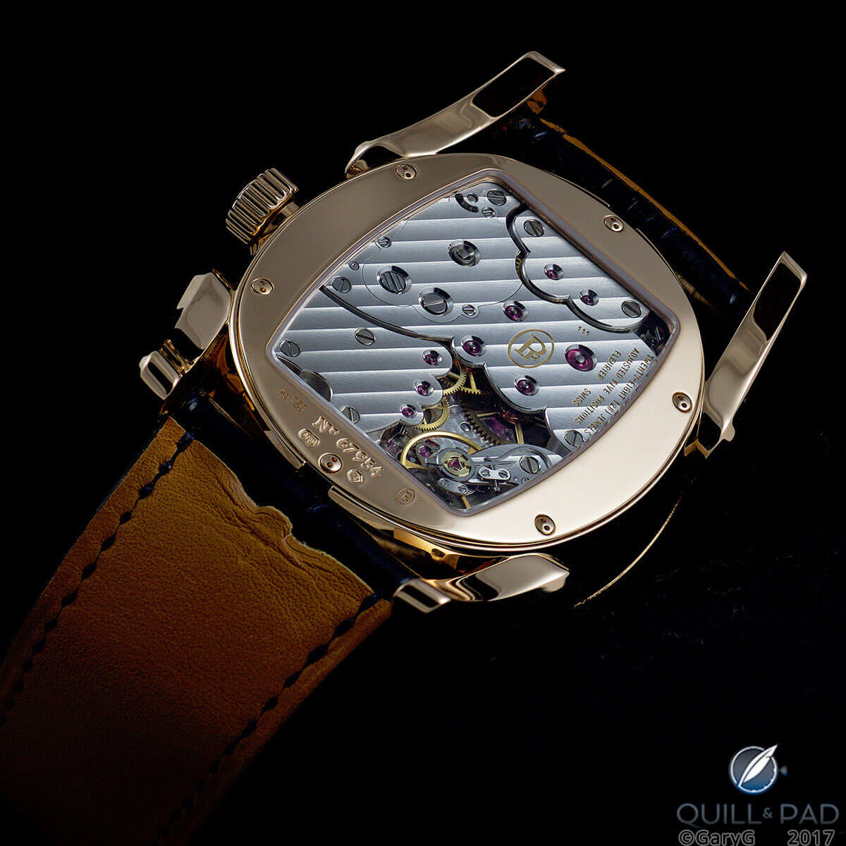
Caliber PF111, Parmigiani Pantographe Ovale
The wide rear bezel of the watch reveals that the base movement is fairly small in diameter relative to the 42 mm case. Happily, the dial layout spreads the subdials and other indications widely enough, and the chapter ring, outer grooves, and large applied indices fill the perimeter of the dial sufficiently to avoid the cross-eyed look that is a pet peeve of mine with many other watches.
Big bezel: movement side, Parmigiani Fleurier Tondagraph GT
The calendar indications work well, too, with the date and month clicking over just as the time approaches midnight.
Any quibbles?
There is no such thing as the perfect watch! There were a couple of small touches that were not quite up to snuff in the watch I handled, including a color mismatch between the orange print on the dial and the hue of the day and date indicators.
But those are the kinds of things that are often a fact of life with pre-production examples, and I expect they will be ironed out in the delivered watches. And the anti-reflective sapphire crystal was good, but not up to the mind-blowing standards of some other watches of my acquaintance.
The chronograph was somewhat less to my taste. The chronograph minutes indication is continuous, not the instantaneous or semi-instantaneous type that I prefer. And the chronograph pushers require quite vigorous activation. I am perhaps more attuned to pusher feel than some others, but I wish that the Tondagraph’s chrono actuation and reset sensations were more progressive and less resistant.
As noted above, creating a robust and complicated watch like the Tondagraph GT at a retail price under $20,000 requires some tradeoffs. Sure, it would be great if it had the finishing of a Voutilainen or the buttery pusher feel of an A. Lange & Söhne Datograph, but as an all-occasion wearer in the same complication category as the Patek Philippe 5960/1A (currently re-selling in the mid-$40,000 range, pre-owned), I think it does a great job.
Value and value for money: Parmigiani Tondagraph GT

Is it right for you?
We can like them all, but we can’t buy them all. The Tondagraph GT might be a piece you need to have in your collection if . . .
- Its robustness, coherent style, and overall quality speak to you.
- You either favor smaller independent brands in your collection or see a watch from Parmigiani as a good transition for you into pieces from smaller manufactures.
- You are in the market for a watch at this price point and find the combination of useful complications, Parmigiani breeding, and limited production of 200 pieces tough to match in other pieces you are considering.
- You manage to get one on your wrist and fall in love with its heft and that silky bracelet.
- You are confident enough in your own tastes to buy something that not everyone else is wearing.
Tempting proposition: Parmigiani Tondagraph GT
On the other hand, this may not be the right watch for you right now if . . .
- You don’t value the utility and simplicity of an annual calendar – or just don’t like date windows in general.
- You use the chronograph on your watch a lot and are a stickler for silky-smooth pusher feel.
- The 42 mm size, prominent guilloche, and dial-side colors and scripts feel a bit too assertive for your style or too large for your wrist.
Parting shot: Parmigiani Fleurier Tondagraph GT
I’ll look forward to reading your impressions on this piece in comments section on how you think that it compares with alternatives. In the meantime, happy hunting and please stay well!
For more information, please visit www.parmigiani.com/en/watch/tonda/tondagraph-gt-acier.
Quick Facts Parmigiani Fleurier Tondagraph GT
Case: 42 x 13.7 mm, stainless steel; 100 m water resistance
Dial and hands: black dial with machined guilloche and peripheral circular grooves; rhodium-plated applied indices with black luminescent coating; delta-shaped hands with luminescent coating
Movement: automatic Caliber PF043; 28,800 vph/4Hz frequency; power reserve 45 hours
Functions: hours, minutes, small seconds; big date, 30-minute chronograph, annual calendar
Limitation: 200 pieces
Price: $19,500/CHF 19,500 with fitted steel bracelet; $18,500/CHF 18,500 with black rubber strap and folding clasp
You may also enjoy:
Heavy Metal: Great (And Not So Great) Watch Bracelets
Parmigiani Kalpa Kalparisma Snow: The Scintillating ‘Icy’ Setting Is The Star
Three Times A Toric: Is Parmigiani’s First Model Also Its Best?
Collector’s View: Parmigiani Ovale Pantographe On The Wrist And What It Tells Us About Parmigiani
Leave a Reply
Want to join the discussion?Feel free to contribute!
Was wondering if you’d bought one when looking at your instagram the other day. I thought it’d fit well as a stablemate to your Vacheron Overseas Chrono with its similar look – that is if you still have the Vacheron!
The black lume is a definite plus (would like to see it used more widely by other brands in the future), as is the quality of overall case and bracelet design, and – as I’ve just noticed from your photos – the movement may be more spartan in its finishing than others they use, but they’ve put a free-sprung balance in there with the adjustments on top of the wheel which makes it easier to adjust; a relatively rare sight.
No purchase for me — at least not yet! I do still have the Vacheron, and this would be a fine stablemate for it, I agree.
As I said in the article I think this watch has a lot going for it, and the price-value proposition is well judged IMO.
Best, Gary
I think that the main motivation to buy from smaller brand like PF is that their watch is somehow better than the mainstream manufacturers. Bearing in mind the smaller size of the movement (and yes we can forgive PP Pilot or RO Chronograph for that) and the level of movement finishing it seems that the only parameter on which PF beats the others is price, which is not a winner for me.
Hi Ilya — I definitely see your point, but I do think that the aesthetics and overall solid construction of this watch — and the splendid bracelet — allow it to compete on more than price. Just my opinion, though!
Best, Gary
I cannot get over how much I love the look of this watch. I simply HAVE to see it in person.
I recommend handling it in person, as the look is really striking — and the weight and wrist feel are excellent as well in my opinion. Hope you have an opportunity soon!
Best, Gary
I have got one of these on order, although i am having second doubts, i don’t like the continuous minutes on the chronograph and i am concerned about the quality of the finishing that you mentioned. Also, if i am going to have an annual calender, surely the day and date are more important than the month! My alternatives are the ALS Odysseus and the Urban Jurgensen One. I would be interested to know your views on these compared to the PF and also out of the 3, which one you would pick if you were purchasing just one?
If I was able to get hold of ALS Odysseus in steel at the retail price, I would not hesitate a minute. As to UJ, I suggest to see it in person first if you didn’t have a chance yet – I was less impressed compare to the feeling you get from reviews.
Thanks Ilya, i’ll bear that in mind.
While you’re waiting for Gary, I just want to say that’s a nice set of choices. Since you’ll probably have to wait for the Odysseus, it might be worth adding a Royal Oak to your considerations, especially as you seem to like patterned dials.
It’s certainly a watch I’ve considered. Although i do prefer to fly under the radar with my pieces and the RO does tend to shout out in a crowd.
Hi Michael — sorry to be slow to get back to you. Well, I did spend my own money on the Odysseus, so I think my love for that piece is pretty clear. In fairness, it isn’t an annual calendar — it’s a straight day-date (although the very easy adjustments to day and date with the two pushers makes catching up on both very easy).
I also liked the UJ One when I saw it and think that it’s a good and coherent extension to the UJ line, so I’m not going to have bad things to say about it, either!
Of the three, I’d still have to stay with the Odysseus — the Lange-quality finishing is a big thing for me, and as a long-time Lange enthusiast I’ve gotten to like the Lange aesthetic quite a bit. That said, the Parmigiani would be in second place for me and has a lot to recommend it.
Hope that is useful!
Best, Gary
thanks Gary, i have taken on board all your comments. I too am a Lange enthusiast ( i have enough of them !). The thing that is putting me off the PF is the lack of quality in the finishing of the movement which you mention. I wonder if it is the fact that you got the prototype and it may be better finished when it arrives. I’ll certainly give it a good inspection when it finally arrives.
I will look forward to your impressions! At the price point in question I wouldn’t be super-optimistic about a big leap in finishing between the piece I handled and the delivered product, but one can never tell…
Best, Gary
This is my first comment on Quill & Pad so let me begin by thanking you for your excellent work, including but not limited to the review above.
I’ve been circling Parmigiani Fleurier for a few years without taking a bite. The GT line has done the trick and I’ve just bought the Tondagraph’s stablemate, the GT Black on a steel bracelet (ref. PFC910-0000210-B00182).
The main reason for not choosing the Tondagraph itself was that my collection is already well stocked with chronographs for the time being. The main reason for choosing the GT Black is that it is an an essentially classical looking piece that speaks to – and just about goes beyond – the tropes of the steel sports watch. It manages to do this without straining to stand out, and I like that.
I also like that PF has achieved this by drawing on its own story – the line is replete with elements from several of their pieces over the last 20+ years. I see notes from early Torics here, as you’ve mentioned; but also the Bugatti Aerolithe and the Chronor. That’s a fine and highly distinctive lineage involving motifs we don’t find in abundance elsewhere. They have not been hemmed in by their back catalogue either. They already did that with the Metrographe, I think.
I have no prior firsthand experience of PF’s movements or finishing so cannot comment on either at the moment. But what I can say with a degree of certainty is that this watch has brought a heft and elegance to my collection that was missing (or so I like to say to justify my indulgence). I prefer to use the watches that I already have as comparators, rather than the watches of other brands that I do not – and will not – own. Ultimately, the aesthetics, symbolism and meaning of a watch have to make sense at an intimate level. So while cross-comparisons are always interesting, they’re not decisive.
Finally, I can’t end without saying that the values of PF were a draw for me. Their ‘Helping Heroes’ initiative earlier this year was extraordinary, raising contributions to essential workers on the front line of the fight against the pandemic in exchange for PF watches. Their role within the Swiss watch industry is both influential and admirable. Their integrity is also on show in how they value and work with their sales network. They are also among the more innovative actors in outreach, albeit from today’s relatively modest base. It helps when you enjoy the kind of financial security that they do, but nevertheless you still have to step up and extol virtue. I see PF doing much of it quite well.
Thank you for this very thoughtful comment. I do not own a Parmigiani, but I have been intimately acquainted with the company for the span of my 30-year career and have appreciated many of the same elements you have just listed. I’m very pleased to hear you are so happy with the Tonda GT. I too think it enriches the steel sports watch field.
Welcome to our family of commenters! Thanks very much for taking the time to share such nuanced thoughts on Parmigiani and your new watch — you definitely made me think more deeply about what I too appreciate about the brand and organization.
It seems that you are a true “independent” enthusiast in the sense that you follow your own tastes and (as you say) compare against other pieces in your own collection rather than with what may be broadly popular, and I commend you for this. It’s great to see enthusiast collectors who invest the time and thought to build their own sensibilities, and who study the histories of brands (in this case Parmigiani) in enough detail to see the styling cues reflected in new references.
Congratulations on your GT — it’s a super watch and I hope it brings you great enjoyment!
Best, Gary
I have had this piece in my collection for the past several months albeit with white dial and black subdials. I feel that it is highly underrated and is a wonderful watch. As you noted the bracelet is wonderful, silky smooth and solid at the same time and is a better bracelet, IMO, than those of my Vacheron 4520v and Rolex 126503. The feel of winding the crown is simply sublime in the truest sense of the word. By far the best feel of winding of any watch in my collection. Of course I would like to see slightly better finishing on the movement but that is more than made up for, for me at least, by the incredible dial, case, and dial furniture. The watch is truly stunning visually. I have the Silver Dial 4520v, the white dial 126503, the Grand Seiko sbgyo26 and the Hublot Classic Aerofusion King Gold. I would rank the PF as my most versatile watch overall and the second best watch in my collection behind only the Vacheron.