It’s time for some history, folks. I know, it’s Monday and all you want to do is grab a big, hot cup of coffee and put on your headphones, but I promise you, this will end well for both of us.
So let me ask you: have you ever wanted to be a knight? Have you ever dreamed you were of noble descent, or wanted to feel what it’s like to be royalty? If so, you are like many people, myself included. For most of my life I have hoped to be knighted some day (sadly, I know I am American, so it will remain a dream) so that I could officially have a family coat of arms.
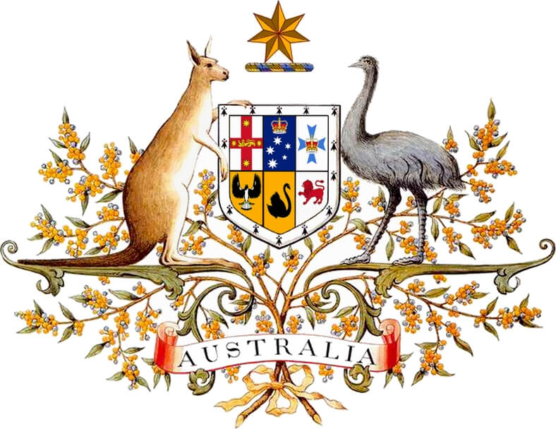
Now I realize that in modern times the coat of arms has largely fallen out of use, and if anything they have been replaced by logos, but they are part of a long and important history all over the world.
The European history of heraldry and coats of arms goes well back into the 11th century CE, and the ancient Romans used similar insignias more than 2000 years ago, though used for a different purpose.
The Japanese have a history of kamon, family badges, dating to the 7th century CE. Through colonization, the coat of arms has spread into Africa as well as most other nations, and almost always came with a title of nobility.
As time passed, cities, states, countries, and corporations would come to use a coat of arms just like individuals or families to distinguish themselves. These heraldic achievements, or full displays of the heraldic components to which the bearer was entitled, were governed by strict rules as to what could be used, how it could be used, who was granted ability to bear, and in many cases, how one must design and display their armorials.
To save you some time, let’s just say that heraldry – the profession, study, or art of creating and blazoning arms – is a large and convoluted topic. Seriously, it’s crazy. Many aspects of it make little sense without understanding a hundred other things about the societies that gave birth to them.
Charges, escutcheons, ordinaries and fields
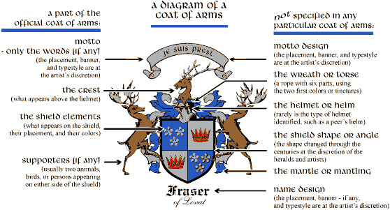
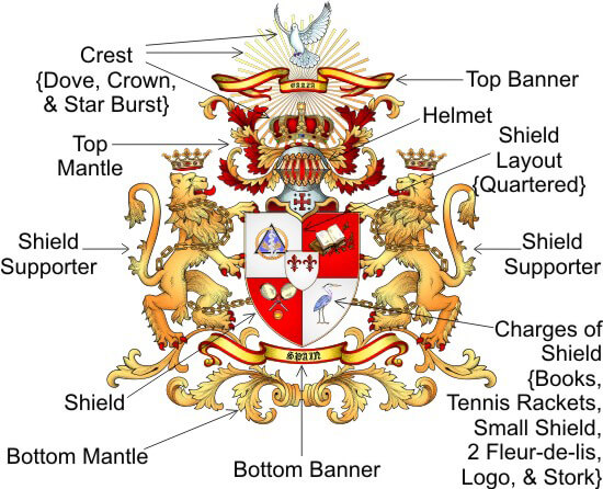
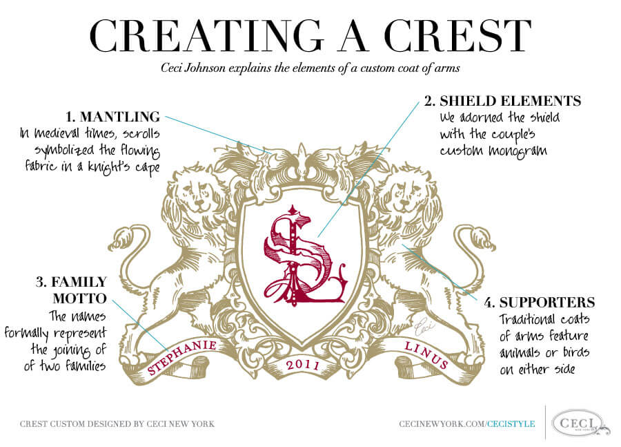
But for our purposes we will delve into one aspect that sheds light on today’s topic, and that would be charges. Charges are any emblem or device occupying the field of an escutcheon. Okay, before you roll your eyes and click over to your email, let’s walk through this as it’s new to me as well.
An escutcheon is the shield portion of a coat of arms. Understandably, it is shaped like a knight’s shield unless worn by a British woman, where it then resembles a diamond called a lozenge. When worn by clergy or a continental European woman it is shaped like an oval and called a cartouche.
There are also many other possible shapes. Now, the escutcheon (shield) has a background called the field. It can be broken up into multiple sections depending on the number of charges required.
The field is really just the inside of the shield shape. Charges are added to the field with any accomplishments, titles, and honors achieved, and possibly even traits and beliefs of the individual or family.
There are literally thousands of charges and I will not go into any depth on them, but instead will focus on one type of charge: the ordinary. An ordinary is a simple geometrical figure, usually bound by straight lines, which crosses the shield or possibly only a single field of that shield.
Time for a coffee break?
Let’s take a break for a moment. Are you good? Do you need another sip of that coffee? I bet you feel better now. Okay, back to it!
Ordinaries are a major building block of a balanced and beautiful escutcheon. They create and define shape and movement, and thus are very strong graphic elements. Some of the most popular ordinaries are the cross, pale (vertical stripe), fess (horizontal stripe), bend (diagonal stripe), chevron, saltire (diagonal cross) and the chief (horizontal bar at the top of the shield).
There are many subordinaries as well (naturally), which expand upon the options for decoration. These are varieties of shapes not considered “honorable ordinaries” and usually not stretching across the entire shield. The ordinaries and subordinaries can also be bound with varying lines including wavy, engrailed (spiked), dancetty (stair-stepped) and many other more complicated patterns.
Compounding on all of these options, one can use a diminutive, which is a smaller version of an ordinary used in repetition across the shield or perhaps in a separate field. But with all of these shapes, how would one keep them all separate and visually distinct?
That is where another aspect of heraldry comes into play: tinctures. Tinctures are the colors used to emblazon a coat of arms, simple as that. Well, not that simple. Tinctures are broken down into metals (silver/white or gold/yellow), colors (the other five regular colors), stains (non-standard colors), and furs, which are complex colored patterns not resembling any of the ordinaries.
Personal coats of arms
All of these combine to create millions of possibilities, which were used to distinguish tens of thousands of families across the centuries. They also combine with the other aspects of heraldry and the coat of arms to make my head explode.
Regardless of that, history is full of examples and they have ended up shaping the future in which we now all live.
As various cultures have changed over the centuries, the usage of coats of arms has lessened, but one of the strong graphic elements, the charged shield, has remained in a very interesting way. Peoples of non-noble descent and cities, states, and corporations that could not partake in the now antiquated practice of heraldry began to create their own armorial shields to represent their families or business interests. In many ways, modern logos are simply an updated way to use color, shape, and imagery to convey a message and represent values and tradition.
World travelers and Louis Vuitton
Before the turn of the last century, a famous travel goods company by the name of Louis Vuitton was working with elite clientele, which often encompassed world travelers. These clients wanted a way to mark their goods with a personal design that would represent them all over the world and distinguish them as wealthy and powerful business people.
Since they had no lineage of nobility, but were newly wealthy thanks to the industrial revolution, their existence created a new “noble class” that needed to be properly represented.
Louis Vuitton would design and emblazon their trunks and luggage with a new form of an armorial shield that had become quite popular.
These new “personal escutcheons” used aspects of traditional charges, employing shapes reminiscent of ordinaries and tinctures to create new emblems representing the clients. Classic and modern interpretations of designs were usually included, and colors as well as basic shapes took on new, complex, and sometimes multiple meanings.
In a way, these were the immediate precursor to modern logos, which began appearing at the end of the 19th century. And Louis Vuitton was at the center of it all, designing for thousands of clients and keeping a record of each design so that no two were alike.
A world timer with history
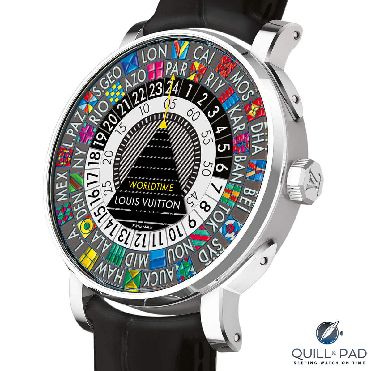
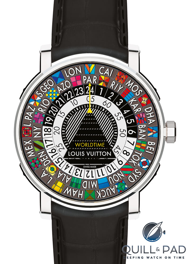
These records provided the inspiration for Louis Vuitton’s newest horological creation, the Escale Worldtime. A first in the new Escale line, the Worldtime borrows from the Louis Vuitton archives and uses historical designs as city escutcheons (or city shields, my name for them) for each time zone and corresponding city abbreviation.
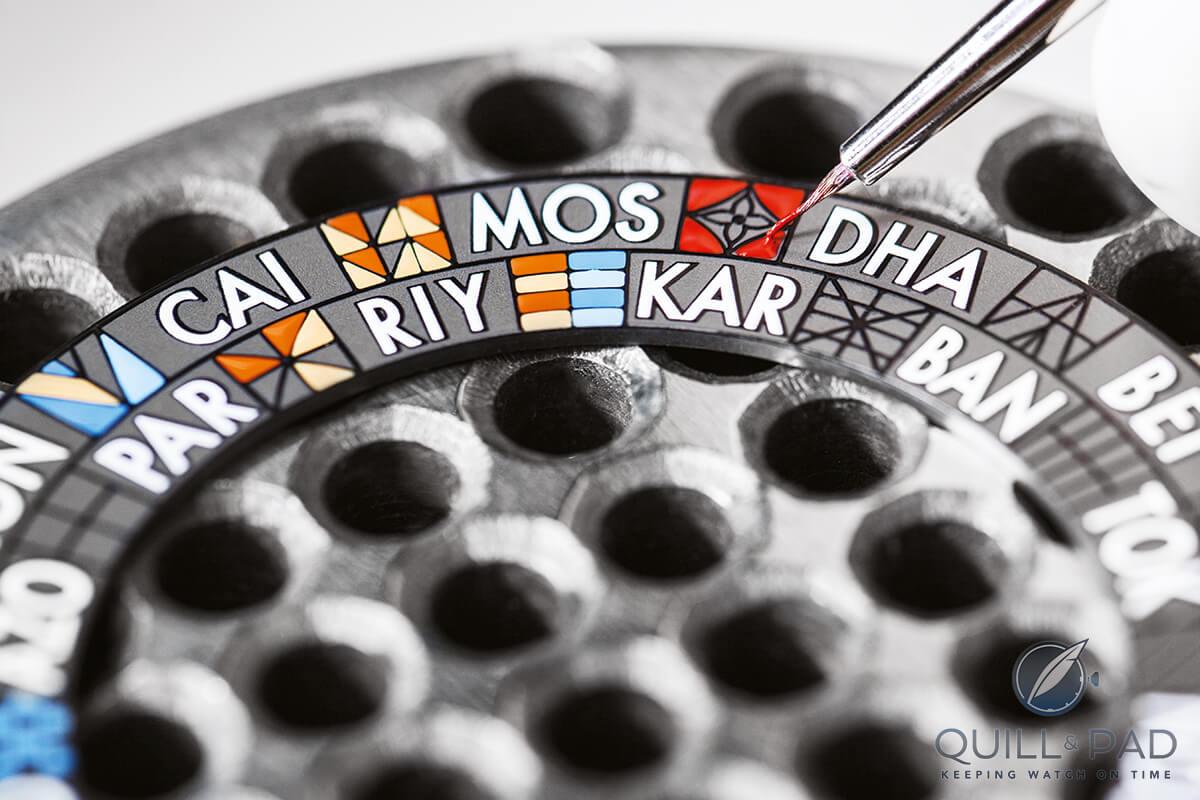
The designs vary widely but hold to the heraldic tradition of geometric shapes and bright colors to differentiate between the world cities. But the back story isn’t the only thing that makes these designs amazing. How about the fact that they are all hand-painted? Yeah.
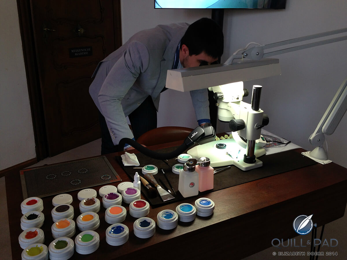
Author Joshua Munchow examining the details in the miniature hand paintings of a Louis Vuitton Escale Worldtime dial
Miniature oil paintings
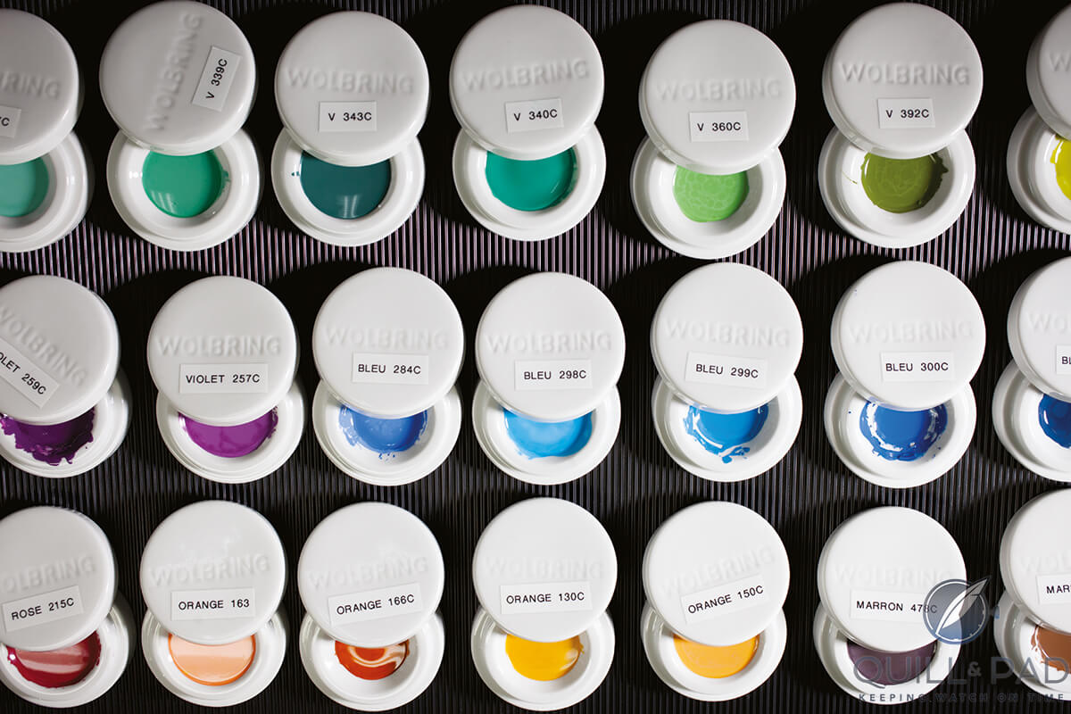
These miniature oil paintings take an exhaustive 50 hours of labor to paint by hand, one tiny color at a time. And if my counting is correct, there are 213 individual, colored shapes with 38 of those being unique colors.
All those different colors require a lot of mixing simply to paint hundreds of miniscule shapes smaller than a grain of rice. For that tremendous amount of dedication I am happy they did it, though, because the result is beautiful. After painting is completed, the dial is then heated to 100° C to dry the paint, permanently setting the city escutcheons to the dial.
The dial, divided into three rings, has also the only moving parts you see,. The exterior ring holds the 24 city escutcheons and city abbreviations, and is settable via the crown to your time zone. The second ring is for the hours (24 of them to match the time zones) and is settable in two ways for ease of use.
Traveling and changing timezones
If you happen to be traveling (which is the watch’s intended purpose), as you change the city ring the hour ring jumps along with it. This is basically the time zone set position.
If you pull the crown out to the second position, you can then set the hours, and along with it the minutes, independently of the city ring. This allows for quick adjustments while traveling after the initial setting of your local time, a very useful feature.
Even more useful is the ability to set it backward, something multi-time-zone watches often have trouble with.
Finally, the center ring holds the minutes and includes an outer ring with numerals and an inner chapter ring with individual minute markers. The center of that ring bears a striped pattern, which is graphically interesting on its own, but when studying heraldry may actually have a separate meaning.
Now, Louis Vuitton may or may not have intended this, but according to a chart I found describing the tinctures and how they should be portrayed, each color has a black-and-white pattern associated with it to help distinguish colors when only a black ink drawing is being made.
So if you wanted to represent gold and blue, the section designated gold would have a light dotted pattern, while the blue section would have horizontal stripes. The main seven colors all have distinct patterns, and red happens to be vertical stripes, just like those on the minutes ring.
Probably nothing or perhaps a pure coincidence, but that center ring could be a very old way to represent red, and a subtle nod to the origins of this style.
Reading the time
Interestingly, none of that has described how to actually read the time or time zone. Since the dial is handless and composed of so many graphic elements, Louis Vuitton wanted to separate the indication from the dial decoration. The solution was to print another familiar graphic element on the underside of the sapphire crystal, this time a very modern one: a black triangle that is sliced into ten sections, emulating the electronic representation of a runway on flight controls.
You are basically coming in to land as you try to read the time on this watch. On top of the runway is a small yellow triangle extending into a line with an arrow on the end. This line bisects the hour and minute rings, providing you with a reference to tell the time from. The arrow at the end points to the current time zone you are located in.
Inside the Escale is a new automatic caliber developed specifically for this piece. Its 38-hour power reserve remains in the normal range expected for an automatic caliber of this type.
Also new is the case, which departs from the typical Tambour in size and shape, creating a slimmer, more manageable piece that takes its styling cues from Louis Vuitton trunks and their iconic corner brackets.
As a traveler’s watch, it makes a strong bid to feel comfortable on the wrist for a long period, something I can appreciate as many large and “manly” pieces can feel a bit oversized on my normal-sized wrist.
But that dial though! It really is the star of the show, and knowing the long road that led to its creation makes me have an even stronger appreciation for it. Now if I could only figure out how to get knighted…
I might be out of luck in that regard, but you are in luck because the history lesson is over and all that is left is to break it down. What do you say? You say yup? Okay!
• Wowza Factor * 9.1 Some might say it’s more of a whoa than a wow, but those miniature paintings are simply brilliant.
• Late Night Lust Appeal * 18.36 gn » 180.050m/s2 More force than a fighter jet in sharp turn, this watch will make you want to travel or want to research lineage…or both.
• M.G.R. * 35.56 A solid movement, developed specifically for this watch makes it more special than many, but it still isn’t a Double Split.
• Added-Functionitis * Moderate Having a true world time disc and a 24-hour dial makes for a strongly recommended tube of standard strength Gotta-HAVE-That cream for the colorful and useful swelling.
• Ouch Outline * 9.12 – Being Hit in the Eye By an Ice Shard Ooh, not a fun time; not a fun time at all. And the worst part is, someone will probably suggest you put ice on it to stop any swelling. Either way, I would take it for the opportunity to get the Escale and its miniature painting wonderfulness on my wrist.
• Mermaid Moment * Historical Personal Escutcheons? Really? It’s quite a romantic thing to think about. Some family somewhere has a grandfather or grandmother who commissioned Louis Vuitton to design a personal modern armorial over a hundred years ago and now it’s on your wrist. It’s a lovely story, makes me want to order an ice sculpture for the reception.
• Awesome Total * 280.3 Multiply the number of individual colored sections (213) by the number of hours it takes to paint a single dial (50). Divide that by the number of unique colors (38) and you get a solid total for a very interesting and fun watch.
For more information, please visit www.louisvtuitton.com.
Quick Facts
Case: 41 x 9.75 mm, white gold
Movement: automatic Caliber LV 106
Functions: hours, minutes, world time
Price: $67,500
































Trackbacks & Pingbacks
[…] Further reading: Heraldry, Coats Of Arms, And The Louis Vuitton Escale Worldtime. […]
Leave a Reply
Want to join the discussion?Feel free to contribute!