by Martin Green
Italians have the gift of making even the most common object look great.
They can even make a coffee grinder with enough sex appeal to make Tom Jones jealous!
While in these modern times most fountain pen brands have fallen prey to the mighty power of keyboards, in Italy they seem to be hanging on just a bit longer. Which means that for a relatively small country, Italy still has quite a few fountain pen manufacturers. And I think that I have tried products from almost all of them!
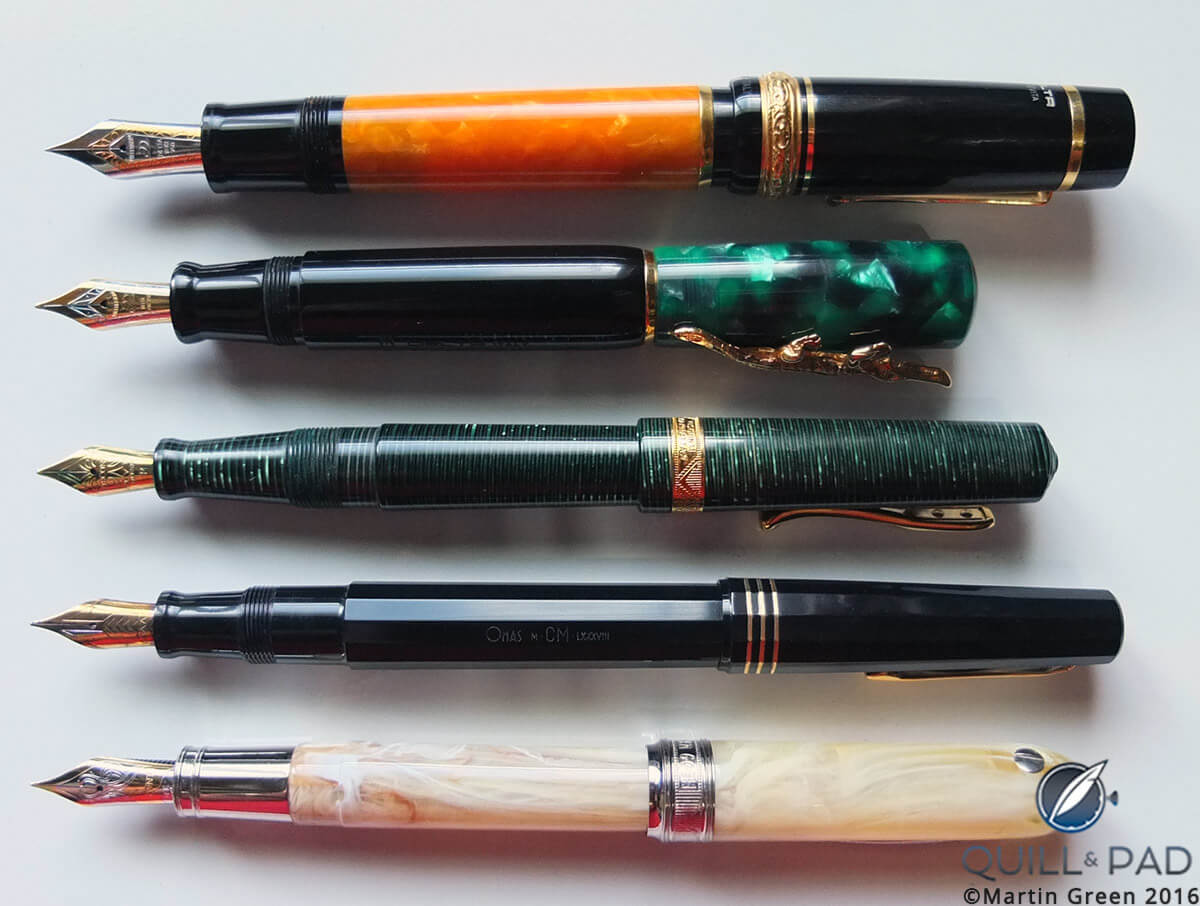
An overview of the author’s Italian fountain pens
My wanderings through the world of fountain pens had made me more knowledgeable (see My Quest For My Ultimate Fountain Pen Part 1: The All-Over-The-Place Period), and my previous pens had made me also quite a bit wiser regarding my personal preferences: the pen should not be too small, and bold colors were preferable.
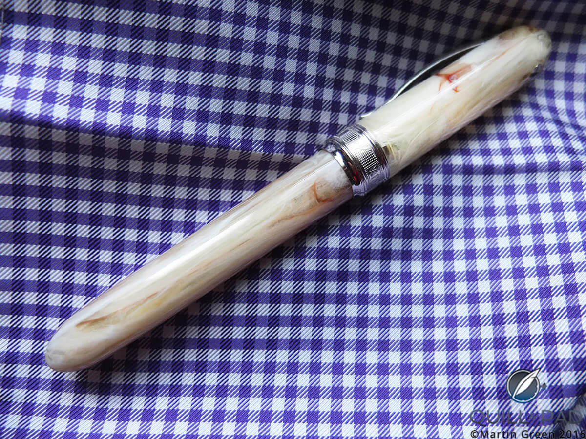
The author’s Visconti Van Gogh fountain pen
And so I entered the world of Italian fountain pens
When I walked into P.W. Akkerman in The Hague, a magnificent store that sells some of the most amazing fountain pen brands, the salesman figured out quite quickly that I didn’t know exactly what I was looking for.
His response was unheard of: instead of presenting me with what he thought I should have or might like, he went over to a display rack, picked up about half a dozen of pen magazines, gave them to me free of charge, and told me to come back when I had found my pen.
I was stunned by this approach . . . but did what he suggested. The magazines certainly bolstered my knowledge about fountain pens, and while I was flipping through the pages, all of a sudden there it was: my next pen, the Visconti Van Gogh.
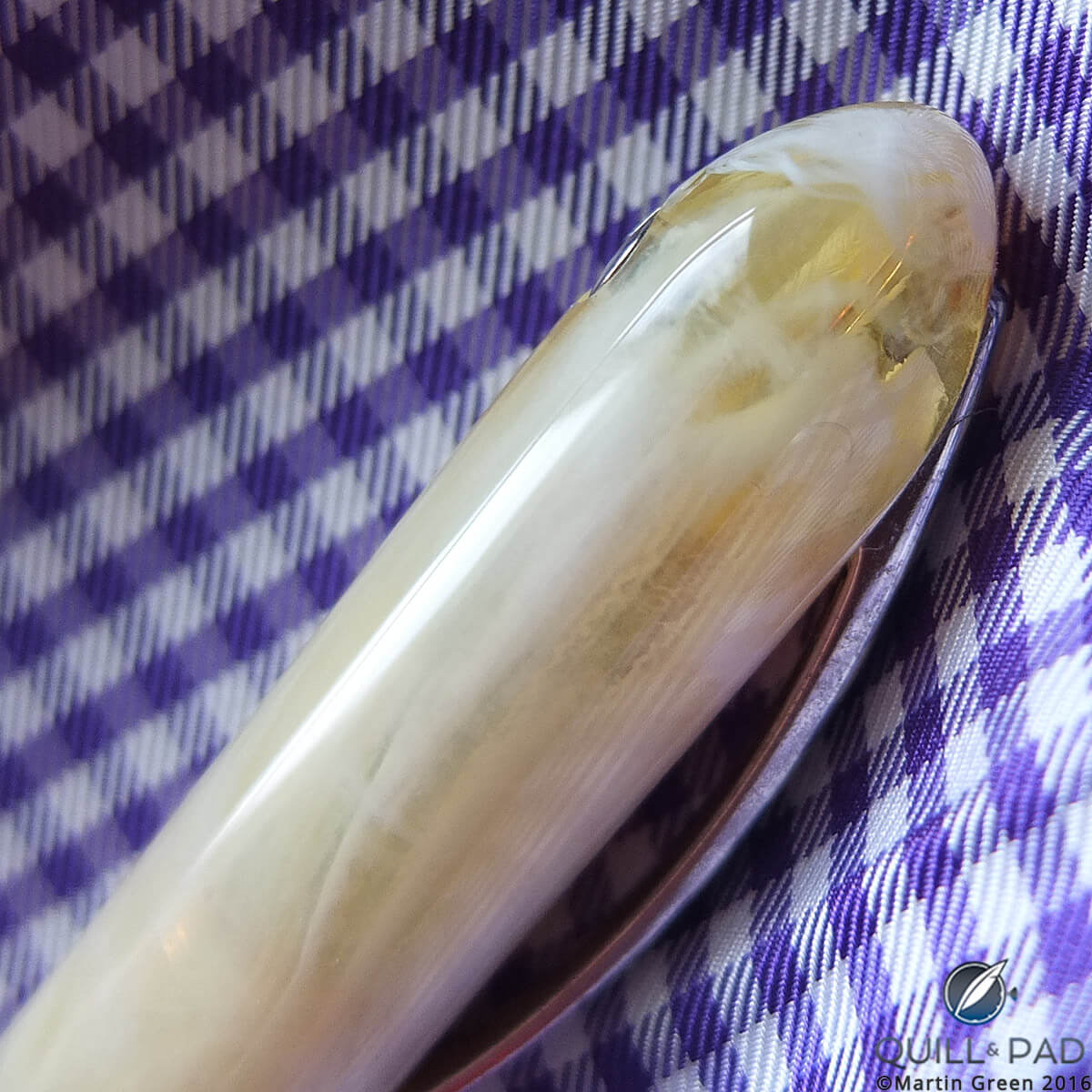
Marble-like resin on the cap of the author’s Visconti Van Gogh fountain pen
Visconti based the Van Gogh collection on the color palette used by this impressionist painter. I fell for the version that seemed to have been carved from Italian marble, but was in fact a natural resin.
This first version was a bit different from the Van Gogh model that Visconti now sells. For starters, the cap had a unique closing mechanism that worked on pressure. A quarter twist of the cap was enough to open or close it.
This element was actually invented and patented by Mercedes-Benz and put to good use by Visconti. Mine has always worked flawlessly, but some have complained that the cap would loosen by itself, which led Visconti to return to a traditional screw cap.
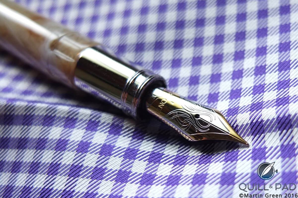
Two-tone nib of the author’s Visconti Van Gogh fountain pen
Visconti has meanwhile also replaced the nib, regardless of the fact that the original two-tone gold nib was a thing of beauty! Not only was it beautifully engraved, it was also a very responsive writer.
King Tut’s tomb
The Visconti was, and remains, perfect in many ways, and I wasn’t looking to replace it; however, I found myself walking through the medieval center of a European city when my eye fell on a high-end pen store that was going out of business. A sad thing in itself, entering it made me feel partly like a vulture and partly like an explorer. Both actually came together once I entered, because I walked into what felt like the tomb of Tutankhamun.
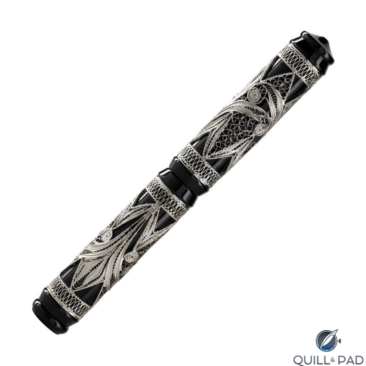
The author’s Visconti Taj Mahal fountain pen
It was wall-to-wall with unique limited editions, pens that I had never seen, and many I would never, ever see again. One that stood out was the Visconti Taj Mahal, a 1995 limited edition with gold filigree on the barrel.

Ornate Visconti Taj Mahal fountain pen
But unlike a 1930s explorer having discovered an ancient tomb, I could not raid this store. Even the heavily discounted prices were still too much for a college student like me at the time.
However, I did not leave the store empty-handed, having adding two pens to my collection.
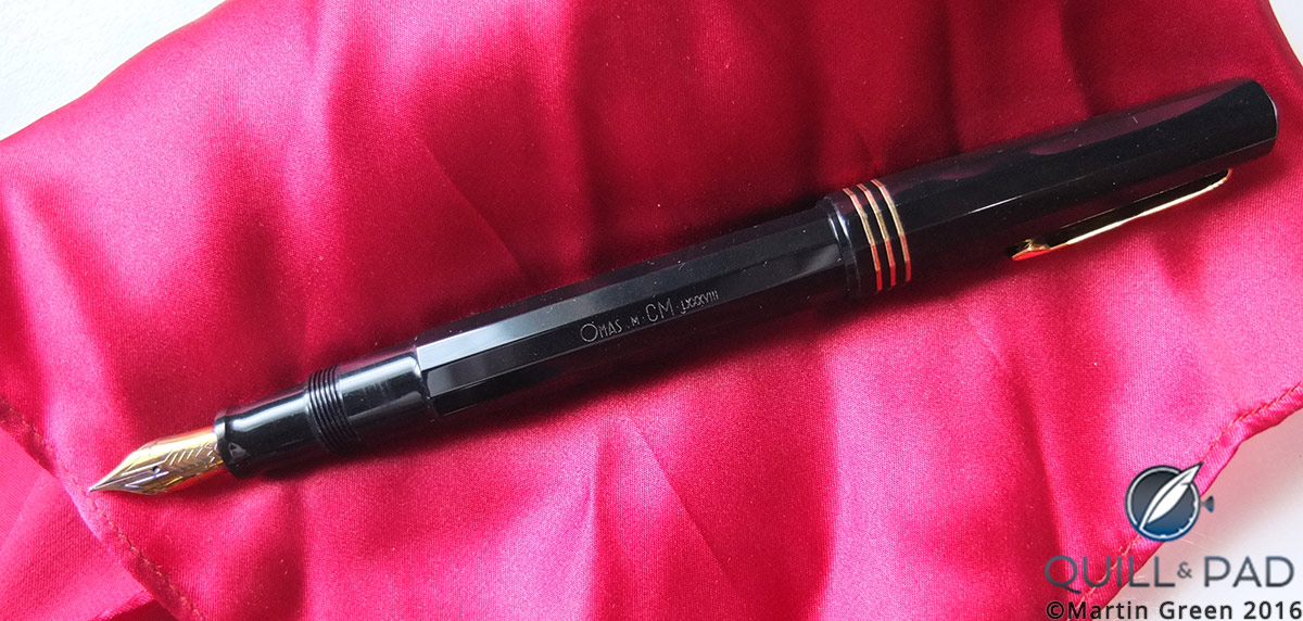
The author’s Omas Paragon fountain pen with cap off
In addition to the Taj Mahal, the second was an Omas Paragon that I actually liked very much because of its signature 12-sided barrel. It had an interesting number engraved on the barrel in Roman numerals, and it took me years to find an Omas collector who could actually tell me what it meant. It turned out that I had purchased an early limited edition pen by Omas from 1988 to commemorate the 900th anniversary of the University of Bologna.
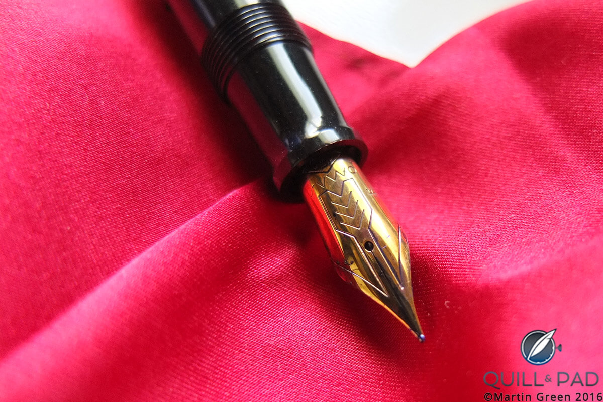
The nib of the author’s Omas fountain pen
Though the Omas was a great writer, especially since its barrel provides not one, but two, natural places to put your fingers, I did end up buying another pen: a green Visconti Manhattan Wall Street.
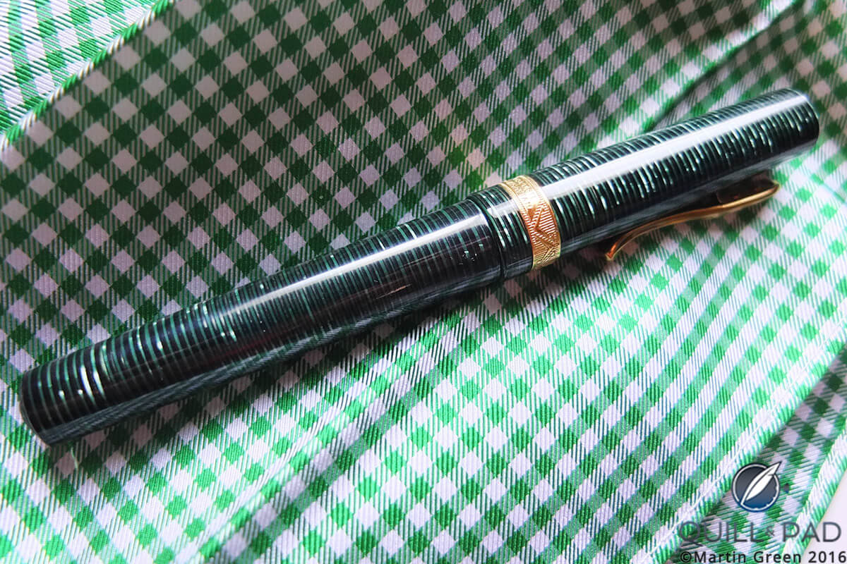
The author’s Visconti Manhattan Wall Street fountain pen
This was a very striking pen, but that is not all: it was fitted with Visconti’s high-vacuum power filler. An especially novel piece of technology in the day, it was also the reason I abandoned this very comfortable pen as a daily writer. The high-vacuum power filler requires some strength to operate, making it a two-hand job with no hand left to hold the ink pot.
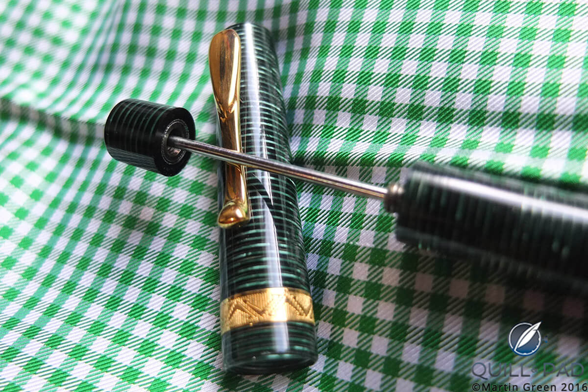
The high vacuum, but low practicality, power filler on the author’s Visconti Manhattan Wall Street fountain pen
Great technology, but lacking in practicality, which made filling it feel like a chore instead of pleasure.
Crocodile bites
But then I got bitten by a crocodile: Italian brand Delta’s Animal Collection features a detailed animal serving as a clip. For some reason still not clear to me, I find crocodiles and alligators fascinating animals. So I picked up the Delta because it was dedicated to these fearsome creatures.
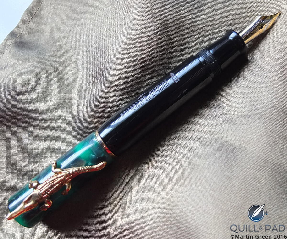
The author’s Delta Animals Collection crocodile fountain pen
The Delta is a pen of contrasts: a very fat and sober-looking barrel with a cap containing flakes in every shade of green, on top of which rests a crocodile sculpted in vermeil. The pen turned out to be a great conversation piece, but more than that it introduced me to Delta as a brand. Not only did the barrel fit very nicely in my hand, but the nib was as smooth as butter, unlike any I had ever experienced before. This excited me so much that I set out to obtain what I thought was the biggest, boldest, baddest Delta there was . . .
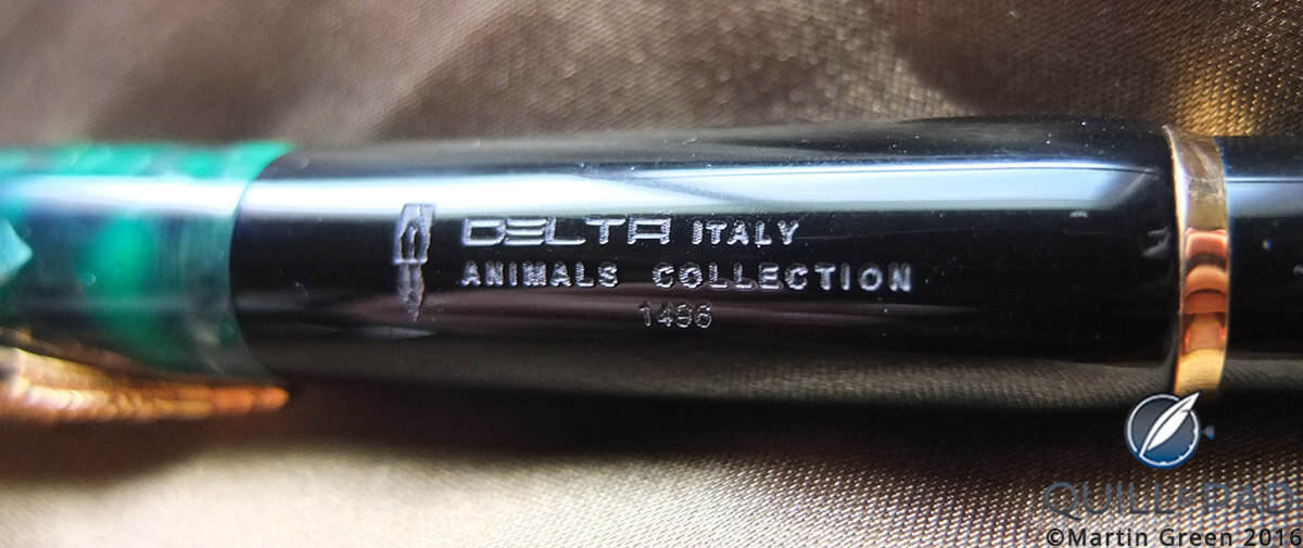
Engraving on the Delta Animals Collection crocodile fountain pen
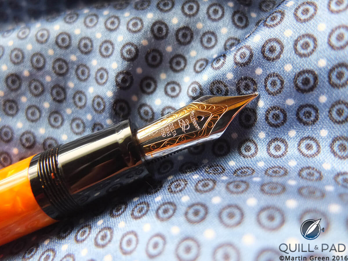
Gold, black, and bright orange: give these colors to anyone else to design a product with and the result will without a doubt be very gaudy. Give it to Italians and they make the Delta Dolce Vita Oversized, a pen fit for Caesar!
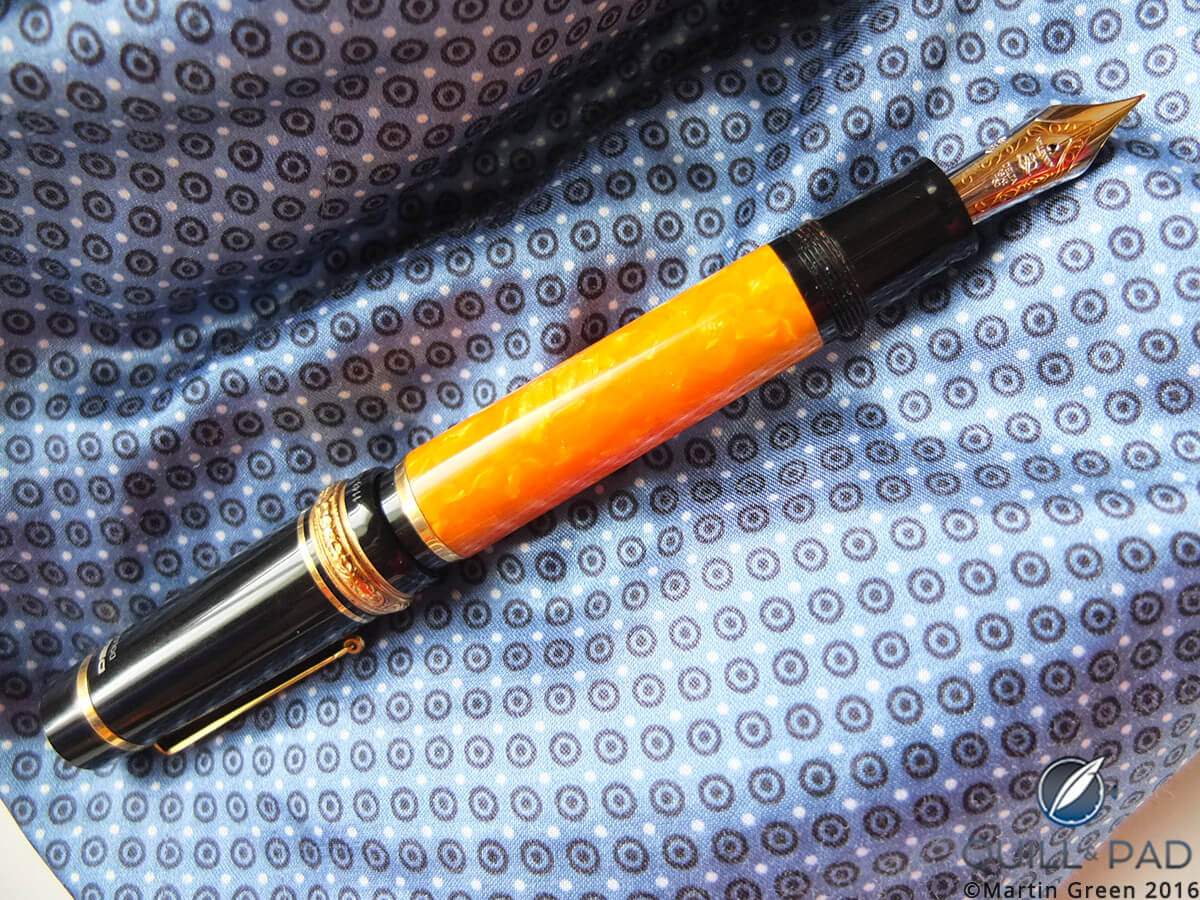
The author’s Delta Dolce Vita Oversized fountain pen
With a bright orange center piece in the barrel that seems to resemble hot lava from Vesuvius, this pen is made to look even more dramatic by the use of black resin on both ends. It is decorated with an engraved ring around the cap in vermeil, a design that seems to have come straight from the villa of a nobleman in Pompeii.
The term “oversized” does not only apply to the pen itself, but even more so to the nib, which measures more than 2.5 centimeters (1 inch) in length. To me, this pen reigned supreme, even over the previous Delta.
As you might notice, I have acquired a lot of pens “by chance”; this was one I actually acquired on purpose.
With watch friends I often talk about how we would view certain watches if we had been able to keep our initial sincere, slightly naive approach to the topic. I went so fast and so deep into the watch industry that before you knew it knowledge and background information had distorted my view.
Knowledge is, of course, never a bad thing, but innocence also has its own beauty. The world of fountain pens allows for this. There are fewer risks, fakes are uncommon (and only focus on the really well-known models), and in a technical sense a fountain pen is far more straightforward.
Of course, you do pick up knowledge along the way, and experience does guide direction. That is why my Italian period was already far more focused than my all-over-the-place period.
But after years of using the Delta Dolce Vita Oversized as a daily writer, I would eventually replace it with something unexpected, the beginning of my luxury brand period.
Keep an eye out for this soon!
For how I got to my Italian period, please see The Quest For My Ultimate Fountain Pen Part 1: The All-Over-The-Place Period.
Trackbacks & Pingbacks
-
[…] obtaining a Delta Dolce Vita Oversized at the conclusion of my Italian period (see The Quest For My Ultimate Fountain Pen Part 2: The Italian Period), I was a very happy man. The pen served me very well, and I was in love with the looks as well as […]
-
[…] See The Quest For My Ultimate Fountain Pen Part 2: The Italian Period. […]
Leave a Reply
Want to join the discussion?Feel free to contribute!



























I love my dolcevita!
It is indeed a very special pen Luke, and quite the writing machine!
Love that Van Gogh, Martin!
Thanks Ryan, and although I don’t use it as often as I should I still cannot bring myself to sell it. The colors are just amazing and all the details are done right.
Nice story, beautiful pens, Martin. Cheers
Thanks Boris!
Thanks for including the Visconti Manhattan. I liked it enough to design it with my dear partner Ed Fingerman. You’re not alone in finding the power filler difficult. We designed it for ease of one stroke filling… Something Visconti was unable to deliver. And so it goes…
Thanks for designing the Visconti Manhattan Jon! I sometimes wonder how this pen would be with just a regular converter. However, despite some technical challenges I still consider it one of the most formidable pens I am lucky enough to own.
I have many fountain pens, but for me the Aurora Optima series are perfect.
this is very fantastic and awesome pen collection. These awesome and expensive pens. Thank you for the post.
Fascinating articles! I’ve fumbled through the first phase as you did and eventually landed on the shores of Japanese maki-e pens.
Agree with you that gold is definitely a pre-requisite for more comfortable writing.
Can’t wait to read the next installment!
RIP omas.
Loving the journey.
Have you tried Japanese pens yet? Nakaya is something special.