Behind The Lens: The Philippe Dufour Simplicity – Reprise
by GaryG
As regular readers of this series know, the idea of Behind the Lens is to present great watches as seen from a variety of visual perspectives, while at the same time passing along a few thoughts on what it’s like to shoot these pieces.
And, from time to time, a helpful technical hint or two to those, like myself, who are afflicted with the irresistible urge to hunch over a camera and peer through it into a light tent.
Mostly, I feature watches on loan from my generous friends, but this time let’s look at a piece that I am very fortunate to have in my own collection: the legendary Simplicity by Philippe Dufour in a 37 mm white gold case with white lacquer dial.
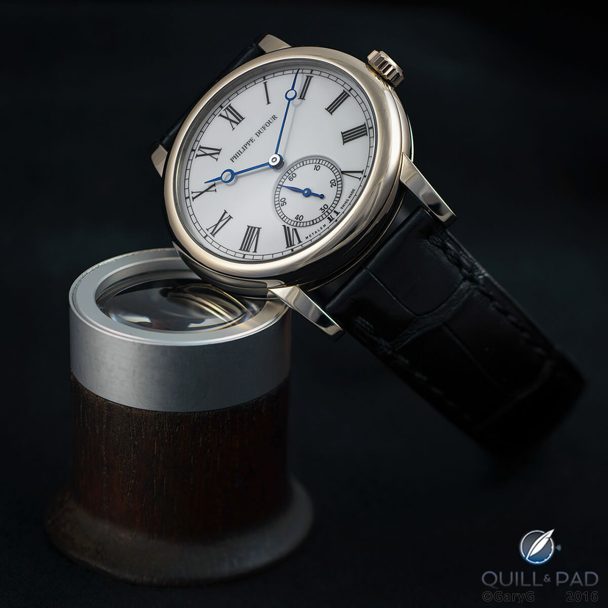
The author’s Philippe Dufour Simplicity in white gold
What makes a good watch photo?
I’d argue that it’s exactly the same elements that make any photograph a good one: my teacher Ming Thein’s “four things.” Repeat after him: light, subject, composition, story.
A photo that has all four of these has the potential to be a great one regardless of context.
For me, the first photo above comes close to meeting the “four things” test; perhaps the only question that nags at me is whether the lighting on the watch is a bit too uniform. That said, the lighting that I chose addresses many of the challenges thrown up by my Simplicity as a photographic subject:
- In bright light, the blued hands quickly turn to black
- It’s very easy to blow out the dial given its color and brilliance
- The white gold case, of course, isn’t really white; if you look carefully at the photo, it becomes clear that the gold is quite distinct in color from both the pure brilliance of the polished steel disc at the center of the dial and the matte-finished aluminum of the loupe
- Particularly against a dark background, the black strap tends to become invisible
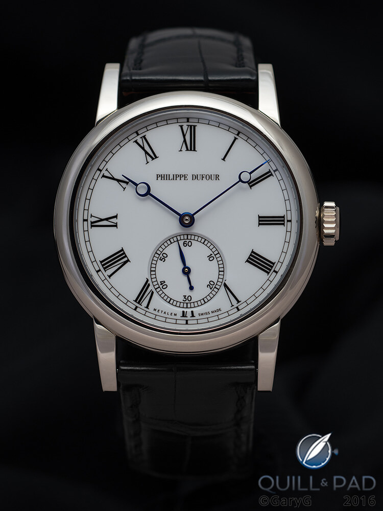
Straight on: Philippe Dufour Simplicity
Different light, different position, different look: here, we can still see that the hands are blue, but from straight ahead with direct light the black-polished central disc atop the hands appears truly black and the white dial really pops.
Does the watch really look like this? In this light, yes.
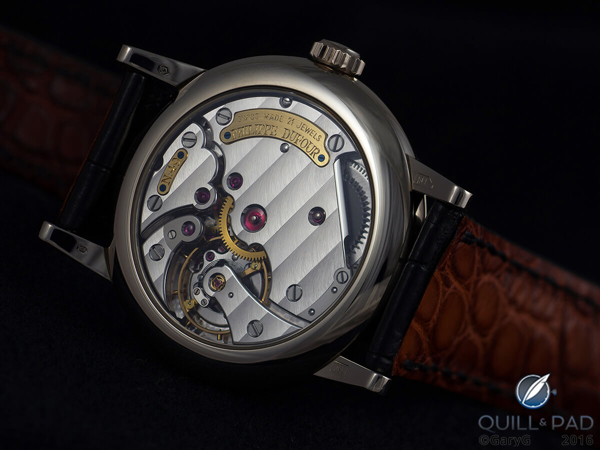
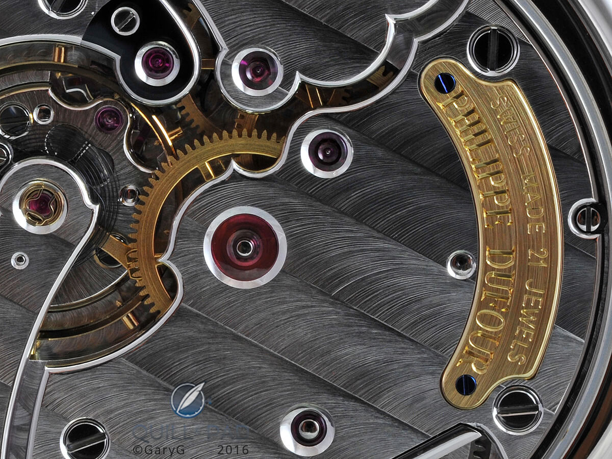
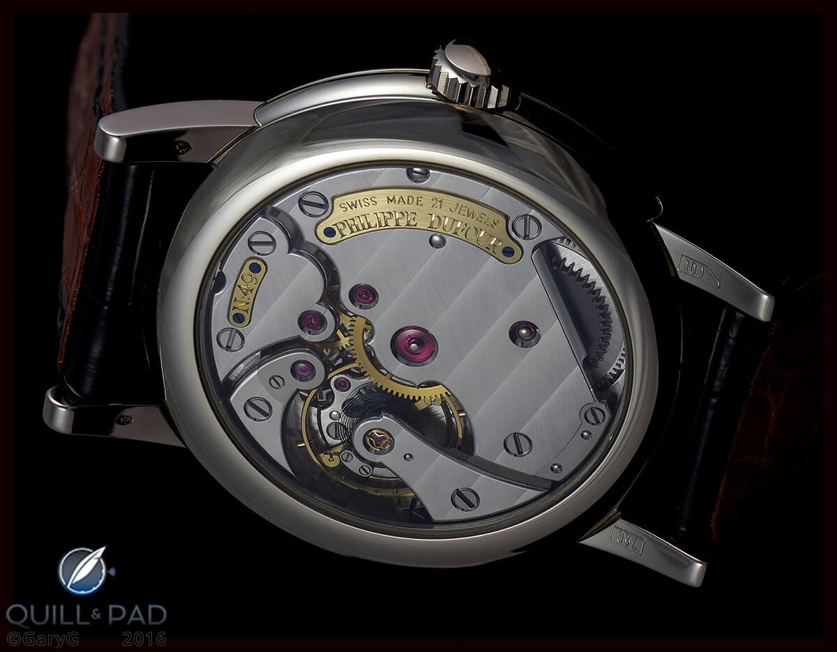
Movement view: Philippe Dufour Simplicity
From front to back
Of course with the Simplicity most of the drama is actually on the reverse side, where the amazingly finished movement resides. The variety of finishing techniques, textures, colors, and shapes creates lots of visual interest, but it’s actually not an easy piece to photograph well.
Among other things, the Geneva striping (we’ll come back to it again later) is extremely shallow; as a result, from many vantage points, in bright light the plates and bridges appear to be mirror-like rather than dramatically etched.
And there are plenty of nooks and crannies, such as the one that the recessed barrel assembly sits in at the right of the movement in the above image, that all too easily sink into darkness.
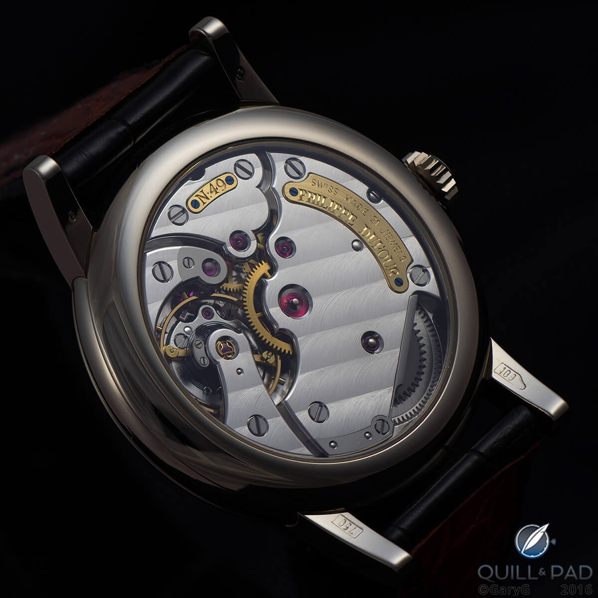
Movement of the Philippe Dufour Simplicity
Blown-out areas are a particular pet peeve of mine, and it takes real pains to avoid them, especially with a watch like the Simplicity that has a large number of polished bevels in the movement and a fully polished (rather than brushed or matte) case.
If you’re doing your own watch photography, try the following exercise: before snapping the shutter even once, keep moving the watch and lights into different positions until you find one that results in no overly-bright areas in the image. I think you will find that it’s not that easy!
Movement detail of the Philippe Dufour Simplicity
Zooming in
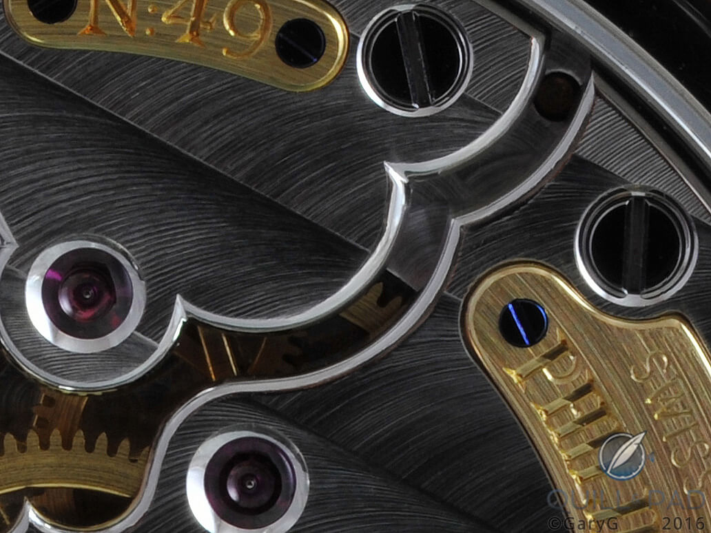
Back to the striping: in this close-up, you can see just how delicate, and delicious, the fausses côtes are on the plates and bridges of this watch. Just above the large ruby jewel at the center of the image, it seems that the effect almost stops, with only the barest curved wisps to continue the illusion.
One way to tell how fine the stripes are is to look at the points at which they intersect the curved bevels at the edges of the plate. On many watches, the line between bevel and upper surface dips each time it meets the edge of a stripe: on the Simplicity, the bevel’s edge is, to my eye, absolutely uniform.

Escapement detail of the Philippe Dufour Simplicity
To see this watch close-up is to be impressed: check out the uniform curve of the bevels on the polished escape wheel cap and striped escape bridge, the full finishing of the balance wheel weights, and the characteristic Dufour “horns” on the plate at lower right.
Movement detail of the Philippe Dufour Simplicity
I couldn’t resist one more detail shot of the movement. Even the recesses for the small plates engraved with the serial number and maker’s name match the plates themselves perfectly; and the sharp interior angles on the edge of the bridge at the top of the photo are clearly hand-made, but wonderful in their uniformity, especially when you realize that they are cut into a curved surface.
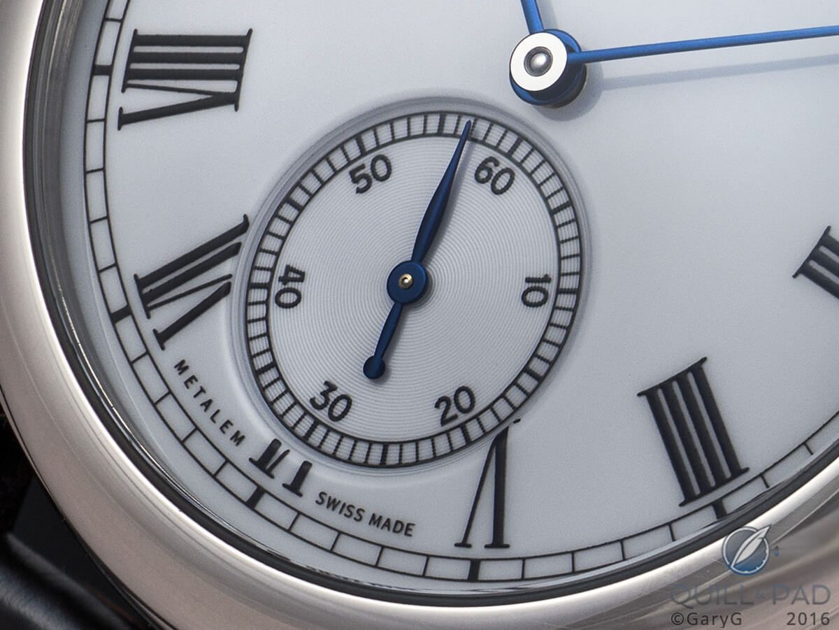
Dial detail of the Philippe Dufour Simplicity
Yes, the seconds subdial is grooved: this is another one of the small details on this watch that provide visual interest but bedevil the photographer with their tendency to get washed out against the whiteness of the background.
And in the image above, you can see one of my favorite bits about the Simplicity: the tiny bit of the serif at the bottom end of the Roman numeral V that is visible just at the edge of the main dial plate where it meets the subdial at 17.5 seconds past the minute.
Playing around
One of the things I’m working on with my watch photography is the “story” aspect mentioned above. It’s all well and good to take technically polished photos, but it’s often more fun for the viewer to see a watch in a context with some meaning.
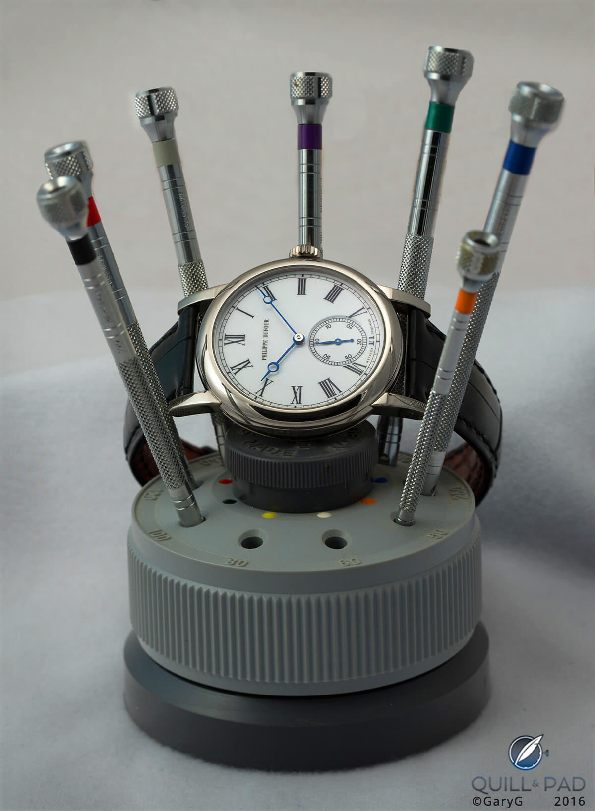
With the tools of the trade: Philippe Dufour Simplicity
For the Simplicity, what could be better than to display it with a set of watchmaking tools?
I’m also going back to something that I actually did quite a bit earlier in my watch photography hobby: experiment with unusual points of view. Before, I was doing it in ignorance, but at this point perhaps I’m getting to the point of being able to “know the rules to break the rules.”
Playing with angles: what do you see?
In terms of classical technique, this image, in which at first we seem to look up at the watch, would be a no-no. But wait a minute: are we actually looking up from below, or down from above? By making the top of the image brighter than the bottom, we can trick the eye into seeing the watch as sitting upright, beneath our gaze.
Parting Shot
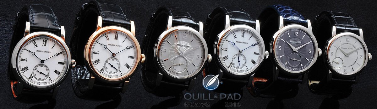
Rarer than hen’s teeth: six Philippe Dufour watches, including the author’s Simplicity
Just for fun, let’s finish up with this image of six Dufour watches (five Simplicities and, at right, a Duality) that I took a few years ago.

I include it for two reasons: first, it’s a pretty unusual sight.
And second, I’ll leave it to you to judge it on light, subject, composition, and story to see where my photographic work has improved over time and where I still need work!
Quick Facts Simplicity
Case: 34 and 37mm cases in platinum, white gold, and rose gold; one example gem-set with white and pink diamonds
Dials: silver or dark grey guilloche with applied indices and white lacquer with printed Roman numerals
Movement: manually wound proprietary Philippe Dufour caliber
Functions: hours, minutes, seconds
Price: original production prices 48,000 to 64,000 Swiss francs
Limitation: 206 known examples
Production dates: 2002 to 2015
* This article was first published on March 2, 2016 at Behind The Lens: The Philippe Dufour Simplicity.
You may also enjoy:
Behind The Lens: Philippe Dufour Duality
Philippe Dufour 70th Birthday Celebration Film
‘Time Piece’: If You Only Watch One Film On Independent Watchmaking, Watch This One
Leave a Reply
Want to join the discussion?Feel free to contribute!


Dear Gary,
Such a breath of fresh air to see these beautiful pictures with this magnificent wrist piece. While sometimes I consider your pictures a bit too dark, I found these on the sweet spot. Don’t get me wrong, it is a good technique (for instance I found some of the pics of GLdP a bit to bright – but it is also a technique and both directions are enjoyable in equal measure) and much better than my most-of-the-times blown highlights pictures.
Plus, an exceptional lesson in watch photography. I need to have a chat with MT to step up my watch photography game since I am doing the same mistakes over and over again and fall in the same trap every time.
It was a real pleasure to read this article and I enjoy it more than a lot. Thank you!
Cheers,
Andrei
Hello Andrei —
Thanks so much for your thorough and kind remarks! As you’ve noticed I have gradually moved my style to a slightly brighter look over time — which has been both the result of technical changes (migration from standing lights to flash, moving from Nikon to Hasselblad) and aesthetic choices. I also have a bit of a challenge with online posting in that my monitor is quite bright and I usually optimize images to look good in their original resolution on the big, bright screen — it takes some adjustment to boost them so that they look good on a phone or tablet without risking blown out areas.
If I have any criticism of GLdP’s work (and he is a seasoned pro) it is that the contrast is sometimes too high for my taste, leading to a harsh look. In my own shooting, especially if I’ve underexposed the source images somewhat, I usually end up moving the Contrast slider pretty far to the left to make the end result more natural looking.
You could do much worse than to seek input from MT — he is a master!
All the best, Gary