Behind The Lens: Greubel Forsey Balancier Contemporain
by GaryG
It’s no secret that I’m a big fan of Greubel Forsey, its watches, and the people behind them. Among other things, I’m the proud owner of an Invention Piece 1, Stephen Forsey’s personal favorite among Greubel Forsey’s references, and the showcase for the firm’s first “fundamental invention,” the 30-degree, four-minute double tourbillon.
For years, Greubel Forsey’s reputation was built on the foundation of its tourbillons – singles, doubles, and quadruples – that ostensibly yielded timekeeping advantages and simultaneously provided showcases for the industry’s very best finishing. Over recent years, however, we’ve seen a series of Balancier watches from the brand retaining the finishing we’ve come to love but with simpler non-tourbillon escapements.
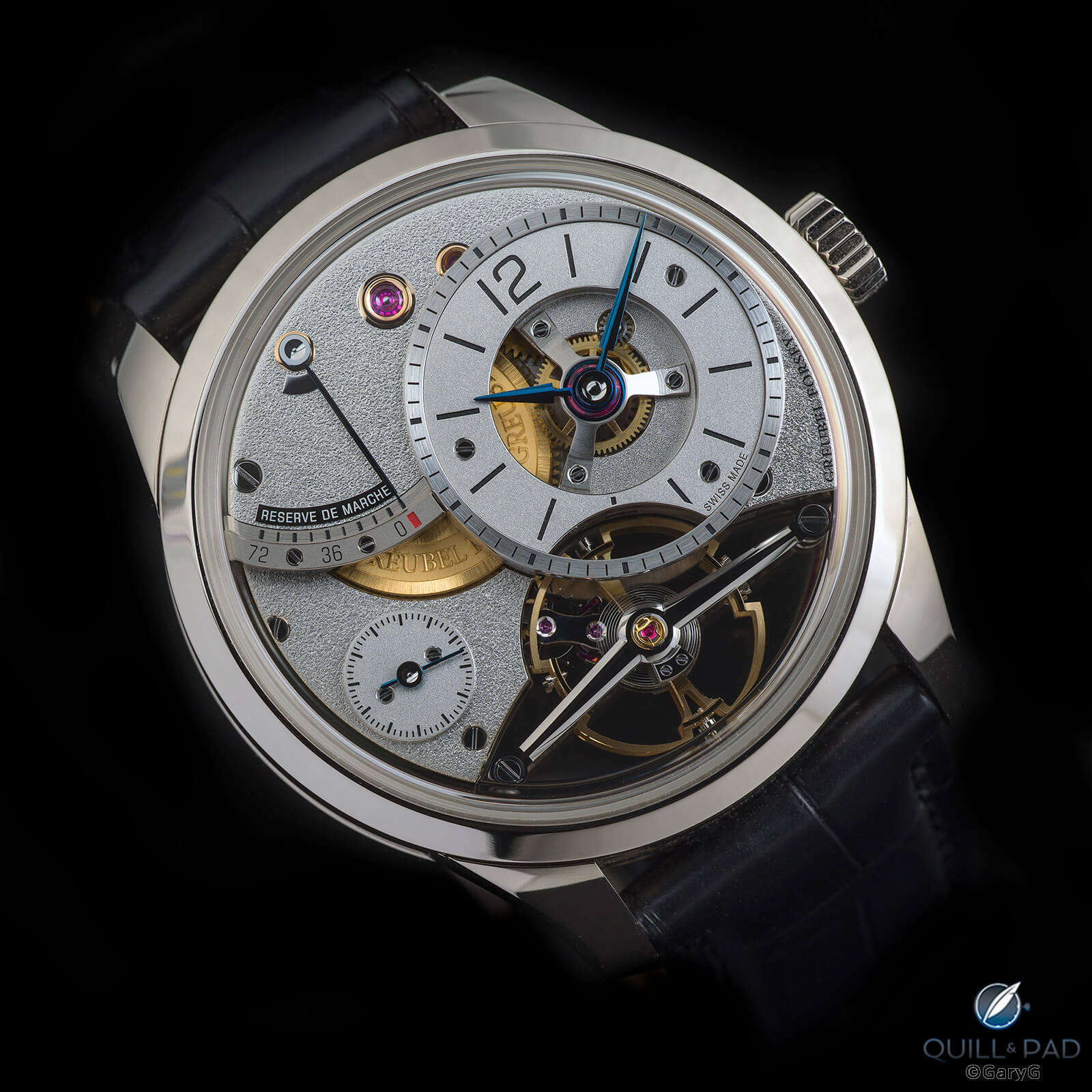
Greubel Forsey goodness: Balancier Contemporain in white gold
Recently, I had the opportunity to handle, photograph, and wear a good friend’s Balancier Contemporain in white gold. I’d actually been with him when he discovered this reference: he and I crashed Quill & Pad colleagues Elizabeth and Ian’s meeting with Stephen Forsey during Baselworld 2019, and Forsey was kind enough to take us through the watch in detail.
My pal had long been a fan of the brand but had always been put off by the size of the watches, and I can understand why: not everyone has a taste for cases 43.5 mm in diameter and larger. At 39.6 mm wide, the Contemporain is the most compact Greubel Forsey ever, and its relatively conventional dimensions and stunning appearance made a purchase a foregone conclusion.
Irresistible: Balancier Contemporain from Greubel Forsey
While everything about this watch is attractive, the star of the show is the escapement, shown in detail below. The long, two-sided balance bridge with its angles and polished surfaces and bevels is a slightly more modern take on the “one bridge to rule them all” on the Invention Piece 1. And in a clever design decision, the surfaces surrounding the escapement are mirror-polished, throwing light and a reflected image of the balance back at the wearer.
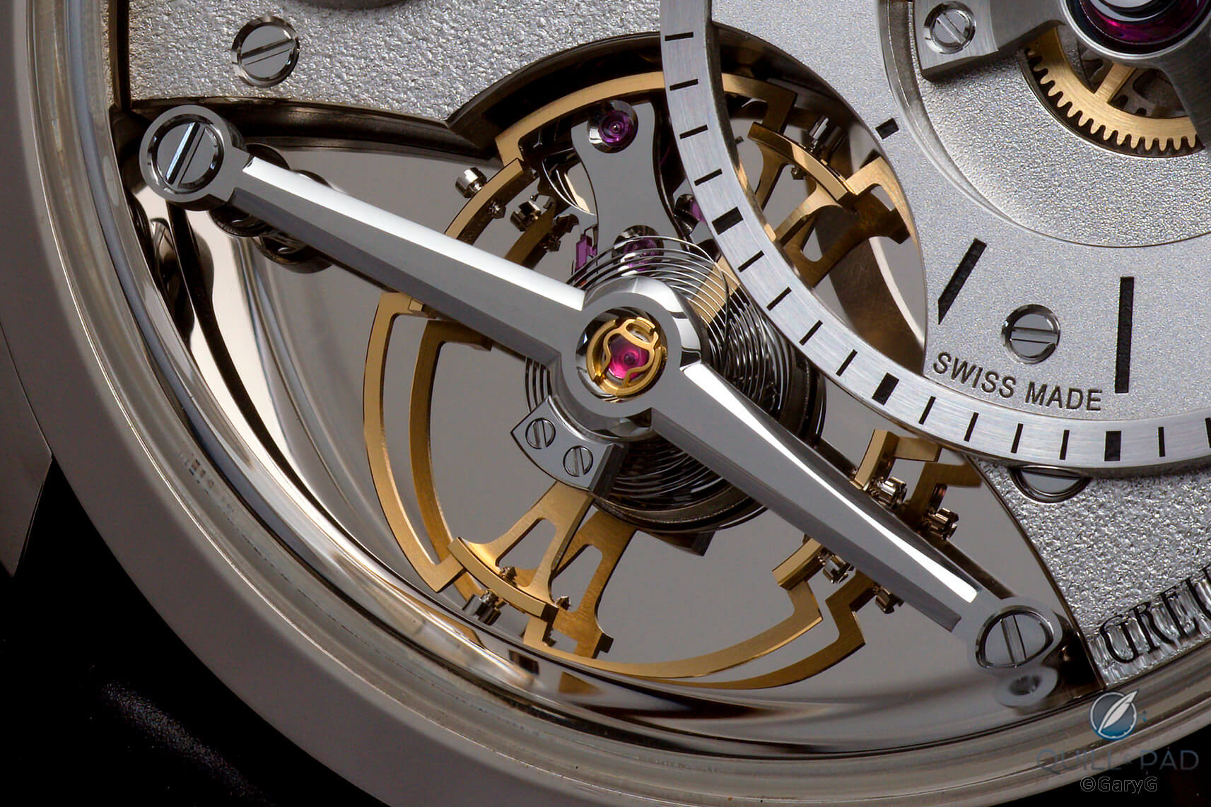
Escapement detail view, Greubel Forsey Balancier Contemporain
In the image above, you can see several of the beautifully executed aesthetic choices that make this a standout watch. I’ve already mentioned the bright surface behind the balance, but as you can see the escapement bridge is also polished as are the pallet fork and escape wheel. The balance is beautifully shaped and alternates satin and polished surfaces along with fine brushing visible on the reflected underside of the balance wheel.
Greubel Forsey Balancier Contemporain
If we zoom out, the escapement can be seen in the context of the entire dial side of the watch. I very much like the way that Greubel Forsey has provided a cutaway view of the entire balance while maintaining a full chapter ring around the hour and minutes dial; one of my peeves about the earlier Signature 1 from the brand was the chapter-less recess in the hour/minute dial.
In the image above we’re also treated to the variety of surface finishes used in this watch, including the bold hand-applied brushing on the major plates, the finer frosting of the subdials, and the brushed chapter ring and power reserve scale.
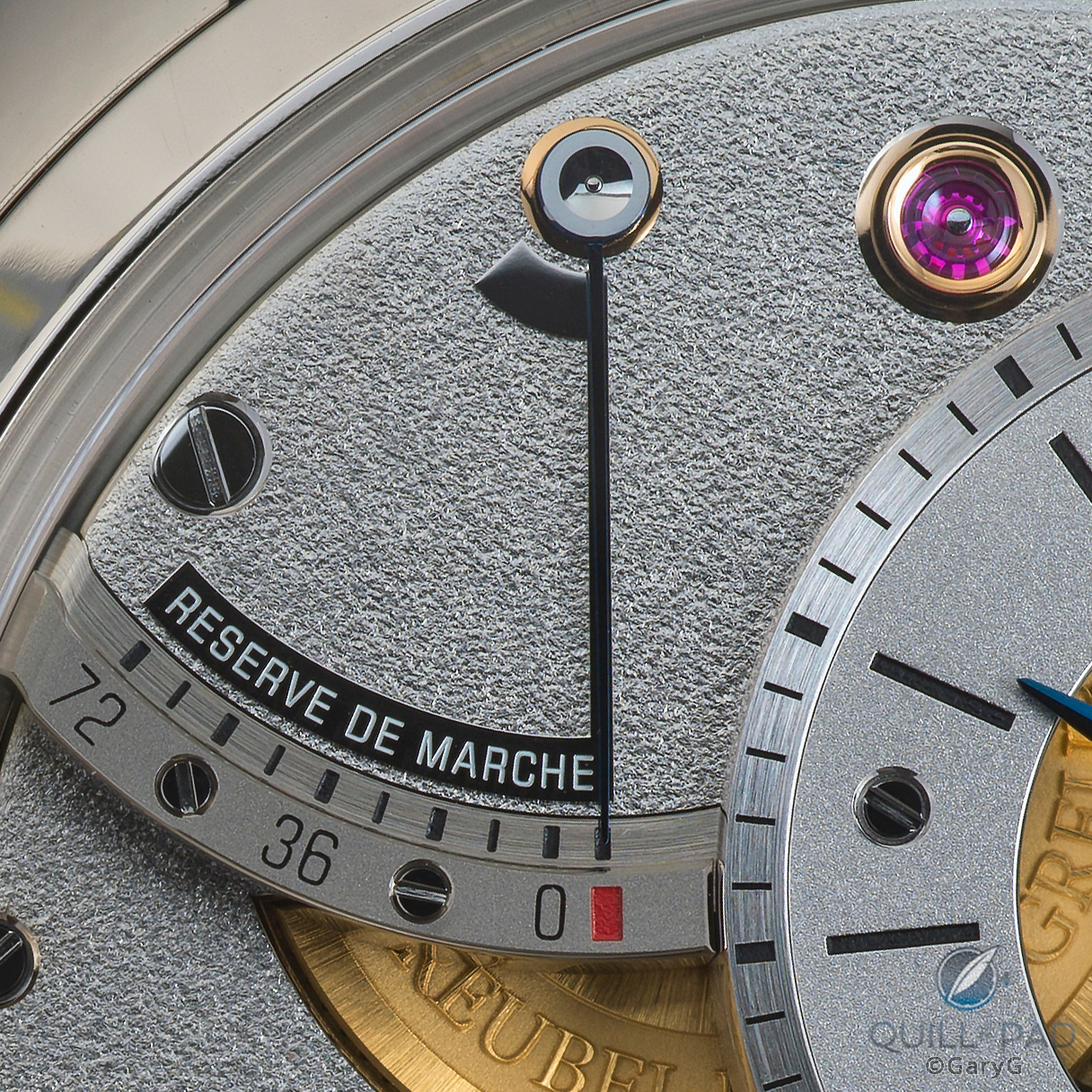
Detail view, Balancier Contemporain dial
In the detail view above, we can also see the radial brushing and relief engraving on the gold barrel and the polished sinks of the jewel’s chaton and the reserve hand axis. One cool thing about this watch is the way that the polished surfaces change appearance depending on the angle of incidental light: in the image above, the small plaques defining the power reserve space appear black, while in other views they blend almost unnoticed into the silver background.
Just in the small space shown above I can pick out at least seven different surface finishings, yet the overall impression is completely harmonious.
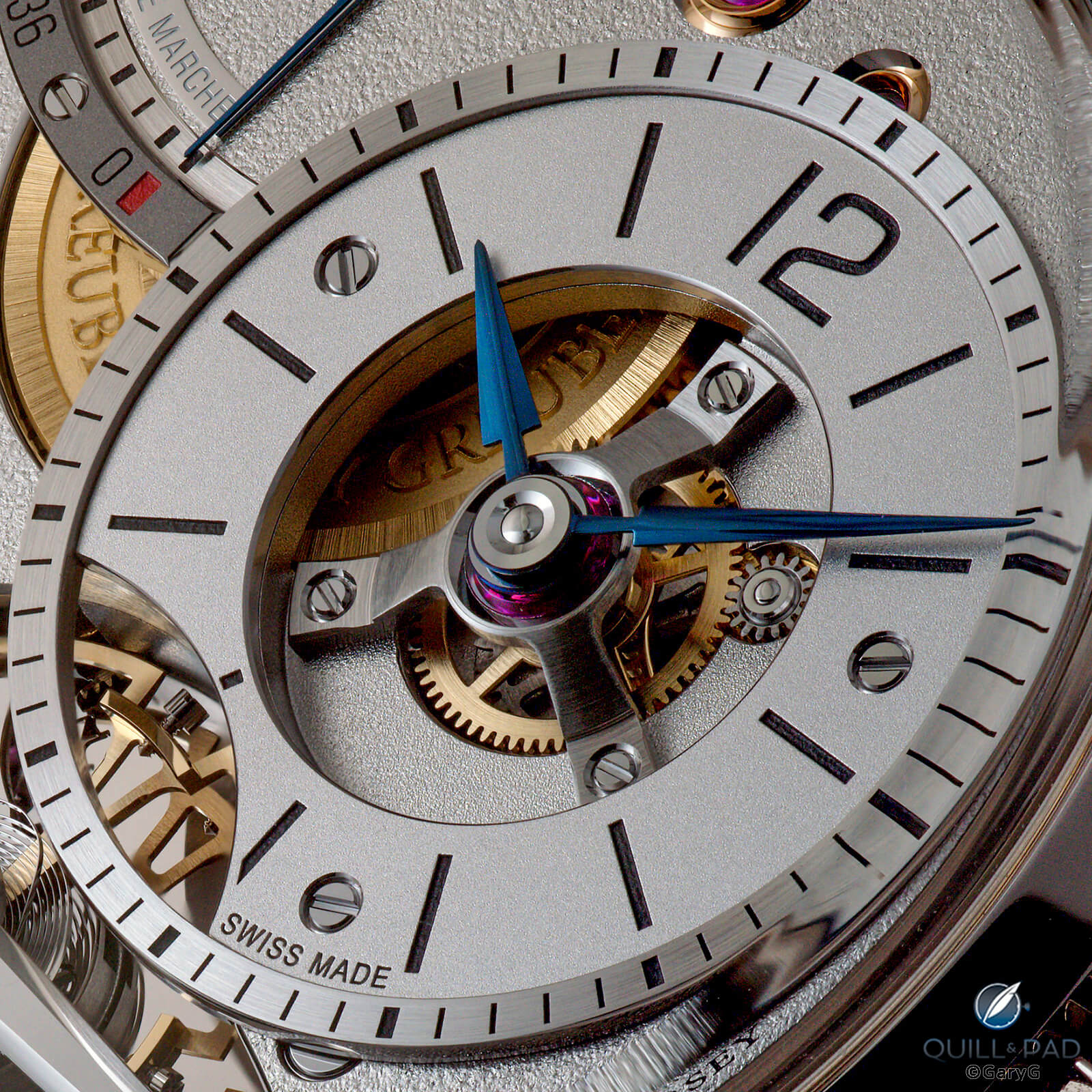
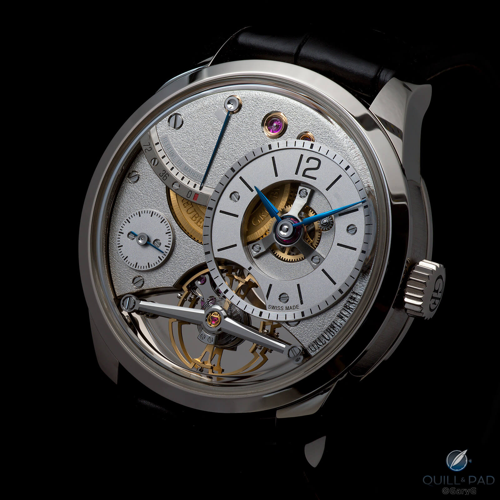
Bearing closer scrutiny: main time display detail
Getting up close with the main time display, we can pick out the polished sinks and curved, polished ends on the arbors as well as the chamfered screw slots and uniform brushing on the tripod supporting the hands. The hands themselves, including the hour and minute hands as well as the second and power reserve hands, are beautifully shaped and blued.
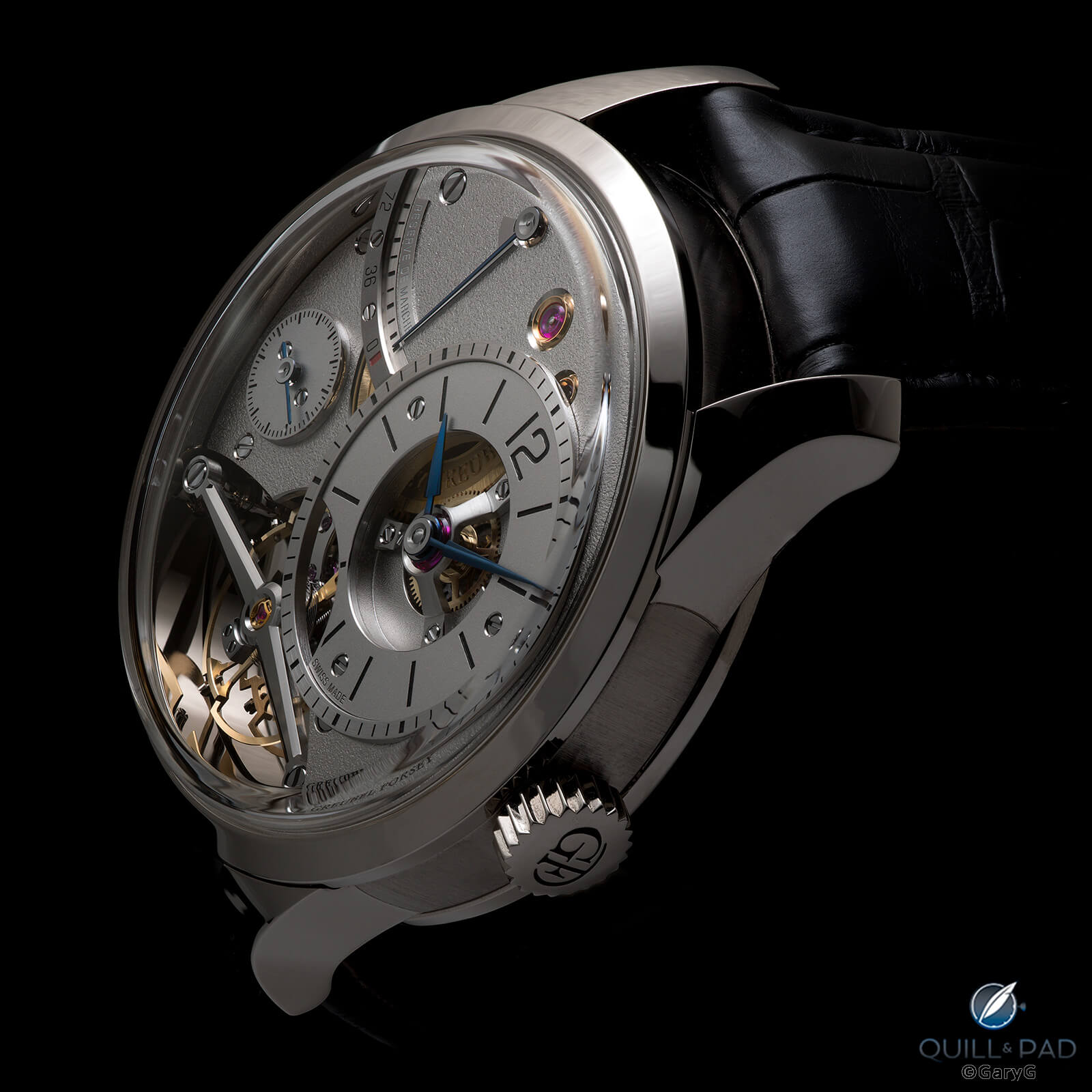
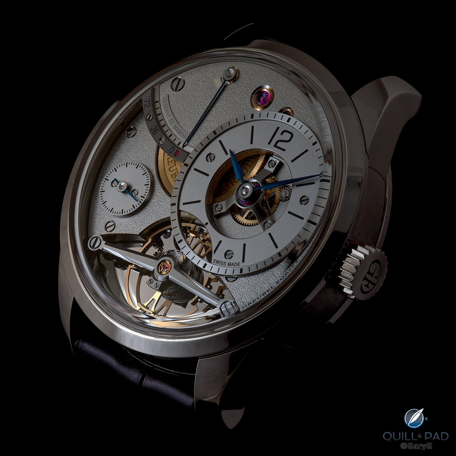
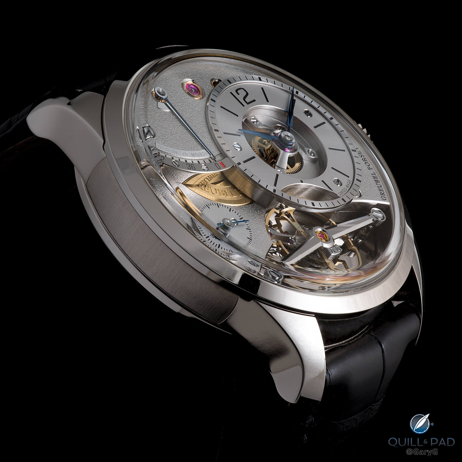
Perspective view, Greubel Forsey Balancier Contemporain
From this shallower angle, we can see the (relatively) modest thickness of the case for a watch with so much apparent depth to the movement as well as the bold lugs and vertically brushed case band characteristic of Greubel Forsey. If you look carefully, you can also see that there is a raised and polished bar underneath the slim blue power reserve hand and connecting the two sectors of the Reserve de Marche scale; and if you’re wondering, the raised power reserve scale is achieved via galvanic growth.
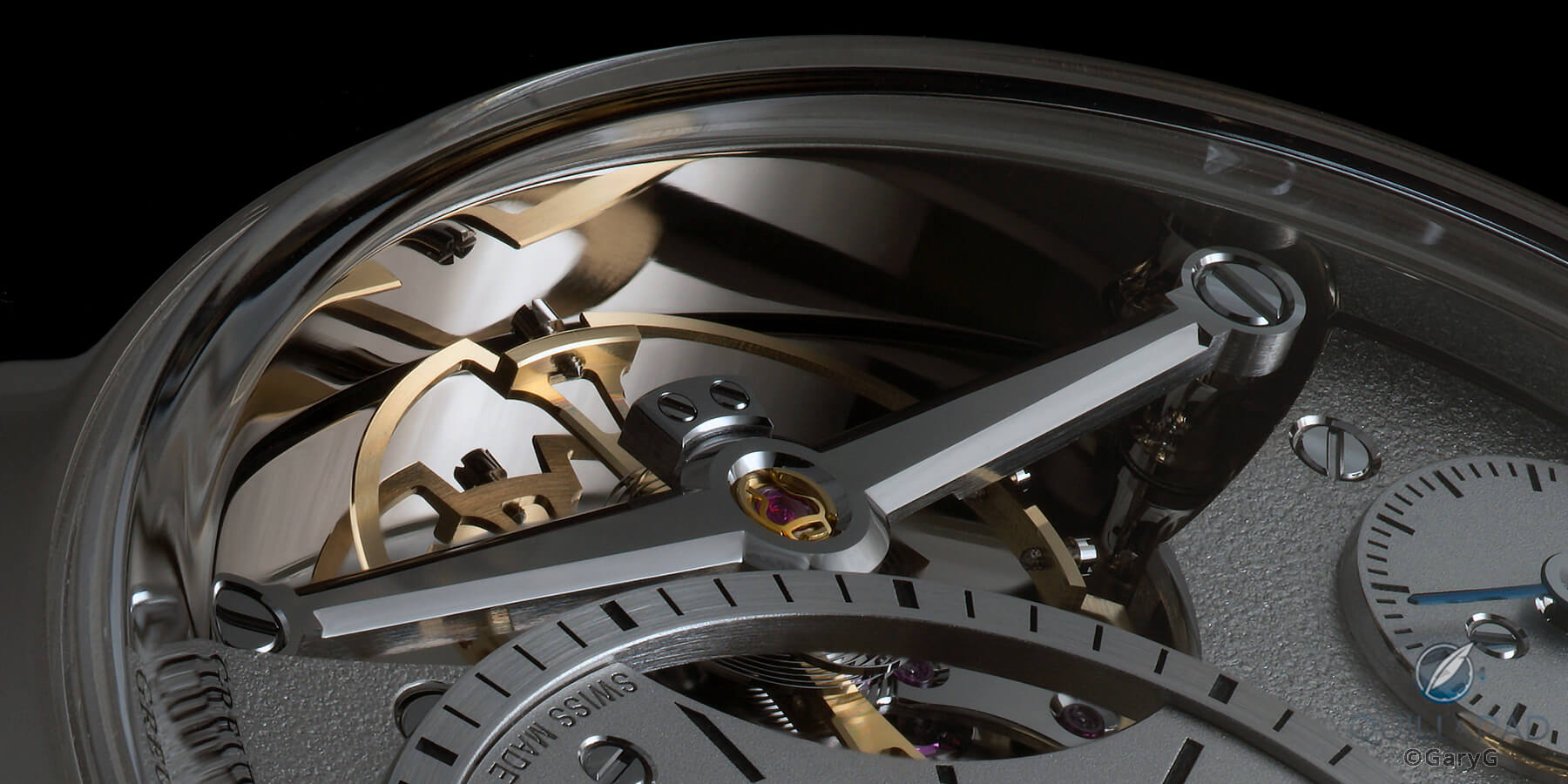
Secret reflection: mirrored inner case wall, Balancier Contemporain from Greubel Forsey
At our Baselworld meeting, there was one design feature of the watch that wasn’t at all evident to us until Forsey pointed it out: the inner wall of the case band is mirror-polished as well, throwing even more light onto the escapement and, if you hold the watch at the right angle, providing a delightful multidimensional reflection of the balance wheel.
Back to the back
As often is the case with Greubel Forsey pieces, the horological action with the Balancier Contemporain is largely on the dial side, but the reverse still gives us some visual treats and displays the characteristic relief engraving of the brand’s values.
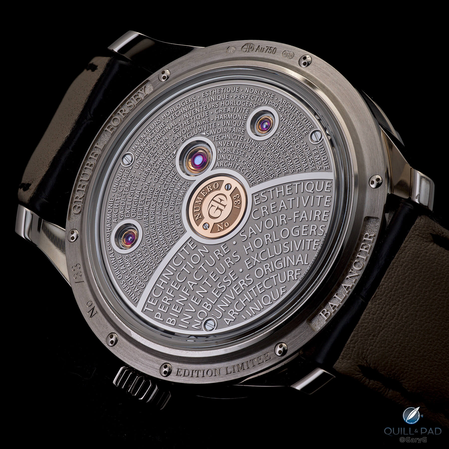
Reverse view, Greubel Forsey Balancier Contemporain
You’re either a “yes” or a “no” on Greubel Forsey’s tradition of inscribing prominent texts on the watches. I’m in the former camp, especially as on my Invention Piece 1 the script on the reverse of the movement isn’t simply a repetitive display of the brand’s themes but rather a detailed story of the idea behind the watch and its approach to timekeeping and a description of the double tourbillon’s technical features. Repetitive or not, for me the relief engraving is part of what makes a GF a GF, and I prefer it to any of the simpler finishes that appear on some other Greubel Forsey references.
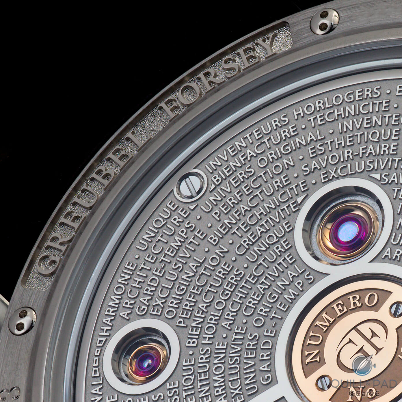
Detail view, reverse of the Balancier Contemporain
The back of this watch isn’t just about the wording, though: as seen above, we are also treated to chaton-set jewels, polished surfaces in both rhodium and gold, beautifully finished screws, including the domed ones securing the case back, more polished arbors, and a variety of case finishings including circular graining and deep-relief logos with hand-punched backgrounds.
Balancier Contemporain on the wrist
Did I try this puppy on after capturing it in the light tent? You bet I did – and found it as wearable, and perhaps even more beautiful than you might imagine.
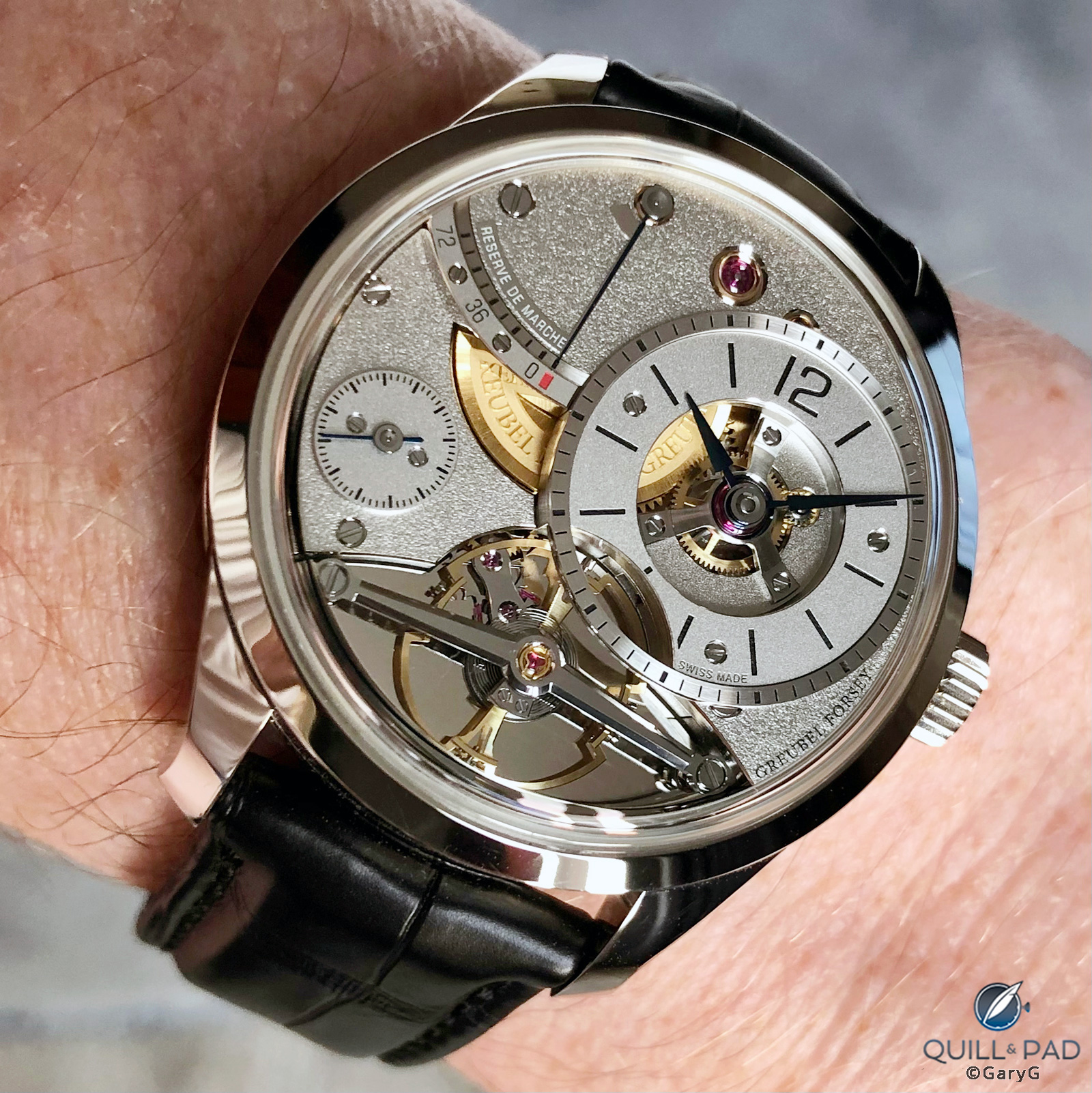
On the wrist: Greubel Forsey Balancier Contemporain
In indirect light, the watch is extremely clean and crisp, but it really leaps to life in direct outdoor light, which plays off the mirrored, brushed, and frosted surfaces to create a sparkling vista while the blued hands, gold barrel, and balance give welcome pops of color.
Final thoughts
With watches like the Balancier Contemporain and the sportier Convexe watches, Greubel Forsey is clearly executing a pivot to make its pieces more wearable and suitable for multi-occasion use.
Parting shot: Balancier Contemporain by Greubel Forsey in white gold
While for me there will always be a prominent place for the function-first GF showcase watches such as the Grande Sonnerie and Quantième Perpétuel à Équation, I think it’s great to see Greubel Forsey adapting to the preferences of the marketplace by extending its model range while maintaining the unique personality and steadfast commitment to quality that have brought the brand this far.
I’ll look forward to your thoughts on Greubel Forsey and the Balancier Contemporain in the comments, in the meantime, happy wearing!

Quick Facts Greubel Forsey Balancier Contemporain
Case: 39.6 x 12.21 mm white gold case with polished bezel and lugs and vertically straight-grained case band; high domed synthetic sapphire front and rear crystals; raised polished engraved logos with hand-punched backgrounds
Dial and bridges: titanium main plates, frosted and spotted with straight-grained flanks; combination of nickel silver, black-polished steel, and black-polished gold bridges and gold plates surrounding the balance
Movement: hand-winding Balancier Contemporain caliber with variable inertia balance beating at 3 Hz/21,600 vph frequency, 72-hour power reserve, twin spring barrels, frosted titanium base plate with frosted German silver bridges
Functions: hours, minutes, small seconds, and power reserve on sector
Limitation: 33 examples in white gold
Retail price: CHF 195,000
Production years: 2019 onward; red gold version introduced in 2021
You may also enjoy:
Why I Bought It: Greubel Forsey Invention Piece 1
Greubel Forsey Tourbillon 24 Secondes Architecture: The King Is Dead, Long Live The King!
Leave a Reply
Want to join the discussion?Feel free to contribute!


Hi Gary,
This is a gorgeous watch and your pictures are amazing. I particularly like the “parting shot” image which highlights the incredible depth and sculptural design of the Balancier Contemporain.
I think the smaller size will be a popular change though at nearly $200K I, sadly, will not be one of the 33 owners!
Very pleased you enjoyed the photos, Bill! I do envy my pal as this piece is both beautifully made and eminently wearable.
All best, Gary
Eloquent and enticing review. With that said, bravo Gary on the incredible photographic work.
Many thanks, Steven! This one was a real treat to handle and photograph, for sure.
Best, Gary
Gary, I’ve just picked up this beauty in part due to these wonderful photos! It’s been a pleasure to own thus far