The Secret to Good Watch Design: The Art of Proportion
by Raman Kalra
Raman Kalra is the founder of The Watch Muse blog and has kindly agreed to share some of his articles with us here on Quill & Pad.
___________________________
The beauty of watches is that while they provide a function – telling the time – they are incredibly artistic. Despite technological advancements, an extreme amount of engineering goes into a movement, even today.
Yet, the engineering behind a watch is beautiful and intriguing, and that’s why so many people are fascinated by watch movements even if they don’t buy into luxury watches.
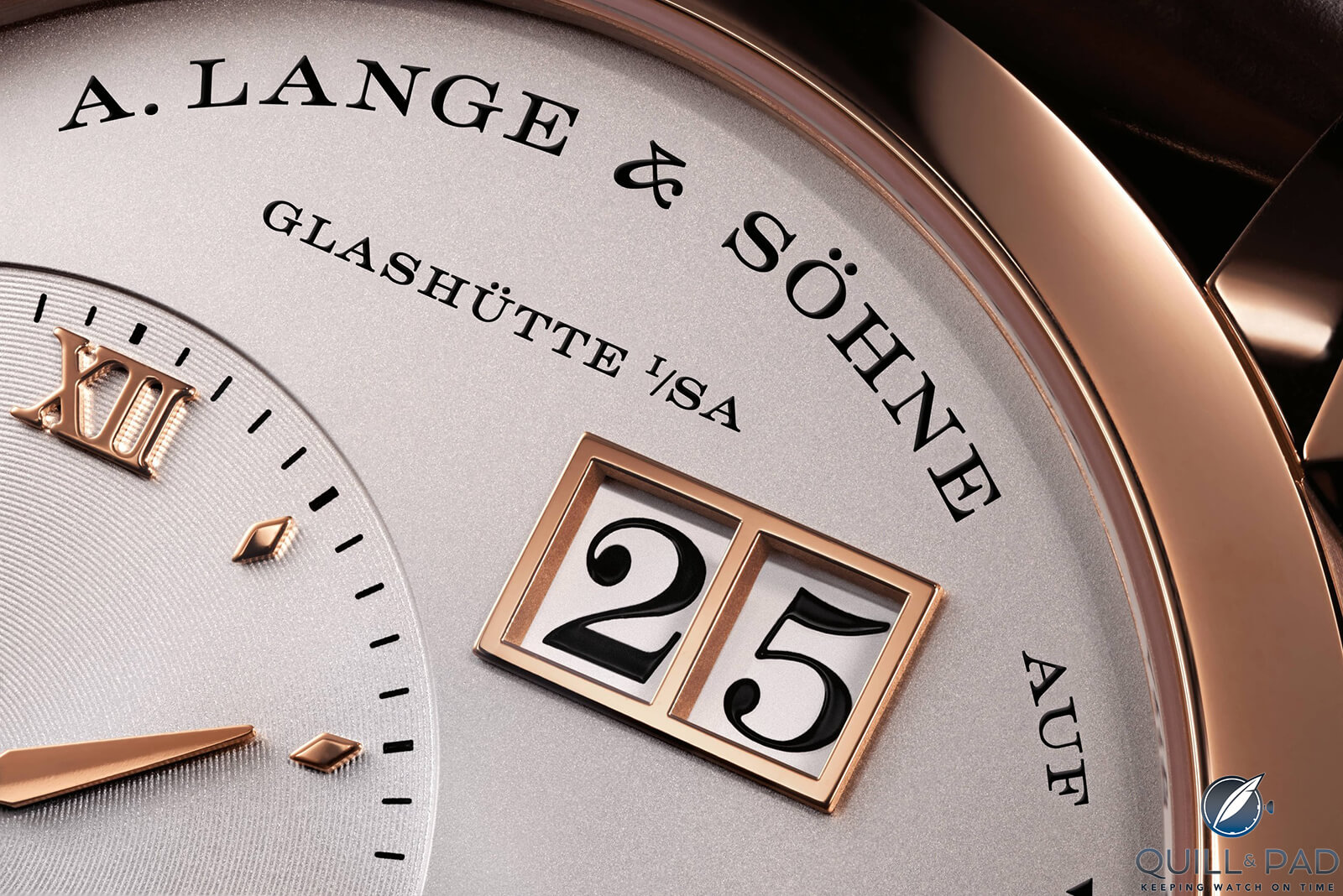
A. Lange & Söhne Lange 1 dial details
On the flip side, displaying the time has always invoked some creative and expressive flair. A watch can be considered art in both the movement and display, given the attention to detail and inspired designs. I am not an artist by any means, but I do appreciate this angle of watches.
Even on the most mass-produced pieces, whether that’s Swatch, Seiko, Rolex or Omega, there is a considered design and expression.
There is also a great deal out there that is generic, but as a whole, one of the biggest draws to watches for me is the intersection between engineering and art.
When looking at a watch design, there are obvious considerations like dial color, indexes, hand shape and case material, but there is also a level below this. A principle of art that I find best at capturing why some watches work so well is that of proportion.
Regardless of your color or size preferences, proportion hits us subconsciously and tells us whether a watch looks good or not.
There are a few different principles of proportion to consider, and within each, I will try to relate how these can be considered in watches.
I have thought long and hard about why I like specific references, and as I have spent more time around different watches and brands, proportion has become the clearer answer to me. Once I realized this, it became hard to un-see!
————————————————————————————–


————————————————————————————–
What is Proportion?
It might seem obvious, but before discussing the different principles of proportion, we should discuss what that means. Proportion is how items are sized relative to one another within a set scale.
A few example questions when this is related to watches: regardless of the overall size of the dial or case, how do the components relate to one another?
Do the hands fit a larger or smaller dial size? How does the case thickness relate to the overall case diameter? Does the text size increase or decrease in the same manner as a change in dial size?
Rolex Explorer Mark 1 (photo courtesy Bob’s Watches)
There have been a few notable examples where this has not been the case, and even Rolex has fallen victim to this idea with the Rolex Explorer I (ref. 214270), which used hands that many found arguably too small.
Proportions are all about relativity between different components, not just size. It can be a common confusion where proportions are confused with scale, which is the overall sizing and field of view.
There are different principles of proportion, which we will cover, but how these principles are defined leads to different outcomes. You will know which style you prefer the most and what is important to you as they can have different results on the end design.
————————————————————————————–
————————————————————————————–
Standard Proportion
Standard proportion is the default, where the relative size across details is accurately achieved. Now, there can be some debate here as to what accurate means.
When it comes to watches, there is set definition of good proportion as some have tried to create in art – think of Leonardo DaVinci’s’ Vitruvian Man.
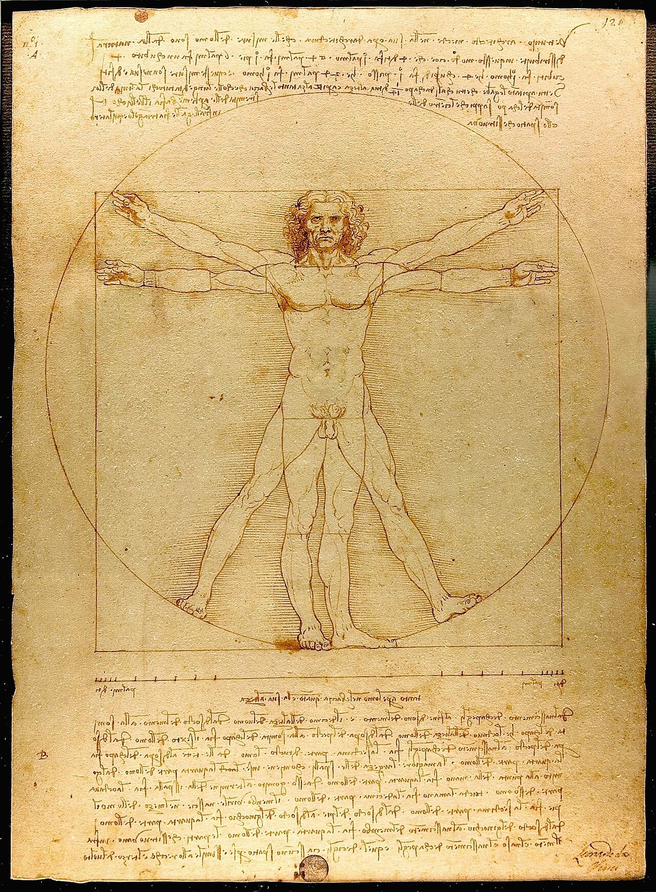
Leonardo DaVinci’s’ Vitruvian Man (photo courtesy Luc Viatour/https://Lucnix.be)
However, with watches, I believe good design this is where balance is achieved. Dial space is limited, so using it in a measured manner where all other aspects have enough weight to be understandable, but not detract focus more to one area than another.
This means having text large enough to be visible but not overbearing, hands and indices that have some weight but aren’t too thin or thick, and so on.
Proportion is also seen in the overall size: a watch needs to have a good thickness-to-case diameter ratio and manageable lug-to-lug where it doesn’t sit too small and thick like a hockey puck, but also not too large and thin.
Then there is the next consideration of typography – how does the brand and watch interact with you telling the time?
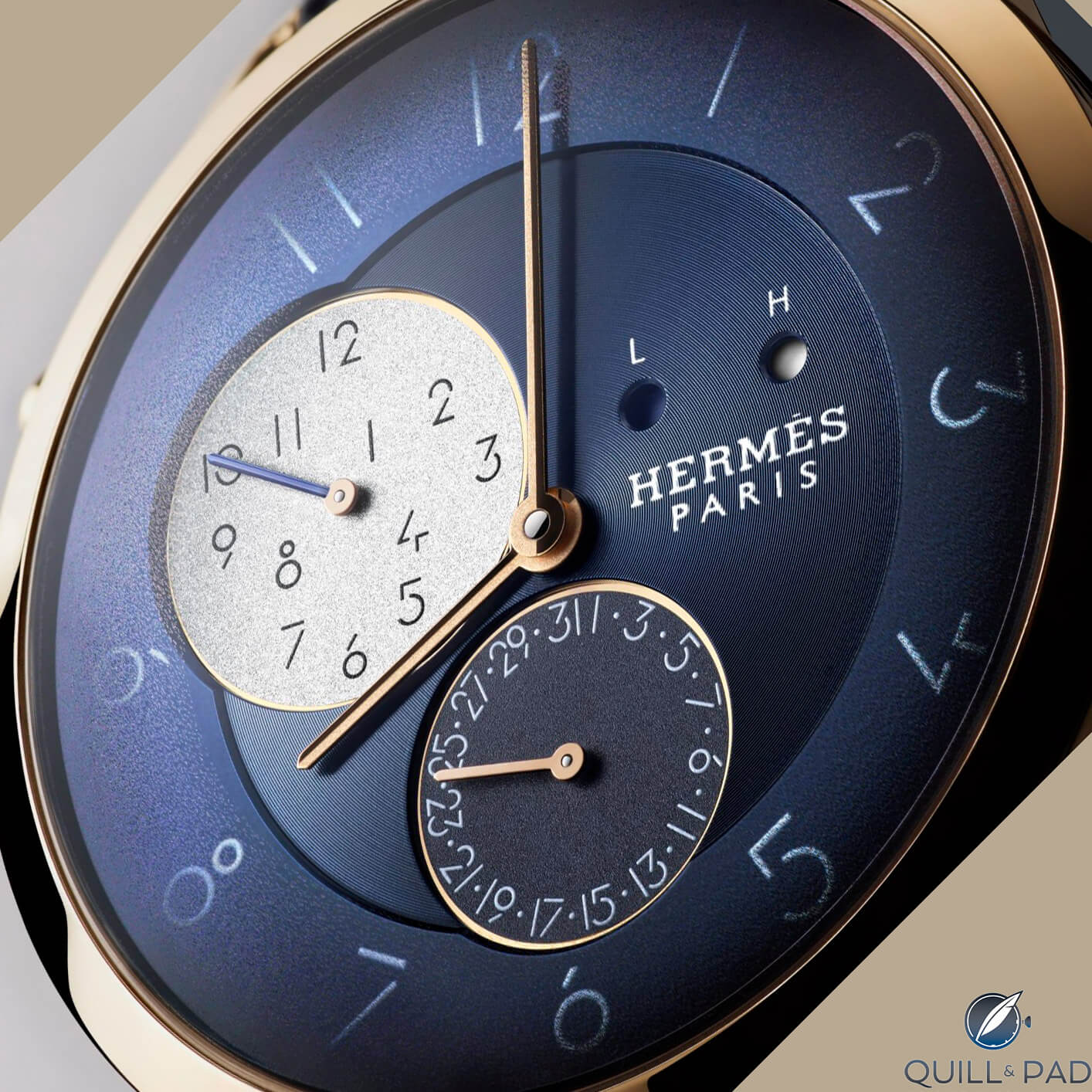
Hermès Slim d’Hermès GMT
What font is used and how does that fit in terms of relative sizing? Some brands do typography extremely well, just look at examples from A. Lange & Söhne and Hermès. Both brands have spent a lot of time figuring out their style of font, making it distinctive, attractive, and legible.
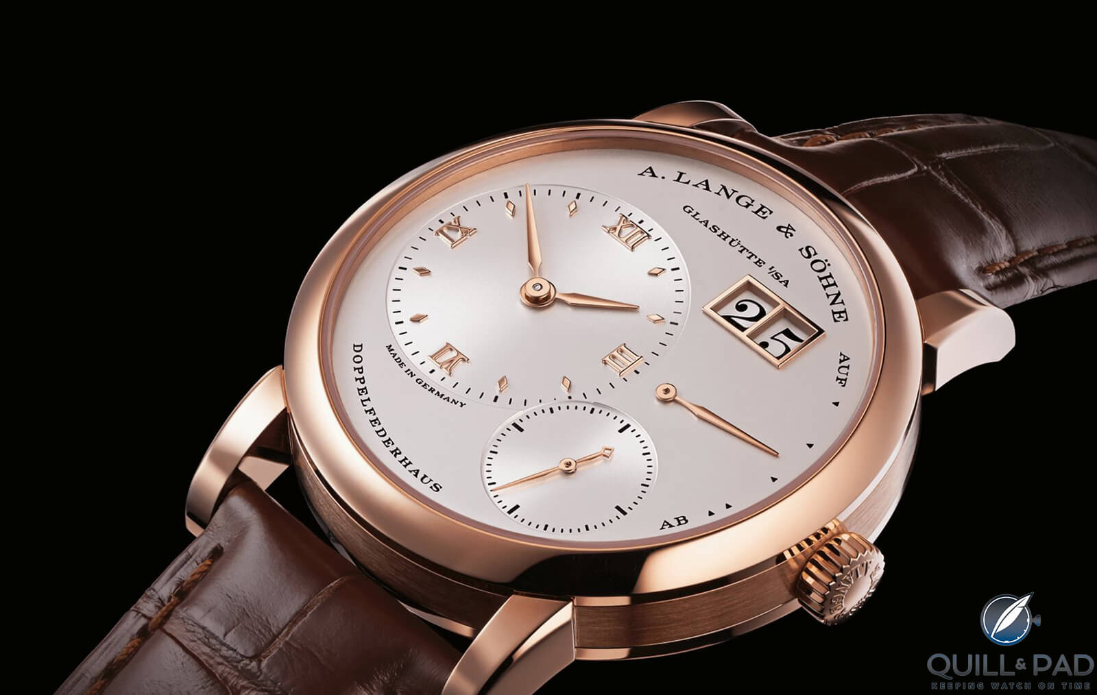
A. Lange & Söhne Lange 1
These all factor into the overall proportions of a watch, and therefore, how pleasing to the eye we find some references compared to others.
————————————————————————————–
————————————————————————————–
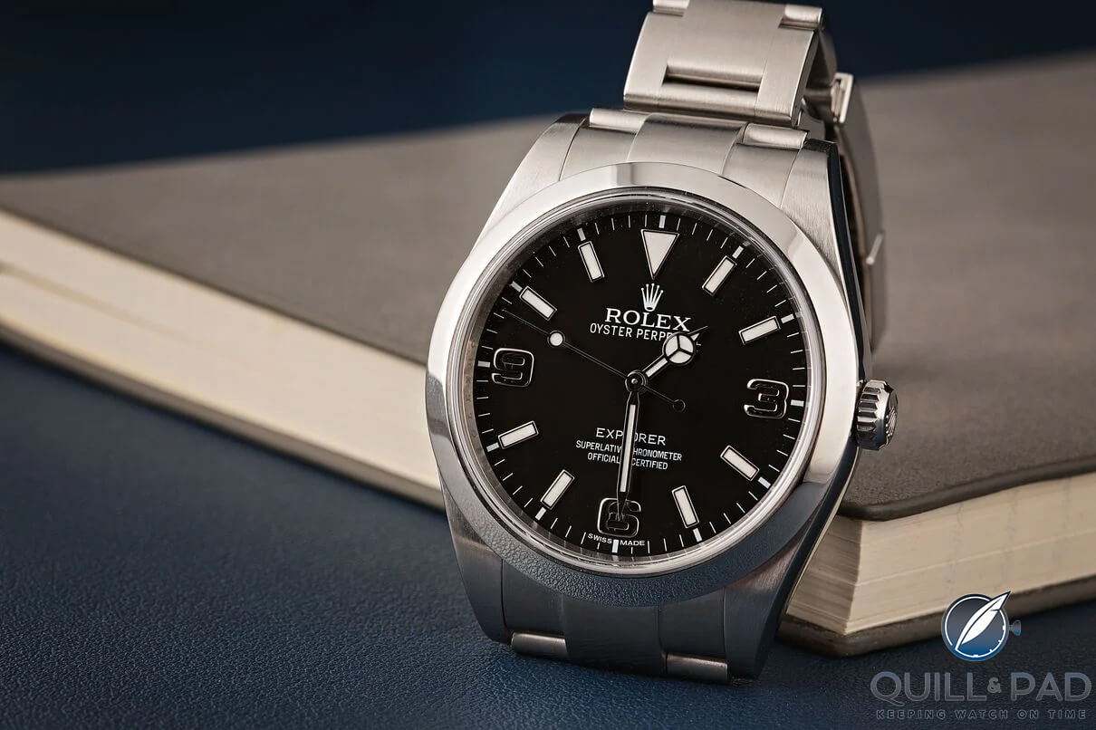
Let’s take a few examples to try and understand this better. On the less complicated end of the scale, we can start with the most recent Rolex Explorer I 36mm. Taking a closer look, you notice small details like the minute hand reaching the minute track exactly.
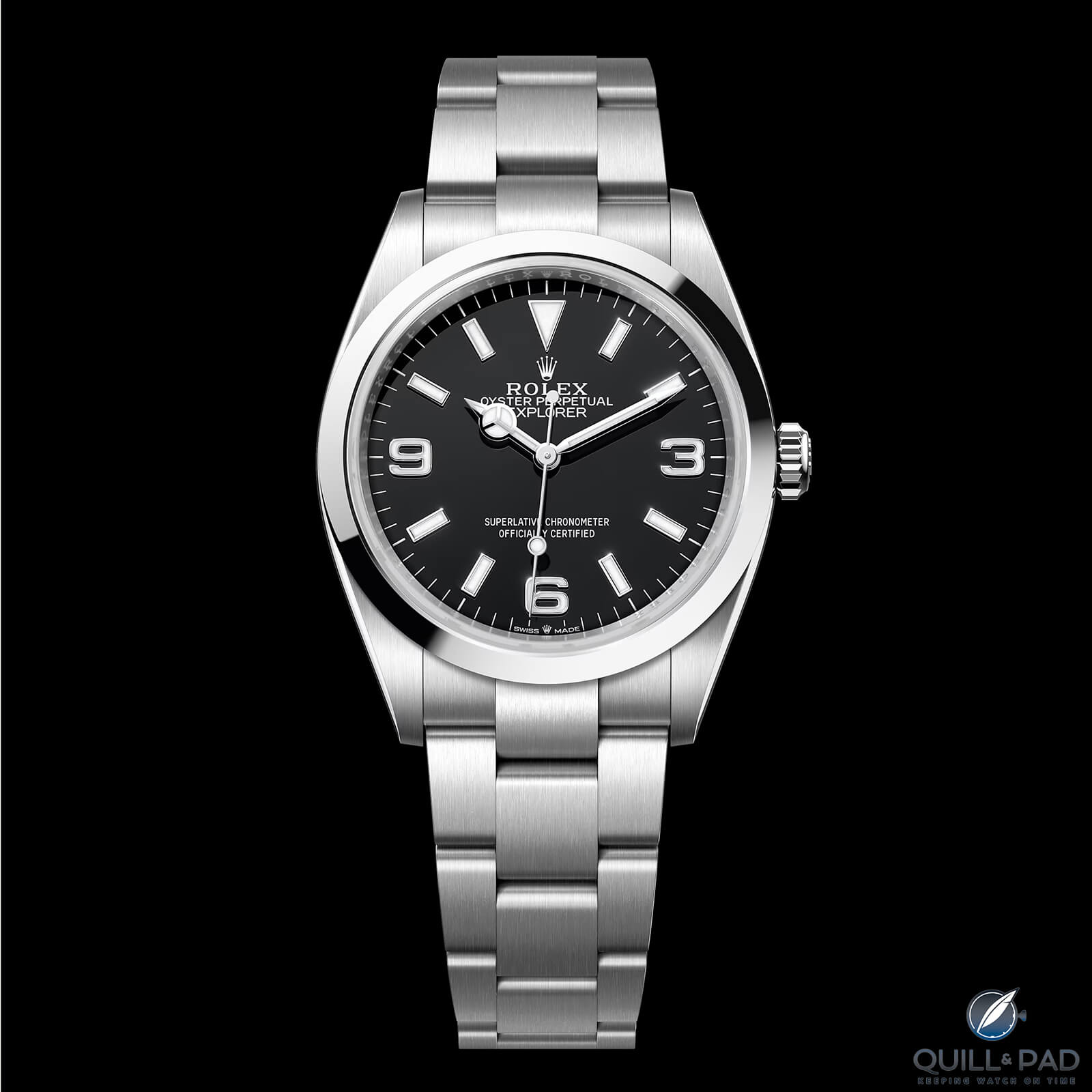
Rolex Explorer 1 36mm
You will also notice the minute track around the edge is sized so that it pushes the indices inwards. This is done just enough so that despite the indices being a smaller size, they fit the dial in a balanced way.
Without this minute track, the indices would most likely be too small, leaving too much dial space. The text is balanced with the logo and positioned where it is neither too high nor too low.
Standard proportion doesn’t just apply to simple-looking watches, it plays a crucial role in more complex examples like the Omega Speedmaster Moonwatch and F. P. Journe Centigraphe. F. P. Journe is one name that comes up more often in the discussion around proportion as the brand is one of the best at understanding it.
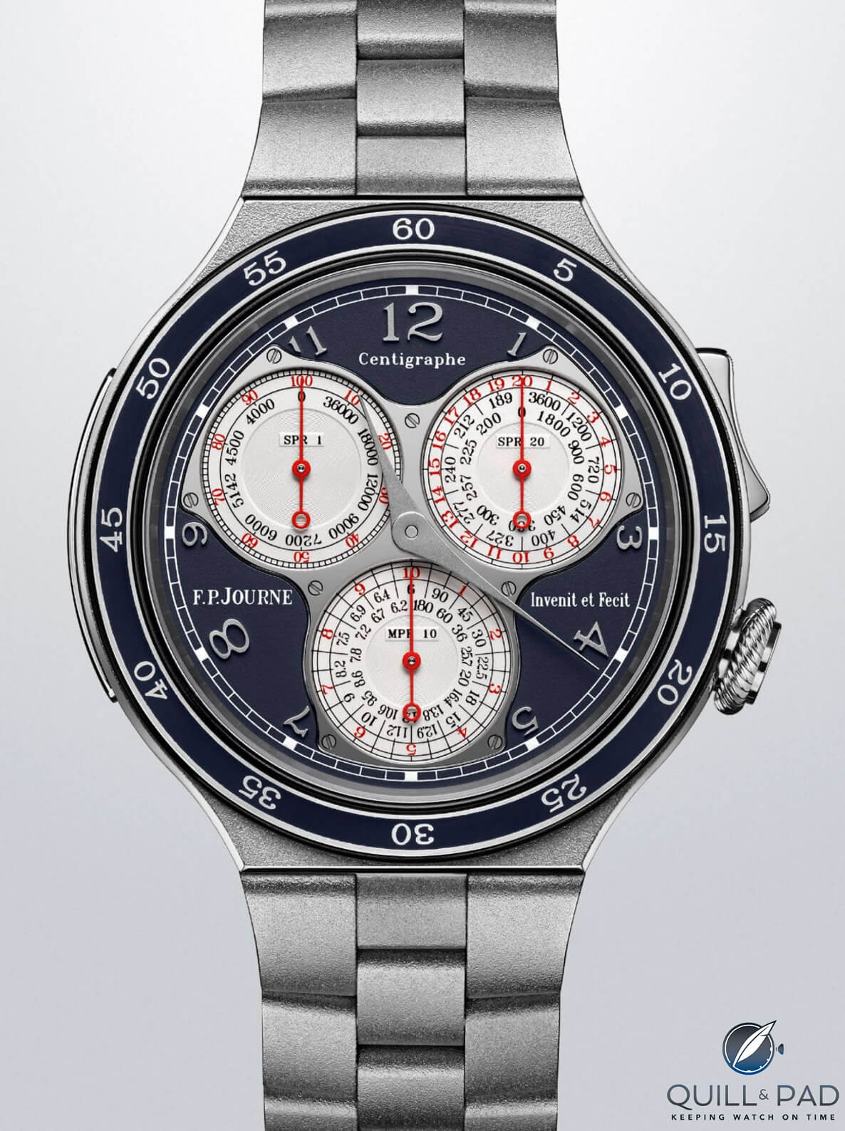
F. P. Journe Centigraphe
The Centigraphe is possibly one of the most busy-looking dials out there, but given Journe’s ability to understand proportion and typography, it is created in such a way that it remains soft on the eyes. The subdial symmetry, hand weight, and relative font size are all set perfectly, giving it a sense of harmony.
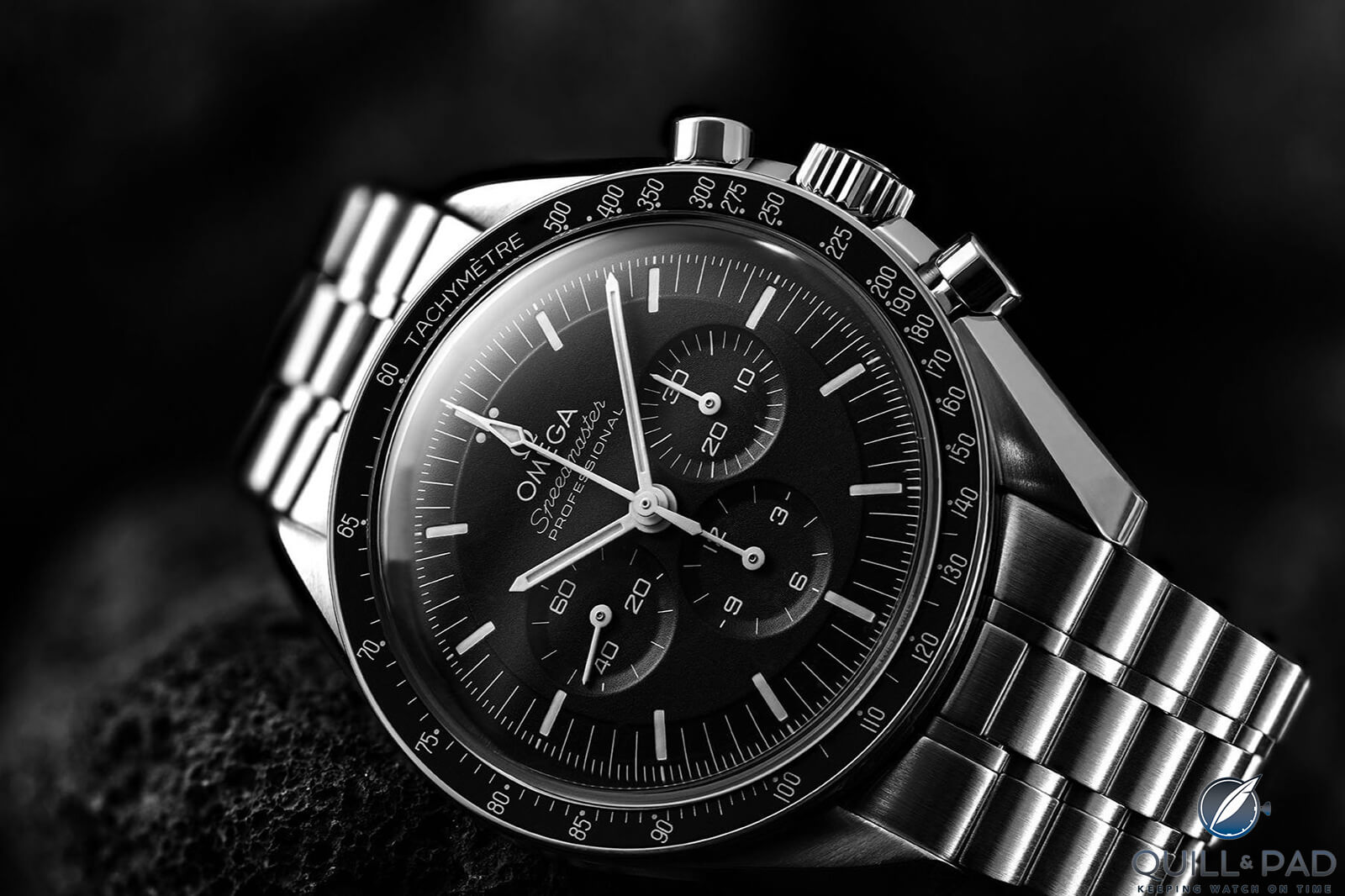
Omega Speedmaster Moonwatch Professional
Moving on, the Moonwatch is one of the most iconic designs in watches and its balance helps make it so attractive. Like the Centigraphe, on the Moonwatch there is symmetry.
The subdials are perfectly sized within the dial, and the text fits the top half of the watch in a weight that offsets the subdials. The minute markers and indices are all perfectly considered, and not one aspect of the dial detracts from another.
Standard proportion is all about achieving a natural look that can be applied to both simple and complex designs. Getting the ratios right is crucial to making a watch look balanced and attractive. That’s why a watch like the Centigraphe, despite being complex, looks so natural and effortless.
————————————————————————————–
————————————————————————————–
Altered Proportion
Altered proportion is the next concept where, as the name suggests, one aspect of a design is changed in relative size or exaggerated. By doing so, there is a shift in the balance either to or from the altered area and it can create a specific narrative or highlight a particular subject.
In the world of watches, this principle is used in various ways to draw the eyes and attention either towards or away from certain details. It’s important to note that altered proportion only affects a small part of the design and doesn’t change the overall balance.
This technique is used in several areas, such as a larger subdial, accentuated hands, or a big-date complication. Even something as small as text size can make a difference – think of the number of watches that either have a brand name or model name sized slightly larger.
While there are many examples to choose from when highlighting this idea. I will mention two that I find do this exceptionally well.
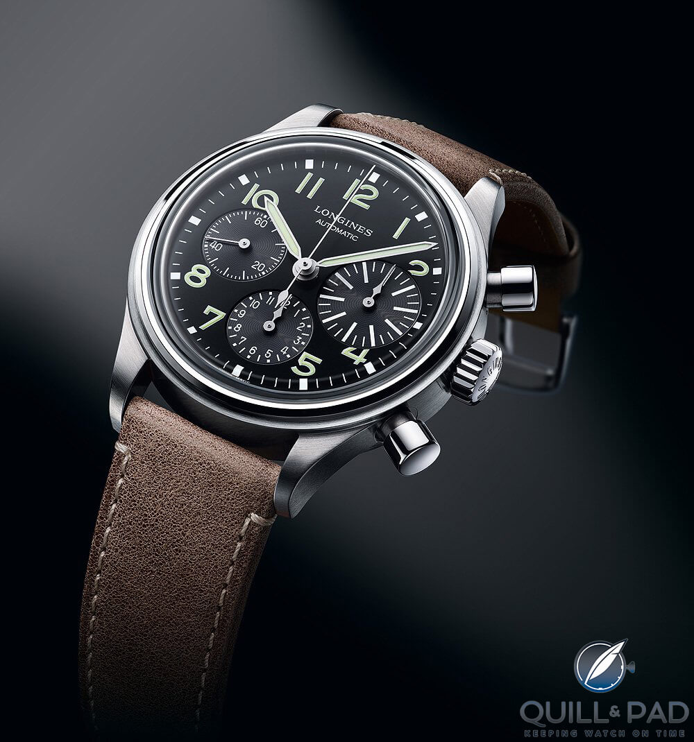
Longines Avigation BigEye
First, the Longines Avigation Bigeye chronograph. It is not the only Bigeye chronograph, nor the first, but it is designed incredibly well. The watch displays standard proportions, with well-placed and sized indices and text.
The subdials are accurate and well-balanced, even the subdial text is scaled down to the right extent, keeping it complimentary to the rest of the dial.
However, at 3 o’clock, you see the enlarged Bigeye subdial. It is made to be larger, but if you notice how as the size increased, the indices grew and the hand is the same proportion as the 6 o’clock subdial, just bigger.
The purpose of this altered proportion is to exaggerate the thirty-minute sub-register and make it easier to read at a glance. Your eyes are naturally drawn towards it, and only once you have digested it, you can then focus on how well-placed everything else is.
————————————————————————————–
————————————————————————————–
Another great example is the Grand Seiko Elegance SBGM221. It has a GMT complication, but rather than relying on a bezel to read the second timezone, the GMT register is on the inner edge of the hour indices. It may not seem like an altered proportion at first, but the whole GMT functionality is reduced to become secondary to telling the time.
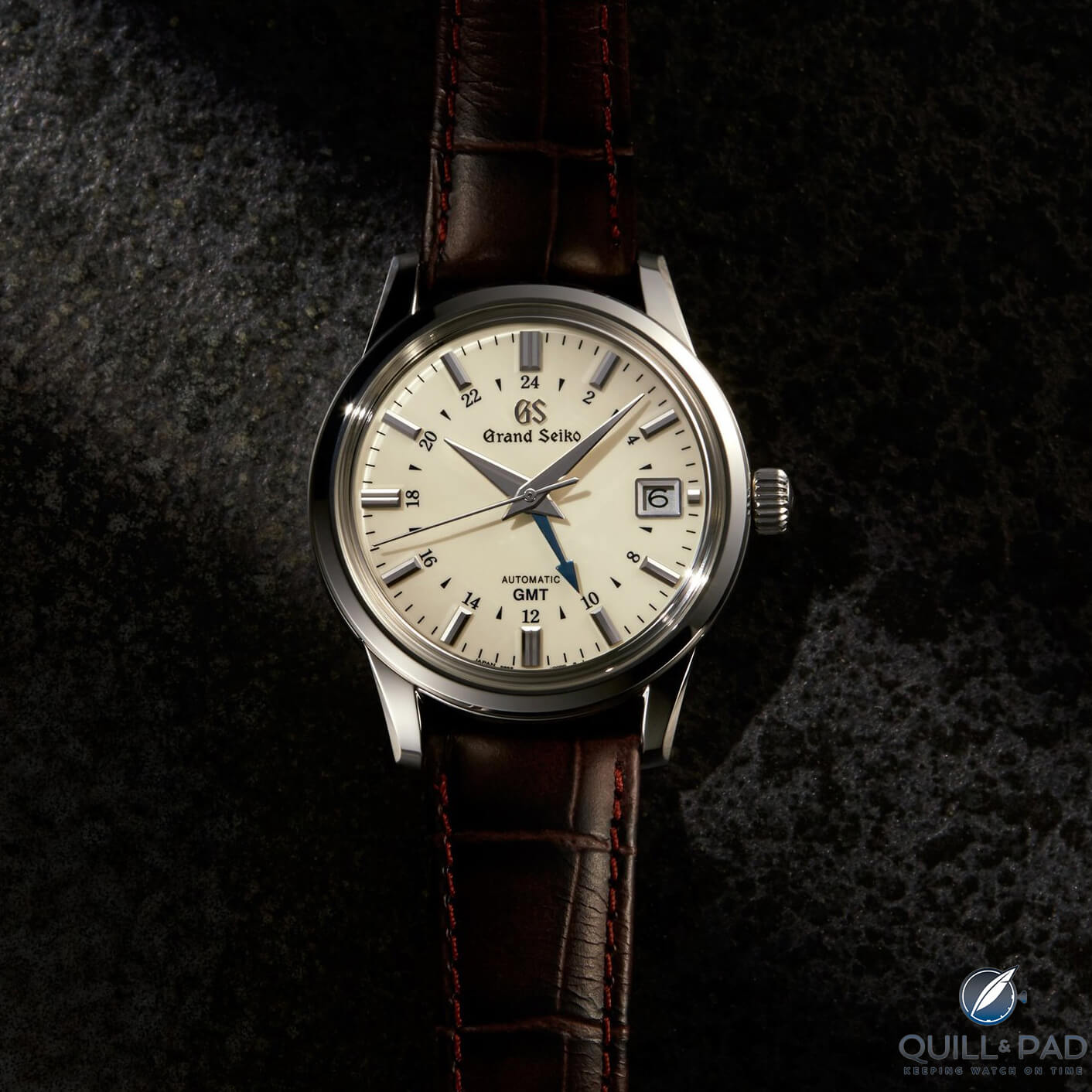
Grand Seiko Elegance Ref. SBGM221
The blue GMT hand is the same length as the hour hand, however, it is slightly thinner making it less visually prominent. The 24-hour register has text that matches the size of the “GMT” branding, creating a clear narrative. It is a more subtle use of altered proportion when compared to the Longines, although it achieves the same desired effect of the principle.
Hierarchical Proportion
The third principle is that of hierarchical proportion. In this principle, proportions are used to describe a hierarchy and give varying levels of importance to different aspects of a watch. In art, this concept was very much used when depicting monarchy, especially in ancient art. However, it can be seen within watches and used as another design element.
Proportions draw attention to elements in a specific order, with the most important details larger and more prominent. In a similar way to altered proportion, the eye is guided in a certain direction when reading a watch, but rather than just one element standing out such as the Longines Avigation, a designer can take you through a series of steps.
Does this always follow a certain logic? Not necessarily, but it can be a creative method to alter designs in a not-so-obvious way.
I have tried to find examples of where this is used effectively. This has been the most challenging principle to relate to watches because usually, if there is going to be some variation in proportion, it will be along the lines of altered proportion.
Watches are small canvases with a limited amount of information in most cases, so altered proportion works well in providing a different dynamic.
Also, given the strive for perfection in horology, watches are praised frequently for their symmetry. This leads to the hierarchical proportion found in fewer cases and it is easier to spot in more complicated watches.
————————————————————————————–
————————————————————————————–
The Rolex Sky-Dweller is one of the best examples. It is the most complicated Rolex in production, featuring a GMT and annual calendar function.
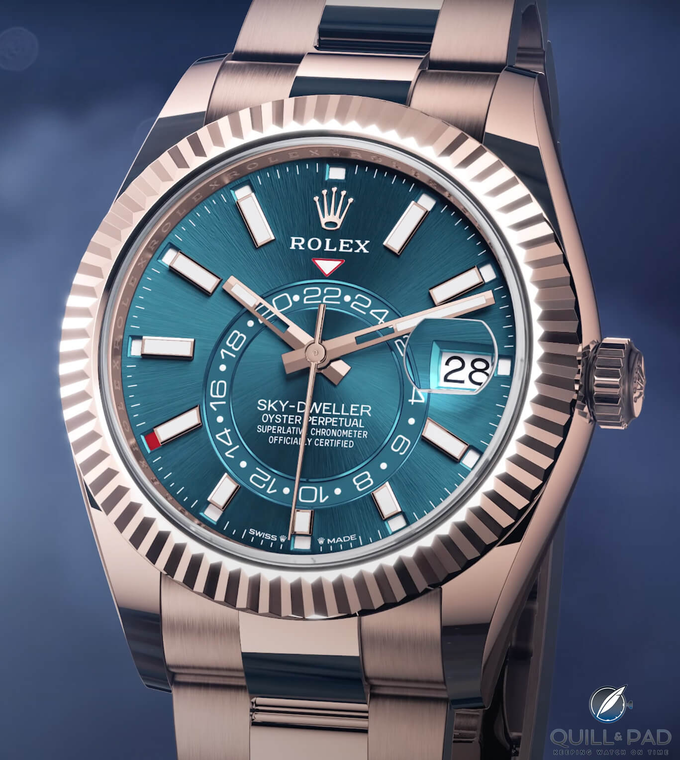
Rolex Sky-Dweller
The use of hierarchical proportion is evident, as Rolex effectively guides the wearer through reading the watch from current time, to GMT, to date, and finally to month. This design does not intrude on the rest of the watch following more standard principles.
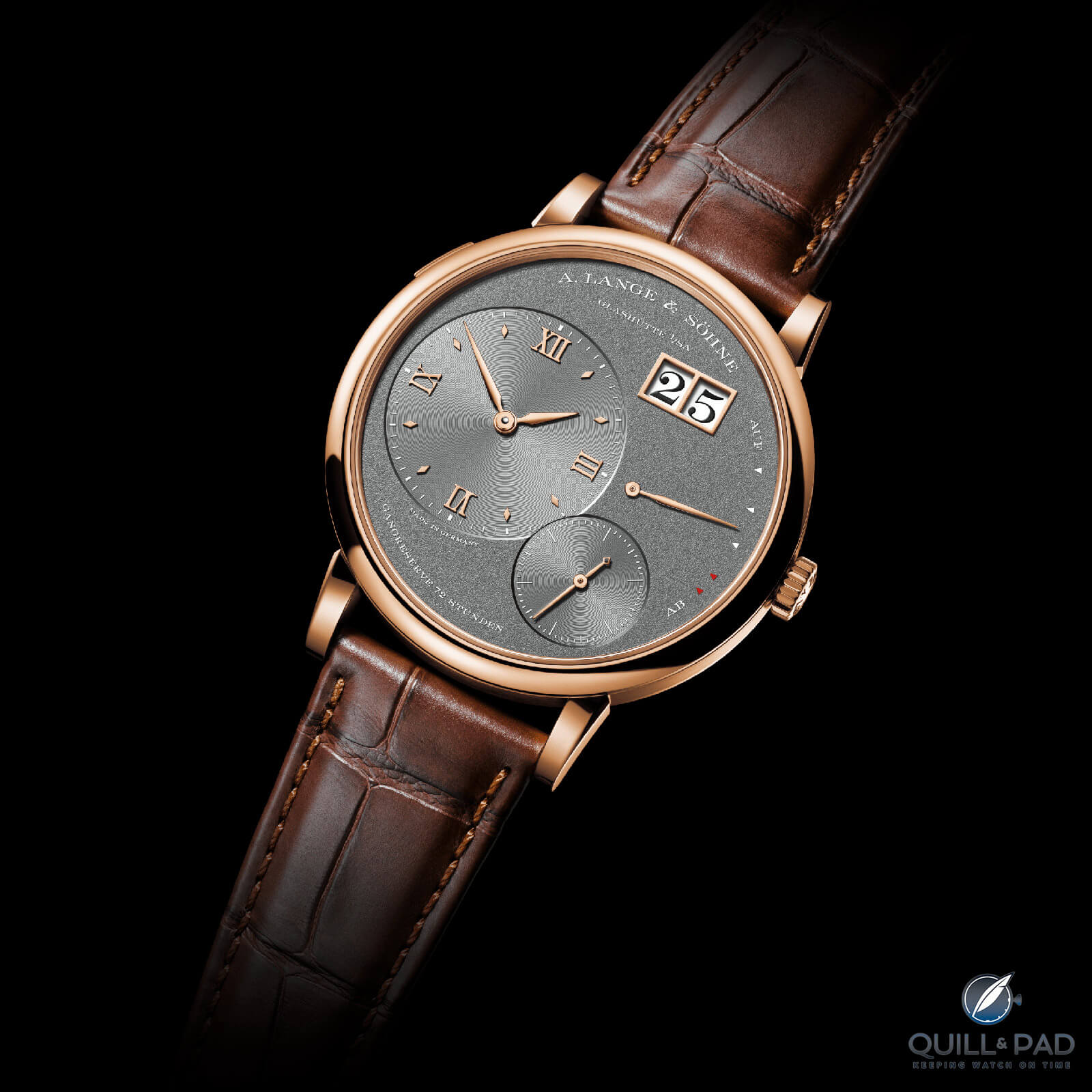
Another watch that demonstrates hierarchical proportion is the A. Lange & Söhne Lange 1. The dial of this watch has become synonymous with the brand, highlighting the importance of geometry in finding the correct positioning of various complications, as well as what proportion can be achieved.
Similar to the Rolex, the Lange 1 guides the wearer’s attention from one complication to the next.
A. Lange & Söhne Grand Lange 1 in pink gold
Even more remarkable with the Lange 1 is that, while it follows this hierarchical pattern, the dial as a whole maintains excellent proportion, remaining balanced and aesthetically pleasing.
The final principle of proportion is known as “out of proportion”. This is where the subject matter is not in proportion to other aspects. This can be an intentional decision with a designer looking to create something that goes against the norm, or it may be unintentional.
Applying this concept to watches directly, have you ever noticed that some have hands or indices that seem slightly too large? Maybe a date window is a bit too small? Is the watch too thick or thin? Is a lug width too broad for the overall design? There are many angles where this principle can be considered.
————————————————————————————–
————————————————————————————–

What makes watches, and art in general, so interesting is that it is individual to us. This means that if a watch is not entirely proportional according to standard definitions, it doesn’t necessarily make it a bad watch.
What is more important is that you like the watch that you are wearing, regardless of other people’s opinions and a millimeter difference here and there.
However, as with the other principles, I want to highlight an example that I find to be out of proportion and demonstrate the small differences that can lead to a large impact.
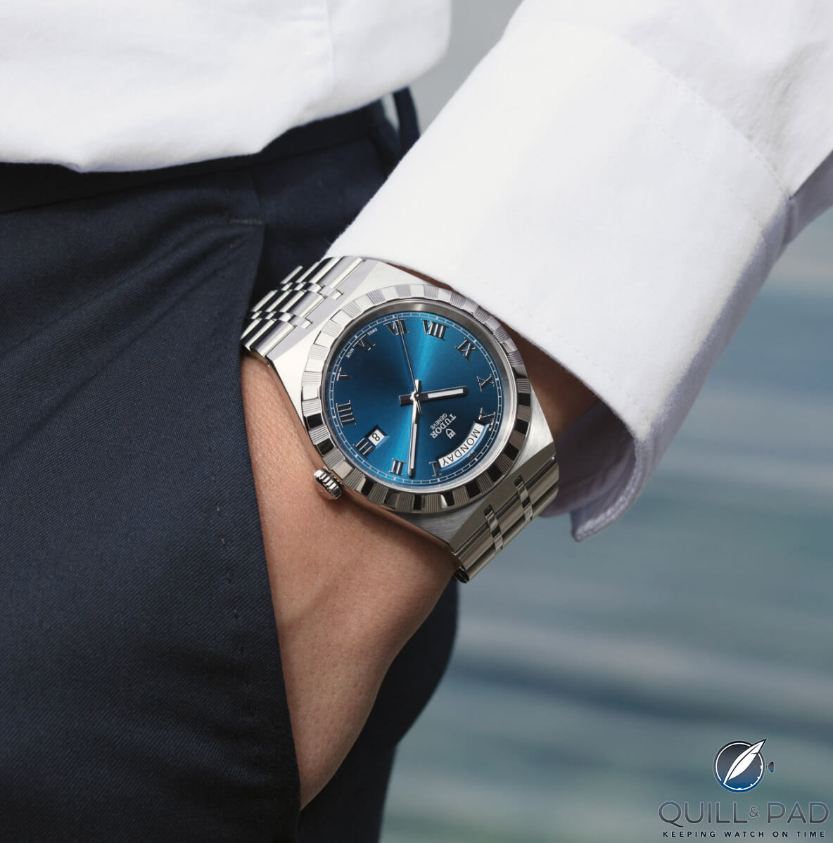
Tudor Royal on the wrist
It is the Tudor Royal, which is the integrated model from Tudor in the current 2023 collection. There are several dial colors and sizes on offer, as well as a day-date version.
The Tudor Royal has a following but it doesn’t receive the attention as the Black Bay and Pelagos. When looking at the Royal, the proportions are off in several dial details.
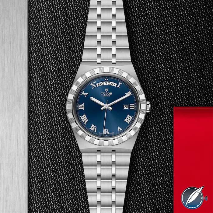
Tudor Royal
First and foremost are the indices. They are too small and leave a lot of empty dial space. It leads to the watch feeling incomplete and bare, even on the smaller models.
This is further compounded by the text. There is the branding as expected, but again on the small side, with no other text on the dial to fill any of the excess dial space. Additionally, the text size of the day function at 12 o’clock looks as large, if not larger than the Tudor branding.
Lastly, the bezel thickness does not match the overall aesthetic of the watch. It is too heavy and broad, not fitting with the more sparse and open dial.
While this is just my opinion, I find the details do not come together well and proportion is the primary reason. Similar to hierarchical proportion, it is harder to find examples here given the size of watches and overall attention to detail that is required when producing luxury timepieces, as well as the personal angle.
————————————————————————————–
————————————————————————————–
Final Thoughts
When it comes to designing a watch, there are several elements to consider. A lot of focus is spent on what the watch looks like on the surface like the color palette, bracelet design, and size. However, one of the aspects that often goes unnoticed is proportion.
Proportion is what makes a watch look right, even if the color or aesthetic is not to your liking.
In my opinion, it’s the key to unlocking a person’s subconscious when it comes to design, not just in watches but in any field. There are four main principles of proportion: standard, altered, hierarchical and out of proportion.
Each principle has a different approach and is be found in many watches out there.
The best type of proportion depends on your personal preference, although I know that given my personality, standard proportion is something I always look for. I hope that looking at watches through an artistic lens gives you a new angle to consider when thinking about a design.
I have become so aware of the importance of proportion, it is hard for me to consider a new watch without taking it into account.
You can read more articles by Raman Kalra at www.thewatchmuse.com.
You might also enjoy :
Suggestions for a 3-Watch Collection for £10,000/$13,000
10 Affordable Alternatives to Iconic Watches like the Rolex Submariner and Omega Moonwatch: The Lightweight Heavyweights!
Why I Bought It: Grand Seiko Seasons Winter “Taisetsu” SBGA415
Christopher Ward The Twelve In-Depth Review: The Science of (Relatively) Affordable Perfection
Tudor Pelagos 39 mm Thoughts: Blandly Exciting, or Excitingly Bland?
Rolex Submariner vs. GMT Master II: Small Differences, Difficult Decision
Leave a Reply
Want to join the discussion?Feel free to contribute!


Great piece. Design and proportion are little understood and are very subjective. I like a lot of your examples, but FPJ always bugs me because I can’t stand numerals in the same scale that vary in size. Rolex chooses to disrupt their dials with the cyclops date. I would love to see some designers from the brands give a detailed break down of the design of a single great watch.