Minimalism is a divisive concept, mainly stemming from the inability of anybody to actually agree on a single definition or a set of rules to help codify minimalistic ideas, art, design, or lifestyles.
One definition of minimalism is the reduction of elements to the absolute bare minimum for function, design, or effect. Obviously this is open to interpretation and, as a result, disagreement.
While some may agree that a home needs nothing more than a single bed and a table with one chair, others might say that a home needs, as a bare minimum, a place to entertain at least ten friends, a swimming pool and a six-car garage.
Obviously, these ideals will result in very different homes, and the opinion holders will probably agree on very little else.
Most likely they would also wear very different watches. The world of watch design is exceptionally varied, and styles range from highly complicated, jewel-encrusted mega watches all the way to timepieces with an opaque crystal so there isn’t even a dial.
Obviously, the latter is a statement about time and not being controlled by it, but the minimalism is definitely at a maximum.
In between lie varying levels of minimalistic thought, and some keep as close to the lower end as possible.
This is where H. Moser & Cie comes in. Known for its classic and understated designs, some of the Endeavour collection contains the best examples of this design ideal.
Commitment to simplicity
Transitioning from the most complicated timepiece of the collection, the perpetual calendar, all the way to the most pared-back example, a time-only model with center seconds, you can see that Moser does not do decoration for decoration’s sake.
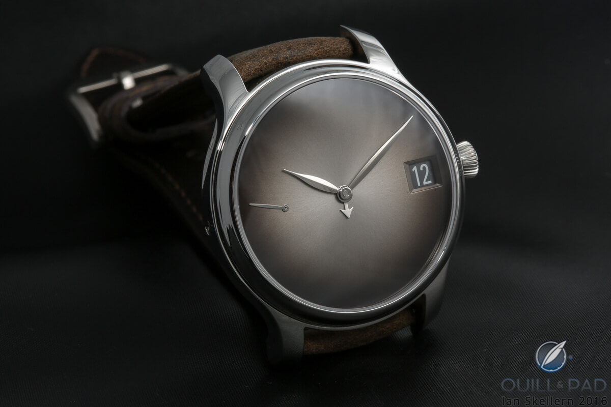
The Endeavour Centre Seconds really pops with its very clean dial with three simple hands, baton hour marker, and the H. Moser & Cie logo across the fumé dial. The only other decoration on the face is the very small swiss made across the bottom.
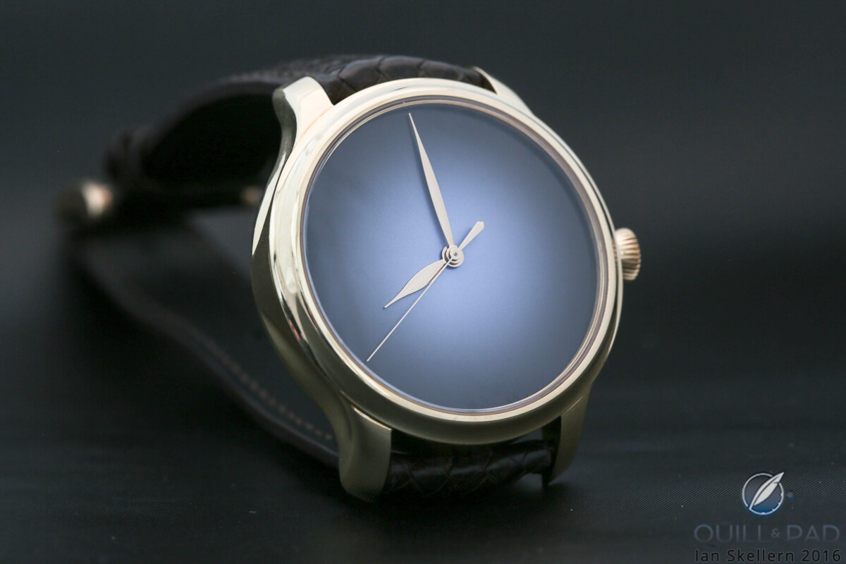
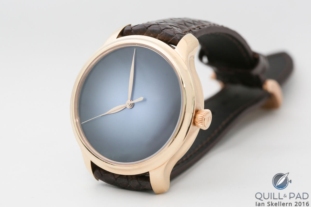
The Endeavour Centre Seconds Concept Funky Blue takes the concept of minimalism even further, eliminating the hour markers, brand logo, and Swiss made predicate altogether.
This visual impact of the watch is completely subdued and elegant, and thanks to the clean and simple case, nothing about the Endeavour Centre Seconds Concept Funky Blue screams exuberant luxury. Instead, it whispers, “Oh, yeah, I’m pretty nice and luxurious.”
Moser’s understated style continues into the more complicated pieces, adding small second subdials, date windows, moon phase displays, second time zone hands, and, of course, with the perpetual calendar a power reserve, date window, small seconds subdial, and month indicator.
Considering how busy the dials of perpetual calendars can get, this watch is spartan in its extra dial details. The power reserve uses minimal hash marks and some text, and the month indicator utilizes the hour markers for the month index.
If I saw this watch on someone’s wrist, I wouldn’t guess without examination that it was nearly as complicated as it was. That is simply the modus operandi for Moser, keeping design clean and simple.
Pushing it further
But what happens when you take a complicated watch that is already rather sparse and minimal and then pare it down even more? Moser wanted to see how far it could take minimalism and so the Endeavor Perpetual Calendar transformed into the Endeavor Perpetual Calendar Concept.
Oh, how clean the world became.
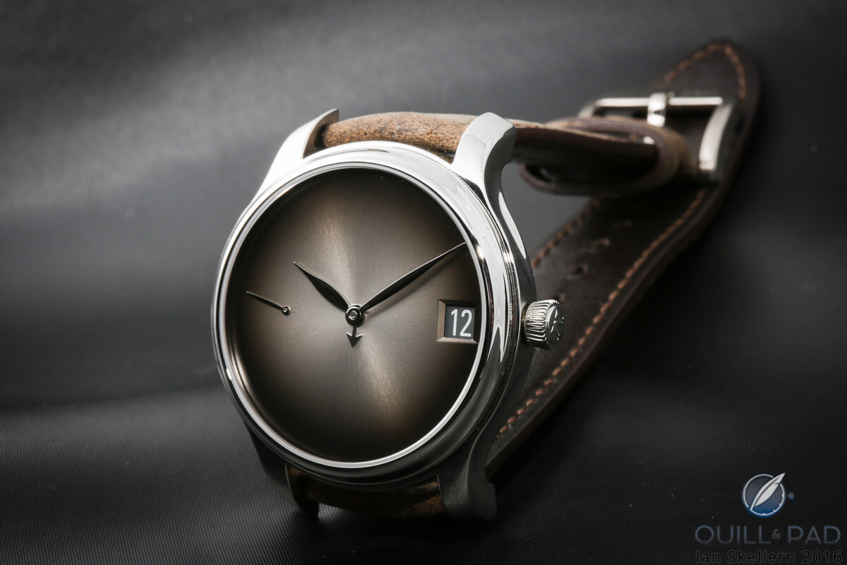
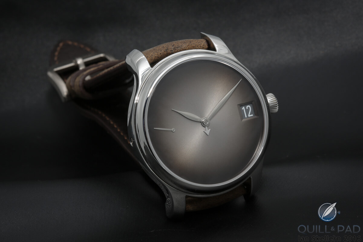
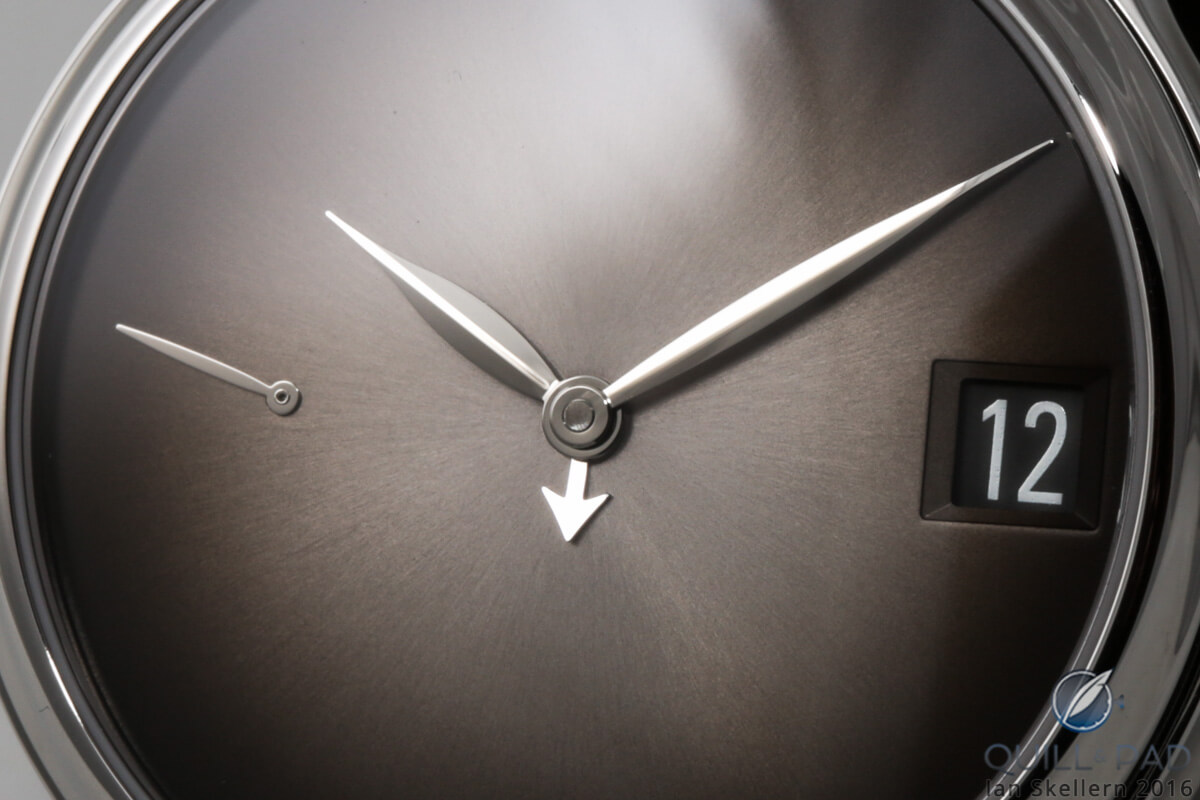
The Endeavour Perpetual Calendar Concept takes the already minimal dial design and strips it of all indication markings and superfluous text. The only remaining “text” is situated in the date window, which floats on the dial opposite the now lonely power reserve indicator.
That single hand no longer points to any indicating marks at all. The only thing that indicates the power reserve is the general slant of the floating hand. While it may not be extremely precise or quick to read at a glance, after wearing it for a short time the angle of the little hand will be more than enough to let the wearer know when needs winding.
The subsidiary seconds dial has disappeared, so that the time moves almost invisibly now, keeping the face of the watch intensely uncluttered. Losing the logo in the middle of the dial dramatically reduces visual busyness, and combined with the other eliminated elements, leaves the important elements – the hands – as the focal point of the design.
But the biggest reduction takes place with the removal of all the hour markers around the perimeter of the dial. There are a few watches that have used this technique for its designs – think Movado Museum Watch, for example – and it always results in striking elegance and simplicity. The main difference to that here is that the fumé dial helps to accentuate the emptiness in the center of the dial as it becomes darker towards the edges.
No problem
Since the dial no longer has any markers whatsoever, the tiny month hand no longer makes a visual line toward a month marker. While this might make telling the month at a glance problematic at first, it does not make it too difficult. There are thirty degrees of arc between each month position so it should be pretty clear to which month it points.
That really doesn’t even matter since the month changes so infrequently that a quick glance down is probably never needed to know the month. It is more an indication for setting the date so that it is accurate for month lengths and leap years since it’s a perpetual calendar.
Moser has created an extensively clean and simple design for a deceptively complicated timepiece. One might even imagine that Moser had accomplished its goals when it finished this piece. You would be wrong.
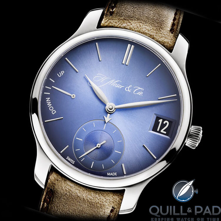
On February 29, 2016 (a leap day, of course) H. Moser & Cie released the Endeavor Perpetual Calendar Concept Funky Blue. Aside from a new color for the fumé dial and a new metal for the case (stainless steel) Moser eliminated one final element on the dial: the power reserve indicator.
The hand no longer tells you when you need to wind the watch, and the dial is the most simplified version of a perpetual calendar I – or anyone else, I should imagine – have ever seen.
It tells you the time and the day of the year: nothing more, nothing less. It is minimized to the extreme.
Okay, it actually does tell you a bit more, but not where you might think.
Technical accomplishments
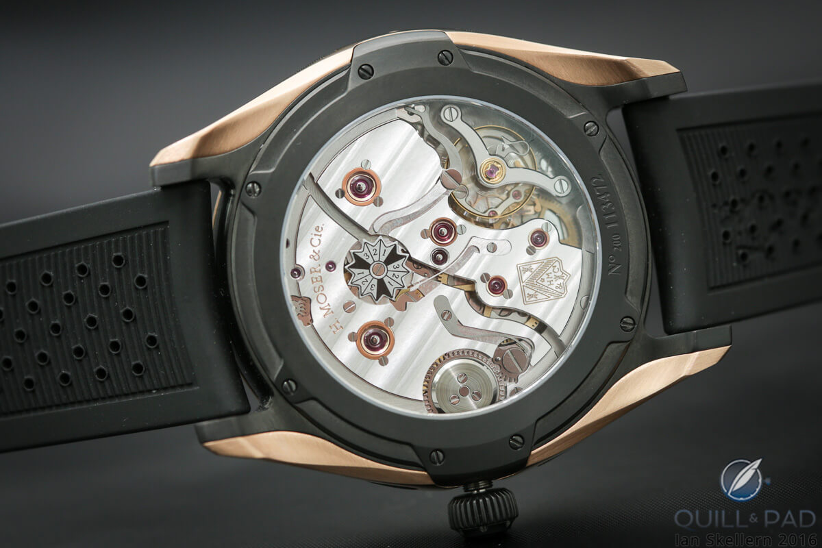
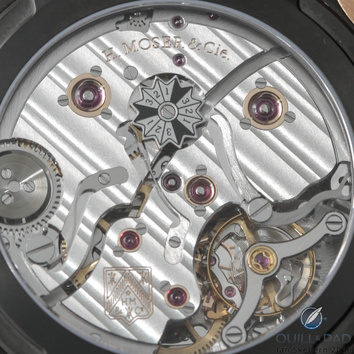
Turning the watch over, you come to the humbled star of the show: the perpetual calendar movement HMC 341. This is where you return to what you expect from Moser: a super high-quality movement with very nice finishing and a view of the last but perhaps most useful indication for a perpetual calendar, the leap year indicator.
A twelve-point star wheel located just off-center makes one revolution every twelve years and has three indexed four-year cycles on it to indicate the current year of the four-year calendar cycle. This feature was always placed on the rear of the Moser movement to maintain design legibility, and for that reason it has escaped the minimization efforts that so completely rendered the dial practically bare.
And for this reason the back of the watch is your secret with its attractive finishing and screw-mounted gold chatons, the perfect complement to the austere dial. This watch has two sides for personality, but pushes minimalism to its limits with what is possible to indicate clearly while keeping components at a minimum.
While it will definitely be a divisive watch, it is not for a lack of superior design and engineering. It will simply come down to what people are willing to accept in terms of minimalism in their lives.
People who own twelve winter coats but live in Miami may just not get the point of this piece. But for those who take pride in an almost empty house or a computer desktop with no icon clutter will most assuredly see what Moser was trying to accomplish with this watch.
Let’s break it down!
- Wowza Factor * 1.11 While this may seem like an extremely low factor, it is actually a very enthusiastic yet minimal assessment of a minimal design.
- Late Night Lust Appeal * 101.1 » 991.45 m/s2 A nice, minimal yet indicative number of just exactly how awesome nothing can be.
- M.G.R. * 71.1 It’s an H. Moser & Cie with an integrated perpetual calendar, did that answer your question?
- Added-Functionitis * Severe Well, well, finally something pretty complicated that doesn’t just have a pretty face! Definitely need prescription strength Gotta-HAVE-That cream for the deceptively complicated perpetual calendar.
- Ouch Outline * 11.1 – Hang nails, all the hang nails! The changing seasons and the cold/hot fluctuations that just dry out the skin and cause the tips of my fingers to hurt for a few months. But you know I would do it for a whole year or two if it meant this baby was on my wrist!
- Mermaid Moment * one year, preferably a leap year!! It just takes viewing that jump from February 28 or 29 to March 1 to fall head over heels!
- Awesome Total * 1100 Multiply the total number of watches in the Endeavour Perpetual Calendar Concept edition (10) with the total number of watches for the Endeavour Perpetual Calendar Concept Funky Blue edition (10) and multiply the result by the case thickness (11.1) for one minimal yet awesome total!
For more information, please visit www.h-moser.com/endeavour-perpetual-calendar.
Quick Facts Endeavour Perpetual Calendar Concept
Case: 40.8 x 11.1 mm, white gold
Movement: manual winding Caliber HMC 341 with interchangeable Moser escapement with gold escape wheel and pallet fork, twin spring barrels for 7-day power reserve, Straumann hairspring
Functions: hours, minutes; perpetual calendar with date, month, leap year indicator
Limitation: 10 pieces
Price: 60,000 Swiss francs
Trackbacks & Pingbacks
-
[…] Who Do You See?; the H. Moser & Cie. Endeavour Perpetual Calendar Concept Funky Blue in Extremely Funky Minimalism: H. Moser & Cie. Endeavour Perpetual Calendar Concept; Andreas Strehler’s Lune Exacte in Objects Of Desire: Independent Watches At Baselworld 2016; and […]
Leave a Reply
Want to join the discussion?Feel free to contribute!


















Plz let me know price and ware I buy this watches.
Regards | Mazhar
The price is listed at the bottom of the article. You can contact H. Moser & Cie for retail information. Enjoy!
Awesome really I like this