by Ian Skellern
I read my colleague Martin Green’s article on the Nomos Orion de Stijl in Ace Jewelers x Nomos: Celebrating 100 Years Of ‘De Stijl,’ first with interest, then with incredulity.
While I used the term “taking the Mickey” in the title, that’s only because I didn’t think I could easily convince our editor-in-chief to let me run with what I really feel like writing: “Is Nomos just taking the piss?
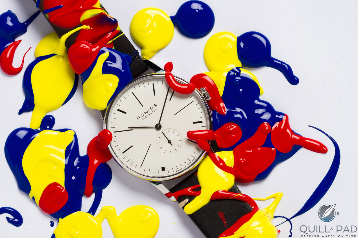
Ace x Nomos Orion 100 Years of De Stijl
And I say this as somebody with a deep respect for Nomos and a likely future customer.
De Stijl art movement
Proponents of De Stijl advocated pure abstraction and distillation to the essentials of form and color, by use of simple vertical/horizontal visual compositions using only primary colors with black and white.
In his essay titled “Neo-Plasticism in Pictorial Art,” Mondrian, a Dutch painter widely regarded as one of the greatest artists of the twentieth century wrote, “This new plastic idea will ignore the particulars of appearance, that is to say natural form and color. On the contrary, it should find its expression in the abstraction of form and color, that is to say in the straight line and the clearly defined primary color.”

An official graphic commemorating the centennial anniversary of the de Stijl art movement
In general, de Stijl proposed ultimate simplicity and abstraction, both in architecture and painting, by using only straight horizontal and vertical lines and rectangular forms. Furthermore, the formal vocabulary was limited to the primary colors red, yellow, and blue and the three primary values black, white, and grey.
The works avoided symmetry and attained aesthetic balance by the use of opposition.
Where is the color opposition to monochromatic in the Ace x Nomos Orion 100 Years of De Stijl, a watch purporting to be commemorating and celebrating the De Stijl style?
Where are the primary colors that are so axiomatic of the de Stijl art movement? It’s worth repeating what I wrote earlier, “Proponents of De Stijl advocated pure abstraction and distillation to the essentials of form and color, by use of simple vertical/horizontal visual compositions using only primary colors with black and white.”
There’s no mention of of cream.
No primary colors on the dial. No primary colors on the hands. No primary colors on the case. No primary colors on the strap.
Where are those primary colors? Not on the watch, no.
The colors are 100% marketing.
What can I say? Great marketing and design. Audacious marketing and design? Scandalous marketing and design? I could, and it’s a pity I can’t, but I think it’s scandalous. However, I’m prepared to cut Nomos some slack because this is the first time I’ve seen them trip up like this.
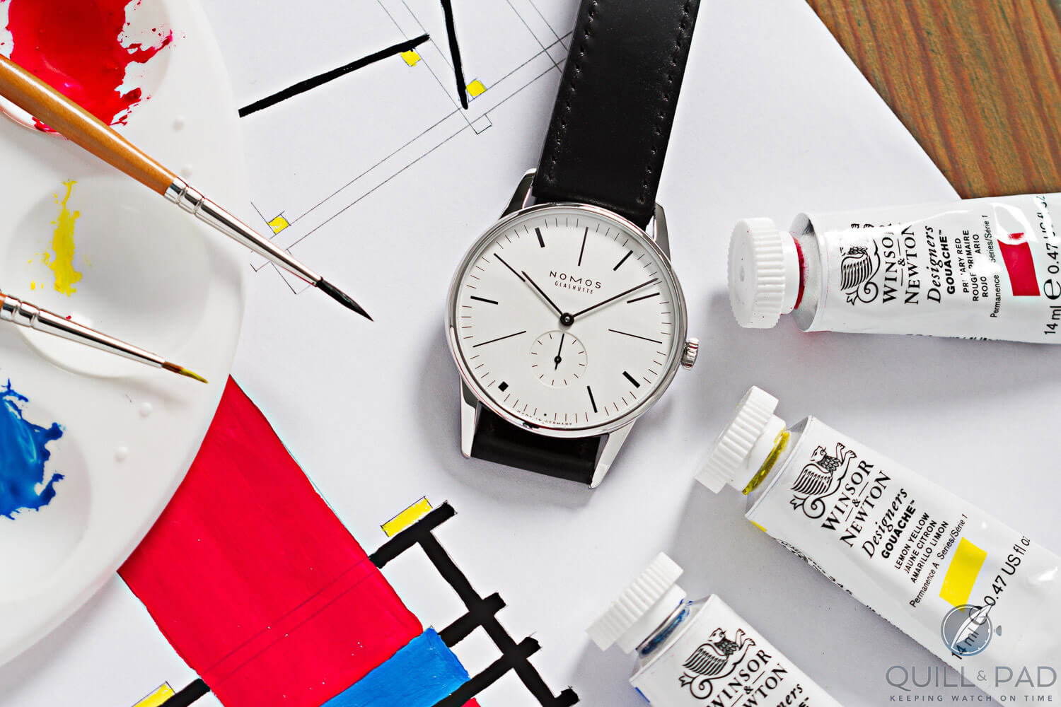
Ace x Nomos Orion 100 Years of De Stijl
In his article, Martin Green sympathetically provided an explanation in Nomos’s defense, “What the watch is lacking are the primary colors for which De Stijl is also well known, colors that became famous through Mondrian’s works of art. This was a clever choice because, while eye-catching, bold colors can be seen as gimmicky or a passing fad.”
A clever choice? If you are correct in thinking that “. . . eye-catching, bold colors can be seen as gimmicky or a passing fad” then why is Nomos is celebrating 100 years of an art movement most instantly recognizable by the use of primary colors in the first place?
And surely the fact that de Stijl is being commemorated after 100 years says everything about the longevity of bright primary colors?
So short fashion life-span of bright colors is apparently OK for the marketing, but not for what’s being sold?
I quote the Wikipedia entry on de Stijl, “The De Stijl movement posited the fundamental principle of the geometry of the straight line, the square, and the rectangle, combined with a strong asymmetricality; the predominant use of pure primary colors with black and white . . . “
In 2016, MB&F brought out a collaboration with Alain Silberstein, a French watch designer strongly influenced by the de Stijl movement. This watch was called the MB&F LM1 Silberstein, and the photos below illustrate how MB&F and Silberstein interpreted de Stijl compared to Nomos.
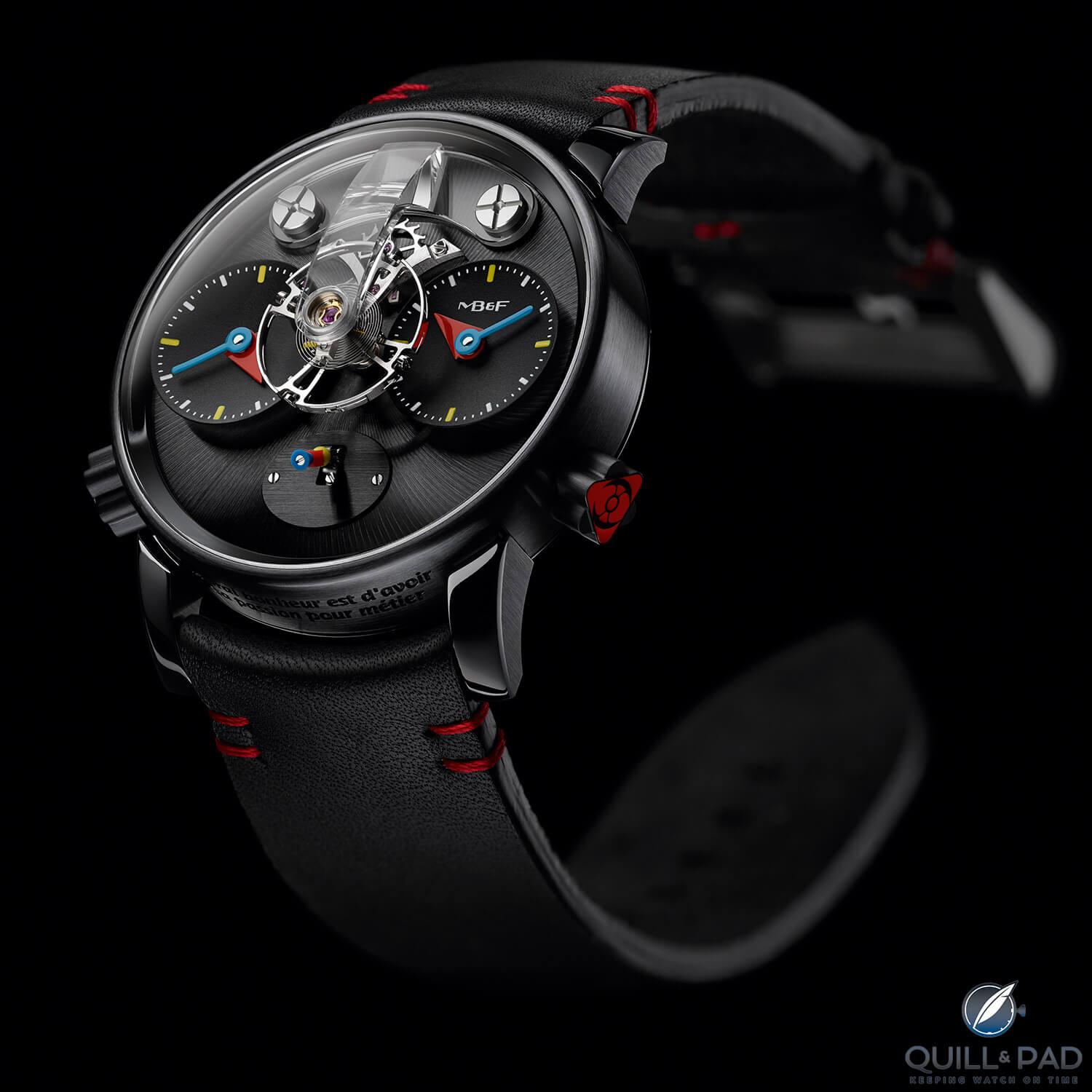
De Stijl-inspired MB&F LM1 Silberstein Ti
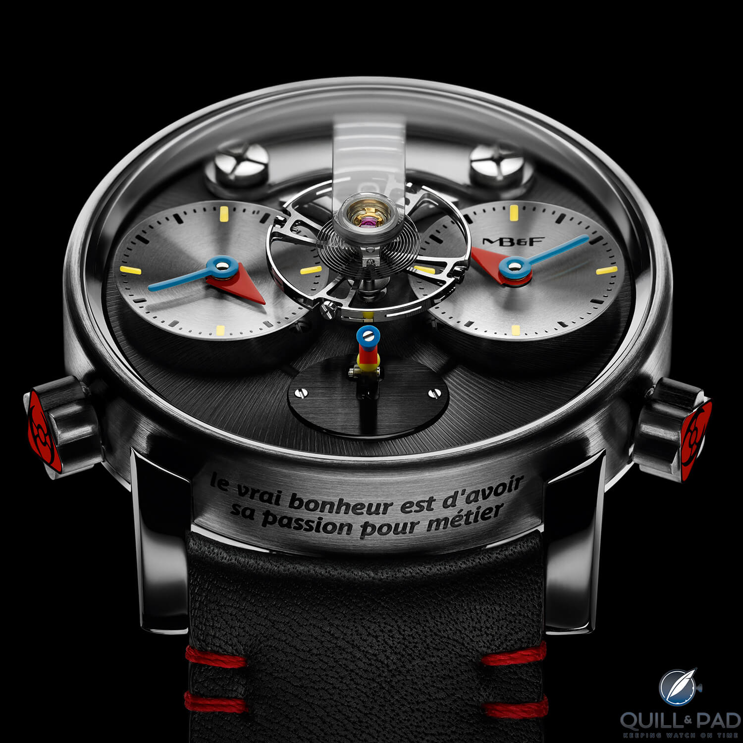
De Stijl-inspired MB&F LM1 Silberstein Ti

Maximilian Büsser and Aiain Silberstein publicity photo for the de Stijl-inspired MB&F LM1 Silberstein
And what did Nomos do to its Orion to commemorate de Stijl? Don’t miss those hour markers!
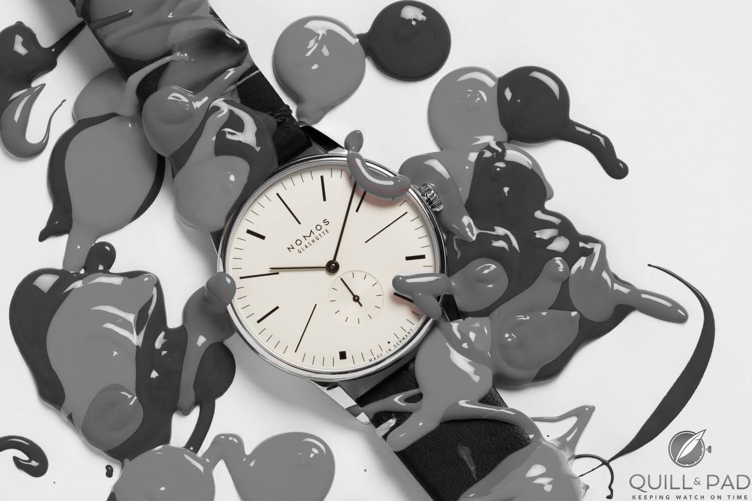
Ace x Nomos Orion 100 Years of De Stijl
Imaginary Ace Jewelers Nomos design meeting
I promise to share the real story if/when I learn more at Baselworld (that should be an interesting meeting), but below is the scene I imagine at the preliminary design meeting between Ace Jewelers and the Nomos design team.
It’s worth repeating here that Ace Jewelers is based in Amsterdam, and that the de Stijl art movement was founded in the Netherlands by a Dutch artist. So we might assume that Ace Jewelers is targeting the market in the Netherlands; the one consumer base in the world likely to instantly recognize de Stijl, especially in year of the movement’s 100-anniversary with posters everywhere.

The only primary color in this photo is not on the Ace x Nomos Orion 100 Years of De Stijl
So at the preliminary meeting, when Ace Jewelers asked Nomos for a special edition to commemorate 100 years of the de Stijl art movement, which is primarily known for its use of the three primary colors red, blue, and yellow, somebody suggested that the simplest and cheapest option was to use a fairly standard design with zero no color; sorry there is color, that de Stijl stalwart, cream.
I do not blame that person as I believe that all ideas, even the most wacky, should be encouraged at meeting like this. I do blame everyone else who agreed, “That’s good enough.” Because it’s not good enough, Nomos. Not by a long shot.
Now while I missed any reference to cream in the de Stijl art style references, I do agree that the apparently haphazard lengths of the hour monochrome markers are de Stijl, though nowhere near as strong an association had, rather than the hour lines been arranged radially (non-de Stijl), instead the lines form part of a 90 degree latticework (very-de Stijl) as (and I quote the Wikipedia entry) regarding the de Stijl style ” . . . only squares and rectangles, only straight and horizontal or vertical lines.” Nomos has the square/retangular Tetra, that would have been a more de Stijl form to start with.
The hour markers are de Stijl, but are they de Stil enough for a watch with this responsibility: I think not.
Did nobody at that meeting say, ” Am I the only one here thinking that watch without color, to commemorate 100 years of an art movement known primarily for bright primary colors, sounds absolutely bonkers to me?” Did nobody say that or did nobody listen?
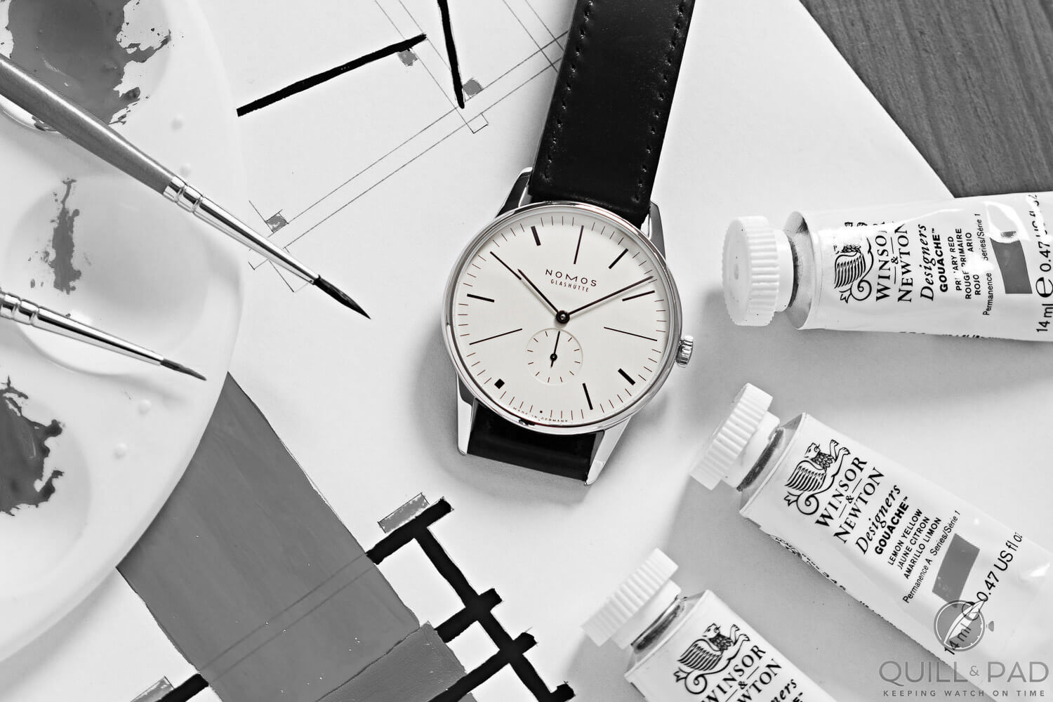
Ace x Nomos Orion 100 Years of De Stijl
I will emphasize again that I think both that Nomos regularly produces exceptionally interesting photography and imagery for their watches and that the brand’s communication in all respects (except size of budget) is generally as good, if not better, than most larger and better funded watch brands.
Nomos understands as few brands do just how important not just good, but great, design is and what an impact it has.
Like art, design sends a message. And the message I’m getting from the Nomos Glashütte Ace x Nomos Orion 100 Years of De Stijl is, “We are taking the piss, just to see if anyone noticed.”
And if nobody else noticed or is bothered – and it took me nearly six months to react – then Nomos has its future limited editions sorted: just release the same nondescript watch time after time, but with different background artwork and imagery. And those hour markers are sooo versatile,
I’m expecting these limited editions from Nomos at Baselworld
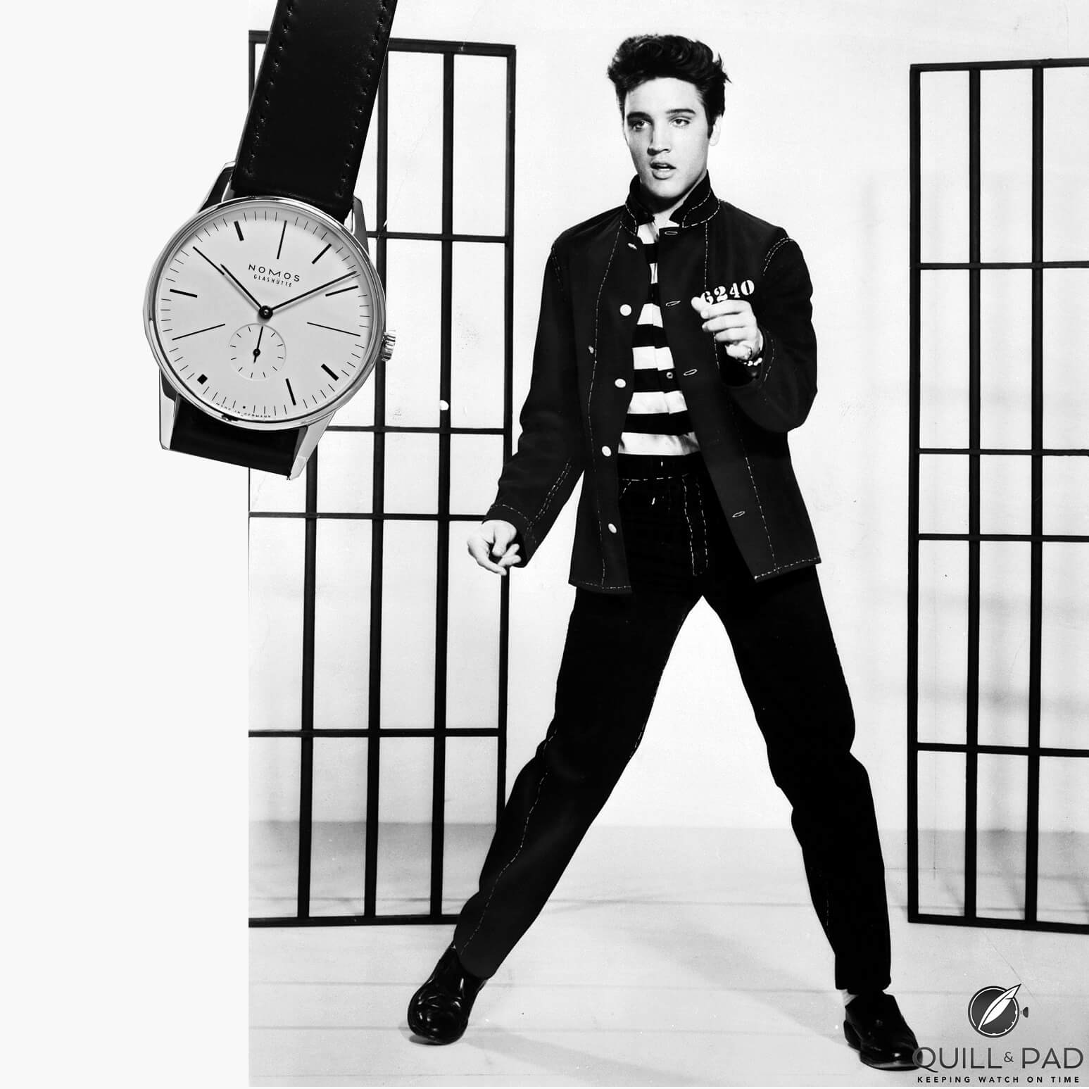
In this exclusively-designed Nomos Elvis Presley Jailhouse Rock commemorative edition, notice how the hour markers, once indicative of de Stijl, now evoke the jail bars of that Presley Classic
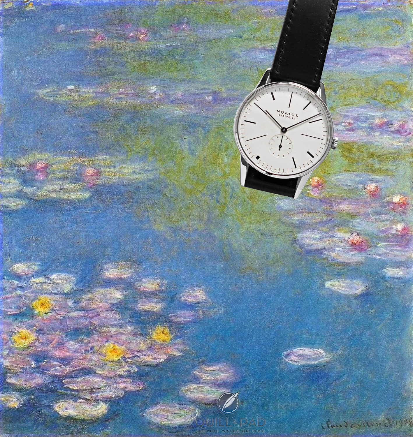
Monet’s pastel colors risked making the Nomos Monet Water Lilies limited edition a passing fancy, so a more monochromatic tribute was used for this eye-catching homage, the cream color of the dial matching the original underlying color of the canvas of this classic masterpiece. Notice how the hour markers, once indicative of de Stijl, now the stems of the flowers and non-existent twigs floating in the pond
One thing is for sure, I do not think that anybody at either Ace Design or Nomos took this design challenge lightly and I expect a lot of careful thought went into the choices that were made (and I expect to hear them very soon). However, whatever the message the design was meant to convey obviously didn’t translate to me.
This is a rare mistake for Nomos, and I hope it and other brands have learned that while we are willing to swallow a lot that the brands serve up, our credulity will break when stretched far enough and his watch broke mine.
If you drank the Kool-Aid and believe the hype, then please visit www.acejewelers.com/en-ch/ace-x-nomos-limited-edition. And for the counterpoints to my op-ed, I highly recommend Martin Green’s Ace Jewelers x Nomos: Celebrating 100 Years Of ‘De Stijl.’
You might also enjoy Shy No More: MB&F LM1 Silberstein.
I’m looking forward to learning if/why I got it all so wrong. What do you think?
Trackbacks & Pingbacks
-
[…] Click to read the full article! […]
Leave a Reply
Want to join the discussion?Feel free to contribute!

























Finally, some one calling Nomos out on this lazy attempt at a limited edition. The use of the Tetra with the primary colors and horizontal hour markers (like a Heurer Monaco) would have been far better.
Thanks for the support, Philip, I was wondering if I was alone here.
Regards, Ian
You were spot on.
Comparing the mb and f to nomos is just absurd. What nomos did with this watch was highly adventurous when comparing to its past limited edition projects. You would have to put into consideration that nomos clientele base would naver except a splash of such vibrant colours as red, yallow and blue. It would just contradict everything they did over the past decades of nomos design. While mb and f are known for a clientele base of comrades that seek adventurous desgin and colour. Nomos has to respect thier clientele and understand that that room for creativity is bounded by the borders of smplicty that govern their designs. That watch represented a genius form of complimenting the movment without of what would have been A suicide of splashy colours. It would break thier code. Although I agree that the strap might have been benefited of primary colours and costumers are free to change that. Sorry for the english
Hi Faisal, Thank you for firing the first shots for the defense.
You make an excellent argument in stating that the Nomos and MB&F clienteles are very different (I agree 100%), but your premise that bright primary colors go against the Nomos philosophy is blown out of the water by the number of brightly colored Nomos models already in existence.
Bear in mind that this special edition isn’t for the general public, it is targeted at those who have an affinity for de Stijl, i.e. those who love bright colors.
Regards, Ian
Check out the Nomos models here: https://quillandpad.com/2017/07/07/nomos-glashutte-splashes-aqua-series-color-16-quality-timepieces-fair-prices-love-water/
I completely agree. I didn’t even understand the connection to, say, Mondrian without reading the original press release a free months ago on another site. But will say that if it was 35mm l’d consider it as it’s a slick looking watch, influence aside.
I’m with you here Anthony, while I’m disappointed in the loose de Stijl association, I would be very happy to have the watch as another excellent Nomos.
Regards, Ian
Thank you. Thank you. Thank you! I never did understand how they came to arrive at this design to commemorate the De Stijl art movement. Maybe if it said De Stijl in big letters on the front with arrows pointing to each of the De Stijl design elements on the watch…and perhaps an inscription on the back that explained why doing a watch with primary colors might not sell as broadly as simple black and white, so screw the movement for having such hard-to-sell elements. A Tag Heuer Monaco with blue dial does a better job of commemorating De Stijl…and they weren’t even trying!
It wouldn’t take much color in my opinion, Michael, just three tiny dabs of primary color.
Regards, Ian
Martin Green, in his article, suggests incorporating primary colours would have been gimmicky. He also says:
“By changing the length and thickness of the hour markers, the connection with De Stijl is already clearly made; adding color might have actually have gone against the movement’s credo to limit oneself to the bare essentials.”
In this case I agree with you. Colour is an essential aspect of the movement and to have included coloured hands, lettering or even perhaps the 12 hour marker would have retained the essence of the Nomos style while better honouring the De Stijl movement.
Whether this special edition watch was well intentioned or the product of lazy and cynical exploitation, the result is the same – fail.
I have a lot of respect for Nomos, Frank, and have no problem in giving them the benefit of the doubt that the design was well-intentioned. We are quick to point out the successes, but this one as you say wasn’t one of them.
Regards, Ian
Completely agree with the article. As a native DUTCH citizen and big admirer of the Stijl I think this model does not very well represent the movement.
Hi Ian,
Thank you for a passionate article! Art is meant to evoke emotions, and as our watch is inspired by an art movement we love how it ignited enough of them in you to write this article.
Leading up to our ltd we did a lot of research, for which we owe a great deal to ClubNOMOS.de. They have an extensive archive on past limited editions, and there have been quite a few of them! Among these you might find one or two that do feature the colors so strongly associated with De Stijl – like the Tangente Gerrit 1918 of 2011 or the Tangente Bauhaus of 2009. We decided to focus on another element – perhaps a less obvious one, but one emblematic for De Stijl nonetheless.
Last but most certainly not least, we feel very honored to have our watch featured in an article that has Alain Silberstein in it too!
Kindest,
Dale
on behalf of team Ace
p.s. we’d love to discuss it more over a beer in Basel next week!
I agree 100%, Dale, if art doesn’t evoke a strong response then it’s unlikely to be saying much at all. And everyone’s tastes and opinions are different.
Baselworld is a date, but we may need more than one beer if you hope to teach me something about design 🙂
Regards, Ian
🙂
funny thing is I never much associated Alain Silberstein with De Stijl. Bauhaus maybe, Memphis Group sure, but never De Stijl. As a fan of his watches based in the Netherlands I like the idea though!
Thanks,
Dale
Hi Dale,
Alain Silberstein sent me this for our consideration (seriously).
“I like the subtle way NOMOS redesigned hour markers. Just missing some touch of colors. Perhaps replace the second hand with a rotating disc featuring a detail of Theo van Doesburg’s Contre-Compostion XIV (1925)?”
Regards, Ian
Now I’m truly humbled. Thanks to both Mr. Silberstein and yourself for this. Awesome.
Is there an ever-so-faint hint of de Stijl in Alain Silberstein’s watch designs, Dale?
I’ll let you judge that yourself 🙂
well, the primary colors are certainly there 😉
This article and discussion has made me think about design, good, bad and the majority, indifferent.
I now consider the Nomos de Stijl good design on the basis that the hour markrs are a clever subtle tip of the hat to de Stijl, without being overpowering, in that you can still wear it every day as a dress watch or in more formal settings.
That I applaud, and that is the type of design I like: a touch of spice, no need to blow my head off.
It is good-but-unsuccessful design (in my opinion) because when the designer is looking to go as minimalistic as possible so as to leave the watch as wearable is as many circumstances as possible — forget the non-existent color fad aversion, it’s the flexibility to be worn in more social settings that I suspect plays (or should play) more of a role here. Thumbs up from me so far.
But the designer has to have a line in their head, a red line on which the other side is “too little de Stijl.” For the designer, the team at Ace Jewelers, and at Nomos, that red line for de Stijl was on the other side of the different-length hour markers.
For me the red line de Stijl is on the other side of the primary colors red, yellow, blue. And there is no correct place for the red line, we just all have our own based on our own tastes and experiences.
So to me good, but unsuccessful design, is good design that push the limits further than a significant percentage of its audience liked. If that was deliberate, fine.
It’s just chance that one of the people who thought the design was over the red line was somebody with a loud voice (me), and when I published the article I thought that the support/against ratio would be around 60/40 in my favor. Indications are that it’s probably higher than that.
I’ll be interested to know if this is the first time anyone has commented on the lack of color. And by all means save it for Basel, there’s likely to be another article here somewhere. 🙂
Regards, Ian
I think that this is a good summary, Ian! Of course, I only partially agree with you as I love the fact that Nomos & Ace didn’t go overboard. In my opinion, there is plenty of monochrome work by De Stijl-artists to rightfully warrant a monochrome version of the watch. The colours would have become a cliche, a marketing tool, a way to draw attention, or at least perceived as such. I think the brands took the high road, but lets be honest, it is also a limited edition, so only 100 people need to love it, and the rest can get the regular edition! 😉
Well, to be fair, even Mondrian fairly often painted in just black and white [just type Mondrian black and white in Google to see some examples], so I suppose that this is the simplest way to reflect de Stijl. I do however agree that it feels like a cheapskate solution here and results in a rather boring watch – and they didn’t even use this approach to solve the large open space below the seconds sub-dial that results from small-movement-syndrome.
Personally, the reason I have never bought a Nomos watch is that, elegant designs notwithstanding, they always seem to be making their watches to a price rather than to a quality. Of course they are, relatively speaking, cheap – but they also feel it (to me at least)!
I heartily disagree with the last sentence in your comment, Ian. I own three Nomos watches and I can 100% attest to their excellent quality. I have seen less quality on far more expensive watches!
Well, I did say ‘to me at least’ – though I certainly agree that you can easily find worse at higher prices
Nomos is just being ironic…
Love it!
I was in Amsterdam last week, and I did some window shopping at Ace, recalling the release of this LE. It was not on display, and I considered inquiring inside. But my schedule was tight, and I moved on. I regret not seeing it in the steel while I was there, so I could have a more authoritative opinion. I also felt that I would likely have to say no, after having specifically inquired, something I hate to do as a customer.
But I will say that I agree with your assessment, Ian. Seeing the promotional images and even reading some on-the-wrist reviews, I felt this LE did not capture the spirit of De Stijl, in my humble opinion. I REALLY wanted to love this watch, and I love the idea behind it. De Stijl’s anniversary, Ace’s dedication as an out-front retailer, and NOMOS’ commitment to the history of design are all right in my sweet spot. But I too really wanted some color, just a tight, controlled splash. Something like M. Silberstein’s sketch would have sold me. And, as you’ve noted, NOMOS has not hesitated to work with serious, bold dial colors in their own catalogue. By that measure, a De Stijl with a splash in the seconds register (or on two or three hour markers) would seem restrained!
I think the calculation was a fair one, and the decision erred on the side of wearability and subtlety. But it wasn’t what I had envisioned. I do hope it sells well and that other LEs will be more daring. My gratitude to Ace and NOMOS for trying something unique, and my gratitude to you for the sincere article, Ian.
If I had ever written an article on a watch, this would have been it. Thank you for a thoughtful and accurate article, Ian.
Being a student of the De Stijl movement for forty years and being a collector of watches I read about this watch with great interest. However, when I first saw the images of them I turned to view my Red and Blue Chair and matching side-table by Gerrit Rietveld to figure out what the similarity was and found literally none.
The only conceivable connection is the uneven lines. However, even that does not match up closely with the thinking of the De Stijl movement. While there are several different withs and lengths of lines in say, a Mondrian painting, an image where there are twelve different lines does not conform to any of De Stijl’s thinking in my opinion. There is no imagery of squares and rectangles and triangles in the watch, just 12 uneven, different lines. Pluralism is precisely what they were not after.
It is telling that every marketing image of the watch contains vast amounts of color. The image in your article shows Rietveld’s chair – with several perfectly-formed rectangles in red, blue and yellow supported by even, equi-distant lines. The contrasts of lack of color and symmetry between the char and the watch are stark.
Which brings me to the watch itself. It is emblematic of one aspect of what is wrong with the watch industry: where “limited editions” and “rare” have simply become marketing tools to get buyers. Over-use of these words make them increasingly irrelevant and pedestrian to the informed buyer.
I, too, look forward to seeing the watch in Baselworld, while keeping my money firmly in my pocket.