by Martin Green
There is no shortage of blue dials. Over the recent years, blue has claimed a well-deserved place next to silver/white and black as one of the most popular colors for watch dials. And blue dials often give extra depth to a design, but only if the design already has strong potential.
At the 2019 SIHH, Vacheron Constantin introduced the contemporary FiftySix line with blue dials. And while normally a new dial color is less exciting than a new watch or complication, the blue highlighted just how good the dial design of the FiftySix is!
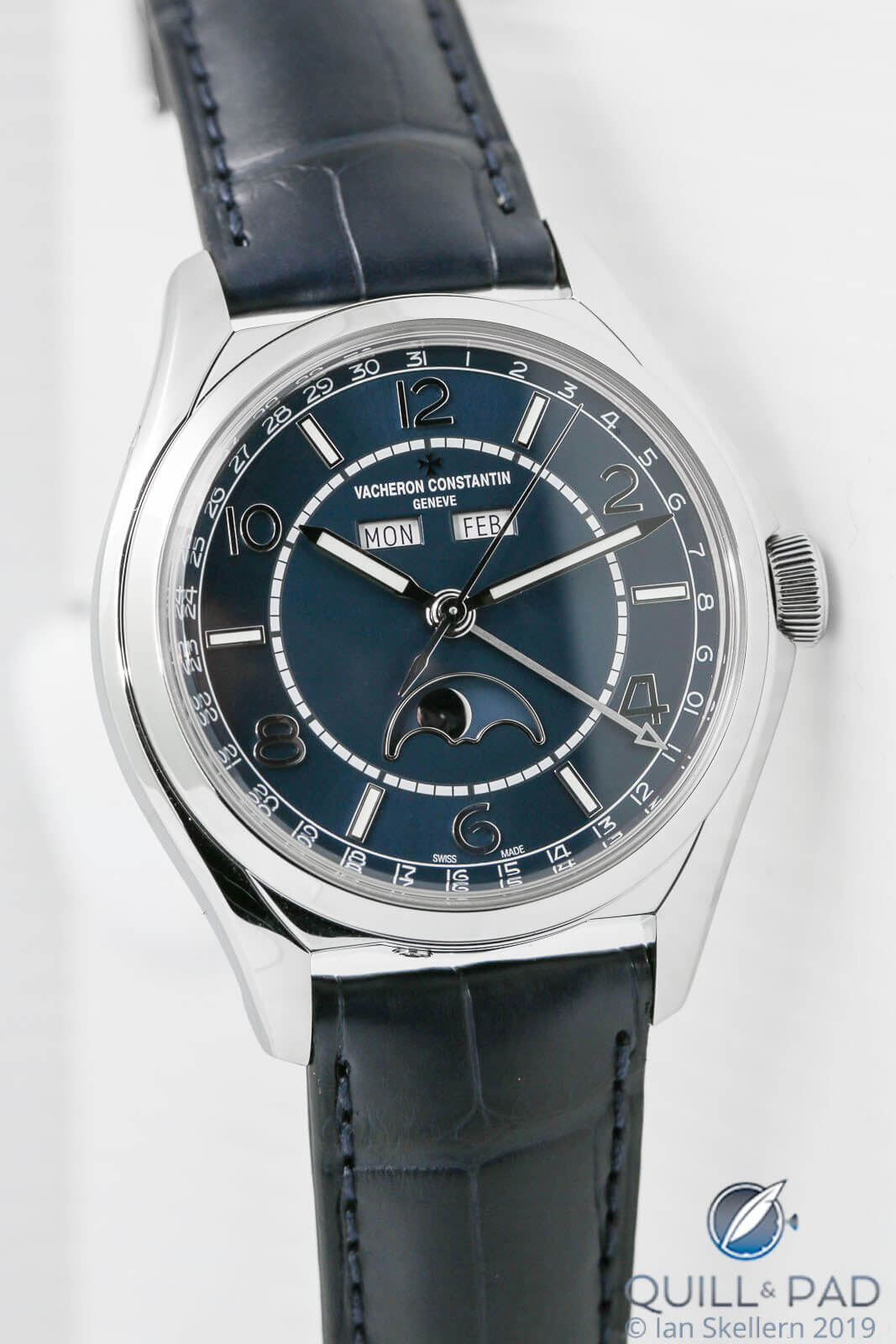
Vacheron Constantin FiftySix Blue Complete Calendar
Vacheron Constantin FiftySix: the essence of beauty
The dials of Vacheron Constantin’s FiftySix collection alternate between baton markers and Arabic numerals. Even numbers are displayed with numerals, providing a visual dynamic and balance with the batons.
The baton markers prevent the dial from becoming too crowded and busy, but they also serve another important purpose other than for reading the time: the markers connect the railroad track around the periphery of the dial with the track at the center. There is a subtle difference between the two railroad tracks, with the outer one for minutes rather restrained in design and the one at the center much bolder in nature.
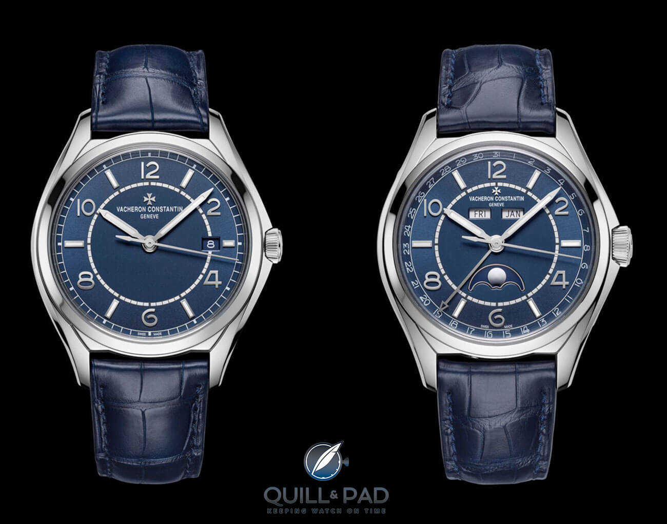
Vacheron Constantin FiftySix Blue Self-Winding (left) and FiftySix Blue Complete Calendar
Most brands don’t utilize a railroad track for the hours, but there is certainly a case for doing so. A track adds a certain dynamic to the dial, while still practicing restraint.
And here it helps take the FiftySix out of the dress watch genre, placing it gently in a category where watches are also worn in a more casual fashion.
The railroad tracks combined with the baton markers draw the eye to the center, where the sunburst effect of the blue dial is the strongest.
Inversely, this allows the eye to float again to the outer edge of the dial enabling the observer to take it all in, greatly maximizing the impact of the dial and the FiftySix as a whole.
The all-too-often ugly truth about date displays
Date indications might be handy in everyday life, yet aesthetically they can wreak havoc on dials.
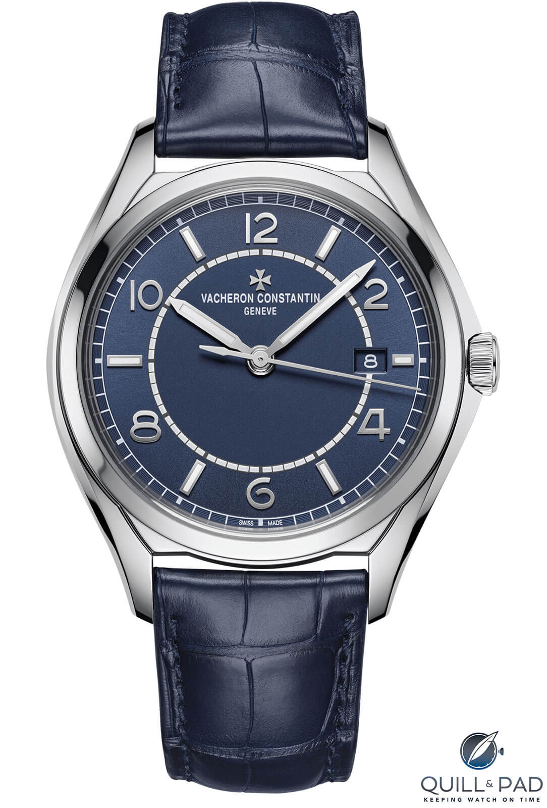
Vacheron Constantin FiftySix Blue Self-Winding
The FiftySix Self-Winding is equipped with a date display, yet Vacheron Constantin has limited its intrusion to the absolute minimum by making the background of the date wheel the same color as the dial itself, while the markers are the same hue as the inner railroad track.
Also, the position of the date window on the dial seems to be perfect: the single digits align with the middle of the railroad track and the double digits flank it. And the font of the date is the same as the Arabic hour numerals, creating visual harmony.
All of which contributes to making this date indication a pleasant addition to the watch instead of the eyesore that it all too often is.
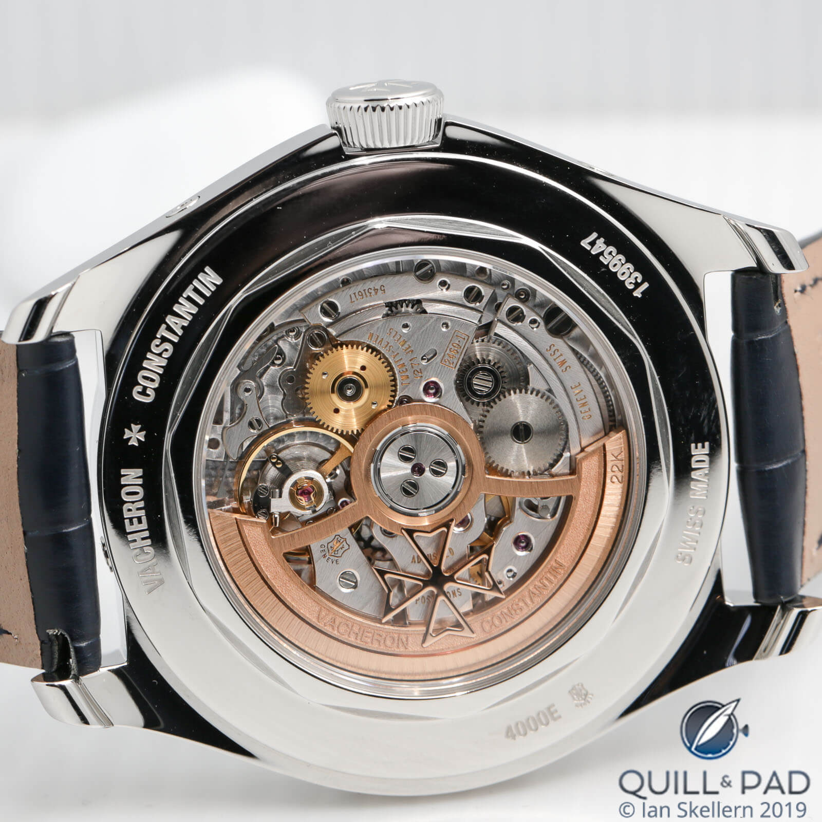
View through the display back of the Vacheron Constantin FiftySix Blue Complete Calendar to automatic Caliber 2460 QCL/1 with Geneva Seal
Vacheron Constantin FiftySix: once in a blue moon
On the FiftySix Complete Calendar, Vacheron Constantin did something remarkable with the moon phase disk: it has the same background as the dial. This is unusual as most brands opt to make the moon disk look like the night sky by using an element like painted stars or aventurine.
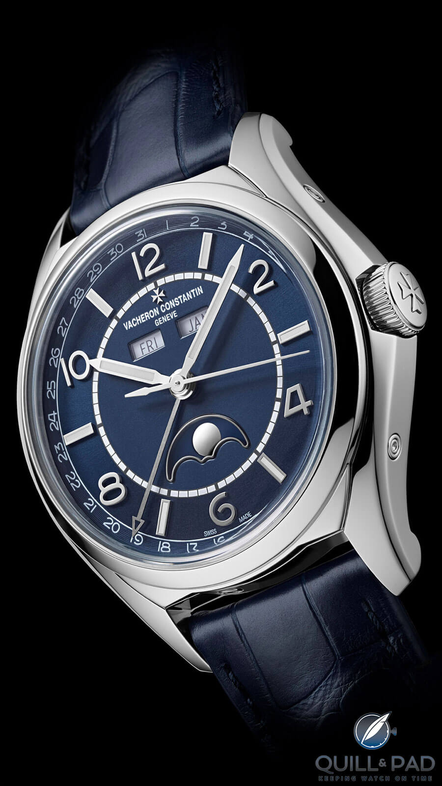
Vacheron Constantin FiftySix Blue Complete Calendar
Vacheron Constantin opted for a tone-in-tone look and it works wonders on the FiftySix, making it a more abstract creation, offering a distinctive look no other brand does in this segment of the market.
The Complete Calendar features a date hand pointing to numerals replace the outer railroad track. This is a nice and subtle solution. And by opting for a white background on the month and day indications, Vacheron Constantin has also created a rather dynamic version of the complete calendar watch, which can generally – especially in this dial setup – be rather traditional.
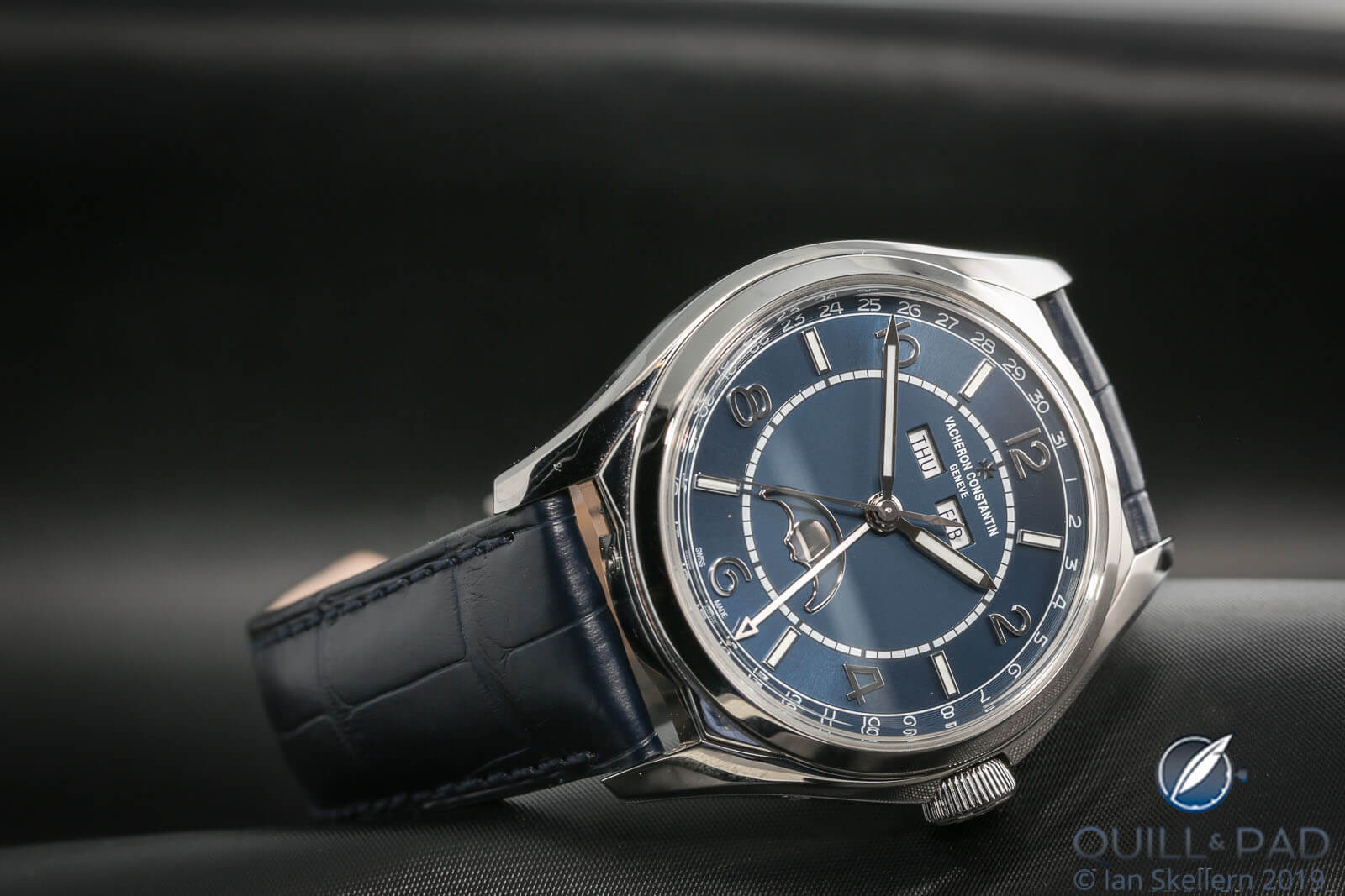
Vacheron Constantin FiftySix Blue Complete Calendar
While there are many good dials around, truly great dials are harder to find. Great dials elevate the watch as a whole, and that is what Vacheron Constantin achieved with these blue-dialed additions to the FiftySix line.
For more information, please visit www.vacheron-constantin.com/en/watches/fiftysix.
Quick Facts Vacheron Constantin FiftySix Self-Winding
Case: 40 x 9.6 mm, stainless steel
Movement: automatic Caliber 1326 produced by Richemont’s ValFleurier and based on the architecture of the Cartier 1904, power reserve 48 hours
Functions: hours, minutes, seconds; date
Price: €11,500
Quick Facts Vacheron Constantin FiftySix Complete Calendar
Case: 40 x 11.6 mm, stainless steel
Movement: automatic Caliber 2460 QCL/1, power reserve 40 hours; Geneva Seal
Functions: hours, minutes, seconds; date, weekday, month, moon phase
Price: €22,400
You may also enjoy:
Vacheron Constantin FiftySix Self-Winding, Day-Date, And Complete Calendar: So Fresh They Snap!
A History Of Vacheron Constantin’s Overseas Line, Culminating In 2016’s Worldtimer
Leave a Reply
Want to join the discussion?Feel free to contribute!



























Well-designed dial? No one above the age of 30 can read the day and date with a font that weak.
Go get your eyes tested, maybe? I’m 50 and I can see the day and date perfectly.
On these pictures – yes they look fine. But not in real life. The month and day window is simply to small and the font print is to weak, even if you have a 20/20 vision. But thanks for caring.
I agree. Remember, the images on your screen are macro shots where everything looks impressive when enlarged. At actual size and especially in low light, say indoors, that date is HARD to read ( good eyes or not ). Also with the brand name and date squashed into the top of the dial there is too much overcrowding going on. I suppose that’s why they had to make the text smaller.
The plain self-winding is very nice though, I’d go for that one.
The case diameters of both models are the same. But when you focus on the relation of their hands/railroad tracks, you will find they are inconsistent(ex. the hour hand of the date-only just reaches on the track, but the hour hand of the complete calendar slightly exceeds the track; same for their minute hands). I guess VC just uses the same hands for these two models.