Why I Bought It: Omega Seamaster Aqua Terra 150M
Deciding to buy the Omega Seamaster Aqua Terra wasn’t exactly a no-brainer (my favorite kind of brainer). Here’s why I bought this timepiece and how I feel about it after a year.
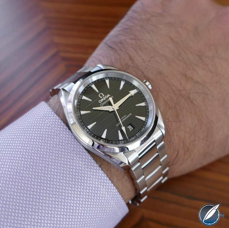
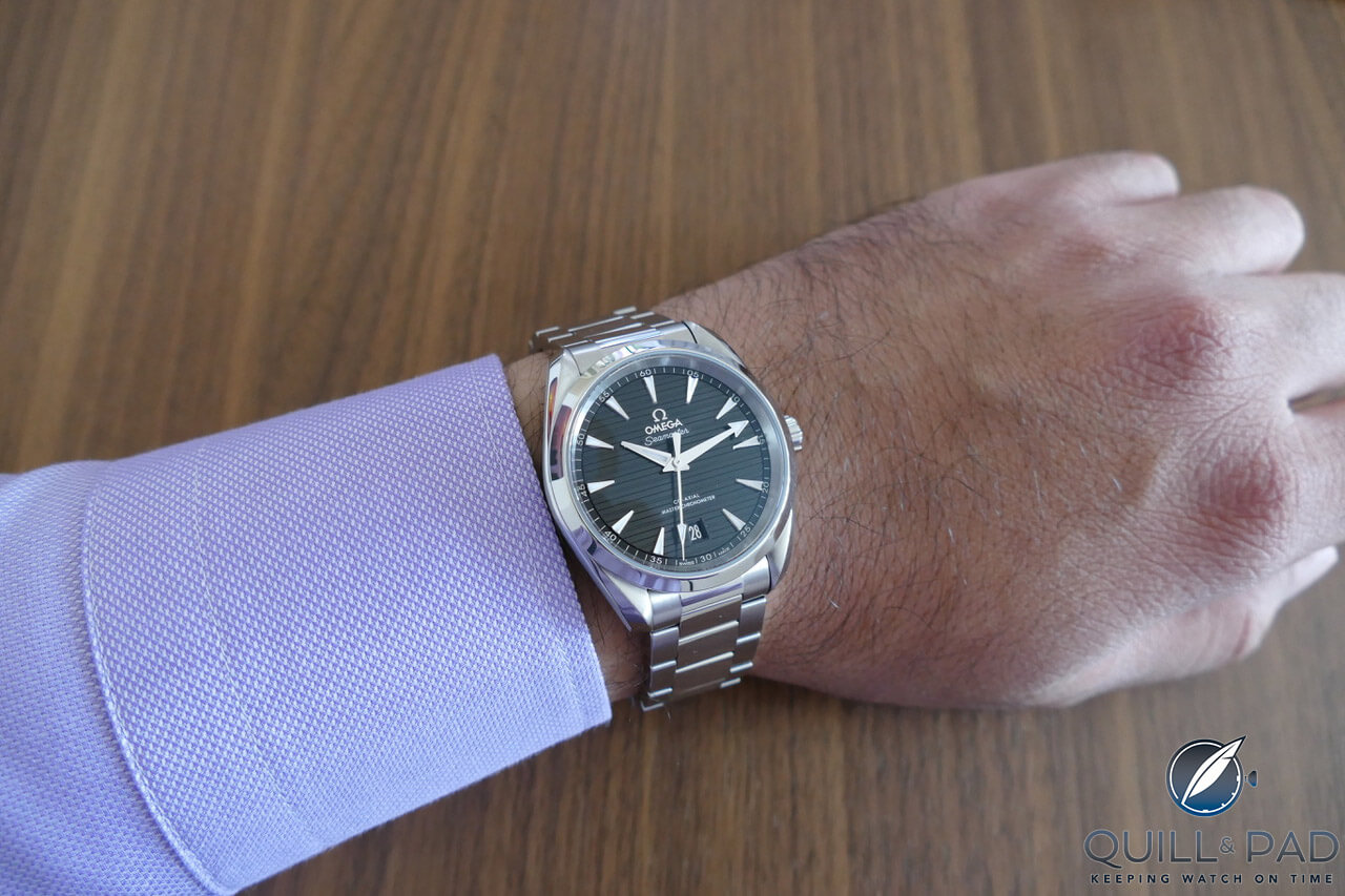
The author’s Omega Seamaster Aqua Terra 150M on his wrist
Before we take a look at the Omega Seamaster Aqua Terra in further detail, though, I would like to introduce you to the field of semiotics.
Of form and function
I do not envy you if you have ever had the misfortune of being invited to dinner at a semiologist’s house. You have earned my deepest sympathies.
You will likely be treated to a conversation drier than the fish you are served and, at some point, it will turn to decorative veils.
The decorative veil isn’t headdress but the space existing between an object’s function and its design. Extensive analysis leading to complex theoretical explanations exist, apparently.
This space, this decorative veil, encourages debate around an object’s nature and its meaning. A example of this is the Alessi Juicy Salif by Philippe Starck.
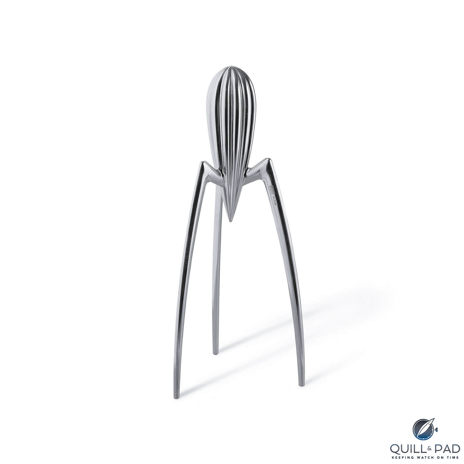
Alessi Juicy Salif by Philippe Starck
Alessi has produced and has sold around a million Juicy Salifs, yet the device is practically useless at juicing oranges and lemons.
French anthropologist André Leroy-Gourham believes the notion of functional approximation to be crucial in offering a reason for an object’s existence, and that there has always been freedom in the interpretation of the relationship between form and function.
Our fascination with watches has very little to do with the study or understanding of time itself. Watches are instruments that measure time and are usually designed to reflect that; however, the desire for watch designers to push the decorative veil leads to a wide variability in legibility.
Omega Seamaster Aqua Terra: when life gives you lemons
Does the Omega Seamaster Aqua Terra, a watch marketed to be worn on a yacht or while playing water sports, drape a decorative veil over its wearer’s wrist or can it actually juice a lemon?
After a year of owning mine, I am happy to report that it can.
Launched by Omega in 2002, it is a good-looking, casual sports watch featuring George Daniels’ co-axial escapement, which was industrialized by Omega and integrated into Swatch Group ETA-produced Omega calibers in the 1990s.
Omega believed in the co-axial and developed the technology for use in robust in-house calibers. A sports watch is the perfect proving ground, and the Aqua Terra was one of the models to benefit from the brand’s technological progress.
The first watches were modern but inspired by past designs. Long, twisted lugs and arrowhead hands came to define the look of the Aqua Terra collection, which was an aquatic-themed watch equally comfortable on land.
As the movements were upgraded to in-house calibers dial patterns became more elaborate, with the most important style update coming with the “teak-pattern” dials. These were embossed with slim, longitudinal lines evoking the teak decks of luxury yachts that came to define the look of the Aqua Terra collection.
The movement grew in thickness and diameter as did the cases. The co-axial calibers were not without issues, and with each update to their reliability came a slight styling change to mark the progress: date window frames were discarded in favor of unadorned cutouts, center links were polished, and finishing improvements were offered.
The dawn of the Master Chronometer certification from the Swiss Federal Institute of Metrology heralded a redesign unveiled at Baselworld 2017, bringing with it a reimagining of the Seamaster Aqua Terra’s look.
Until that point my interest in the watch was lukewarm; however the technology, new design, and finish raised my thermostat past tropical.
Omega Seamaster Aqua Terra 150M: dial and hands
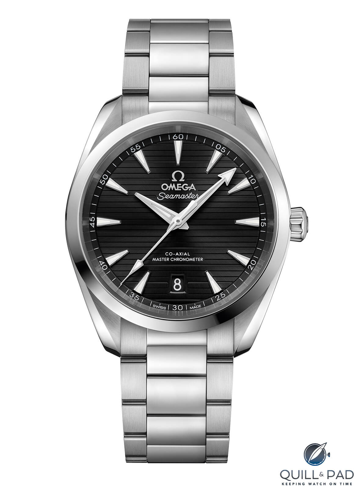
The Omega Seamaster Aqua Terra 150M dial features latitudinally engraved furrows of intermittent depth streaked across the three-dimensional dial. A rich lacquer and metallic sunburst finish in the central dial leads the eye to hour indices resembling the prow of a yacht. Radially aligned, trapezoidal and tall, the indices proudly display their faceted bows with polished sides and vertically brushed top surfaces.
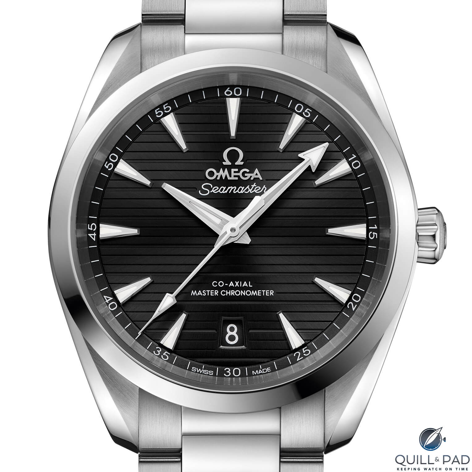
Dial of the Omega Seamaster Aqua Terra 150M
The hands and indices are Super-LumiNova filled, while the metallic dial reflects off the sides of each like a distant mirage.
The dial imparts a calmness to the Aqua Terra not present in previous models that I ascribe to the horizontal lines on the dial.
The calmness, a feeling of being grounded, is enhanced by the gently domed sapphire crystal held in place by a highly polished conical bezel. The dial’s applied Omega logo, vertically brushed on top and polished along the sides, sits proudly below the single 12 o’clock hour index (a double index would have been delightful here in my opinion).
Dial text is surprisingly terse, reduced to announcing it’s a Seamaster with a technically advanced co-axial escapement and Master Chronometer certification. At 6 o’clock is a well-executed precision-cut date window with bevels extending all the way down to the date disk. And I’m particularly pleased that the date disk matches the color of the dial.
Although slim, the date (in Futura font like the minute numerals) is highly legible.
The dial’s “teak deck” pattern consists of “planks” with shallow spacing between each and a wider furrow between every three. This both generates interesting and deep shadows and creates margins for visual mass to decentralize and expand outward, creating the impression of a larger dial. This rhythm allows the dial to be enjoyed like a lyric rather than mere graphic field.
The hands are a wonderfully multifaceted affair.
The long and thin second hand, bisected and polished with a spearhead lume plot, reaches comfortably into the minute track markings. The pentagonal counterbalance is the same length as the spearhead.
The minute hand contains three surfaces with the leading and trailing edges polished and a plateaued central column brushed along its length. Ditto the hour hand.
The minute hand boasts an arrowhead at its tip, broad and squat, and entirely filled with lume. The lume on the hour hand is within its central body.
The shape of the hands is dauphine in concept but freshened to reflect the watch’s modern sporting credentials and production techniques. The breadth of the hour hand’s terminal is the same as that of the hour indices.
Omega Seamaster Aqua Terra 150M: case and bracelet
The case accommodates the current Omega co-axial architecture without too much paunch, while clever design makes it appear slimmer than it is.
The slab sides of the case are horizontally brushed in a coarse grain, smooth to the touch but rough in appearance, which gives it a very living feel, almost like wood, and provides texture you can feel with a fingertip. The case features Omega’s lyre lugs, which, true to the namesake instrument, compose organic curves framing the case.
The lugs are polished on top with circular brushing angled toward the bracelet. All the surface changes are crisp, and all the lines generate visual tension. This is finely detailed design work deserving full appreciation.
The same circular brushing continues on the underside of the lugs and case, and a thick, wave-pattern motif with alternating brushed and polished surfaces surrounds a case back set with a generous sapphire crystal. The bezel of the screw-in case back announces the model name and water resistance.
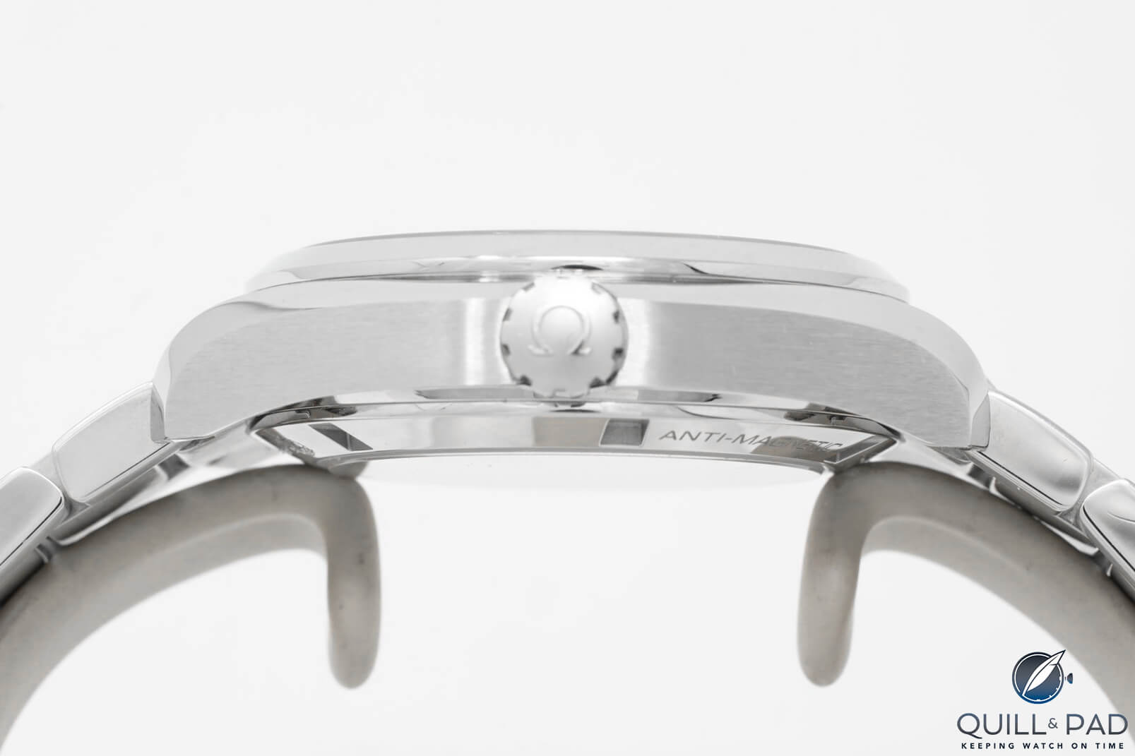
Crown of the Omega Seamaster Aqua Terra 150M (photo courtesy topperjewelers.com)
The generously-sized conical/pear-shaped crown is fully polished except for its finial, which contains a polished Omega signature relieved on a blasted finish convex field. The crown’s knurled grip alludes to an abstract helm, a detail becoming more apparent in use. The crown screws into a slight recess in the case side so it both looks and wears smaller than it is.
The bracelet links attach to the case with end links sitting flush with the case band, cascading out in staggered three-link formation. The center links and side surfaces are polished while everything else is vertically brushed.
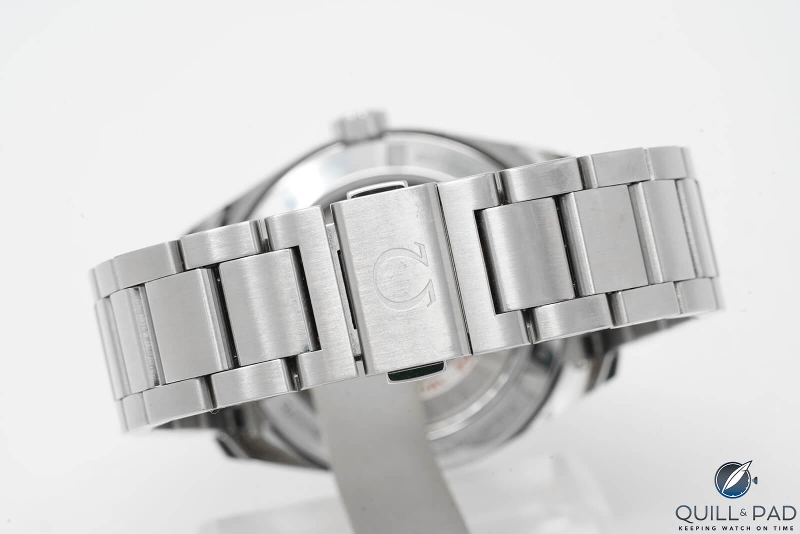
Folding clasp of the Omega Seamaster Aqua Terra 150M
The clasp is a sequential folding dual arc with push-button actuators for release. There is an engraved Omega logo on the brushed clasp, and the underside architecture of the rocker arms is polished and curved for ergonomic comfort and operation.
I tend to err toward the toolish-end of the luxury watch spectrum. I appreciate these watches’ no-nonsense approach to time telling and their come-what-may attitude to timekeeping. No decorative veil for me.
The technical merits and aesthetic virtues come together in a harmonious package that is much more than the sum of its parts.
Omega Seamaster Aqua Terra 150M: why I bought one
The question when considering to buy was what would a watch designed for life on the high seas and dinners at yacht clubs do for me? The closest I ever got to a yacht was owning a pair of Sperry boat shoes, and I imagined it would be dishonest of my wristwatch to proclaim Seamaster when I didn’t even live near a pool.
Aqua was in the name, but so was Terra. And while The World Is Not Enough for James Bond, I thought that the Aqua Terra might be enough for me. And after all, Bond made do with one (see Commemorating 56 Years Of Bond, James Bond: A Complete Rundown Of Watches Worn On Screen By The World’s Most Famous Fictional Spy and The On- And Off-Screen Watches Of Brosnan, Pierce Brosnan).
I took the plunge. The Seamaster Aqua Terra 150M was a birthday present to myself: a wristwatch that wouldn’t necessarily be precious but a robust, well-made, legible, and water-resistant daily companion.
The broad case band, horizontally brushed, hinted at the sporting aspirations of the watch, but the polished sections in the now-shortened lugs and bracelet center links imparted slightly dressier pretensions, softening its image without damaging its character. I didn’t mind.
Being highly reflective, the hands and indices motivated me to select a black dial, which would absorb some of the light, leaving the fireworks to the rest of the hardware. In bright light, the black dial appears iridescent due to its metallic sunburst pattern.
The case back design ensures that the watch sits slightly proud on the wrist, leaving the lugs never quite in contact with skin. When they do touch, there is the polished bevel waiting.
The author’s Omega Seamaster Aqua Terra 150M on his wrist

At 38 mm in diameter, the watch sits nicely on my wrist, projecting an image of classic proportions. It is an image I can’t shake. In the 12 months I’ve had the watch it has never faltered, always keeping time well within its chronometer-rated promise, aided by the free-sprung silicon balance that makes a magnetized balance spring a worry of the past.
Omega Seamaster Aqua Terra 150M: from open road to open sea
I have taken my Seamaster Aqua Terra to the end of the world, a dinner at a yacht club (yes, really), on the open road, and on the open sea. The brushed finish has held up well, if not exceptionally well. The polished bezel has scars from doing battle against train commuters and car doors. The clasp has scraped against my keyboard more times than I care to admit, however the watch still looks remarkably good.
Most importantly, legibility and comfort throughout all of this has remained excellent. The luminescent hands are bright and blue when the theater lights dim, instantly and distinctly revealing themselves throughout the night.
The arrowhead minute hand makes it easy to read the time precisely and without effort. The crown’s operation is incredibly smooth and precise with a good amount of feel in the fingertips while being sturdy, well-weighed, and responsive when changing the date or adjusting the time.
Omega Seamaster Aqua Terra 150M
The Omega Seamaster Aqua Terra is a wonderfully composed sports watch with luxury appeal that carries itself just that little bit better than this wearer ever could.
The black dial suits most occasions, the brushed and polished finish goes with everything, and I would happily buy a Seamaster Aqua Terra again, decorative veil be damned.
For more information, please visit www.omegawatches.com/watch-omega-seamaster-aqua-terra-150m-omega-co-axial-master-chronometer.
Quick Facts Omega Seamaster Aqua Terra 150M Ref. 220.10.38.20.01.001
Case: 38 mm, stainless steel
Movement: automatic Caliber 8800 with co-axial escapement and free sprung balance featuring silicon balance spring; official METAS certification as a chronometer, 3.5 Hz/25,200 vph frequency; 55 hours power reserve
Functions: hours, minutes, seconds; quick-change date
Price: $5,700/€5,300
You may also enjoy:
New 2019 Omega Seamasters: Confessions Of A Secret Seamaster Fan
Decoding Omega References: 14 Magic Digits And Codification Tables Revealed
Trackbacks & Pingbacks
-
[…] (COSC). I’m continually impressed with the accuracy, reliability and performance of my Omega Seamaster Aqua Terra‘s related caliber […]
Leave a Reply
Want to join the discussion?Feel free to contribute!


Love it own a white dial myself!
Hello Hank, and thank you for reading. Do you own one of the GoodPlanet models in titanium? Those are beautiful. How has the finish fared compared to mine?
I have just bought one the white dial 38.5mm titanium.for my upcoming 50th birthday.Love it cos of the simplicity & lightweight
In spite of its almost ludicrously flowery language, I agree with the essence of his message – this is a good-looking, hard-wearing and accurate watch of the Seamaster genre. I also bought one and value it highly but what a shame the author referred to the date-window at 6 o’clock and horizontal “teak-deck” lines on the dial of the current model (2018 on) but followed with a photograph of the previous model (before and to 2017) which has the date window at three o’clock and vertical “teak-deck” lines. I have the earlier model and prefer it. Why? The date at three o’clock is quicker and easier to read at a glance, peeping just round a shirt-cuff. And as a sailor I tell you that teak decking on ships and yachts is always fore and aft (= vertical) and never athwartships (=horizontal). What baloney to call athwartships more “calming”!
Hello Trev, and thank you for reading. You are right about some of the pictures and that will be brought to the attention of our editor. You are also right about the convention of fore-aft deck alignment on yachts and ships. However, this is a watch dial and does not need to conform to said conventions of sailing construction. From the accessible TAG Heuer Aquaracer models to the unobtainable Patek Philippe Nautilus, aquatic-themed watches often carry horizontally-aligned embossing or engraving on their dials. Being a designer by profession, I can tell you that a large part of the first year of design school is understanding formal analysis. Elements of art and design are isolated and defined. Lines, we learn, can communicate information through their character and direction. Horizontal lines, parallel to the horizon, imply rest, balance, and stability as opposed to vertical lines, perpendicular to the horizon, which imply energy, height, and spirituality. But don’t take my word for it. French artist Claude-Joseph Vernet painted a Mediterranean port in 1770 and in his landscape, chose horizontal lines under a setting sun to demonstrate the repose after a storm. Wanna guess what the painting is called? “A Calm”! What baloney!
Nice answer Saad and good evidence through examples!
You are right on concerning the design principles and Trev is right about sailboats! By the way Trev, the date at three o’clock position does not work for all of us (like me) who wear the watch on their right wrist where the ‘starboard’ side is covered by the sleeve and doesn’t peep out.
Hello Stefan, and thank you for reading. I picked the black dial. What would you have picked to peep out from under your right arm shirt sleeve?
Apologies on the errant photo – that was our faults and it has been rectified. Signed, the editors.
I appreciate that the same attention was given to the workhorse AT as to the more traditionally haute pieces that Q&P are known to cover in these “why I bought it” columns.
These “all rounders” carry a greater appeal for me so to see it get the full treatment was a joy to read. Though I prefer the more stripped down original 2500 series Aqua Terra, in 36 no less, to all the bigger, bolder variants. And a 6 o’clock date simply doesn’t work to my eye. (Though I also wear watches on my right wrist).
Thank you.
Hello Judah, and thank you for reading. Glad you appreciate the effort. What dial would you pick from among the Cal. 2500 generation?
No matter how good any watch is, if it doesn’t have a bracelet with micro-adjustment, I simply will not buy it.
Unfortunately, any Omega also looks decidedly outclassed by any Rolex.
Hello Tam o’ Banter, and thank you for reading. I don’t mind that my Rolex outclasses my Omega. I like owning both. Wouldn’t you?
No. I passed on both and bought a Tudor instead. Neither was out of my budget. I came close to buying a Railmaster but it was too thick and blocky on my wrist. I object to paying The Rolex Surcharge and it didn’t quite sit right with me, wearing such a watch. Omega make watches very well and considering their market position, they are well-priced. But for me, they don’t have that timeless quality. Let’s face it, a Black Bay 59 is a much better buy.
Tudor is not a great watch no………….looks cheap
A great watch, I have the previous version and I enjoy being easily able to type due to the flat nature of the bracelet. It’s a classy timeless watch that will never go out of fashion.
Hello Daniel, and thank you for reading. I agree – it will look just as good decades later, just like its predecessors do now.
A beautifully written paean to a wonderful watch.
I have been wearing a 38.5 mm blue dial AT (sometimes referred to as “Skyfall” because of its initial appearance on the wrist of Daniel Craig in the movie of the same name) for the last six years.
It has been a wonderful companion–sturdy, reliable, unruffled in any occasion. It’s been worn to the beach, boardroom, and everywhere in between. Indeed, the smooth bezel has picked up some nicks over that time, but I view those as signs of a life well lived.
Of course I have other watches, one more expensive, but none that have spent more time on my wrist than my Aqua Terra.
Funds permitting, I would consider moving on to a Vacheron Constantin Overseas, or an Audemar Piguet Royal Oak, but I don’t think that day will come.
Enjoy your watch–wear it in good health!
Hello Peter, and thank you for reading. I remember the Skyfall watch clearly, with its thoughtful window frame that used the same volume of metal as an hour index, and slightly asymmetric case guarding the crown. The blue dial had a life of its own, changing brilliantly under light, and the brushed center links on the bracelet certainly suited Bond well, as I’m sure they suit you. The evolution of the Aqua Terra has been fun to watch, and I am excited to see where Omega decides to take it. I am thankful for the ‘midsize’ option that allows the watch to actually fit a wrist rather than simply sit on the wrist. It is one of the few remaining democratic-luxury options in reasonably-sized sports watches that are handsome, well-appointed, thrilling to own and to use, and easier to read than a neon sign. A considerable amount of money will buy you an Audemars Piguet or Vacheron Constantin, yes, and both offer finish and construction that Omega can’t match. However, the Omega’s handling, ergonomics, and legibility are hard to match at any price point. Enjoy yours!
What a very fine, highly detailed and well written review. Just what I was searching for.
Looks like a Grand Seiko to me, and that’s not a good thing.
Beautifully written.
I like the watch too.
really fine writing–motivated me to purchase one in fact (the grey dial w/ dark blue rubber strap, aesthetically, almost an opposite to the one you purchased and reviewed.
fantastic watch
About a month ago I just purchased the black lacquer dial Aqua Terra in 41MM. Love it as the case is all polished and the bracelet offers smaller center links much like the Rolex President bracelet.
I am just looking at the Rolex OP41 blue dial stainless bracelet & this Aqua Terra Blur dial on a leather strap. Both same price from AD . The Rolex I have to wait between 6 months & 2 years for a call from the AD (assuming I’m lucky & still alive)
The omega I can pick up on the AD shelf immediately.
Rolex op41 will be worth more to resell & has a 10 year to service period. More brand kudos? But does look like your a Rolex fan boy who can only afford the entry level watch.
Omega will lose money & I read the service interval is just 5-8 years. Less brand Kudos but looks like you made a purchase with your head rather than ❤️.
Any help & advice most welcome