by GaryG
It’s hard to believe that it has already been more than five years since our “NorCal Gang” took delivery of six unique chronographs from independent watchmaking legend Kari Voutilainen following a three-year gestation process that I described in Commissioning A Watch: My Journey With The Kari Voutilainen Masterpiece Chronograph II.
In that article, I promised a more in-depth Behind the Lens treatment of my watch at some point, but I was also hopeful of being able to compare and contrast my piece with one or more of the other watches in Voutilainen’s ten-piece Masterpiece Chronograph II series.
Recently, a generous friend offered me the opportunity to shoot his white gold Chronograph II, and now I’m able to share both his and mine with you here.
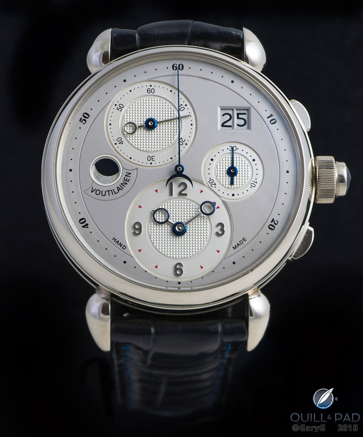
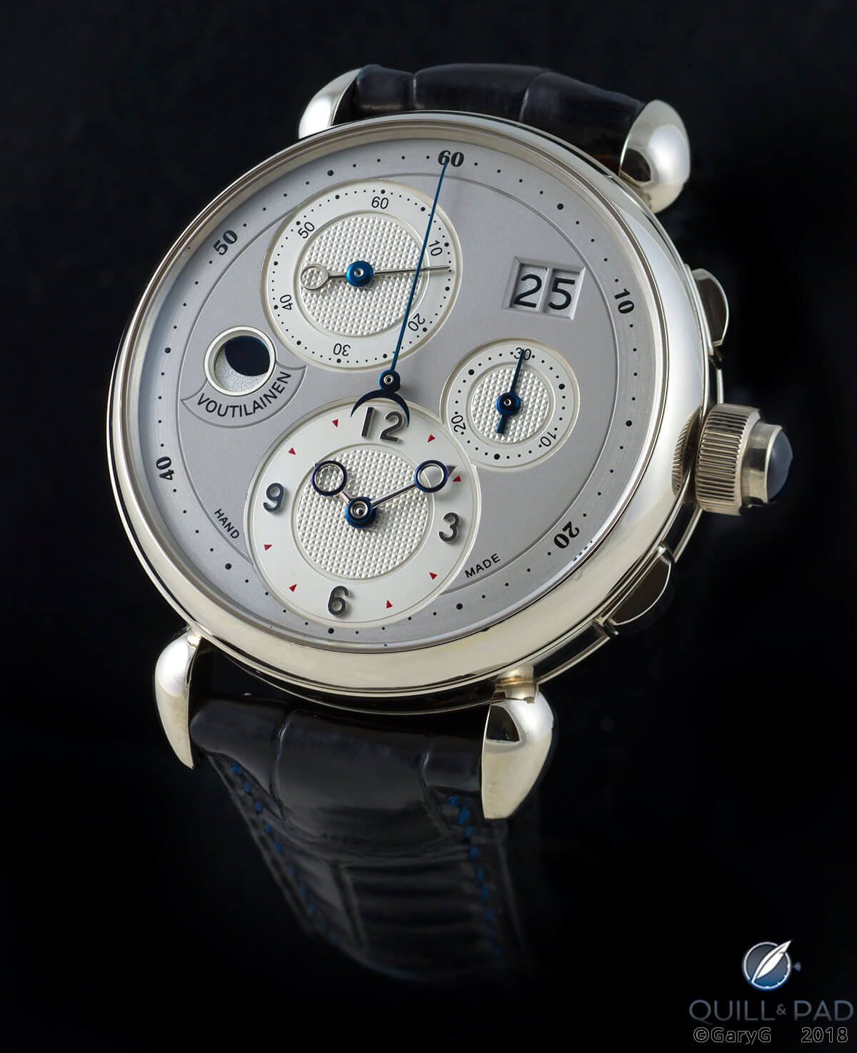
Kari Voutilainen Masterpiece Chronograph II in white gold
Starting with a (relatively) blank slate
I’m still fascinated with the diversity of requests made by members of our group when offered the chance to recommend some custom touches for a design concept we had seen only as a blank dial in a case.
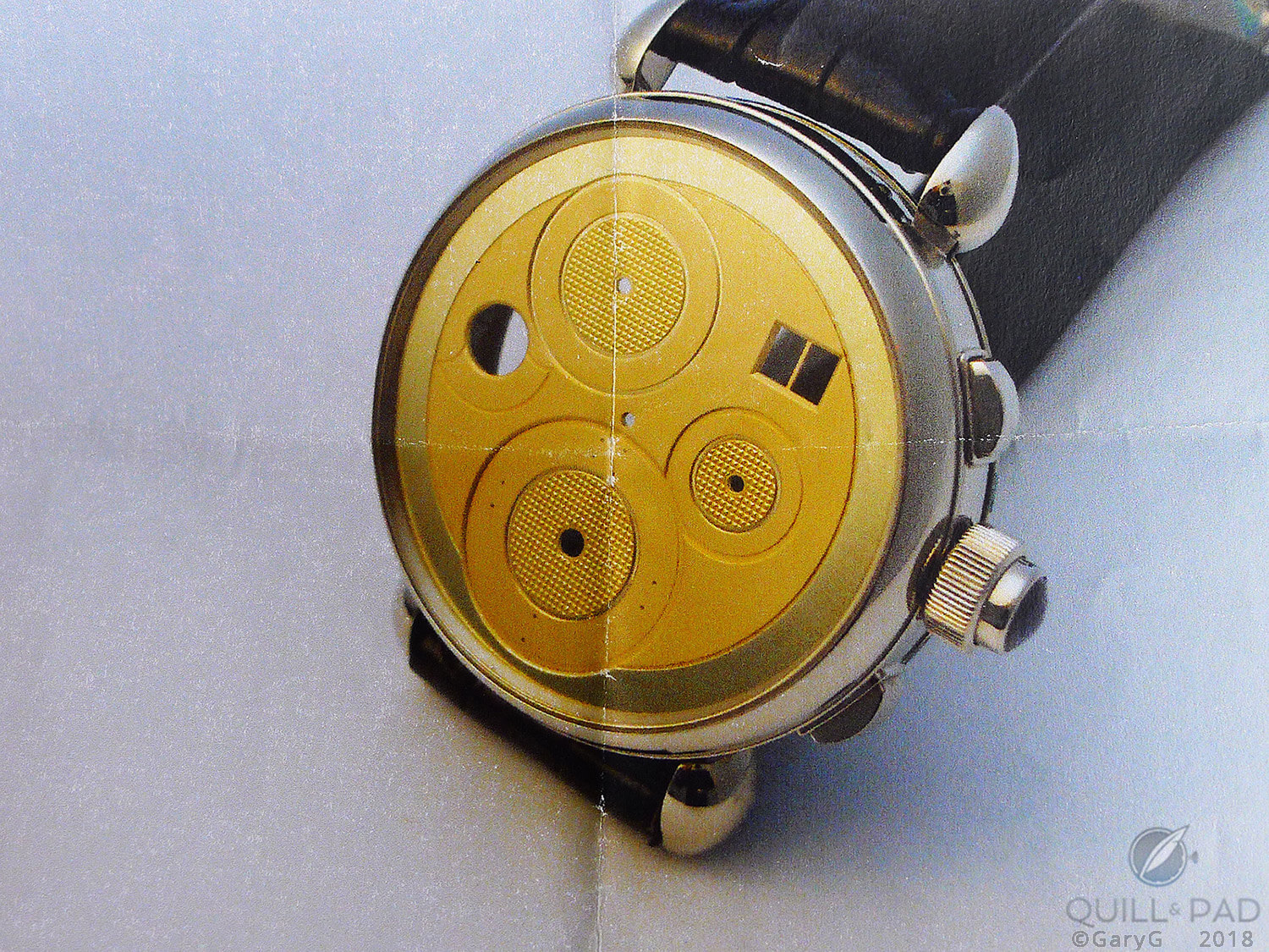
Where it all began: blank dial and case
While I immediately gravitated to the idea of a pink gold case with dark dial, the final tally among our group was two platinum watches (one each with solid blue and black dial), one other pink gold with a lighter dial color than mine, a steel-cased version for the “gram geek” in the group, and a single white gold piece with a subtle two-tone silver dial that you see in the photo below next to mine.
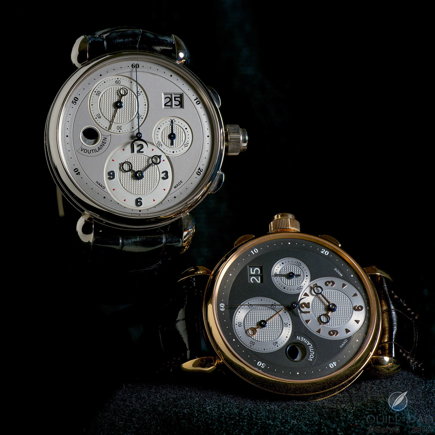
Day and night: two unique Kari Voutilainen chronographs
More alike than different?
If you look closely, you’ll see many similarities (in addition to the hard points of case design and dial positions based on the movement architecture) that cross the entire series of watches:
- “Unflipped” Arabic numerals indicating the running seconds, chronograph seconds, and chronograph minutes along with vertically placed numerals for 3, 6, 9, and 12 on the main time subdial
- A font for the chronograph seconds indication taken from Voutilanen’s first limited series of Masterpiece Chronographs, with a thinner font utilized on the printed subdials
- On the chronograph minutes subdial, the absence of dots at 10, 20, and 30, with the remaining dots placed between the numerals rather than above them as they are on the running seconds subdial at 11 o’clock
- Dots on the chapter ring for every interval of the chronograph seconds, leading to the use of a “chin” at 6 o’clock that reminds us of, but is perhaps subtler than, the one that appeared subsequently on the Patek Philippe Reference 5270
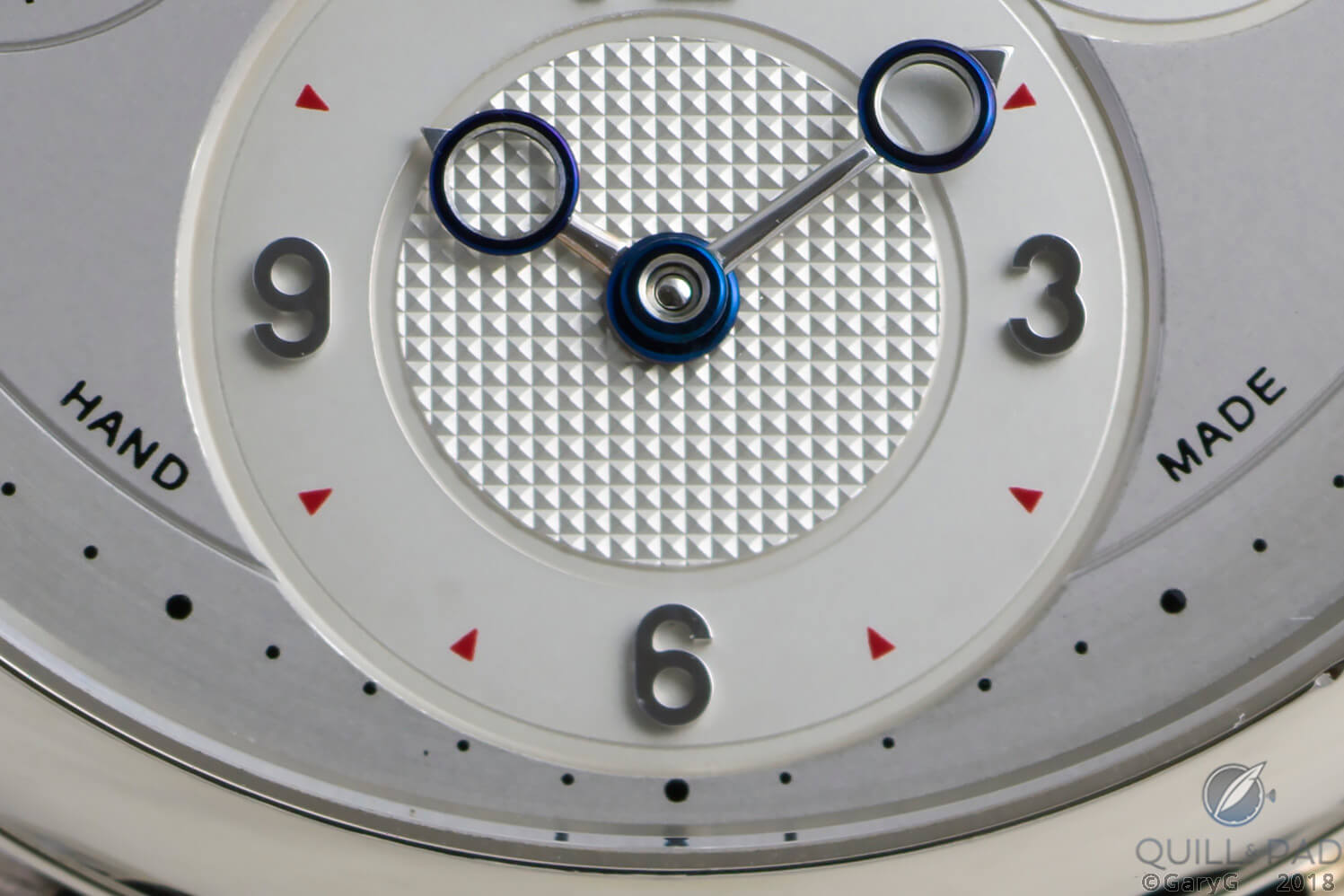
Does my chin look big in this? Dial detail, Voutilainen Masterpiece Chronograph II
- Multi-level subdials with prominent grooves, with the main time subdial and chronograph minutes joined in a figure 8
- Clous de Paris guilloche on the central sections of the subdials and circular brushing on the outer rings of the subdials as well as on the main chapter ring of the dial
- Backgrounds for the date wheels that match the color of the dial
- A deep recess with a color-matched bezel that contains a moon phase indication with polished blue “sky” and frosted silver “moon”
The distinctions begin
As we entered into the dialogue with Voutilainen, my friend’s priorities were pretty clear: he wanted a watch that he could wear frequently in both business and more casual settings. And as much as possible he wanted to emulate the dial design of Voutilainen’s first series of ten Masterpiece Chronographs.
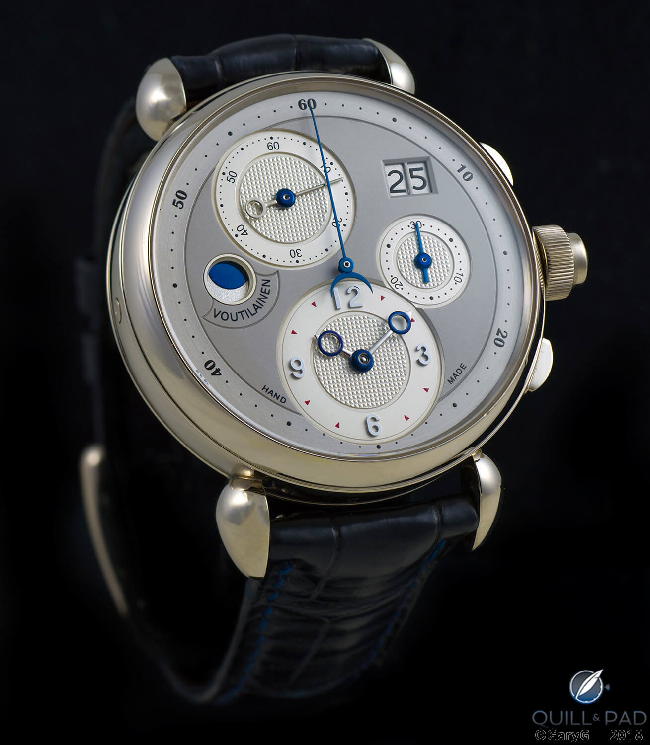
Similar, but different: dial of a unique Voutilainen chronograph in white gold
The subtle two-tone silver dial with a slightly darker matte finish on the main dial surface is a fitting tribute to the Masterpiece I, and my friend’s watch also incorporates the first series’ tiny red printed triangles at the five-minute marks of the time subdial and the silver and blue color schemes of the time and chronograph hands, respectively.
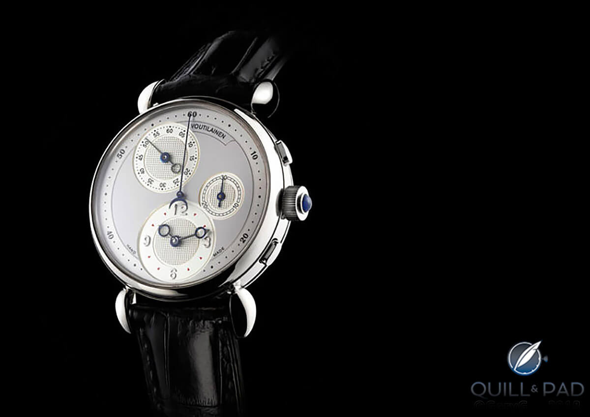
Kari Voutilainen Chronograph Masterpiece (photo courtesy voutilainen.ch)
There are a few subtle differences from the first series, however, including the non-flipped vs. flipped printed numerals, omission of the numerals ending in “5” on the seconds subdial, and substitution of dots for the railroad track of the original series’ chronograph minutes dial – as well as the aforementioned chin.
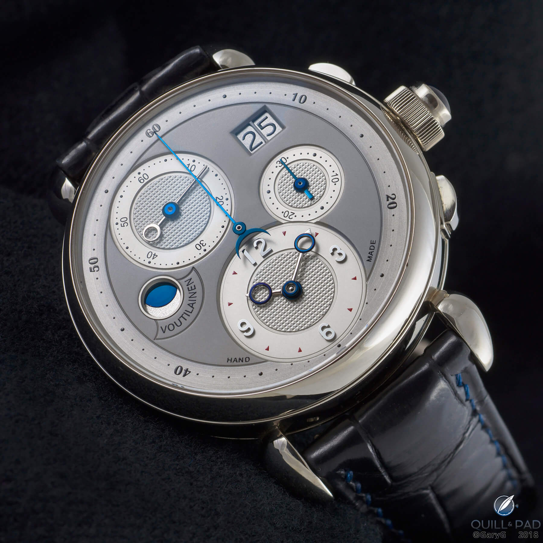
Harmony on the wrist: Voutilainen Masterpiece Chronograph II in white gold
The resulting look is to my eye harmonious and clean, with the subtle tonal variations giving the dial an open look and the muted palette allowing the watch to peek out from under the wearer’s cuff without attracting undue attention, despite that large sapphire cabochon atop the date corrector on the crown!
By comparison, my watch is considerably more dramatic: I wanted a piece that featured strong contrasts and I’ve long had a bias toward colored metals in my collection as a matter of personal taste.
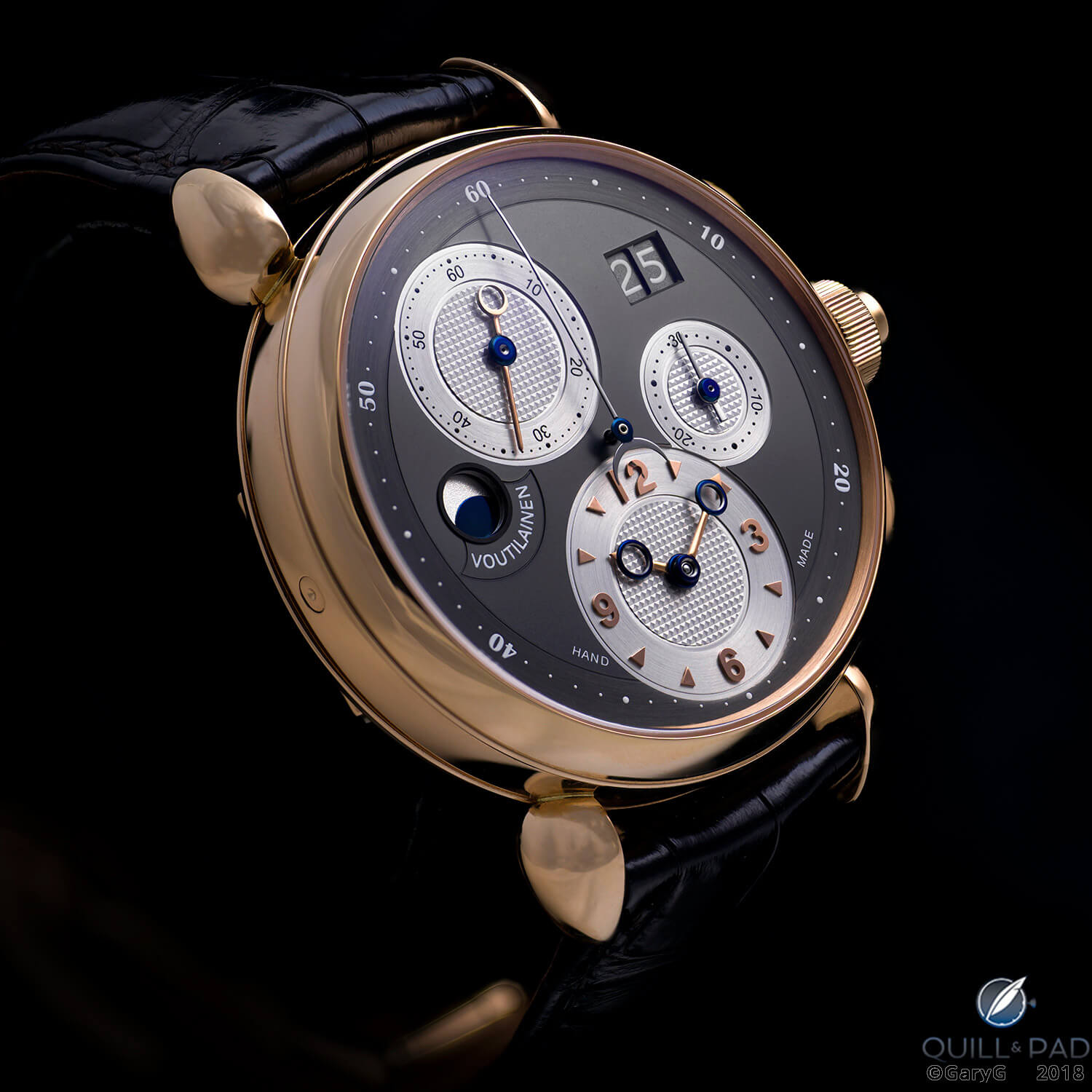
The dark side: dial of the author’s unique Voutilainen Masterpiece Chronograph II
As you can see in the photo above, I went quite strongly with a pink gold theme, including the execution of the time-indicating hands and applied hour and minute markers in that metal.
Those little pink gold triangles caused a lot of trouble!
I really wanted applied markers and at the same time favored a triangular shape. Voutilainen insisted on ensuring the stability of the markers over time by equipping each marker with two tiny feet to ensure that they would not spin. This in turn set a minimum size for the triangles, and it wasn’t until I saw the finished watch that I was fully at peace with the relative sizes of the triangles and applied numerals.
Other members of our group opted for a variety of configurations within the confines of the lower portion of the dial, including printed numerals and markers rather than applied ones, smaller circular applied gold dots that required only one mounting post, the addition of tiny dots for the individual minutes on the time subdial, and even the omission of Voutilainen’s signature “Hand Made” inscription.
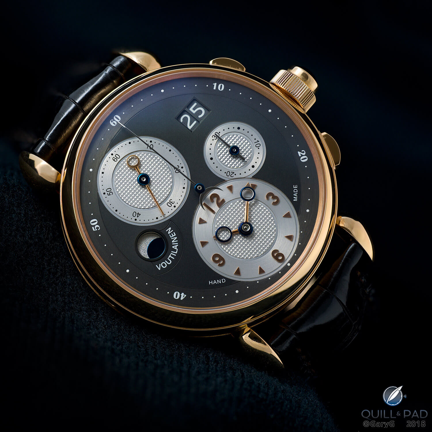
Both shiny and dark: dial side of a pink gold Voutilainen Masterpiece Chronograph II
The dial of my watch ended up with a look that is somewhere between dressy and sporty due to the way that the light catches the circular brushing on the various rings and a texture on the main underlying dial surface that is somewhat on the reflective side of matte.
The chronograph hands in silver rather than blue add a bit more pop, and while there are days on which I wish we’d ended up with a softer overall look there are many more on which I’m really pleased with the final result.
Even the small frame around the moon indication, which Voutilainen added to our watches to what formerly was a more open aperture with sloped sides, is very much to my taste and a good example of the impact that small changes can make to the appearance of a watch.
What about the back?
The custom touches on these watches extend to the movement side as well.
My pal’s watch is faithful to the finishing motif of the first series Masterpiece Chronographs, with frosted and spotted plates and bridges in gold contrasting with the brushed and polished steel levers, bridge caps, and balance cock.
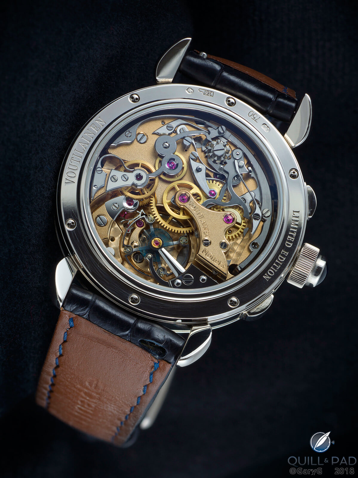
Movement view, Voutilainen Masterpiece Chronograph II in white gold
In the detail view below, I’m struck by how beautifully the polished and beveled plate and bridge edges make transitions into Voutilainen’s peerless frosted finish; and of course, the sharp peaks, crisp interior angles, rounded “tourbillon style” balance cock, and black-polished finishes are just mind-blowing.
And while you’re at it, take a few seconds to check out the striking blue hairspring with its hand-crafted Breguet and Grossmann curves.
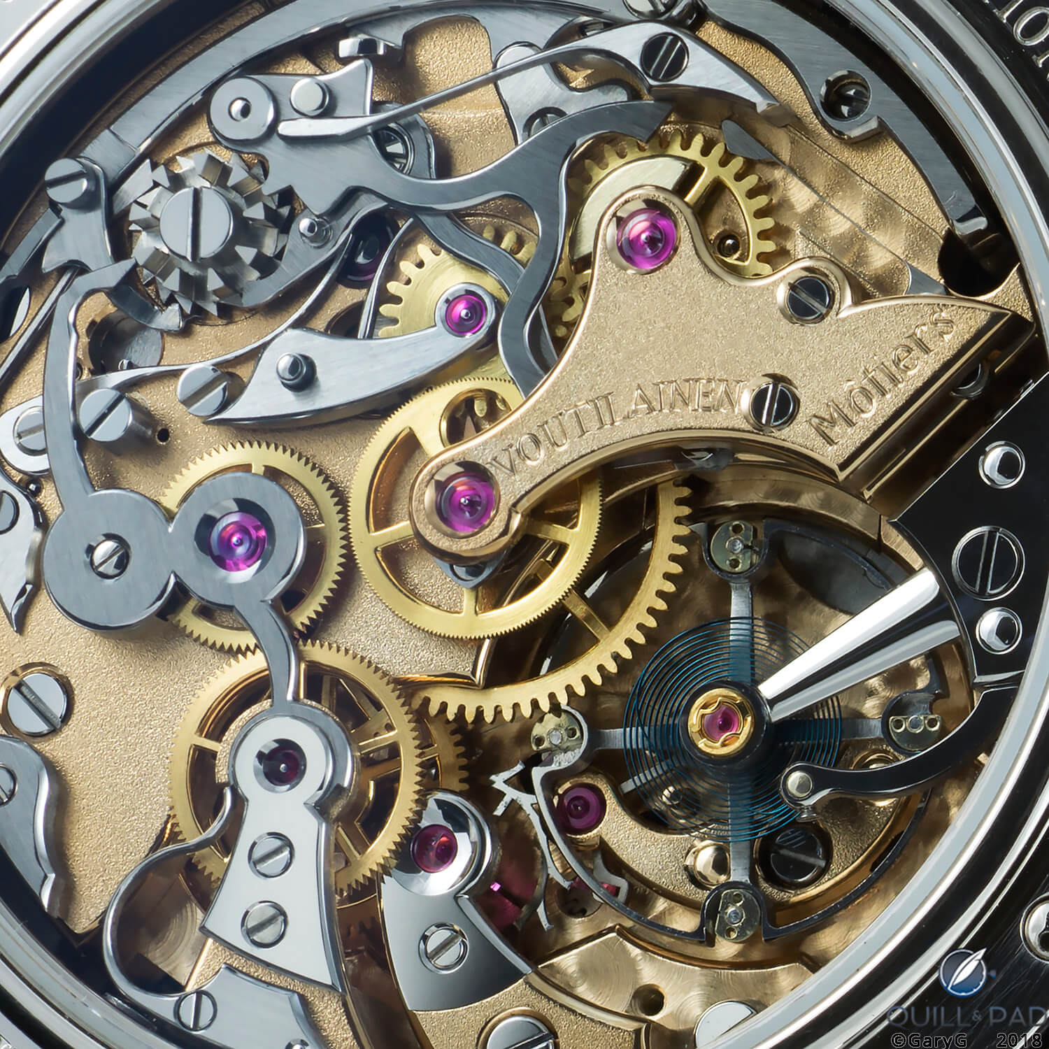
Movement detail, Voutilainen Masterpiece Chronograph II
With the pink gold of my case I wanted a different look, and as a result my watch is the only one in the series with rhodium-plated plates and bridges. While in my friend’s watch the contrast is between gold plates and steel components, in my watch the largely silver-colored movement is offset by the gold-toned wheels and contrast with the colored case.
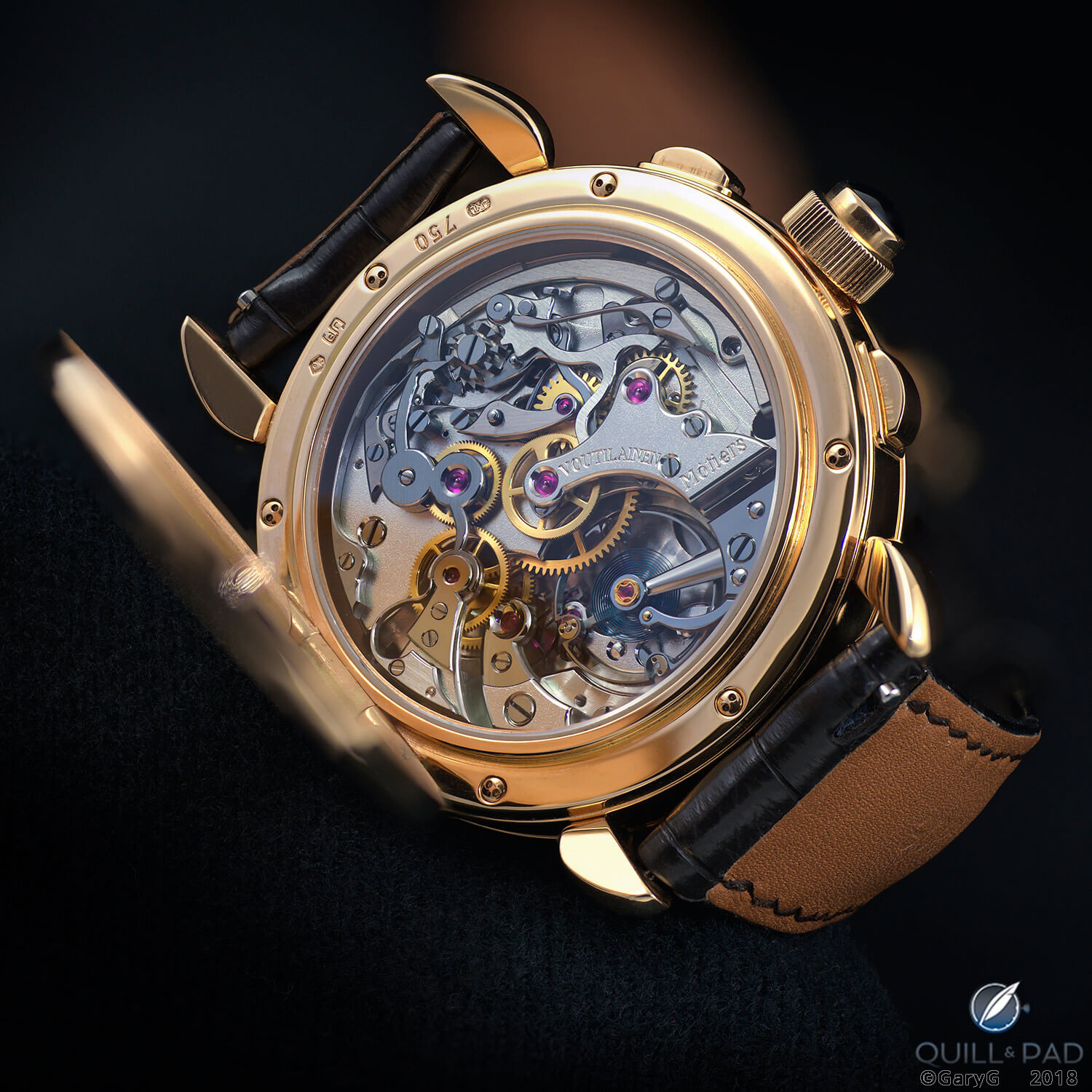
Case back view, unique Voutilainen chronograph in pink gold
While I like the way my watch looks, I have to say that I really love the warmer look of my friend’s piece!
That said, it’s somewhat likely that a gold-colored movement in the pink gold case might be a bit too much of a good thing, so there’s no risk of me asking Voutilainen for a do-over.
One unique aspect of my watch about which I have absolutely no reservations is the officer back, engraved by Eddy Jaquet with a motif depicting Chronos, the Greek god of time.
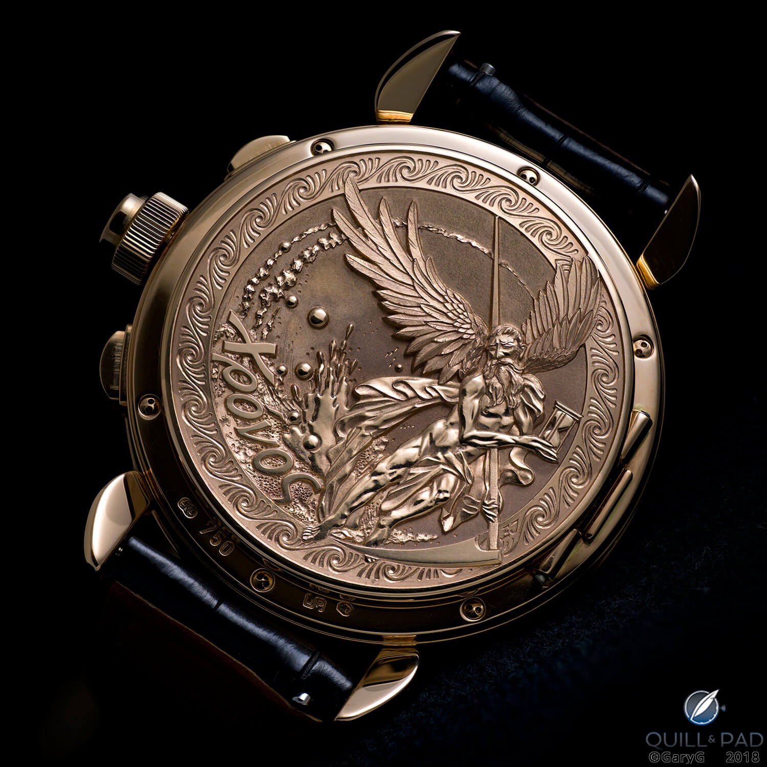
Unique engraved case back, Masterpiece Chronograph II by Kari Voutilainen
I can’t imagine how Jaquet could have done a better job on this, and every time I wear the watch, I’m grateful to Voutilainen for finding a way to incorporate a hinged back on a case that was not originally intended to have one.
Shooting the Voutilainen Masterpiece Chronograph II
As is my habit these days, I shot the images in this article with the Hasselblad X1D. The shots of my pal’s watch were executed as single exposures with the Nikon 85mm PC-E tilt/shift lens, and I photographed my watch with the Hasselblad XCD120 macro lens utilizing multi-image stacking.
While stacking allows for more variation in position and perspective, and the Hasselblad 120 macro is superbly clean and sharp, I’m still a fan of the shadow rendering and “live” look that single-image photography allows. I’ll continue to practice with both, and in future Behind the Lens articles will continue to share what I’m learning.
As for the watches themselves, they are a pleasure to shoot, with different camera and lighting angles revealing different aspects of color and tone. I’m particularly happy that Kari updated our watches with anti-reflective crystals, as that also makes a big difference in the ability to eliminate unwanted reflections while introducing just a touch of glare as desired for contrast.
The beauty of bespoke craftsmanship
It’s always a privilege for me to handle one of my friends’ custom chronographs. The craftsmanship is always tremendously pleasing to the eye, and considering the small choices that each member of the group made makes the viewing fun and helps me to understand more about them as individuals and collectors.
Which one of these pieces speaks to you? And what did you see in the photos that I may have missed?
I’ll look forward to reading your thoughts in the comments below.
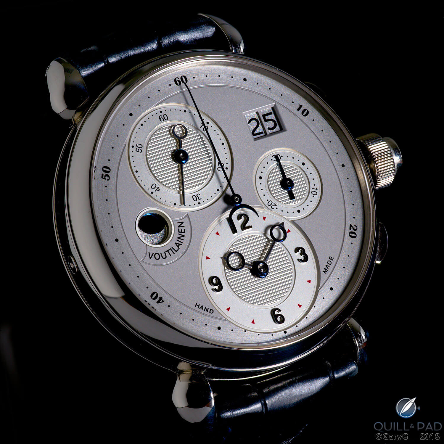
Parting shot: Kari Voutilainen Masterpiece Chronograph II in white gold
For more information, please visit www.voutilainen.ch/item/masterpiece-chronograph-ii.
Quick Facts Kari Voutilainen Masterpiece Chronograph II
Case: pink gold, white gold, steel, or platinum, 40 mm, one watch with unique officer case back engraved by Eddy Jaquet
Dial: 18-karat gold dial in a variety of color schemes (black, anthracite, silver, blue) with applied or printed indices and printed markings
Movement: manually wound Caliber 25Q with gold or rhodium plating; 55-hour power reserve
Functions: hours, minutes, subsidiary seconds; large date, 30-minute chronograph, moon phase display
Limitation: limited series of 10 watches
Production year: 2013
Price: not disclosed
* This article was first published on June 30, 2018 at Behind The Lens: Two Unique Masterpiece II Chronographs From Kari Voutilainen.
You may also enjoy:
Commissioning A Watch: My Journey With The Kari Voutilainen Masterpiece Chronograph II
Sounding Off: A. Lange & Söhne Zeitwerk Minute Repeater vs. Kari Voutilainen Masterpiece 8
Kari Voutilainen 217QRS With Retrograde Date: Striving For Perfect Beauty






















Leave a Reply
Want to join the discussion?Feel free to contribute!