How To – And Not To – Photograph A Watch
by GaryG
One of the great pleasures of being a contributor here at Quill & Pad is that it gives me an excuse to set aside other priorities on a regular basis and immerse myself in the world of macro watch photography.
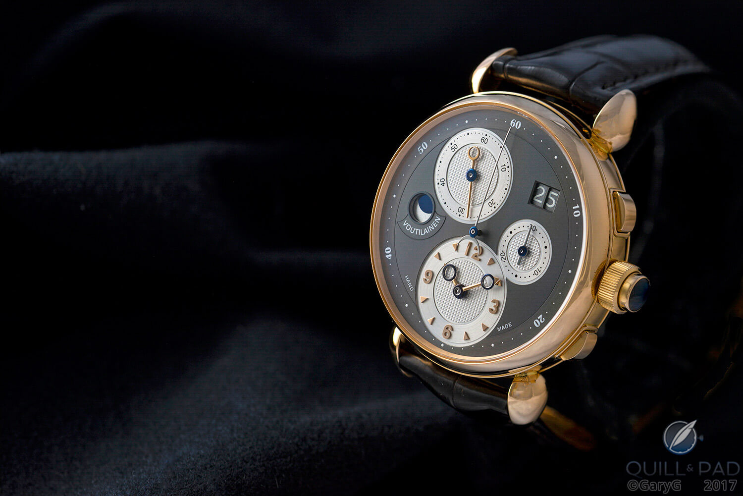
Shooter’s delight: Kari Voutilainen Masterpiece Chronograph II
The results are great fun to share, and along the way I’ve been asked by a number of folks to reveal some of the techniques that I use to create the images you see in my articles. While space won’t permit a comprehensive tutorial, and I’m going to light tent shooting rather than wristshots or other types of images, I’m pleased to pass along some of the wisdom that I’ve been fortunate to receive over the years as well as talk about some pet peeves of mine when looking at my own and others’ photographic efforts.
Ming and the four things
I’ve been shooting on a fairly regular basis for more than ten years now and, among other things, have benefitted greatly from the tutelage of watch collector, professional shooter, and now watch entrepreneur and occasional Quill & Pad contributor Ming Thein (see Design Your Own Watch? A Collector Explains The Pros And Cons With Ochs Und Junior).
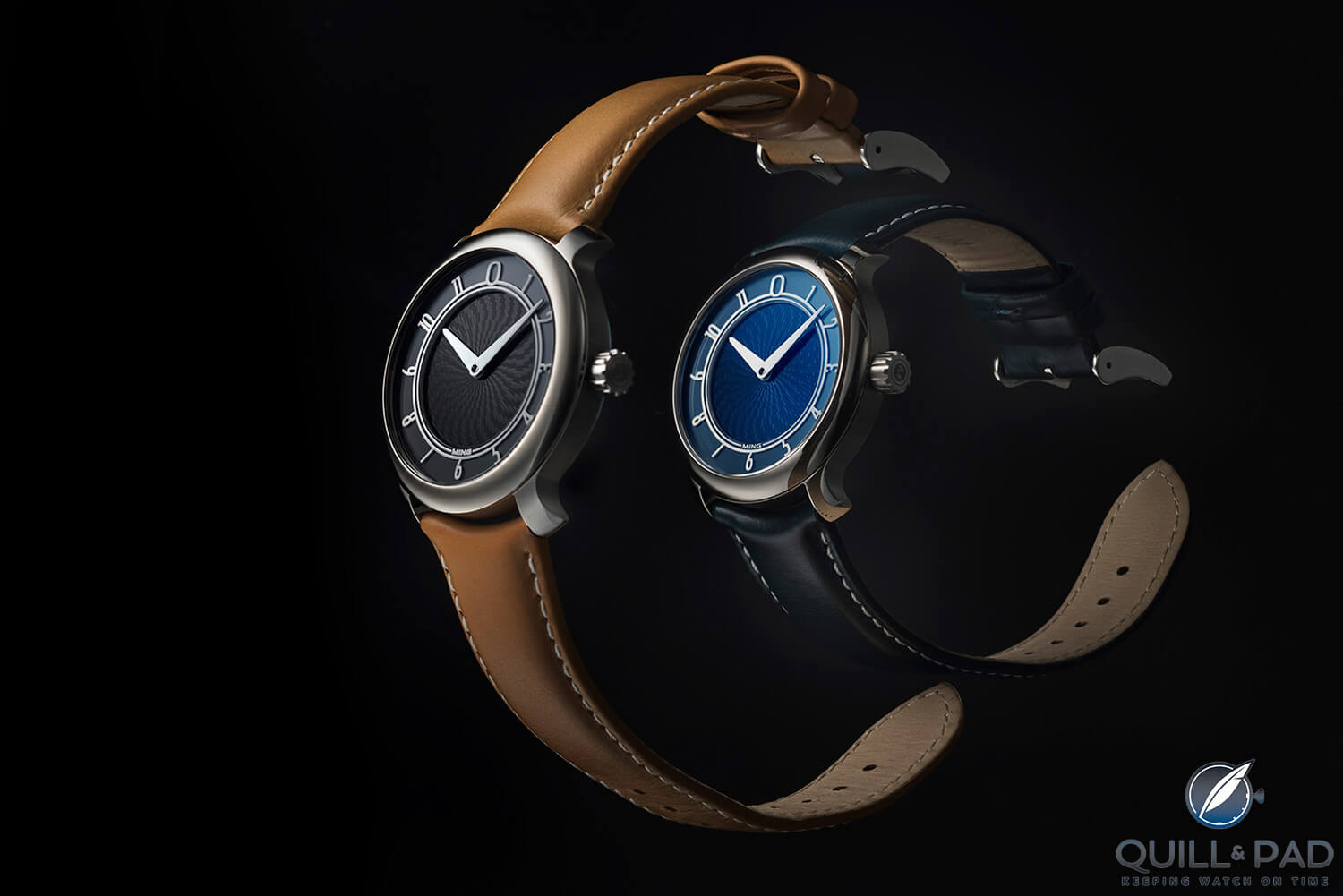
A teacher’s influence: Ming Thein’s photo of the MING 17.01 (photo courtesy Ming Thein)
If you’re a photographer of any stripe and you haven’t already done so, I strongly recommend that you read Ming’s article on the four things that make for an excellent photograph. Here they are in abbreviated form:
- Light (and shadow): the directional lighting that brings depth to two-dimensional images and in macro work brings us inside the mechanical world of the watch.
- Subject and isolation: ensuring that the subject of the image is obvious and clearly distinct from other elements of the photo.
- Composition: using objects and space in a considered way to create interest.
- Idea/story: capturing imagination and evoking emotion.
It’s all about the light
Light is first on the list for a reason: if I look at my own images and divide them into ones I like versus the “meh” category, good lighting is by far the leading determinant.
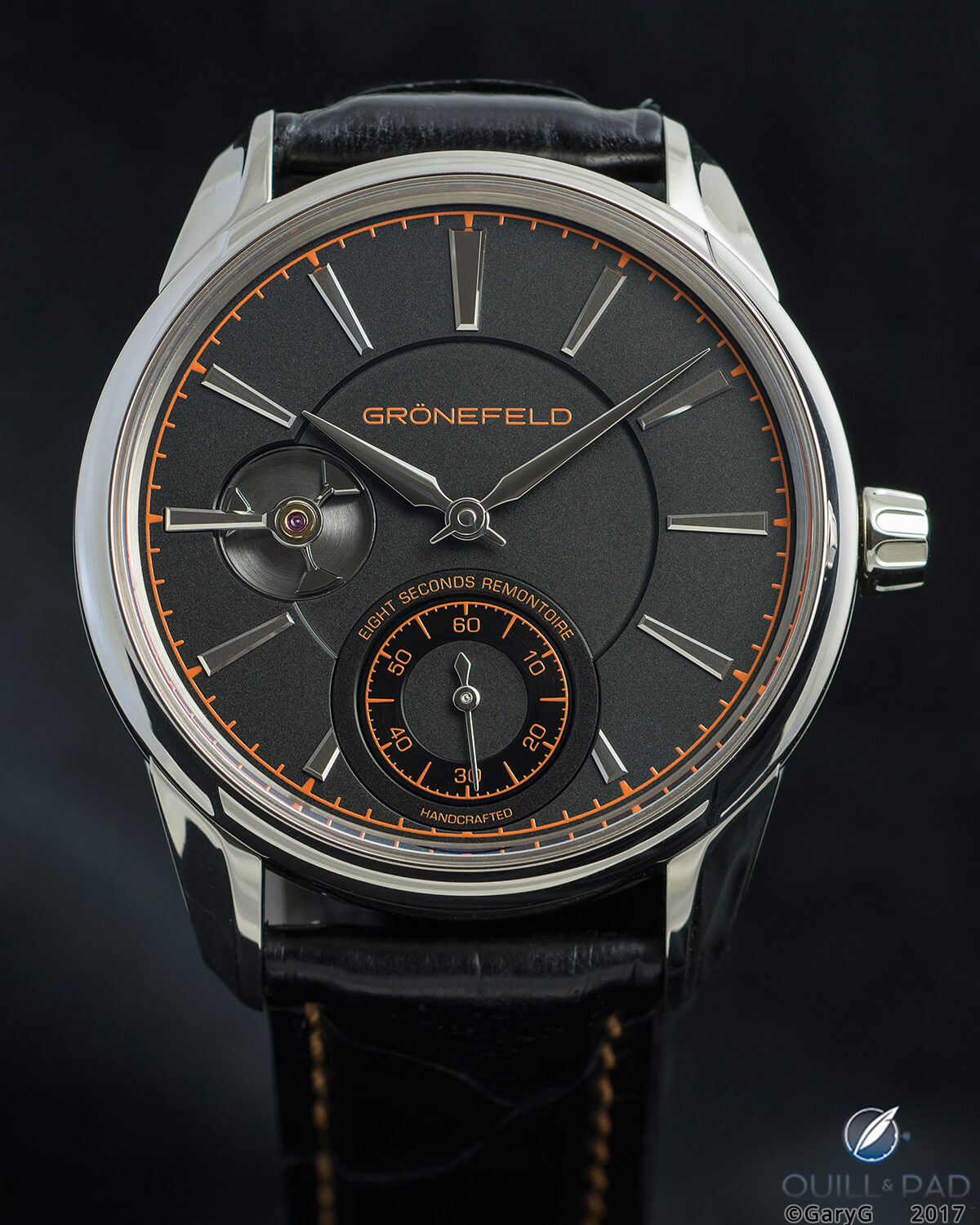
All about the light: Grönefeld 1941 Remontoire
In the photo above of Tim and Bart Grönefeld’s splendid 1941 Remontoire, the light is directional enough (with a dominant light shining from the left and a fill light from the right) to give a sense of dimensionality and make the highlights pop. It is bright enough to make the strap visible and to keep the black dial from appearing as a murky blob, and at the same time diffuse enough that the bright case and applied markers are not “blown out” visually.
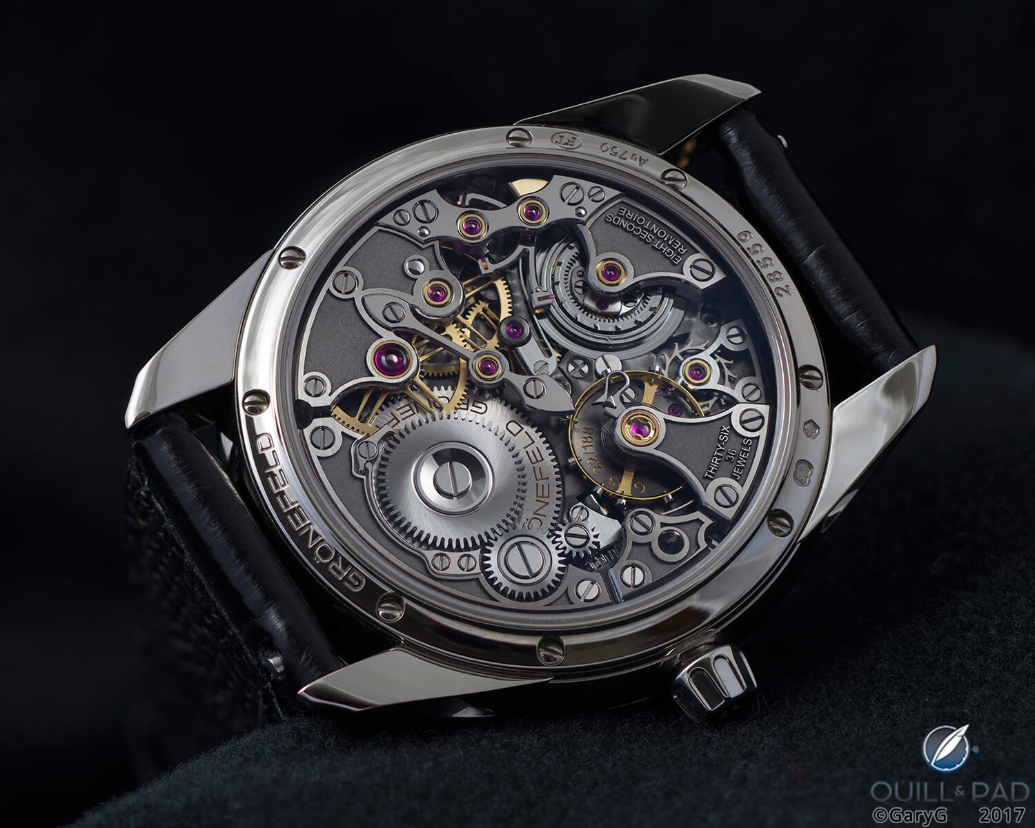
Directional yet diffuse: movement of the Grönefeld 1941 Remontoire
Trust me, making all of that happen at the same time was not easy!
Directional yet diffuse light was also the secret to the image above of the reverse of the same watch; it would have been really easy to blow out the lugs on the left side, and in fact in several of the shots I took the light from the right, which was too bright, making those lugs scream “look at me!” when of course that isn’t what the shot was supposed to be about.
Scattered light can be your friend or your enemy: I spent years figuring out how to banish the light reflected from watch crystals from my images and then slowly re-introduced scatter to give a sense of depth to some images, particularly those of dark-dialed watches.
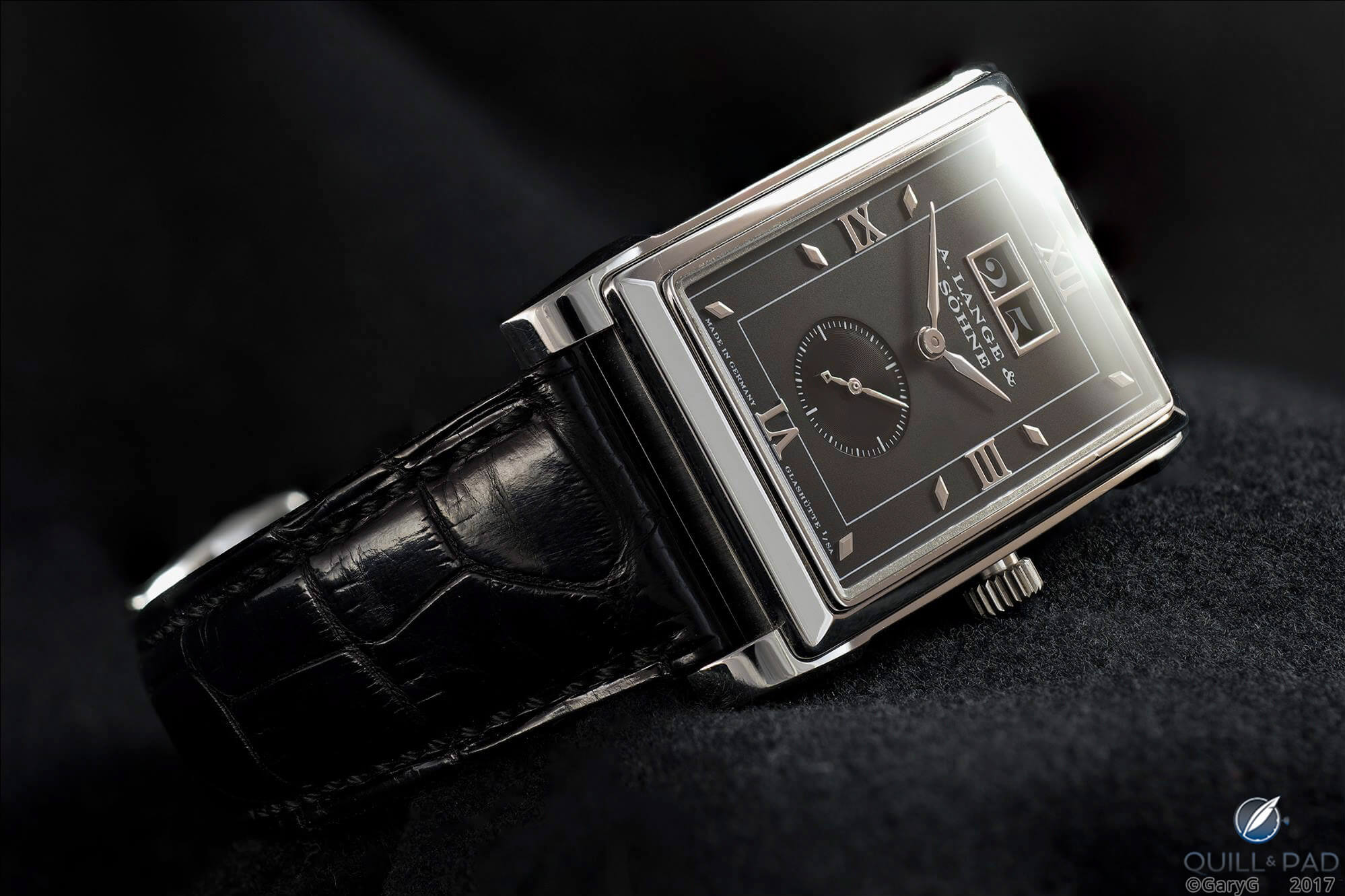
Scatter shot: A. Lange & Söhne Cabaret in platinum
Early on, I really struggled both with directionality and blowouts, and the latter is a real pet peeve for me when I look at watch photos posted online. In the worst cases, photographers overwhelm watches with too-bright and ill-placed flashes that make us look everywhere except where we should.
Isolation ward
That brings us to the second “thing”: making sure that the viewer’s eye is drawn to an evident and clearly isolated subject.
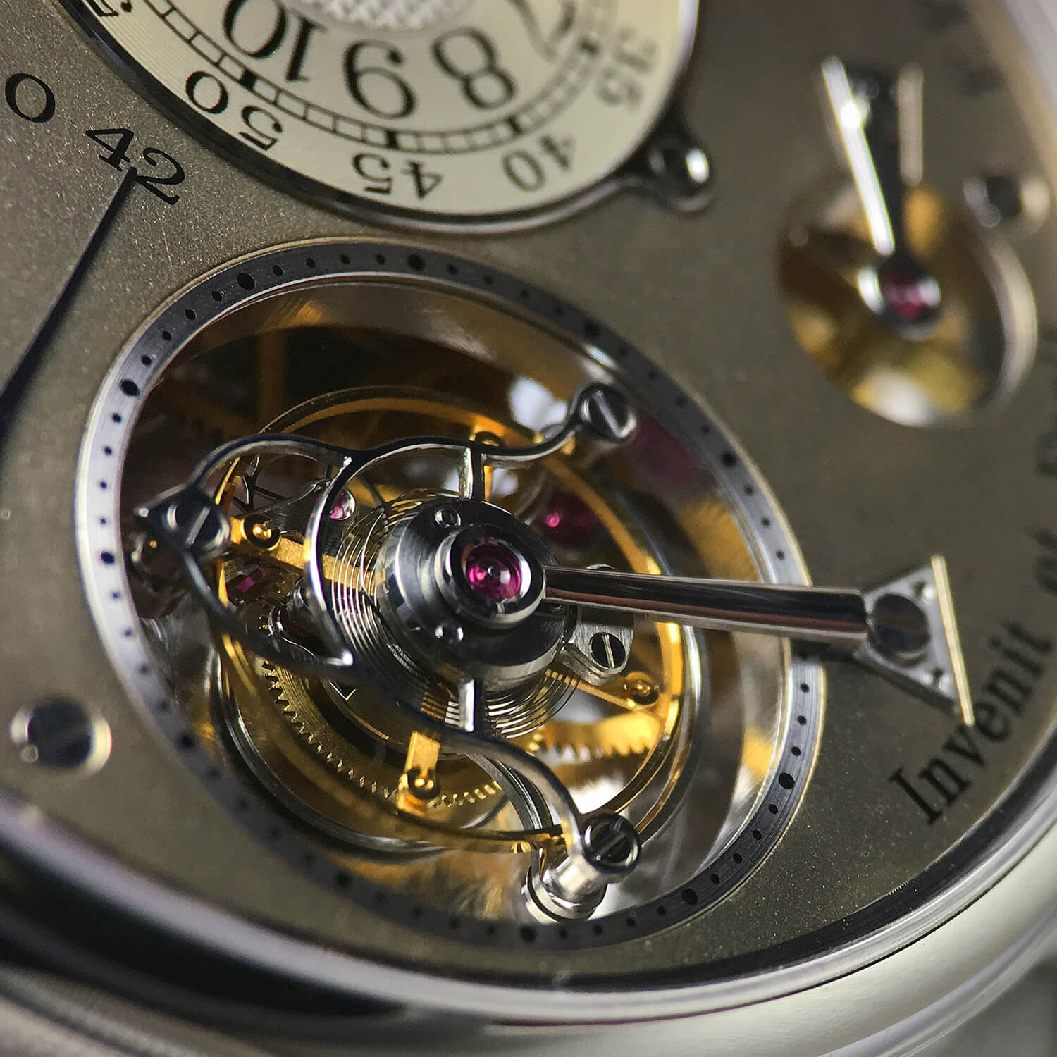
A photo about nothing: F.P. Journe Tourbillon Souverain
It would be tempting to label my photo above “tourbillon detail,” but in reality it’s not at all clear from my use of focus and lighting what the subject is supposed to be. The balance spring and its anchor as well as the number 42 seem to be in focus, but otherwise this image is sort of a mess (and, by the way, some of the cage highlights are blown out).
Just because a photo is a super close-up with some blurry bits doesn’t make it art! Pet peeve number two for me is the plethora of watch photos online that bear titles such as “escapement view,” but in them the escapement is a blur and some irrelevant wheel elsewhere in the movement is in sharp focus.
For comparison, take a look at the photo of the constant torque mechanism of the Romain Gauthier Logical One below, in which it’s pretty evident what we are supposed to be seeing.
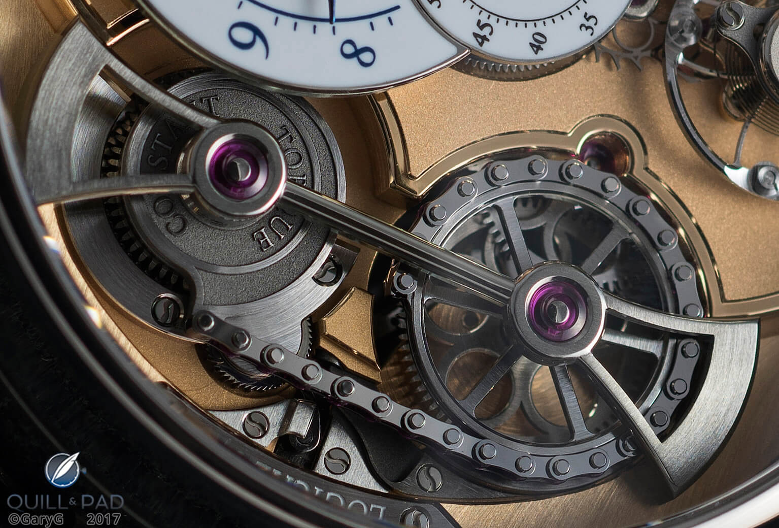
Constant torque mechanism, Romain Gauthier Logical One
At the extreme, subject isolation can also communicate mood. Quite often, the “parting shots” I use in my articles are fairly moody and use both light and depth of field to draw our attention to one element of the watch.
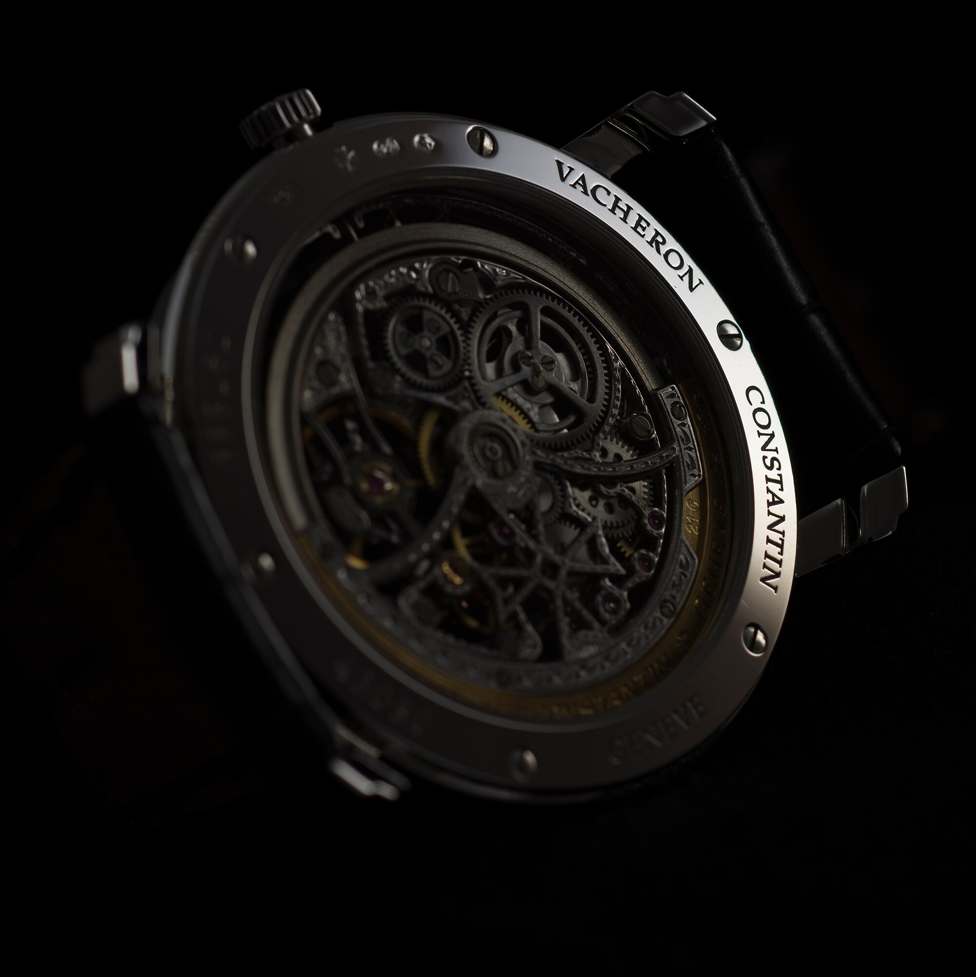
Subject isolation: Vacheron Constantin Malte Squelette
Composition class
I doubt that I’m going to bring much in the way of news to the classic topic of composition other than to say that while I was a bit concerned at first that studying the formal rules of composition would somehow make me “less creative” as a photographer.
That fear turned out to be completely unfounded as having a structured starting point has actually freed me to try some unconventional approaches.
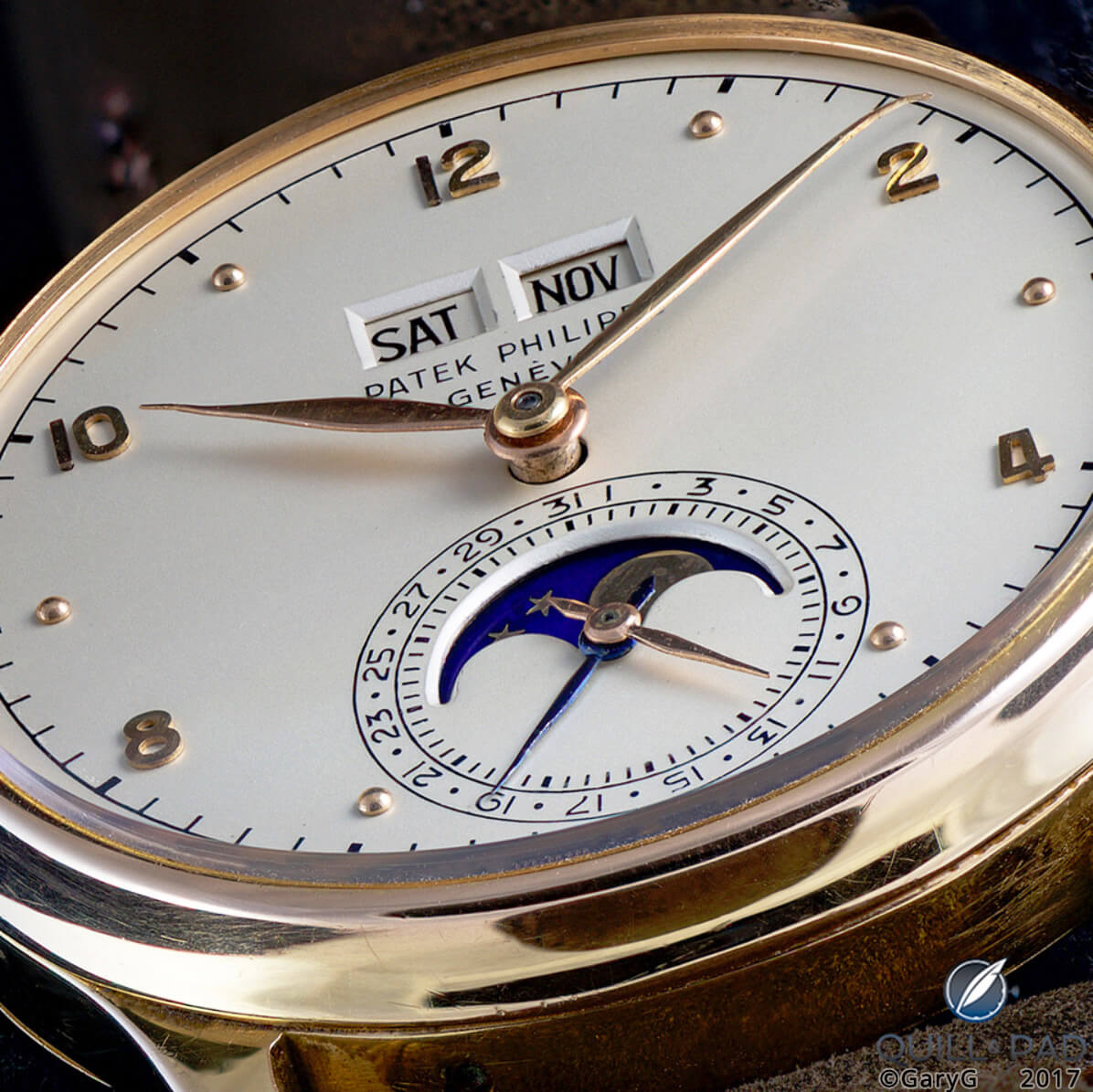
Filling the frame: Patek Philippe Reference 1526 Perpetual Calendar in pink gold
I like filling the frame with steeply raked views of both movements and dials, as in the photo above (which is actually a stacked image built up from several individual shots), but like my teacher Ming I also enjoy using negative space as I did in the first photo in this article and in the Jaeger-LeCoultre Futurematic shot below.
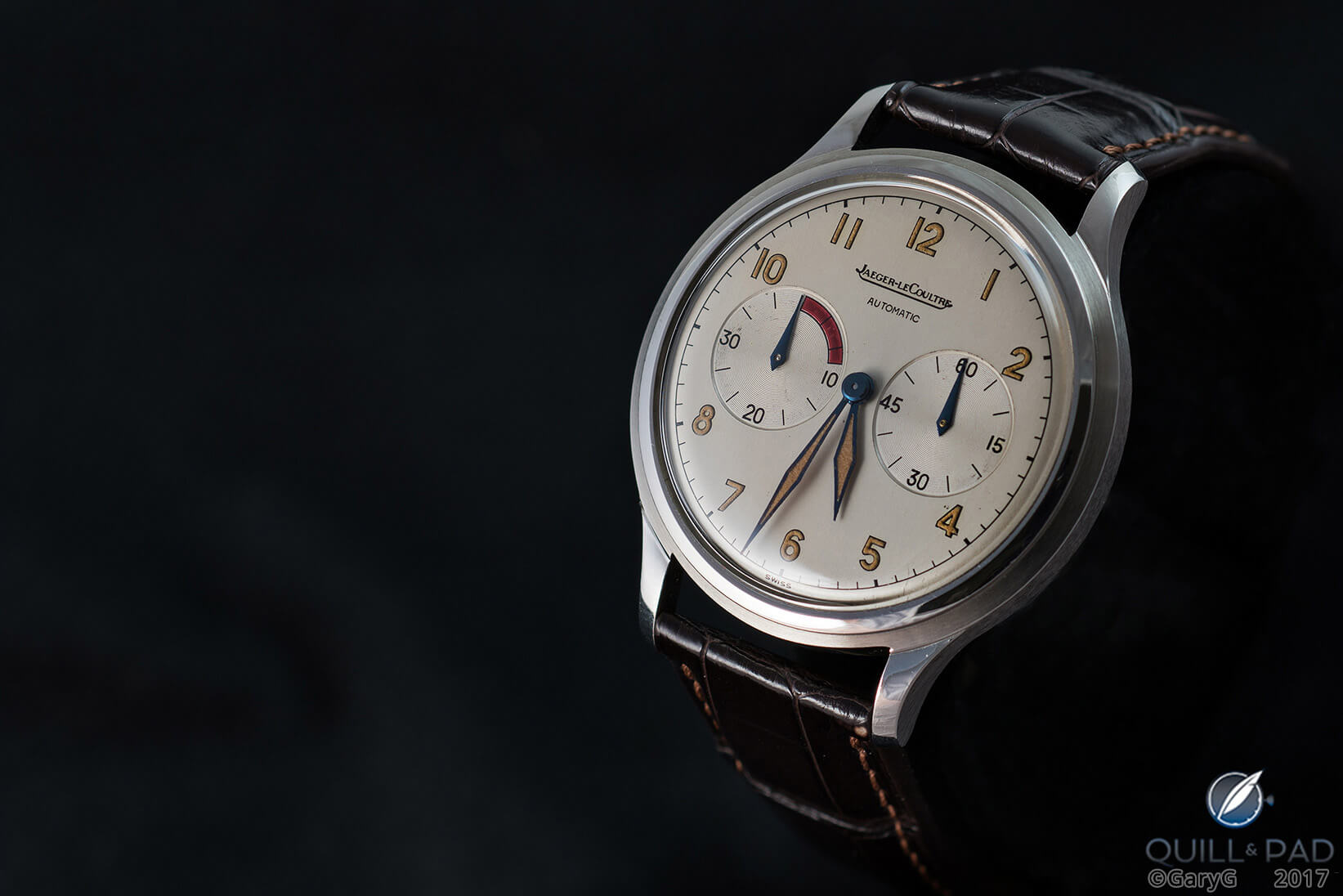
(Not) lost in space: Jaeger-LeCoultre Futurematic Jumbo in stainless steel
Props can both lend interest to a shot and help with composition. I’m still in the early stages of getting really comfortable with props, but not too surprisingly my emerging style is a fairly sober one in which one or two props support (in some cases literally) the watch that is the center of attention.
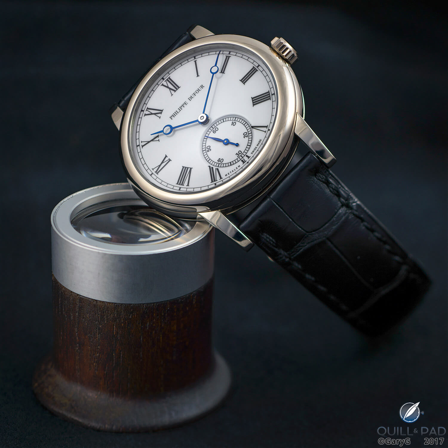
Propped up: Simplicity by Philippe Dufour
At the end of the day, pleasing composition is about what looks good to your eye as the photographer, and I’m not reluctant to put some shots out there that look great to me but that may seem fairly unconventional.
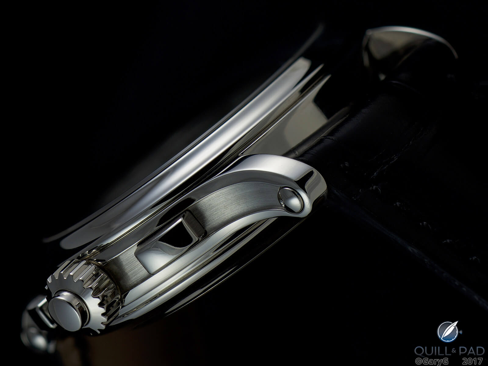
Case profile view: Patek Philippe Reference 5370P
For instance, the image below of the sweeping lines of the Patek Philippe Reference 5370P’s case breaks a lot of the classical rules, but it looks just right to me and (at least for me) communicates my appreciation of just how beautiful this hunk of metal is.
(Not) every picture tells a story
For that final bit of gravy, think about what idea or story your image conveys about your watch and what it means to you.
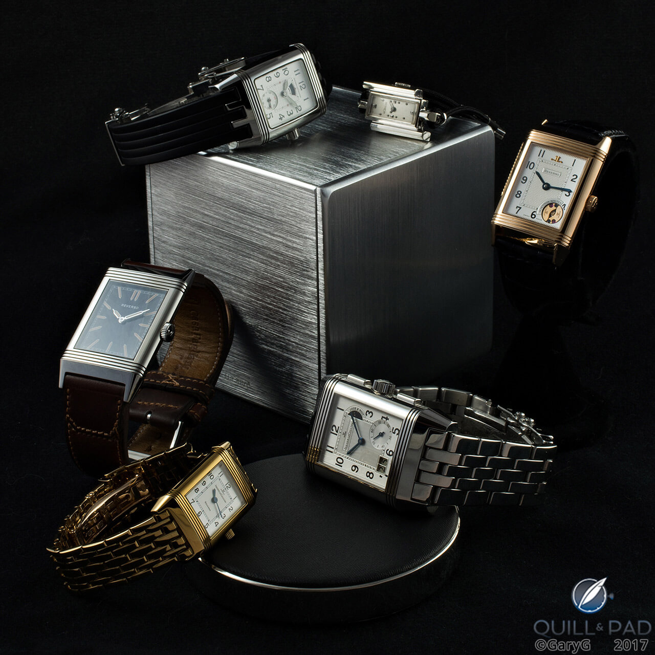
Hip to be square: rectangular Jaeger-LeCoultre watches
Sometimes the theme is immediately evident and can be supported by the use of appropriate props; other times all you need is the right watch and the right light, as in the shot of the F.P. Journe below that at the same time reveals both the watch’s age and lifetime of use and its stunning, textured yellow gold dial whose subtle patina is the beautiful result of that same experience.
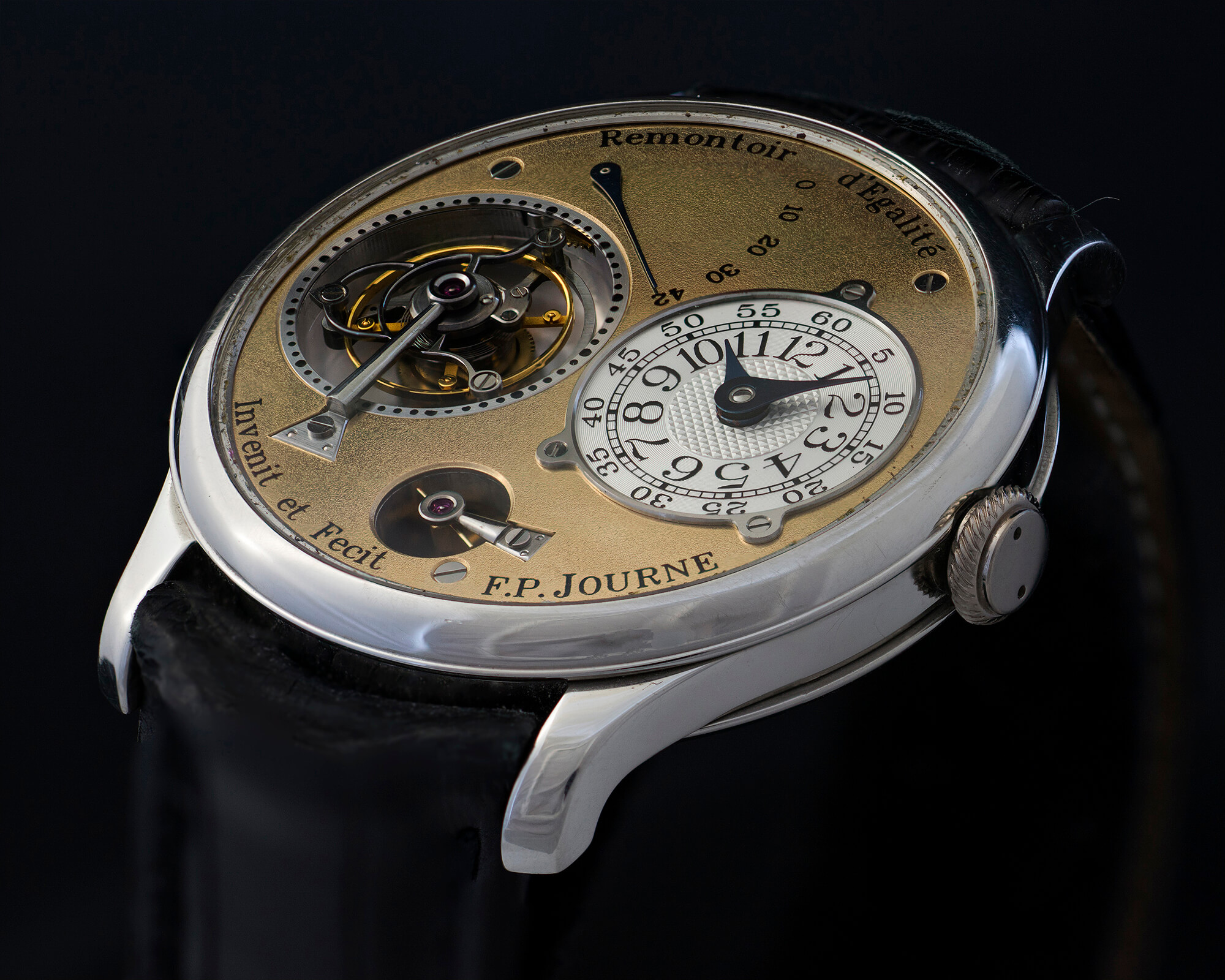
Distinguished veteran: early F.P. Journe Tourbillon Souverain
On those flattering occasions when folks see fit to compliment one of my photos, what I hear more than anything else is that it’s evident from my images that I simply love watches.
And for me, perhaps that’s the best “idea” of all: presenting these lovely objects in a way that expresses my love for their beauty and appreciation for their makers.
Parting thoughts and parting shot
Anything else? Perhaps just a few more thoughts on dos and don’ts:
- For goodness’ sake, clean the watch! I typically spend 30 to 60 minutes cleaning a watch before starting to shoot, and even then I find that there are always a few (or more) specks of dust – or all too often, a stray cat hair – that need to be removed carefully from the final image. Pet peeve number three for me is when someone who should know better posts “studio” images of a watch that has obviously not been cleaned.
- Post-process with prudence: my rule of thumb is to make the watch look as natural as possible first before doing anything dramatic with post-processing adjustments. The Internet is full of over-sharpened, contrast-laden images – while (in my opinion) clear focus is essential, harsh sharpening is ugly.
- Check those hand positions: 10:10 (or 1:50 for A. Lange & Söhne) are the traditional positions, but if that obscures something you want people to see, consider other options such as the 5:32 I chose for my Futurematic shot.
- Be selective: as Ming says, they can’t criticize the photo you don’t post! If you shoot for a couple of hours and have nothing you’re proud of, learn as much as you can from it and move on. If you have five great shots, post two first and come back to the others a day or two later to be sure.
- Try new things and practice! The great news for us enthusiasts is that we’re not professional shooters, so our signal-to-noise ratio can be fairly low. Try shooting a single watch in one position with ten different lighting setups and go from there.
Most of all enjoy!
I hope that at least some of these musings are helpful to you and I look forward to reading about your own views and experiences in the comments section below.
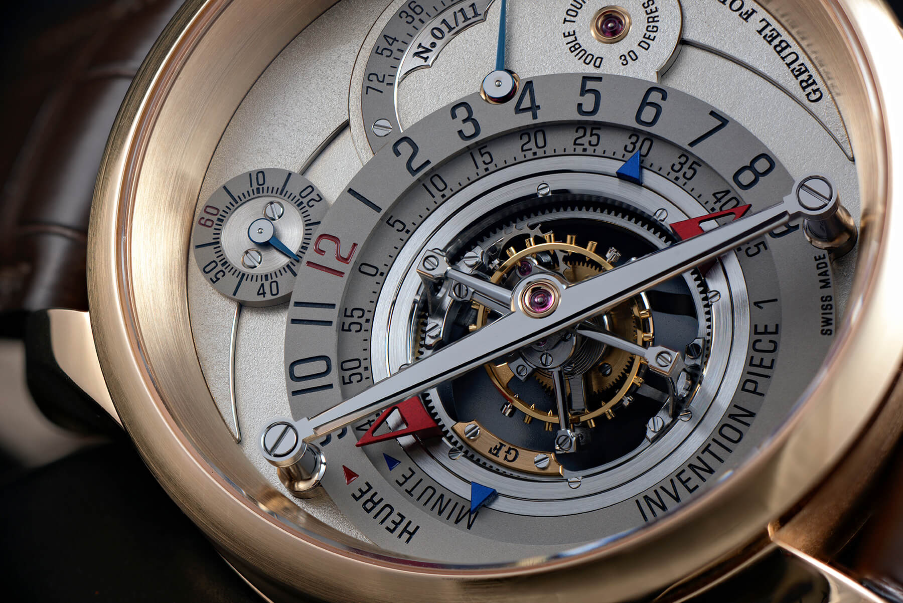
Parting shot: double tourbillon, Greubel Forsey Invention Piece 1
* This article was first published on October 14, 2017 at How To (And Not To) Photograph A Watch.
You may also enjoy:
Behind The Lens: Shooting Watches With The Hasselblad X1D-50C
#mybaselworld 2016: Exquisitely Emotional Baselworld Wristshots Shot With A Leica Q
Leave a Reply
Want to join the discussion?Feel free to contribute!


Excellent article and wonderful photography. As we have come to expect from you, Gary.
I use the light God gives me. I have yet to graduate to making my own. Well apart from a couple of times. I have a small religious statue I wanted to isolate, so I waited until 1am, on a very dark, clear night, then I opened a window and placed the statue on the sill. Then I used a spot-lamp to illuminate and shot with a tripod. That’s about as adventurous as I have become. 😊
It did work though.
I don’t know whether you would agree with me, but I find it almost impossible to repeat the basic photographic rules too often, because as I progress, my understanding of even the most basic concept deepens.