by GaryG
If you spend as much time in watch stores as I do, and over time express a genuine interest in horology, sooner or later that magic moment will come when the person behind the counter or across the desk says, “I have something in the back you might enjoy seeing.”
In “olden days,” that treasure might actually have been available to buy. But that’s a topic for another time. Returning to the present, I was delighted when my favorite local independent watch retailer brought out a very special piece, one of five HM9 Sapphire Vision watches in white gold with a vivid purple movement. And I was even more pleased when I was allowed to take some photos to share with you before the watch was delivered to its happy new owner.
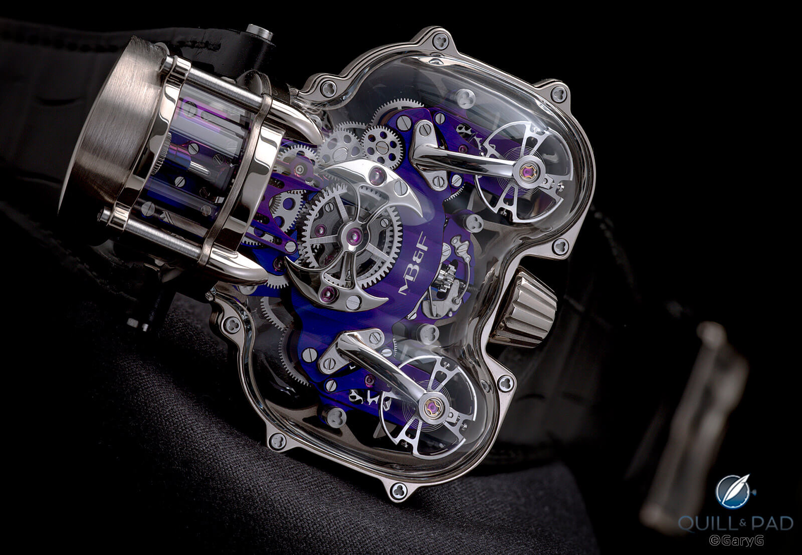
Rare and delightful: Horological Machine No. 9 Sapphire Vision by MB&F
MB&F HM9 Sapphire Vision family
When you’re Max Büsser, how do you top yourself after you’ve launched one of your Horological Machines? Since the days of the HM2, one of the answers has been to introduce variants with cases made largely or entirely of sapphire crystal.
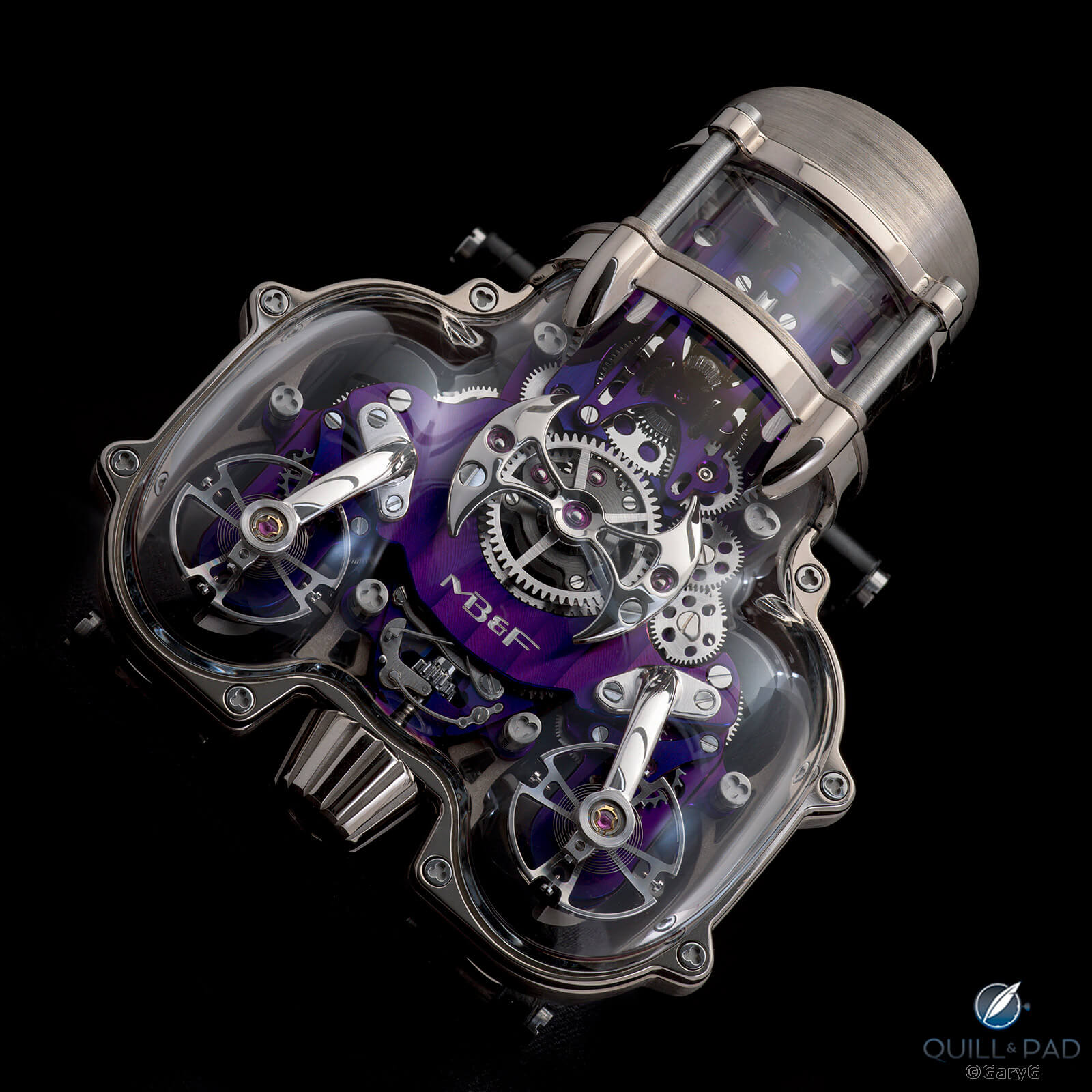
Can’t top this, or can they? HM9 SV from MB&F
I love openworking and skeletonization, so as you might expect these see-through versions of the HM2, HM6 Space Pirate, and other MB&F works have usually appealed to me even more than their metal-clothed counterparts. Once again, with the HM9 MB&F has served up a tasty assortment of sapphire crystal beauties for our slack-jawed amazement: red gold-framed watches with black or blue movements and white gold editions with red gold-plated or purple movements, each in a strictly limited edition of five pieces.
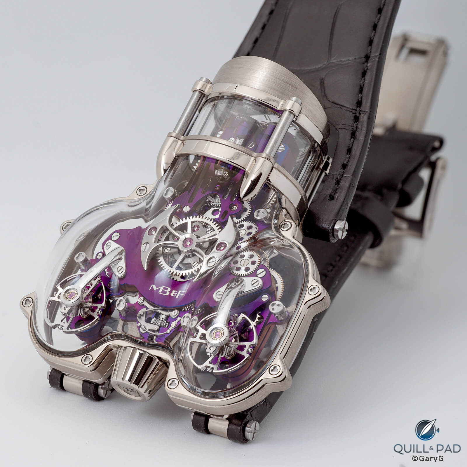
All access: clear view of the MB&F HM9 SV movement, courtesy of the sapphire crystal case
In photos I’ve seen they all look great, but I’ll confess that I’m particularly pleased that I had the opportunity to photograph the white-with-purple one.
Playing with light and color
Purple is purple, right? Well, not so fast: as with my personal MB&F piece, the LM101 with purple dial I added to my collection last year, the color you see depends very much on the angle of the watch to your eye and the incident light to the watch.
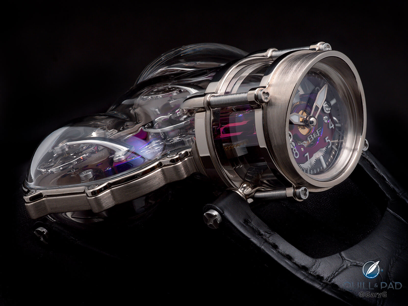
Low angle view of the HM9 SV with red tones
In the image above, for instance, the low-angle view reveals colors toward the red end of the spectrum, whereas in some of the initial shots in the article and in the view below you’d swear that the color is more of a deep blue.
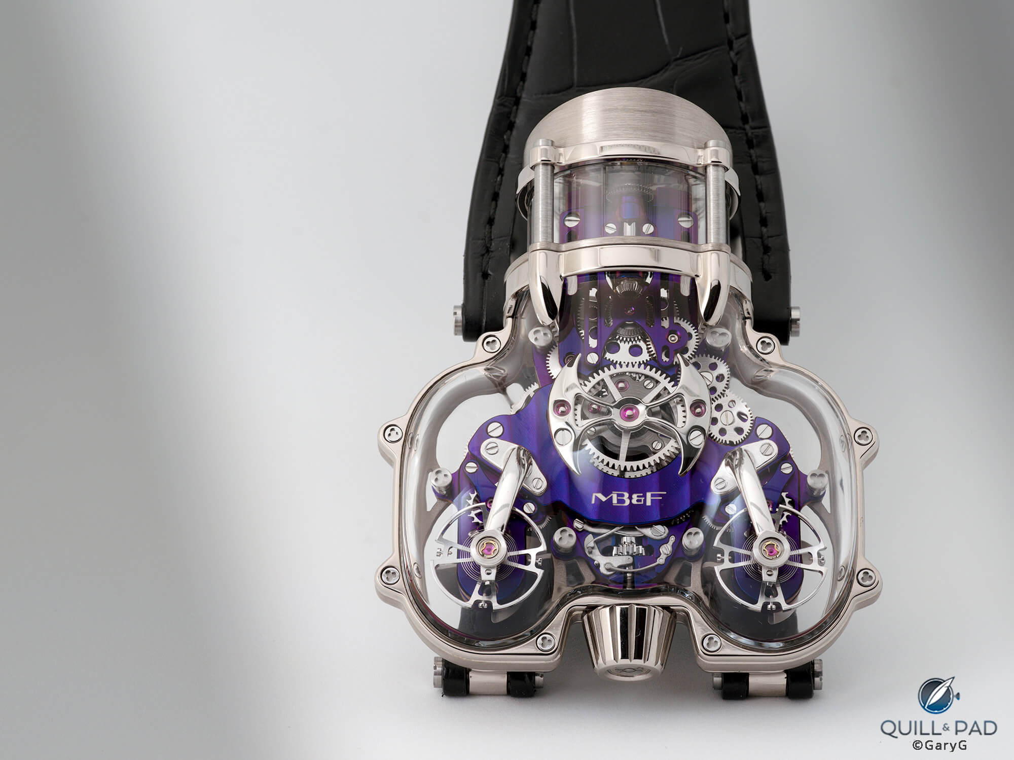
Am I blue? MB&F HM9 SV in white gold with purple movement
Blue, purple, or red? I’m sure that the play of colors is one more reason for the wearer to spend as much time as possible checking out this piece on the wrist.
What time is it?
Speaking of which, what happens when the owner wants to know what time it is? The HM series is famously identified as a group of “machines that also give the time,” so expectations are explicitly set low. As for the HM9 SV, I’ll give a rating of “acceptably legible” even with the see-through dial and visible maze of movement parts behind the hands and indices.
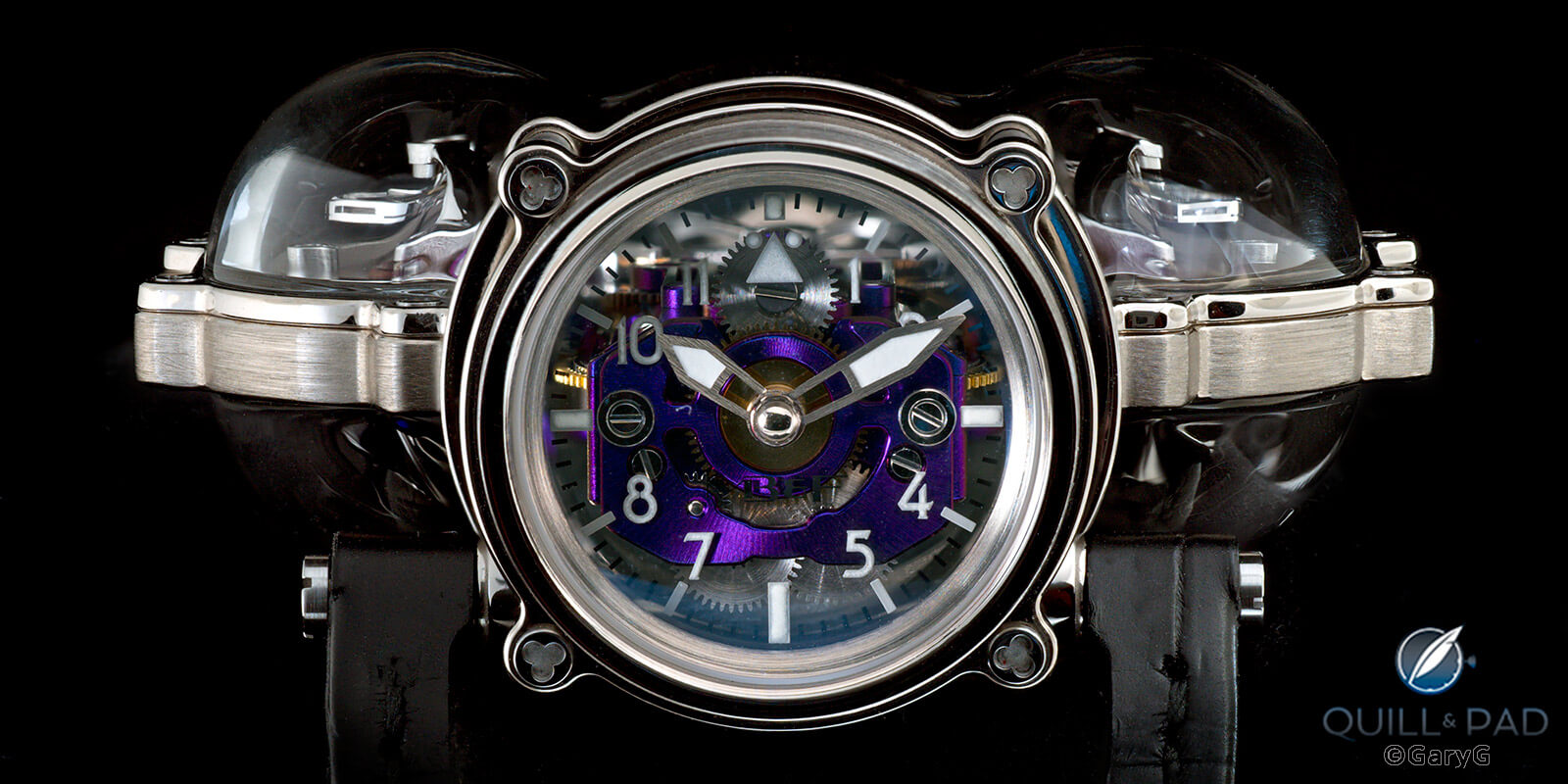
If you don’t have your phone handy, you can use this: time display, MB&F HM9 SV
Ease of reading improves somewhat at an indirect angle and with a brighter background; but if I owned this watch checking the time would be far from my top priority.
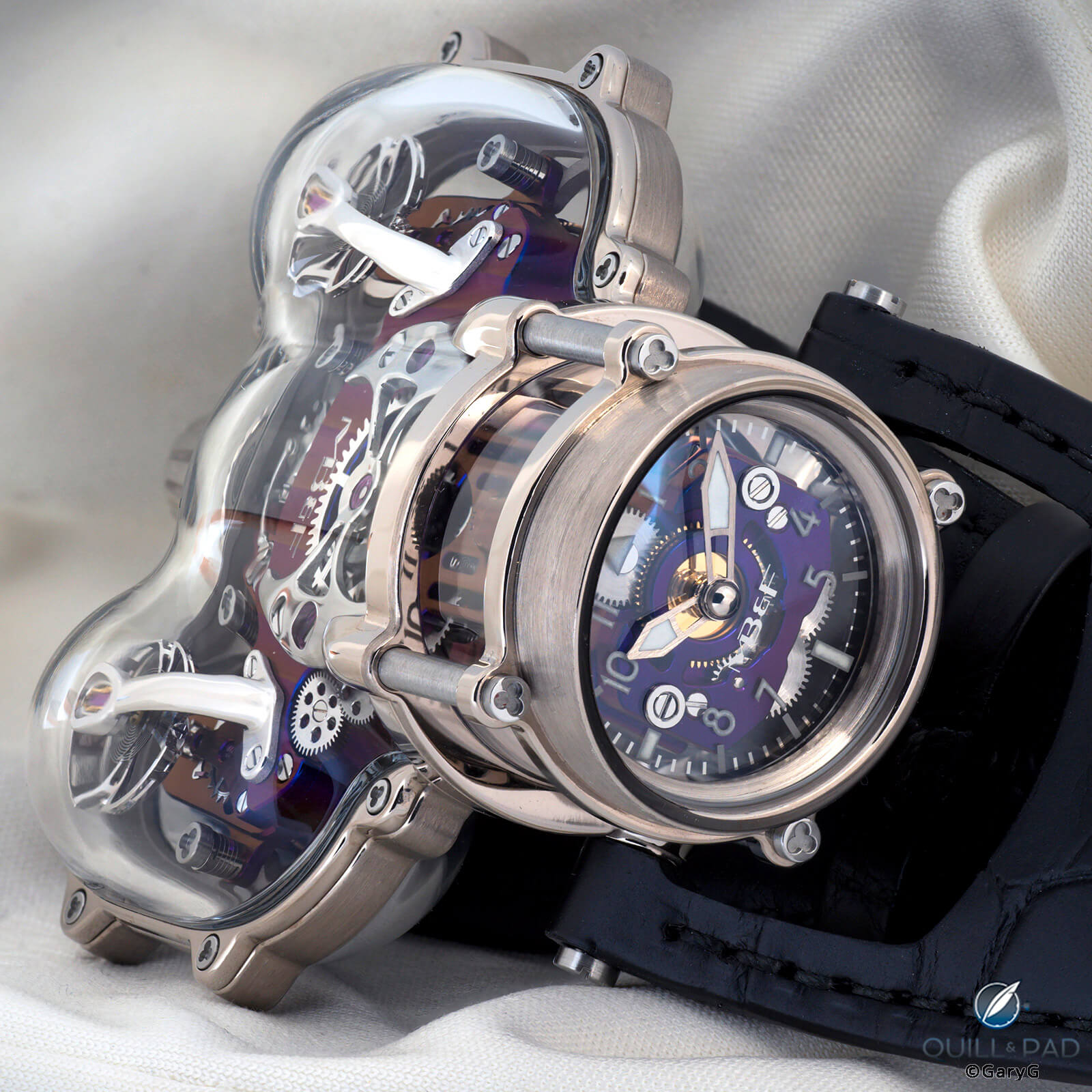
Ready to wear: HM9 SV on the dresser
Visible movement, with a twist (or two)
Flipping the watch over provides another striking vista, with the purple plates of the movement and bright gear train providing plenty of visual interest.
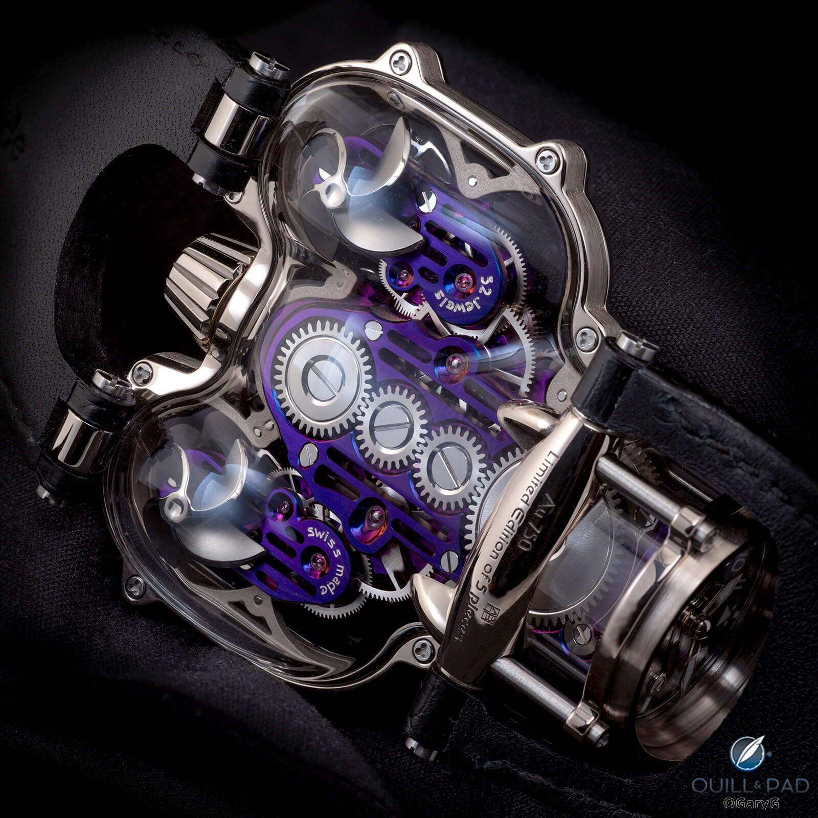
Rear view, MB&F HM9 SV in white gold
For me, the rear of the watch provides an even sharper sense than the front of the profile of the white gold frame surrounding the sapphire crystal elements, and the rear inspires appreciation for the skill needed to design and execute the three-dimensional gasket sealing the sections.
The frame-with-sapphire-crystal construction required a change in case shape from the metal-cased versions of the HM9; as is clearly visible in the photos of the cage profile as seen from the rear, the SV profile is somewhat more squared-off, substituting clear shoulders for the more severely sloped and pointed shapes of the original HM9’s sidepods. I for one prefer the SV as the “flow” of the first-generation HM9 was a bit too organic for my personal tastes.
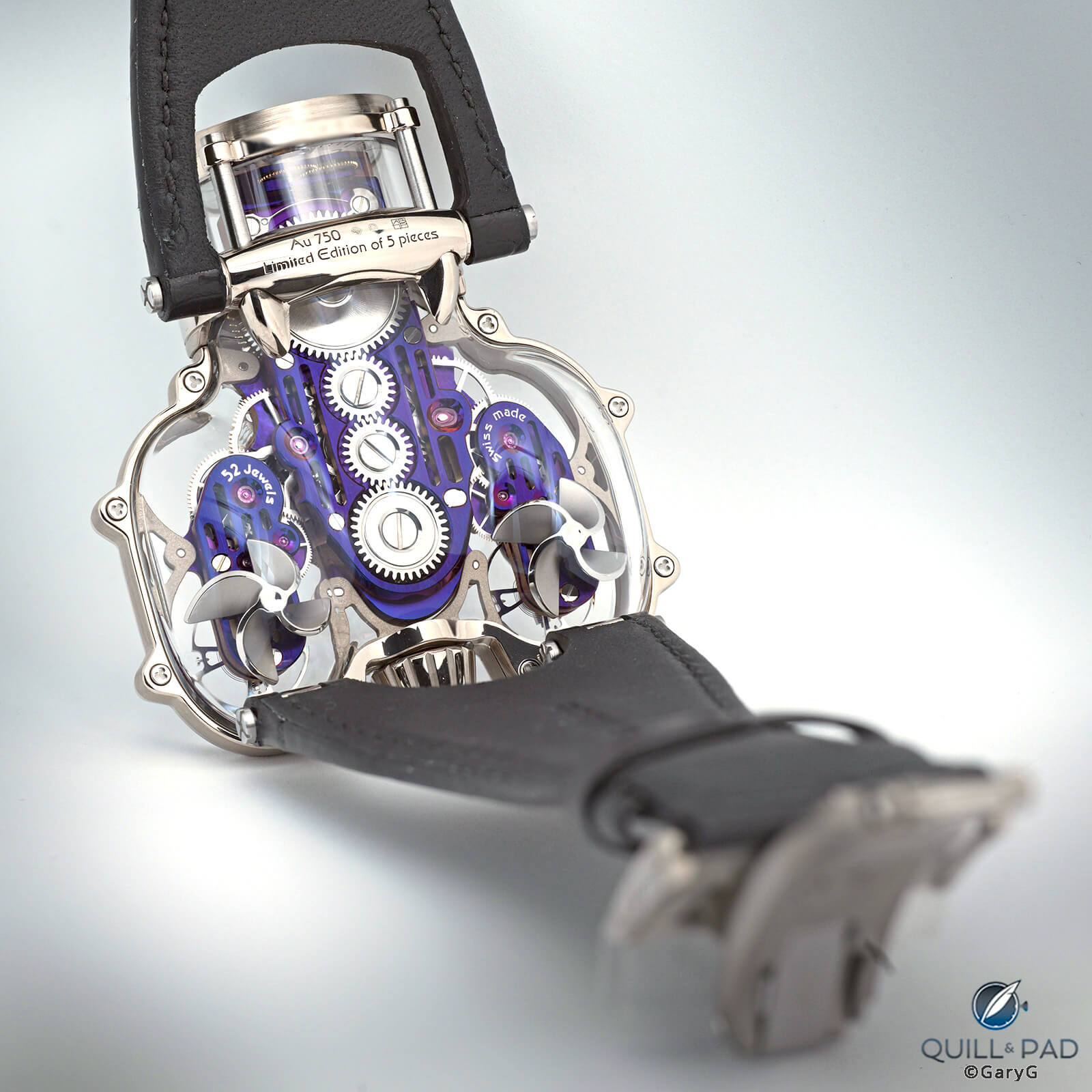
Square shoulders, clear view: reverse of the MB&F HM9 SV
The SV version also differs from the original HM9 in the addition of those two spherical propellers visible beneath the positions of the twin balance wheels on the front of the movement. I wish I’d been in the design meeting for that discussion: “When we make the bottom of the case transparent, people will see that there’s an empty space behind the balances.”
“Wait, I’ve got it. Propellers!”
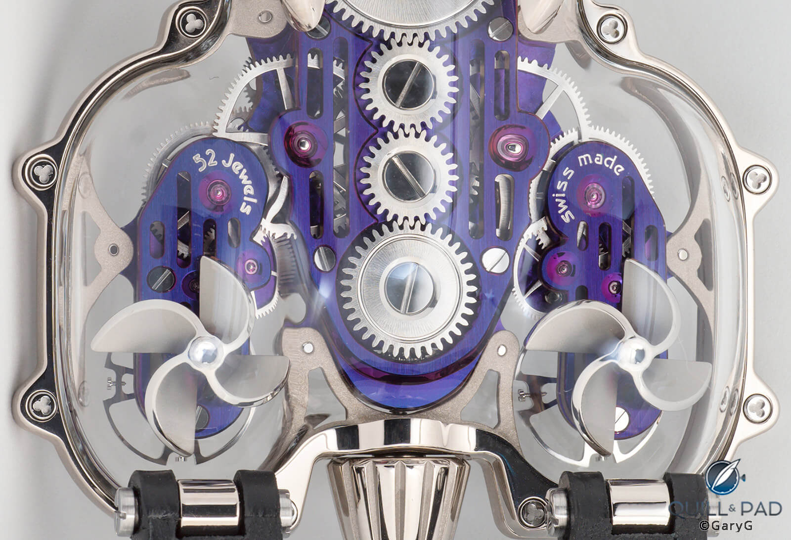
Movement detail, HM9 SV, with propellers visible at bottom
What do they do? As it turns out, nothing other than spin lazily for our amusement as we handle the watch. This is a manually wound movement, and while one initially suspects some sort of involvement in charging the mainspring, the propellers are simply a bit of whimsy.
Horological interest
How have I gotten this far without mentioning the parts of the movement that do function? The two fully independent balance wheels linked by a planetary differential are a serious bit of horological kit, harking back to the Duality-inspired Legacy Machine 2 however implemented here in an entirely new form with rounded balance bridges and a markedly domed battle-axe bridge for the differential, worthy of the reference’s “Flow” nickname.
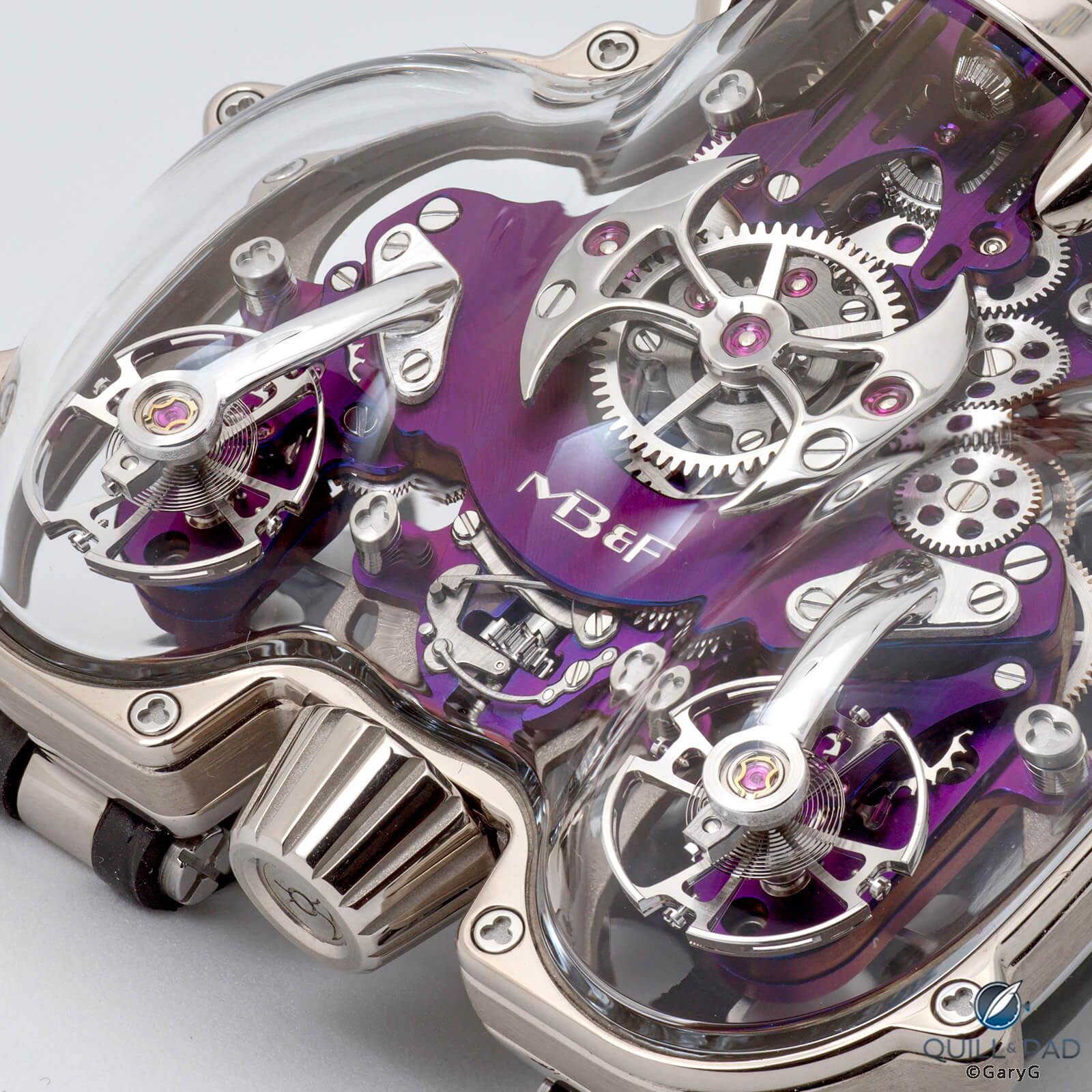
Movement detail, MB&F HM9 SV, with twin balances and planetary differential
I think that sometimes MB&F doesn’t get the credit it deserves for its level of horological sophistication. Whether it’s the inventive layouts and unusual time-regulating mechanisms of the Horological Machines or the world-leading innovation of references such as the Legacy Machine Perpetual Calendar, what we’ve seen from MB&F both in its collaborations with outside movement constructors and in its more recent in-house efforts is a serious demonstration of watchmaking chops.
Family resemblance
While I had the HM9 in hand for shooting, I took the opportunity to photograph it side by side with my LM101 2021 Edition piece to give a sense for how the two compare.
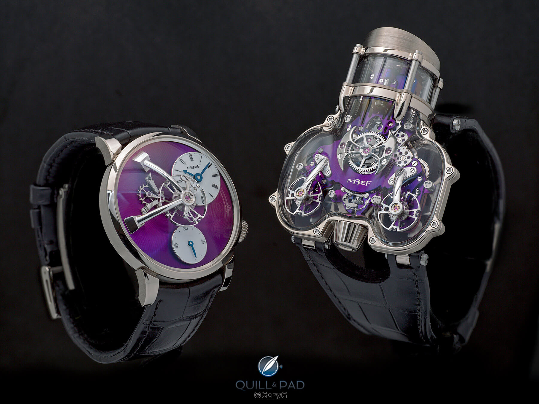
LM vs. HM: the author’s MB&F LM101 and the HM9 SV side by side
While both are white gold with purple, each with features exposed, suspended balances, and definitely an MB&F, the differences in size, shape, and boldness are apparent. The purple hues on the two watches are somewhat different: mine tends more to the red and the HM9 more to the blue. I suspect that it’s not easy to make the tones absolutely consistent from watch to watch, and while I have a slight preference for mine (thankfully enough) I think both look great.
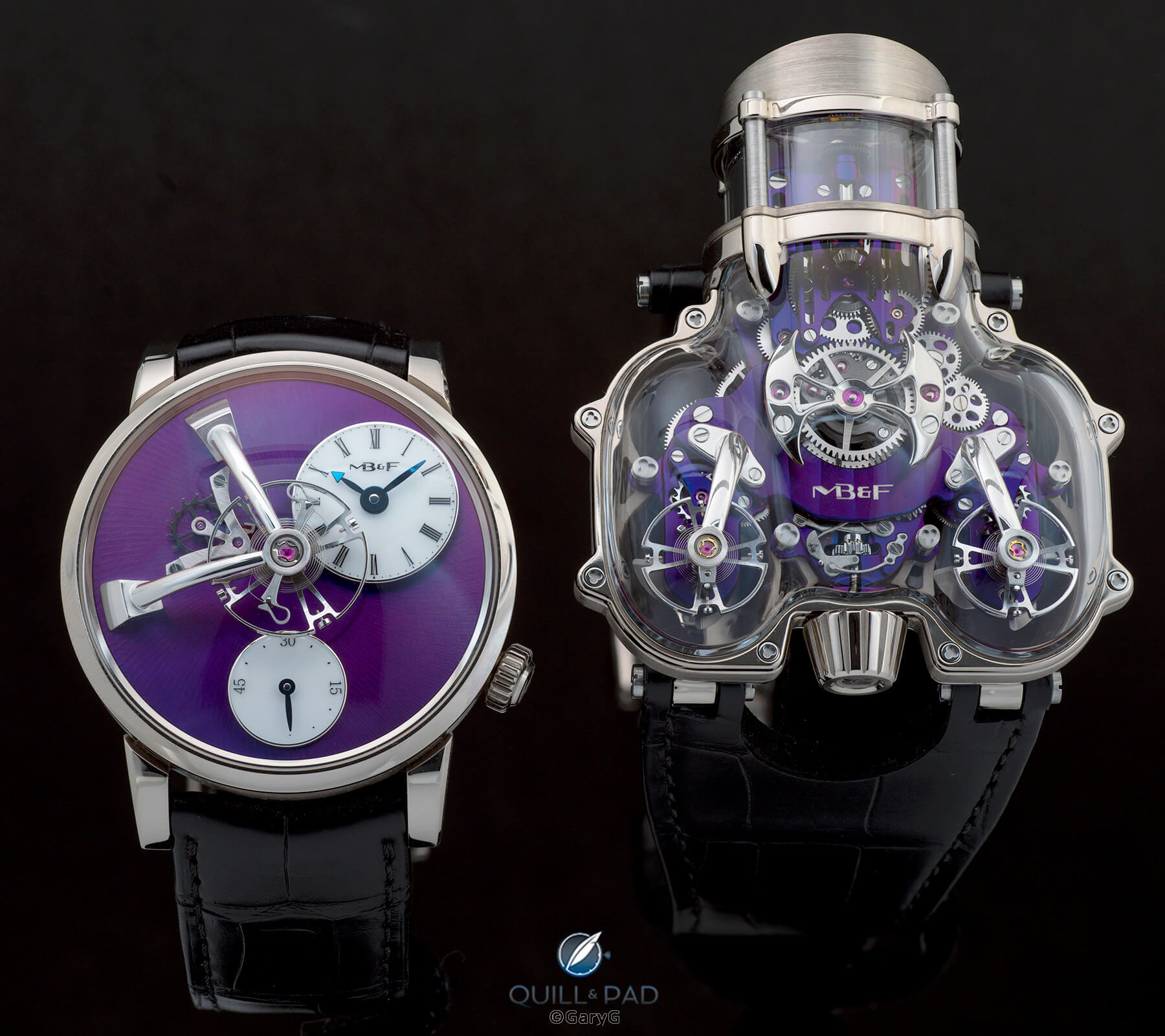
Size differential: LM101 (left) and HM9 SV from MB&F
The scale of the two watches is obviously quite different as well. When you first see the HM9 laid out on a table, it’s a bit difficult to believe that it fits on the wrist at all. But if you look carefully at the photo above and at the earlier case back shots, you can see that the lugs are positioned well under the case at a distance from each other just about right to allow easy wearing.
That said, if anyone tries the old “it slides easily under the cuff” cliché on you when talking about the HM9 you have my permission to look askance.
As a final bit of fun, I positioned the HM9 behind the LM101 in my light tent and took a variety of sets of focus stacked images: the first with the LM in focus and the blurred HM looming behind; the second with the roles reversed; and the third, shown below, with both watches in crisp focus.
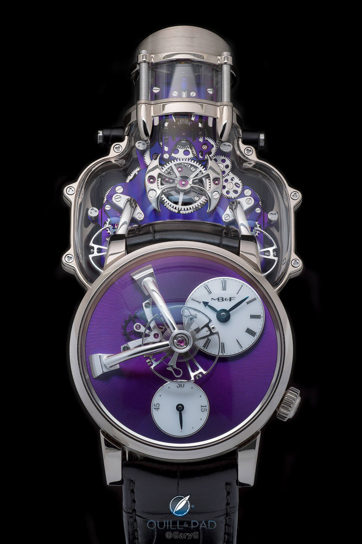
Looming presence: MB&F HM9 SV (rear) and LM101 2021 Edition
Photographing MB&F’s HM9 SV
While the purple plates make for plenty of drama and the anti-reflective coating on the crystals is superb, this is not an easy watch to shoot! Particularly in my preferred style of placing complete emphasis on a watch by photographing it in isolation, it’s tough to show a piece of this shape and size and give a sense of how it looks in context.
I avoided shooting it in the pose used on MB&F’s website – a three-quarter view with the dial pointing down and left – but I suspect that’s the best approach to giving a real-life perspective, short of taking a dreaded “I spilled some coffee beans and put my watch on them” shot to give a sense of scale.
Parting thoughts
I did not take any wristshots of the HM9 SV, both out of consideration for its future owner and due to a slight fear of somehow banging it on something and shattering the sapphire crystal. It’s a gorgeous watch, but could I bring myself to wear it? Even though I’ve never (touch wood) managed to crack or ding a sapphire crystal or even an earlier mineral glass (or Plexiglas for that matter), I suspect that for me this watch might end up being a “sofa piece”: worn while sitting on the sofa watching TV with my left wrist propped up on a soft pillow.
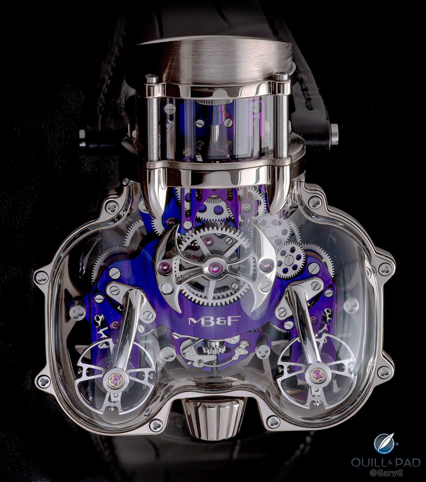
Parting shot: Horological Machine No. 9 Sapphire Vision by MB&F
I suppose that when it comes to MB&F, I’m a more natural Legacy Machine guy than a Horological Machine wearer. That doesn’t mean that I don’t admire those among you who sport these dramatic pieces, and I wish you happy wearing and soft landings!
For more information, please visit www.mbandf.com/en/machines/horological-machines/hm9.
Quick Facts MB&F Horological Machine No. 9 Sapphire Vision
Case: 57 x 47 x 23 mm shaped case with a white gold or red gold frame and three-segment sapphire crystal main case; 30m water resistance
Dial: crystal dial allowing a view of the movement; luminous hands and indices
Movement: manually wound in-house movement; two fully independent balance wheels with planetary differential for rate averaging; dual spherical free-spinning propellers under the balance wheels; 45-hour power reserve; 18,000 vph/2.5 Hz frequency
Functions: hours and minutes on vertical dial display
Limitation: four editions of five pieces each: red gold frame with black or blue movement; white gold frame with red gold-plated or purple movement
Price: $440,000
Production years: 2021-2022
You may also enjoy:
MB&F HM9 Sapphire Vision: MAD Machines Under Glass
Leave a Reply
Want to join the discussion?Feel free to contribute!





















I hold my horses when it comes to MB&F. Somehow, I believe that a watch’s dial should only be used to for telling the time or other functionality. There is no space here for drollery or showmanship. Due to this view I tend to regard MB&F and Jacob & Co to have something in common which is, probably, unfair. Perhaps you can correct me, Gary.
I agree. I think Jacob & Co is especially so. I like the watch more in which the writer of this article has. Watches need to tell time. Otherwise it becomes mostly gimmick. For some though that is ok. Also, this watch has that ever so sensitive sapphire covering which could break easily. That’s something to always worry about when wearing this very expensive watch. So then you can’t even wear it that much?! Just look at it I guess.