Why I Bought It: C By Romain Gauthier Titanium Edition Two
by GaryG
I’m a big fan of Romain Gauthier! After several years of admiring his creations, I took the plunge in 2015 and bought a Logical One. And over the years it has been my pleasure to visit the Gauthier atelier several times and spend a number of happy evenings with one of the truly good guys in the watch world.
Gauthier’s motto is “The evolution of tradition” – with good reason. In his work, he draws on and is faithful to many of the core movement architecture features and finishing practices of his native Vallée de Joux, but at the same time he has developed his own visual language. And he has expanded upon traditional manufacturing techniques by drawing on his own expertise as a micro-mechanical engineer.
Engineering meets micro-mechanical art: C by Romain Gauthier Titanium Edition Two
He’s also an MBA, and it wasn’t lost on him that the watch market has been shifting steadily toward a desire for sportier models. So, it should have been no surprise at Only Watch 2021 when Gauthier showed the first unique example of his new sport line, at the time named Continuum but now shortened simply to C.
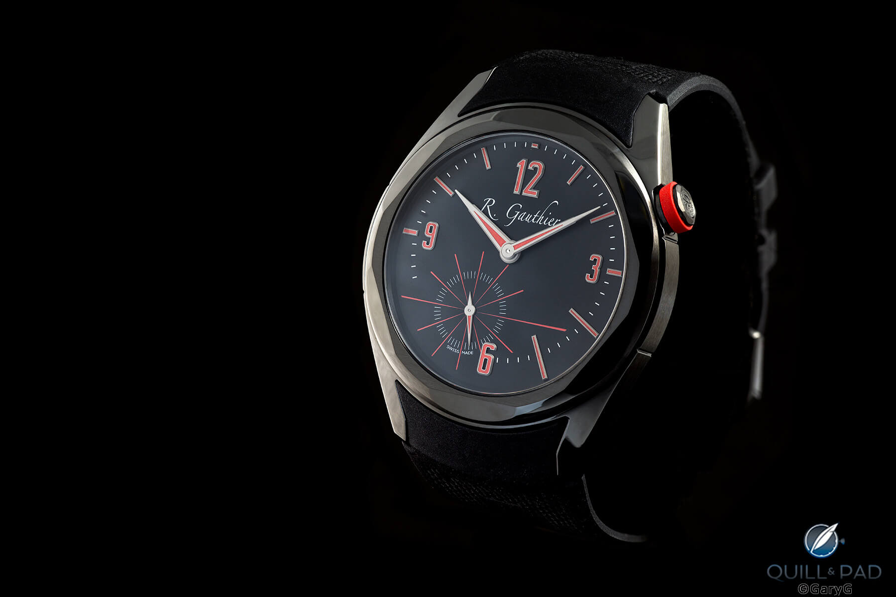
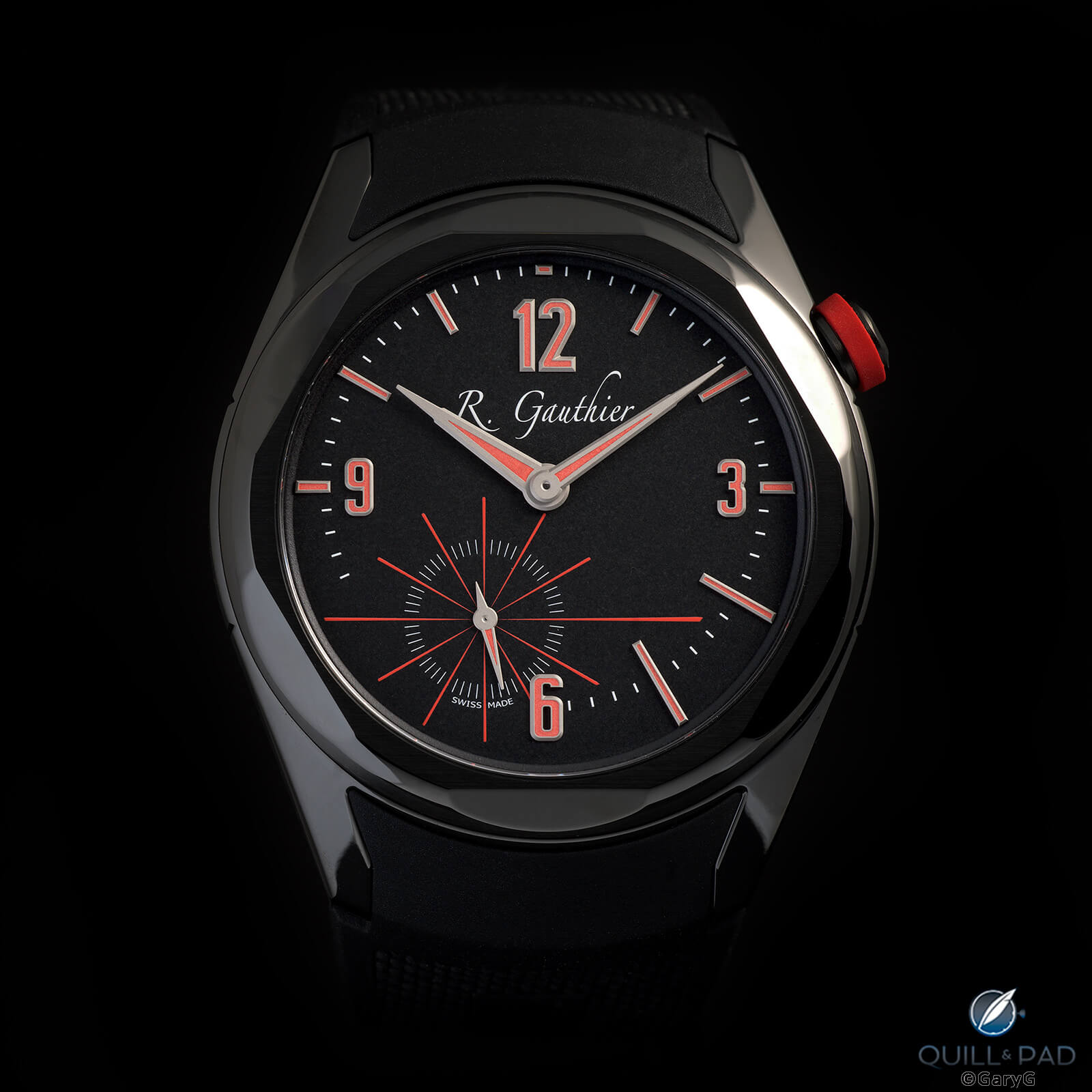
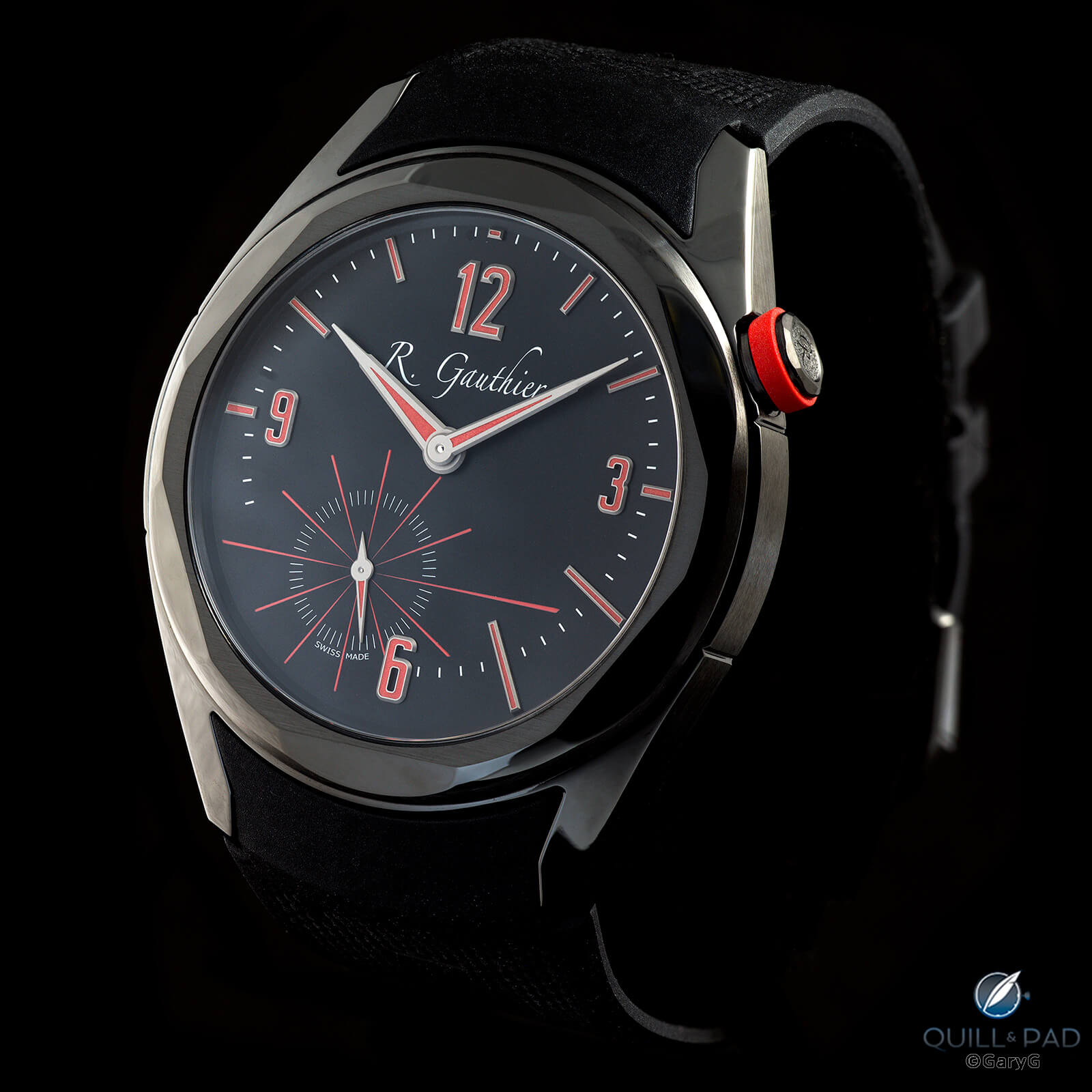
That same weekend, a friendly dealer/enabler showed a friend and me renderings of the first two production versions, the first in natural titanium with red markings and the second a dramatic blacked-out version with red accents. My friend immediately opted for the first, but I couldn’t decide between the two until, after seeing a prototype version in April of 2022, I went for the second.
Pick one: the author’s selection, C Titanium Edition Two
Why I bought it and how it fits
It wouldn’t be a “Why I Bought It” without my pal Terry’s taxonomy! As you might suspect, the C is very much a patronage watch as far as I’m concerned. I’m a believer in its maker and what he is working to express, and even though at this point in my collecting career I am very much in a “selling to buy” mode, I still feel it’s essential to support the work of today’s leading horological creators, and so I am willing to make some sacrifices to keep buying pieces like this one.
This watch also fits my own shifting lifestyle and watch wearing habits; as more and more of my time is spent in casual clothing and running various errands, it’s great to have a piece that has a true sporting character yet still packs the punch of a top indie creation. I certainly have no plans to bang it – or any other watch, for that matter – around, but I won’t fret as much about wearing it to the hardware store as I would some dressier timekeepers.
Why I love it
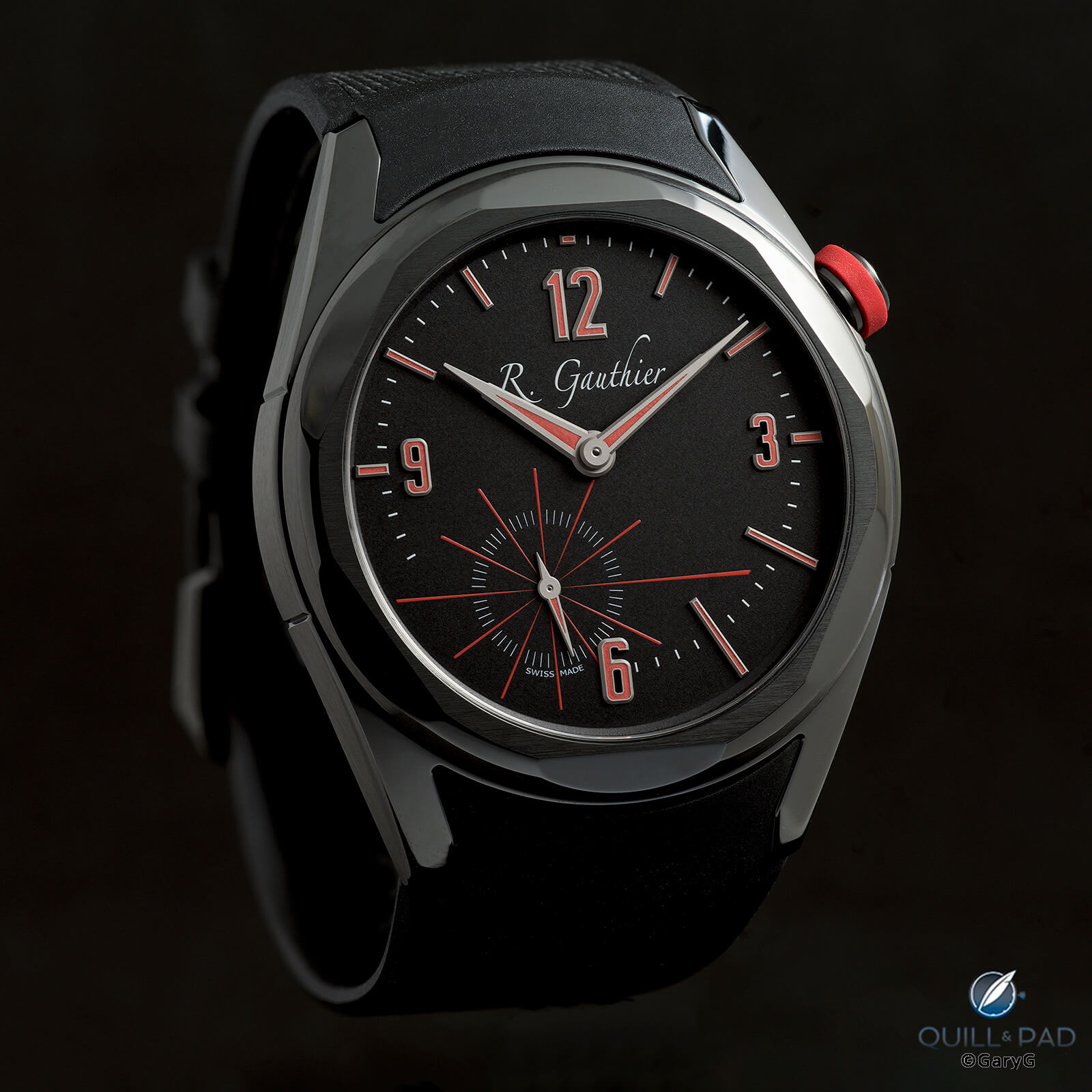
Where to begin? Perhaps with my top criterion for assessing a watch: coherence.
All of a piece: C by Romain Gauthier
Everything about this watch is consistent with every other feature; there’s nothing oddly jarring on either front or back. One reason for this is the watch’s foundation in a single design idea: continuity.
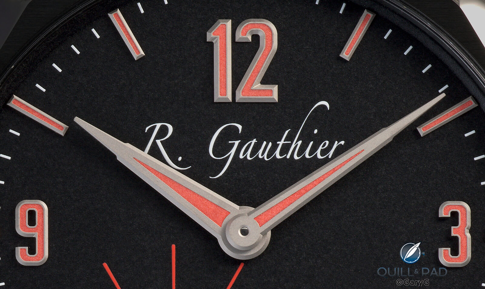
On the dial side, continuity from the past is expressed in the use of asymmetry, a prominent feature of past Gauthier designs, notably his Logical One. And the sense of continuity extending into the future is captured through the clever use of perspective and the absence of firm boundaries.
Take a look at the image below. The most obvious use of perspective is in the tapered printed indices for each five seconds, which seem to draw us forward into an expanding universe. At second glance you can also see that the applied gold hour indices are also subtly tapered, giving more of a sense of depth.
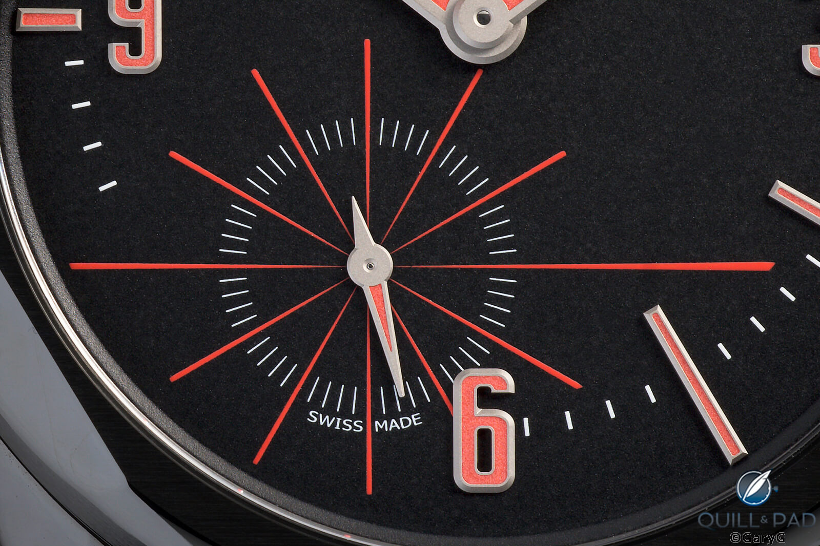
Boundaryless perspective: dial detail, C by Romain Gauthier
You can also see in the photo above that while there are indices for minutes and seconds, there are no formal closed rings connecting them, reinforcing the concept of continuity and allowing the eye to travel more freely to the vanishing points suggested by the tapered markers.
To return to the topic of asymmetry, I very much like the way in which Gauthier plays with both it and symmetry in the dial design. For instance, while the main hands are placed above the vertical midpoint of the dial, and the surrounding minute track mirrors that placement, the applied numerals and batons extend to the edge of the dial. The batons are of varying length to allow them to extend equal distances within the minute track, and the applied 6 crosses the track vertically to anchor the bottom of the dial.
Symmetrical asymmetry: C by Romain Gauthier
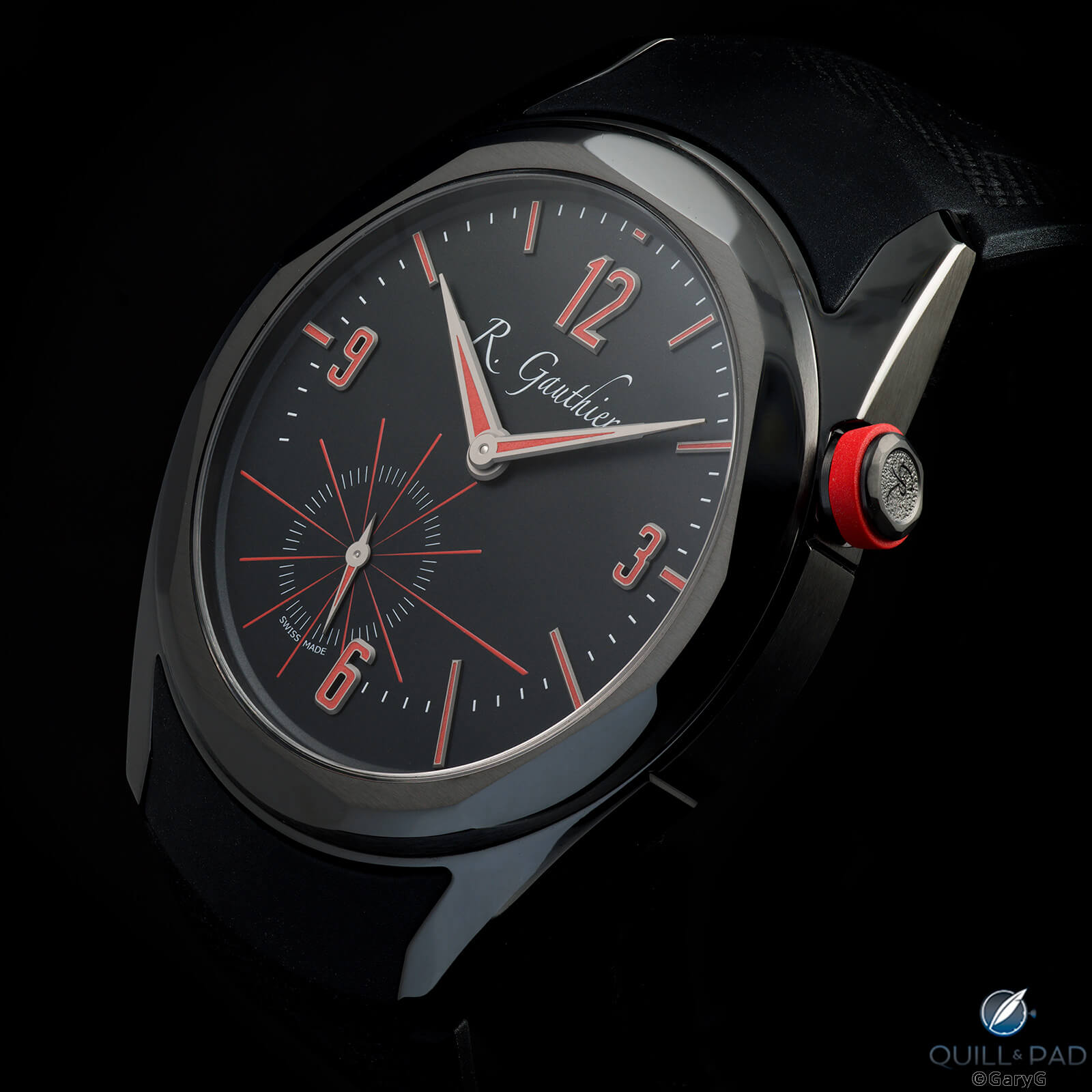
To my eye the rays emanating from the second hand also provide a visual counterweight to the large 12, above-center main dial, and prominent printed logo and help keep the dial balanced; in aggregate, I think these visual tricks work even better on the black and red dial of the Edition Two than on the lighter-dialed versions of the C. And while Gauthier may have had other reasons for locating the crown at 2 o’clock, that placement also keeps us from being troubled by the above-center placement of the main hands’ axes.
Another obvious pattern in the design of the C is the use of bevels: we see them clearly on the applied gold indices and the hands with their complex shapes and on the array of alternate polished and brushed surfaces that make up the front and rear bezels.
Bevels galore: hand and applied index detail, C by Romain Gauthier
Bevels also appear on the inner surfaces of the lugs, where they match neatly with the angles of the integrated rubber strap, and on the complex edge geometry of the crown.
For me, the balance of polishing and brushing on the case is just right: the brushed surfaces immediately surrounding the dial, on the outer rim of the bezel, and on the case band keep the black surface from being overwhelmingly shiny while the polished bevels and lugs provide welcome visual pop.
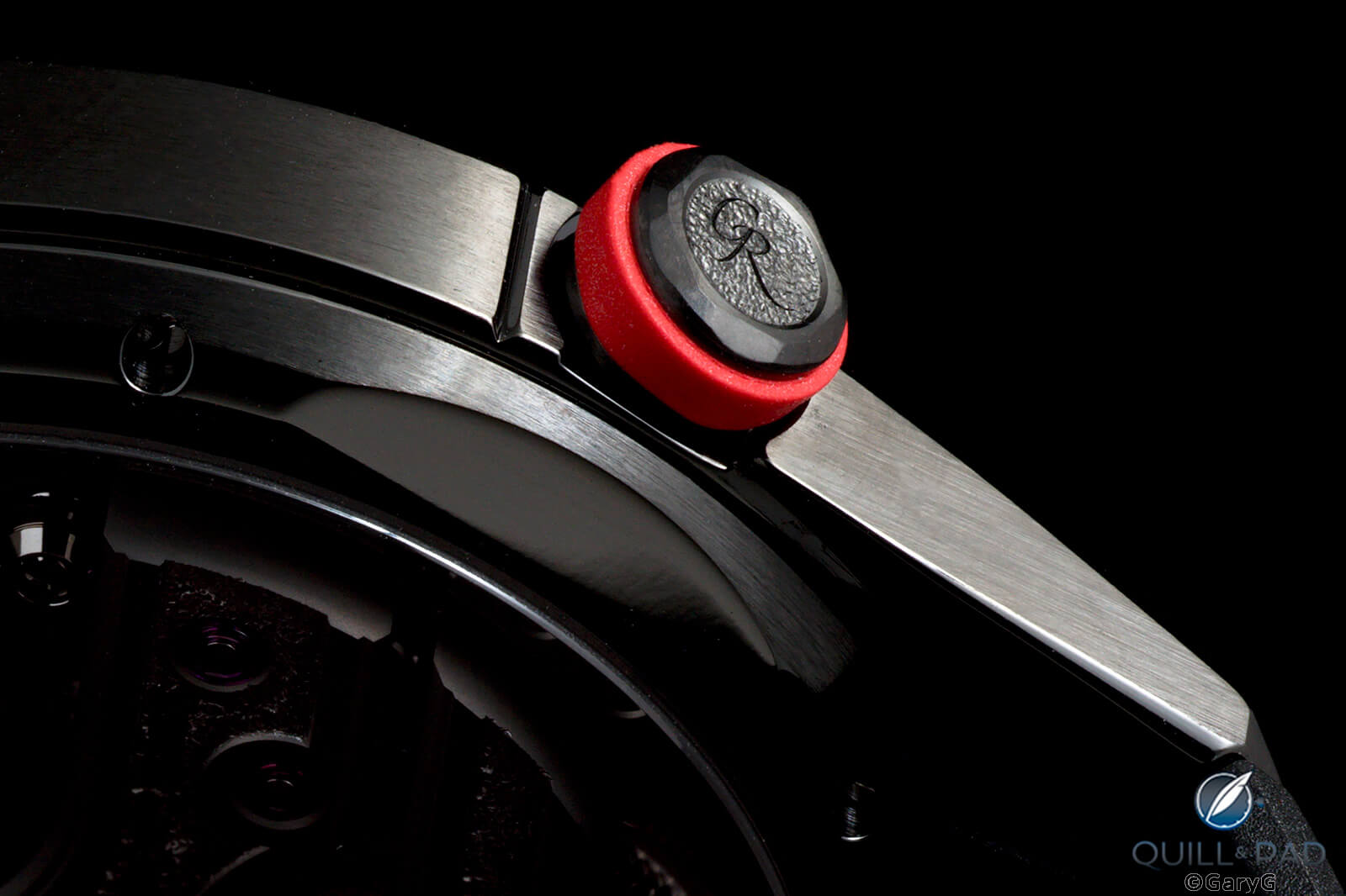
Bevels and bezels: case and crown detail, C Titanium Edition Two
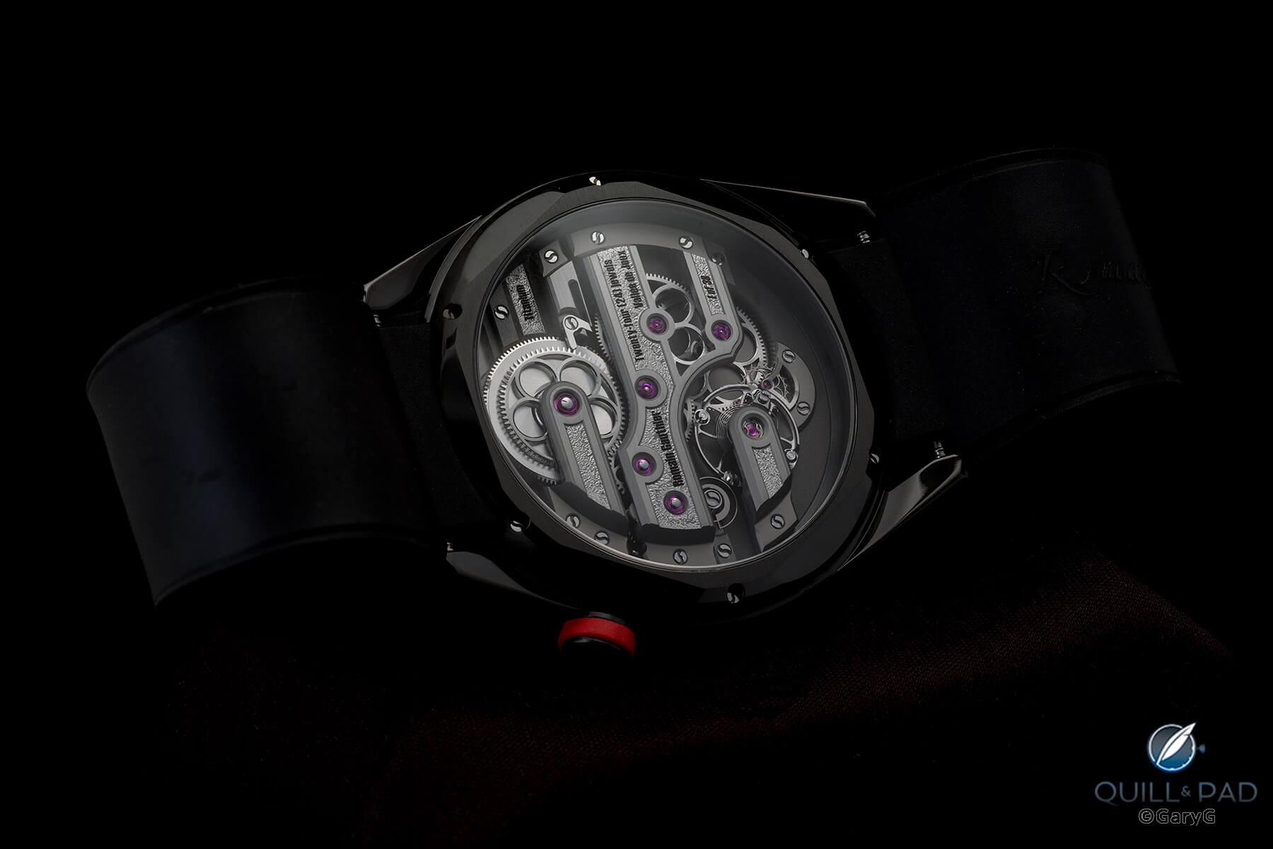
Continuing: to the back
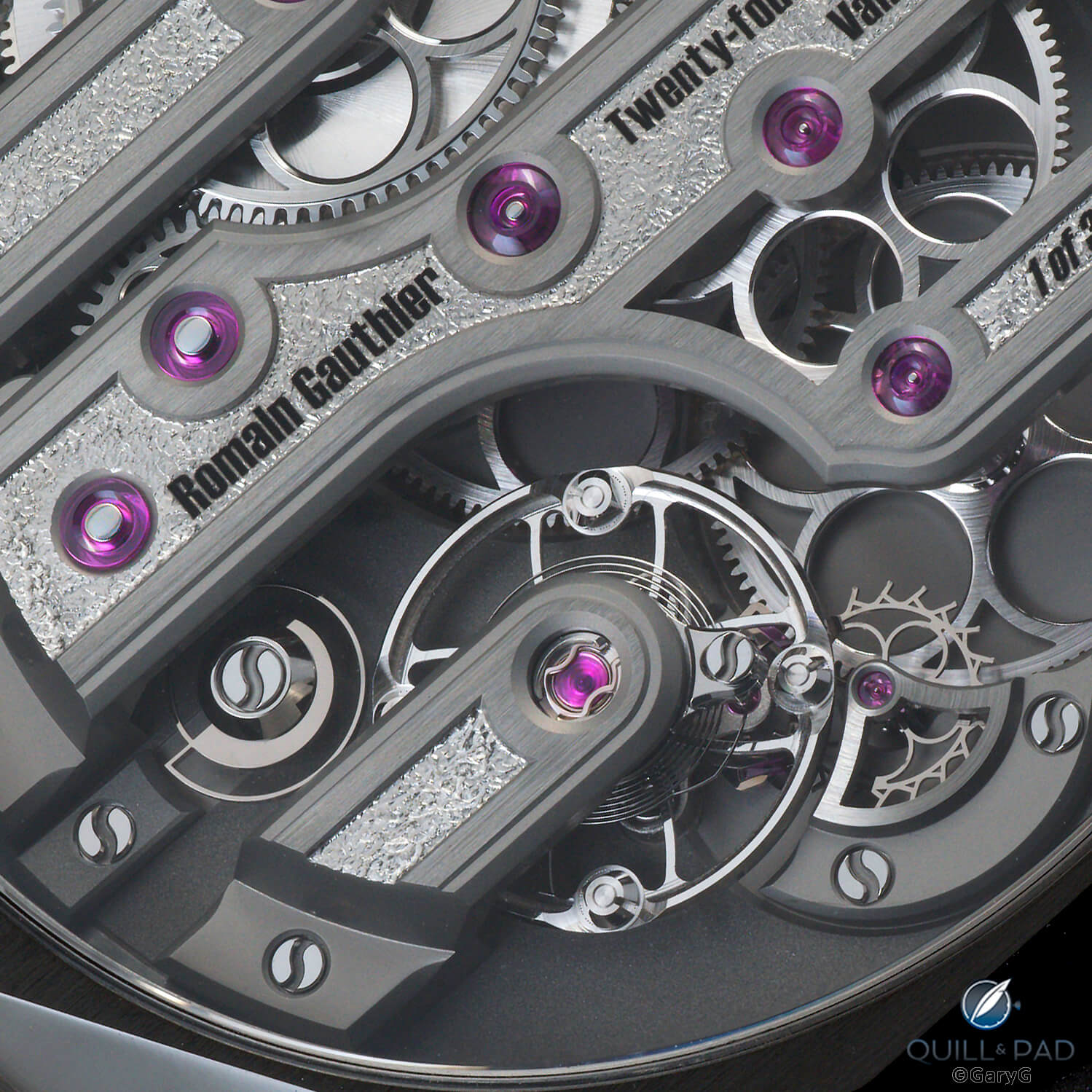
As with the front of the C, the movement side seamlessly links past and future. The movement architecture is a clear tip of the hat to the traditional finger bridge style of Gauthier’s native Vallée de Joux, updated with more modern shapes and finishes.
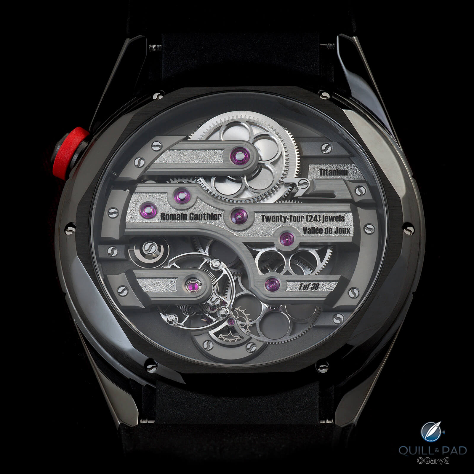
Evolution of tradition: finger-bridge movement architecture, C by Romain Gauthier
Many familiar shapes return from earlier Gauthier watches, including the wheels with circular beveled spokes, polished balance with curved spokes, and two-step raised edges on the bridges.
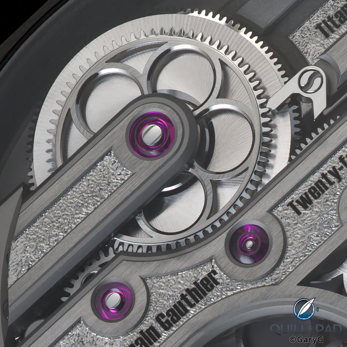
One touch I especially like is the hacking seconds mechanism, seen at lower left in the image below: a rotating snail that both smoothly halts the balance when the crown is pulled and helps to kick the balance back into action as it moves back into place when the crown is depressed.
The return of the snail: hacking seconds mechanism at lower left, Gauthier C movement
In addition to being cool technically, the snail is a clear reference to the chain-and-snail constant torque mechanism that was the foundation of Gauthier’s landmark Logical One, seen at left below in a detail shot that also includes views of Gauthier’s wheel and balance shapes.
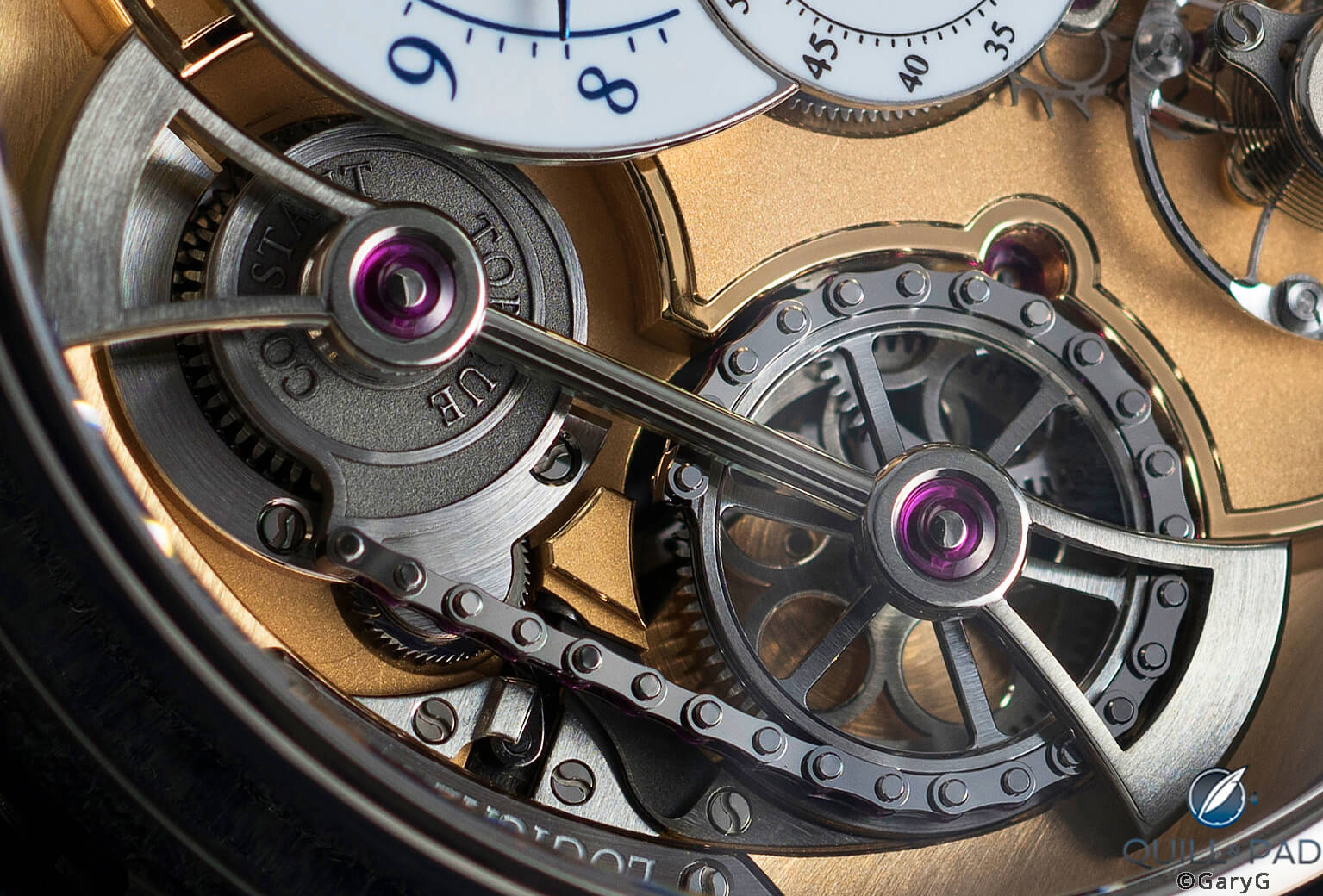
Constant torque snail, Romain Gauthier Logical One
Before we move on, one thing to note is that even though the dial side of the C is asymmetric, the movement fills the full circular opening of the rear bezel and its radius (look at the outer edges of the bridges) matches that of the case back opening rather than being offset vertically.
Appropriately enough for a watch that is a fraction the price of the Logical One, the C does feature a higher proportion of fine machine finishing. For instance we don’t see the mouth-watering rounded bridge bevels of the earlier watch; but the touch of the human hand is still very much in evidence in features including the hand frosting of the base plate, brushed wheel surfaces, snailed spring barrel, polished click, snail cam, and screws, and most distinctively what Gauthier calls the “dimpled” hand-applied texture on the central surface of each bridge.
Still handmade: finishing details, C by Romain Gauthier
It probably would have been easy for Gauthier to slap a simple flat bezel on the back of the C, but I’m not surprised that in service of coherence he chose a multi-beveled shape consistent with that of the front bezel and crown, and with its own alternating brushed and polished surfaces.
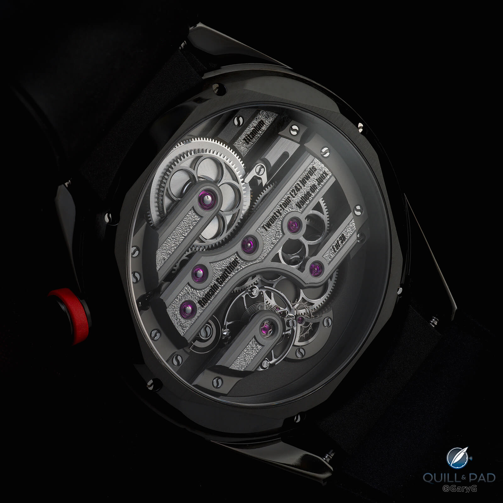
Coherent and consistent: rear view, Romain Gauthier C Titanium Edition Two
Even the clasp doesn’t escape the governing philosophy as the tang buckle greets us with its own array of finely finished bevels and an engraved RG logo.
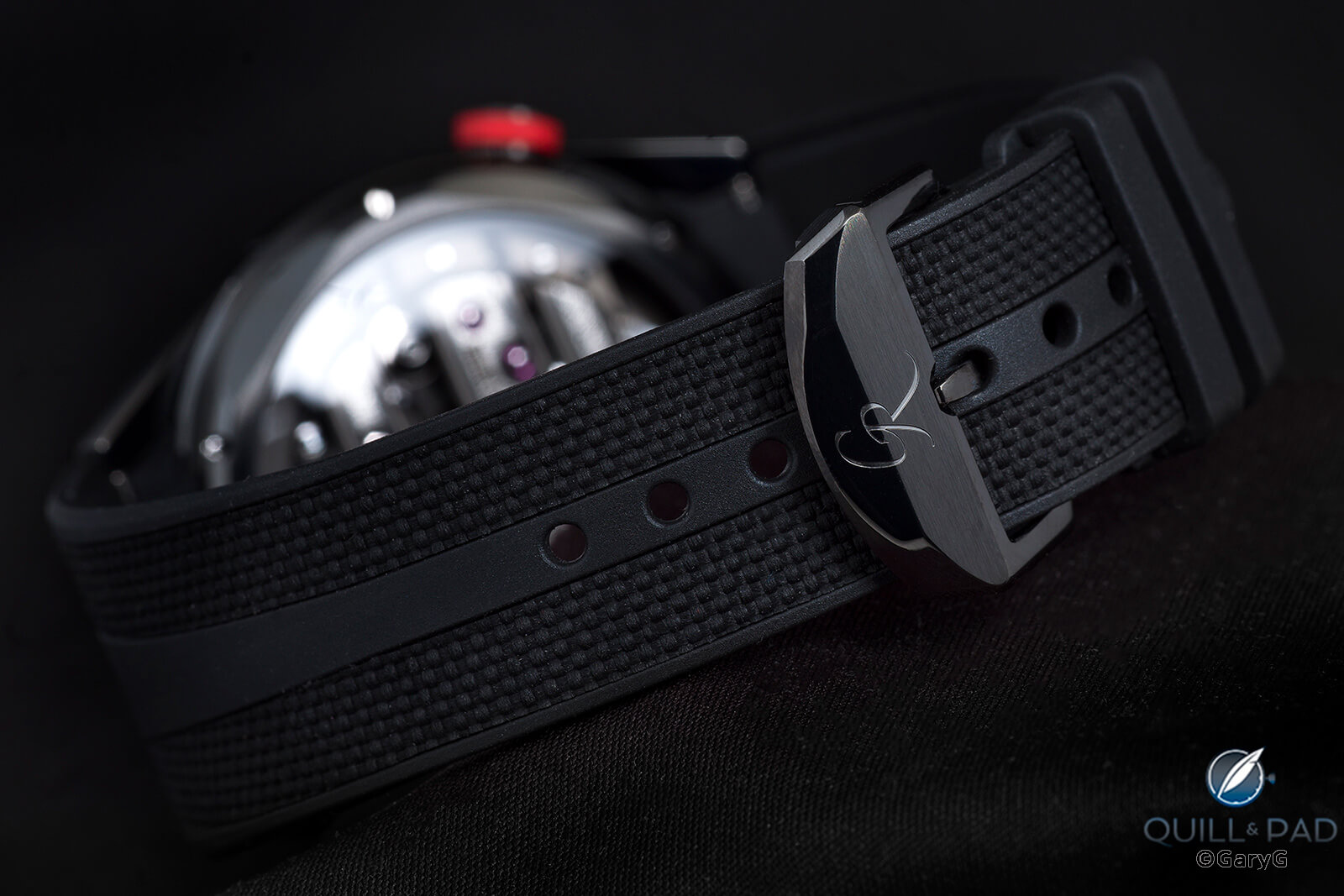
Clasp and strap, C by Romain Gauthier
On the wrist
If there’s anything better than a watch that is thoughtfully created and beautifully made, it’s one that also is a pleasure to wear!
I had a good feeling about the C as soon as I felt how supple the fitted rubber strap was, and on the wrist the sensation does not disappoint. While I generally prefer heavier watches, there’s something about how the C with its titanium case, dial, and movement and relatively slim profile seems to blend seamlessly into your arm.
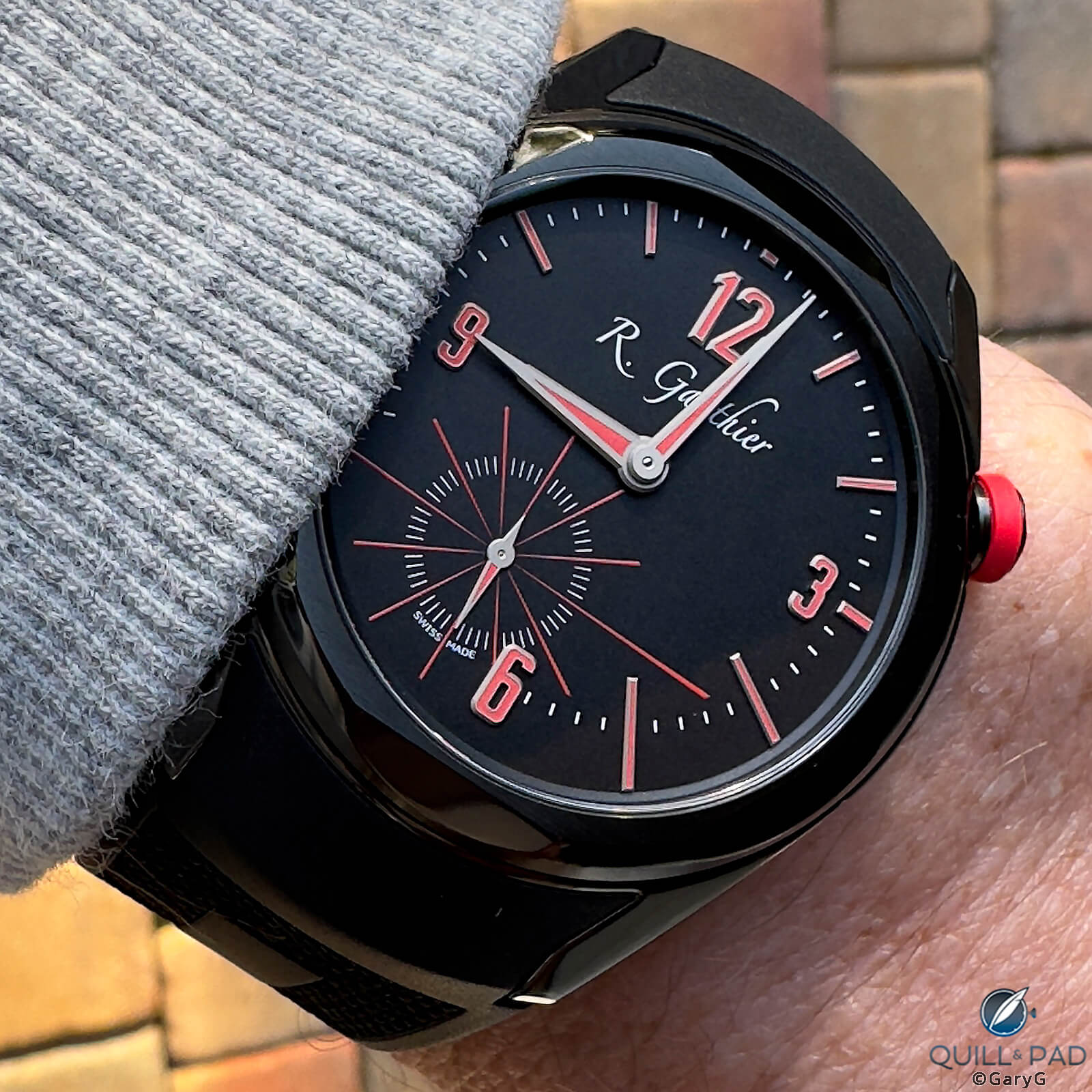
On the wrist: C by Romain Gauthier Titanium Edition Two
A side view shows how well the watch sits and how the sharp downturn in the rubber strap as it tucks under the outer edge of the lug helps to snug things down.
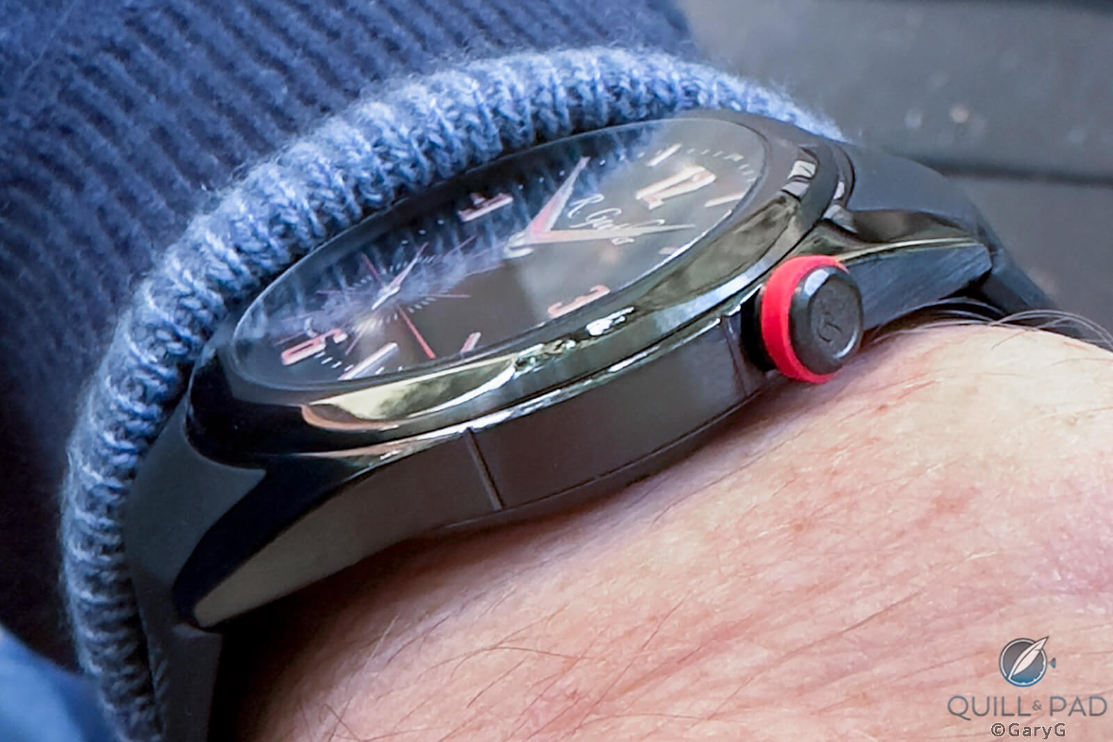
Side view, C by Romain Gauthier on the wrist
Any quibbles?
The perfect watch has not yet been made! I’m extremely pleased to have this one in my collection, but in the perfect (for me) world I’d change a few small things.
While I quite like the idea of using red luminous markers, the sad fact is that red is the dimmest Super-LumiNova color – about a fifth the luminous intensity as some of the brightest variants used by brands like Rolex as shown in the table below.
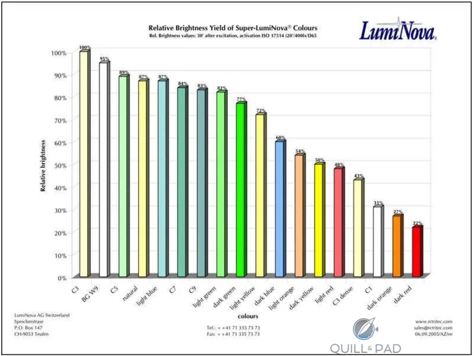
Super-LumiNova intensities by color (image courtesy LumiNova AG)
Even zapped with a high-intensity UV flashlight, the red is dark enough that I had trouble capturing it in a photo; what you see below is a lot whiter – and brighter – than what I see with my naked eye.
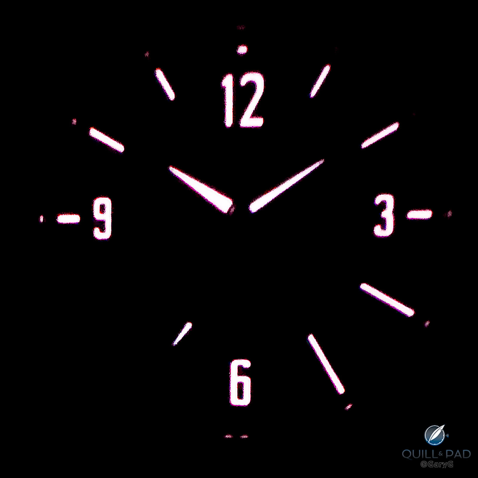
Lume view, C by Romain Gauthier Titanium Edition Two
As long as I’m being picky, the quail-topknot tip of the “h” in Gauthier that extends from the printed logo toward 1 o’clock often at first glance looks like a bit of dust to be swept off; I like the decision to keep Gauthier’s traditional logo for C but wonder if something might have been done with its size or placement.

I earlier praised the crown position, and Gauthier says that one objective was to make the watch more comfortable on the wrist as with some of his other references: the only bad news is that I have a prominent bone on my wrist up by 2 o’clock and while I don’t feel the crown hitting it, a visible depression red line does form on my skin.
Finally, all things equal I’d prefer an actual serial number on my movement to the “1 of 38” notation that adorns all the watches in this limited series, but I do understand that it’s a pain to manage all the specific requests for buyers’ special numbers and it’s not a big deal to me.
Final thoughts
Especially for a small independent, it takes real courage to move in a new direction. We’ve seen “sport” watches from other indies recently, but none of those have moved as dramatically in terms of visuals, materials, design, and movement architecture from their makers’ prior work as does the C series from Romain Gauthier.
Rear view, C by Romain Gauthier
At the same time, Gauthier has done a splendid job, in my view, of maintaining links to both his own past and to the traditions of the Vallée de Joux with C and has tapped his unique competence among the indies in highest-quality micro-machining and material science to give us watches that only he can make.
Parting shot: C by Romain Gauthier Titanium Edition Two
I’ll look forward to reading your comments on this watch and on other sports watches by independents. In the meantime, happy wearing!
For more information, please visit www.romaingauthier.com/heritage/c-romain-gauthier.
Quick Facts C by Romain Gauthier Titanium Edition Two
Case: 41 x 9.55 mm, Grade 5 titanium case coated with black ADLC; polished and brushed beveled bezels, polished lugs, and brushed case band; anti-reflective front and rear sapphire crystals; crown at 2 o’clock with red rubber ring
Dial: frosted titanium dial with ADLC and anti-UV coatings; Arabic and baton indices in white gold with red Super-LumiNova; printed minutes, seconds, and logo
Movement: manually wound in-house movement in titanium; extensive hand finishing; 60-hour power reserve; 28,800 vph/4 Hz frequency; hacking seconds governed by snail cam
Functions: hours, minutes, hacking offset subsidiary seconds
Limitation: 38 examples
Price: $43,700
Production years: 2022-2023
You may also enjoy:
C By Romain Gauthier: A Continuum of Lifelong Learning
Watchmaker Of Historical Significance: Romain Gauthier
Why I Bought It: Romain Gauthier Logical One
Leave a Reply
Want to join the discussion?Feel free to contribute!


Who’s really interested in a 43,000 watch?
Who’s really interested? Enough people that there’s a long waiting list.
Regards, Ian
What Ian said! I know that watches in this price range aren’t accessible (or even appealing, as you note) to lots of people, but two of the joys of this hobby are the freedom to judge for yourself what is right for you, and to understand the level of design and hand-manufacturing excellence that makes some people line up for pieces like this one.
To each his own!
Best, Gary
I realize this is an old post, but I wanted to thank you for your detailed review of this model. I especially appreciated your take on the different dial details and how they connect to continuity (I also feel this touches on unboundedness or “anything is possible” type mentality, which is a nice thought to have while looking at a watch). I wanted to ask, do you still have this piece? Curious to hear if your admiration has waned, and perhaps led to an alternative replacement, or whether it persists years later. Thanks