Behind The Lens: Roger Smith Series 2
by GaryG
Roger Smith holds a special place in the pantheon of independent watchmaking, both on his own merits and as the man who worked most closely with the legendary George Daniels.
From his workshop on the Isle of Man, Roger turns out a very small number of distinctive pieces each year; I’m fortunate to count among my close friends two fellows who own variants of the Roger Smith Series 2, the subject of this edition of Behind the Lens.
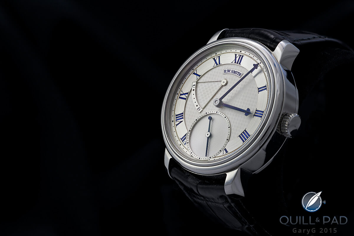
Roger Smith Series 2 in stainless steel
Roger Smith Series 2: front and back
While any Smith watch is rare, the particular Series 2 that you see in the photo above is in fact unique: it’s the only such watch in stainless steel that Smith has yet produced. My friend has made a practice over the past several years of acquiring a variety of top-end independent watches in steel, which comes close to the visual whiteness of platinum without the attendant weight.
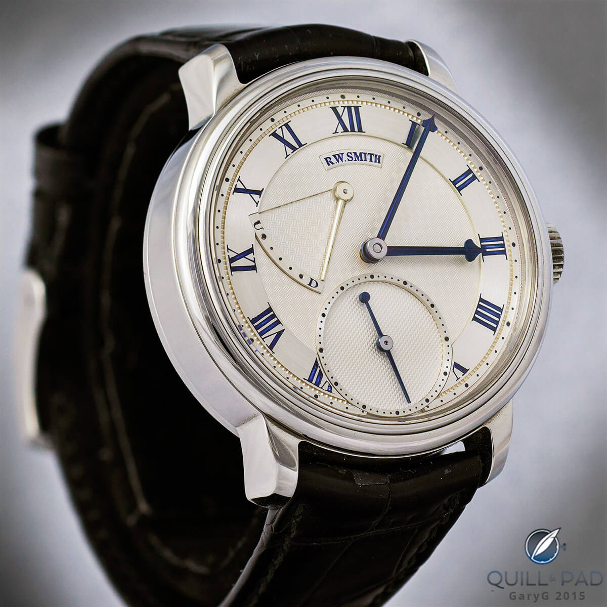
Straight on: Roger Smith Series 2
While from a casual glance the dial side of the Series 2, with its varied guilloche finishes, prominent power reserve, and asymmetric layout, might be mistaken for a Breguet, upon closer inspection its origin becomes rapidly apparent. In particular, the sculpted hands and especially their three-dimensional arrows that indicate hours and minutes, are a dead giveaway.
And in everything from the prominently raised chapter rings, power reserve scale, and name plaque to the deeply carved and lacquer-filled numerals, the clear message here is one of hand-made construction and assertive dimensionality.
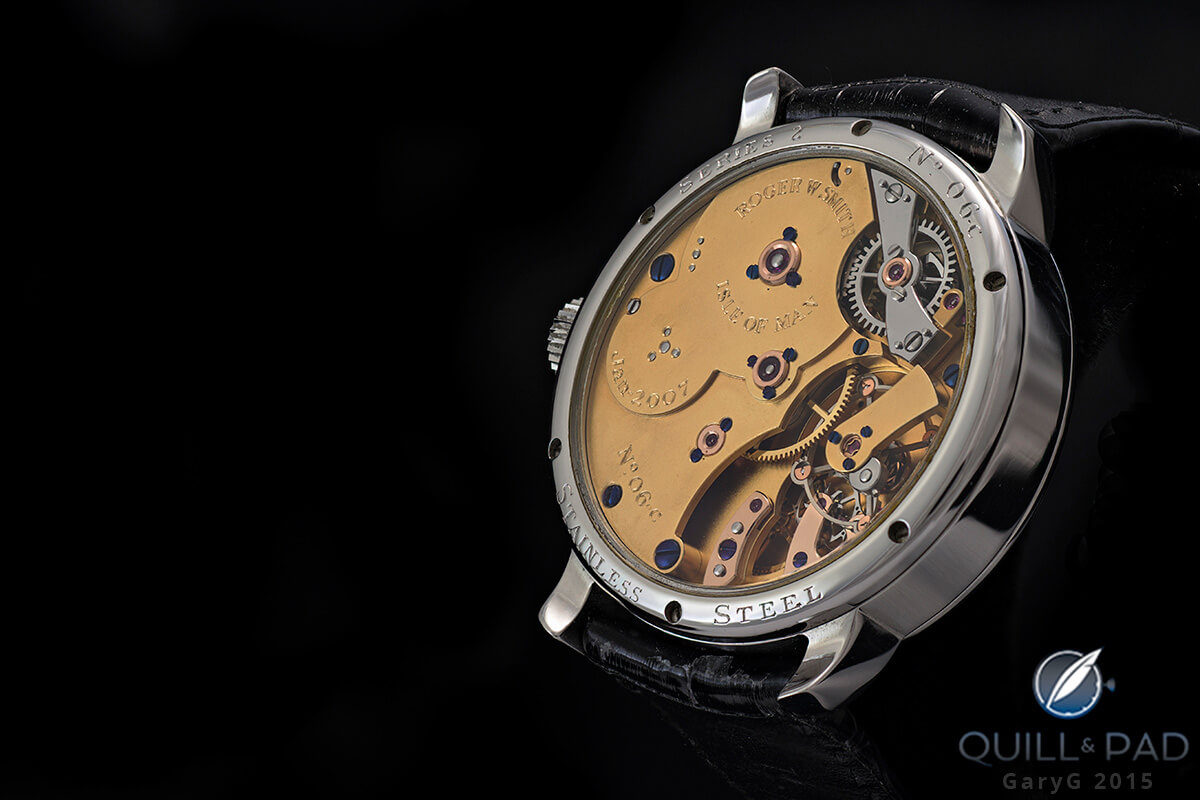
Movement of the Roger Smith Series 2
When we flip the watch over, any comparisons to the style of Breguet come to a screeching halt. As you can see in the photo above, the movement design is quite elemental, and the finishing is in a traditional English style with frosted plates and simple edge shapes and bevels in stark contrast to the more florid Swiss style.
I got in a bit of trouble with some folks in a prior article here by referring to this style as “rustic”; perhaps the term was a bit harsh, but I hope that you can see what I meant!
Roger Smith Series 2: movement side
Zooming in
If there’s one thing I’ve learned over the past few years of photographing watches, it is that the macro lens is an unforgiving tool. Any tiny flaw in the actual watch becomes a massive blemish when seen at full-screen sizes. Even with the reduced image sizes and upload compression we use here at Quill & Pad, there’s no place to hide.
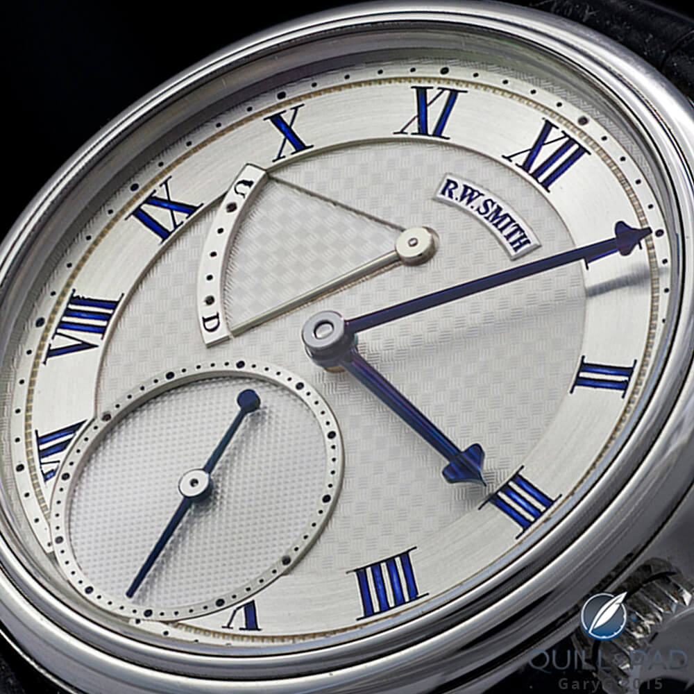
Detail view of the Roger Smith Series 2’s dial
In both the image immediately above and the prior dial-side images, some of the glitches with this particular example of the Series 2 become evident, including the rough edges of the Romans VII and VIII, uneven lacquer fill in some of the engraved numerals, and (a bit less visible) non-uniform color of the blued hands.
This is, of course, where individual taste and viewing context come to the fore: as seen with the naked eye, to me the overall effect is one of interpretive hand craftsmanship. Seen on my giant Thunderbolt monitor, my impression is somewhat less favorable.
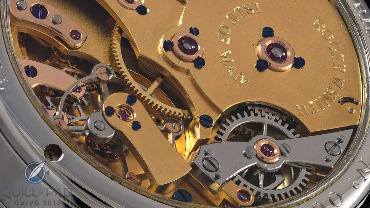
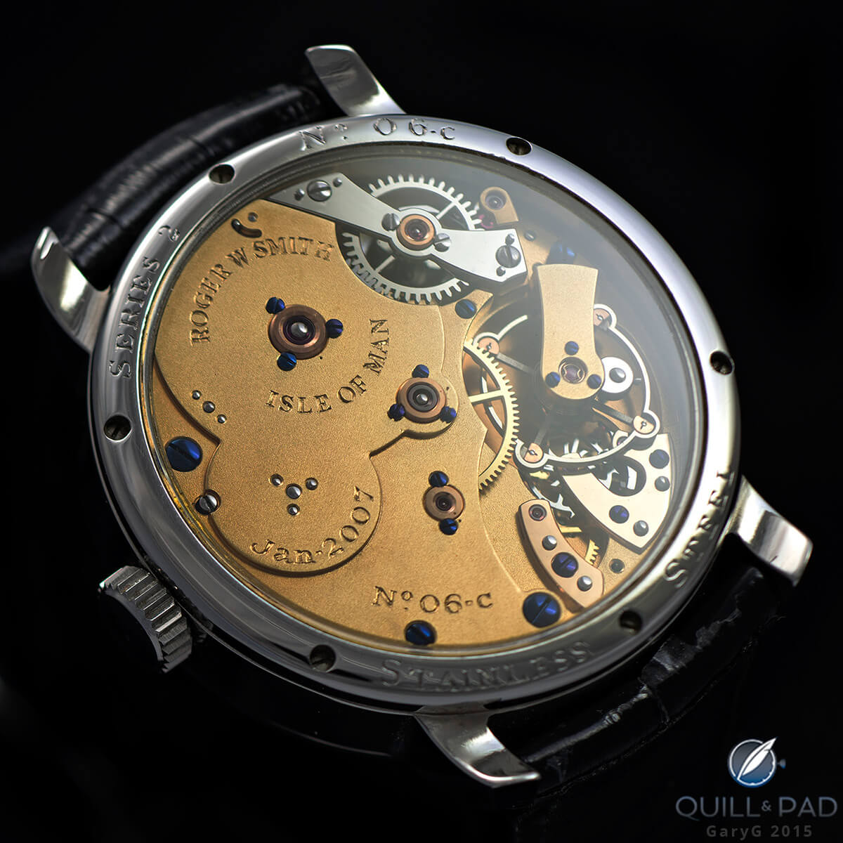
Detail view of the Roger Smith Series 2’s movement
In this movement view, the key technical item to notice is about halfway up near the left edge: the co-axial escapement, which was developed by Daniels and improved by Smith. Of course, you can also get an even better sense of the design and finishing choices made by Roger; straight-edged plates and bridges and simple shapes, frosted surfaces, chatons and bridges affixed with deeply blued screws.
Shooting the Roger Smith Series 2 in the wild
Shooting watches in the calm of my home office with controlled lighting and a stable tripod is great, but sometimes opportunity knocks in less favorable settings.
If your watch pals are like mine, they love to meet over meals! That’s great as far as it goes, but if you’ve brought your camera along you’ve probably noticed that most restaurant lighting is diabolical: too bright or too dark overall, with glaring pinpoint spotlights, and usually involving halogen lamps that throw a strange orange light that is almost impossible to correct.
And, whether you are holding the watch in hand, wearing it on your wrist, or perching it on a table being jostled by the elbows of your compadres, achieving a stable relationship between the positions of the watch and camera is virtually impossible. Other than that, perfect conditions, right?
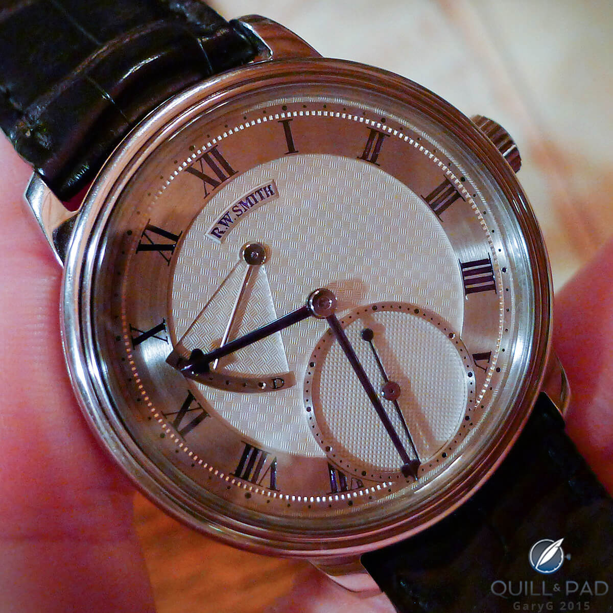
Time to eat: Roger Smith Series 2 seen at a collectors’ luncheon
Here’s a view of the same watch as shot in a bustling restaurant with my point-and-shoot camera. You can probably tell that I was lucky: there was a window to my left casting fairly clean natural light from that side and generating some nice shadows that give the image a high-contrast appearance. Still, a substantial amount of post-processing was needed to adjust the white balance so that it didn’t look as if I was holding the watch in a tanning booth.

Tabletop photo of the Roger Smith Series 2
One nice thing about the bright lighting at the restaurant was its ability to bring out the vivid blue of the numerals on the Series 2 dial. Also, outside of the more sterile light tent environment and at a more natural viewing size, the small flaws in execution seem to melt away in favor of an overall impression of deeply hewn, masculine craftsmanship.
Roger Smith Series 2 on the wrist
At the end of the day, watches are made to be worn! So, how does the Series 2 actually look on the wrist? In my view, darned good, as seen below:

Wrist shot: Roger Smith Series 2 in stainless steel
Two big things I’m hoping to see from a watch when I see it peeking out from below my sleeve:
- Visual interest: are there enough visual landmarks and engaging textures to make my eye linger?
- Coherence and harmony: as a whole, does the appearance of the piece make sense? In particular, do various parts seem to blend well, and does the watch maintain the visual interest mentioned above without having to be jarring?
For me, the Series 2 passes both of these tests quite easily.
And the appeal of the Series 2 goes well beyond the look of its dial, of course, with its co-axial escapement, its clear linkage to the tradition of George Daniels, and the devoted work that Roger and his team put into each and every part of the watch.
The Smith Series 2 a watch that I was delighted to have the opportunity to borrow and photograph, and if the stars align in future I would be more than pleased to add one to my own collection. Now I need to find one of the Open Dial versions to photograph!
For full information on the origins of this model, please visit www.rwsmithwatches.com.

Quick Facts Roger Smiht Series 2
Case: 40 x 13 mm, stainless steel, crafted using the Daniels method
Movement: manually wound caliber, 2.5 Hz/18,000 vph, power reserve 36 hours
Functions: hours, minutes, small seconds; power reserve display
Price: in 18-karat gold the Series 2 retails for $125,000
* This article was first published on April 10, 2015 at Behind The Lens: Roger Smith Series 2.
You may also enjoy:
Roger Smith Series 4 Triple Calendar: Excellence In Hand-Crafted English Watchmaking


Leave a Reply
Want to join the discussion?Feel free to contribute!