Ming 18.01 H41 and 27.01: Revolution and Evolution
Just when I thought I was out, they pulled me back in!
These are iconic words for many fans of the Godfather trilogy, even if (as many will argue) Godfather 3 is the weakest of the trio.
For me, these words are only known through parody because (gasp!) I never actually watched any of the movies. Like so many classic films that everybody has seen, these have slipped through the cracks and I haven’t had much reason to dive in, even if they are so entirely quotable (I live my life one movie quote at a time).
But the phrase uttered by Michael Corleone as played by Al Pacino has staying power because it illustrates how old interests, or what you thought was a temporary fancy, turns out to become a longer obsession that you just can’t escape. When I was ten years old I started playing the drums in our school band and even though I have barely touched a drum set since leaving high school, I am constantly reminded that percussion is in my blood as I tap, slap, bang, and pound my way through my days with ever more complicated rhythms.
The same goes with my passion for snowboarding, a sport I did in high school and college because I lived in the frozen wastelands of the Midwest and didn’t play basketball. After graduating from college and just before moving to San Francisco I sold all my gear because I probably wasn’t going to be snowboarding any time soon. But as recently as last month, while researching a story, I found myself diving into the current models and advancements in snowboarding technology, just itching to get back on the slopes and feeling the pangs of displaced euphoria imagining fresh powder and the rush of giant turns on a cold day.
Some things, it seems, just never leave us. Of course, this applies to the watch industry too. I often am enamored of brands or new models and become the biggest fanboy for weeks or months, only to get busy, distracted, or focus on other watches while that exuberance slowly fades. It isn’t because I stopped appreciating it, simply that the zeal is replaced by a fresh excitement for the next thing. This means it can sometimes take years to “rediscover” that brand and let it come back to the fore of my attention.
And with that I return to Ming, a brand that I unabashedly championed when it debuted, writing two articles in 4 months – one on the 19.01 and one on the 17.03 – but not returning to it for the last two and a half years.
But with two pieces in the 2020 edition of the Grand Prix d’Horlogerie de Genève and a new concept featuring an AgenGraphe chronograph movement from Agenhor, there is nothing that can distract me now from the awesomeness that first entranced me back in 2017.

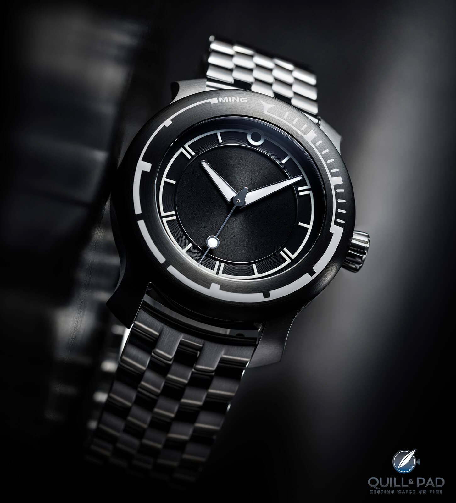
Ming 18.01 H41: a serious dive watch for work and play
That also means I have a bit of catching up, so today I dive into the two incredible watches that Ming Watches hopes could snag golden hands in November at the 2020 Grand Prix d’Horlogerie de Genève: the 18.01 and the 27.01. These are two very different watches and yet both represent the principles of Ming that have been the driving force from the very beginning.
Ming 18.01 H41 diver’s and sports watch
We begin in a place most collectors find themselves eventually: under the sea. Or, more accurately, with a watch that belongs to the depths. The 18.01 is Ming’s take on the diving watch, and being a brand that literally dissects every element of a watch to understand what makes something work both as a timepiece and as a collectible object, it is one dang good diving watch.
Ming 18.01 H41 dive watch on bracelet
The “what” is to be expected: a simple three-hand watch with luminous hands, dial markers, and a 60-position unidirectional bezel. It features a screw-down crown and titanium case with option for a five-link bracelet, all water resistant to an incredible 1,000 meters. And while this makes it one formidable diving companion, it goes further than the typical diver that follows the same threadbare styles used by every “reinvention” of the diving watch.
The 18.01 H41, a previously uncertain follow-up to the original Abyss Concept, takes the practical requirements for a tool watch of this type and makes an ergonomic study out of the aesthetic necessary to impart critical data to a diver. The dial opts to be less important for keeping track of submerged time with a less bulky hour/minute track in place of the more common bold markers. Taking the typical design cues found on a Ming dial such as the circle at 12 o’clock and the simple arcing lines with hashmarks, it forgoes numbers and instead alternates between single and double hashmarks.
The fully lume-filled hands are typical Ming style, though, and present for the first time on a Ming watch is a second hand, in this instance in the somewhat rare lollipop style usually seen on a Tudor or Mondaine, though with its own Ming twist for the base. But the real attention should be paid to the bezel where the crucial design decisions come into play.
What makes it a Ming: the bezel
Typically, a bezel on a diving watch has numerals every ten or fifteen minutes with simple hashmarks in between and a fully marked section from zero to fifteen. Sometimes there will be individual minute marks around the entire bezel, and almost universally it features a large, luminous triangle at 12 o’clock to indicate the beginning (or end) of the scale. On almost every bezel there is a visual balance and uniformity that keeps the watches fairly symmetrical.
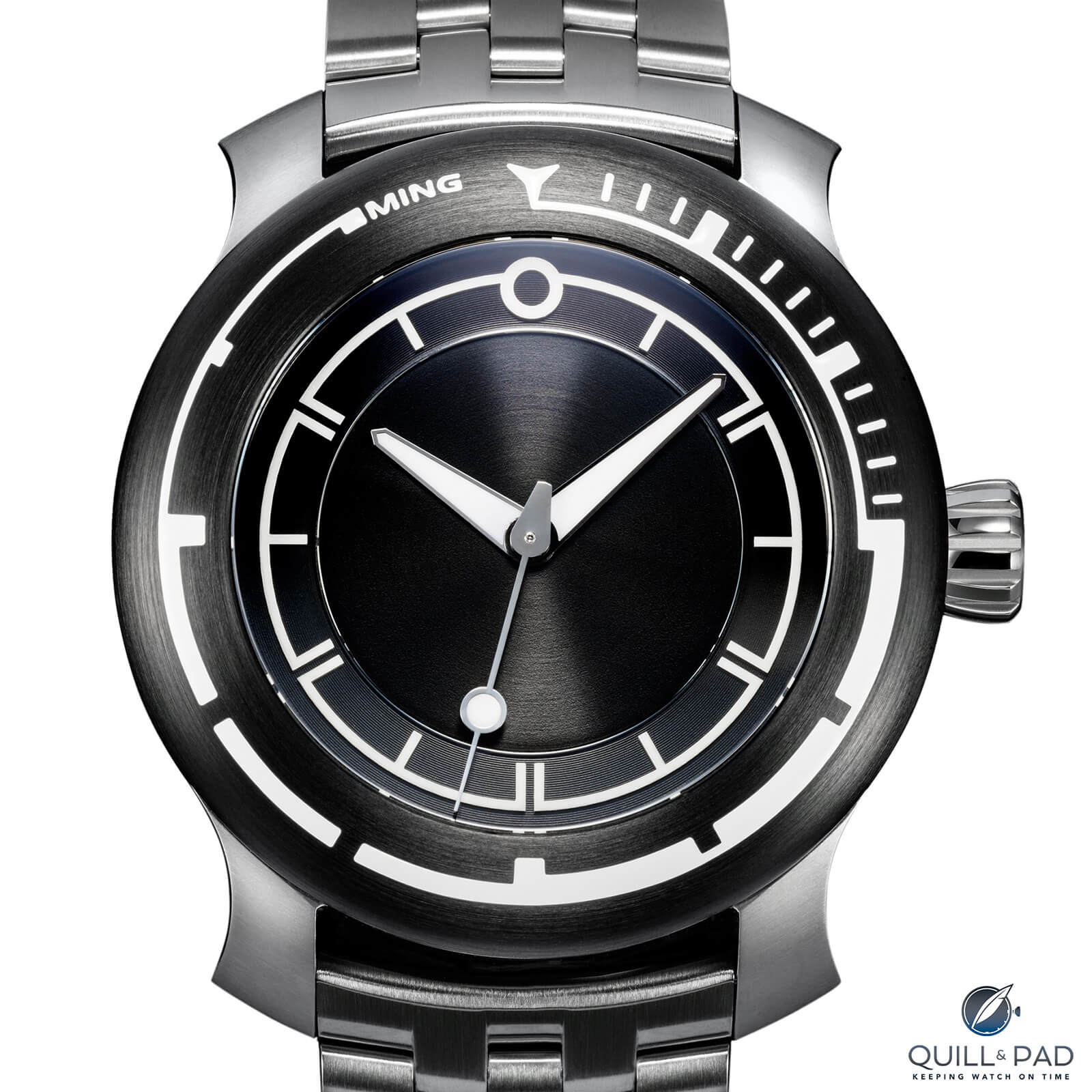
Ming 18.01 H41 dial and bezel
Ming realized that was not the best way to make a bezel. Since the bezel is the key component for quickly understanding elapsed dive time, it makes sense that it should be immediately clear what the orientation of the bezel is (since it will be rotated to match the start of the dive). Symmetrical bezels aren’t visually weighted very strongly to one side or the other, but the bezel on the 18.01 is.
The triangle remains at 12 o’clock since an arrow shape is still a useful reference, but gone are the numerals and symmetry plaguing other bezel designs. Eponymous company founder and designer Ming Thein decided that the first fifteen minutes (the maximum time for diving past 30 meters) should still contain the recognizable hashmarks, but a descending scale based on line width comes after that. The first fifteen-minute segment has a thick band with five-minute marks (notches for the first two and a node for the third), and each fifteen-minute segment thereafter gets progressively thinner.
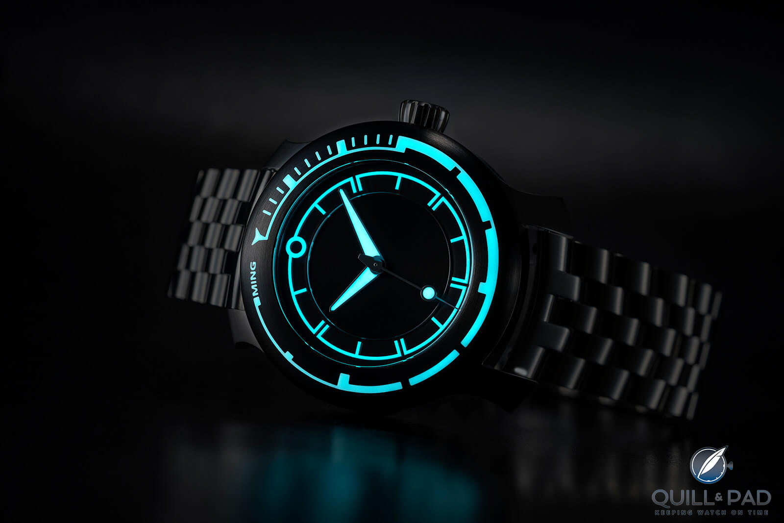
The Ming 18.01 H41’s lume is excellent in the dark
This makes reading the time elapsed perfectly intuitive because you have a visual clue that needs no numbers or orientation: it is either hashmarks, thick, medium, or thin. And this tells you immediately how much time has passed without counting. The idea is so simple yet brilliant that I am surprised it wasn’t popularized decades ago in place of the more ambiguous numerals.
This detail is what really makes the 18.01 and sets it apart from other diving watches. The timepiece hits all the right notes with a rugged material, simple layout, great water resistance, and a fantastic bracelet, but making a true functional improvement simply through design is going the extra mile.
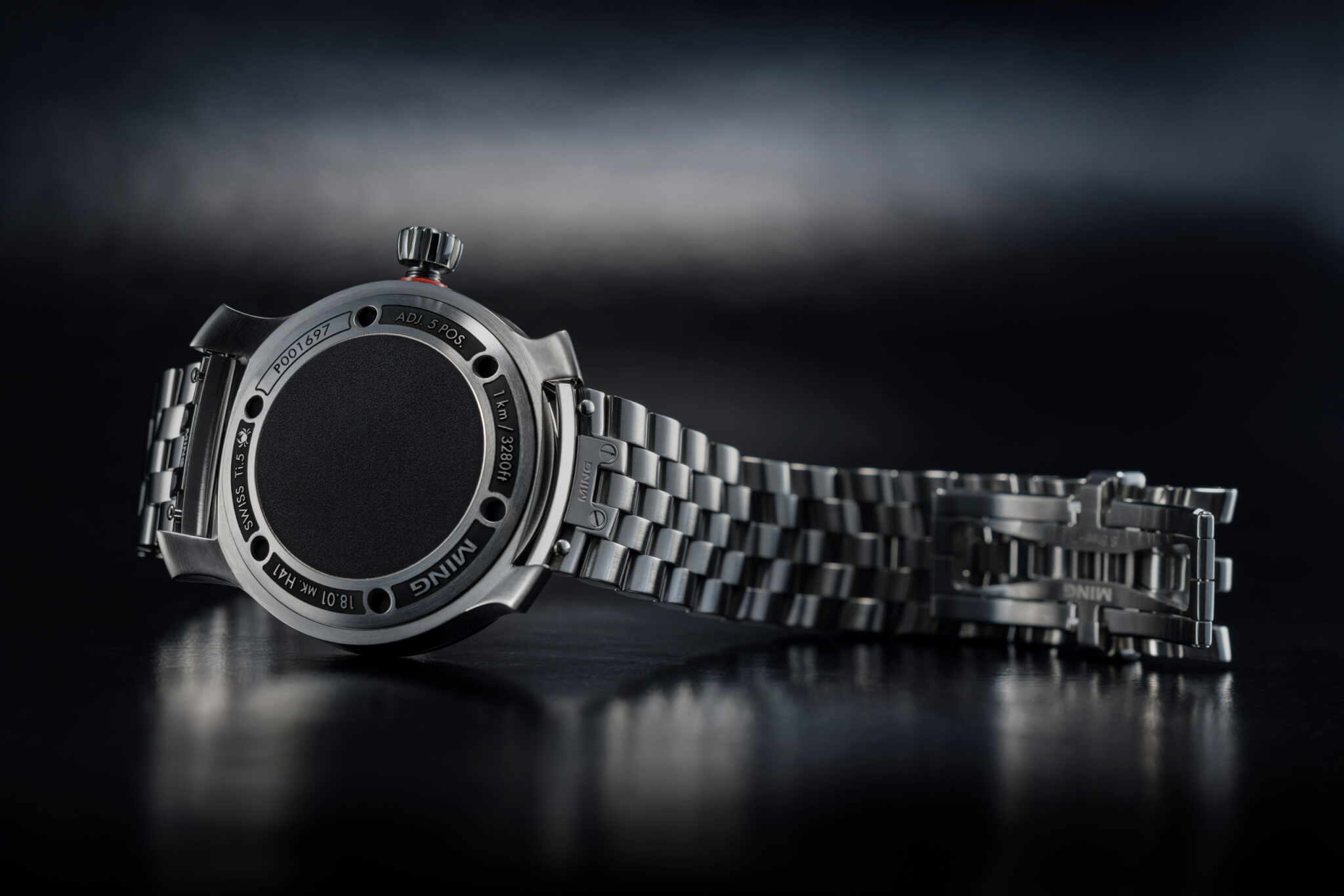
Back of the Ming 18.01 H41
Of course, when you go through 41 design iterations to land on the production version of a concept watch (hence the “H41” nomenclature), I should hope there have been some carefully considered design solutions. But that is what Ming is all about to its core: the meticulous exploration of every conceivable detail in service to creating a highly desirable and collectible piece of horology.
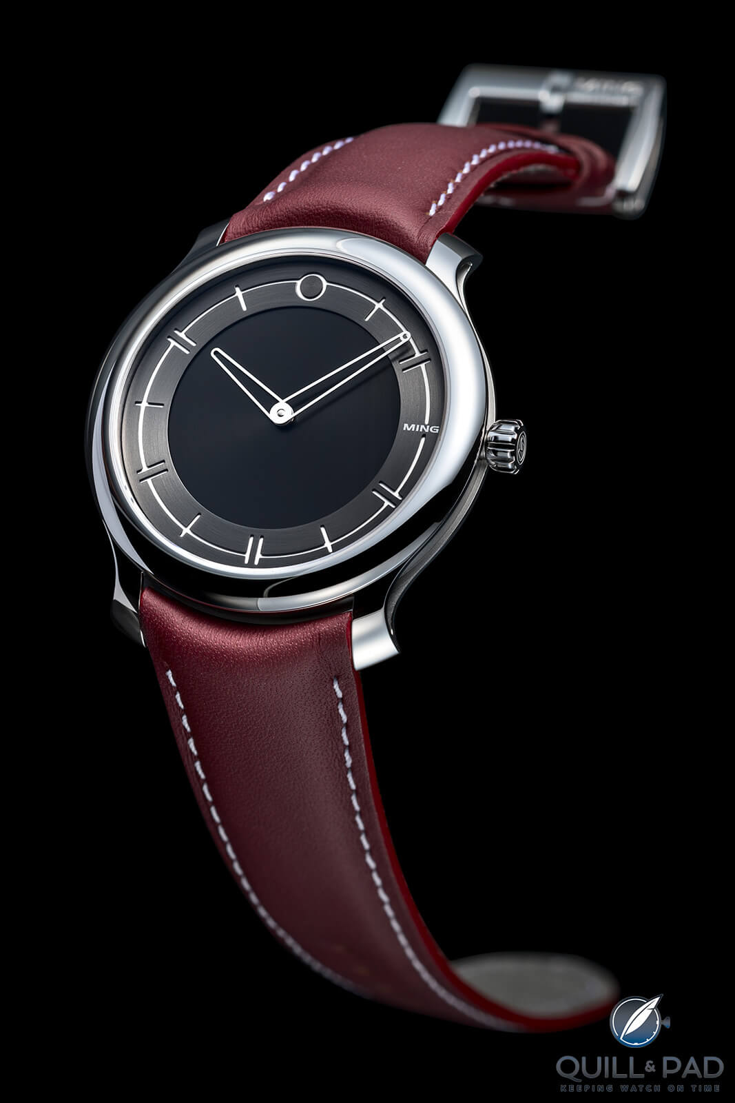
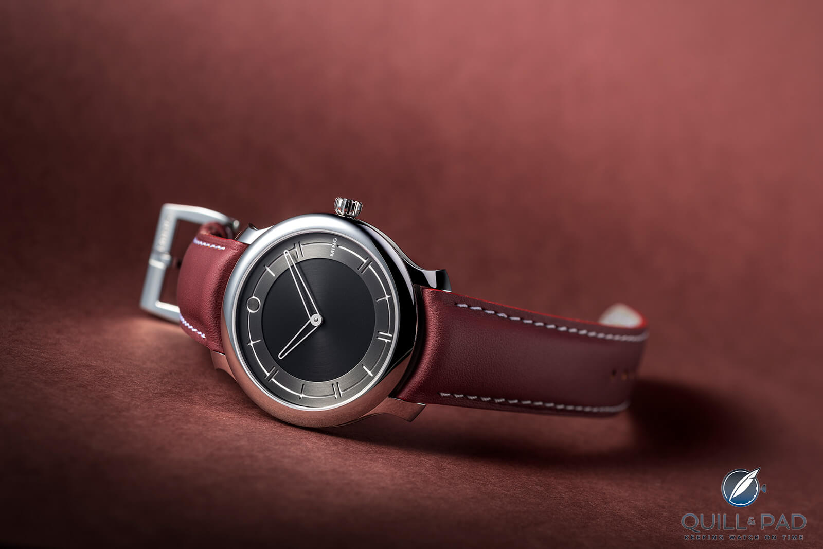
Ming 27.01 Ultra-Thin
This ideology is in full effect on the 27.01, a spiritual successor and evolution of the 17 series and an aesthetic version 2.0 for Ming as a whole. While the 18.01 is aesthetically similar but visually very different from most Ming pieces due to being a distinctly different watch purpose, the 27.01 is a product of design evolution and tweaking and refining details.
Ming 27.01 Ultra-Thin
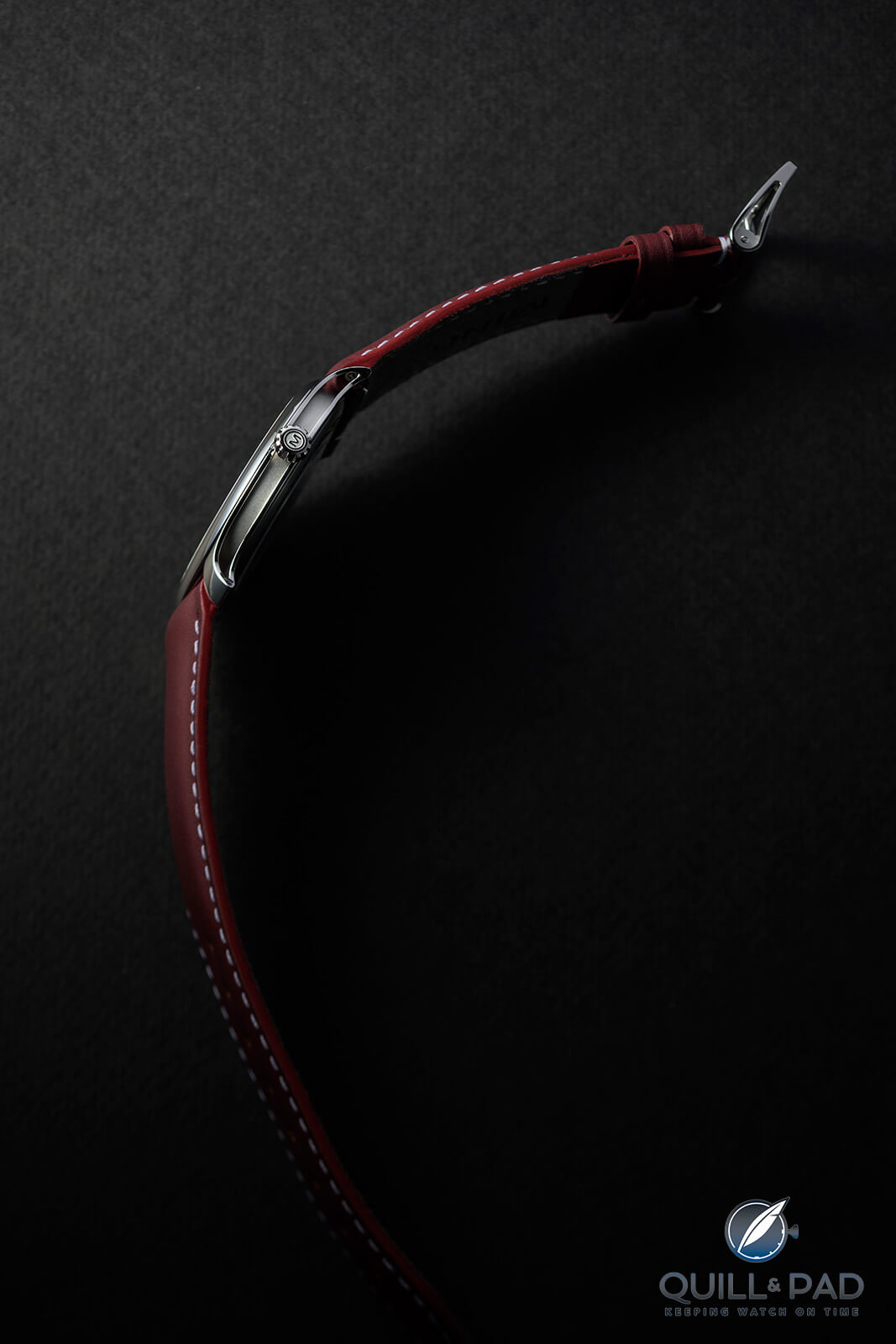
The first thing to note is that the 27.01 is an ultra-thin watch and built differently to accommodate that and highlight the differences. While the case outline and proportions are mostly the same from the front, the side profile is much more revealing. I mean this literally: the lugs and case band have been carved out to take what is already extremely thin and make it paper thin.
Breathe in: Ming 27.01 Ultra-Thin
The 17 and 19 series watches ranged from 9.3 to 10.9 mm in thickness, and the 27.01 is a rather svelte 6.9 mm thanks to the modified ETA Peseux 7001 inside, which is 2.5 mm in height. With the carving of the lugs and case band, the visual edge drops down to less than a millimeter, giving the illusion of a much thinner piece. But if the only changes were the thickness, that would be the end of it.
The 27.01 is what Ming is calling the beginning of “design language 2” or DL2 for short. As indicated by its reference number – DL2, series 7, model 01 = 27.01 – this model introduces a few changes that shift the look of Ming toward a more minimal styling, something already strong across the brand’s design language. The numeral track is the most obvious since it no longer has any numerals.
Ming 27.01 Ultra-Thin
The original 17.01 used all the standard numerals oriented toward the center for more radial symmetry, and the 17.06 replaced all the odd numbers with single hashmarks to reduce visual clutter even more. With the new DL2, all of the even numerals have now been replaced by double hashmarks (alluding to even numbers versus the odd numbers of the single hashmarks), which finally does away with any remaining symmetry issues from the visual difference between the numbers 10 and 2 or 8 and 4.
Small cues can mean a lot
The DL2 also cleans up the zero at 12 o’clock, which previously followed the typography of the numerals but now has become geometric to match the other indications. With this change, the dial becomes almost text free, save the Ming logo.
While the logo was always kept to a minimum (the people behind Ming are collectors who know about brand logos ruining a beautiful dial), it now becomes almost elusive as it moves from the bottom of the dial above 6 o’clock to replacing the single hashmark at 3 o’clock. Since it was already very small, this change makes perfect sense for the new aesthetic.
Speaking of elusive, the hands have been skeletonized to reduce visual weight and match the hashmarks more closely. The minute hand has a small arc completing the radius of the tip to differentiate it from the hour hand by more than just size.
One change that some may not fancy is the disappearance of the “floating” sapphire crystal ring that previously held the numerals thanks to the new decreased thickness. Instead of the floating ring, we now find deeply etched hashmarks filled with lume in a brushed ring around the center of the dial. This adds visual depth without needing to add a whole extra layer.
But if you loved the sapphire crystal ring and thought it was a defining feature of Ming (I did, and it was) then fear not. Ming has recently presented the 2020 Concept Set intended for auction at Phillips on November 8, 2020, which includes the 27.02 concept showcasing the gradient sapphire crystal dial (originally seen in the 19 series) and guilloche ring sandwiched underneath, all taking the ultra-thin 27.01 to a whole new level. It’s different than the 17 series but I think it improves on both the 17 and 19 series, another evolution in the design language.
The last major change is the case back. Since the 27.01 has a bit more reason to show off the movement, we now find a sapphire crystal case back highlighting the caliber dubbed the 7001.M1 and design details seen on the 18.01. The 18.01 is sort of a bridge between DL1 and DL2 as it mostly sports the new design language but still has aspects of the original design language as well. Plus it is a reference starting with a 1, so there’s that too.
The 18.01 and now the 27.01 have case backs that feature debossed arcs with embossed text, with the case back screws highlighted by being the visual separation of the debossed arc segments. This is a stylistic choice seen on other watches, but for the highly minimal case backs of the 17 series this is a nice departure adding texture and making the watch feel more complete and considered.
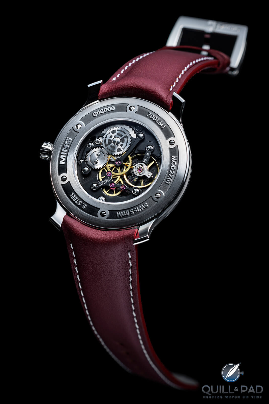
Back of the Ming 27.01 Ultra-Thin
More crucially, the case back design also helps hide the fact that the movement is only 25 mm in diameter, leaving a fair bit of real estate around the sapphire crystal window that may have worked against the intended aesthetic. Since the movement choice was limited by the affordable price of the watch and the thickness desired, this is a great way to use design to highlight what was intended and divert attention from something undesired.
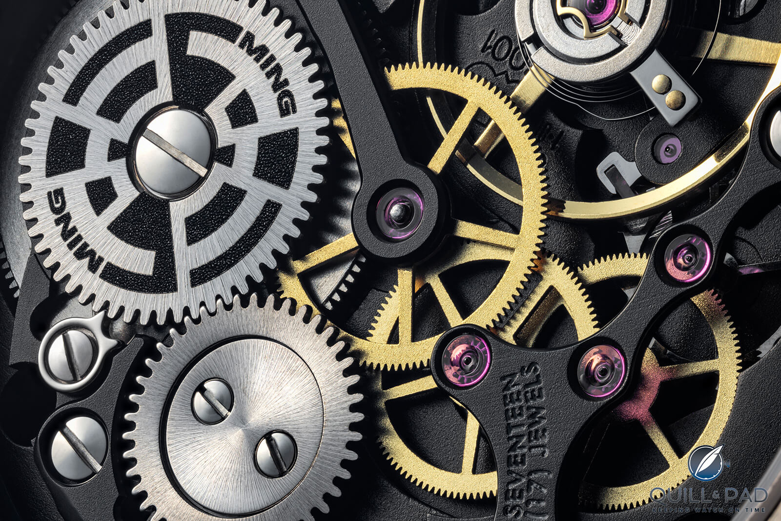
Nice contemporary finish on the movement of the Ming 27.01 Ultra-Thin
And since the original ETA Peseux 7001 was almost entirely reworked (minus the going train) to match the previous Ming aesthetic, there was no way Thein and his designers wanted to hide that behind a solid case back either. It was just one more small detail that the team considered at length to make the 27.01 a much better watch that could compete with long-established brands and their known design language.
The 18.01 and the 27.01 are two incredible examples of how Ming continues to evolve and develop the brand by focusing on details and considering them from every direction. The 2020 Concept Set shows that this will continue as the possible future 27.02, while the brand-new 20.01 S1 chronograph carries on Ming’s tradition of awesome watches.
While I am sure this trend will likely continue as the brand continues to gain fans and a back catalog, I still am continually surprised by how much I enjoy the brand and yet how I lost focus for so long.
If anything good comes out of 2020 (please let something good come out of 2020), it’s my reacquaintance with Ming and its latest offerings, which have definitely become a highlight of my October.

I look forward to both 2021 and the future of the Ming aesthetic as it grows and evolves with each new timepiece. And maybe someday the massively popular and limited production runs might line up with my extremely limited resources and I can finally find myself with one of these highly desirable watches!
For more information, please visit ming.watch/products/ming-27-01 and ming.watch/products/ming-18-01-h41-on-bracelet.
Quick Facts Ming 18.01 H41
Case: 40 x 12.9 mm, titanium or black DLC-coated titanium with stainless steel bezel
Movement: modified automatic Caliber ETA 2824-2 with 40-hour power reserve, 28,800 vph/4 Hz frequency
Functions: hours, minutes, seconds
Price: 2,950 Swiss francs on rubber strap, 3,250 Swiss francs with titanium bracelet (initial production runs sold out)
Quick Facts Ming 27.01
Case: 38 x 6.9 mm, 316L stainless steel
Movement: manual winding Caliber 7001.M1 (based on a highly modified ETA Peseux 7001), 42-hour power reserve, 21,600 vph/3 Hz frequency
Functions: hours, minutes
Price: 3,950 Swiss francs (initial production run sold out, future batches based on movement availability)
* This article was first published 31 Oct 2020 at Ming 18.01 H41 And 27.01: Revolution And Evolution
You may also enjoy:
Why I Bought It: Ming Watches Model 17.06 Monolith
Musing On The Ming Model 19.02: Micro Brand To Mega Brand?
Ming 17.03 GMT: A Brand On A Roll
Ming 19.01 By Ming Thein, Unparalleled Quality For Price


Leave a Reply
Want to join the discussion?Feel free to contribute!