Days Of Futures Past: HYT H0
The future is always changing and will always change as ideas are molded by the past and current worlds from which they arise.
In science fiction, the look of the future has grown and shifted as technologies change and as manufacturing evolves. In the earliest days of the twentieth century, the future described by sci-fi writers and artists looked like a strange conglomeration of current trends and products and wild, sometimes impossible, ideas about future technology such as steampunk-style flying boats and bat-like wing suits.
This is one of the main consistencies in science fiction: a future based on exaggerations of the current day. This is why when manufacturing and design switched to art deco, so did the future.
And in the 1970s when manufacturing left smooth round shapes behind for the hard-edged boxy designs of the “future,” so did science fiction.
Present-day ideas of the future can be more elaborate and, in many cases, not any less impossible – such as depictions of androids that can take their skin on and off without any noticeable seams or material defects. As someone who understands manufacturing throughout history, that really is a glorious future of perfect materials and tolerances.
But throughout the twentieth century, styles have continued to change and with them, our hopes and dreams for what the future will look like. For some, the future promised to look like something that will never come to pass as technologies and capabilities have vastly outstripped the imaginations of earlier minds. Design changes, it always does, and this leaves us with remnants of past futures, shapes, and styles that weren’t bad, but now are simply outdated.
Yet every once in a while, something comes along that is so purposefully designed and well considered that it touches on aspects of the past futures we adored and at the same time fits perfectly with the day in which we live. These objects have the power to grab our attention and, even if we don’t know it, trigger hopes for the future and feelings of nostalgia all at the same time.
HYT has, since its inception, been a watch brand about one thing: redefining horology and the future through the use of microfluidic technology and advanced research. The design has always been forward leaning.
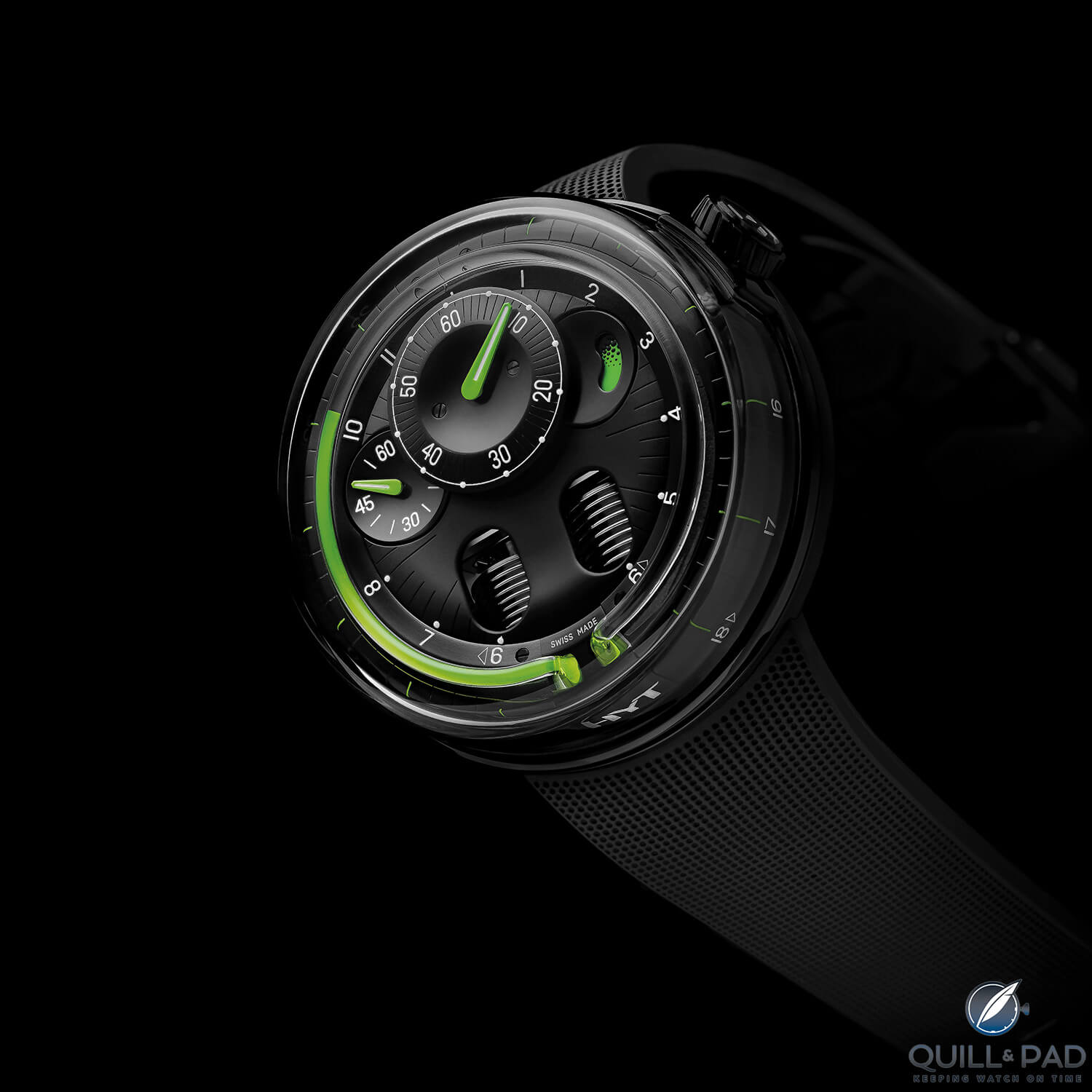
HYT H0 Black
But the newest HYT release from Baselworld 2017, the H0, was a practice in simplifying and distilling design cues for a supremely functional and visceral design experience. As a result of this path, the brand inadvertently (at least to my eyes) created a watch that harkens back to the future imagined in the 1950s and 1960s, while still feeling relevant and modern today.
The HYT H0 is a special object that captures something intangible inside our hopes for a better tomorrow.
HYT H0: simplified design
The H0 collection is described by HYT with phrases such as “source code” and “going back to basics” which, in design terms, usually means working with only one or two shapes and keeping a design as simple and clean as possible.
Compared to earlier models, especially the H2 and H3, H0 is a very clean design with a much less complicated dial and case; it stands apart as something with a different intent than its predecessors. Since the H0 is the sixth collection, returning to the “source code” isn’t a return to an earlier design and the beginnings of HYT, instead it is returning to the basics of shape.
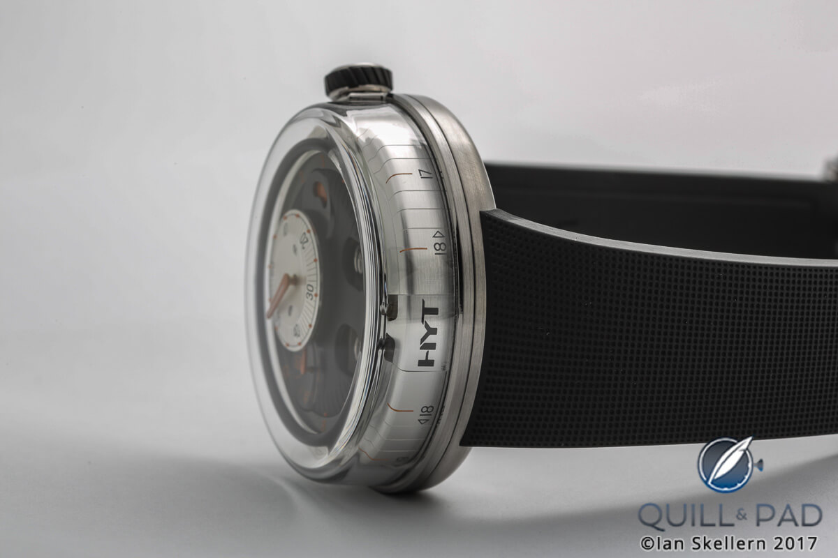
The HYT H0 on its revealing side showing the minute track
The H0 case is no longer a strong, deliberate shape; instead is the least it can be.
The case has been largely reduced to a giant sapphire crystal dome surrounding almost the entire movement: there is no distinction between bezel, crystal, and case; the only thing remaining is the shape. This practice follows into the dial, which normally highlights the mechanics underneath, but here highlights time telling with only a minor glimpse into the bellows system for the fluidic display.
The domed hour “ring” underneath the capillary tube is reminiscent of mid-century knobs and dials that might be found on advanced computer equipment.
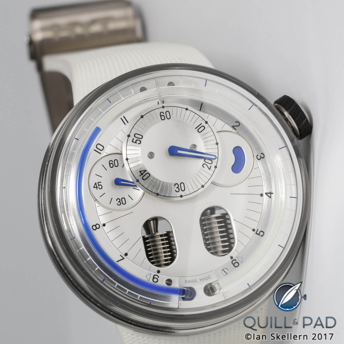
HYT H0 White
Its large curved and brushed surface is soothing instead of hard and exciting like the construction of previous models. The soothing nature is continued with the center, the dial, which seems to undulate as if it were a liquid.
This was largely the design intent, described by HYT as “suggesting the concentric waves formed by drops of water repeatedly falling into the basin of a water clock.” The subdials for minutes, seconds, and the power reserve echo this as well.
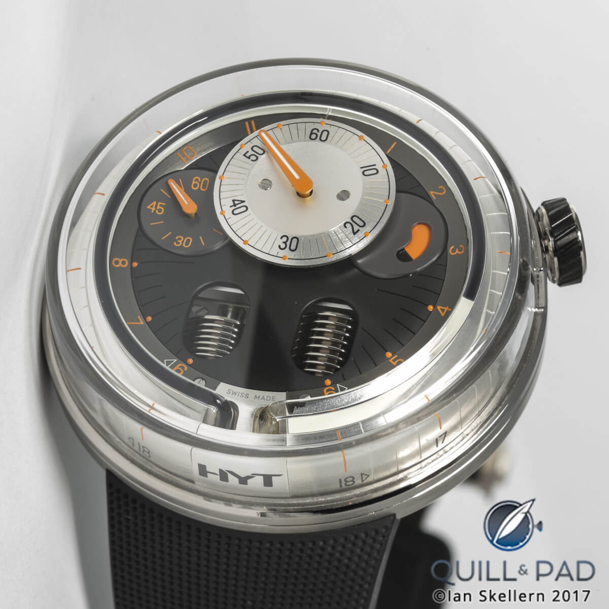
HYT H0
The only indication that there is something behind all of this are the two pill-shaped cutouts in the dial that display a small portion of the bellows and the capillary tube, uncovered where it joins the movement, which can be seen diving beneath the surface of the dial.
This is the first watch showing the liquid’s return back towards the movement; viewing it is the simplest way to see that the fluid’s motion is a product of the movement underneath.
Days of future past
That movement, when viewed from the rear, is still beautifully finished and as complicated as always, but that isn’t the H0’s point anymore. This watch is simplified to be worn and appreciated on a regular basis, hence the much more legible dial.
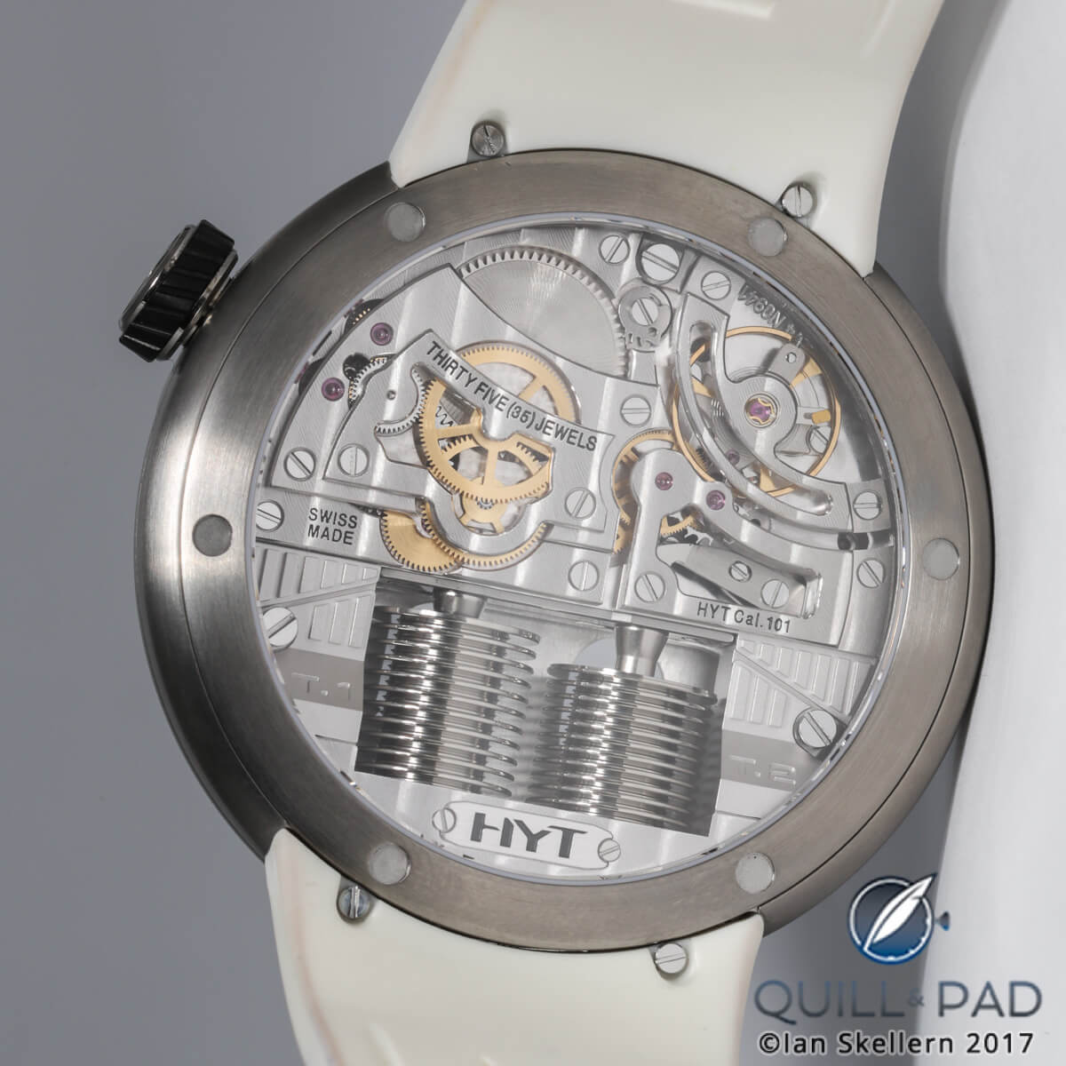
Through the display back to the movement of the HYT H0
The case lacks lugs; the strap screws into the underside of the case. The elimination of lugs and the inclusion of the giant domed sapphire crystal make what is technically a large watch wear very comfortably on the wrist.
The measurements belie what it feels like to wear the H0, which is easily the most wearable of all the HYT models. I love wild, large, and weird cases, so HYT never had an issue winning me over, but this change definitely could sway the minds of others.
The best part about the H0 is the overall impression it gives, the feeling that you are stepping back in time toward the future. While that sounds contradictory, it goes back to the beginning of my discourse here: the future that was promised to some before design and technology changed.
To me, the H0 feels like it was born out of the 1950s and 1960s visions of the future, when teardrops, domes, bubbles, and simple geometric shapes defined what the future looked like.
That era neared the end of the time of hand-built forms, coinciding with the beginning of the space age. Curved shapes were simplified over the previous hand-hammered generation, but hadn’t yet reached the angular and boxy limits of cheap manufacturing that would take over in the 1970s and ҆80s.
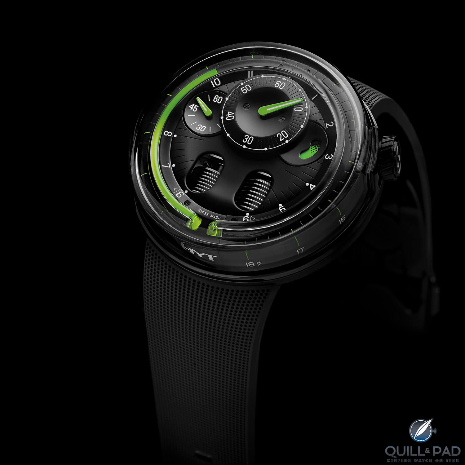
HYT H0 Black
Designs were inspired by geometry and form that would survive high speeds, deep dives, and space exploration, and the influences can be seen in product and building designs, especially at events like the World’s Fair.
However, the feeling it evokes isn’t of a dated design, but of an actual bright promise of the future. H0 feels like it embodies the hope and optimism of a beautiful future where we are people of the stars and the world we build around us reflects that fact.
Design surely has changed since then, but the design ideals had solid ground for what the future could look like, and I believe we may actually be headed back in that direction. Manufacturing changed design because capabilities limited what could be made affordably, and so we lost that vision. But with the ever growing capabilities of industry, we are coming back around to idealized forms that can actually be manufactured cheaply and efficiently.
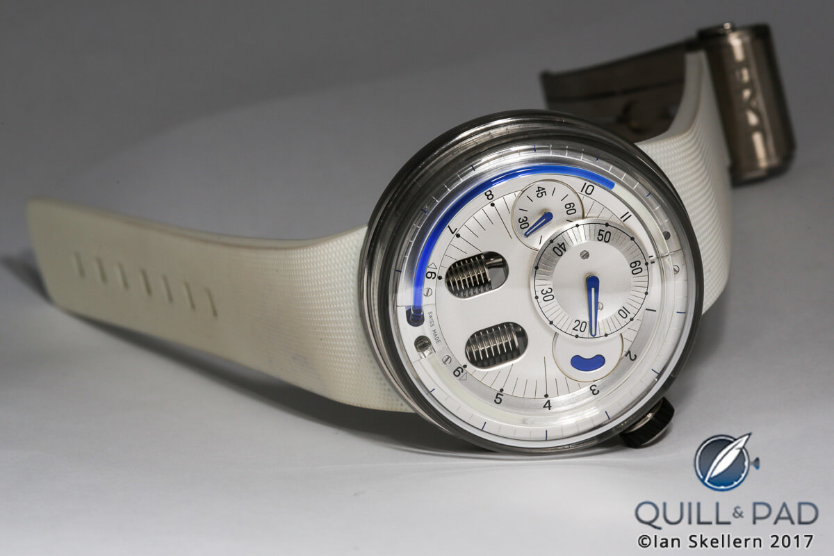
HYT H0
Granted, the HYT H0 isn’t a building or a car, but it touches on the design directives of simplicity of form and directness of function. That was one of the best things about design in the middle part of the last century: the focus on making things look good while not overcomplicating things – and having them function, too.
Design can struggle with that, and good design often has these factors guiding the direction. The HYT H0 is a fantastic example of this, showing that incredible mechanics need not be the only reason to wear a timepiece. Instead, it shows that feeling and function are just as important as a wow factor.
I personally love the direction of the H0 (if you couldn’t tell) and hope that more watches along these lines emerge from the brand. Of course, I don’t want the other design directions to be abandoned, far from it, but I truly love the simplified approach to form and function.
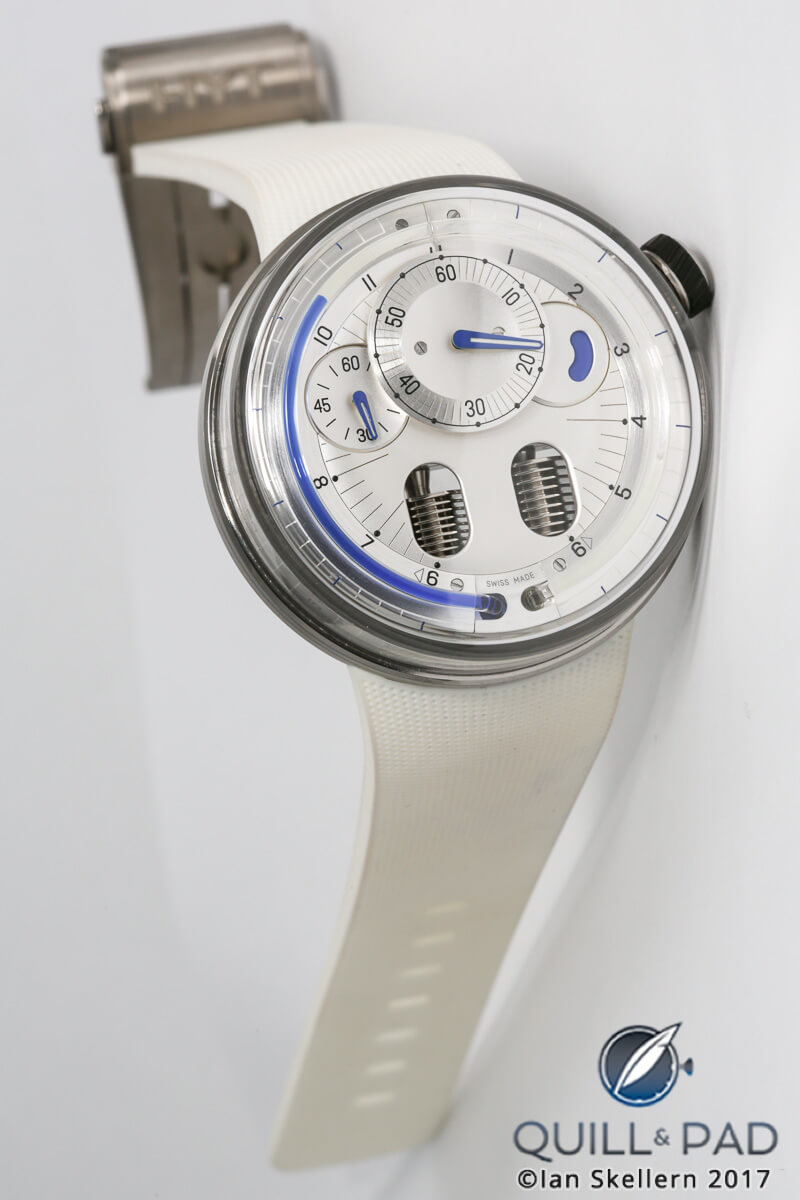
HYT H0
The HYT concept is incredible, and the H0 amplifies that in a way we haven’t seen before. The days of future past could be here again.
So how about a breakdown!
- Wowza Factor * 9.5 When the future comes back from the past, the only response is wow!
- Late Night Lust Appeal * 88.9 » 871.811m/s2 The force of this watch to keep me lusting into the wee hours is stout, nearly enough to stop me cold!
- M.G.R. * 71 HYT movements are always incredible, and the technology behind them is second to none!
- Added-Functionitis * Mild Power reserve is a supremely functional additional complication in a manually winding watch. Still, the awesomeness of the HYT is in the display, so you’ll only need childrens’s strength Gotta-HAVE-That cream for the clean, futuristic swelling!
- Ouch Outline * 11.6 Pinching a nerve on both sides of your neck! I needed a better pillow, but was too lazy to buy one. Getting that double pinched nerve (one that also made a popping sound) was enough to get my butt in gear. Though if sleeping on that terrible pillow means getting one of these for my wrist, I’d do it again in a heartbeat!
- Mermaid Moment * One day far in the past future! Since it is the past’s future, it already happened (I think). So that means you will fall head over heals for the H0 almost immediately! Now I just need to find a 50s space-themed reception hall!
- Awesome Total * 793 Multiply the diameter of the case (48.8) with the number of hours in the power reserve (65) and divide the total by the period of the balance in Hz (4) for a truly timeless awesome total!
For more information, please visit www.hytwatches.com/collection-h0.
Quick Facts HYT H0
Case: 48.8 x 18.7 mm, brushed or black DLC-coated stainless steel
Movement: manual winding Caliber HYT 101
Functions: hours, minutes, seconds; power reserve
Price: $39,000
Leave a Reply
Want to join the discussion?Feel free to contribute!


Gimmicky, rather ugly and one-trick only!