by Martin Green
My personal quest for the ultimate fountain pen began unexpectedly.
I was taught to write with a fountain pen in elementary school, which is quite normal in Europe. But I switched this out for a ballpoint pen later on as the speed of my classes’ lectures increased.
Blessed with horrid handwriting, I never thought myself worthy of a nice fountain pen. Cheap ballpoints pretty much ruled my adolescent years and I was fine with them.
But then my grandparents moved into a nursing home. This was a sad occasion, and it also meant that their house had to be dismantled since not everything could move with them. And this is how I ended up with the black-barreled fountain pen with silver cap from my grandfather.
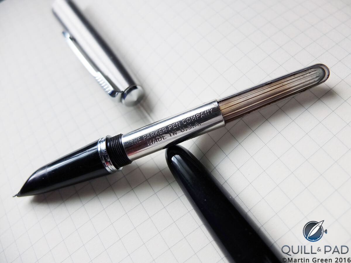
Inside Martin Green’s Parker 21
The arrow-shaped clip clearly indicated it was a Parker, but I had no further information about it bar that. I filled it easily from an ink pot by pressing a little plastic bladder five times, and off I was on the path to a journey I had never expected myself to take.
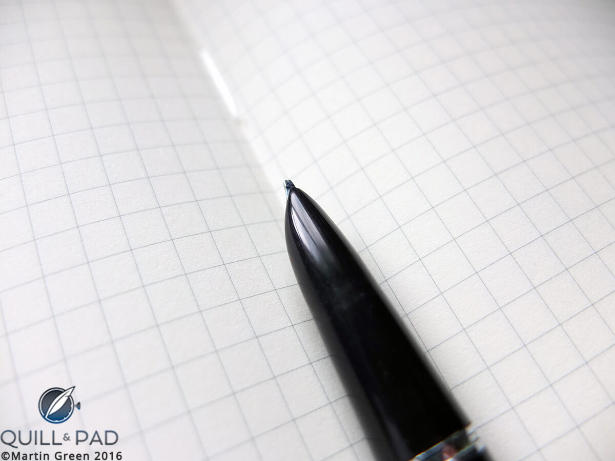
The broad, flat stub nib of Martin Green’s Parker 21 fountain pen
The steel nib of the Parker turned out to be a smooth writer. It was actually a stub nib, meaning a broad, flat one with rounded corners, which made my messy handwriting look more acceptable. But even more than that, I enjoyed the experience: filling the pen with ink, the smooth writing, the feeling of satisfaction that this type of writing gave me.
It was there and then that I decided that I might have a horrible-looking handwriting, but that I could certainly compensate that with a pen that looked amazing – and felt amazing as I wrote with it.
My perfect pen – yours might be different
My quest for the perfect fountain pen ended up taking almost two decades.
During that time I wandered aimlessly through the world of fountain pens because I allowed myself to wonder. This was the strategy I had worked out to find what I was looking for; in a sense I was following my yellow brick road to the wizard of Oz.
I consider all the pens I came across on my journey formidable writing instruments, yet in the end there was only one that became my ultimate pen, the one above all others. But if it wasn’t for all those other pens, I would have never found it.
On another note – and I was very fortunate to learn this very, very early in my journey of discovery – I also learned that the “perfect” fountain pen is different for everybody. It has a lot to do with the size of your hand, the way you hold a fountain pen, the pressure you put on the nib while writing, the way you move your hand, and the speed with which you write.
So one person’s grail pen can be somebody else’s writing nightmare. What I might criticize on a pen can be taken as a recommendation by somebody else.
When I ventured off in the world of fountain pens I learned that the pen I got from my grandfather was in fact a Parker 21, the less expensive sibling of the famed Parker 51 introduced in 1941.
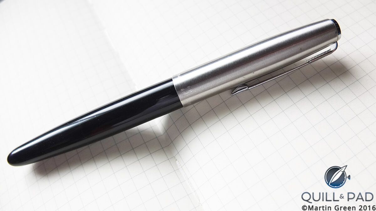
The author’s Parker 21
With the clarity of hindsight, I now ask myself why I actually began looking further at all because I still consider it a formidable writing instrument.
But the answer is twofold: first of all, it turns out that I like dramatic-looking pens. And by dramatic, I mean almost over the top. For me a pen needs to be eye-catching, and with its black body and silver cap, the Parker 21 couldn’t be more understated.
Secondly, I learned that nothing compares to writing with a gold nib.
Gold nibs
I had to try a gold nib, so I got myself a Pelikan M250, a 14-karat-gold-nibbed demonstrator. A demonstrator is a writing instrument whose barrel is partially or completely transparent so that the filling mechanisms can be viewed as they work.
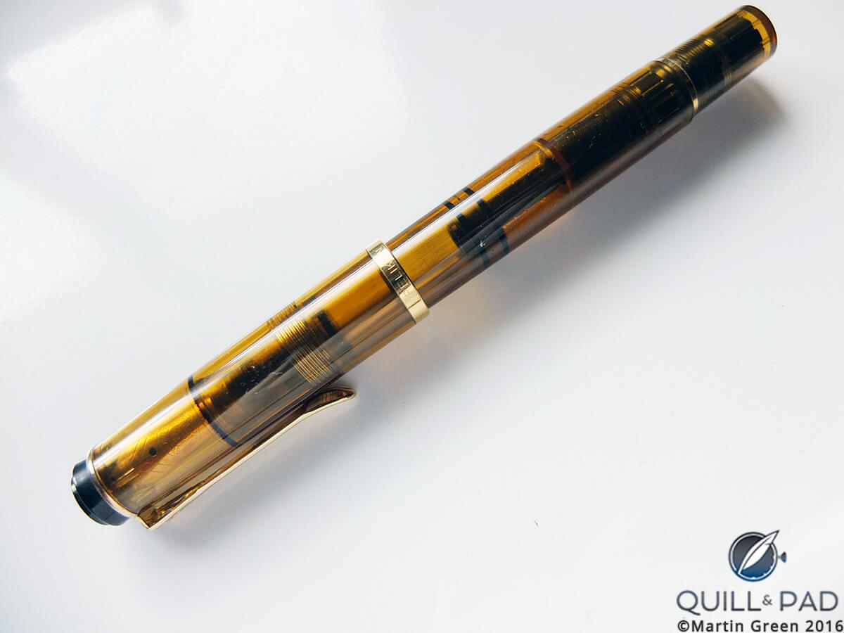
The author’s Pelikan M250 demonstrator with transparent barrel
I got it in a brownish-yellow color that I dubbed Havana. It was a great writer, especially for the money, but as cool as a demonstrator sounds in theory, I learned that it is not like a skeletonized wristwatch.
Yes, you can clearly see how the pen’s large piston sucks in the ink, but since it is filled with liquid, you can also see condensation and ink residue. This is perfectly normal, but pens with colored barrels don’t allow you to see that. I found that instead of adding to the experience, it took away some of the magic. And it was time to move on.
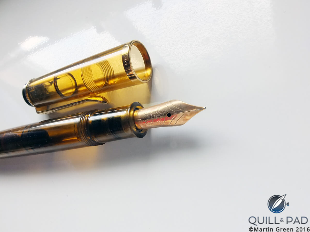
The 14-karat gold nib of the author’s Pelikan M250
The Pelikan did have a smooth-writing 14-karat gold nib, but I was wondering if 18-karat gold would provide an even smoother writing experience.
I have learned over time that this doesn’t necessarily have to be the case, and one of my teachers was the Conway Stewart Amethyst fountain pen.
About the same size as the Pelikan M250, the Conway Stewart Amethyst was based on the brand’s “58” model. Being somewhat of an anglophile in terms of clothing and cars, I was taken by the fact that Conway Stewart was an icon of the British fountain pen industry and always had an interesting approach.
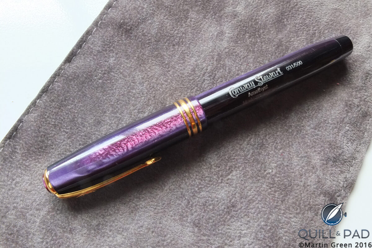
Conway Stewart Amethyst fountain pen
The Amethyst was most certainly interesting with a stunning-looking body and cap displaying almost every hue of purple that exists.
At that time I was actually convinced that thinner pens would prove to be more comfortable for me to write with. I could not have been more wrong.
However, I don’t regret this side step because it led me to a very slender beauty with the very unsexy name of Élysée Edition No. 1.
Quite unlike the images a name like Élysée might conjure in one’s head, this was actually a German brand that made very high-quality pens. However, by the time I became aware of the brand in the early 2000s, it was already out of business.
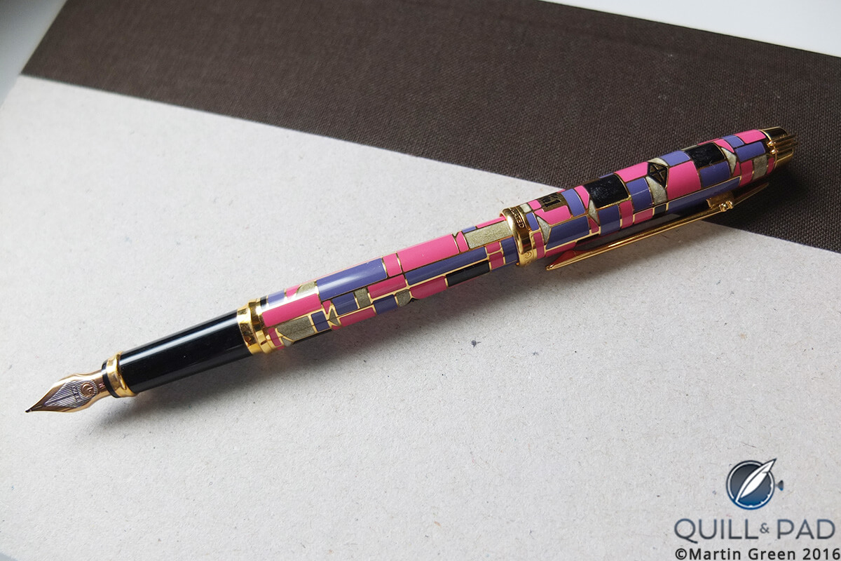
Élysée Edition No. 1 fountain pen
In 1993 Élysée had the idea to pay tribute to the art of Chinese cloisonné with a series of limited edition pens based on the Parthenon, the brand’s flagship model. The first edition of this series was created by German artist Karl Diesner, who would later also design a second one. According to him, his purpose was to “activate our vision.” And he was not kidding!
Almost every geometric shape known to man decorates the barrel and the cap of this pen. Outlined in yellow-gold-plated wire, the shapes are filled in with pink, purple, black, and grey enamel in cloisonné style. This is for sure a pen that tantalizes the eye.
The level of craftsmanship is extremely high; I have heard that Élysée actually went out of business because the firm produced much too high of a quality in relation to its prices, limiting profit margins. Judging by this fountain pen that could very well be the case.
Unfortunately, I also discovered at this time that thin pens don’t really agree with my writing style.
Time to tuck my Élysée pen into the pocket of my white blazer, which I wear with matching white pants, a pastel t-shirt, and Gucci slip-ons, and take the white Testarossa for a spin on the way to part 2 of this trilogy, which will focus on my Italian period.
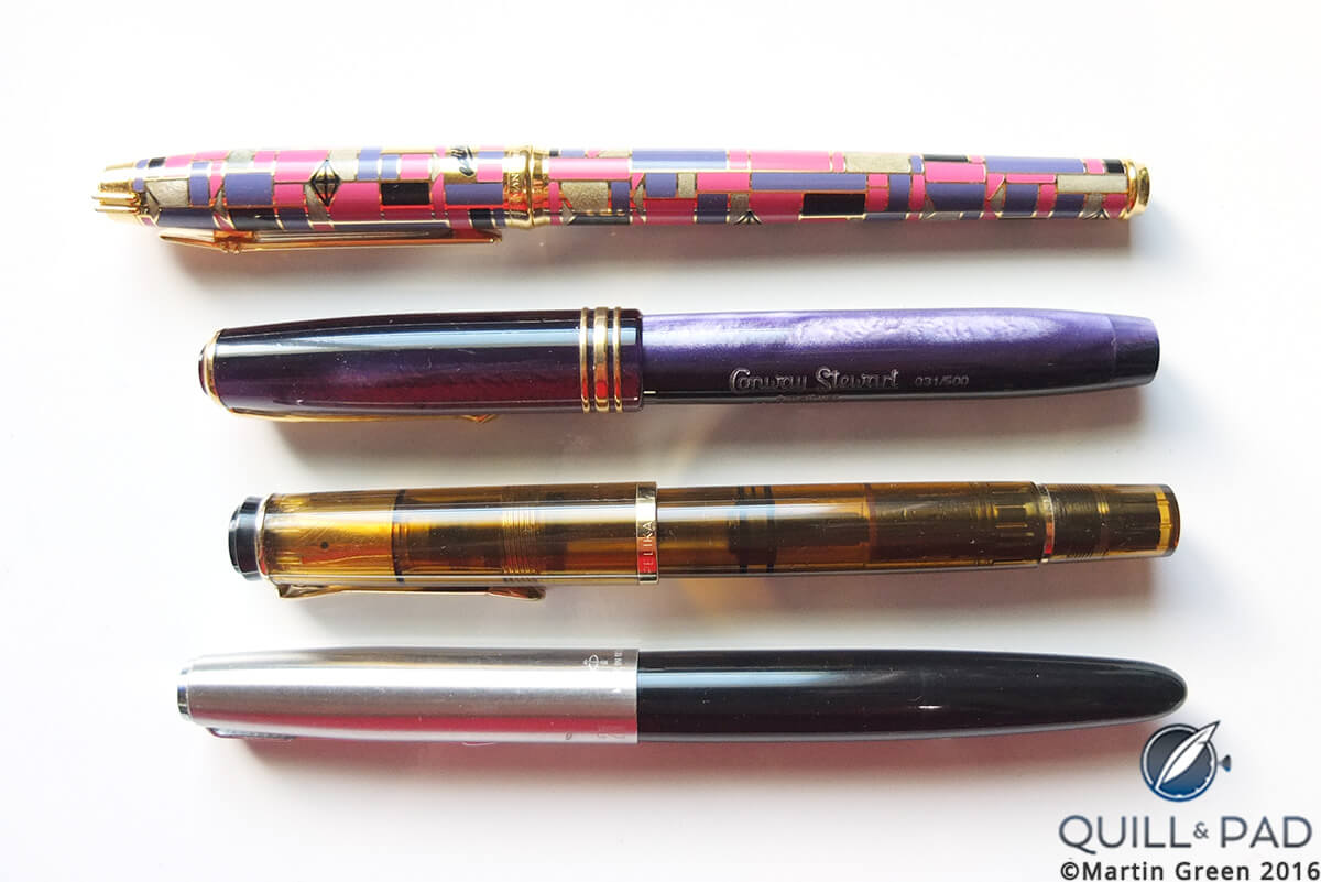
Part of the author’s colorful fountain pen collection
See part two in The Quest For My Ultimate Fountain Pen Part 2: The Italian Period.
* This article was first published on July 27, 2016 at The Quest For My Ultimate Fountain Pen Part 1: The All-Over-The-Place Period.
You may also enjoy:
Five Top Writing Instrument Stories From 5 Years Of Quill & Pad
Yard-O-Led: The Most Traditional Writing Instruments You’ve Never Heard Of
Ground Control To Major Tom, “Help Is On Its Way!”: Astrograph By Caran d’Ache and MB&F
Leave a Reply
Want to join the discussion?Feel free to contribute!



































fountain pens for sale rate collectors Parker ’40 and ’30. call +39 335 6462415 from sept 12.
I have a Marble Pelikan fountain pen if anyone is interested. Box paperwork. Lmk Email me