Rebuilding a civilization to its former glory is a nearly impossible task that cultures throughout recorded history have learned the hard way. Once a culture peaks and begins the long (or sometimes abrupt) downward slide from its pinnacle, it is often hard to stop it, let alone regain the same levels of greatness.
Sometimes the decline is caused by something outside of the civilization’s control, like a shifting climate. One hypothesis is that the only thing that stopped the Mongols from conquering Europe was a period of cold and wet years in Eastern Europe that made large hordes of horses impractical for the marshy conditions. Combine the over-extension and then retreat from the unsuitable lands with key deaths in leadership and the decline of the Mongols was on its way.
In other instances, the reasons are more varied and less obvious than with the Mongols, perhaps resulting from the gradual march of time. One could argue that values and practices naturally change over generations, so an entirely different culture arises within the one that built it. This leads to the inevitable shifting of priorities in a system built for different goals with very different core assumptions.
When enlightenment principles of liberalism, science, and capitalistic ideals began to replace the clearly diseased feudal monarchies of Europe, great royal lineages and empires began to falter as corporate entities and more agile and innovative nation states began to rise. This was also the period of great colonization, built on exploitation and industry, that led to the industrial revolution and the almost complete obliteration of any hereditary leadership remaining a world power.
As Bob Dylan would go on to sing, “the times they are a changin’.”
But sometimes, rebuilding can happen if it follows a new path seeking a different goal instead of trying to attain any previous glory. The watch industry is no stranger to the rise and fall of an “empire,” and the peak of watchmaking culture may have undoubtedly come before today, taking a massive hit with the quartz crisis and the later ubiquitous use of the smartphone and smartwatches.
But we are seeing a renaissance of watchmaking now, taking old values and technologies, meshing them with new ideals and transforming into a different industry.
This is even being seen on a smaller scale as some brands once very popular saw their fortunes change as watchmaking culture shifted into new directions. Some have ceased to be, still others have tried to rebuild, not following an earlier roadmap, but adapting to the new world we live in.
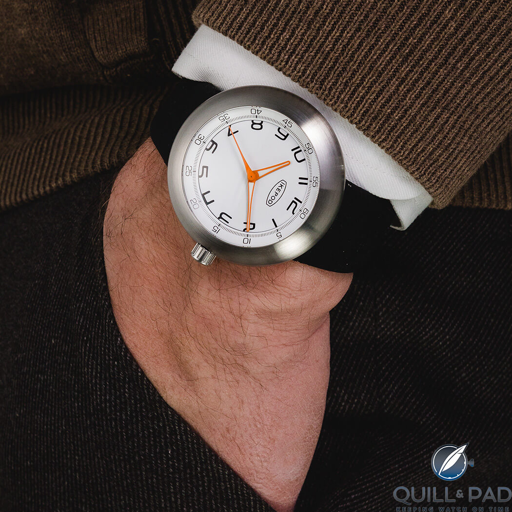
Ikepod Megapod M203 Joe on the wrist
Ikepod is a fantastic example of this. Like a phoenix, Ikepod was recently reborn out of the ashes of its former self and, unlike its former self, began small and with a different goal in mind, growing organically with the true fans first.
This brings us to today: Ikepod has recently launched its second Kickstarter campaign with a new collection, the Megapod.
Ikepod Megapod
Ikepod is a design brand first, so getting the Ikepod style back on people’s wrists was paramount to the rebirth, and it launched in 2018 on Kickstarter with a handful of options featuring quartz movements. Affordable prices attracted interest combined with nostalgia and passion for what Ikepod represented.
Of course, some hardcore fans balked at the apparent abandonment of mechanical watchmaking. But success followed and plans for the inevitable mechanical follow were already under way.
And, as expected, the follow-up brought mechanical watchmaking back with the new Megapod collection, launching on Kickstarter on March 24, 2020.

Ikepod Megapod designer Alexandre Peraldi
Following original design cues from Ikepod, mixed with the flair of designer Alexandre Peraldi (previously with the Richemont Group and later solely Baume & Mercier), the Megapod collection features three style options with eight variants across the group (11 if you count the three Kickstarter-only editions).
Focusing on a three-hand dial with modern minimalistic details, the Megapod feels very much the descendent of the original Megapode collection and definitely fulfills the requirements for a solid, high-quality mechanical watch featuring incredible design at an affordable price.
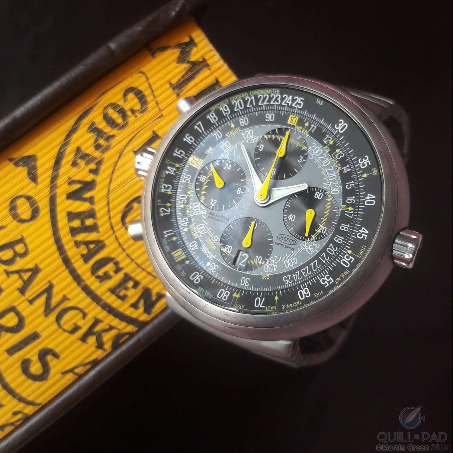
The original Ikepod Megapode chronograph of 1999
How affordable? Well the owner of the modern Ikepod, Christian-Louis Col, specifically chose to price the current Megapod at around one-tenth the price of the original Megapode from 1999. And if you back the brand on Kickstarter to support production, you can get the watches at a fantastic rate of 740 Swiss francs, more than 40 percent off retail.
And, because nobody can escape the time we are in, two percent of sales will go to help relief efforts for the current COVID-19 pandemic. But that is nothing new for a Kickstarter campaign, so what are the watches and how do they stack up against the originals?
Megapod M000
The new Megapod collection is broken into three groups denoted simply by the collection names M000, M100, or M200. The M000 could be considered the most accurate to the original Megapode models (not the chronograph, though) with a clean dial featuring hour, minute, and second hashmarks around the edge and on the beveled outside ring. The M000 line has three regular variations and one Kickstarter-only model.
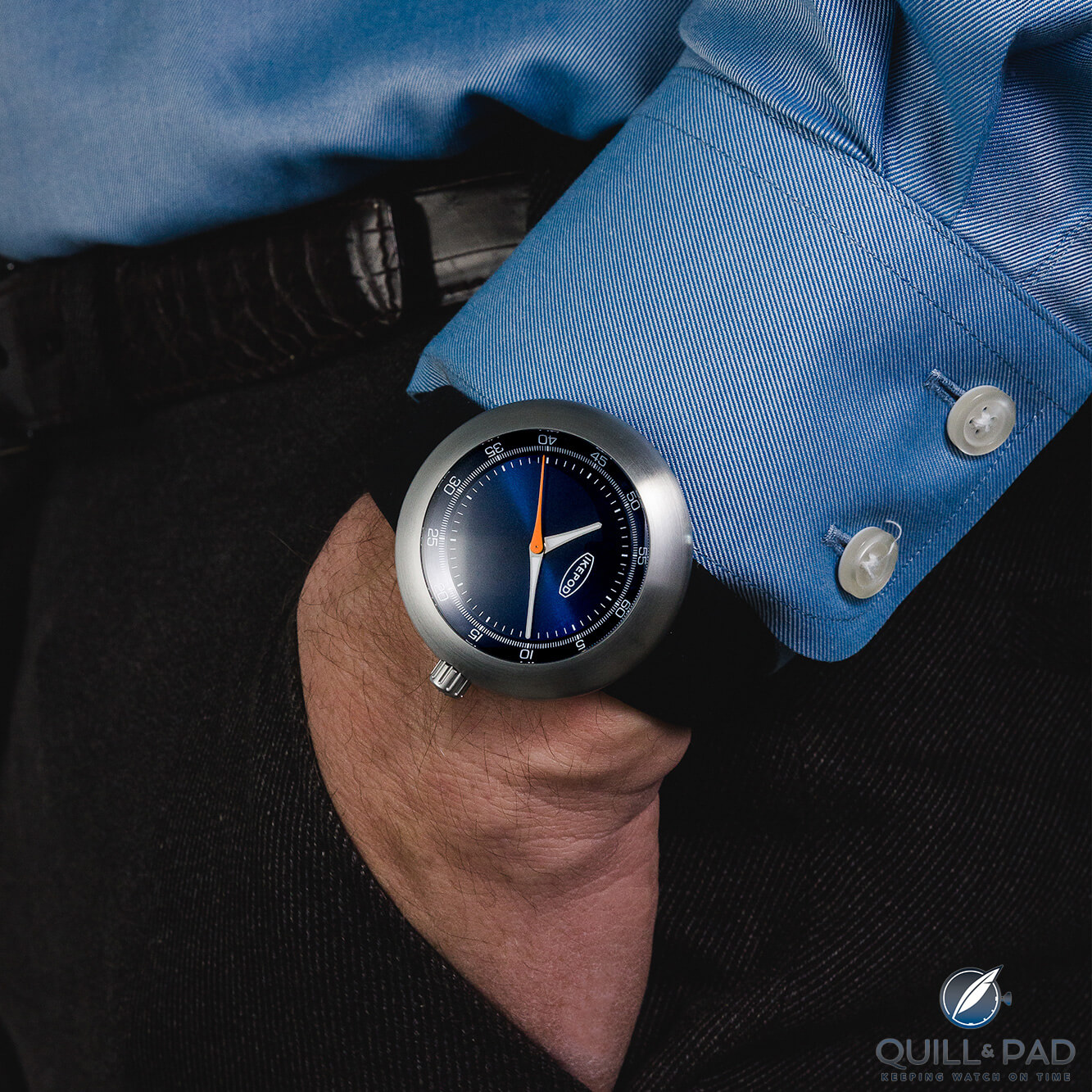
Ikepod Megapod M001 Dieter on the wrist
The M001 Dieter (no clue on the addition of these names, by the way) has a sunray brushing across the dial with a deep blue finish. The pad-printed minute numerals and hashmarks are all in white with silver and white hour and minute hands, and for some contrasting color the second hand is a bold orange.
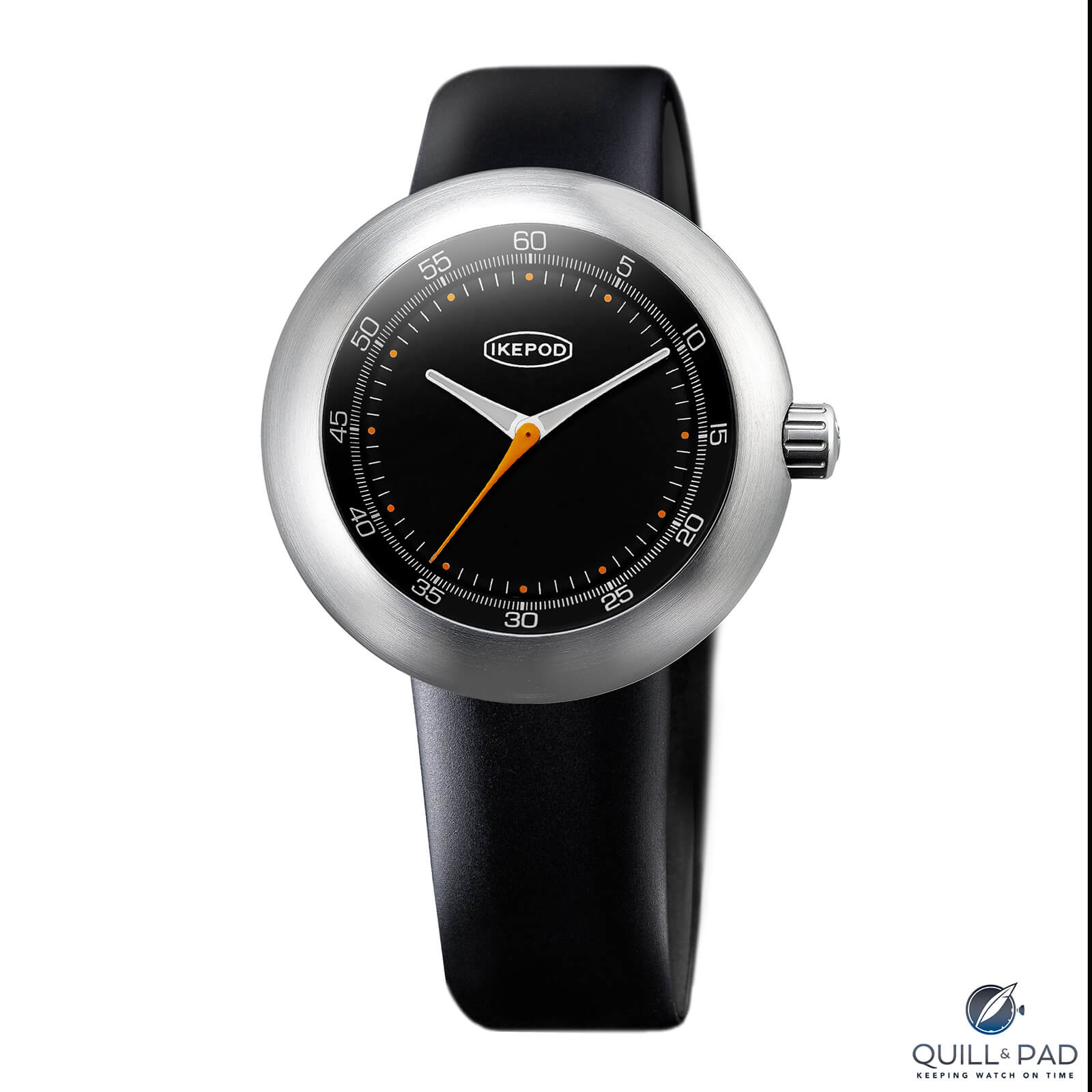
Ikepod Megapod M002 Gae
The M002 Gae features a black dial with the white pad printed numerals and hashmarks, though this model adds an orange dot instead of square white markers for the hours. This tiny change may seem insignificant, but it makes the entire dial feel so much more cohesive.
That is the odd thing with design: changes don’t need to be massive to completely redefine an aesthetic, and that is why simple watches can either look plain or perfectly curated. It’s a tightrope balancing act. This small orange dot makes the dial for me, and makes the M002 Gae my favorite of this bunch.
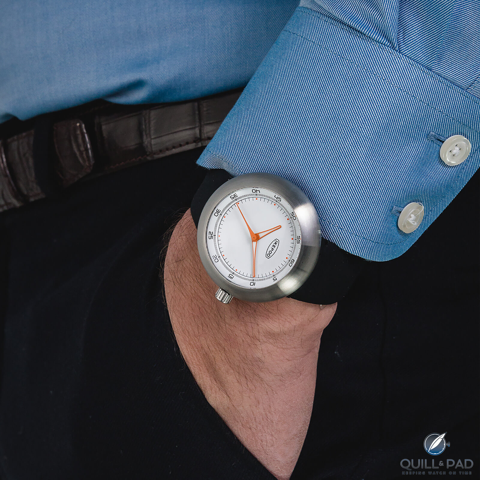
Ikepod Megapod M005 Walter on the wrist
The M005 Walter follows the M002 with the hour mark change, but does it with a white lacquer dial for those who want something bright. It also swaps the white printing for black and adds the orange of the second hand to all three hands for better contrast.
For the special Kickstarter edition, the M006 Zaha, the dial printing goes back to the basic hashmarks for the hours but adds a unique brick red finish, a satin brownish red color that stands out from the rest. To keep contrast and legibility, all of the hands on this model are white, a detail only found on one other Megapod.
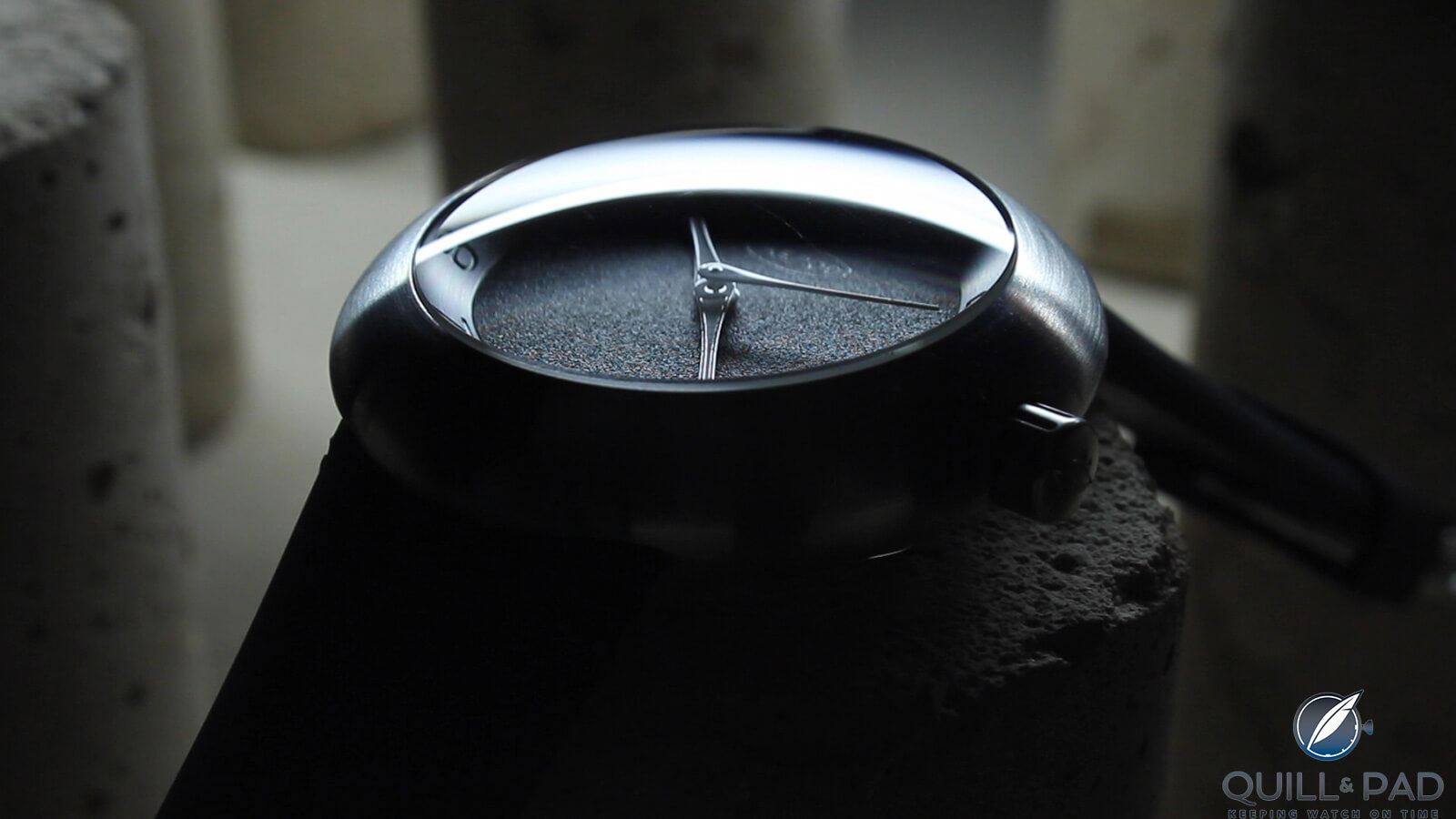
Ikepod Megapod M100
Megapod M100
The next group is the M100, which changes the dial strategy from homage to allusion . . . well, in a way. The M100 versions have gotten rid of the second markers completely, making the dial much less busy around the outer ring.
In their place Ikepod engraved Arabic hour numerals in a custom-designed typeface that is both modern and retro modern. On top of that, they haven’t been filled with color but are the same finish as the sloped outer ring, making them essentially ghost numbers. This aesthetic is by far my favorite of the Megapod collection because it upsets the norms a bit to focus on subtle design codes.
The reason I said earlier that these feel like allusions to the past is that special editions of the original Ikepod Horizon with artist KAWS (you remember, the one with the teeth) have a mono or dichromatic ghost feel that the Megapod M100 models allude to in a very different way. It isn’t much, but it is a little thread of creative continuity that I observed and appreciated. The M100 has two production dials and another Kickstarter-only design.
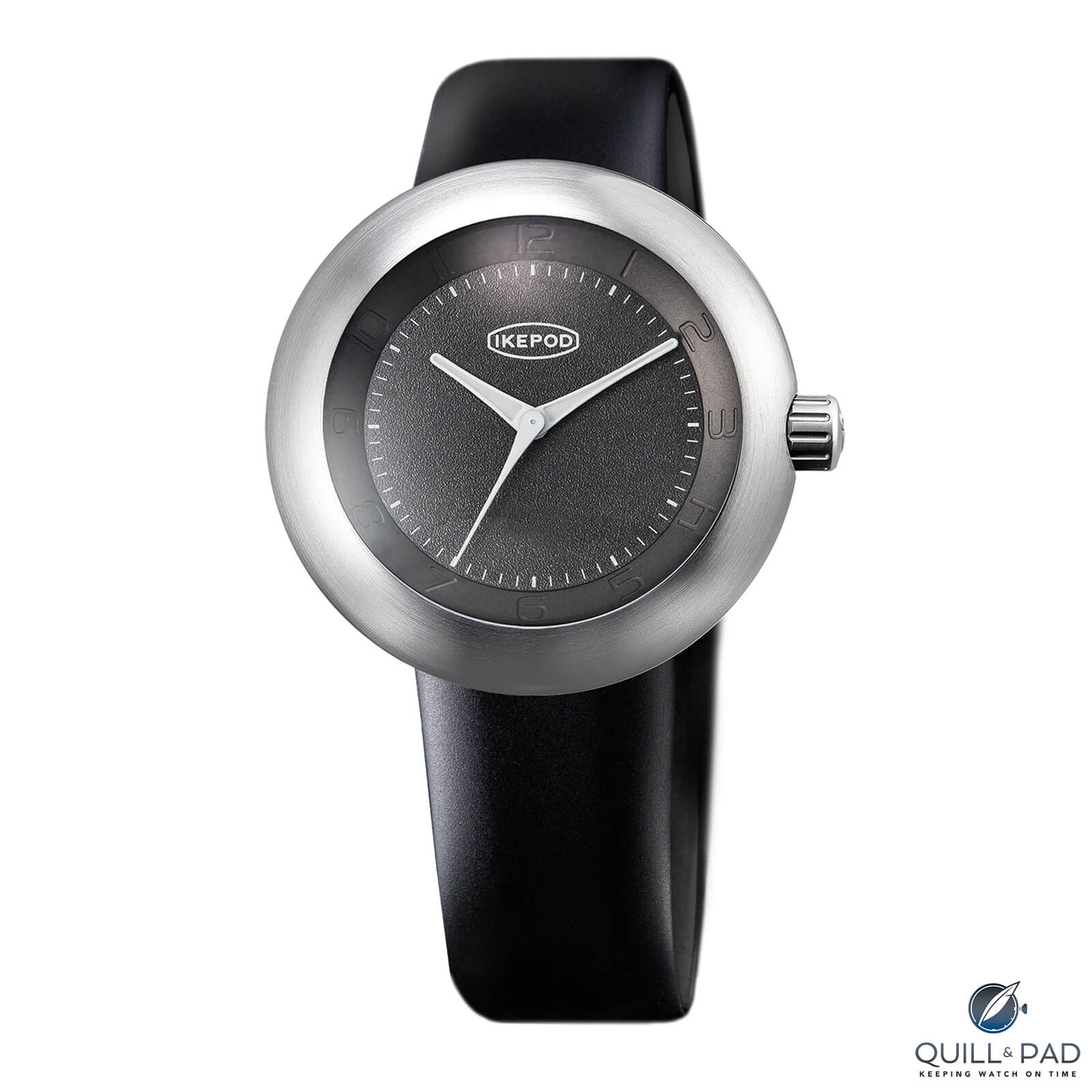
Ikepod Megapod M101 Rob
Beginning with the M101 Rob, we find a brushed dark grey outer ring and a heavily textured central grey dial. That is combined with simple minute hashmarks in white around the periphery and all-white hands (the only other version aside from the M006 Zaha with this hand color) to offset the heavy dial texture. The entire aesthetic is both rough and smooth while being very minimal, a definite plus if you are like me.
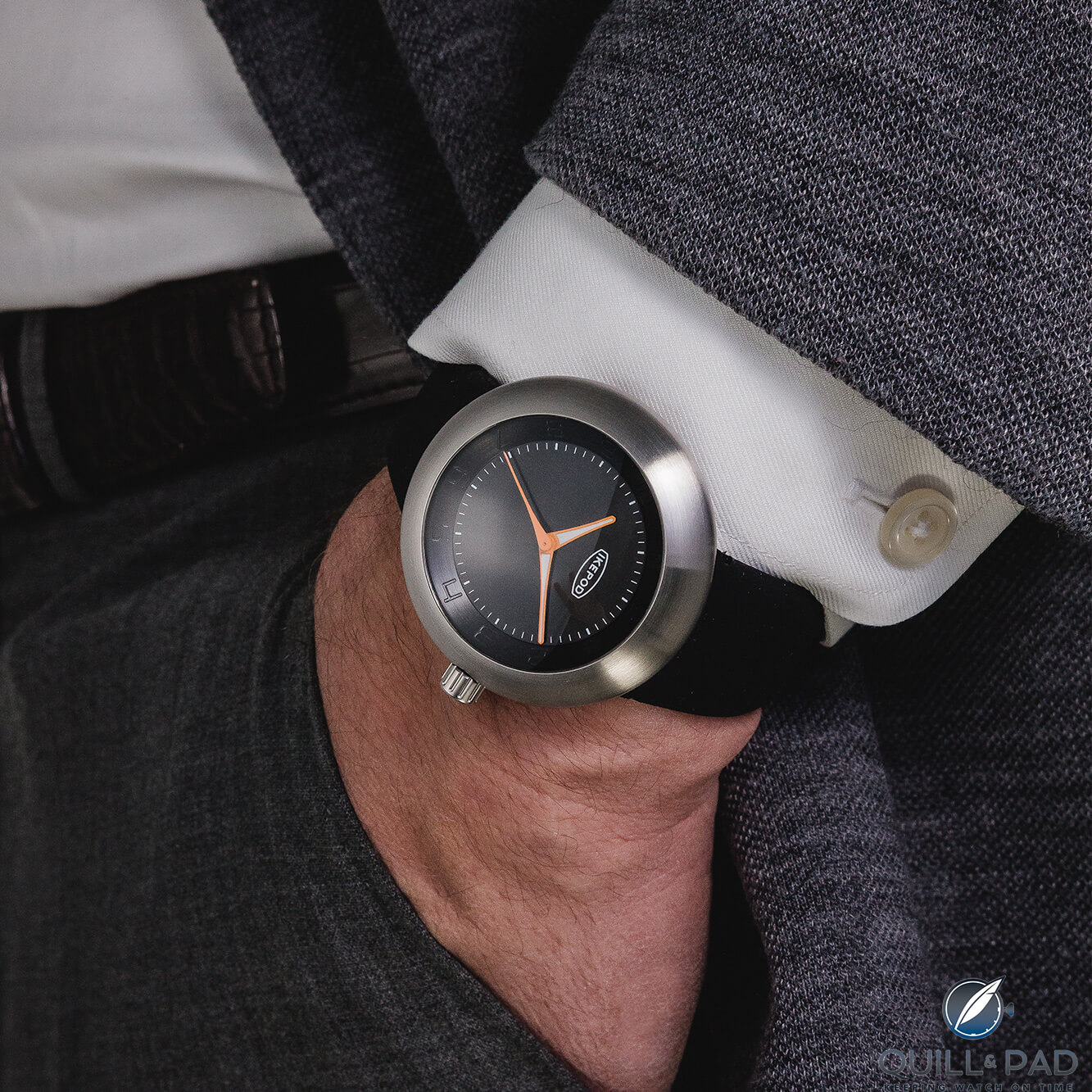
Ikepod Megapod M002 Quazar on the wrist
The M102 Quazar (again, the names) takes a bit of a step back from the M101 and has a satin black dial and brushed black outer ring for a darker take on the M100 series. The hands all feature orange for a pop of contrast, combined with obvious white dial printing. I feel like this was a missed opportunity to add the orange hour dots back in, but I can understand it is probably justified by noting that there are already hour numerals so no need to further highlight the hours with orange, even if that would have looked killer.
Finally, the Kickstarter-only M106 Matti takes the monochromatic aesthetic even further and keeps the dial and outer ring brushed steel slightly darker than the case, but close enough to fully explore the ghost vibe the model aims for.
With black dial printing there is still some contrast, aided by the black outline on the hour and minute hands, but the second hand and centers of the hour and minute hands stay white for the biggest contrast of the piece. While my favorite is the M101, I feel the M106 may end up being a fan favorite out of the entire launch.

Ikepod Megapod dial detail
Megapod M200
And now we come to the third aesthetic direction of the Megapod collection, the M200 line.
This line is a bit of a mashup of the M000 and the M100, but not in the way you would imagine if I didn’t show you first. These models retain the outer sloped-ring style of the M000 with second markers and minute numerals, but now the ghost hour numerals of the M100 line are on the flat part of the dial and positioned so that the top (or bottom) is partially cut off by the outer ring.
It truly feels like someone took the outer ring and installed it in a dial that wasn’t supposed to have it, but it strangely works. Except when it doesn’t, but I’ll touch on that in a second.
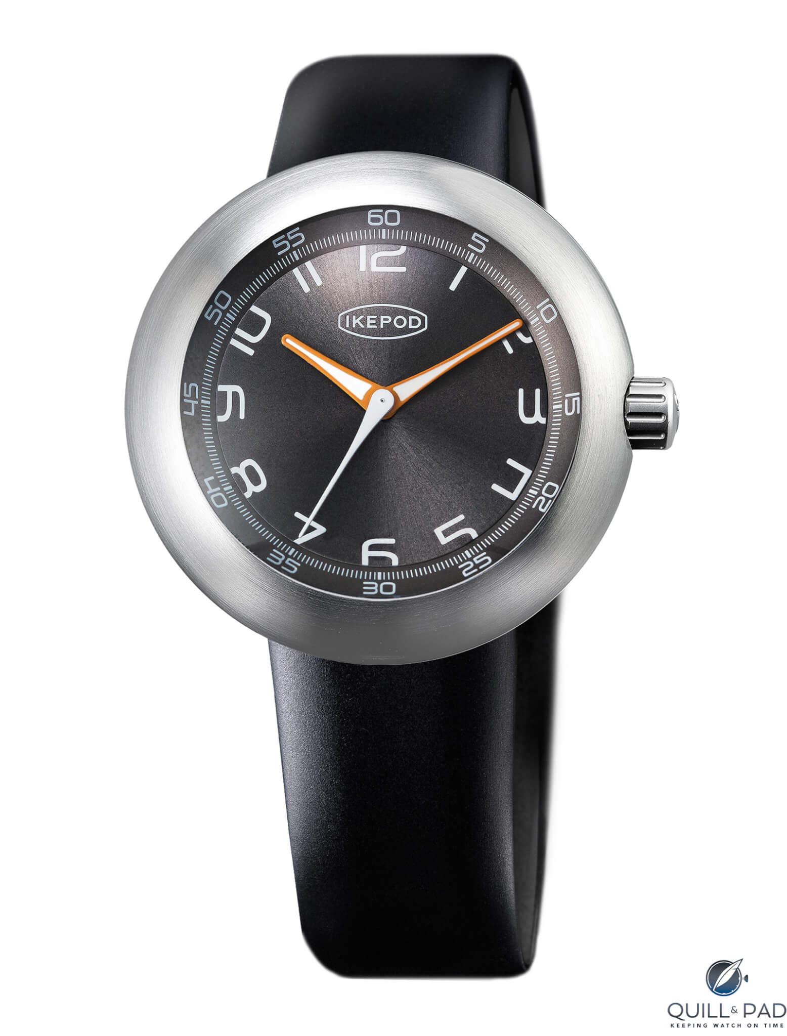
The M200 line has three regular variations and one Kickstarter-only version, just like the M000 line. And the M201 Alexandre, the favorite of the Ikepod team, is the Kickstarter-only version. So the brand took the first number of the collection instead of the M**6 like the other collections, which seems like an oversight, but it still is probably the best of this bunch.
Ikepod Megapod M201 Alexandre
So the M201 Alexandre (at least this name makes sense to me) sees a dark grey brushed outer ring and sunray dial, both featuring white printing for contrast. The hour and minute hands are orange with white centers, and the second hand is a solid white as well, keeping the contrast pretty consistent across the model. The hour numerals are printed white and, as previously mentioned, cut off about halfway on the tops (9-3) and bottoms (4-8) by the sloped outer ring.
With this aesthetic, it is a slight disruption to your vision that gives the dial energy and keeps you wanting to look at it again.
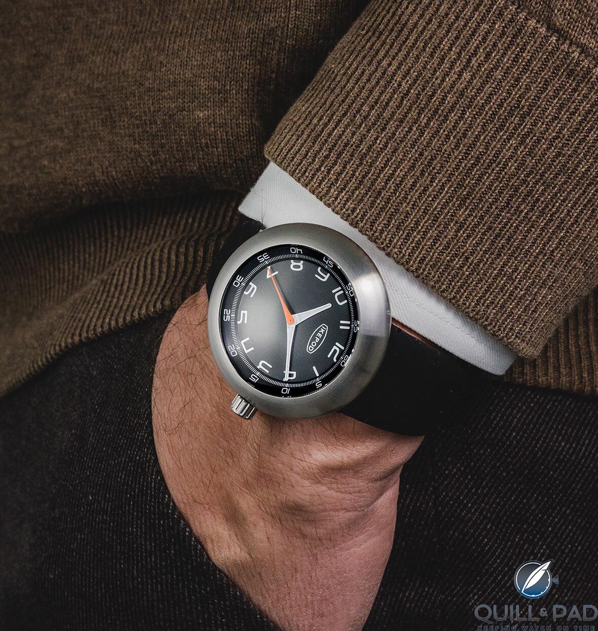
Ikepod Megapod M202 Richard on the wrist
The M202 Richard opts for brushed and satin black with white numerals but swaps the colors of the hands with silver and white hour and minute hands and the poppy-orange second hand.
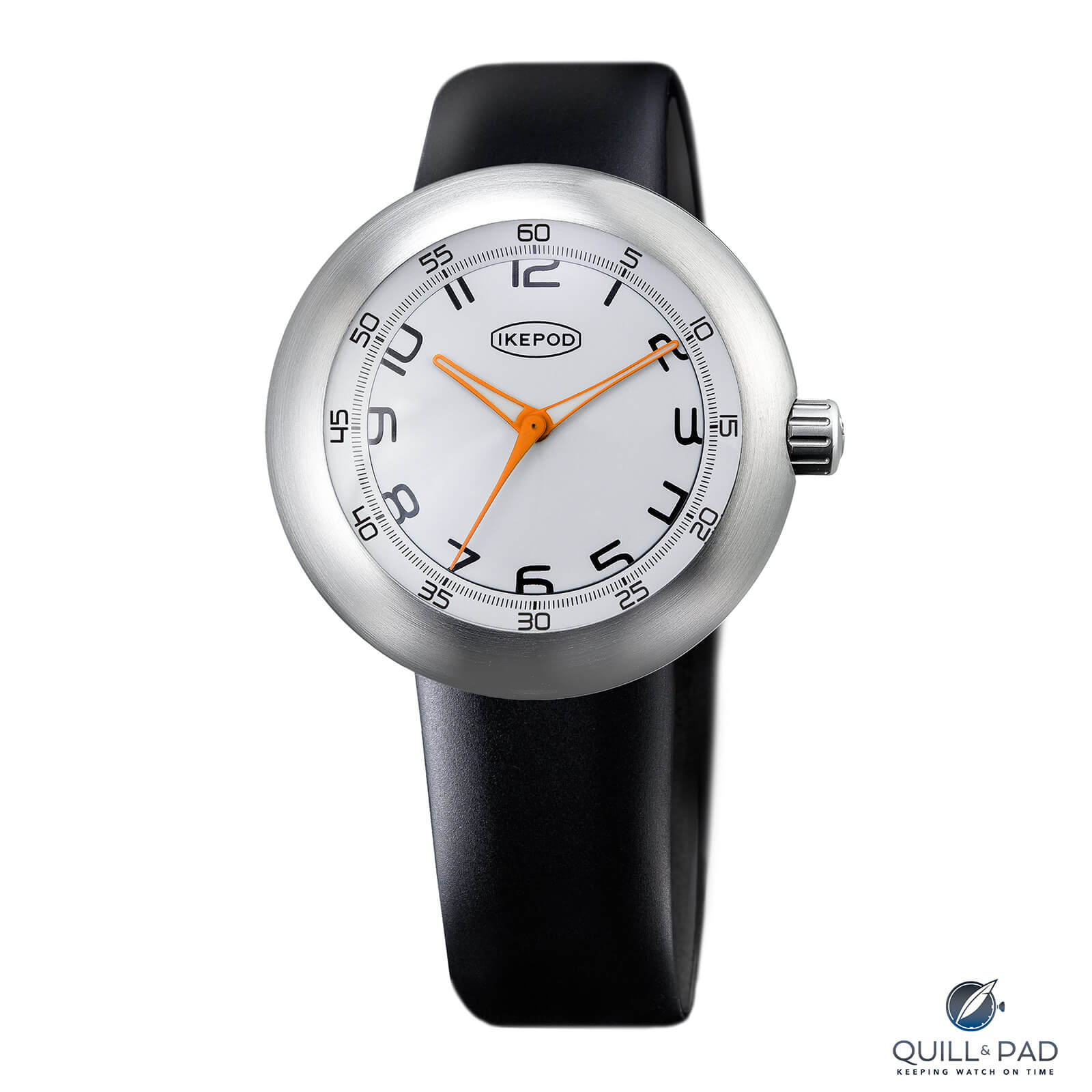
Ikepod Megapod M203 Joe
The M203 Joe joins the M105 Walter for the white, black, and orange aesthetic to create continuity across the Megapod collection. The M203 has a lacquered white outer ring and dial printed with black hashmarks and numerals, which feels like the most contrasting color scheme in this group. It also adds the orange for all the hands to help with grabbing the attention.
And this brings us to the M205 Ray, the least successful M200 and, in my opinion, the least successful of the new Megapod collection. Why? Well it has to do with consistency.
The M205 Ray matches most of the aesthetic of the M001 Dieter with a sunray brushed dial in blue with white second markers and minute numerals on the sloped outer ring. But then it does something weird: instead of also printing the hour numerals in white (like it totally should have), they are instead applied numerals in polished steel. Already this is a weird decision since it strays from the color, materials, and finishes seen across the entire collection, but importantly, they don’t seem to match the quality or aesthetic of the rest of the dials.
Remember how Audemars Piguet launched the Code 11.59 and one of the things that people picked on the most were the applied numerals? Well they just weren’t right for the watch, polished as they were and seemingly not the best quality, and so they kind of stood out, especially against a smooth lacquered dial. And not in a good way.
The numerals on the M205 Ray are like this; they just don’t seem to fit, and the polishing seems off for this aesthetic. It might have been different if they were flat-polished, or perhaps flat-brushed, but the slightly domed polishing isn’t vibing with the rest of the dial. Change that one feature and the whole dial could improve.
A bit more Ikepod Megapod
Aside from that, the M200 collection has some very cool versions, and I will be interested to hear which models and specifically which line does the best out of all of the pieces on offer. Since they all share the same iconic case with fluted crown, silicon straps, and similar hands and details, this is where we begin to see what the public likes the best.
Since this is a Kickstarter, Ikepod will have built-in metrics before it even goes to final production, which is the best thing about Kickstarter: it allows you to workshop the options and then phase out the least popular. Given the success of the re-launch of the brand, I’m sure this second round will be successful too as horological enthusiasts finally can have that Ikepod style with the mechanical heart.
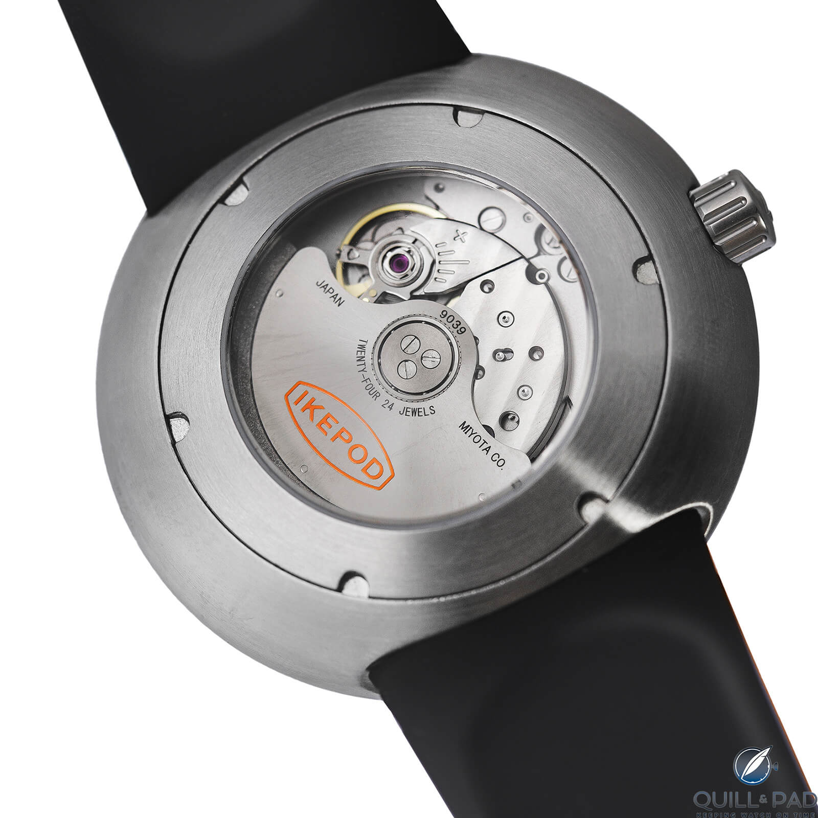
Back of the Ikepod Megapod
But this is also where the brand missed an opportunity, at least in design terms. The original Ikepod watches were all mechanical but didn’t highlight the mechanism as the focal point, instead using basic ETA 2824 calibers only viewable within a porthole crystal on the rear of the case. The new Megapods are different. The obvious flaw of the original watches was a one-piece case construction that made the final watch a nightmare to service.
Well, the Megapods did away with this, providing a regular threaded case back with a large crystal for viewing the automatic movement, a Japanese Miyota 9039. While a good movement to be sure, it is no beauty queen.
I would have loved a repeat of the style of the original models with a porthole crystal providing a tiny window but not trying to focus too much on the movement itself. It might have made the machining of the case back slightly more difficult, but it could have provided a unique reveal opportunity when the rotor passes in front of the window and a small Ikepod logo centers itself in the porthole.
But these are just nitpicks and would not stop me from happily picking one of these up, probably the M101 Rob. Though if I could customize one, I would take the M101 with the black trimmed hour hands from the M106, the orange second hand, and add in the orange hour dots from the M000 line. A man can but dream.
Or perhaps Christian-Louis Col will read this and know that my idea is utter genius and make another M100 version and call it the “M183 Nerdwriter.” Now a man can really dream!
Hey, we have to find things to do now that many of us are home all day! Now that I’m done dreaming, I’ll break these down!
- Wowza Factor * 8.3 When you have nearly a dozen new watches from a brand that has a cult following and they are finally mechanical again, this is clearly a big wowza moment!
- Late Night Lust Appeal * 83» 813.952m/s2 Whether it’s the M000, M100, or the M200, the force is strong with these Megapods!
- M.G.R. * 30 Standard three-hand Japanese movement, a good workhorse for a design oriented brand!
- Added-Functionitis * N/A It’s all about design, yo! As such you can skip the Gotta-HAVE-That cream this time around.
- Ouch Outline * 8.8 Smashing your teeth on your mug when you take a sip of coffee too fast! If your teeth don’t immediately chip, then the feeling of a hard ceramic mug smashing into them is a very uncomfortable sensation. It makes you kind of cautious trying to drink anything for a while. But since there is no damage, I’d gladly do that multiple times if it meant getting one of these on my wrist!
- Mermaid Moment * It’s finally mechanical! I’ve said for a long time that I am more into watchmaking than watches, and so watches that are largely design oriented won’t be high on my list. Ikepod has a special place in my heart, so being able to rock an affordable mechanical Ikepod with all the style of the originals has me picking out centerpieces and flatware!
- Awesome Total * 822 First multiply the number of versions of the Megapod that are launching (11) by the diameter of the case in millimeters (46), then add the alloy number for the case material (316) to get a remarkably affordable awesome total!
For more information, please visit www.ikepod.com and/or www.kickstarter.com/projects/ikepod-watches-swiss/ikepod-automatic-design-watches.
Quick Facts Ikepod Megapod
Case: 46 x 18.25 mm, 316L stainless steel
Movement: automatic Miyota 9039 with Parashock-protected balance, 28,800 vph/4 Hz frequency, 42-hour power reserve
Functions: hours, minutes, seconds
Limitation: limited by production, 3 variations limited to Kickstarter campaign only
Price: 1,250 CHF retail or 740 CHF through the limited-time Kickstarter campaign
You may also enjoy:
Ikepod Megapode: Marc Newson’s Smartest Watch (And Perhaps My Smartest Rolex Trade)
Leave a Reply
Want to join the discussion?Feel free to contribute!






















Dear Nerdwriter,
some editors copy and paste the press release. We know that reading one of your article is definitly not that.
I will discuss your comments with Alexandre Peraldi. For sure.
Nicknames are for famous designer and architects, but you will desserve one day a M183 Nerdwriter.
Merci beaucoup
Christian-Louis / IKEPOD