by GaryG
It’s no secret that I’m a big fan of Vianney Halter and his work (see Why I Bought It: Vianney Halter Antiqua and Why I Bought It: Vianney Halter Deep Space Tourbillon).
I strongly believe that one of the defining moments of my development as a collector was taking the plunge and buying an example of his landmark Antiqua in pink gold.
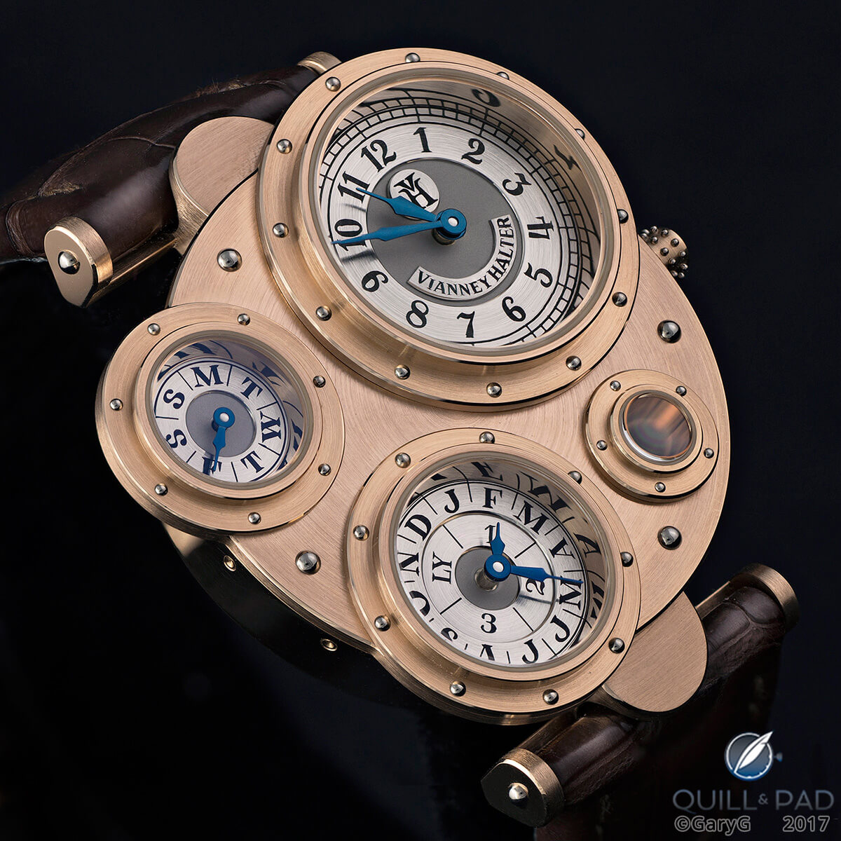
The author’s Vianney Halter Antiqua in pink gold
My Antiqua is in fact the independent piece that I’ve owned the longest, and that’s given me the opportunity to scrutinize it through the macro lens a number of times and from a variety of angles.
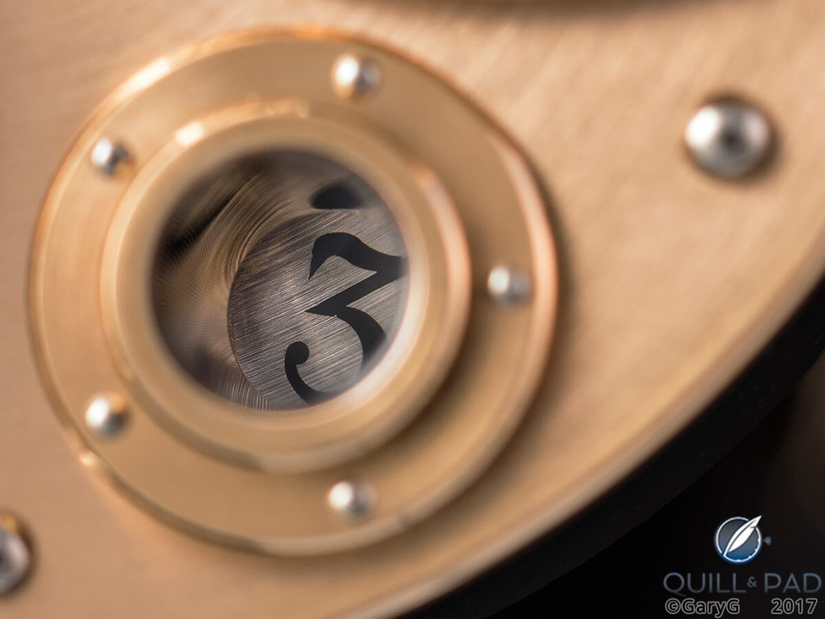
Date porthole, Vianney Halter Antiqua
My watch collecting pals seem similarly drawn to the Antiqua, and to the pink gold variant in particular.
I’m aware of at least five of those pieces in the hands of good friends, and recently one of those owners offered me the opportunity to capture some images of his Antiqua along with some side-by-side shots with my piece.
As fast as you can say “put up the light tent” I was snapping away!
Every watch a prototype
To the casual viewer, and even to the trained eye, when seeing examples of the Antiqua one by one, they look pretty much the same.
Certainly the distinctive shapes of the case, crown, and bezels are consistent across the total production run, which, going by the most recent published statistics, was on the order of 80 watches, but in more recent times may have grown to number about 100, with between 40 and 50 in pink gold.
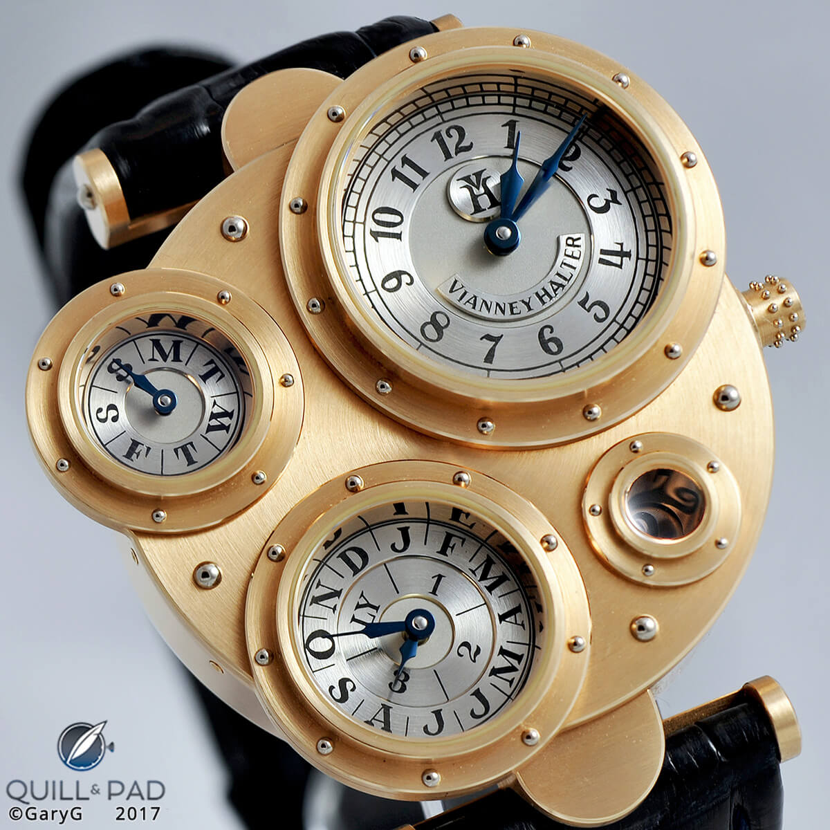
A fairly early Vianney Halter Antiqua: Number 14R
A closer look, however, begins to reveal differences. One of Halter’s associates once told me, “with Vianney, every watch is a prototype.” This sense of true hand-working and continuous adaptation throughout the series of timepieces is evident once you start to inspect multiple examples.
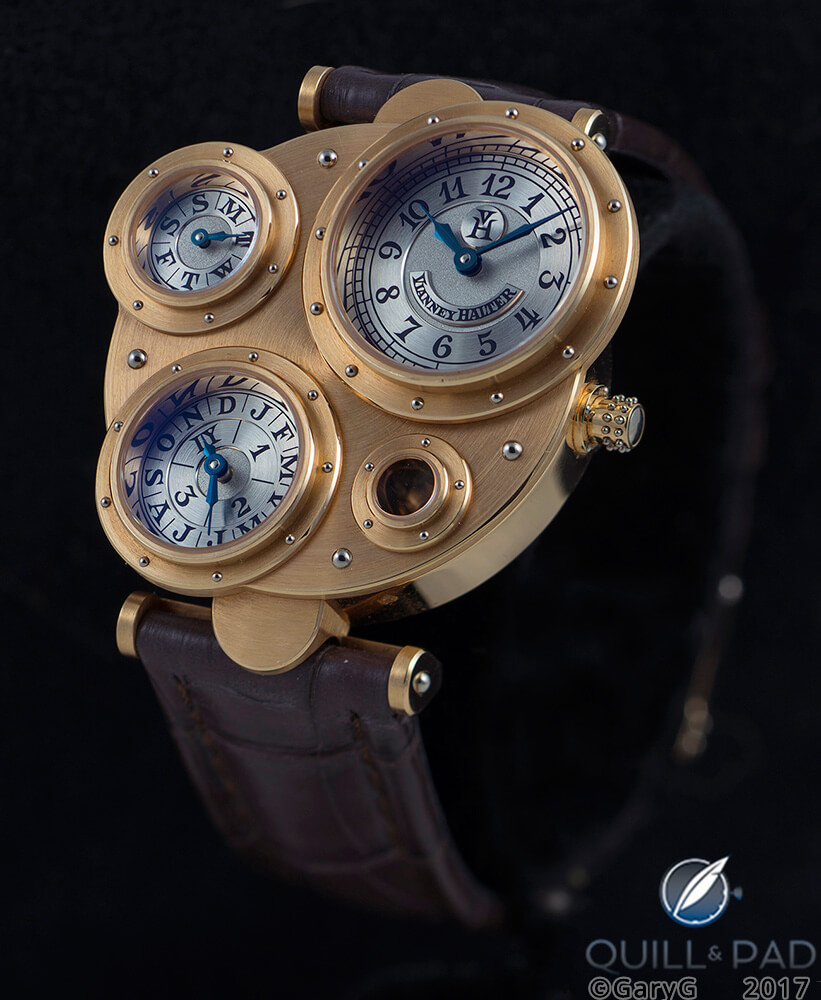
For comparison: a more recent Vianney Halter Antiqua: Number 30R
Of course, the earliest watches in the series were labeled “Halter Barnes” on the dial-side nameplates and movement imprints with “HB” on the small lozenge on the primary time dial.
Antiqua Number 6R, which was auctioned at Sotheby’s in November 2016, has the letters “VH” on the lozenge side-by-side, but by the time my Number 14R was made, the VH insignia had taken the form of a small V atop a larger H.
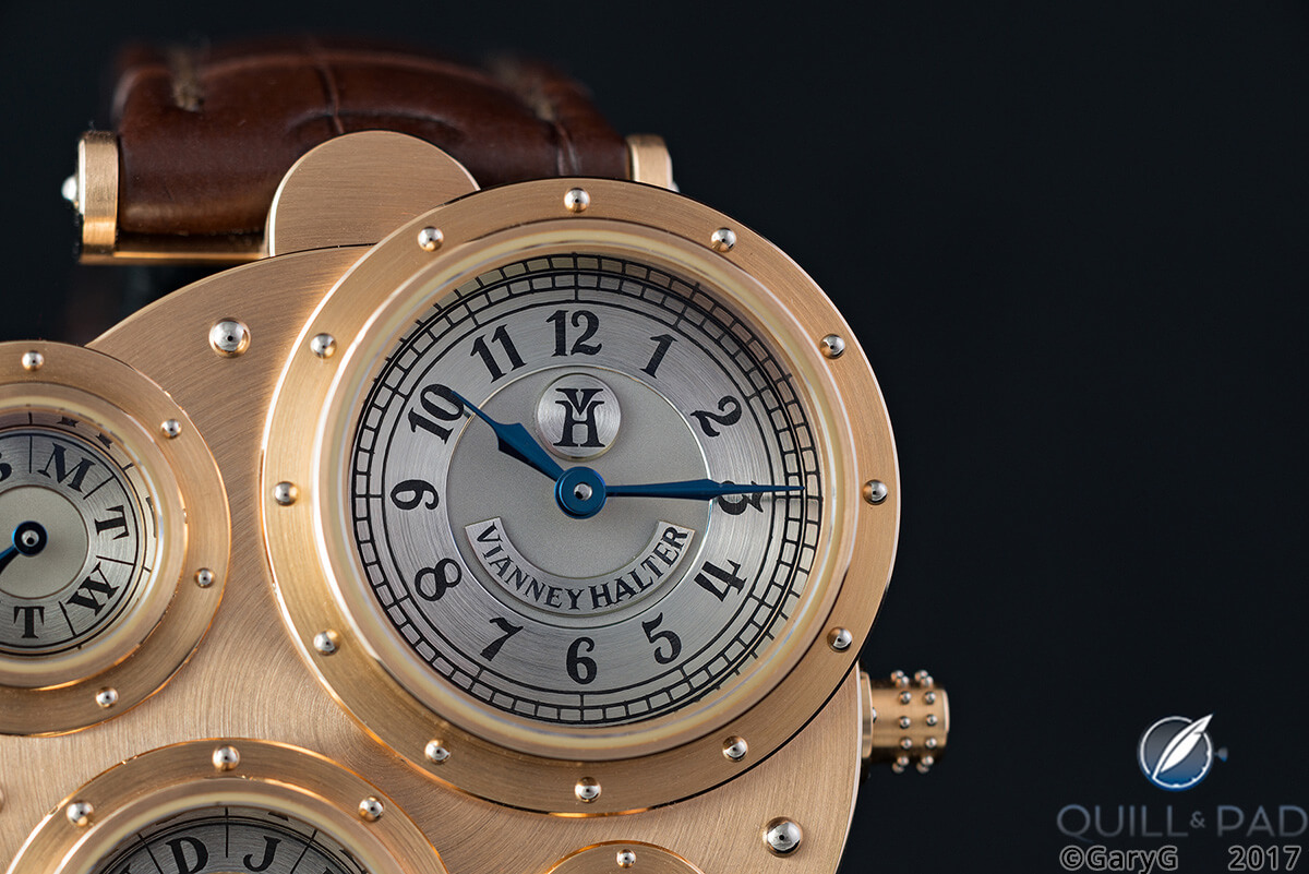
Dial detail, Vianney Halter Antiqua Number 14R
On the earliest watches, the engraved numerals and letters on the small platinum subdials were somewhat squat looking, then became a bit more elongated and delicate by the time my watch came along.
By the time my friend’s Number 30R was produced, the dial-side engravings had changed once again, becoming more pronounced and broad.
Side by side
Take a look at the side-by-side shot below, with the newer watch on the left and older on the right: how many differences can you spy?
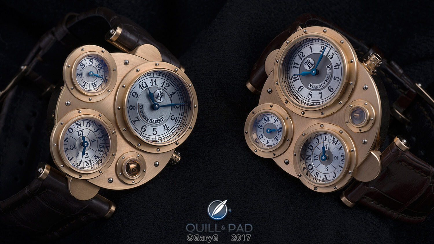
Side by side: two examples of Vianney Halter’s Antiqua in pink gold
Here are a few that I can see:
- Throughout the subdials, the engravings on the newer watch are blockier and as a rule broader, incorporating substantial triangular serifs as compared with their counterparts on the older piece. For instance, check out the base of the 7s on the hour and minute dials of each watch or the “S” figures on the day of the week dials.
- The tops of the 1s are also different, with the newer engraving featuring long, curved extensions.
- The “VH” logo is also different, with the newer watch showing the same triangular foundations as its other engravings and the “V” appearing a bit narrower within the top portion of a slightly broadened “H.”
- The engraving of the “Vianney Halter” name is quite different: on the left, many of the letters appear connected to their neighbors at top and bottom and the effect is more assertive overall.
In the photo below, you can see a more detailed view of the logo on my older piece, which for me has a combination of delicacy and (in some ways) harshness that I quite like.
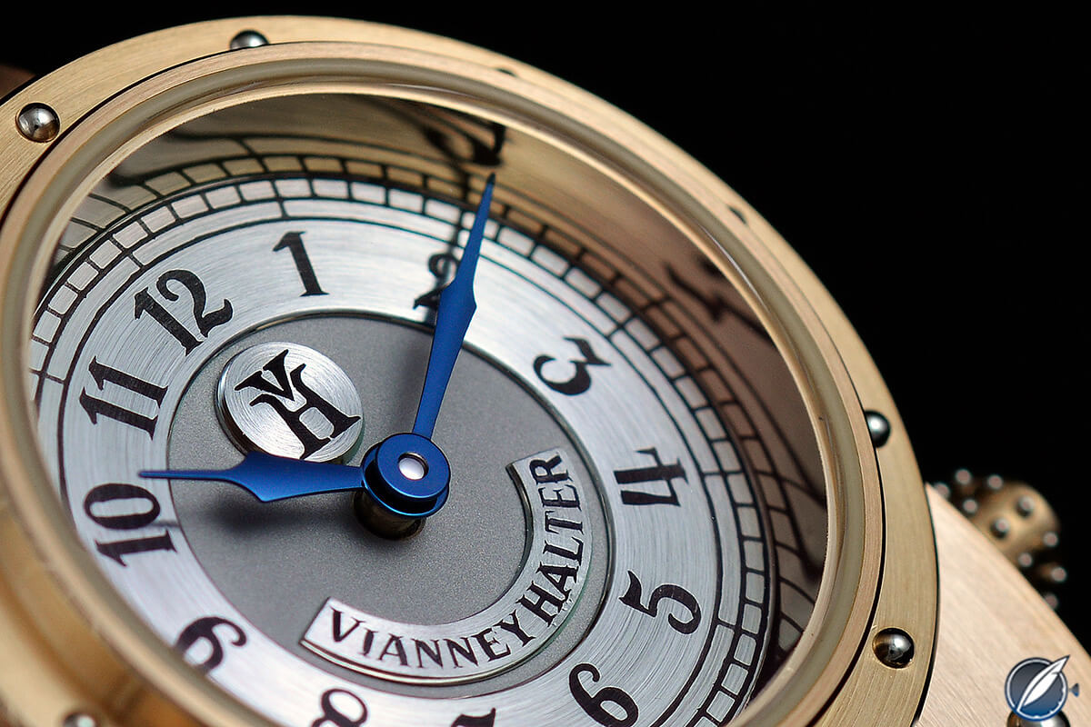
Dial detail, Vianney Halter Antiqua Number 14R
And for comparison, a detail shot below of my buddy’s piece.
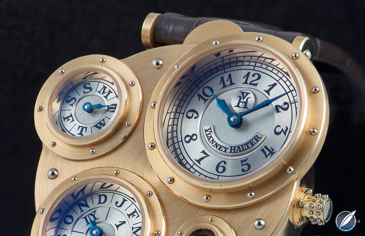
Dial detail, Vianney Halter Antiqua Number 30R
The same themes continue on the reverse, with the printed logos and other indications appearing more assertive and perhaps “modern” on the newer example, including the same triangular serifs.
What this tells me is that the differences on the dial side aren’t just the artistic interpretations of the respective engravers, but in fact represent a conscious choice to update the fonts.
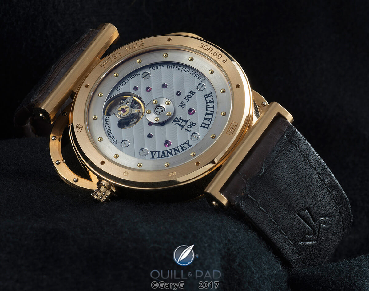
Movement view, Vianney Halter Antiqua
For comparison take a look at the two watches together, with the newer one on the left.
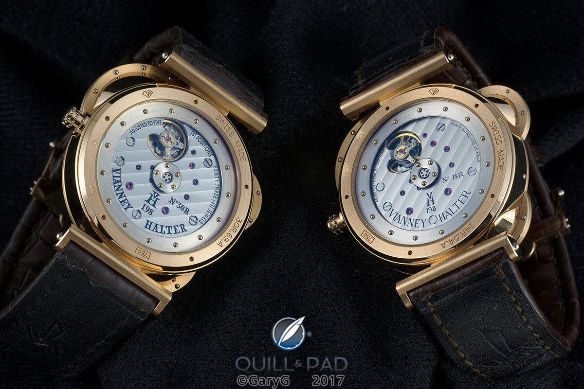
Movement view of two Vianney Halter Antiquas
In addition to the font differences, I see several distinctions:
- On the left, the VH 198 caliber identifier and Vianney Halter logo are centered on the vertical centerline of the watch, whereas on the right they are centered on the screw that is slightly to the left of the axis.
- The indications for adjustment and number of jewels are both differently sized and in different places.
- The movement serial number on the left is actually lower relative to the “VH 198” than on the right, but as it is rotated with the rest of the printing to be centered on the vertical axis of the watch, it appears higher relative to the right-hand screw.
I’m sure there are other things I’m missing, but one thing that appears quite consistent is the finishing of the movement parts; for instance, the Geneva striping of the plates and graining of the outer rims of the mystery rotors seem almost identical across the two watches, as seen both above and in the second view below with the positions of the watches switched.
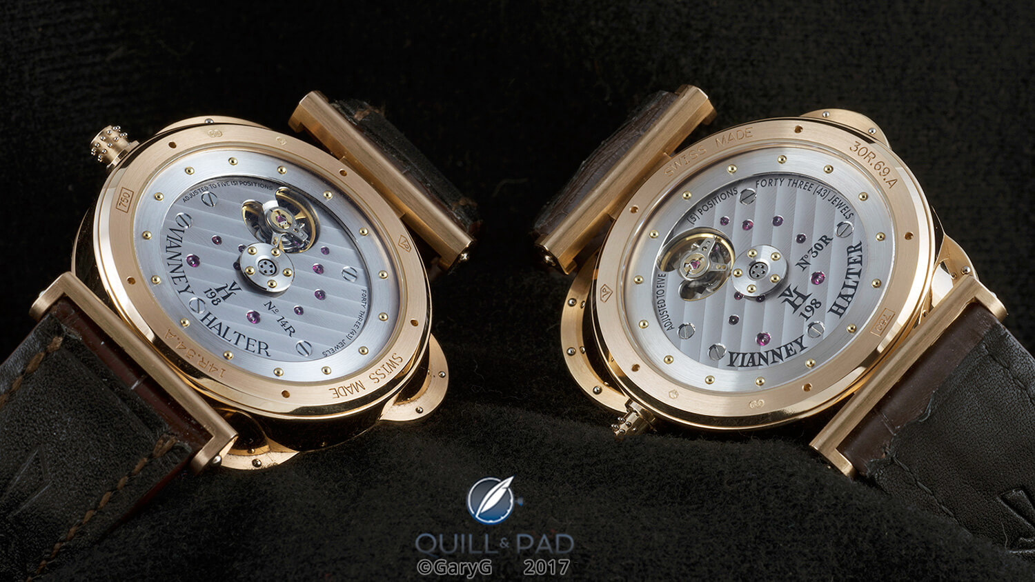
Two Vianney Halter Antiquas of different vintages
Either, both, or none?
So which one do you prefer?
I have to confess that I love them both, and each appears to me to be in splendid condition, but at the end of the day I think I might just stick with my earlier piece and its finer markings.
That said, I could completely understand that for others the slightly tidier look of the newer piece might be just right.
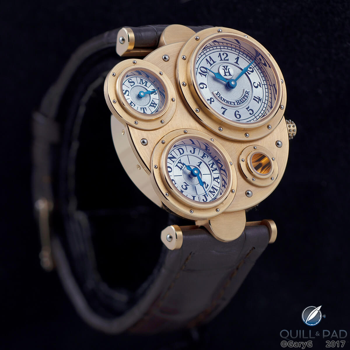
Vianney Halter Antiqua Number 30R
As a collector, I’m of the view that the Antiqua is both a very desirable watch and an important one – the acknowledged link between traditional and contemporary wristwatch design. As a rule I don’t like absolutes like “every serious collector should own one,” but I feel almost that strongly about this watch.
It’s clear that my view isn’t unanimously held, though. With fewer than 100 of these watches it would be impossible for “every serious collector” to have one, and while prices at auction for the Antiqua have been on a rising path over the past couple of years, they aren’t out of reach yet for a substantial sub-sector of the collector community.
Is it for you? Only you can say that, and if the images here help to nudge you one way or the other, I’d love to hear about it in the comments section below.
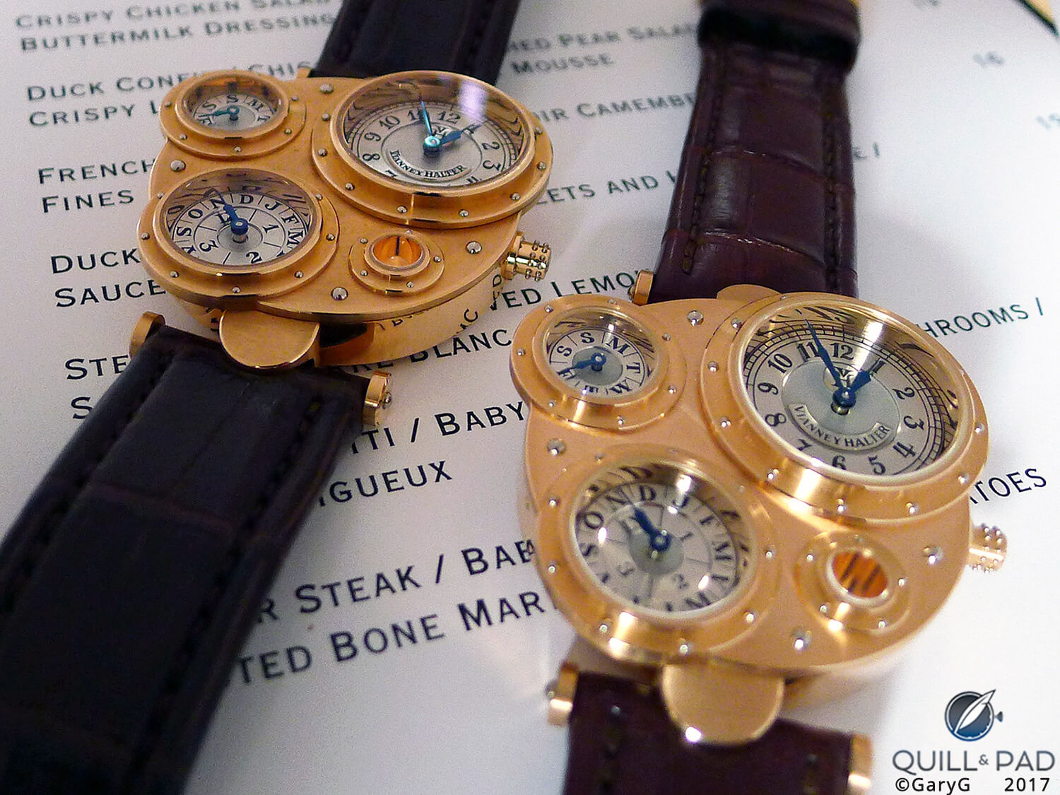
On the menu? Two pink gold Antiqua Perpetual Calendars by Vianney Halter
For more information, please visit www.vianney-halter.com/watch-perpetual-calendar-vianney-halter-antiqua.
Quick Facts Vianney Halter Antiqua
Case: yellow gold, pink gold, white gold, platinum; one gem-set platinum case, 46.5 x 42.5 mm (including lugs and crown), underlying round case 36 mm
Dial: hand-engraved platinum dials (yellow and pink gold cases); platinum, yellow gold, and pink gold dials (platinum and white gold cases)
Movement: automatic Caliber VH 198 with 35-hour power reserve and “mystery” rotor
Functions: hours, minutes; instantaneous perpetual calendar with day, date, month, and leap year cycle
Production years: 1998 to 2016
Price: most recent auction prices 500,000 HKD (approx. $65,000) for white gold, December 2015; 62,500 CHF (approx. $62,500) for pink gold, November 2016
* This article was first published on May 20, 2017 at Behind The Lens: Twice The Fun With Two Vianney Halter Antiquas.
You may also enjoy:
Why I Bought It: Vianney Halter Antiqua
Behind The Lens: Unique Piece Classic Date By Vianney Halter































Leave a Reply
Want to join the discussion?Feel free to contribute!