Art and design are just as important as engineering. And now that I’ve gotten everyone riled up with a controversial statement and people will be fervently taking sides (well, if this was Twitter or YouTube), I’d like to make the case for art, design, and the importance of efforts to make highly functional things beautiful as well.
Think back to Cold War-era communism where it was clear that an aesthetic existed putting functionality and frugality on the pedestal of importance. It’s not that communism or socialism is inherently against beauty (the ideologies actually say nothing specific about art creation and beauty), but the ruling regimes stifled expression because non-emotional citizens were less likely to be inspired to revolt.
So in these places basic shapes, a lack of colorful finishes, and ultimately passionless but supremely functional objects and buildings often came into existence. Structures built in the days of the GDR (German Democratic Republic), for example, are extremely plain and lack possible flourish.
Cars, appliances, and even most timepieces, were very functional but aesthetically as boring as dirt (to all the geologists and pedologists out there> dirt is very interesting, but please just go with it for now). Structures built before and immediately after the GDR period are all sorts of interesting with Baroque, Victorian, Greek Revival, Modern, Post Modern and other architecture styles, all existing in the same place.
Highly decorative or well-designed buildings indeed serve pretty much an identical function to the basic buildings of the GDR era, but nearly all people would probably agree that they would prefer to live in the more interesting structures because they inspire emotion.
A spoon can be both an utterly basic stamped object mass produced by the millions, but it can also be an object made by a passionate craftsman with beautiful filigree and sumptuous curves that makes people feel like they are truly dining in the utmost luxury created by mankind.
Neither spoon is more functional for its intended task, but while one could simply be ignored while being used, the other inspires more enjoyment and pleasure. And this idea can be extended to everything, from a bridge to a hammer to a couch.
When it comes to modern engineering, the goal is often to optimize function, minimize cost, and maximize manufacturability. Designers often have to battle to keep design intent alive once the engineering department gets hold of the approved design, though in the best case scenario engineers work side by side with designers to create truly unique objects that still meet all of the engineering requirements.
These products often stand out as supremely well-designed objects and are highly likely to become successful because not only do they function, but they are visually stimulating. One trip to Target (or any big box store) will demonstrate that basic, functional toasters are pretty boring while expensive. Yet equally functional toasters have you imagining a high-end kitchen with beautiful appliances. The design evinces passion, and that is what makes for a great object.
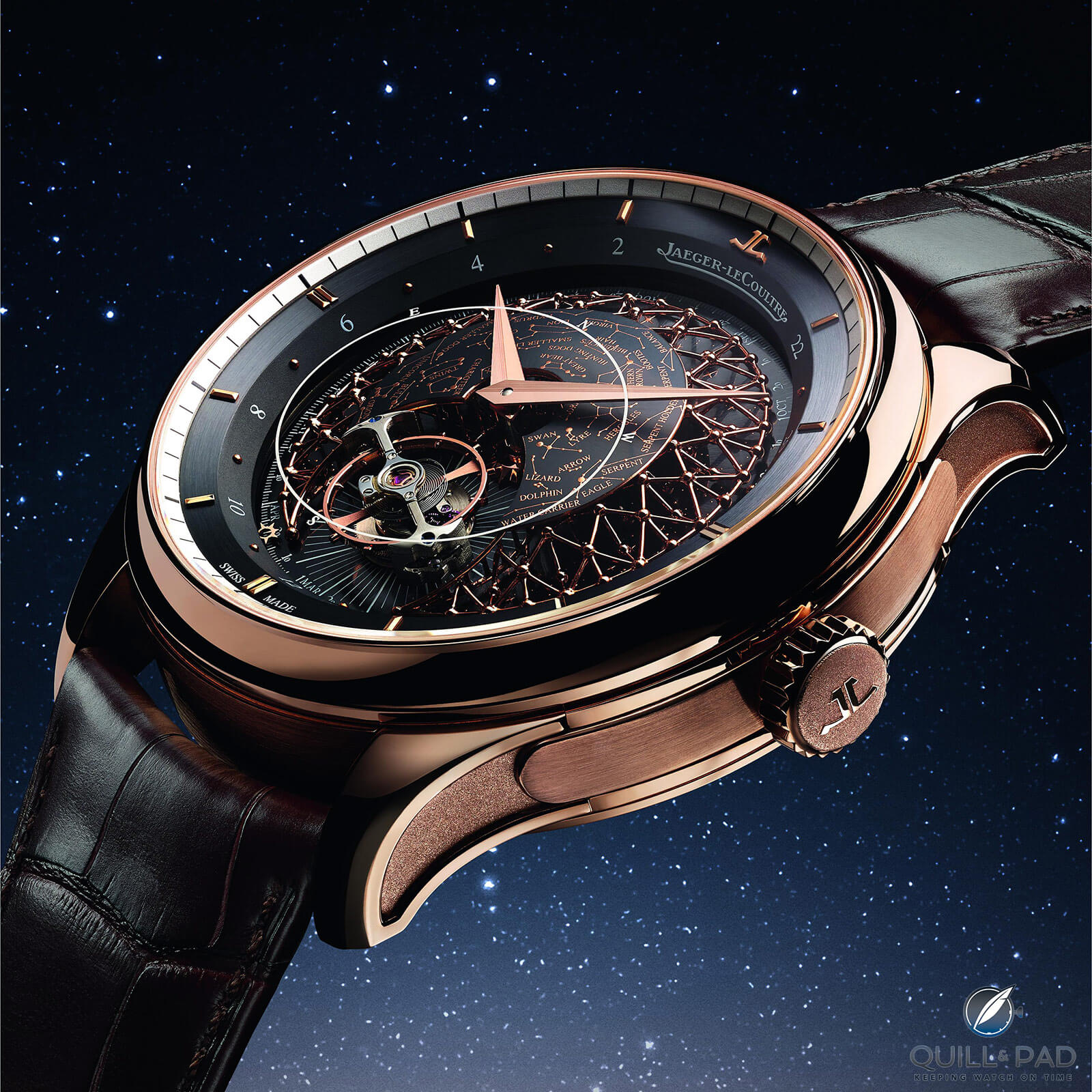
Jaeger-LeCoultre Master Grande Tradition Grande Complication in pink gold
The most recent Jaeger-LeCoultre Master Grande Tradition Grande Complication released for the 2020 digital edition of Watches & Wonders is a perfect example of using design to take an already great watch to an entirely new level.
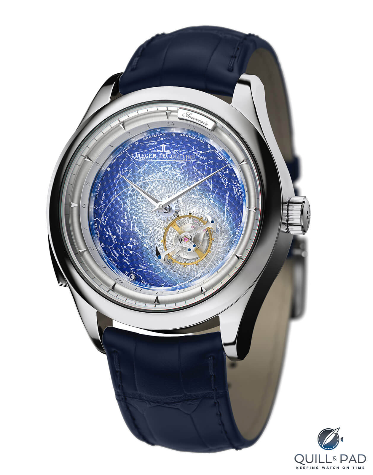
Jaeger-LeCoultre’s first Master Grande Tradition Grande Complication from 2010
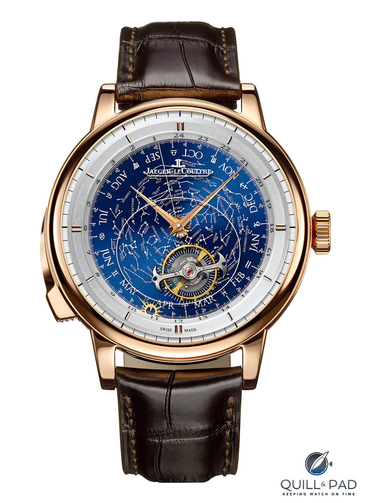
The second Jaeger-LeCoultre Master Grande Tradition Grande Complication from 2015
As the third incarnation of the Grande Tradition Grande Complication in a decade – the other two having appeared in 2010 and 2015 respectively – one might expect a retread. Instead, it feels like a designer demanded a redesign that elevated an incredible movement to the heights it truly deserves. I’ll show you what I mean as we go through it.
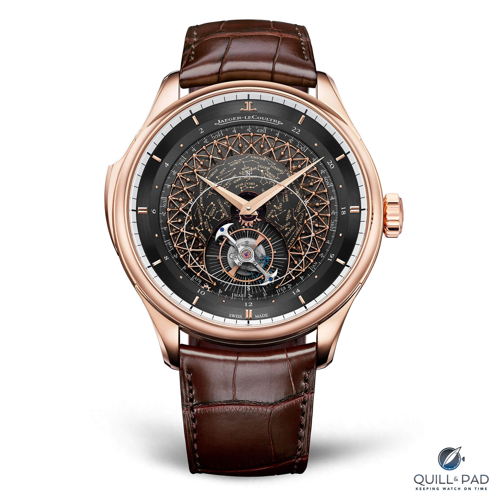
Jaeger-LeCoultre Master Grande Tradition Grande Complication in pink gold
JLC Master Grande Tradition Grande Complication for 2020
First let’s dig into what the Master Grande Tradition Grande Complication is to understand why it is such a glorious update. As the name implies, this is a “grand complication,” which classically means it should house a chiming mechanism, a calendar indication, and some other family of indications for a trio of complications.
In this case, the watch has an annual calendar displaying date and month, an orbital tourbillon tied to a sky chart that makes one revolution each sidereal day, a 24-hour indication, and – the cherry on top – a fantabulous minute repeater with cathedral sapphire crystal gongs affixed to the rear crystal for maximum sound.
Each of these features was present on the two previous versions, but this edition sees them come together in such a cohesive way that the prior models look almost plain. They weren’t, of course, but the stark difference between those versions and this newest design marks a significant aesthetic shift.
The Master Grande Tradition Grande Complication of 2020 takes the basic concept of the earlier model and acts as if the design manager said, “Just have fun with it.” The original models were awesome and clearly a feat of fine engineering, but the presentation felt a bit less, let’s say, unimaginative.
The orbital tourbillon on previous models was mounted directly on top of the rotating dial/sky chart, standing alone and unsupported as if it was either an afterthought or the sky chart was. It felt functional but disconnected as if it received little aesthetic consideration beyond its functionality.
The sky chart was interesting and contained the sky as seen from Jaeger-LeCoultre’s home in the Vallée de Joux near the 46th parallel. The sky chart, which made one full rotation around the dial once a day along with the tourbillon, also contained a yearly calendar along the edge and the signs of the zodiac (missing from the latest iteration).
Most of these details are still found on the latest version, but the visual impact is oh so different.
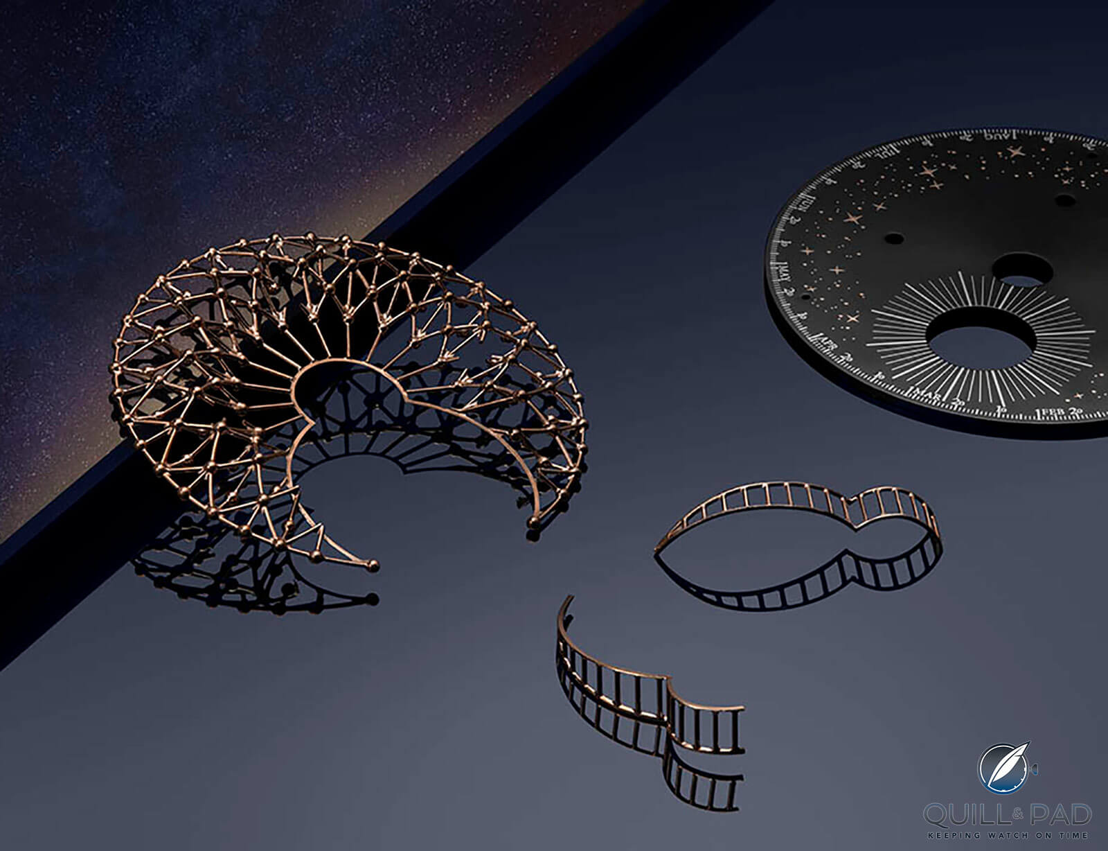
The fine filigree lattice dome surrounding the tourbillon of the Jaeger-LeCoultre Master Grande Tradition Grande Complication
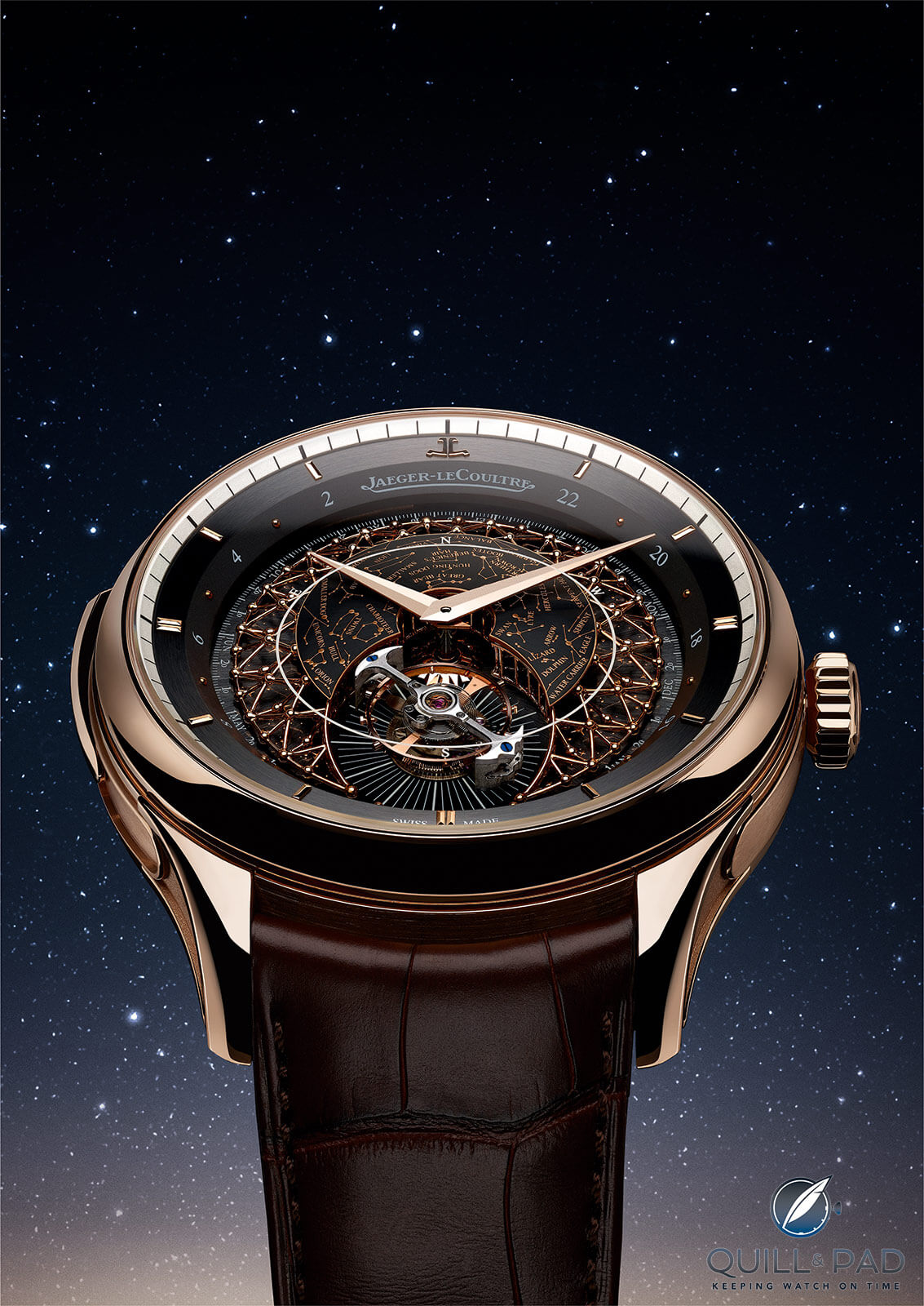
First, the once lonely 60-second flying tourbillon is now surrounded by a fine filigree lattice dome structured to allude to the lines connecting constellations on the sky chart. This filigree lattice structure almost completely surrounds the tourbillon to visually support the mechanism and it also acts as a support to the sky chart.
Jaeger-LeCoultre Master Grande Tradition Grande Complication
The sky chart is slightly smaller as it only takes up the center of the dome and not the entire dial, though visually it feels more considered. The outline on the underside of the sapphire crystal demonstrating the visible portion of the sky is the same. But now that it is physically closer to the sky chart it tracks the constellations with much less parallax (the displacement in the apparent position of an object viewed along two different lines of sight).
The small sun pointer at the edge of the rotating dial, used to indicate the date and month as well as act as the 24-hour indication, is smaller than on previous models, which saw either a sun on the end of a stem with large sunrays extending (the 2010 iteration), or a sun with very large sunrays but no stem and an internal pointer (the 2015 iteration).
Big details and small changes make a world of difference
The latest model has a more petite sun with internal pointer and very diminutive sunrays as it needs to pass by the outer edge of the lattice dome in the center of the dial. This makes for a slightly more hidden detail that that still feels much more cohesive with the rest of the dial design.
The lattice dome also necessitated a reduced size for the month abbreviations from the previous model, something I remember thinking was a bit disproportionate on the previous dial. Still, the three-letter abbreviation is better than the original model, which contained the full French names for the months, tiny date numerals, and a double chapter ring making for a busy calendar display on an already busy dial.
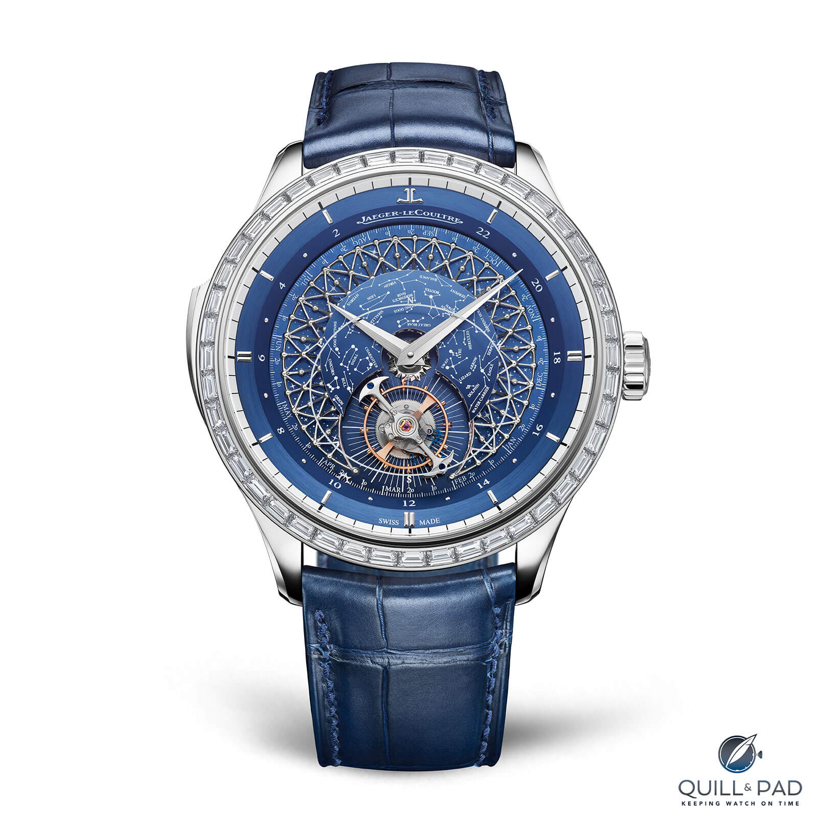
Jaeger-LeCoultre Master Grande Tradition Grande Complication in white gold with diamond-set bezel
Another small change that nonintuitively helps create more visual space are the radiating lines underneath the 60-second tourbillon. Found on both prior versions, the 60 lines extend out further here and, as a result, don’t seem as busy underneath. This is helped by the constellations sky chart being on a different level with overlapping lines and names, so it is much cleaner as it only stands for the markings for seconds and nothing else.
Minimization and adjustments to proportion seemed key for the latest Master Grande Tradition Grande Complication since adding such a detailed and stylistically distinct feature as the filigree dome required restraint and resizing of other details.
One such adjustment is the 24-hour ring just inside the hour and minute chapter rings. The 24-hour indications alternate between polished dots and numerals, whereas previously it displayed all 24 hours. This might seem minor, but it makes the indication less intrusive and visually messy, something that previous models didn’t seem to strive for (hence why they were functional yet less visually impactful).
Slight adjustments to the width of the dauphine hands also correct for what seemed like disproportionate features.
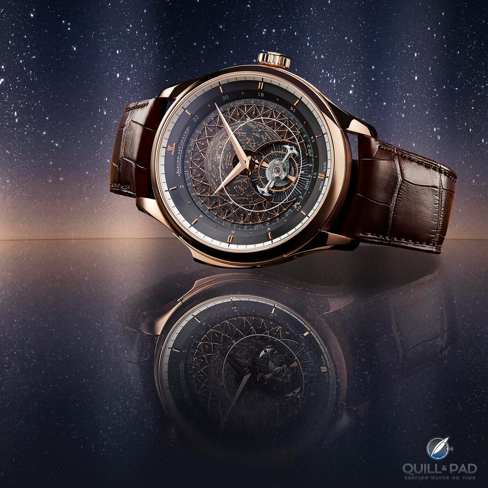
Finally, on previous models the Jaeger-LeCoultre logo and name were etched on the underside of the sapphire crystal directly above the dial, once again overlapping a detailed dial and creating visual confusion. I like this method of applying the logo since it makes it float above the dial, but it definitely works better on very clean and simple dials.
Jaeger-LeCoultre Master Grande Tradition Grande Complication
For busy dials that contain a complex sky chart it feels unconsidered. The newest model finds the logo serving as the 12 o’clock hour marker, with the brand name printed on the 24-hour ring replacing two polished domes and the numeral 24. The application and placement again feel cohesively considered.
A case for the case
And this brings us to the case, an entirely new Master Grande Tradition case design first seen in 2019 on the Master Grande Tradition Minute Repeater Perpetual Calendar, which finally turns a previously uninspired shape into something reflecting the aesthetic a grande complication deserves. The basic but functional earlier cases left no desire to hold the watch, while the gentle curves and recessed lugs of the new version call loudly for a caress.
That might sound weird, but with a minute repeater one is supposed to want to hold the case, activate its slider, and hold it while it rings out its beautiful chime. The previous square lugs and stocky bezel combined with an oversized, heavy-looking slider just don’t seem as nearly inviting as the curved lugs, rounded bezel, and subtly arcing slider of this new case.
The previous case worked wonderfully and did the job it was required to do, but it lacked the right amount of engaging passion. This cannot be said of the new case as it begs for you to run your fingers around it and activate the chime. It’s an object that wants interaction, not to simply be a functional machine strapped to your wrist.
What about the movement?
As you flip the case over, you might notice there is a slight visual difference from earlier versions, but this is where the least amount of changes have occurred.
From the 2010 to the 2015 versions of the Master Grande Tradition Grande Complication, Caliber 945 saw some alterations to Jaeger-LeCoultre’s proprietary trebuchet hammers, a bridge was skeletonized, a wheel relocated, and a bridge added in the center. The sapphire crystal gongs also had the word “Sonnerie” added to their mounting location, which was previously on the dial of the original model.
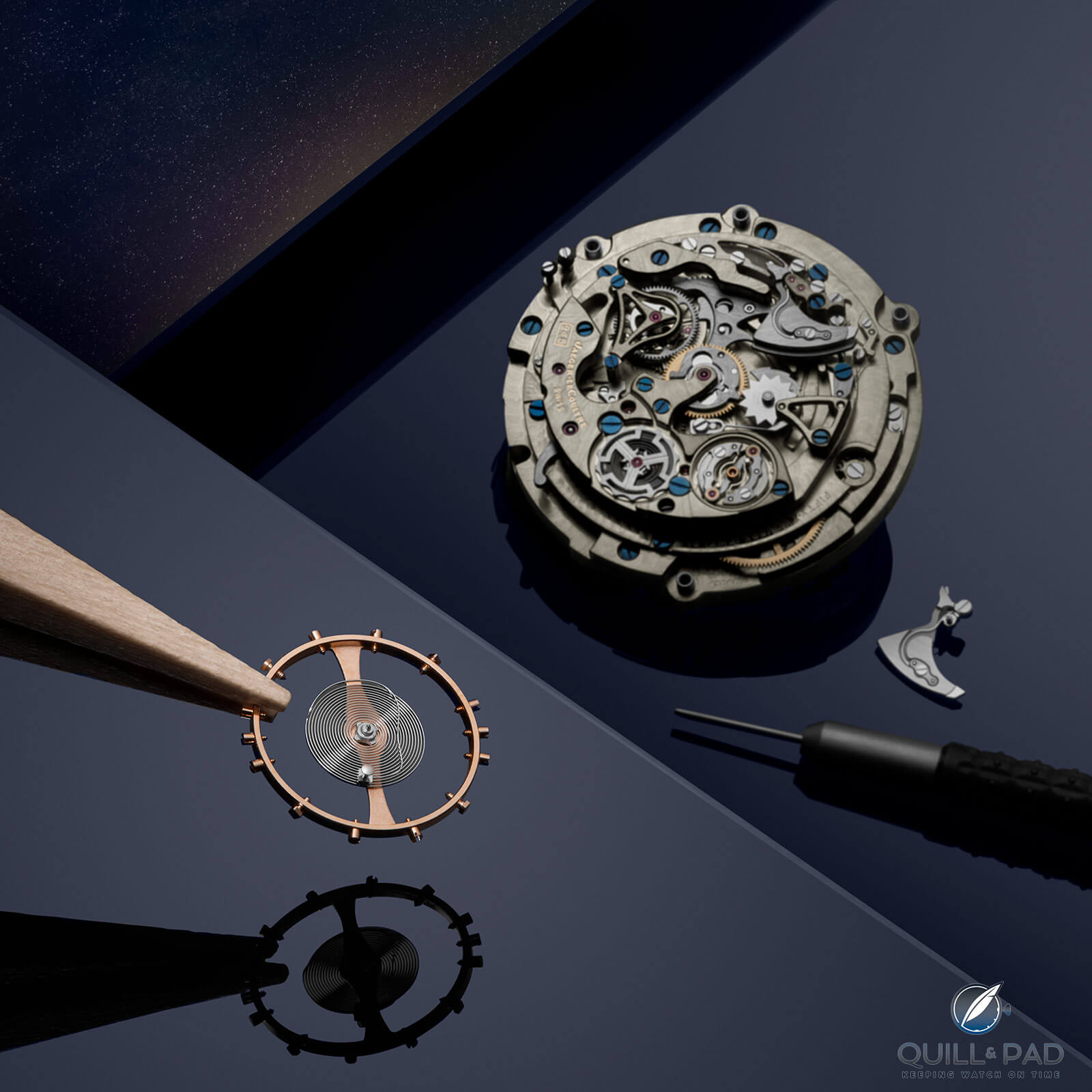
Jaeger-LeCoultre Caliber 945 of the Master Grande Tradition Grande Complication
On the latest version of Caliber 945, we find a new design for the silent strike governor mechanism and changes to the informative engravings on the bridges.
The rest remains largely the same because it was a phenomenal movement right from the beginning.
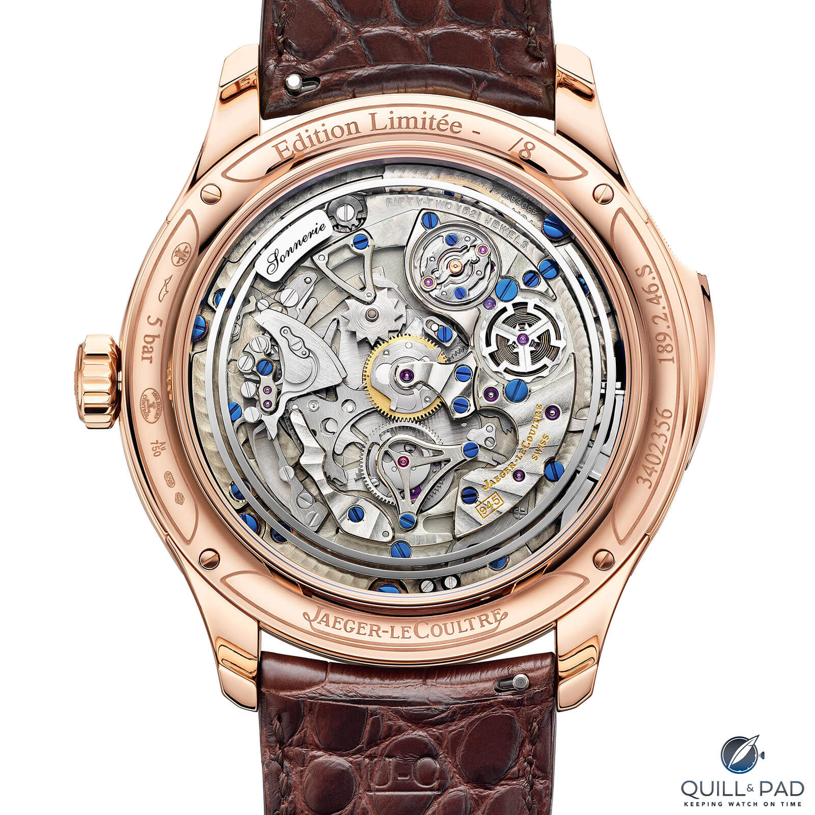
Jaeger-LeCoultre Caliber 945 visible through the display back of the Master Grande Tradition Grande Complication
No need to mess with a winner, which is why the design focus was the dial and the case, debatably the weaker points of the previous models.
I say the weaker points because all one needs to see in order to understand Jaeger-LeCoultre’s expansive catalog: from the Hybris Mechanica and Duomètre to the iconic Reverso or some of its Rendez-Vous models, this brand has demonstrated the ability to design beautiful and visually interesting watches that support incredible mechanics and reliable engineering.
I don’t think the earlier versions of the Master Grande Tradition Grande Complication were poorly designed or boring – far from it – but when placed side by side with the latest iteration, it becomes evident that the previous models weren’t designed with aesthetics as the main driving force.
The new model is design-focused, heavily influenced by the theme and purpose of the watch and not by pure functionality. There are other brands that do a far more disappointing job with their respective grand complications than Jaeger-LeCoultre will ever do, focusing on cramming features in with no care for purposeful aesthetic or theme (I won’t name any names . . . ).
I feel like the latest Master Grande Tradition Grande Complication is the point where Jaeger-LeCoultre finally feels confident in the superiority of this model, realizing it was time to let its hair down, figuratively speaking.
It’s not as wild as some avant-garde brands – Jaeger-LeCoultre will likely never be –but it shows the brand is as dedicated to style and aesthetics as it is to superior engineering, something often missing from its collections in an effort to be all things to all people. The brand does play it a little safe stylistically, so the direction for this model finally brings the visual impact in line with the mechanical statement of Caliber 945.
If Jaeger-LeCoultre continues with design explorations like this model as it moves forward into the next decade, I believe we may see some very interesting things from other collections that could spark a design renaissance within the brand.
The brand often lets the engineers play to create mechanically awesome movements, so it would be fun to see what else Jaeger-LeCoultre could come up with when not sticking rigidly to the established design codes of the last couple decades.
But you know what happens with rigid objects, you have to break them down!
- Wowza Factor * 9.75 With what’s inside and what the dial design is, this model went from a wowza to a wowie wowza!
- Late Night Lust Appeal * 97.5» 956.148m/s2 There is enough lust appeal with this watch to rocket me from zero to the speed of sound in a third of a second! (I’d be dead, but still . . . )
- M.G.R. * 70 It is hard to argue about a JLC minute repeater with crystal gongs, an orbital sidereal tourbillon, and a sky chart: this is one geeky movement!
- Added-Functionitis * Severe Okay, so we have six additional functions meaning that an immediate dose of prescription-strength Gotta-HAVE-That cream is crucial to prevent dangerous horological swelling!
- Ouch Outline * 12.4 A fingernail to the cornea! Anyone that has taken a finger to the eye and scratched their cornea with a rough fingernail knows how much this can hurt and continue hurting for days (let’s hope it doesn’t get infected). Still, I might actually opt to take one for the team if it meant getting one of these on my wrist!
- Mermaid Moment * That lattice filigree is stunning! Design risks pay off so well sometimes that I’m already on hold with my jeweler to custom order a ring!
- Awesome Total * 992 First take the caliber number (945) and add the diameter of the case (45), then add the number of limited editions (2) for a surprisingly cohesive awesome total!
For more information, please visit www.jaeger-lecoultre.com/us/en/chronicles/new-master-grande-tradition-grande-complication.
Quick Facts Jaeger-LeCoultre Master Grande Tradition Grande Complication
Case: 45 x 16.05 mm, pink gold with smooth bezel or white gold with bezel set with 44 baguette-cut diamonds (3.76 ct)
Movement: manual winding Jaeger-LeCoultre Caliber 945 with 60-second flying orbital tourbillon, 28,800 vph/4 Hz frequency, 40-hour power reserve
Functions: hours, minutes; annual calendar with month and date, 24-hour display, orbital tourbillon indicating sidereal time, celestial sky chart; minute repeater
Limitation: 8 pieces in each metal
Price: €340,000 in pink gold, €420,000 in white gold with diamond bezel
You may also enjoy:
Jaeger-LeCoultre Duomètre Sphérotourbillon Blue: Synergy In Design With Diamonds






















Leave a Reply
Want to join the discussion?Feel free to contribute!