Commissioning A Watch: My Journey With The Kari Voutilainen Masterpiece Chronograph II
by GaryG
The date: late February 2010.
The place: a small San Francisco restaurant.
The players: 5 of the 6 members of an informal group of Northern California watch collectors, all of whom were already owners of one or more Kari Voutilainen watches.
After the usual pleasantries, wristshots, etc., one of the members of the group nonchalantly mentioned, “I’ve been talking with Kari about something . . .”
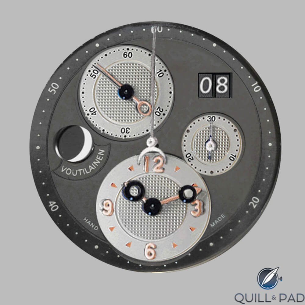
After a few moments of stunned silence and a few minutes of frenzied entreaties, he pulled from his case several photocopies of the following page and passed them around the table.
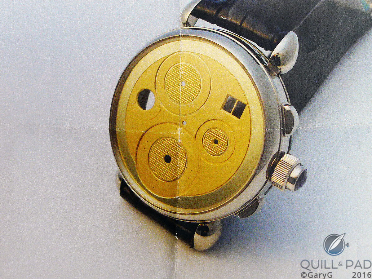
The start of it all: raw dial blank of the Kari Voutilainen Masterpiece Chronograph II
The time: two seconds later.
My response: “I’m in!”
Another member: “I’m in!”
And so on.
Interspersed came the details: slightly larger than the Observatoire, it was a chronograph with big date and moon phase (as could be seen from the prototype dial), date adjustment through the button on the crown; in all, a total limited series of ten pieces with two watches available in platinum and the remainder to be split between white gold and pink gold.
My response: “Pink gold with dark grey dial.” Others chimed in, including an immediate call on one of the two available platinum spots.
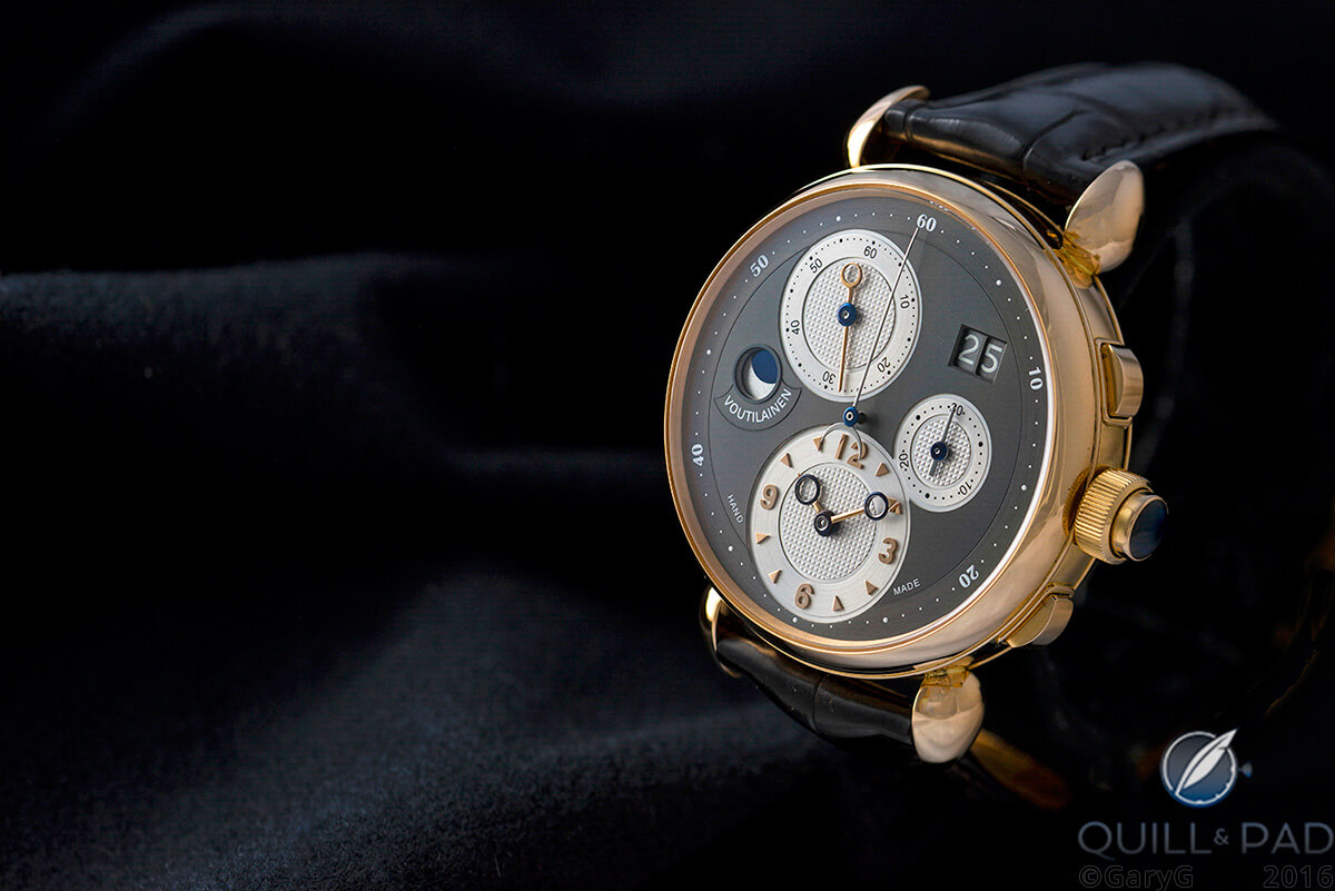
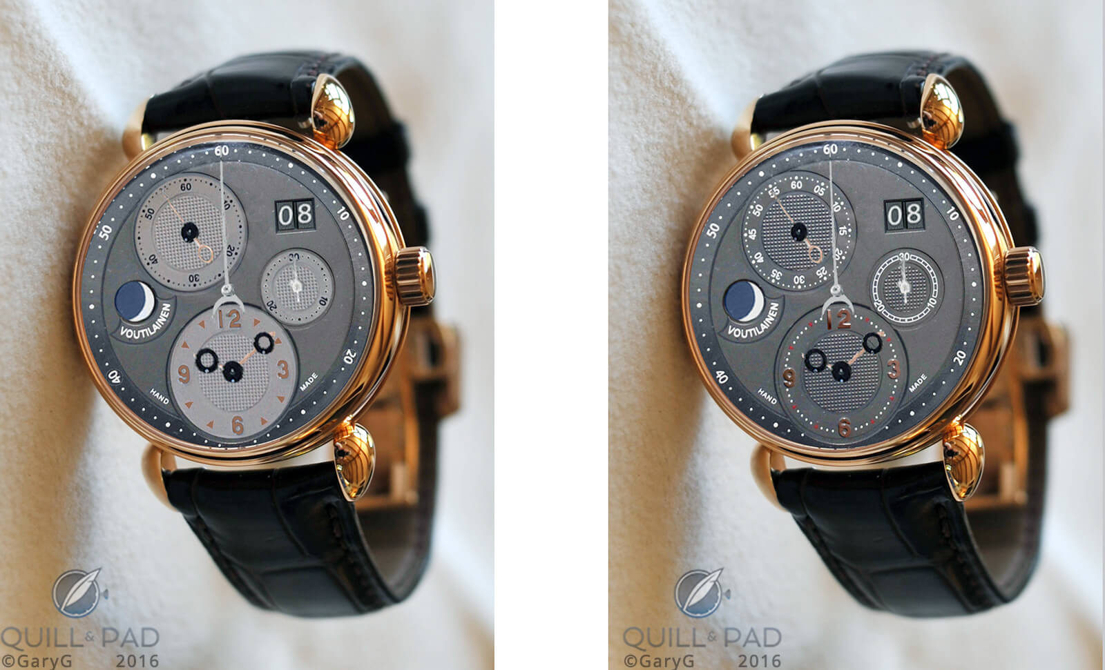
Waiting at the end of the trail: the author’s Voutilainen Masterpiece Chronograph II in pink gold
Finally, at the end of the dinner, there was one member who had not spoken. We turned to him and asked, “Are you in?”
His response: “You had me at ‘Kari’ and ‘chronograph’!” Laughter all around – and this member of the group, after some consultation with Kari, eventually specified the second platinum example.
Estimated delivery date for the watches: “Late summer 2011 . . .”
The following morning, the remaining member of the group signed up and specified pink gold for his case. Some big commitments made, especially for those of us for whom this would be our most expensive watch purchase ever, but what an opportunity to take a journey with great friends!
In July of 2010, Voutilainen and his family visited California. My wife and I hosted them and the rest of our group and spouses at my home. There was some excitement as Kari brought along two prototype dials – one dark and one light.
Immediately, my “mockup” process on behalf of my buddies went into high gear: I used a photograph of the Chrono I from Kari’s website, grafted on pushers and a crown from the prototype case photo, dial photos from the party, a moon phase stolen from a photo of another watch, hands from the Chrono I, case color from a photo of my Observatoire, and so on.
I don’t know exactly how many mockups I generated during the course of the overall process, but it was easily a hundred in various colors, patterns, and stages of refinement.
Early Photoshop mockup of the Voutilainen Masterpiece Chronograph II
If you look closely at the photo above, you can see some of the modifications that we tried out. Specifically, watches of Kari’s earlier Masterpiece Chronograph I are “missing” chronograph seconds dots at the bottom of the main dial of the watch. On the image above, I tried out adding some dots across the lower subdial (with the exception of 30).
Also, in the image immediately above you can see that the 20 and 40 are now “unflipped” vs. their “flipped” orientation on the physical prototype dial. And, we were also trying out some options for the seconds displays on the running seconds subdial; above you see a model in which we only had 15, 30, 45, and 60, rotated horizontally.
There’s one other difference. Were you able to spot it? On the lower photo, the chronograph minutes are represented with dots rather than with the railroad track of the prototype dial. These sorts of minor variations in dots, no dots, flips, tracks, number of numerals on the running seconds dials, etc. went on for several months, with lots of inputs and requests for custom mockups from every member and, I am sure, no end of consternation for Voutilainen as we asked about various permutations.
At one point there was a dialogue about whether there was too much “blank space” on the dial, which led to some hilarious mockups like the disaster shown below.
Don’t let this happen to you: some ideas are better than others
Ouch! Suffice it to say that I’m really pleased that I didn’t ask for that one; not that Kari would have made it.
I did of course spend some time working on alternative ideas for my own watch. In the rendering below, you can see the applied triangles for the five-minute markers on the main time subdial, something that ultimately became one of the unique design features of my personal piece.
Early dial rendering of the author’s unique Voutilainen Masterpiece Chronograph II
At this point I put two versions together in a photo of my Observatoire case, just to see what the watch might look like sitting on my nightstand. You’ll see that by this point Voutilainen had told us that he was going to insist that the night sky be blue rather than black or anthracite; an inspired decision, in my view, based on the appearance of the finished watch.
It was this comparison that led me to request a two-tone dial when we sent Kari our final preferences in January of 2011.
Final design trial runs by the author, 2010
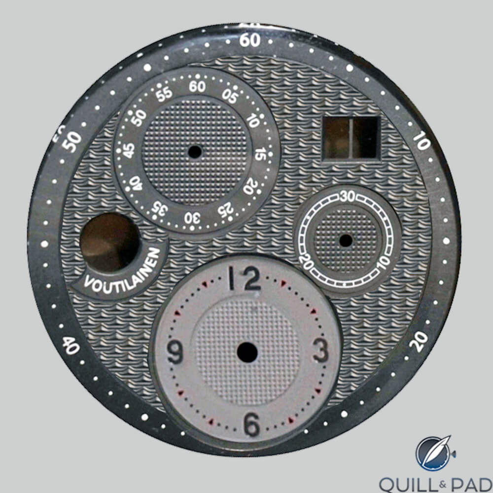
By now, we were in January of 2011: almost a year in, and time to view engineering schematics of the proposed dials. In the blueprint below, you can see that all chronograph seconds have dots on the outer chapter ring, the railroad track is gone, and the chronograph seconds are unflipped (the things that collectors care about!). Applied triangles are also in evidence.
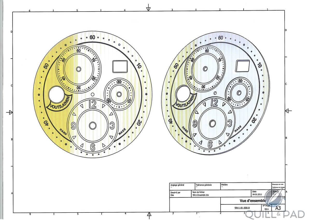
Dial design schematic, Voutilainen Masterpiece Chronograph II
During the months that followed, I pursued an angle that had intrigued me ever since I had seen the case of Voutilainen’s Masterpiece 7: the idea of an engraved officer case back.
I loved engraver Eddy Jaquet’s work on that watch, and began searching for a suitable subject for him to address on mine, finally settling on the idea of Chronos, the Greek god of time.
I pulled a bunch of Chronos images from the web and sent them to Eddy. The one that we both found appealing is the one shown below, of a sculpture by Ignaz Gunther.
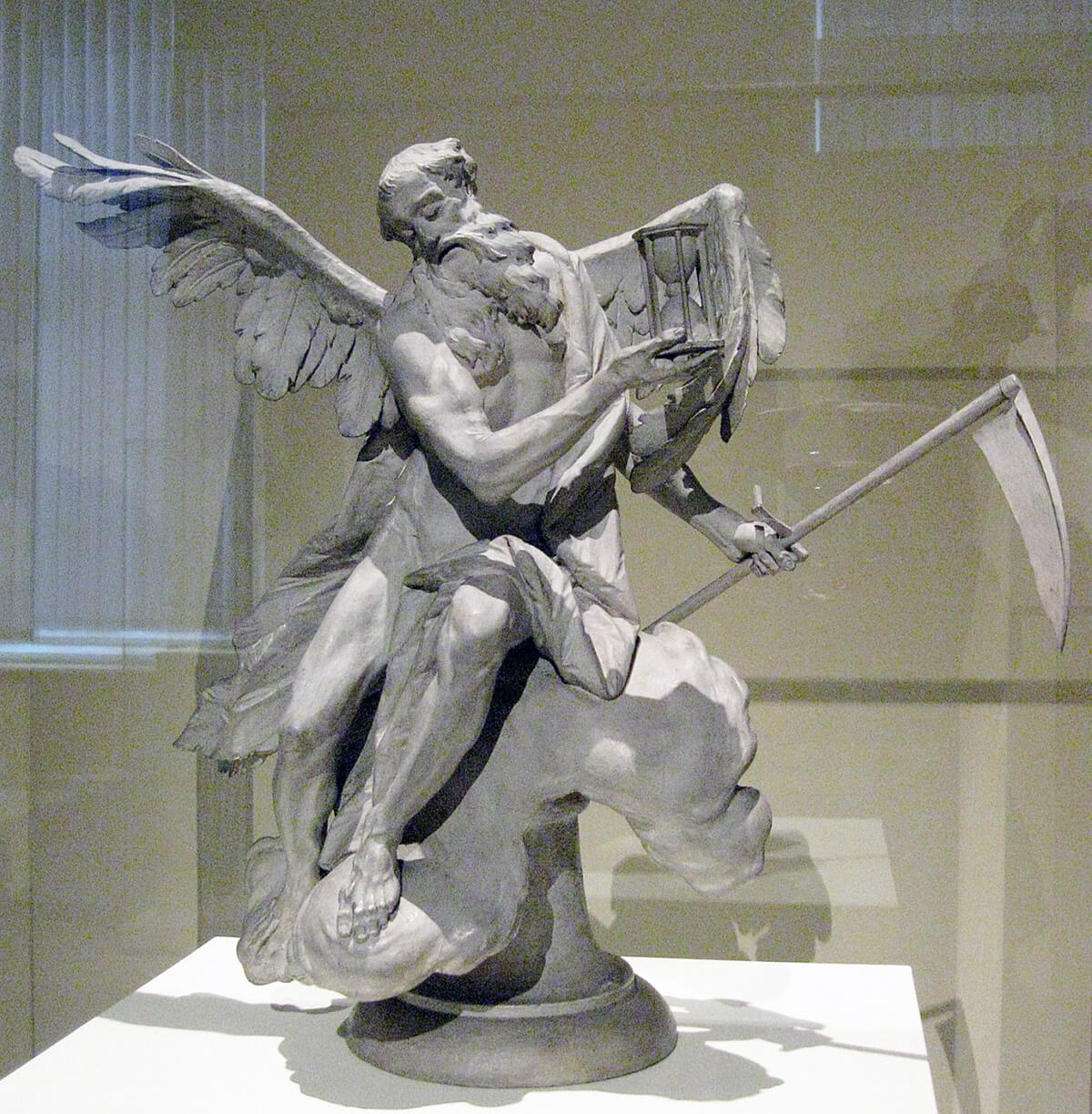
Statue of Chronos by Ignaz Gunther: inspiration for the unique engraving on the author’s watch
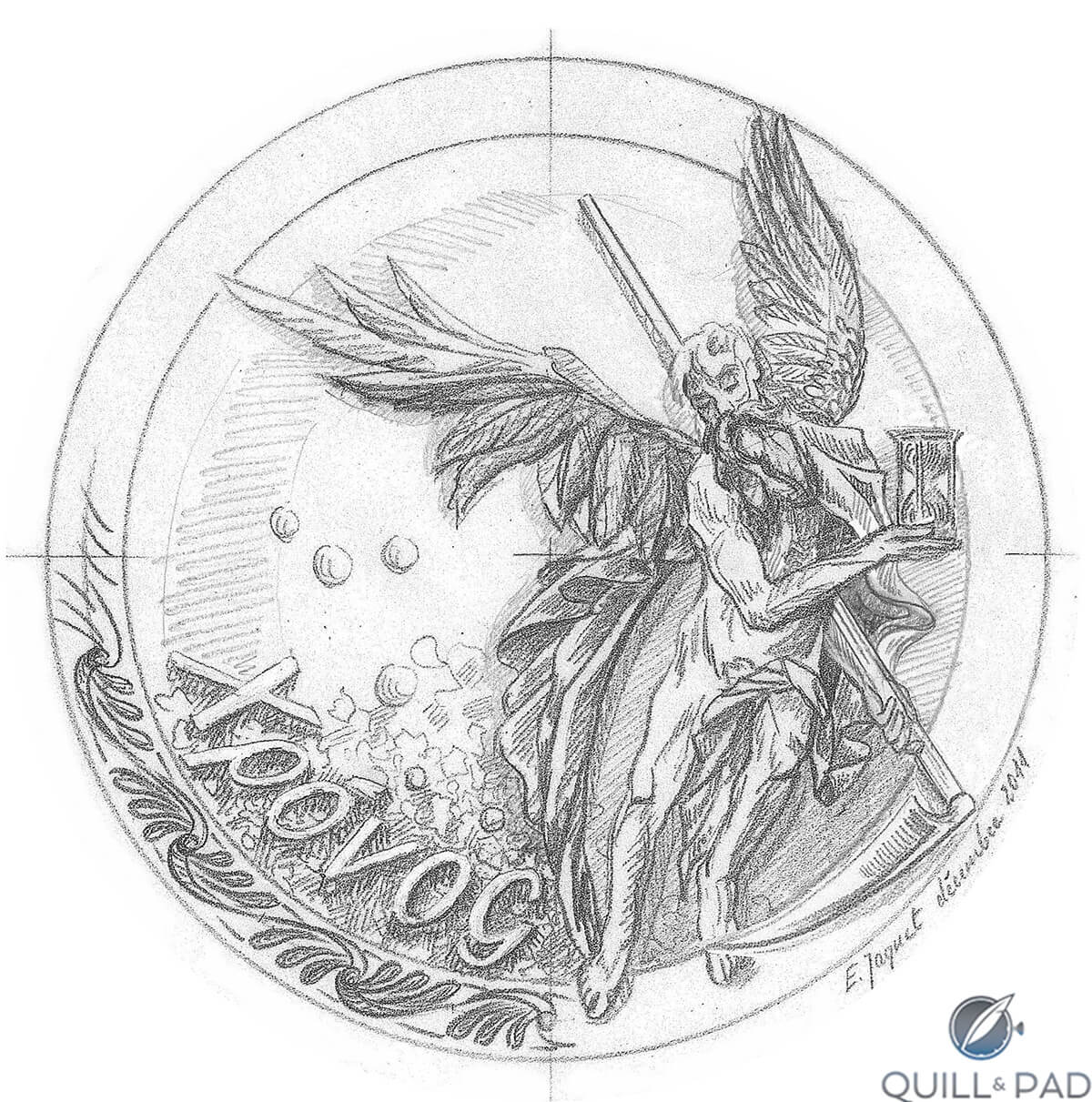
Over the course of the year we went back and forth as the “late summer” target completion date for our watches came and went due to sourcing issues with the dials. The delay did give me time to consider Jaquet’s first proposition, shown below.
Initial design proposal from engraver Eddy Jaquet for the Chronos engraving
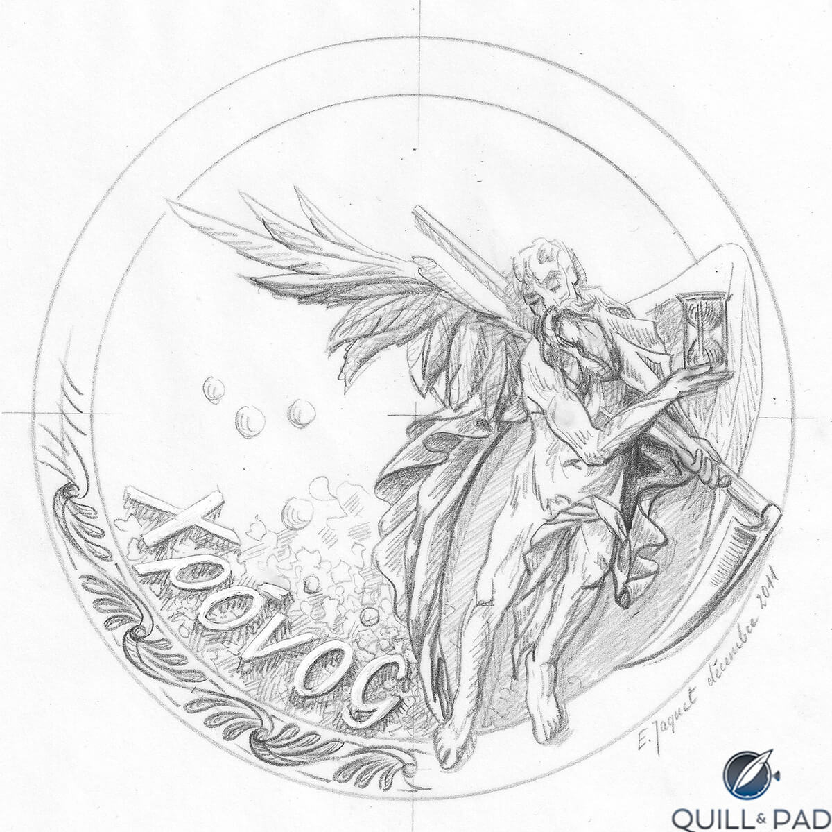
Hmm . . . it seemed to me that it would be tough to see the hour glass, and I also didn’t like the way that Chronos’ left wing was furled. Could we try again? Sure enough, the next proposal was very much to my liking.
Final design of Eddy Jaquet’s Chronos engraving
While Jaquet and I were corresponding back and forth, Voutilainen stayed busy approaching various vendors to commission a closed case back that could be added to an already-existing case (even tougher than it sounds). The winner is shown below: a simple design that added only 1.2 mm to the thickness of the watch.
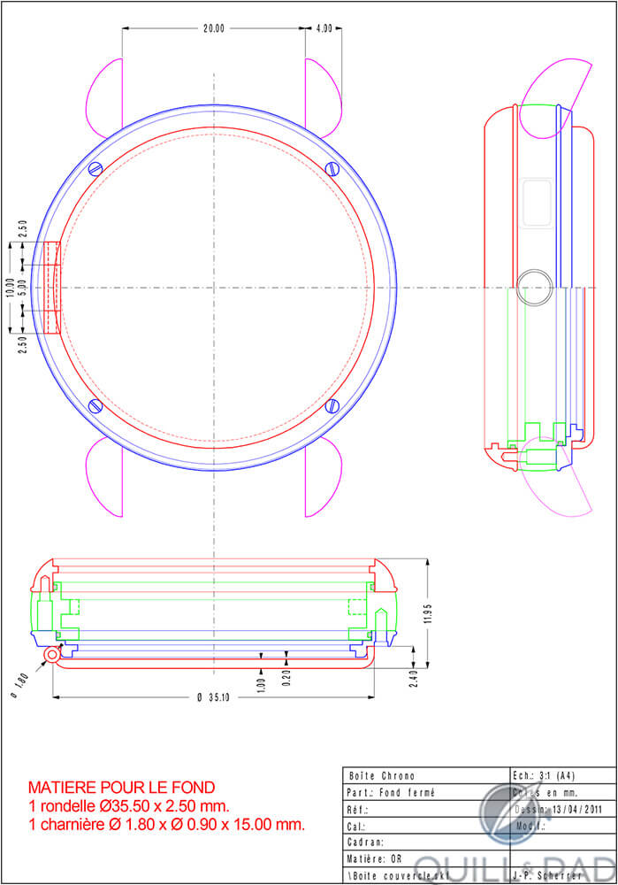
Blueprint for the case back addition to the author’s Voutilainen Masterpiece Chronograph II
In January 2012, our group visited with Voutilainen once again, this time to see our gleaming cases (mine with the engraved back not yet in place) and get a sense of how the movements were coming along.
Some of the major elements of my movement kit as seen at the time are shown in the photo below. It was frustrating that there was no working movement yet, but fun at least to see trays of completed parts.
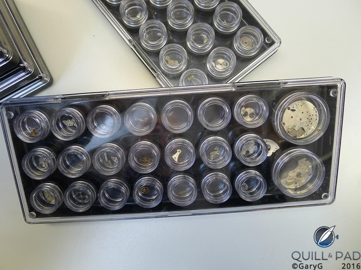
Movement components, Voutilainen Masterpiece Chronograph II
We also got a look at a movement under initial assembly and paid special attention to the design of the date mechanism, itself a cause of delay as Voutilainen had decided to reconceive it to avoid any concerns about patent issues relative to other “big date” calendar mechanisms.
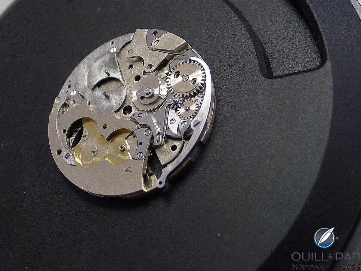
Dial side: Voutilainen Masterpiece Chronograph II in raw form with calendar components shown at right
A few months later, I received the first photo of Jaquet’s completed work on the case back, and things were looking good. As for the watch itself, I had thought for some time that it might be nice to have my movement plated in rhodium as opposed to the gold plating of the other movements in the series, and Kari was agreeable, so we decided to proceed with that unique touch as well.
That summer, we were fortunate to have dinner as a group with the Swiss-based Finnish watchmaker in San Francisco, and in tribute to all of his work on our watches we presented him with a signed print containing mocked-up renderings of all six of our forthcoming pieces.
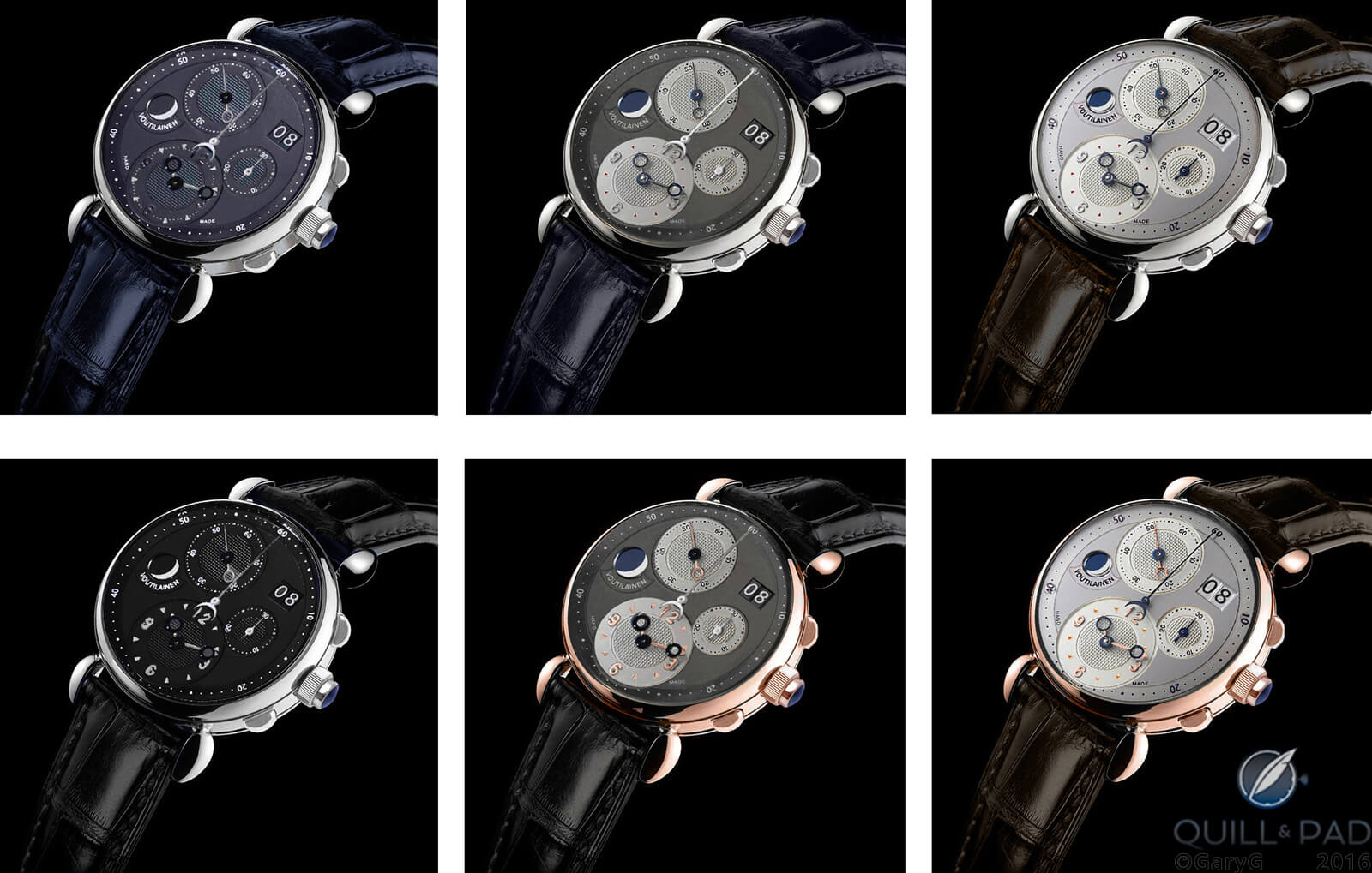
Mockup of the six “NorCal” versions of the Voutilainen Masterpiece Chronograph II
In December 2012, our boxes arrived, with just one small thing missing.
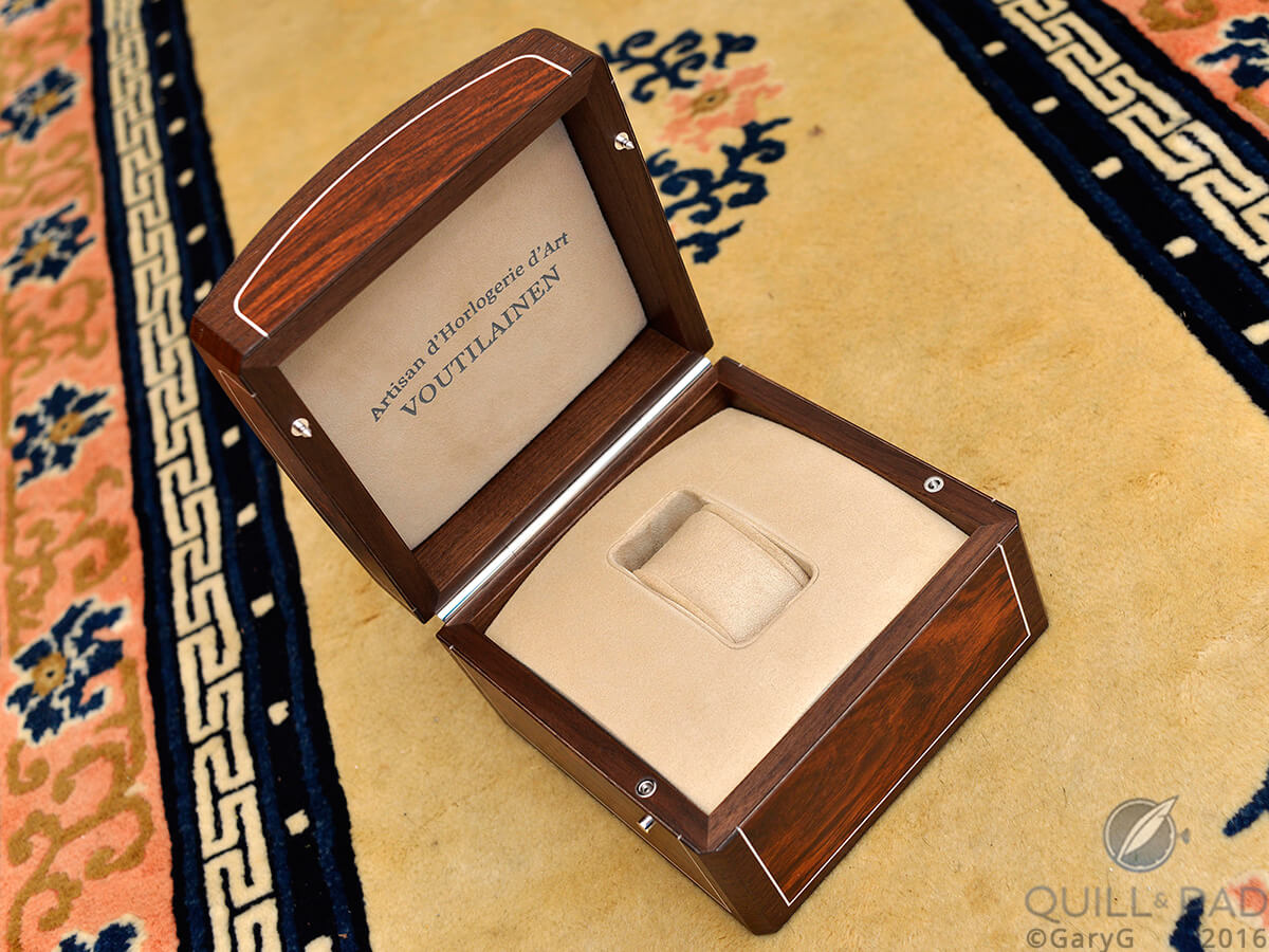
Presentation box, Voutilainen Masterpiece II Chronograph
That omission was remedied in January of 2013, as Voutilainen presented me with my watch in a moment graciously captured by one of my close watch buddies.

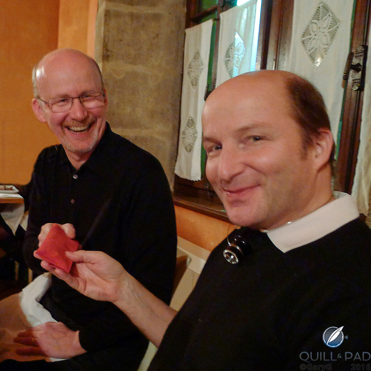
Kari Voutilainen presents the author with his Masterpiece II Chronograph
The bad news: an issue with a binding pinion that meant that the watch had to go immediately back to Voutilainen’s Môtiers, Switzerland workshop for adjustment! Such is the path of bespoke watchmaking, I suppose.
And there were some other teething issues with our watches, but (knock on wood) mine has been absolutely bombproof for a couple of years now. Earlier this year Kari was also kind enough to update my crystal to an anti-reflective version, allowing for better legibility and better photography.
I’m sure that at some point I’ll return to this watch for a more comprehensive “Behind the Lens” feature here on Quill & Pad, but for now here are a few more parting shots to give you a sense of the physical result of this wonderful journey with Kari Voutilainen and my dear friends.
Repeat after me: it’s all about the people!
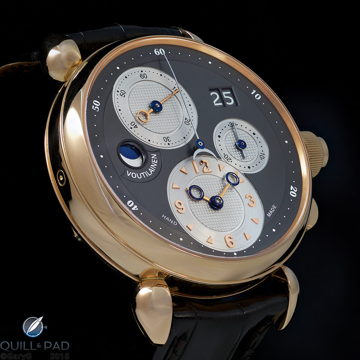
Unique Voutilainen Masterpiece Chronograph II commissioned by the author
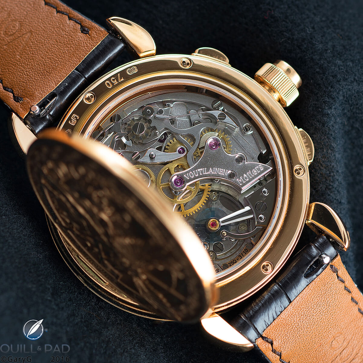
Movement, Voutilainen Masterpiece Chronograph II, with unique rhodium treatment
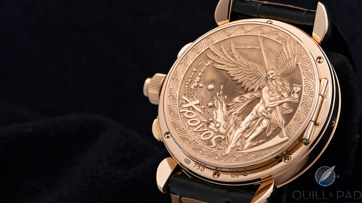
Parting shot: Chronos engraved by Eddy Jacquet on the reverse of the author’s Voutilainen Masterpiece Chronograph II
Quick Facts Voutilainen Masterpiece Chronograph II
Case pink gold, 40 mm, unique officer case back engraved by Eddy Jaquet
Dial: two-tone anthracite/silver-colored 18-karat gold dial with applied indices in rose gold
Movement: manually wound Caliber 25Q with unique plating in rhodium; 55-hour power reserve
Functions: hours, minutes, subsidiary seconds; big date, 30-minute chronograph, moon phase display
Variations in the six-piece series: others were produced in platinum, white gold, and stainless steel with varying dial colors including blue, black, anthracite, silver two-tone, and anthracite/silver two-tone
Price: not disclosed
Production year: 2013
* This article was first published on July 9, 2016 at Commissioning A Watch: My Journey With The Kari Voutilainen Masterpiece Chronograph II. You may find the comments under the original article interesting.
You may also enjoy:
Why You Can’t Afford To Buy Your Watch If You Can’t Afford To Break It
Why I Bought It: Romain Gauthier Logical One
Kari Voutilainen 217QRS With Retrograde Date: Striving For Perfect Beauty
Leave a Reply
Want to join the discussion?Feel free to contribute!


Congratulations on such a marvelous timepiece. The proportions are perfect as is the overall design. You clearly have an eye for beauty. Enjoy!
Sorry for the delay in responding — some Summer laziness on my part! Thanks very much for your kind comments — they are greatly appreciated.
Best, Gary