by GaryG
Sometimes when you slowly buy and sell watches over time, a trend in your collection sneaks up on you.
When I recently took a good look at the current state of my assortment, I was surprised by the large proportion of dark-dialed pieces in the mix. I guess I shouldn’t be entirely shocked as the first watch I ever bought for myself (the Bucherer Chronometer, which is still with me) has a dark blue dial. Even so, the number of dials in black, blue, grey, and even green and purple at this point is more substantial than I would have supposed.
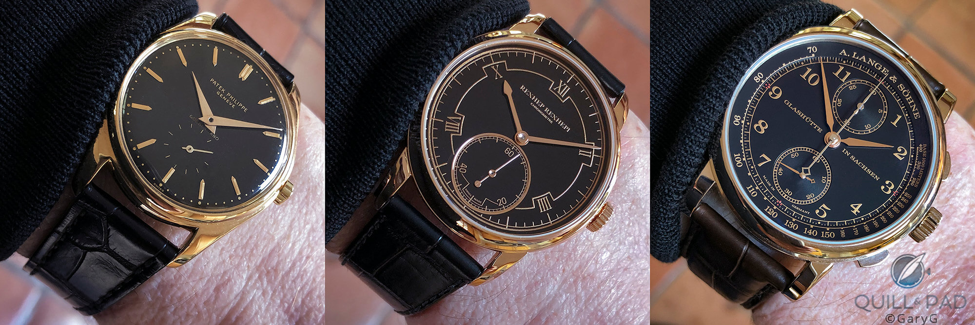
Among those, there are a few important pieces in a combination I certainly didn’t envision as recently as a few years ago: colored gold and black.
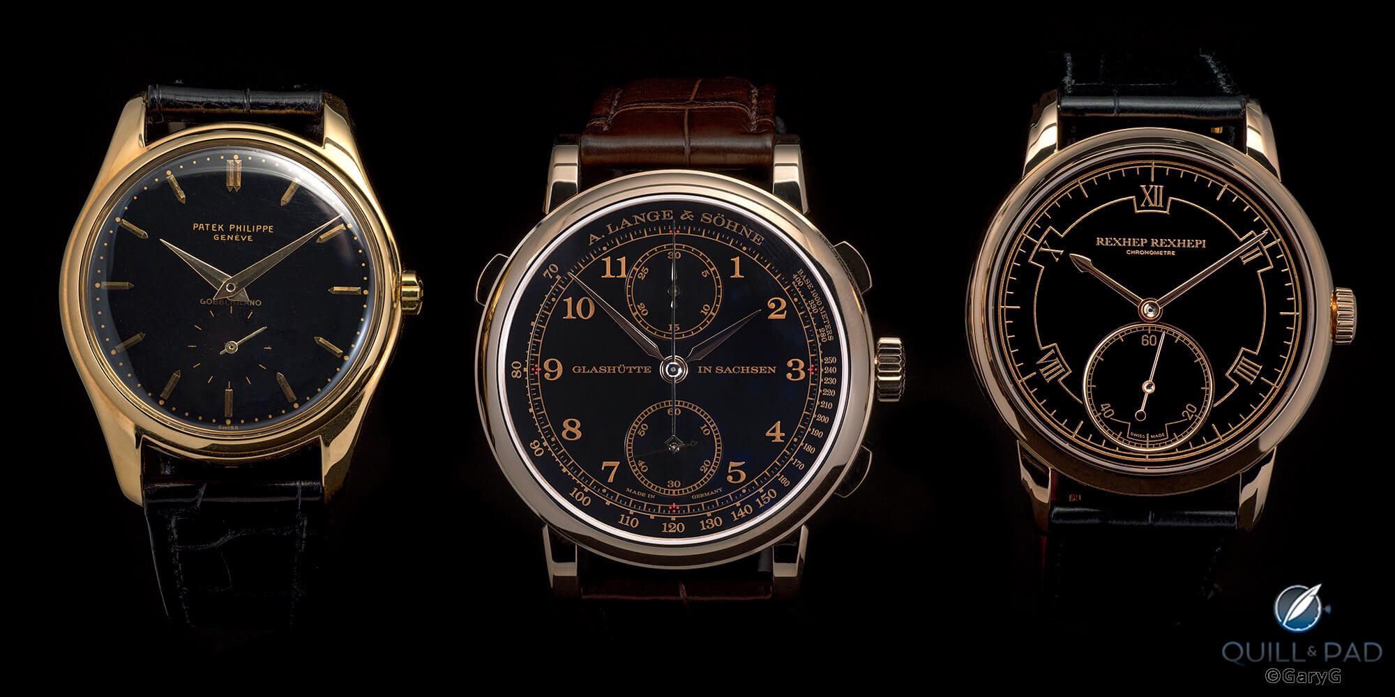
From left: Patek Philippe Ref. 2526, A. Lange & Söhne 1815 Rattrapante, Rexhep Rexhepi Chronomètre Contemporain
I distinctly remember handling a yellow gold Patek Philippe Reference 5074J – a large perpetual calendar minute repeater – at an auction preview several years ago and wondering to myself what the appeal of a black/gold combination could be. Tastes change, though, and sometimes rapidly; it was only a couple of years later that I saw, loved, and bought my Patek Philippe Reference 2526 with double-signed “Gobbi Milano” dial in the very same yellow gold, but with a high-fired black enamel dial.
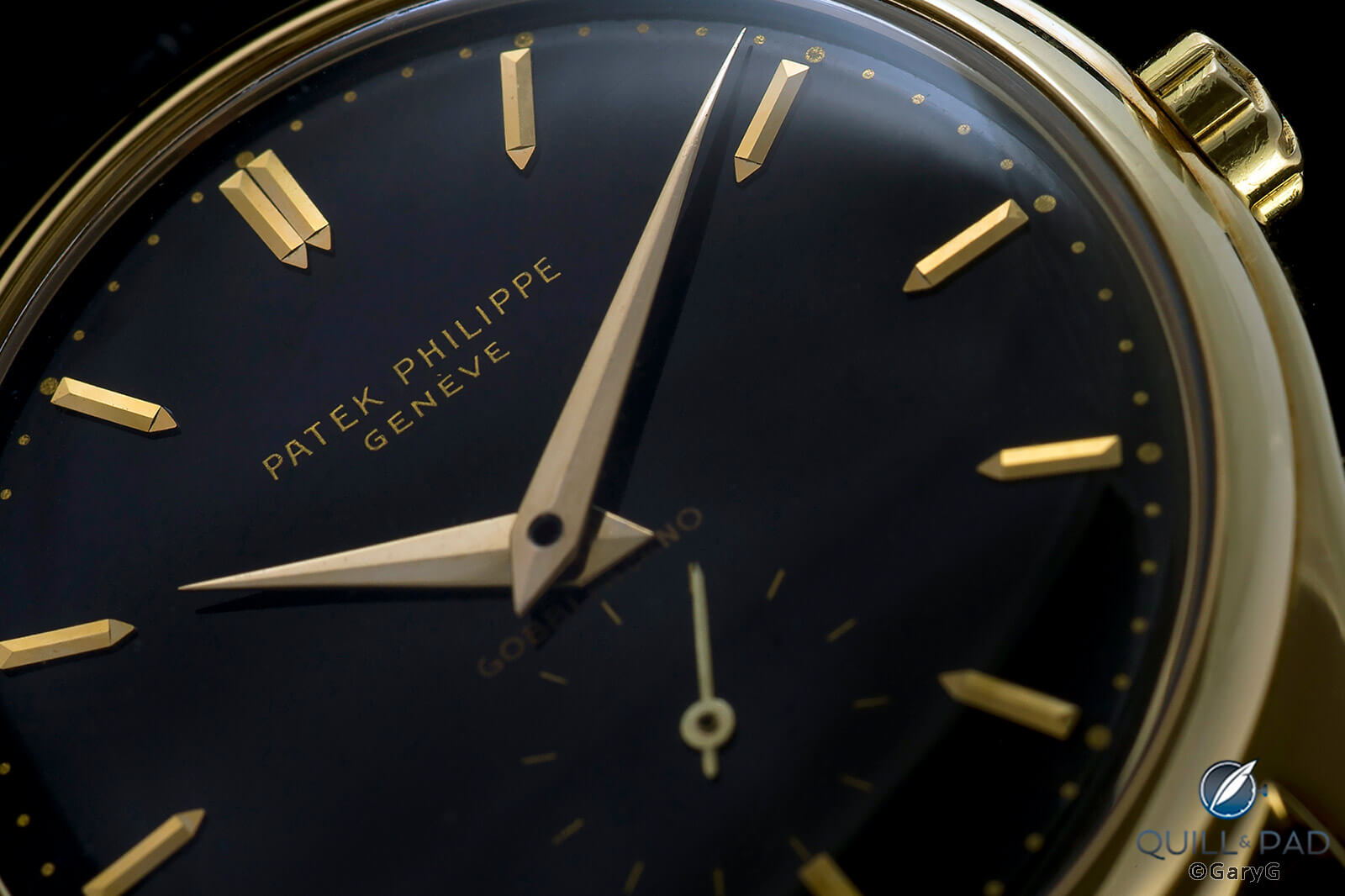
Start of a trend: the author’s Patek Philippe Ref. 2526J Gobbi Milano with double-fired black enamel dial
More recently, I added two contemporary black/gold pieces to my collection, but in different gold hues: the 1815 Rattrapante Honeygold from A. Lange & Söhne and Rexhep Rexhepi’s Chronomètre Contemporain in 5N red gold . I’ve enjoyed – and photographed – each of these watches a great deal, but it isn’t until recently that I pulled them together in one place for side-by-side shooting and direct comparison.
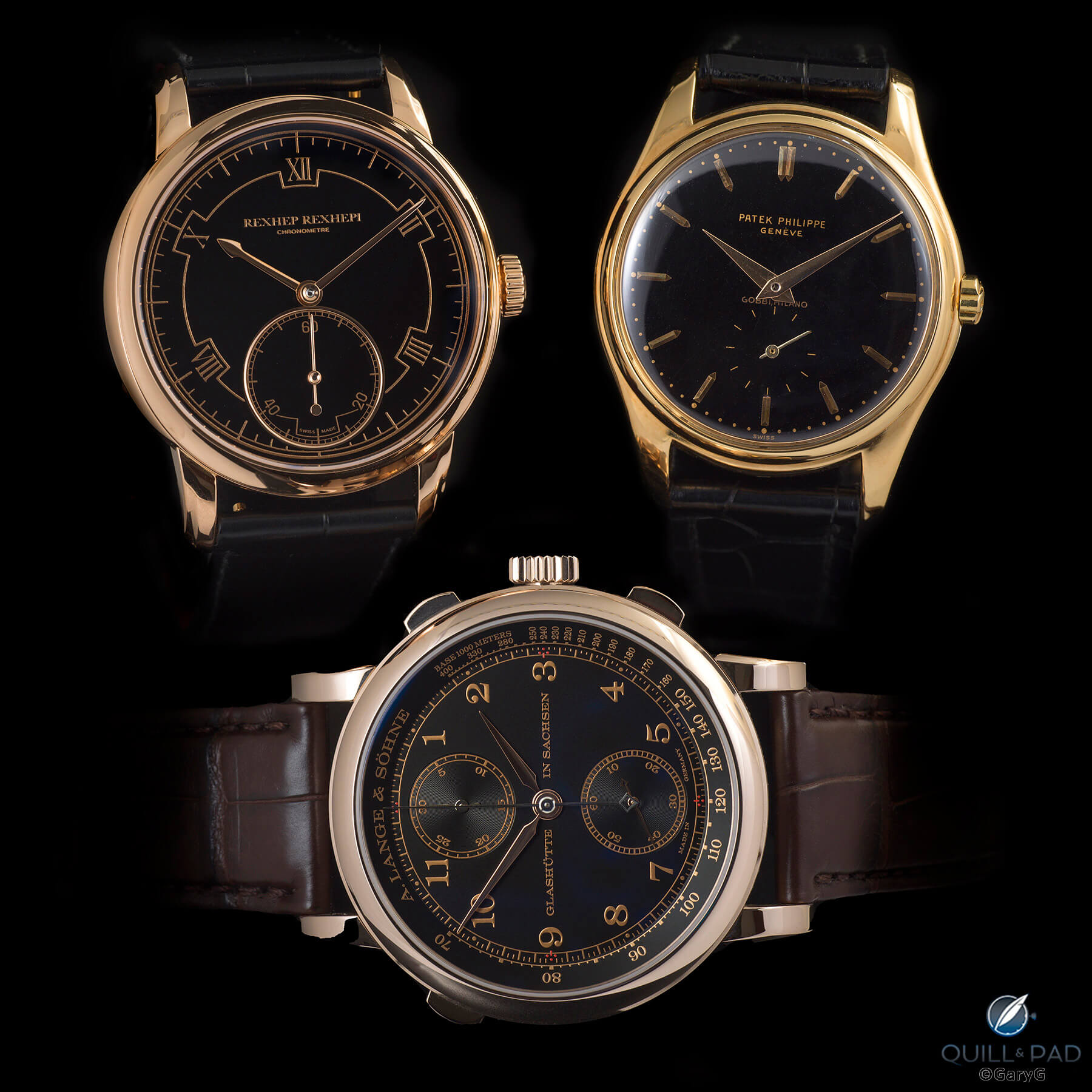
Clockwise from top left: red gold Rexhep Rexhepi Chronomètre Contemporain, yellow gold Patek Philippe Reference 2526, Honeygold A. Lange & Söhne 1815 Rattrapante
One quick note on my photography technique: for each of the group shots in this article, I took the photographs with the subject watches in a single setup in my light tent rather than shooting each watch separately and then smashing them together in Photoshop. In the photo above, for instance, you can see reflections of bits of the Lange in the bottom edges of each of the upper two watches and a glimpse of the RRCC’s crown in the left edge of the Patek Philippe.
Is that more difficult? You bet it is. It’s tough enough to get any decent shot of a black-dialed watch without losing the hands and dial details in the darkness or introducing unwanted glare from the crystal of the watch. Getting multi-watch, multilight setups that yielded usable photos of these black dialed beauties provided many hours of what, in consideration of the more sensitive members of our reading audience, I’ll simply call “fun.”
Modern marvels: A. Lange & Söhne 1815 Rattrapante Honeygold and Rexhep Rexhepi RRCC 01
On to the watches! I’ve been saying for a while that we live in a golden (no pun intended) age of watchmaking, and there aren’t many better examples to make the point than the Akrivia Rexhep Rexhepi RRCC 01 and A. Lange & Söhne 1815 Rattrapante Honeygold.
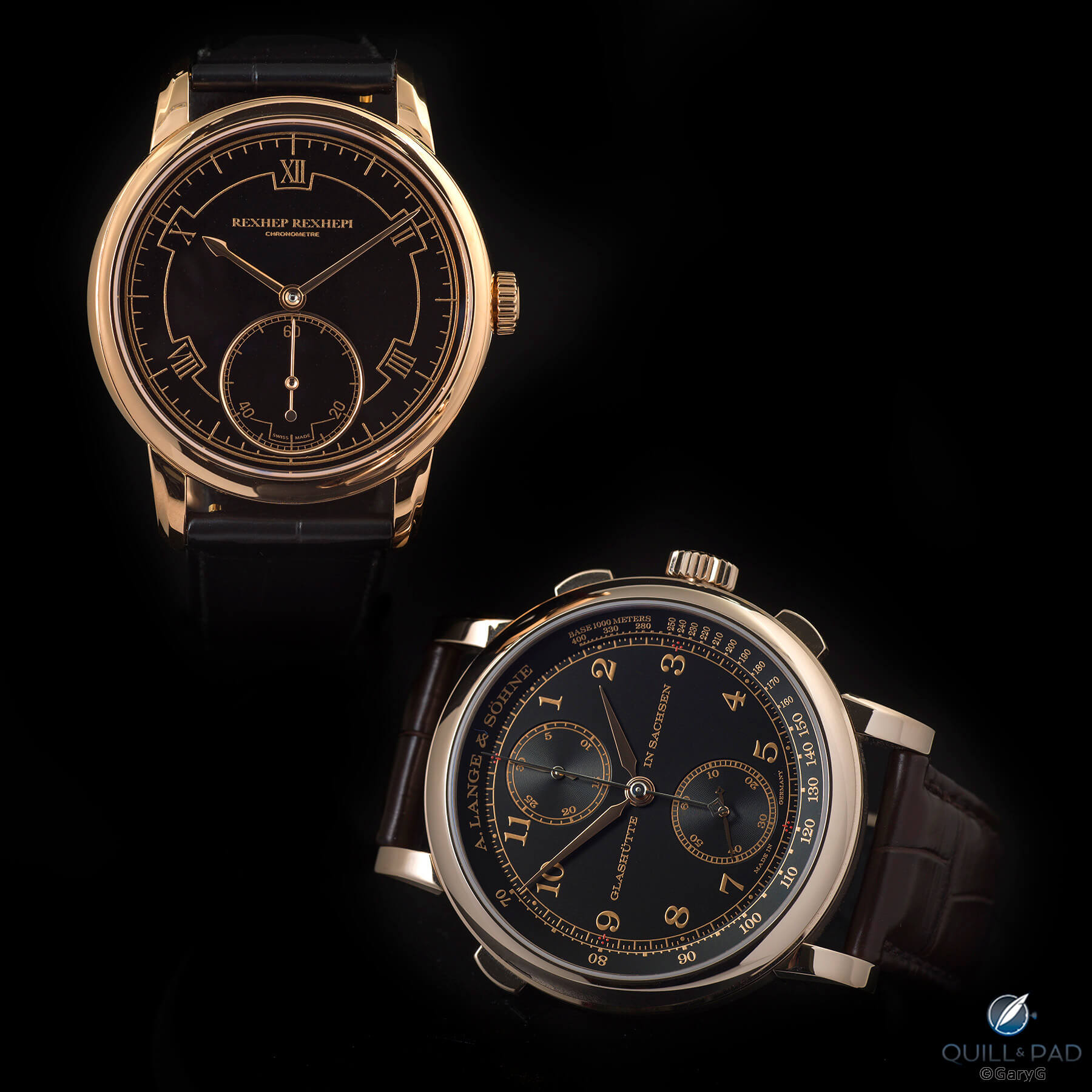
Two of the best of recent times: RRCC 01 in red gold (left) and 1815 Rattrapante Honeygold
I’ve written about the mechanics of each of these pieces before, so for now let’s stick with the aesthetics. The obvious difference is Rexhepi’s use of 5N red gold throughout, which in combination with the bottomless cavern of the black enamel dial creates a very formal look versus the proprietary Honeygold of the Lange, which for me imparts a lighter and more versatile appearance.
At the same time, A. Lange & Söhne has avoided the risk of having this wearable grand complication look bland by using red gold for the applied markers and indices and adding those tiny 1815-signature dots in red print at 12, 3, 6, and 9 o’clock.
As you can see in the photo above, the black galvanized silver dial and grooved subdials of the 1815 Rattrapante catch and throw a fair amount of light at oblique angles. Some might view enamel vs. silver as an unfair fight, but for me each has its virtues. Let’s not forget that between the prototype and production versions of the RRCC 01 Rexhepi moved the seconds subdial to a lower level and added a polished ring around it to increase the visual interest of the dial.
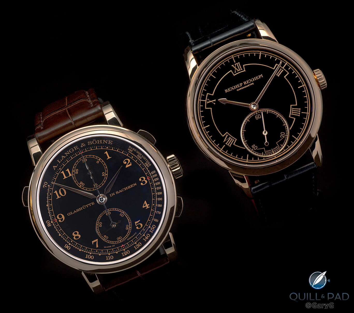
A. Lange & Söhne 1815 Rattrapante Honeygold (left) and Rexhep Rexhepi RRCC 01 in red gold
As far as visual similarities go, both use textured gold for the printed indications, with the ones on the RRCC just that tiny bit grainier. And while symmetry of both dial and movement design is a Rexhepi hallmark, the A. Lange & Söhne does at least as well in the instance of the 1815 Rattrapante with its vertical subdials and horizontal text creating a sector-dial look.
Let’s face it: if a brand came to me tomorrow and said, “we’d like a watch design – just make it in gold with a black dial,” chances are that I’d cook up something either blandly generic or wildly incoherent. With the 1815 Rattrapante and RRCC 01, the creators have given us relatively clean yet interesting – and completely distinctive – results.
Vintage class meets contemporary style: Patek Philippe Ref. 2526 and Akrivia RRCC 01
If somehow I’d managed to come up with something not too awful in my first pass at watch design, imagine that the ante was then raised: “How about something along the lines of a classic Calatrava, but with a more contemporary vibe?”
Before I awoke from my dream, I’d likely have tracked directly back to what for me is the quintessential Patek Philippe Calatrava: the legendary Reference 2526, and in my case the black-dialed “Gobbi Milano” version that I am fortunate to own.
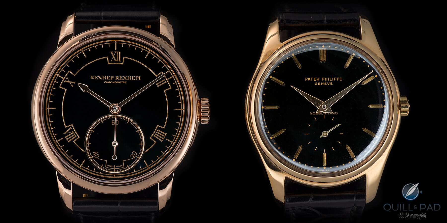
Evolution without imitation: Rexhep Rexhepi Chronomètre Contemporain (left) and Patek Philippe Ref. 2526J black-dial Gobbi Milano
Is there any doubt in the photo above which is the vintage piece and which is the modern one? The coolest thing for me is that despite being products of their times, each is timeless as well.
Rexhep Rexhepi is a graduate of the Patek Philippe apprenticeship program, and while it’s fashionable in some quarters to pooh-pooh Patek Philippe, Rexhepi remains deeply respectful of the brand and its watches. It’s no surprise, then, that for instance in his first classically styled watch he took inspiration from the stepped lugs of the Patek Philippe Reference 5970.
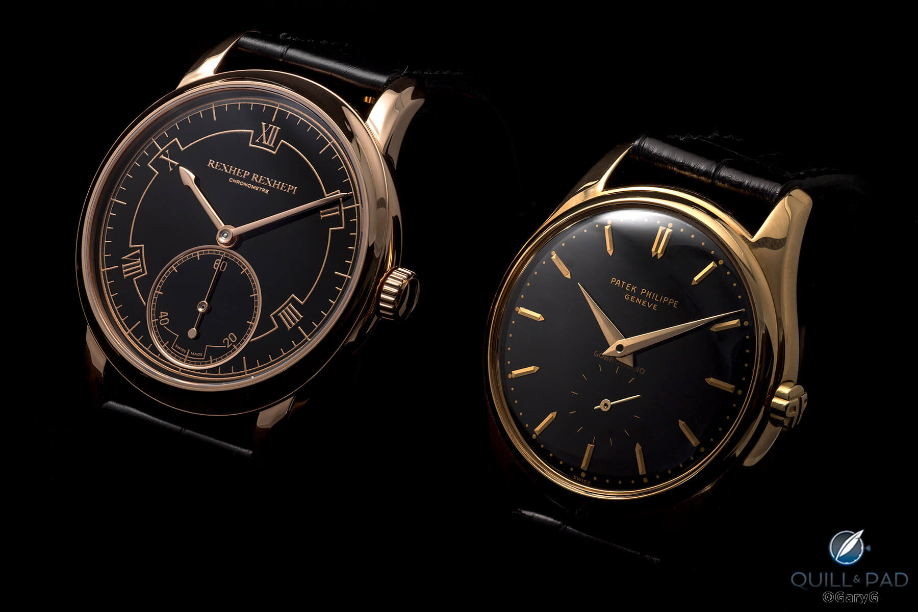
Two greats: Akrivia RRCC 01 (left) and Patek Philippe Ref. 2526J
But the RRCC is anything but an imitation of the 1950s Calatrava look: witness the ovoid bezel shape, the larger (and tapered) crown, the flat (and nearly reflection-free) crystal, and the stylized frieze framing the printed Roman numerals.
For its part, Reference 2526 is a landmark watch, both for its standing as Patek Philippe’s first automatic watch and for its distinctive styling. While it’s a pure, round shape with simple lugs, there are whimsical touches – my favorite being that Frank Lloyd Wright meets Raymond Loewy “PP” crown. And the simple applied indices and minimalist markings for the seconds are in my view the perfect complements to the double-fired black enamel dial, which due to the technique used is a bit rougher in texture than the RRCC’s but still provides the perfect backdrop.
The compact proportions and modest bezel of Reference 2526J also suit well its yellow-gold-and-black color scheme, unlike the big case and broad, stepped bezel of the aforementioned Patek Philippe Reference 5074J, which struck me as being a bit too much.
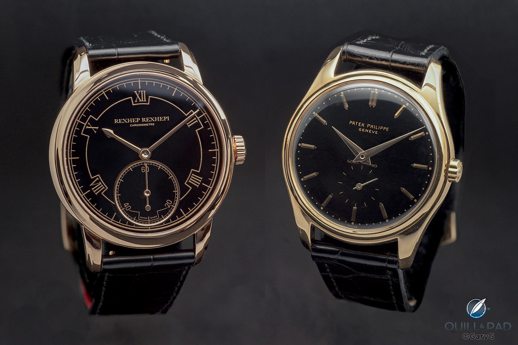
Take your pick: Chronomètre Contemporaine vs. Reference 2526
If I had to pick one? A favorite story told of my late first wife when she was a girl was that at a family gathering she was offered the choice between turkey and ham. Her response: “Why not both?” Why not, indeed.
The ideal two-watch black/gold collection? A. Lange & Söhne 1815 Rattrapante and Patek Philippe Ref. 2526
Simple and complicated; enamel and textured galvanic black; yellow gold and Honeygold with red gold accents; Swiss and German; vintage and modern. For my money, there can’t be too many two-watch black/gold combinations that cover more bases or that would serve for a greater variety of wearing occasions than the Patek Philippe Reference 2526J and A. Lange & Söhne 1815 Rattrapante Honeygold.
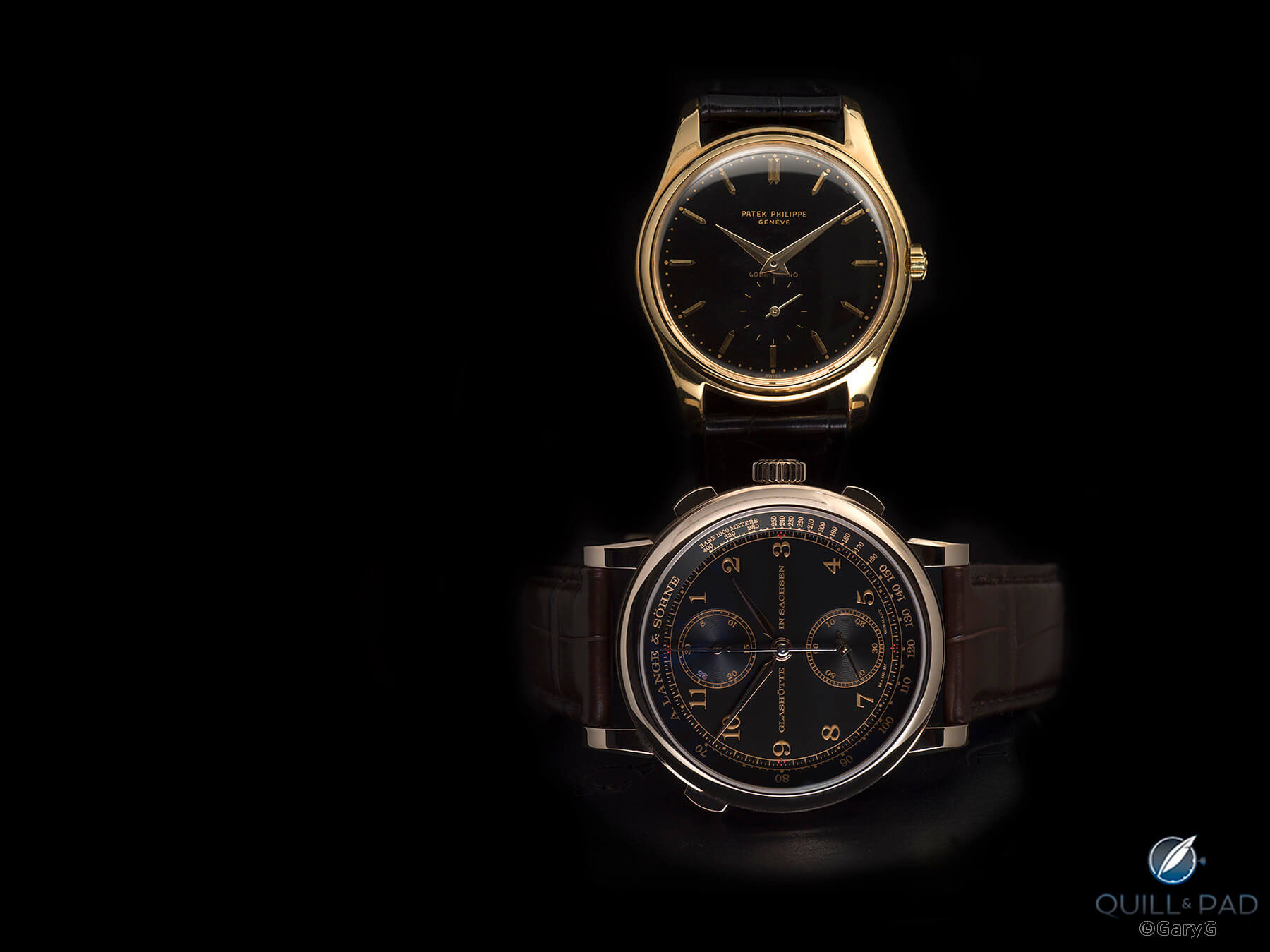
Two watches to rule them all: Patek Philippe Ref. 2526J (top) and A. Lange & Söhne 1815 Rattrapante Honeygold
In reviewing the photo above, I was struck by how well the brown strap of the A. Lange & Söhne meshes visually with the two gold hues of its case and dial, in contrast with the more severe look of the black strap on the Patek Philippe. I’ve actually bought a couple of different-colored straps for the 2526 but at this point am having difficulty choosing to swap either for the current black; perhaps at some point I’ll follow recent trends by pairing it up with a bright red or some other wacky color, but for now I’ll stick with what I have.
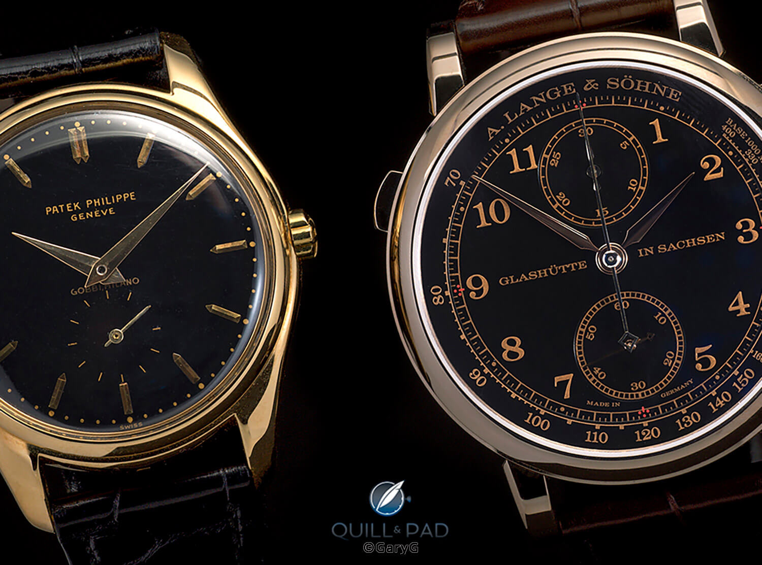
Contrast in styles: Patek Philippe Ref. 2526J (left) and A. Lange & Söhne 1815 Rattrapante Honeygold
A good look at the A. Lange & Söhne next to the Patek Philippe gives a better sense of how daring – at least in the context of German watchmaking – the 1815 Rattrapante is with its multiple colors, vertically arrayed subdials, and horizontal line of text. Definitely not the super-traditional look of the 2526, but for me it really works.
More than dials and cases
Our primary focus here is on the dial/case combinations of these watches, but they do have movements – and great ones at that!
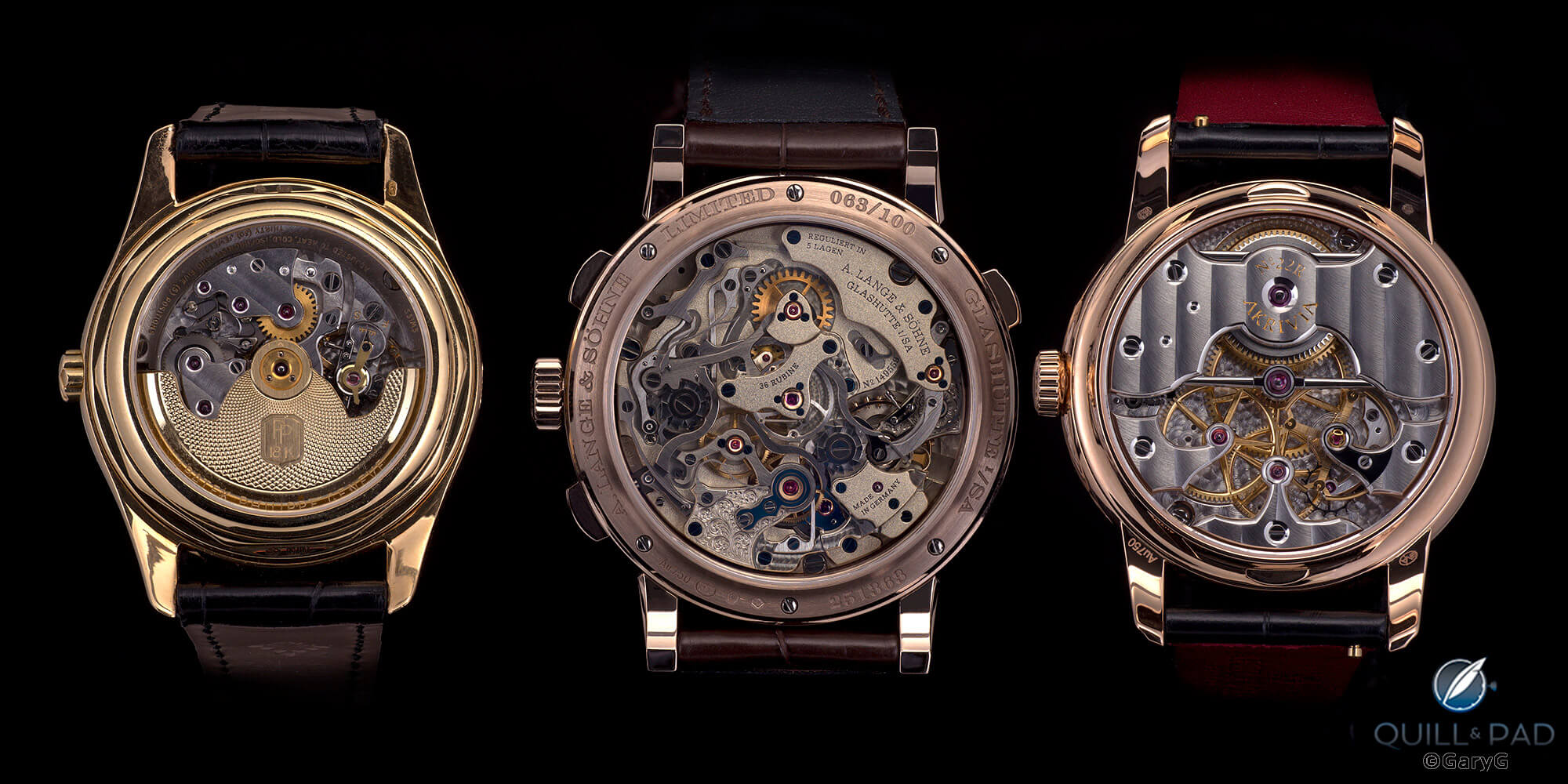
Gold frames, great movements: from left, Patek Philippe Ref. 2526J, A. Lange & Söhne 1815 Rattrapante Honeygold, Akrivia Rexhep Rexhepi Chronomètre Contemporaine 01
I’m really not sure what to say about the photo above other than that it stops me in my tracks each time I look at it. Patek Philippe’s Caliber 12-600 AT is an all-time classic, and revealed here by its custom Voutilainen-Cattin display back shows us its clean design and beautiful finishing. I’ve shot this watch using a variety of angles and lighting setups and I can testify that it is virtually impossible to make those shallow Geneva stripes look anything but sublime.
A. Lange & Söhne’s Caliber L101.2, with its frosted finish taken from traditional Lange pocket watches and framed in Honeygold, gives us a different take on Lange styling while retaining the deep dimensionality we’ve come to expect. And what to say about Caliber RR01 on the right other than to note the otherworldly glow and to admire the symmetrical design that is an Akrivia hallmark?
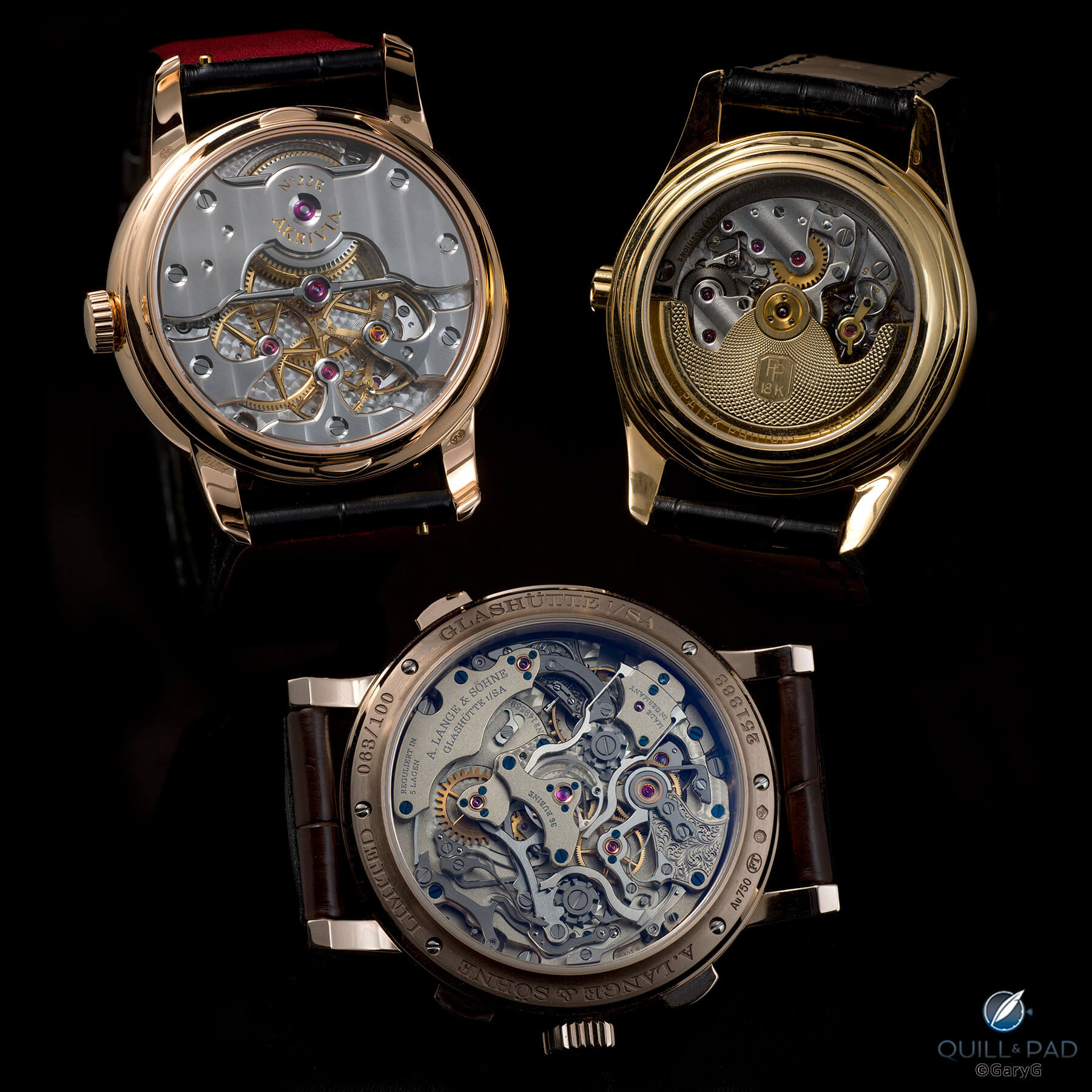
One more time: movement sides, three remarkable gold watches with black dials
I don’t know about you, but for me it’s also a bit easier to see the exact colors of the gold alloys in these movement-side shots than in the dial-side views of black against black; that may be the way our eyes work or my camera running up against the limitations of its outstanding color rendering capabilities with only gold and black tones to process.
Black and gold on the wrist
Watches are made to be worn! So, off to my secret wrist shot location, aka a corner of my kitchen, where I grabbed quick real-life images of these three watches.
Wearing any of these pieces just makes me want to wear them more! In fact, I’ve been wearing the Lange nonstop for the past several days and once I tear it off my wrist, I’m sure I’ll proceed to give each of the other two some prolonged wrist time.
How about you? Are you a fan of colored gold watches, and especially those with black dials? And for you, would it be Honeygold, red, or yellow? I’ll look forward to your comments – in the meantime, happy wearing!
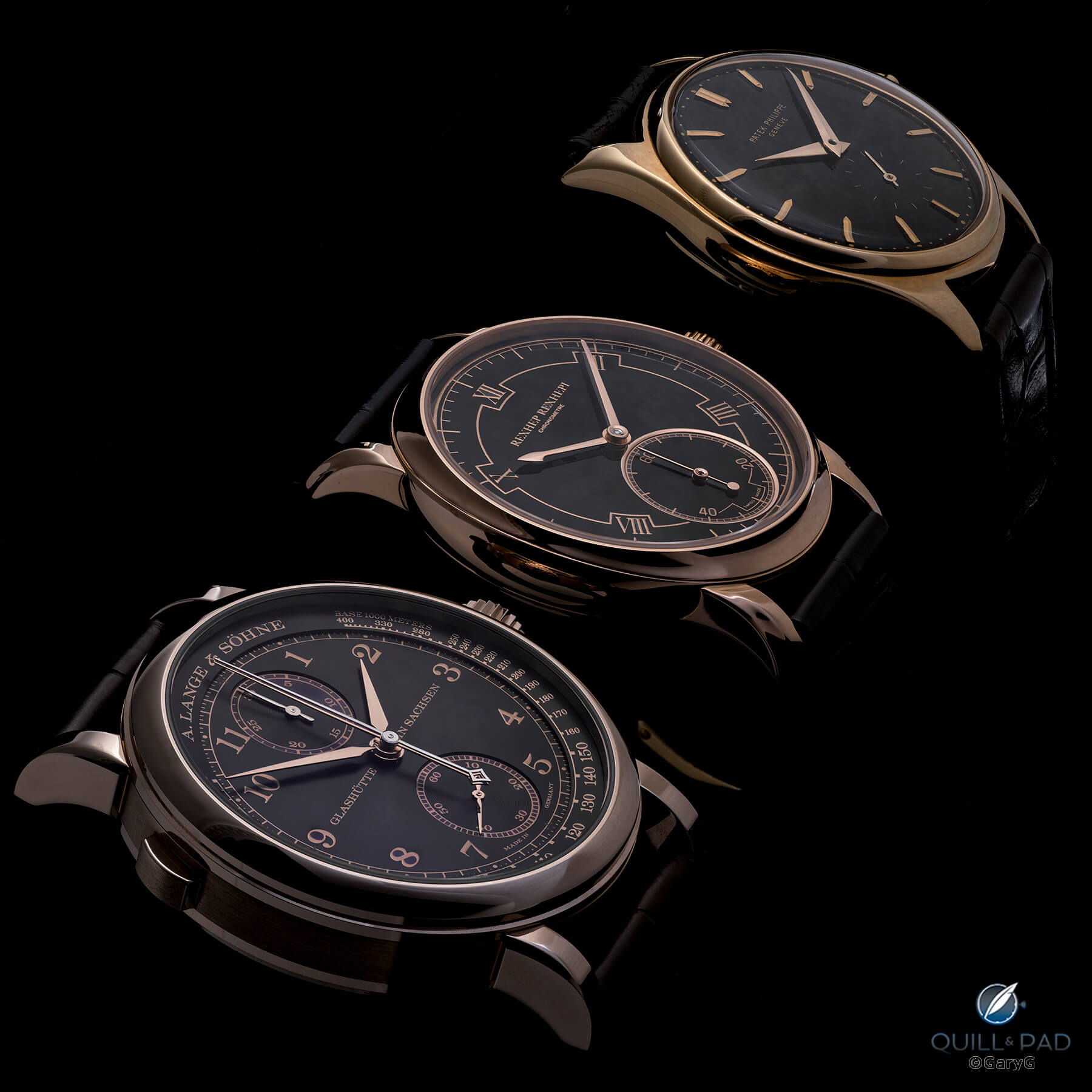
Parting shot: from left, A. Lange & Söhne 1815 Rattrapante Honeygold, Akrivia RRCC 01, Patek Philippe Ref. 2526J
Quick Facts A. Lange & Söhne 1815 Rattrapante Honeygold “Homage to F.A. Lange” Ref. 425.050
Case: 41.2 x 12.6 mm, proprietary Honeygold with polished and brushed bezels and brushed case band; sapphire front and rear crystals
Dial and hands: black-treated solid silver dial with gold printed indices; pink gold, white gold, rhodium-plated steel, and gold-plated steel hands
Movement: manually wound Caliber L101.2; 58-hour power reserve; 21,600 vph/3 Hz frequency, twice assembled, frosted finish
Functions: hours, minutes, seconds; rattrapante chronograph seconds, 30-minute chronograph
Limitation: 100 numbered pieces, sold only through A. Lange & Söhne boutiques
Production years: 2020-2021
Price: $134,000
Quick Facts Rexhep Rexhepi Chronomètre Contemporain
Case: 38 x 9.5 mm, platinum or pink gold with polished concave bezels and case band; oval front bezel and eccentric profile case band; front and rear sapphire crystals with antireflective coating
Dial: black (pink gold) or white (platinum) fired enamel dial with recessed subsidiary seconds dial surrounded by gold or platinum ring; printed indices and logo
Movement: manually wound Caliber RR01 with 100-hour power reserve; 18,000 vph/2.5 Hz frequency; chronometer certification carried by Besançon observatory
Functions: hours, minutes, hacking subsidiary seconds with zero reset
Price: CHF 55,000 (gold), CHF 58,000 (platinum)
Limitation: 50 examples in total (25 platinum, 25 pink gold) with one additional watch with custom dial and JP Hagmann case made for Only Watch 2019
Production years: 2018 to 2021
Quick Facts Patek Philippe Ref. 2526 “Gobbi Milano” black dial
Case: 35 mm, yellow gold with solid screw-down back, PP logo crown
Dial and hands: black double-fired enamel signed by Patek Philippe and retailer Gobbi Milano; applied gold markers and gold dauphine hands
Movement: automatic Caliber 12-600 AT stamped with the Geneva Seal
Functions: hours, minutes, subsidiary seconds
Auction price: CHF 100,000 at Christie’s Geneva, November 2017
Produced: 1954
Sold: June, 1955
You may also enjoy:
Why I Bought It: A. Lange & Söhne 1815 Rattrapante Honeygold Homage to F.A. Lange
Why I Bought It: Rexhep Rexhepi/Akrivia Chronomètre Contemporain
Why I Bought It: Patek Philippe Reference 2526 ‘Gobbi Milano’
Leave a Reply
Want to join the discussion?Feel free to contribute!



























It’s like seeing the evolution of watchmaking. From old to modern. The Rexhep Rexhepi showcases just how far ahead modern horology is to those of years past.
I do agree that we are in a golden age of watchmaking right now! How wonderful to see a new generation of masters emerging before our eyes.
Best, Gary
That’s the best side-by-side comparison of different colored golds I’ve even seen, Gary.
Regards, Ian
Many thanks indeed, Ian! Lighting was of course a key but I also have to give big credit to the color rendering engine of the Hasselblad. They individually calibrate each camera at the factory and the color software reloads each time you start up the camera — which makes it pretty awful for point-and-grab action shooting but allows the sort of color renders you see here.
Thanks for taking the time to comment!
Best, Gary
Rose gold and black dial is one of the absolute most beutiful combinations.
I agree, and especially on a watch as well designed as the RRCC!
Best, Gary
Aw Gary!
You have made me unhappy with both my watches AND my photography in ONE article!
Have some compassion please!!!
And when are you going to publish a book?
Sorry! Well, not deeply sorry, as I take your comments as a real compliment — thanks very much indeed.
Will have to ponder on a book — I’m one of those people who looks at his work from 6 months ago and thinks it’s trash, but perhaps there are enough nuggets to use!
Best regards, Gary