Omega Specialties CK 859: A Sector as Sweet as Nectar
I have always lived a bit between two worlds, design and engineering. Working in product development means I’m always thinking about how things work and how they will be made, and the engineering required to build a prototype versus a mass-produced component.
Yet at the same time as I am considering all of that, I am very aware and deliberate with the design of anything I am making.
Working with designers means that I must help them justify making a product that is more difficult or costly to produce because of the aesthetic benefits. As a result, I am regularly considering design from its functional implications, regardless of my appreciation for the way something looks and feels. But this doesn’t mean that I have no design sensibilities, in fact I often spend more time trying to engineer solutions to aesthetic choices I have made rather than simplify the design.
So, while I am still first and foremost a mechanics-first type of watch lover, I spend an inordinate amount of time comparing and considering various watchmakers’ takes on aesthetics. Whether it be dial design, finishes, hand shapes, numeral choices, case profiles, movement design, and the ever-elusive X-factor that pulls a design together, I love seeing how different brands approach the problem of “How to make an attractive-looking watch.” Judging by the state of the industry, there are truly a million ways to answer that question.
It’s even more interesting to see how different designers and brands approach similar aesthetics and go in dramatically different ways. One of the styles that is very popular for creating new iterations is the “sector dial” watch, a very clean and simple design that many may even disagree about what constitutes one.

Omega Specialties CK 859
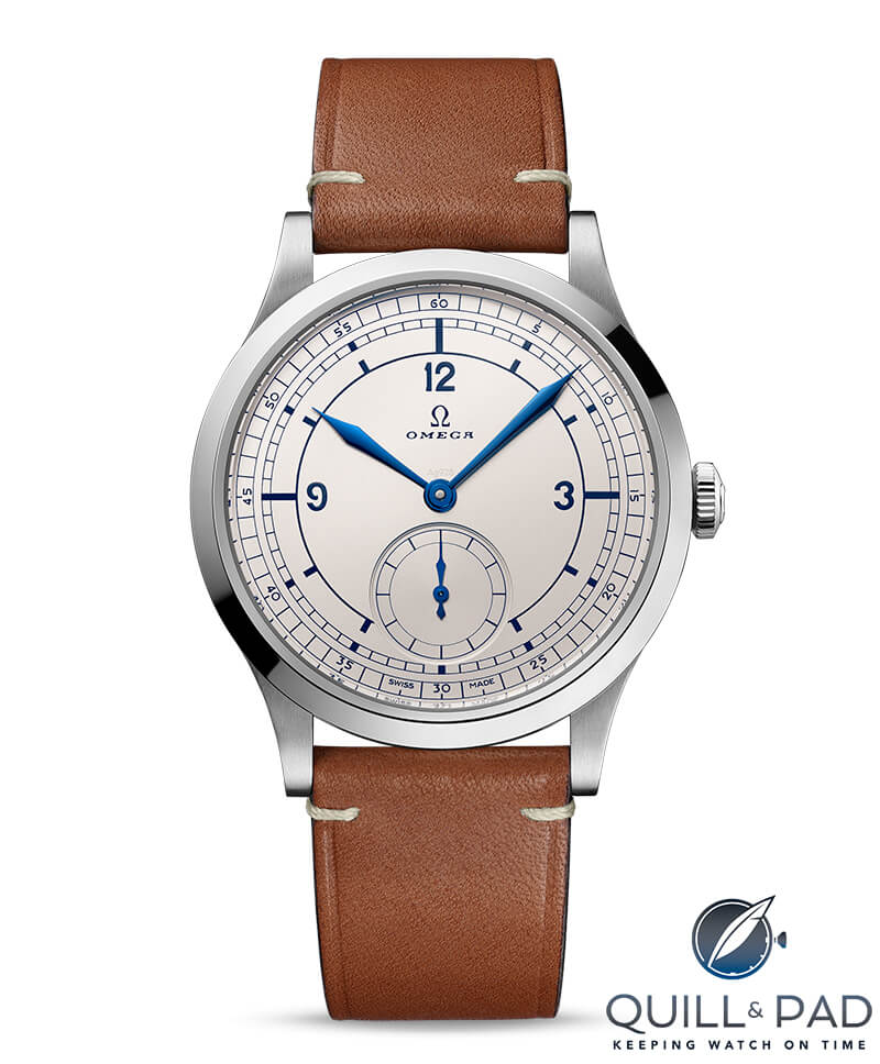
The Omega Specialties CK 859 is a recent take that stood out to me for its success at capturing the sector dial aesthetic and how it became a mini-grail for many collectors.
————————————————————————————————————–
—————————————————————————————————–
Omega Specialties CK 859
When the Omega Specialties CK 859 launched in the spring of 2022, it flew a bit under the radar as other releases were still garnering a lot of the press (fairly typical for spring in Switzerland). But it quickly picked up steam as people realized what a little gem this watch was, and it became a star in the eyes of fans of sector-dialed watches.
While the definition of a sector dial watch is both broad and in no way consistent (or official), people usually know one when they see one, and the CK 859 is an incredible example of the genre.
The basics of a sector dial watch include the standard minute track, divided into 60 sectors (hence the name), with additional large hash marks to delineate the quarters, or sometimes even five-minute intervals. These can vary in thickness and length and be accompanied by Arabic numerals, plus a secondary seconds dial can also repeat the style of the minute track around the edge. The overall appearance evokes a precision instrument, perhaps the dial of a caliper or gauge.
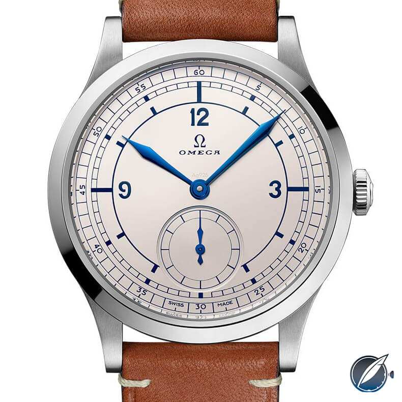
After one look at the CK 859, it is clear that this is a definitive sector dial watch, and then some. Just like the original model it was based on, it features not one but two minute tracks around the edge of the dial, both tracking individual minutes but in two different form factors.
The exterior track is wider and features Arabic numerals for each five-minute indication, carving out a space within the thin sector line. The interior minute track is thinner and replaces the numerals with thick, solid lines providing a visual base for the outer ring.

Omega Specialties CK 859
Inside both of these minute tracks is the hour track. It is made of a single medium-weight segment of a circle (broken only by the off-center seconds dial) that has thick lines radiating outwards marking each hour.
The line weight matches the five-minute lines on the interior minute track, but each line is a bit longer than the width of that ring. Each of the quarter-hour lines extend from the hour track line to the interior minute track, joining those to make a long visual division to the set of tracks.
—————————————————————————————————–
—————————————————————————————————–
What’s there and what’s not
It is this variation in length that helps divide the dial into quarters visually, even though it is missing another hallmark of some sector dial watches, a full dial crosshair. Some would say that you cannot have a sector dial watch without such a crosshair, but since it was never a universal detail, I would argue that the visually implied crosshair works just fine.
That is what comes across with this dial, the thick quarter hour lines visually divide the face of the watch to give a clear, instrument like feel.
This is only possible thanks to careful application of line weight, spacing, and negative space. The absence of a feature can sometimes play just as important a role as a feature that is present, at least when it comes to how you perceive a design.
The double minute tracks giving way into a very spread out hour track with three long, thick markers allow the eye to move from a busy and detailed measurement to a mostly empty interior, allowing the eye to take the strongest visual elements and extrapolate from that. The longer thick lines aren’t required to connect for your brain to accept that they do.
Inside the hour track sit three larger Arabic numerals marking three, nine, and twelve o’clock, once again only pausing at six o’clock to present the off-center seconds dial. This dial is recessed with a very subtle double step down to the twelve sector ring, echoing the design but keeping the line weight small so as to avoid drawing too much attention to this dial and breaking the visual impact of the broader dial.
What makes a larger impact, once again, is the lack of any strong color to the dial. Made in a perfectly satin silver, the dial is unobtrusive and allows for amazing contrast with the blue pad-printed markings around the dial. This is continued with the expertly blued hands, only slightly divergent in hue from the printing thanks to the fact that it is pristinely polished metal instead of a flat ink.
Outside of the vintage Omega logo and typeface just under the twelve o’clock numeral (and the obligatory Swiss Made on the bottom), the dial keeps it supremely simple to highlight the precisely deliberate design aesthetic.
Little touches
One detail that stays hidden until you look extra closely is the final wording on the dial, “Ag925” sitting just above the central shaft for the hour and minute hands. The words are engraved into the satin silver dial and have no special finish, just a satin surface that matches the dial and allows it to fall into the background. This is almost akin to the secret signature seen on a Breguet timepiece, but in this context, it is a touch of class to indicate silver alloy the dial is made from.
A solid silver dial is nothing new in watchmaking, nor is one finished with a perfect satin texture. But a sector dial watch, something alluding to precision and chronometry, is not the first thing you think of when you think of solid silver dials. For a watch like this, it could have easily been a typical brass base with rhodium plating and the aesthetics would have been largely the same, but it shows a way to elevate a explicitly utilitarian design to new heights.
Such a practical aesthetic born of the Art-Deco movement is often considered a low-key design because it usually does not include flashy or flourishing details, and geometrically simple dials are not what people usually write home about. Unless you are a designer and then you sit and stare at the judiciously applied line weights, spacing between sectors, typography used for the numerals, and the expertly considered negative space.
—————————————————————————————————–
—————————————————————————————————–
There are dozens of small choices that a designer will consider, such as the decision to have a very tiny tail extend beyond the five and seven hour markers toward the sub second dial, or to make sure that the tips of all the hands match the width of the smallest line weight on the dial.
A designer would notice that the outer minute track is exactly the width of the interior minute track plus the gap between the two, as well as the ratio of width of the interior minute track to the gap between the short hour markers and the interior minute track is approximately the golden ratio of 1:1.6.

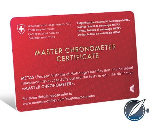
Omega Master Chronometer cerificate
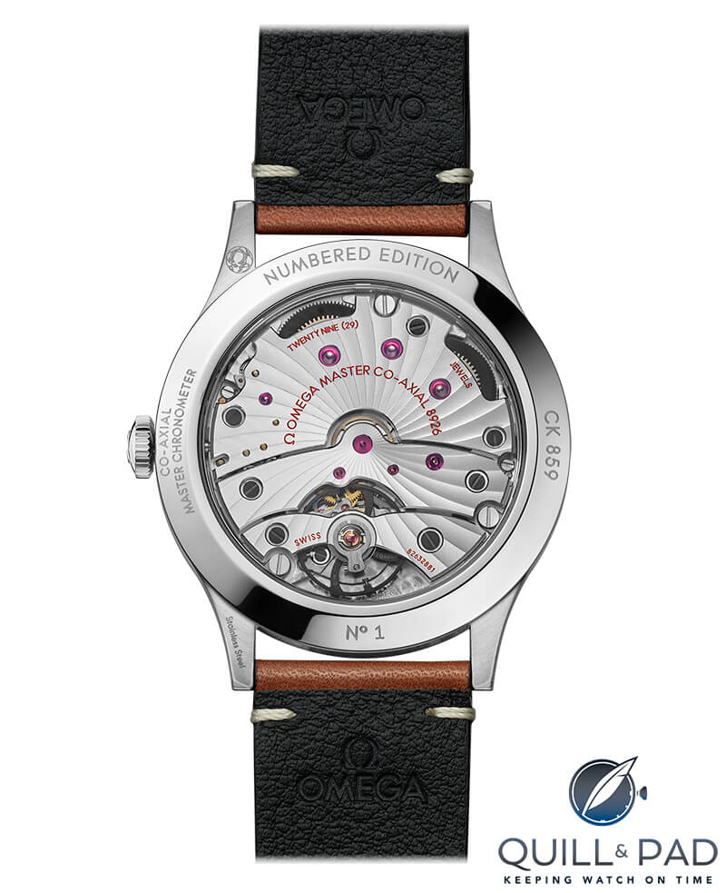
All of the details within the dial are simple to behold yet balanced very carefully with each other, something Omega is rather adept at. Of course, for a mechanics first guy like me, this watch isn’t just a design darling, the caliber 8926 is an awesomely capable and modern caliber sporting the now iconic co-axial escapement first invented by George Daniels. Going further, it is a certified chronometer with a silicon hairspring, twin barrels for a healthy power reserve, and an impressive magnetic resistance of 15,000 gauss.

View through the display back of the Omega Specialties CK 859 to its caliber 8926 movement
Aesthetically the caliber is rather handsome, designed to make flipping over the CK 859 something you would want to do when showing it off to a fellow collector. The watch is built to be a rock-solid performer on the wrist, and stay under the radar as a daily wearer. I would argue that having a watch designed to mimic the precision of measurement gauges while backing up the appearance with a horological performance to boot takes the CK 859 beyond the typical everyday wear timepieces and into the realm of a category-defining watch.
Time will tell if the watch stays popular as a highlight of modern Omega or if its limited production keeps it firmly planted in a collectors niche, never to gain the wider respect that is shared with arguably lesser watches. One thing is for certain, Omega knows how to design a killer sector dial watch.
Since the watch is so robust, let’s try to break it down!
- Wowza Factor * 8.8 It might take you a minute to consider the dial on the CK 859 but after you do you will probably share a wowza with me!
- Late Night Lust Appeal * 88 » 862.985m/s2 I have adored sector dial watches for years and dreamed about owning a co-axial escapement, and this brings it all together perfectly!
- M.G.R. * 64.5 What might seem like a fairly standard movement to the uninitiated the caliber 8926 is chock full of modern horological wonderfulness!
- Added-Functionitis * N/A This is a watch for telling the time accurately and keeping in precise style so you can skip the Gotta-HAVE-That cream and just focus on how well proportioned everything is!
- Ouch Outline * 9.71 Pulling your groin! It’s raining, it’s pouring, it’s slippery on the porch. Not the best rhyme but a rather apt way to remember that slipping on a glistening layer of water on your porch steps is a perfect way to pull something you don’t want to, yet I’d gladly do it with the CK 859 on my wrist!
- Mermaid Moment * What a perfectly considered design! Designers know when they have made a good design, and they know when they’ve knocked it out of the park. This piece is so well done it makes me want to rent a tuxedo!
- Awesome Total * 868.6497 Start by caliber number (8926) and divide it by the purity of the silver dial (925), then add the result to the model number (859) and the result will be a precisely awesome total!
For more information, please visit www.omegawatches.com/watch-omega-specialities-ck-859-51112392199002.
Quick Facts Omega Specialties CK 859
Case: 39 x 11.7 mm, stainless steel
Movement: Manual wind caliber Omega 8926, 72-hour power reserve, 25,200 vph/3.5Hz Master certified chronometer
Functions: Hours, minutes, seconds
Limitation: Numbered, (reportedly discontinued)
Price: $6,500
* This article was first published 26 February 2023 at Omega Specialties CK 859: A Sector As Sweet As Nectar
You might also enjoy:
Omega vs. Rolex: How Omega is Reaching for the Crown
Why I Bought It: Omega Seamaster Aqua Terra 150M
The Omega Spirate System: A New Idea in Balance Spring Technology
Omega x Swatch MoonSwatch Owner Review: The Good, The Bad, The Complicated
Omega Seamaster Planet Ocean Ultra Deep Review by Tim Mosso


Leave a Reply
Want to join the discussion?Feel free to contribute!