Watch Design: Originality, Similarity, Or Imitation?
by GaryG
Thank goodness I don’t have to design watches for a living! While it’s well established that creativity flourishes within constraints, the constraints that confront those who design the ticking toys we all love are daunting indeed.
Whether it’s size, shape (after all, most consumers prefer round watches), legibility, materials, affordability, time-keeping conventions (such as the use of hands for the analog display of time), fashions of the day, or the limitations and requirements imposed by the hard points of the movement lurking behind the dial, the odds are stacked against designers who want to create something that not only is fresh, but also will sell.
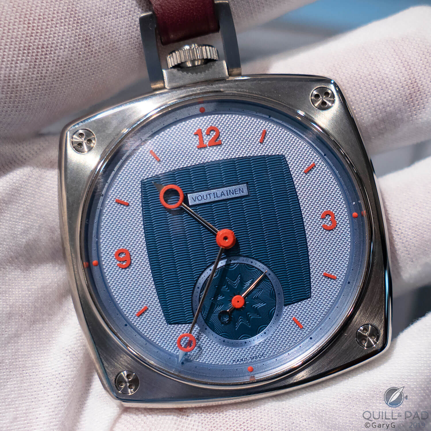
Not like anything else: pocket watch by Kari and Venla Voutilainen for Only Watch 2019
With all of that to consider and something on the order of 100 years of precedents already behind us for wristwatches alone, it’s all the more impressive that designers continue to delight us with new looks. My initial instinct was that it would be difficult to generate a list of distinctive designs, but in just a few minutes of pondering many came to mind, including:
- Bulgari’s ultra-flat Octo line, proving that “octagonal” and “Royal Oak” aren’t synonymous terms.
- Akrivia’s early watches, including the most recent AK-06 in a slim version of the brand’s characteristic case.
- The Singer Track 1 and Fabergé Visionnaire central chronograph watches, each based on the AgenGraphe movement from Agenhor that puts the chronograph mechanism in the center of the watch and the hour and minute displays at the periphery.
- The watches from Ming with their box crystals, stylized fonts, gradient sapphire crystal dials, and creative case shapes.
- This year’s Hermès Arceau L’Heure de la Lune, otherwise known as “THAT Moon watch” from SIHH 2019.
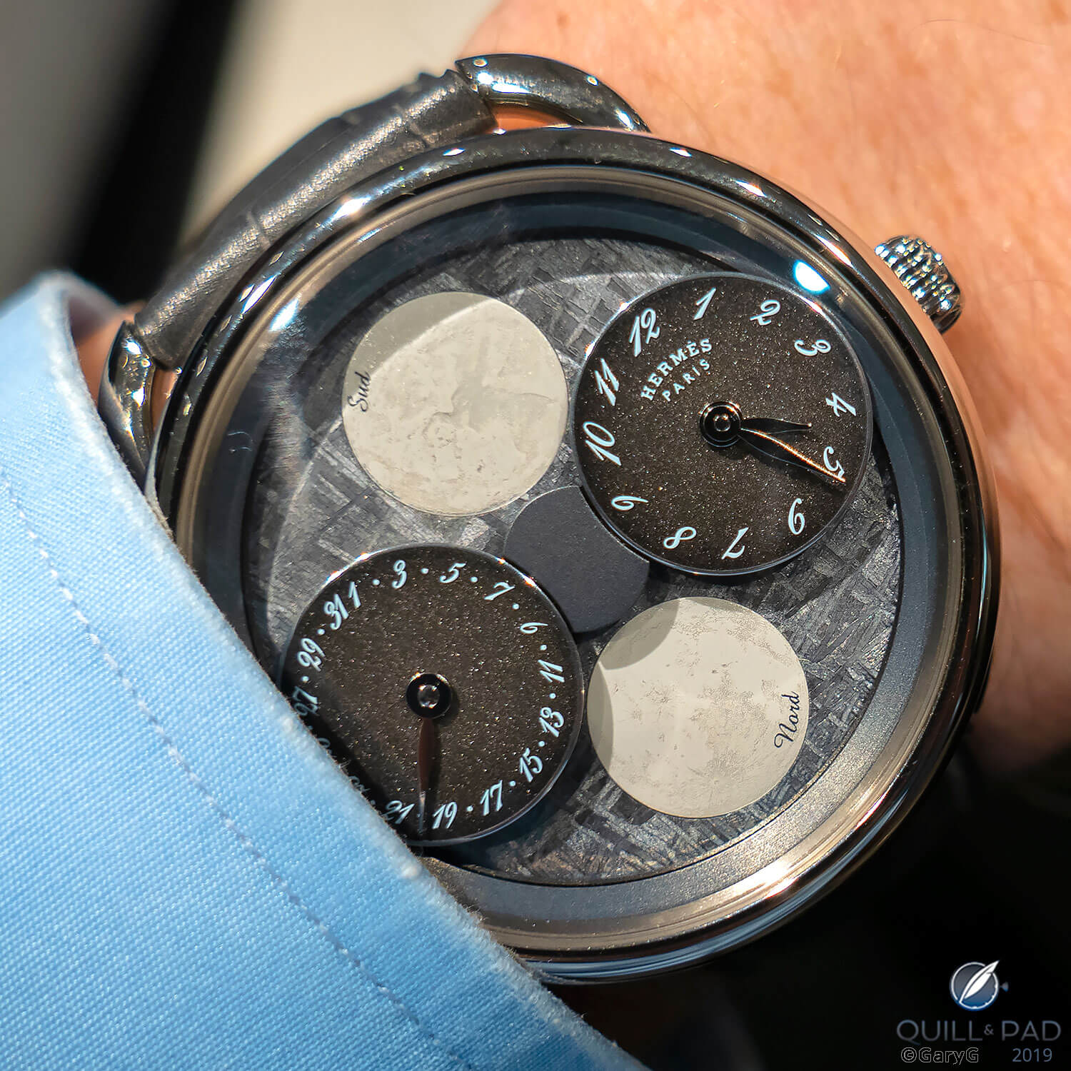
Visual and technical innovation: Hermès Arceau L’Heure de la Lune (here in the Only Watch 2019 version)
As impressive are designs that established design trends and inspired others to create their own variations, including:
- The Breguet La Tradition Reference 7027 that broke convention by displaying major elements of the movement on the dial side, with a visual lineage inspiring great (and distinctive) pieces including Romain Gauthier’s Logical One, the Greubel Forsey Double Tourbillon 30° Technique, and Kari Voutilainen’s recent 28Ti Inverse.
- Jeff Barnes’ groundbreaking design for his and Vianney Halter’s Antiqua, a watch that Max Büsser describes as the “missing link” between traditional and contemporary horology and that laid the groundwork for his MB&F and others to experiment with new shapes, forms, and displays of time.
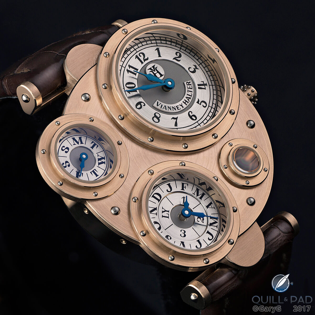
Foundation piece: Vianney Halter Antiqua, designed by Jeff Barnes
And there are those unique enough that their looks are absolutely characteristic and (except for the lowest of counterfeiters) untouched by others. For me, these include F.P. Journe’s designs, the work of Alain Silberstein (happily incorporated over time by partnership into two MB&F designs and most recently into a new regulator watch by Louis Erard), and the sensation of Basel 2017, the Joker by Konstantin Chaykin.
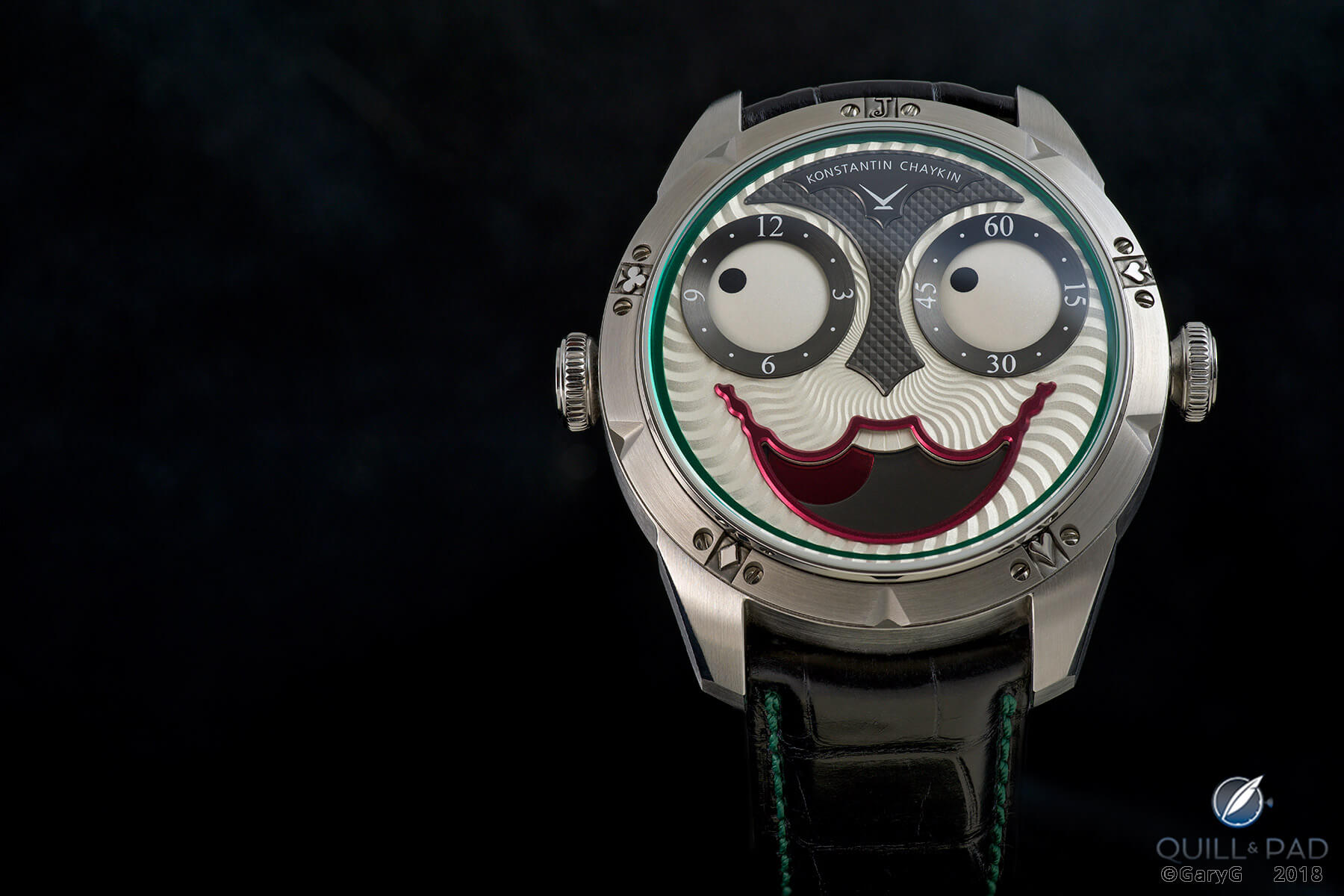
Here’s looking at you: Konstantin Chaykin Joker
These examples and others teach us that the development of fresh designs can be done! What we see elsewhere, however, are two concurrent phenomena:
- A flood of imitative and derivative designs, particularly in the most popular watch sub-categories.
- The popular perception that “all new watches look alike” and angry trolling by some members of the online community each time a new piece in a popular category such as steel sport watches is introduced.
Imitation is the sincerest form . . .
Trying to describe the slippery slope from vague resemblance to outright theft is not a simple task, so I’ll begin down at the lower end of the grade with so-called homage watches.
Yes, for only $59.95 you too can own a “Submariner” – if it happens to be the Tevise T801 Submariner Date shown below. My favorite feature: the notation “Perlative Ceronometer” on the dial; other than this garbled inscription and the brand’s name on the dial, what you see is, in my opinion, a blatant rip-off of the original.
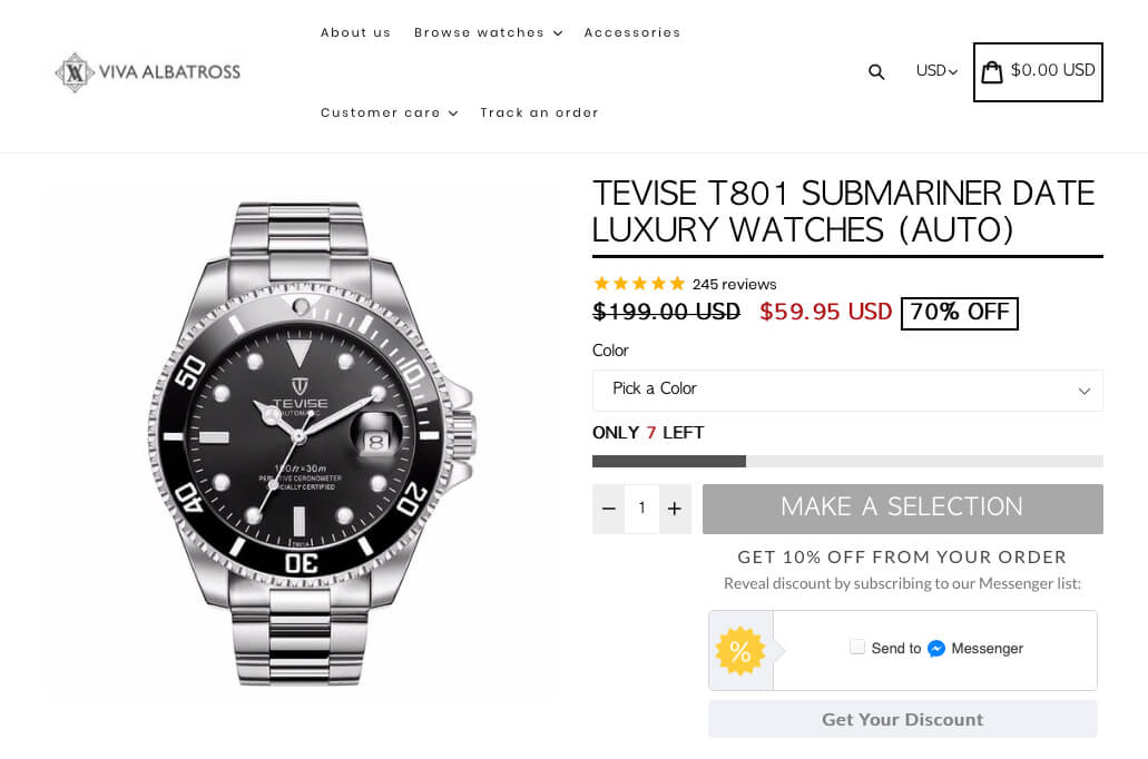
Hoo boy: Tevise T801
In the guilty pleasure department, I will confess that it was worth a chuckle or two reviewing the Tevise “brand story”: founded in the 1990s, but making watches since 1952, apparently employing George Daniels in the back room, and seeming to use the same ad agency that is generating vapid slogans like “Seize the moment to win the future” for other watch brands.
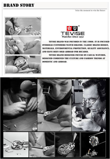
Seems kosher to me: the Tevise “brand story”
One tiny step up the food chain are marketers like Steinhart. I’ll save you a visit to its website by letting you know that it has pages for pilot watches that are apparently modeled on vintage B-Uhr and contemporary IWC designs, Panerai- and Ulysse Nardin-like marine-themed watches, Ocean 39 GMT watches that reflect the major elements of the GMT pieces from you-know-who, and an “Ocean One Vintage Chronograph” with a face that bears a startling resemblance to a Paul Newman dial.
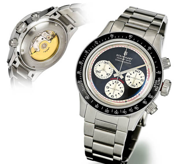
Equally kosher: Steinhart Ocean One Vintage Chronograph (photo courtesy Steinhart.de)
The value proposition for these and like companies seems to be “spend a few bucks and wear one of the most popular looks” or, more cynically, “For those with no self-respect, get some of the prestige of a true luxury product on the cheap.”
Up in the air
Once we get past the obvious copycats, however, things quickly get murky. For instance, what happens when multiple name brands address a single product type such as pilot watches?
To my eye, at least, there are several clearly recognizable styles of watches even within the relatively narrow constraints of the pilot category that include substantial size, (usually) dark dial, legible indications, and easy setting and winding.
For instance, even without looking at the brand markings it’s pretty easy to pick an IWC pilot piece out of a lineup. And Type XX watches from Mathey-Tissot and Breguet, especially the “big eye” variants with large chronograph minutes subdials featuring prominent indices every three minutes, are immediately recognizable in auction catalogues and on online sites (and, by the way, objects of desire for me, but that’s a tale for another time).
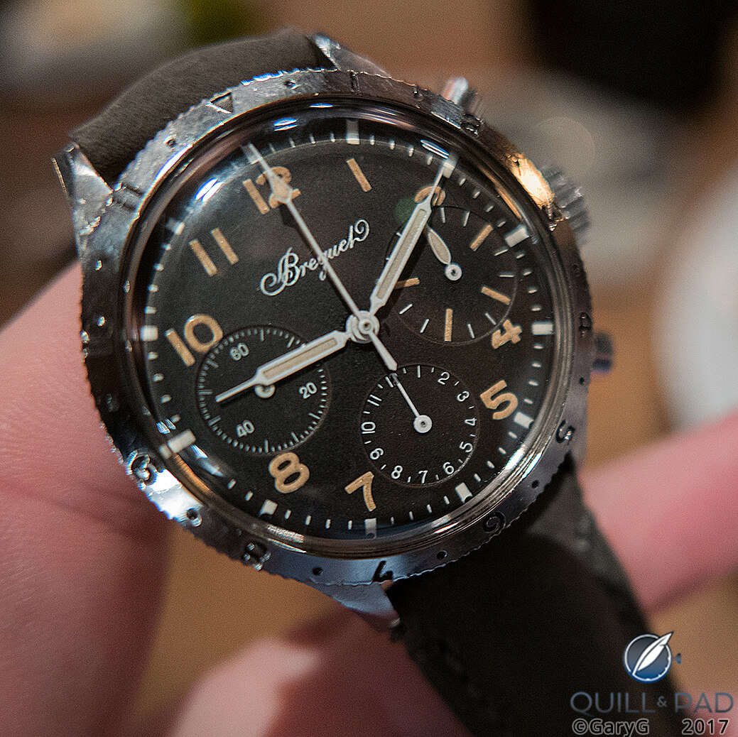
Vintage Breguet Type XX “Big Eye”
The Zenith style, with its ornate scrolled numerals, is another differentiated design; however, it seems that other brands are either copying that look or noting that somewhere back in their archives they’ve found one or more similar-looking watches and therefore introducing refreshed versions.
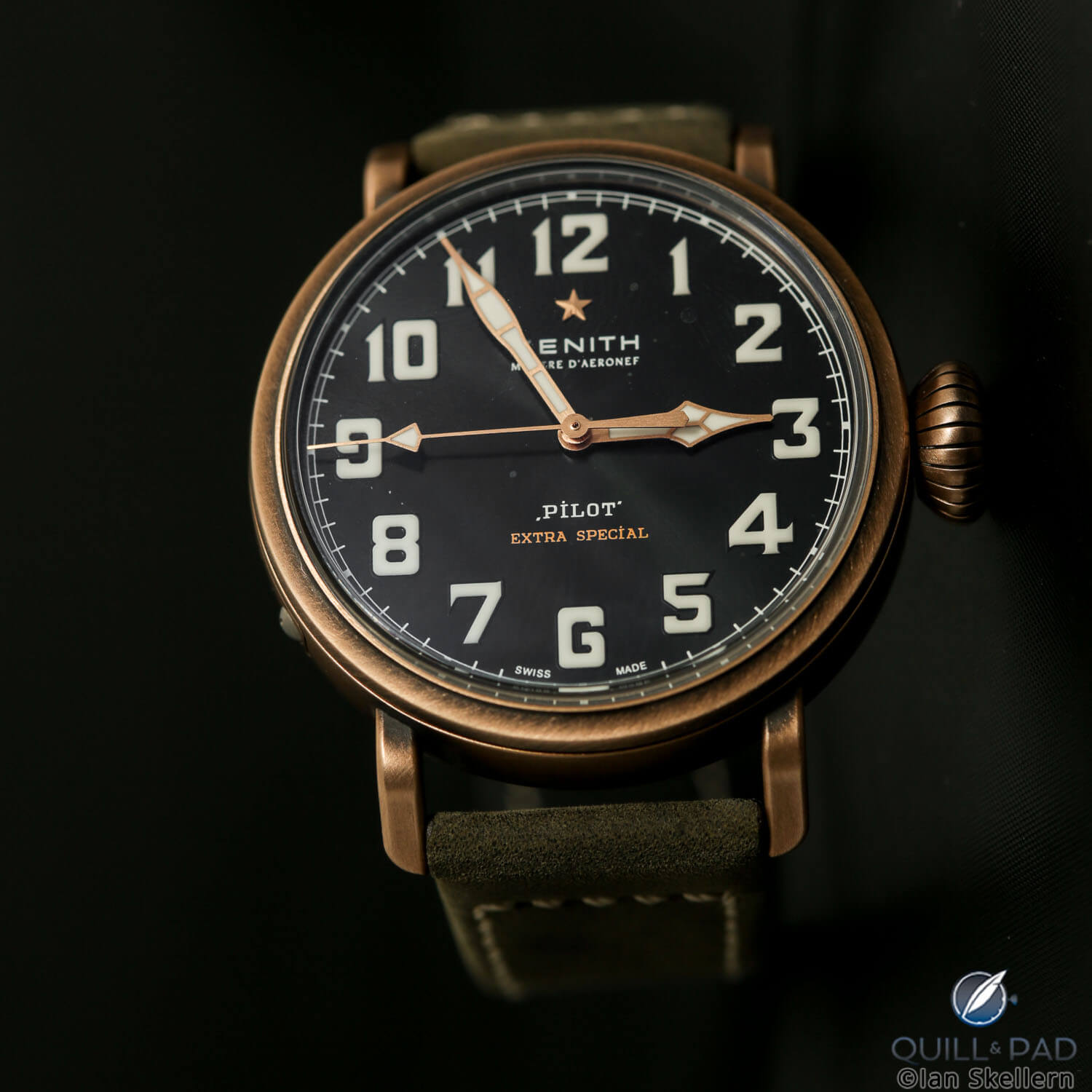
Zenith Pilot Type 20 Chronograph Extra Special
Here I’m talking specifically about the H. Moser & Cie Heritage Tourbillon and Patek Philippe’s “pilot style” References 5522, 5524, 7234, along with its alarming-looking four-crowned Reference 5520P alarm watch.
While Patek Philippe did make some military watches in the 1930s, my research hasn’t turned up anything that looks remotely like the Zenith-like appearance of these recent pieces. Even if it had, I’d still be inclined to invoke what I’ll now dub the GaryG Styling Statute of Limitations: once a competitor has brought one of its vintage design themes back into contemporary use and established it commercially, it’s not fair game for others to pile on with me-too watches, even if somewhere in their vaults or files they can find some possible justification.
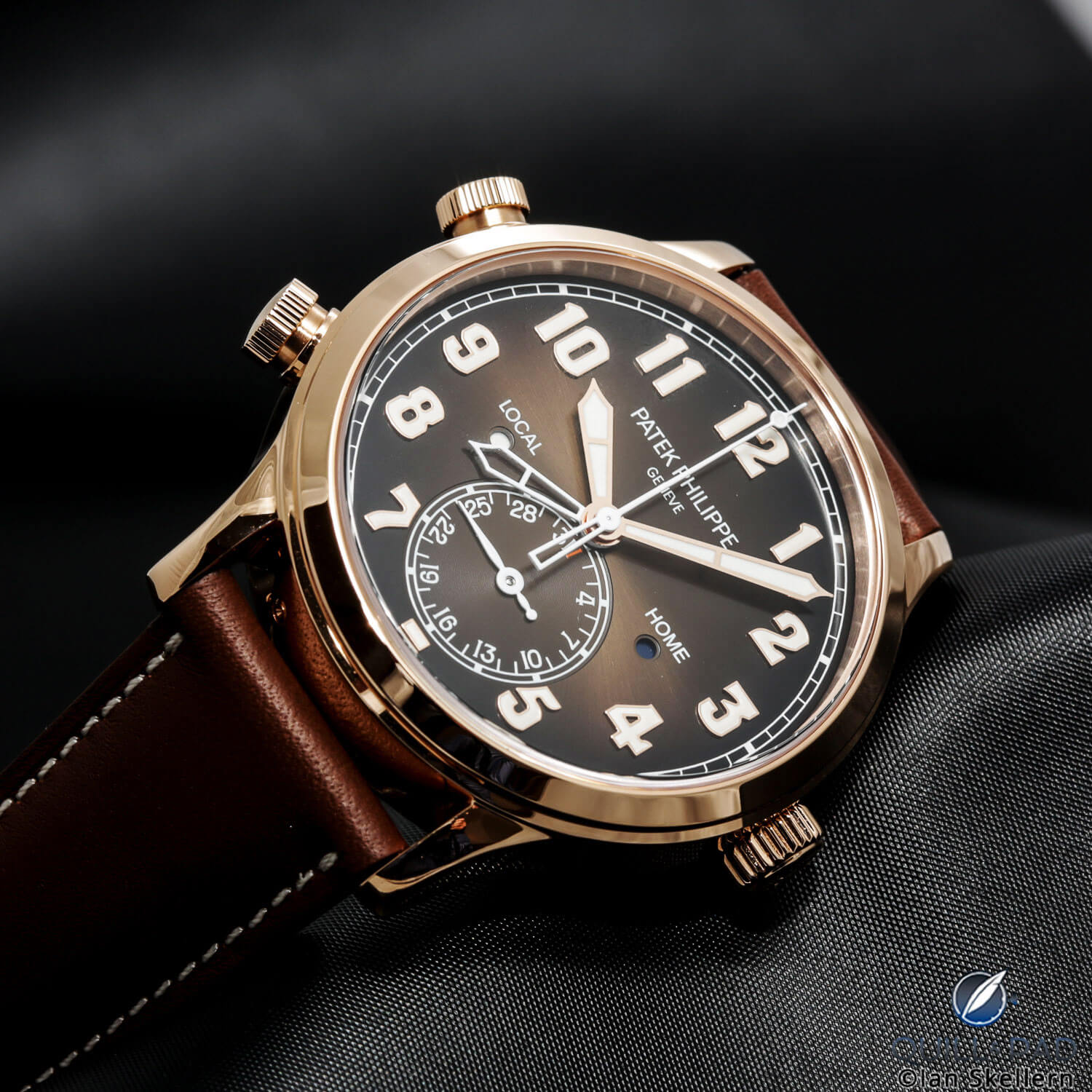
Calling shenanigans: Patek Philippe Reference 5514R Calatrava Travel Time
So, despite my great respect for Patek Philippe and the observable commercial success of its current pilot watch references, for this discussion I’m going to call shenanigans.
Haven’t I seen you somewhere before?
On the spectrum of mainstream brands from masters of uniqueness to slavish imitators, I’m afraid that to my eye Girard-Perregaux lives closer to the latter end of the scale than to the former.
To its credit, Girard-Perregaux has one landmark design: the instantly recognizable Three Bridges tourbillon design and all of its variants.
But when I look at the Cat’s Eye series (first introduced in 2004), I immediately see the AudemarsPiguet Millenary, and for the vertical versions of the oblong Cat’s Eye, a less compelling version of Breguet’s Reine de Naples.
The WW.TC calls to mind every other watch based on the Louis Cottier world time system; and the 1966 collection calendar and moon phase watches fairly scream “Patek Reference 2448,” but with the indications awkwardly crunched into the center of the dial.
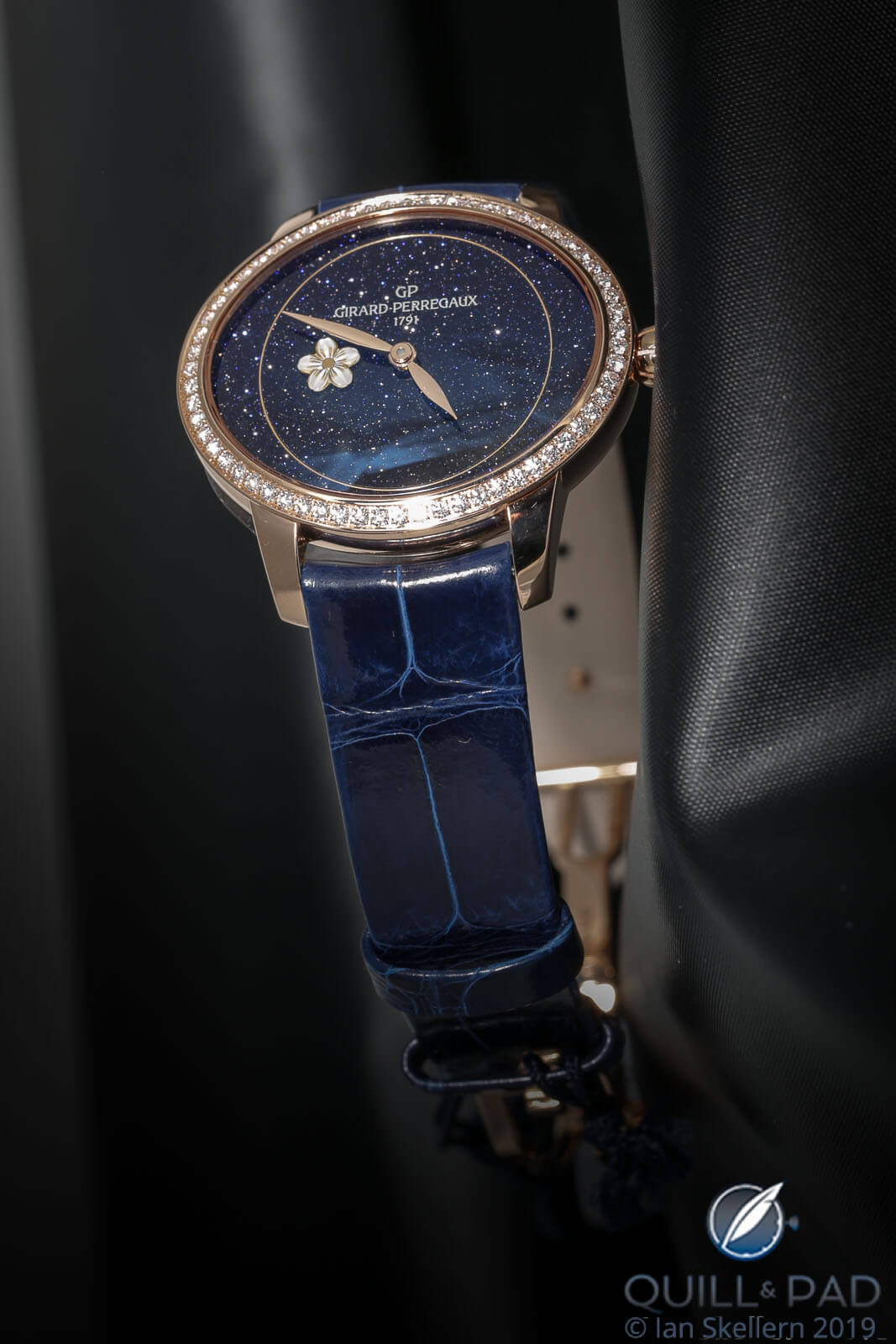
Girard-Perregaux Cat’s Eye with aventurine dial
Then there’s the Laureato series, widely decried upon its 2017 re-introduction as a watered-down clone of the Royal Oak. While Girard-Perregaux was quick to point out that the hexagonal bezel and integrated bracelet of the new versions were taken from its own original Laureato of 1975, I think that it would also be fair to suspect that the 1975 watch, designed by a Milanese architect, was itself somewhat based on Gérald Genta’s Royal Oak design that had been introduced three years earlier.
Regardless, I’m calling shenanigans once again based on the GaryG Styling Statute of Limitations, which dictates that coming out with a watch this similar to the Royal Oak after this long a hiatus isn’t originality. It’s imitation.
The elephant in the watch box
All of which, of course, brings us to the controversy of the day: the perception among many watch buyers and enthusiasts that we’ve seen far too many similar steel sport watches, many with blue dials, introduced over the past few years.
It’s gotten to the point at which online commentators have started creating visual displays of as many of these pieces as they can find, such as the one below.
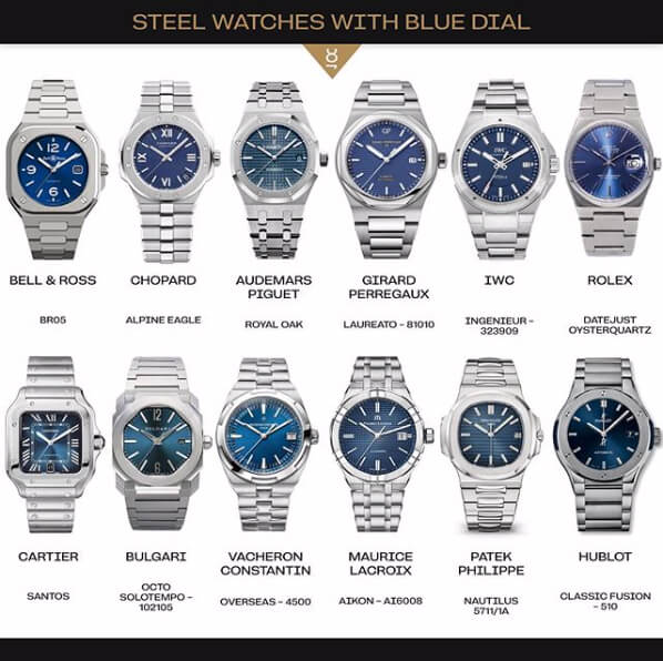
Family resemblance? A recent inventory of blue-dialed steel sport watches (photo courtesy @dailywatch Instagram)
By my reckoning, some of these pieces are “too similar” while others are not!
I’ve already opined on the Girard-Perregaux and Bulgari, and I’ll grandfather the Royal Oak, IWC Ingenieur, and Patek Philippe Nautilus as being direct descendants of the original Gérald Genta designs, and the Rolex and Cartier for being true to their original versions as well.
The Hublot with its flat, screwed bezel has always seemed Royal-Oakish to me; and while I saw the new Chopard Alpine Eagle recently and liked it, I have to confess that on inspection the AP-style screws and Nautilus-style ears make me understand some of the criticisms that have come its way.
I think that over the past years Vacheron Constantin has established its own recognizable (and attractive) design language for the Overseas based on the Maltese cross, and the Aikon from Maurice Lacroix is a tweener for me as it doesn’t obviously parrot the category leaders.
For the life of me I don’t understand why some folks have labeled the Bell & Ross BR 05 as a Royal Oak clone; while I’m not a likely buyer for the watch, it looks a lot more like a classic B&R to me than anything else, Nautilus-style bracelet notwithstanding.
How we see things
However, if 12 of us looked at those 12 watches, I’m guessing that we’d come up with 12 different evaluations of what’s “too similar” and what’s not! I strongly suspect that’s because different people process what they see in different ways.
Years ago, I took a Rorschach test – the one with the ink blots – as an assessment of cognitive style, basically, to understand how I see things.
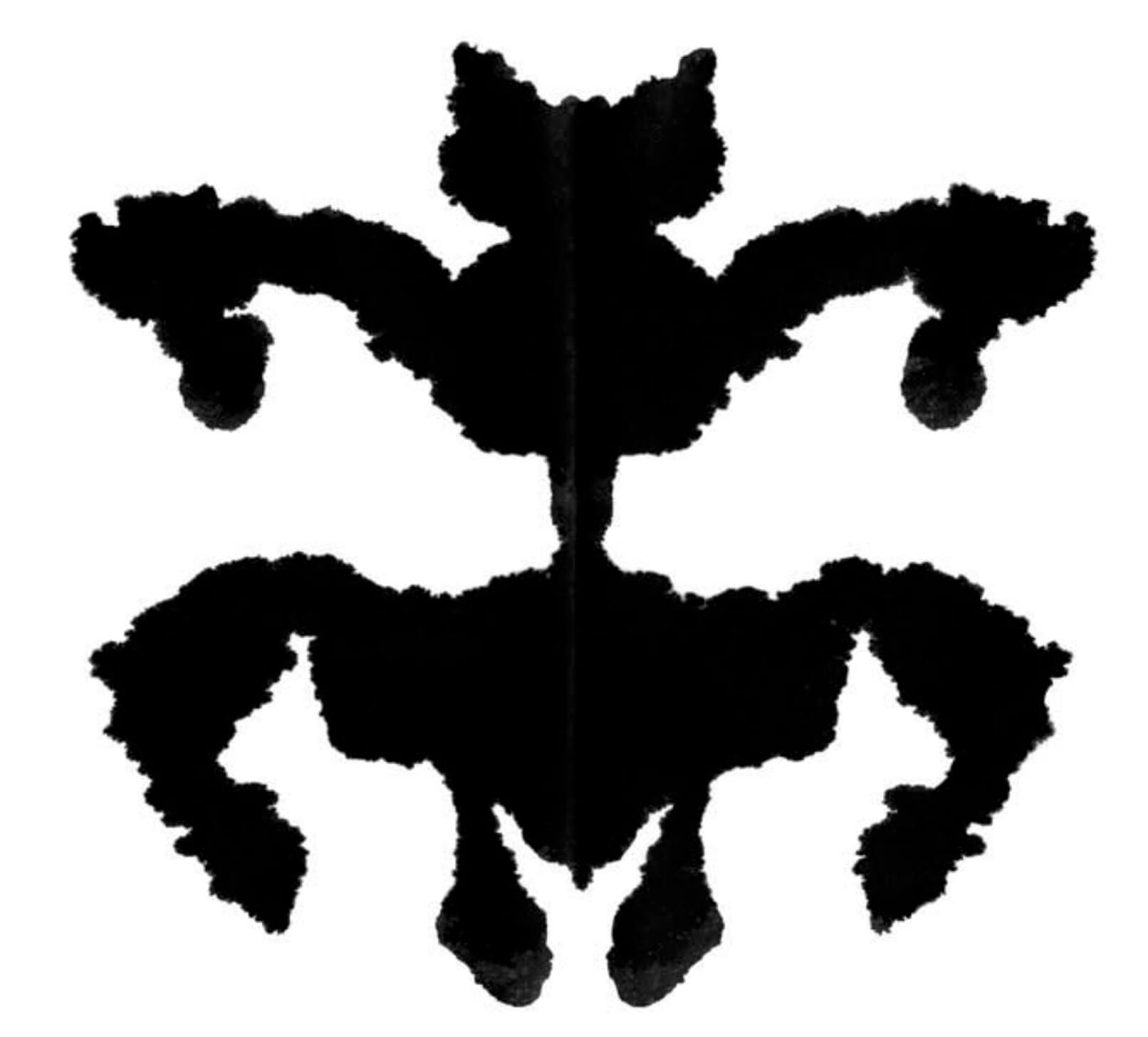
Typical Rorschach blot (image courtesy Buzzfeed)
The way the test goes is to look at the blot, and then write down every different thing you see (feel free to try it for yourself).
Once you’ve made your list, go down it and circle the area on the page that corresponds to each item. What you’ll find is that some of your answers incorporate the whole page (for this image, maybe the entire blob reminds you of a spaceship), others major subcomponents of the blot (perhaps the bottom left extension looks a bit like a horse’s hoof), and still others minor details (one of the tiny protuberances may look a bit like maple leaf).
As it turns out, different people end up with very different ratios of “whole image” to “component” to “detail” items on their lists. And that ratio tells us how the person in question evaluates what he or she sees.
And it’s likely someone who primarily sees objects in their entirety will evaluate the similarity of two watches quite differently from someone who zeros in very tightly on the shape of the crown or the number of screws on the bezel.

Is there any absolutely correct answer?
Of course not!
Our differences in perceptions and opinions and the debates that they stimulate are a big part of the fun of our hobby. And for me, the discussions become more interesting as the distinctions between the pieces become more subtle.
I love it when a friend points out a similarity or difference that I hadn’t previously noted. And while I’m unapologetic about my views of when a certain watch (or even a certain manufacturer) is too derivative of others’ work and I channel my scarce purchasing dollars accordingly, I’ll happily respect your views on novelty versus imitation.
Except, that is, for the GaryG Styling Statute of Limitations: that’s an absolute!
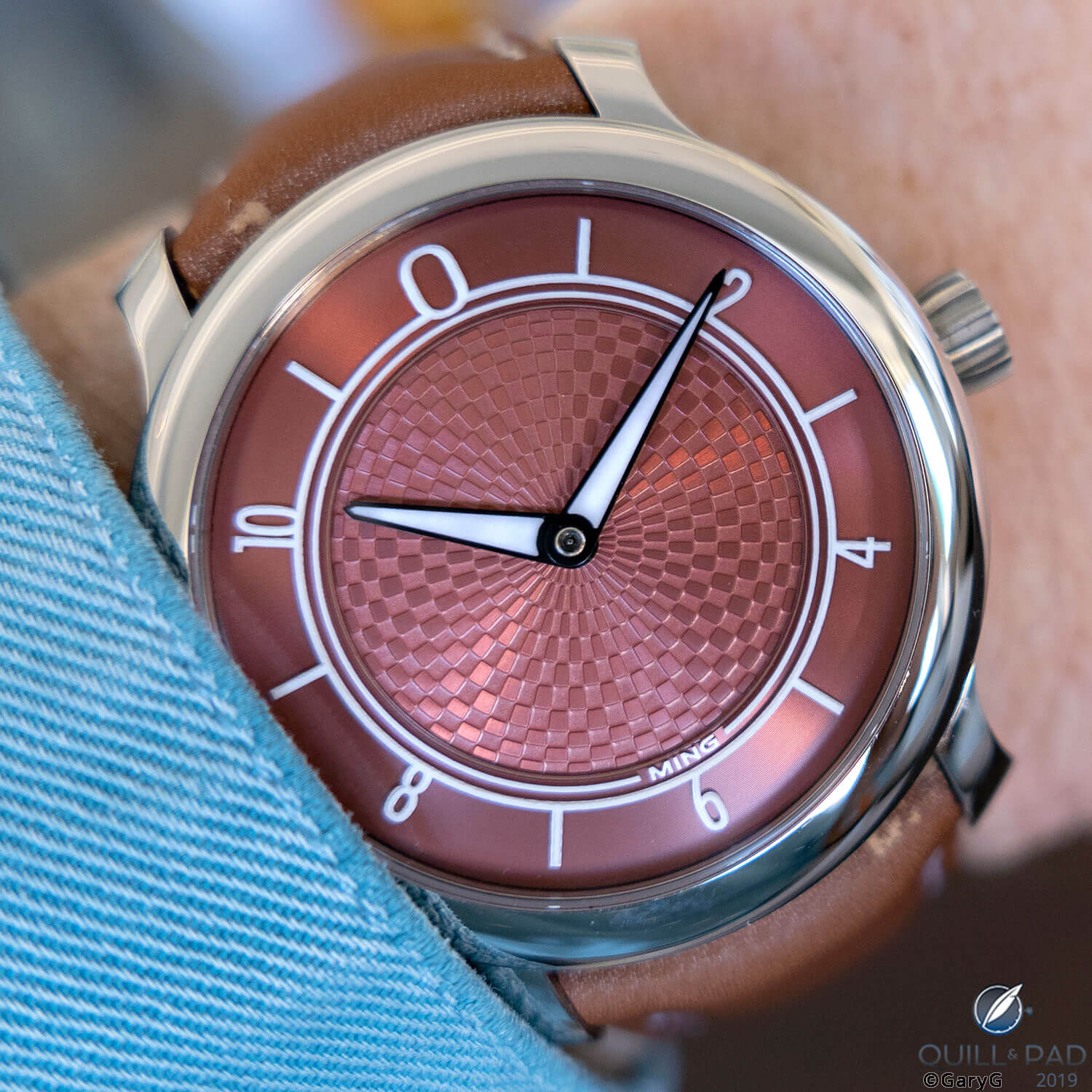
Parting shot: fresh design in a round watch, the Ming 17.06 Copper
* This article was first published on October 26, 2019 at Watch Design: Originality, Similarity, Or Imitation?
You may also enjoy:
Bell & Ross BR 05 For A Week On The Wrist: How It Measures Up
Stainless Steel Patek Philippe Nautilus Market Madness: Thoughts On The Current Market Situation
Piaget Polo S: Outside Its Comfort Zone
Piaget Upstream: Why I Chose The Underdog
3 New Competitively Priced Stainless Steel Dress Watches From Chopard, Omega, And Montblanc


Leave a Reply
Want to join the discussion?Feel free to contribute!