GaryG’s Favorite Watch Photos of 2022
by GaryG
It’s that time again! As in prior years, I’m in the process of moving my 2022 photos into backup storage, and before they go into the vault, I’ve scanned through them and picked out my personal favorites from the past 12 months to share with you. Some have appeared in articles here on Quill & Pad; others have featured on my Instagram page, @garyg_1.
Year of the soldier
As I look through each year’s photos, obvious patterns linking subsets emerge. Last year, categories included moody shots and the use of light scatter. This time around, I was immediately struck by how many of my favorites were posed in the so-called “soldier” style, with the watch standing straight up and facing us head-on.
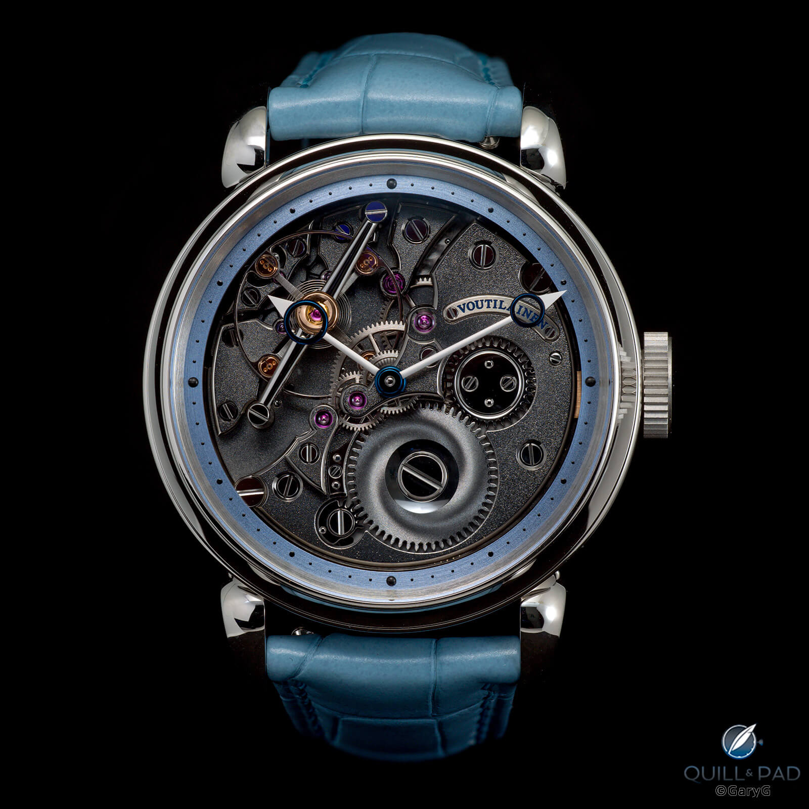
Standing proud: a friend’s Kari Voutilainen 28 Inverse
Taking a good straight-ahead shot is not simple as it’s very easy to pick up unwanted light scatter on the crystal, blow out highlights, or lose details in the darkness. I was really pleased with the photo above of my pal’s Kari Voutilainen inverse as I was able to highlight the tastiest details of the watch, including the sand-frosted hands, barrel wheel snailing, and black-polished pieces and throwing light on the escapement while still giving a sense of depth with deep shadows around the movement edges.
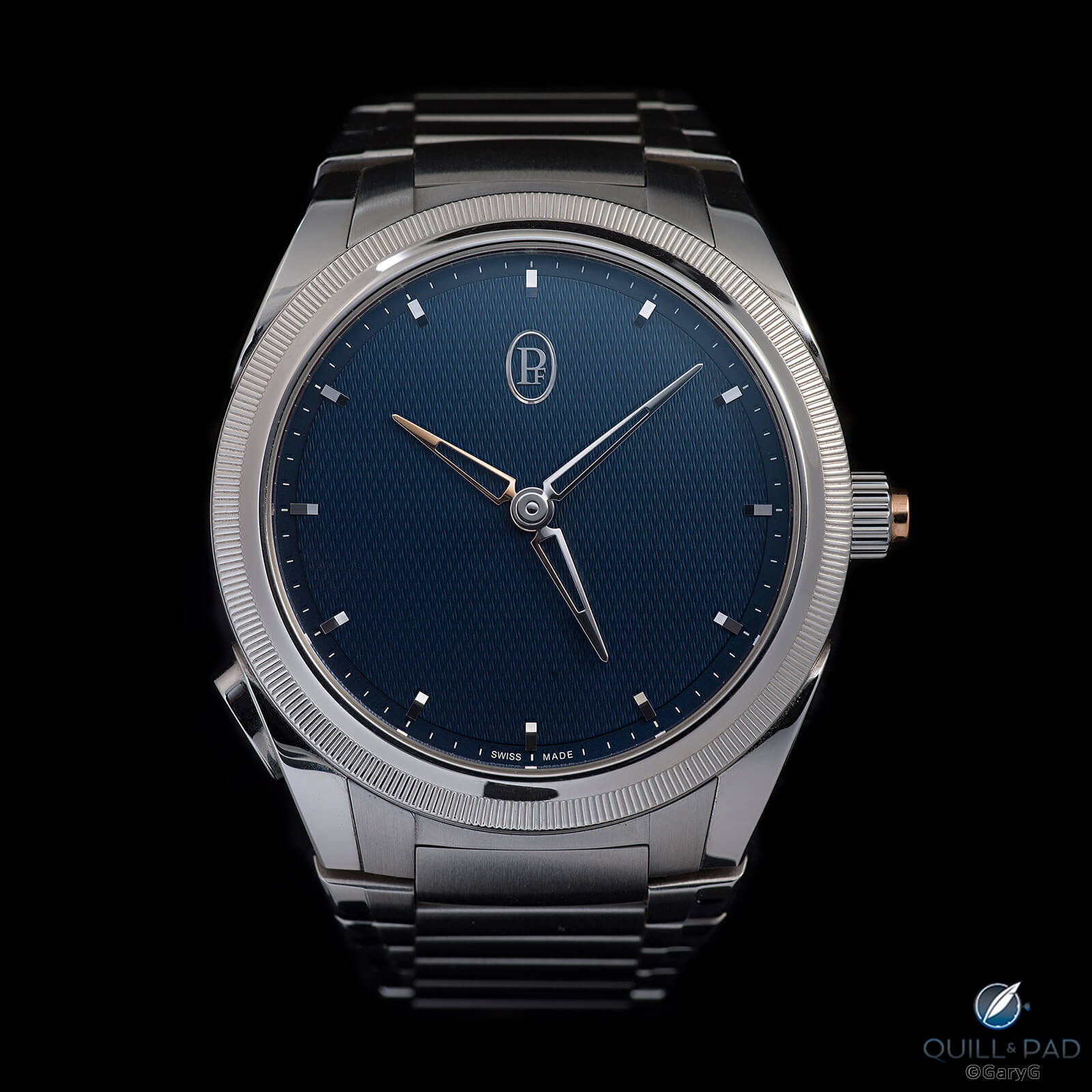
Parmigiani Tonda PF GMT Rattrapante in steel and platinum
As a long-time Parmigiani fan, I’ve been very happy to see the brand gaining traction with enthusiasts and turning out lovely new references like the Tonda PF GMT shown above. For this shot, I used just a bit of scatter at top right to bring out the subtle dial guilloche and showed both the travel and home time hour hands to fill the open dial and connect visually to the gold rattrapante button on the crown.
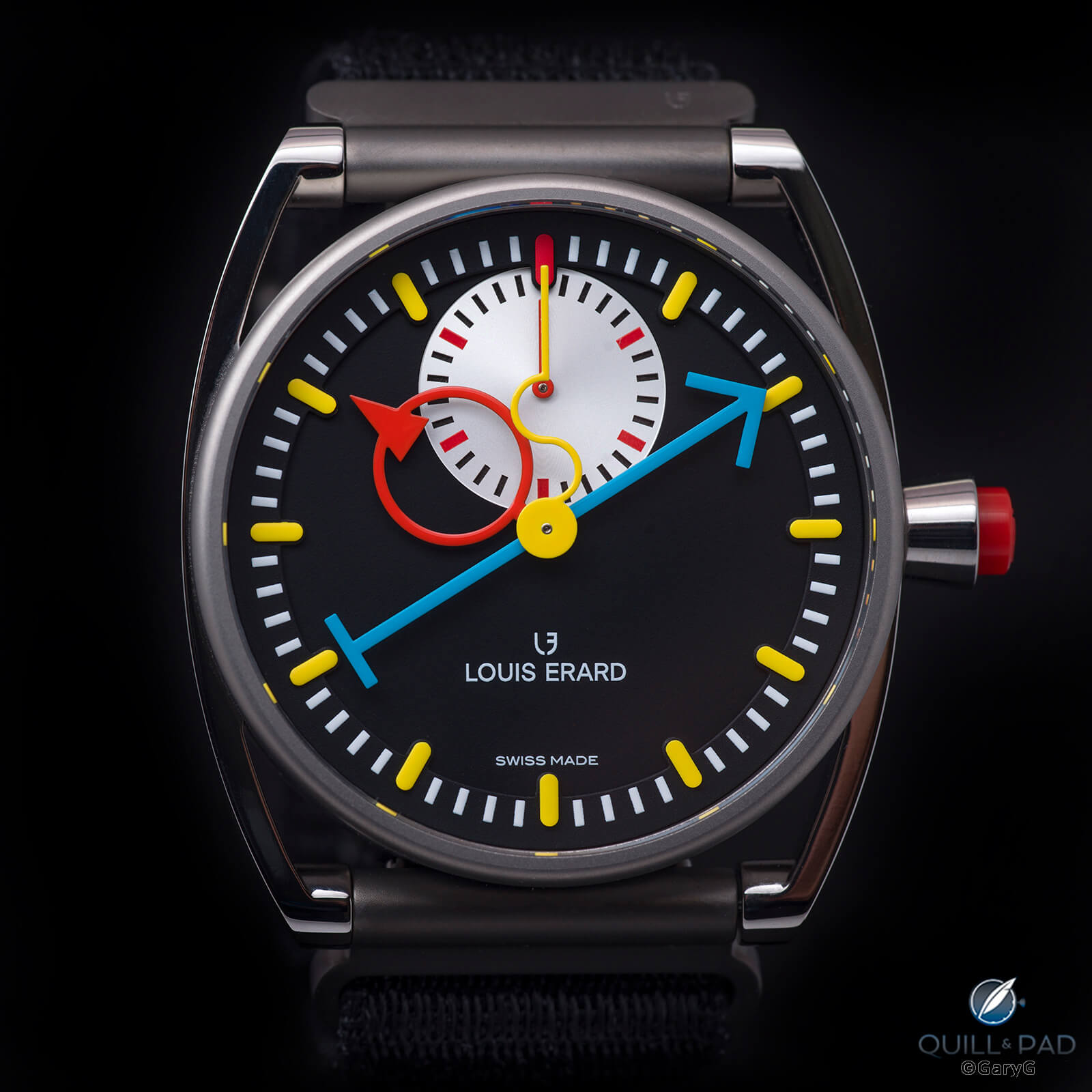
Louis Erard x Alain Silberstein Monopoussoir
I haven’t had the chance yet to put together a “Why I Bought It” on the entertaining Louis Erard x Alain Silberstein Monopoussoir, but you can see above why it’s such fun. For this shot, I was careful to use a bit of fill lighting to keep the frame around the case and woven strap from disappearing into the darkness and to highlight the brilliant red chronograph button in the crown.
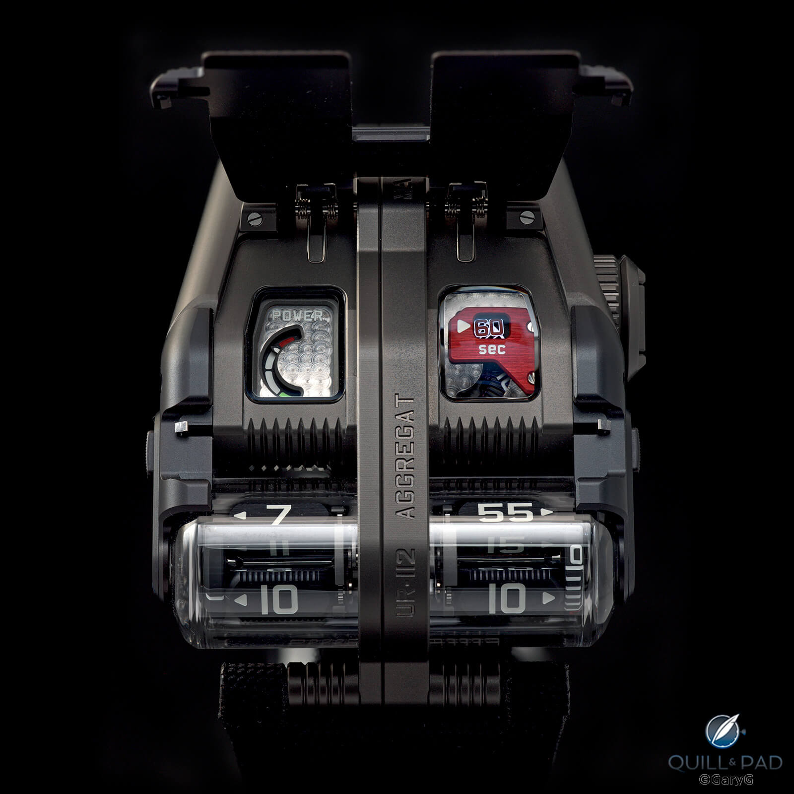
Urwerk UR-112 Aggregat
With some watches, it’s a bit difficult to decide what “straight on” should look like. With the Urwerk UR-112, I decided that a position with the cover open and the watch nearly vertical gave the best view of the piece and design touches, including the power reserve and seconds display. I also backlit the watch to ensure that the viewer can see the edges of the opened cover.
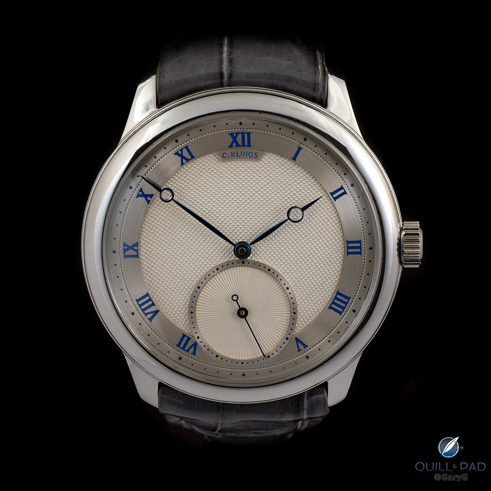
Christian Klings wristwatch No. 8
As in past years, friends were very generous with their watches, lending them to me and at times enduring substantial waits to get them back. I won’t say that I intentionally held out on them to have these great pieces in my hands longer, but you get the idea.
A prime example of a watch you are unlikely to see in the wild unless you know my pal “Chuck” and run into him on a lucky day is the unique Christian Klings No. 8 shown above. And for good measure, here’s a companion shot of his Klings No. 2 pocket watch, subsequently sold at Phillips in November to a lucky new owner.
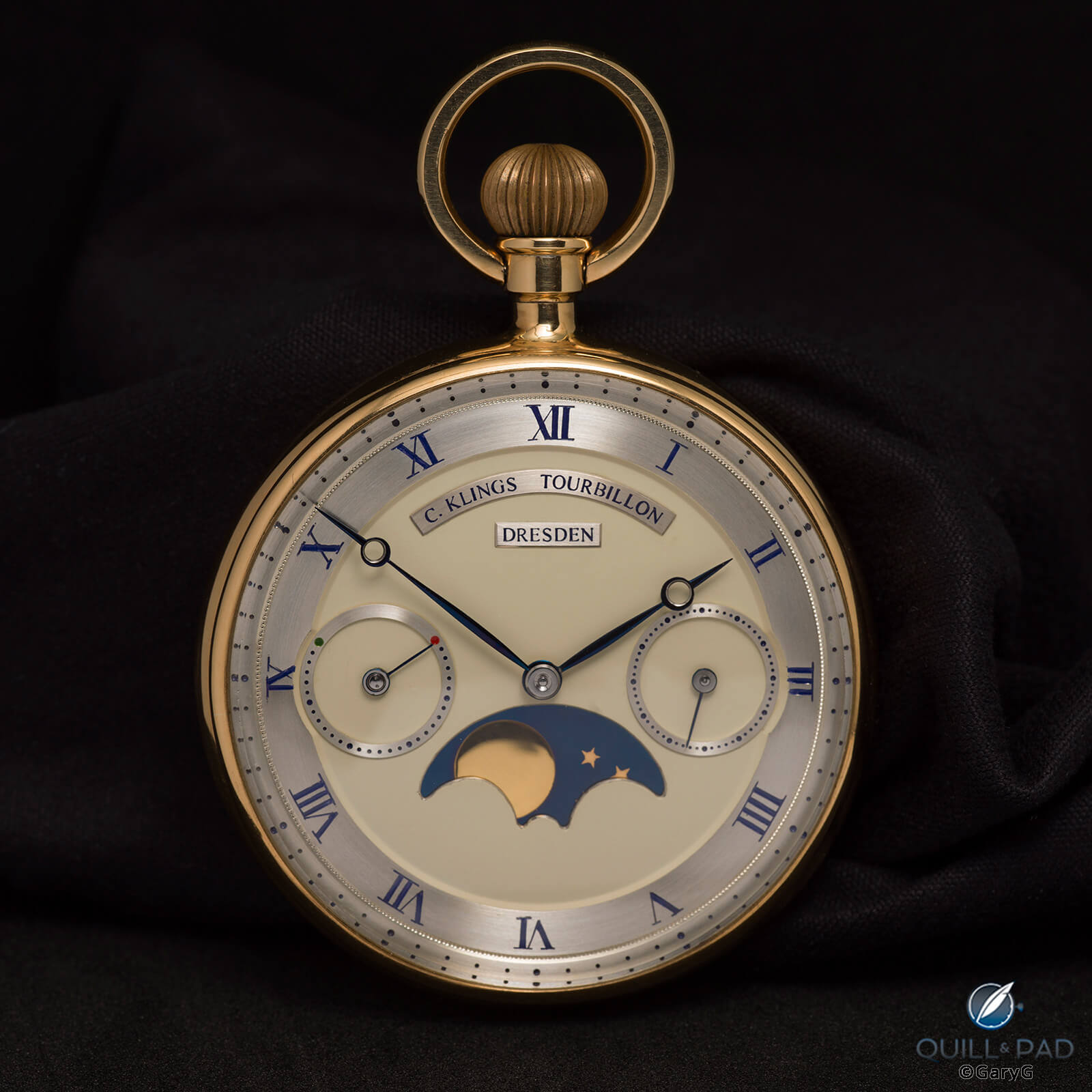
Christian Klings pocket watch No. 2
In the image below, I wanted to make sure that I captured the Golden Gate logo on the Torsti Laine limited edition for San Francisco’s 49 Crowns group; a stripe of light thrown almost straight down the dial from 12 to 6 did the trick.
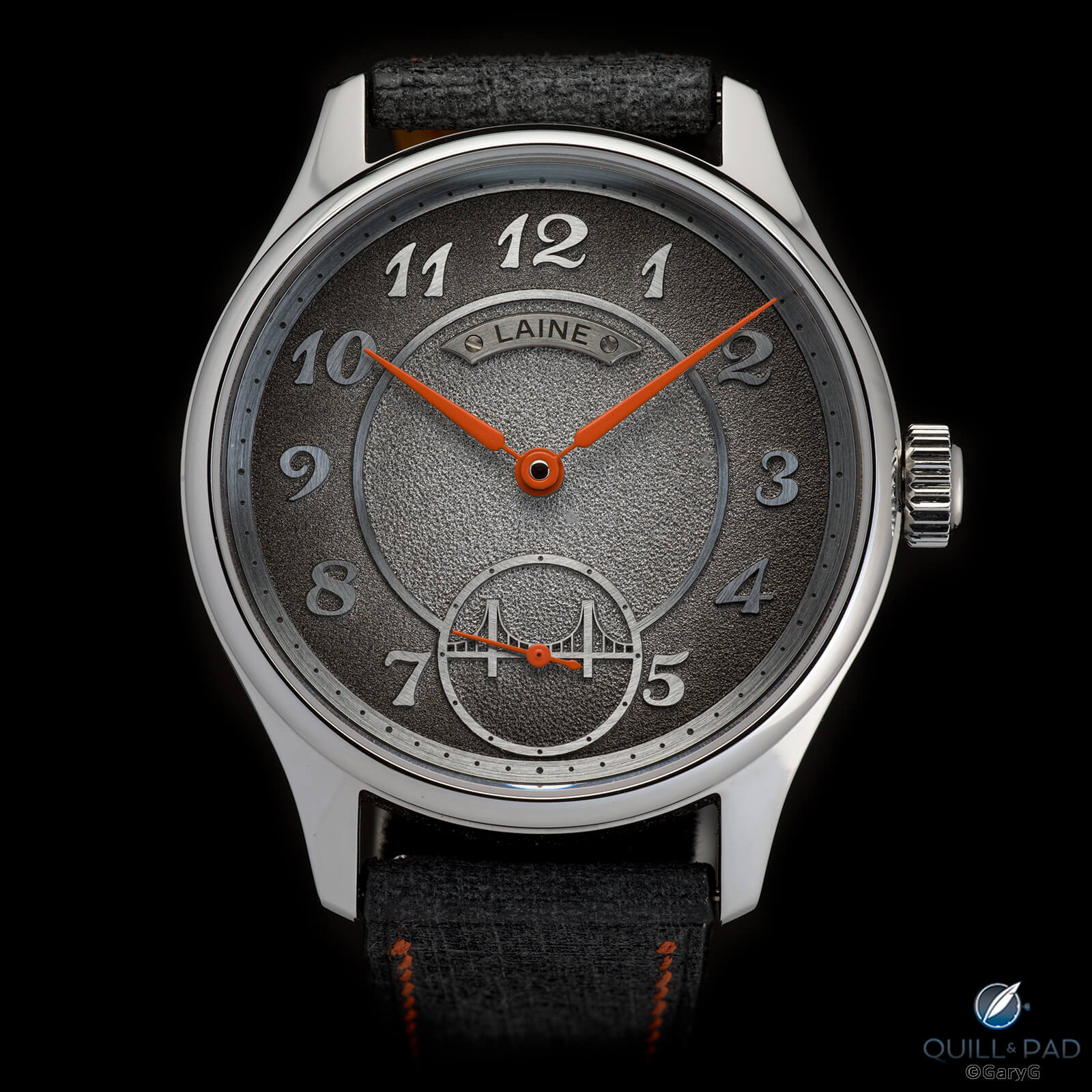
Laine GG3 for 49 Crowns
The straight-ahead look also featured in many of my favorite movement side shots this year. One example is my A. Lange & Söhne 1815 Rattrapante Honeygold: lighting it from the left allowed me to showcase the movement’s depth while still featuring the textures of the frosted plates and engraved balance cock.
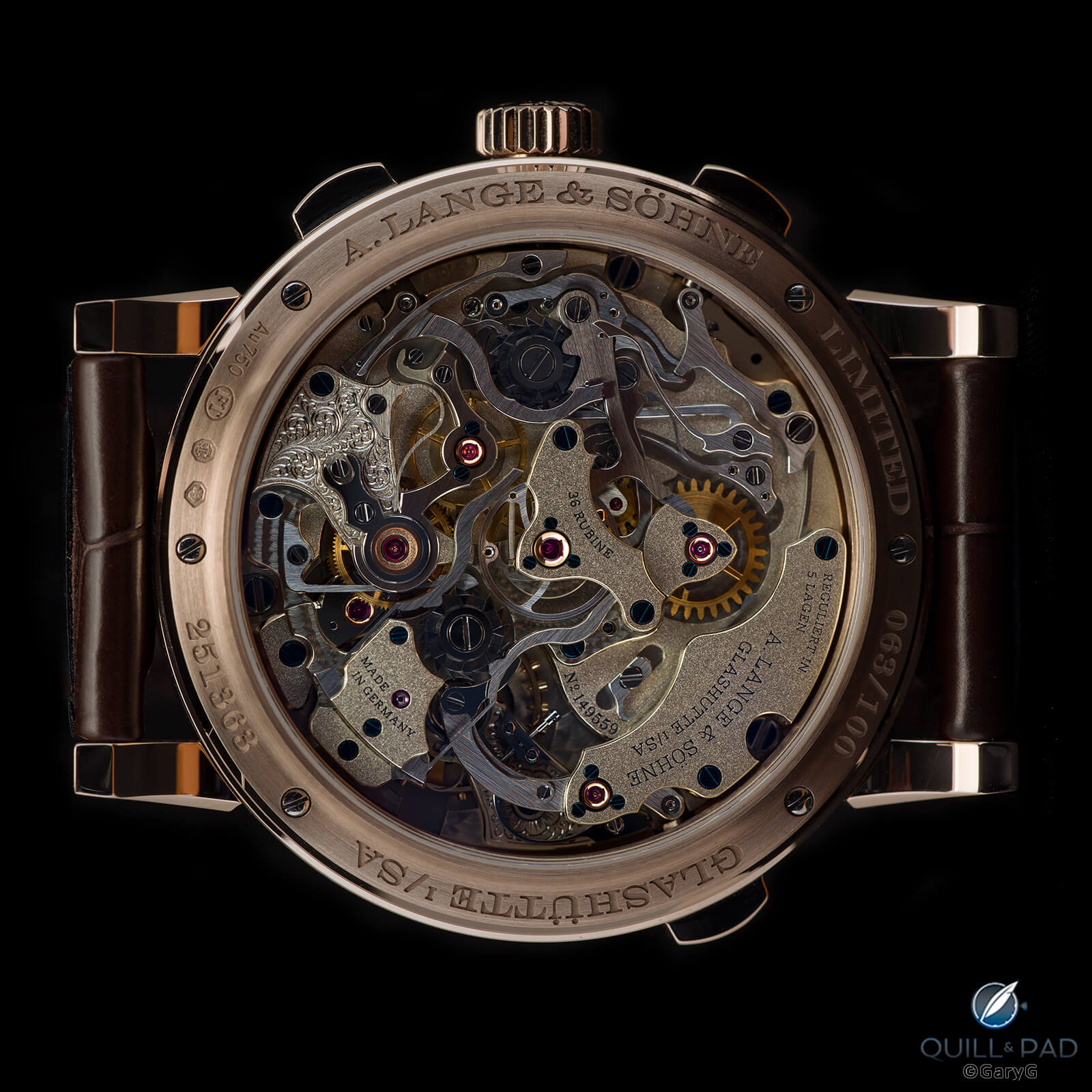
Movement view, A. Lange & Söhne 1815 Rattrapante Honeygold
I’ll come back later to some of my favorite multi-watch images, but as I’ve mentioned Chuck’s Klings watches here’s a soldier-style image featuring both movements. The color of the German silver of the pocket watch movement just blew me away!
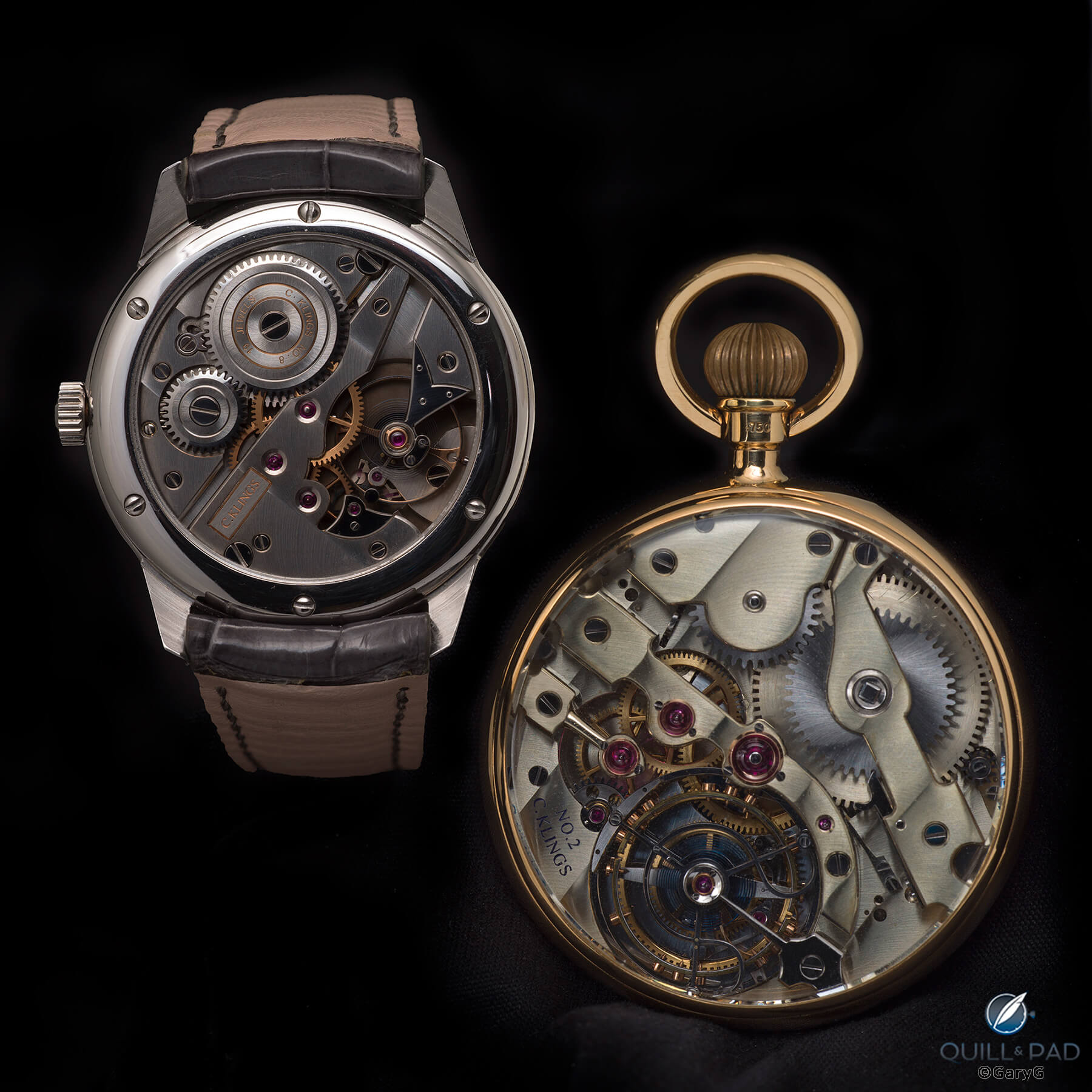
Movement view, Klings wristwatch and pocket watch
Finally, here’s a view of my recently added C from Romain Gauthier that brings us to our next theme: dark-dialed watches and the use of light.
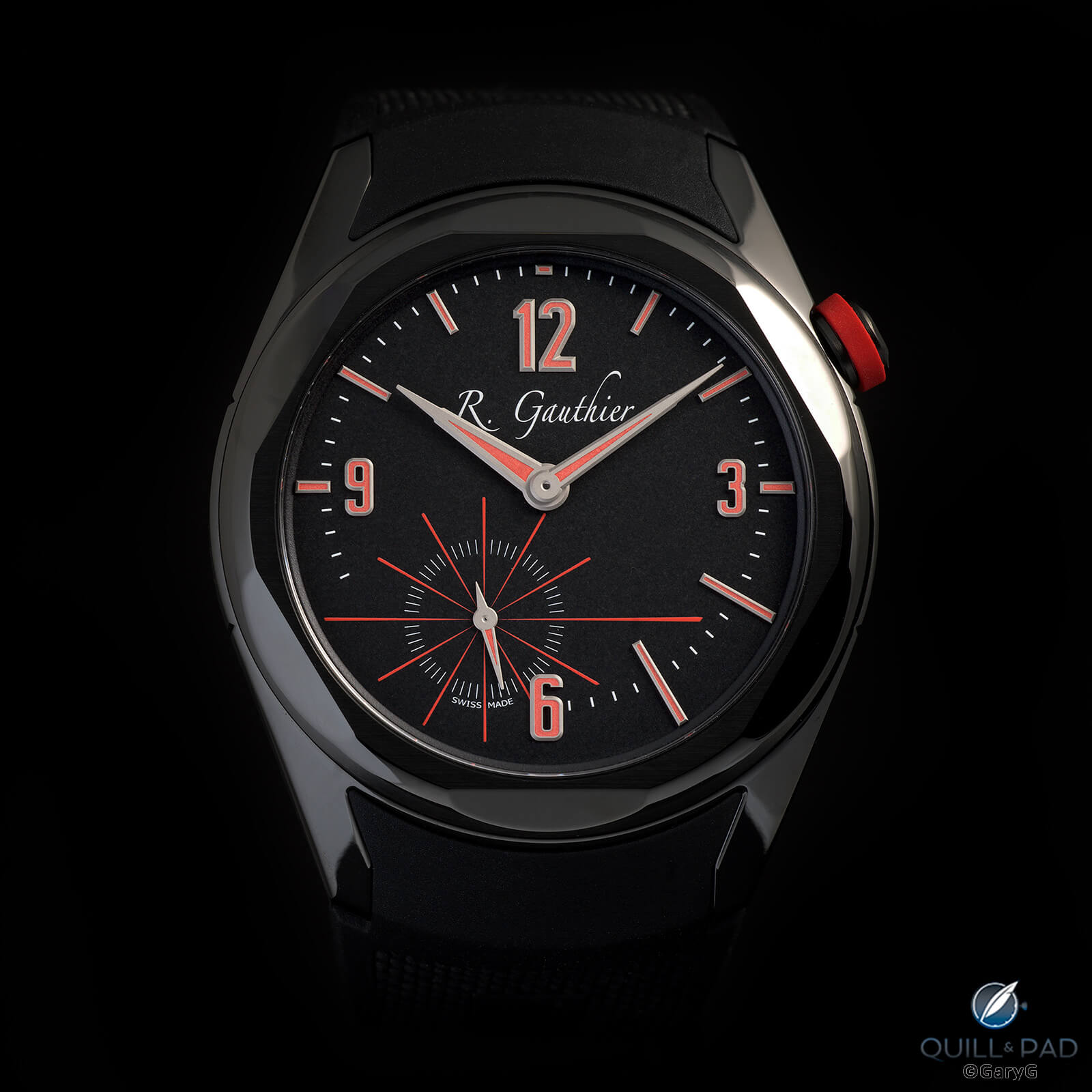
C by Romain Gauthier in black titanium
Dark on dark
Dark-dialed watches – especially those with black dials – are notoriously difficult to shoot, but for some reason I seem drawn to them both in my collection and in my shooting.
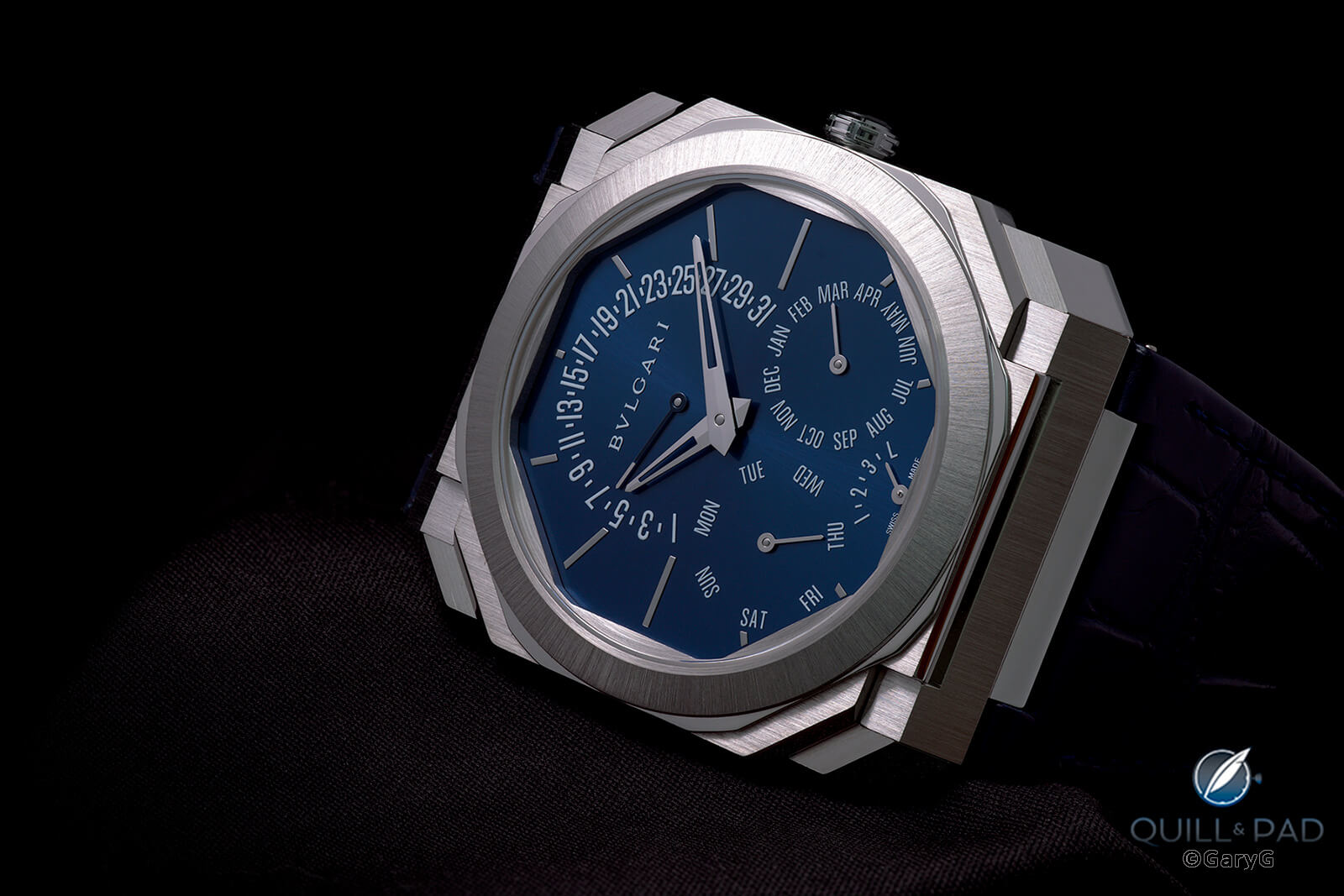
Bulgari Octo Finissimo Perpetual Calendar
It’s difficult enough getting enough light on a dark dial to show its details, as with the fine brushing on the Bulgari shown above, but doing that while simultaneously illuminating the hands and retaining the brushed details on the bezel and case rather than blowing them out took me quite a while.
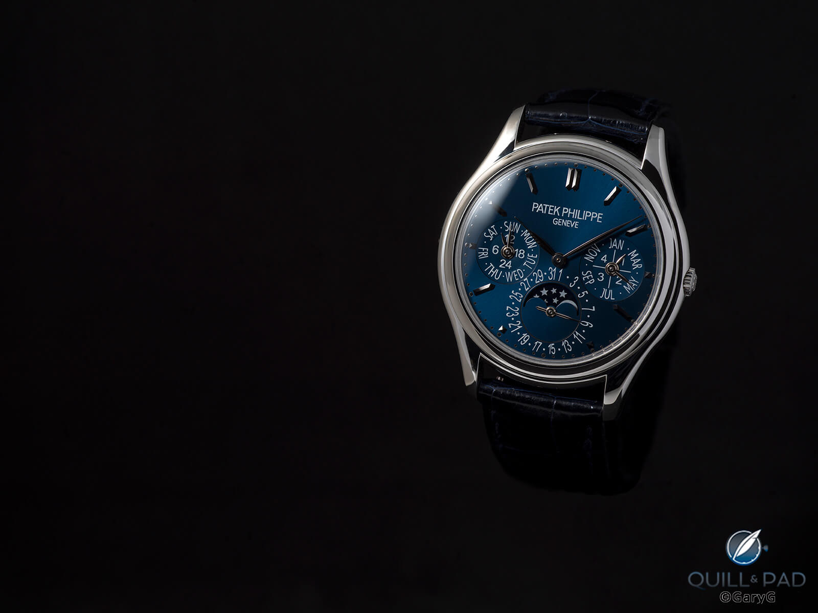
Patek Philippe Ref. 3940P Vintage Collection
I faced similar challenges with my Patek Philippe Vintage Collection Ref. 3940P and ultimately resorted to using some scatter on the crystal to deal with its domed shape and limited old-school anti-reflective properties. In my more fanciful moments, I imagine this is what the Artemis spaceship saw when it looked back at earth from its orbit deep beyond the moon.
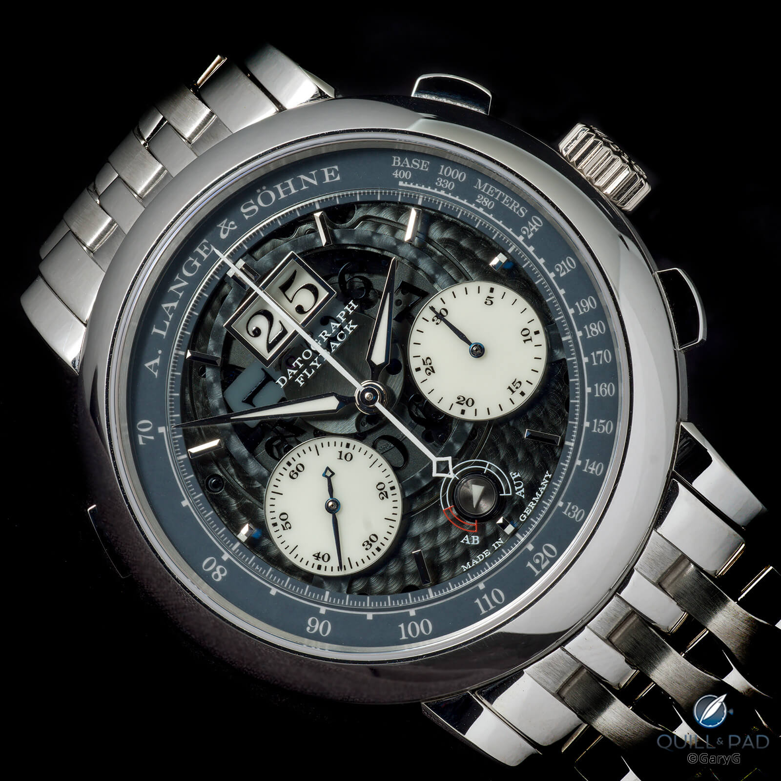
A. Lange & Söhne Datograph Lumen
The A. Lange & Söhne Datograph Lumen is – and isn’t – a dark-dialed watch. In the image above, I really wanted to give the viewer a perspective that reached deep into the watch but without blowing out all the brightwork of the bezel and fitted bracelet
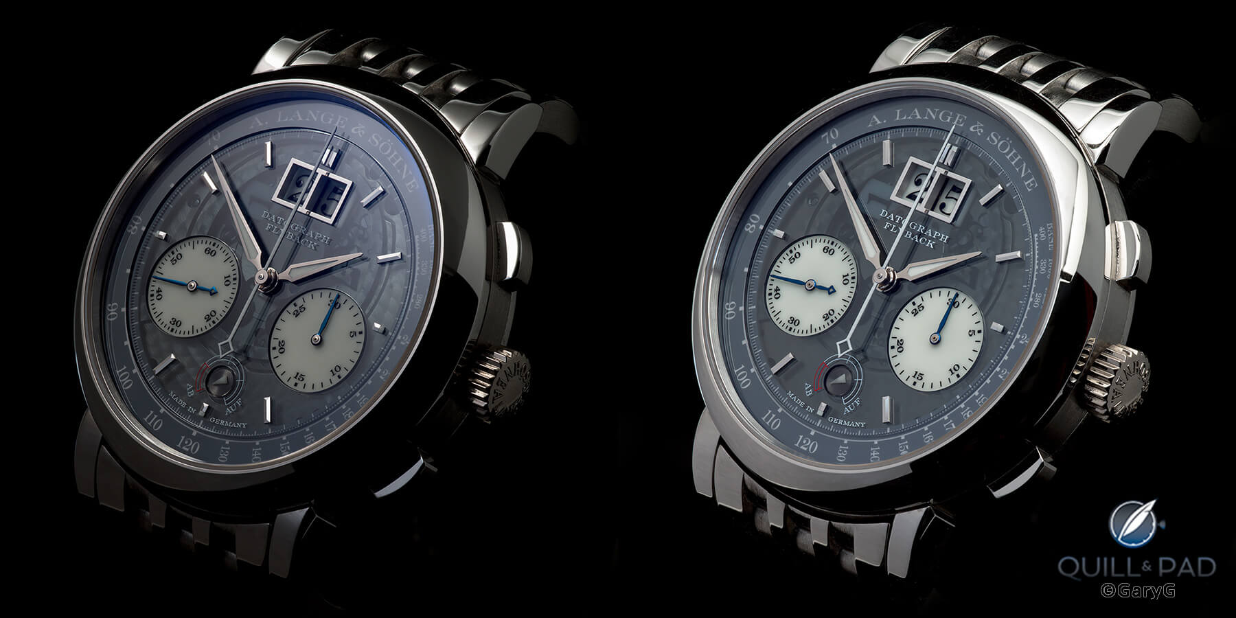
Same setup, different light: two views of the A. Lange & Söhne Datograph Lumen
One of the first exercises my teacher Ming Thein drilled me on was setting up a watch and camera in a single position and then creating different looks by repositioning the light. The A. Lange & Söhne Datograph Lumen lends itself well to this approach: above, you can see how something as simple as moving a flash a few inches can yield dramatically different moods.
Variety is the spice of life
Even within the constraints of my dominant shooting style – watches emerging from a black background – there are opportunities to create variation by using some creativity with positioning.
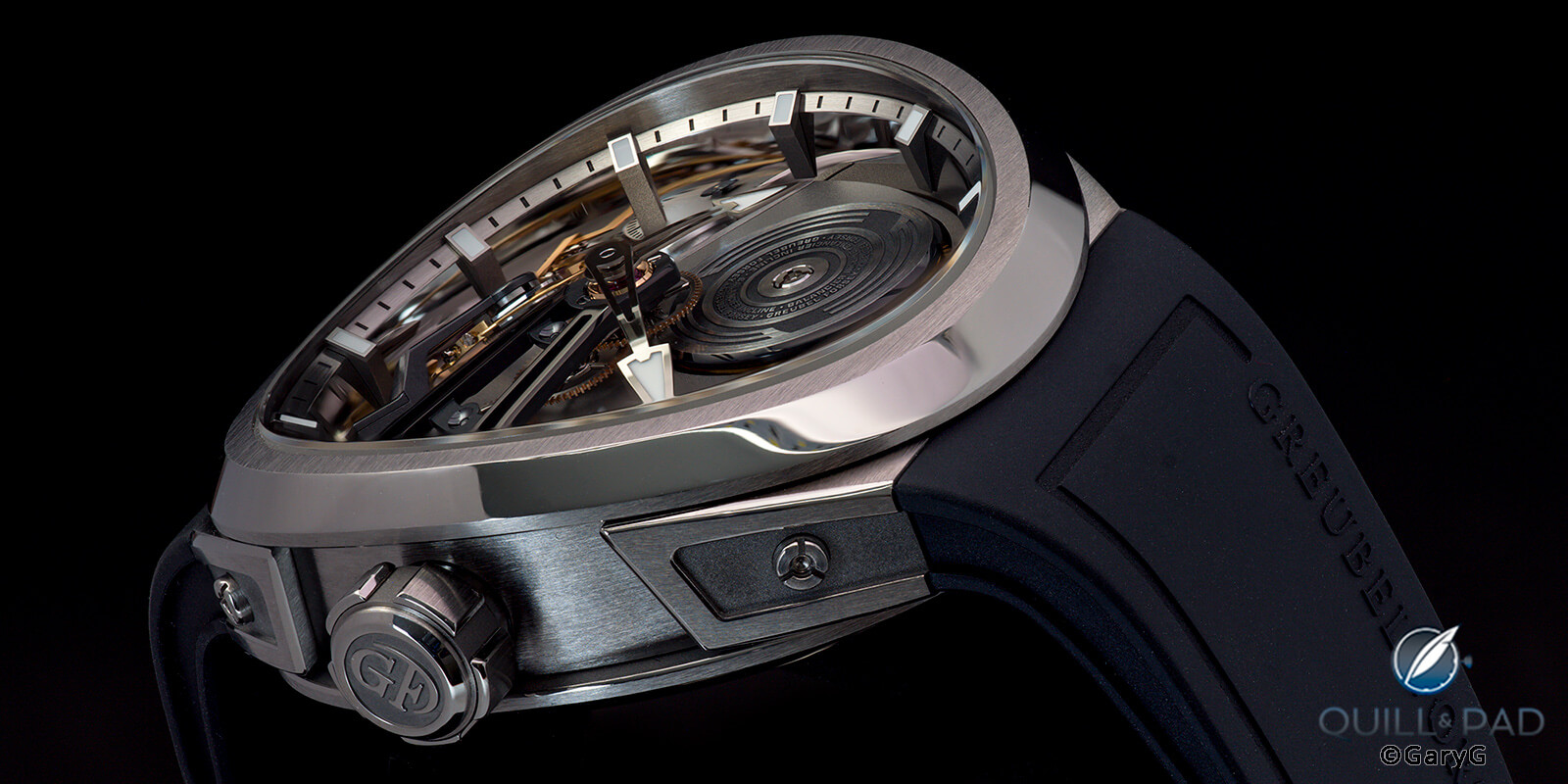
Low angle view, Greubel Forsey Balancier Convexe
Because of their extremely deep architecture and fascinating combinations of shapes and finishes, Greubel Forsey’s watches seem to lend themselves particularly well to the use of extreme perspectives. Check out the view above of the Balancier Convexe that shows how dramatically the case shape curves when seen from some angles.
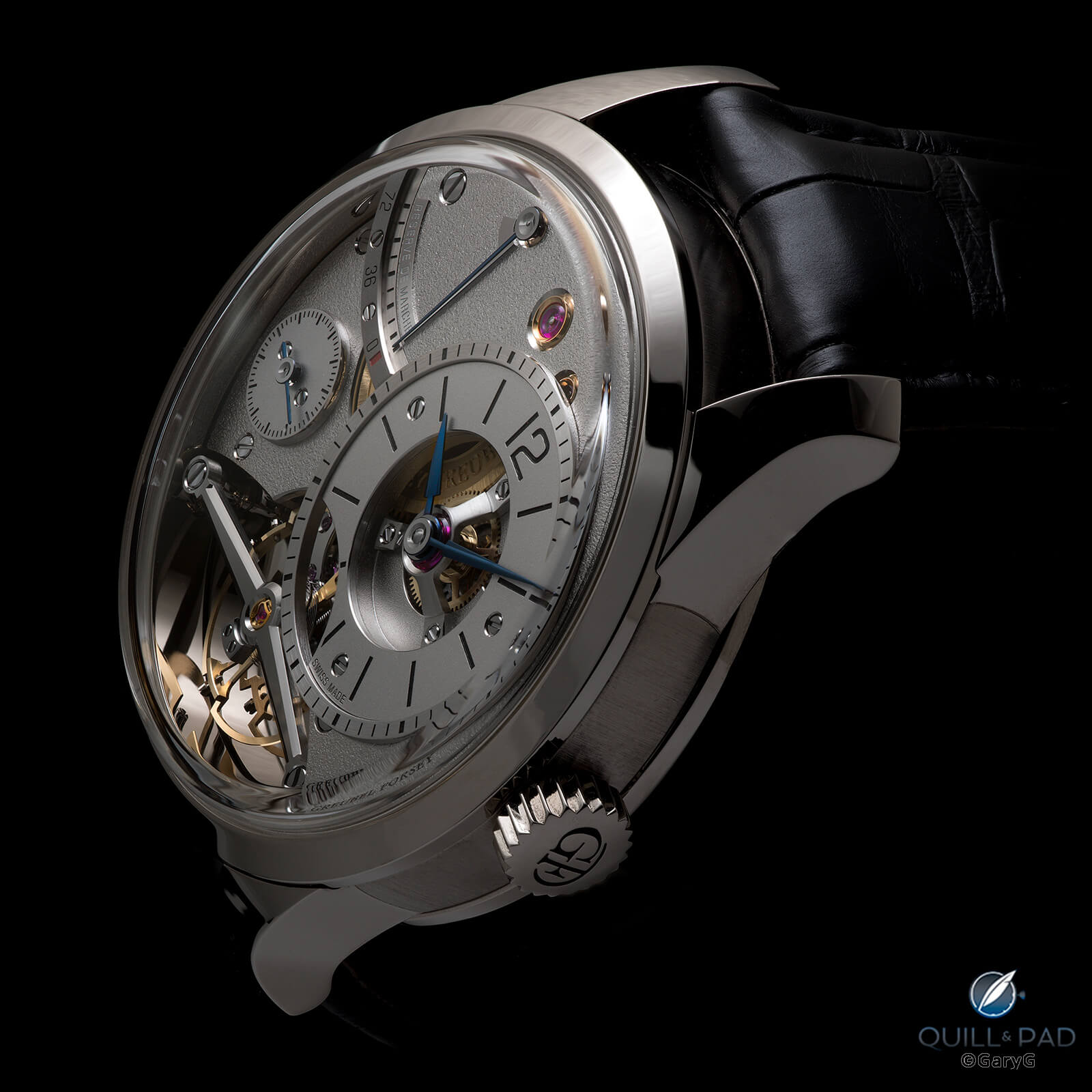
Greubel Forsey Balancier Contemporain in white gold
I also had the opportunity this year to shoot a Greubel Forsey Balancier of a different shape, if not color: my friend’s Balancier Contemporaine. One could spend hours identifying and enjoying the variety of finishing techniques expertly applied to this piece as well as the compelling design choices that include one I particularly favor: the mirror-polished enclosure surrounding the balance. To highlight it, I took the shot above and flipped and cropped it to isolate the balance and its reflection.
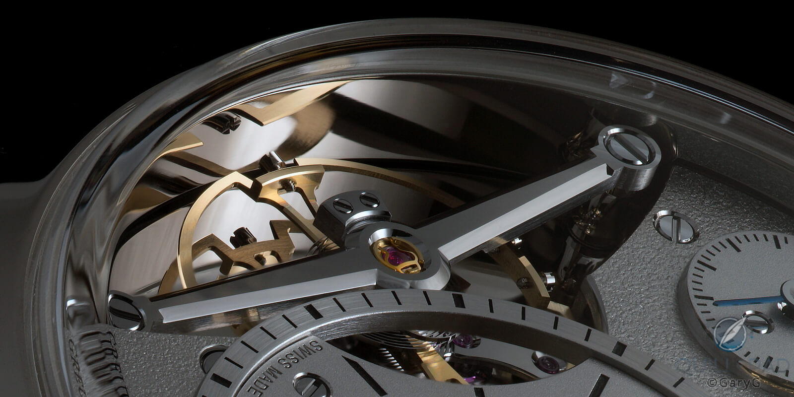
Same image, different angle: Greubel Forsey Balancier Contemporain
One of my most unusual shots of the year came from an unusual opportunity to shoot the MB&F HM9 SV in combination with my LM101 2022 Edition. Playing around with positions and lighting, I was finally able to show the details of both while capturing the subtle differences in their purple coloration.
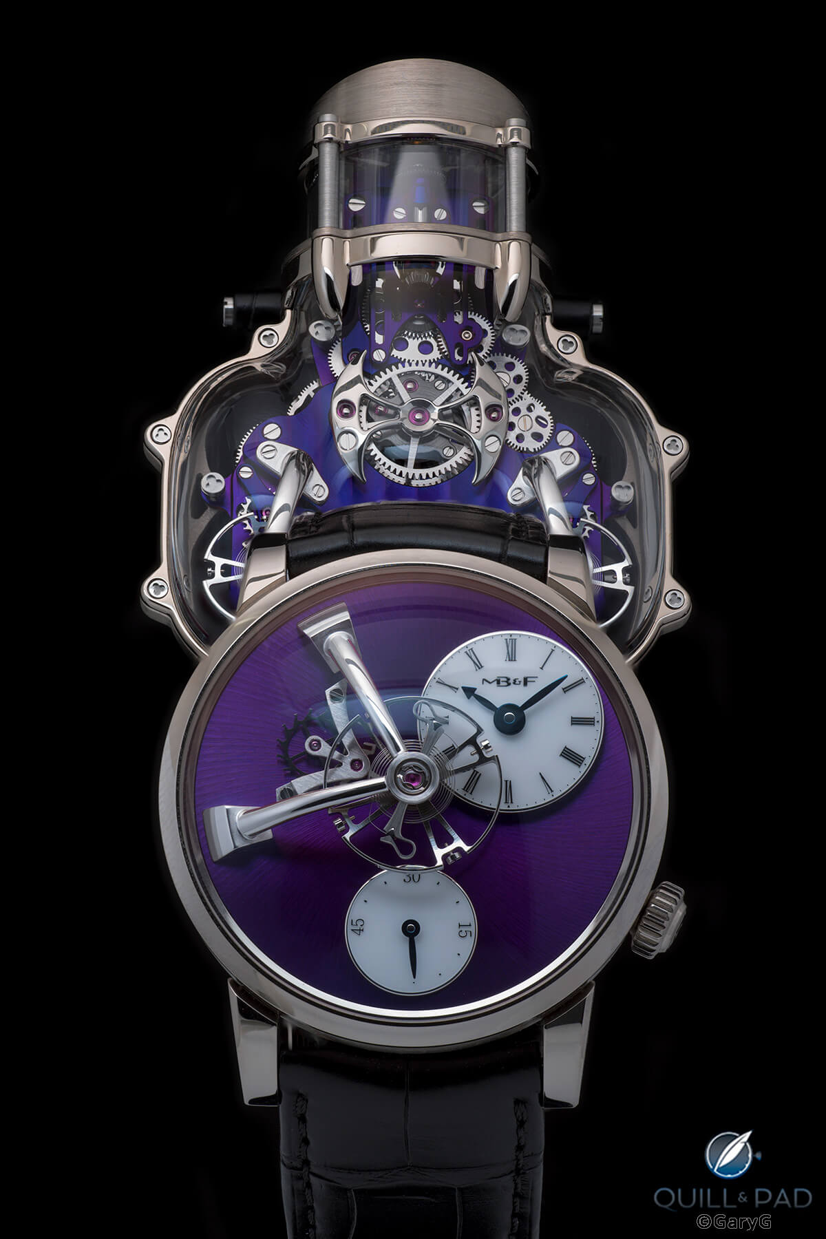
Two of a kind, sort of: MB&F HM9 SV (top) and LM101
More movements
I showed a couple of movement shots earlier, but there were others that made my favorites list. First up: a shadowed view of the modified Omega movement in David Walter’s “White.”
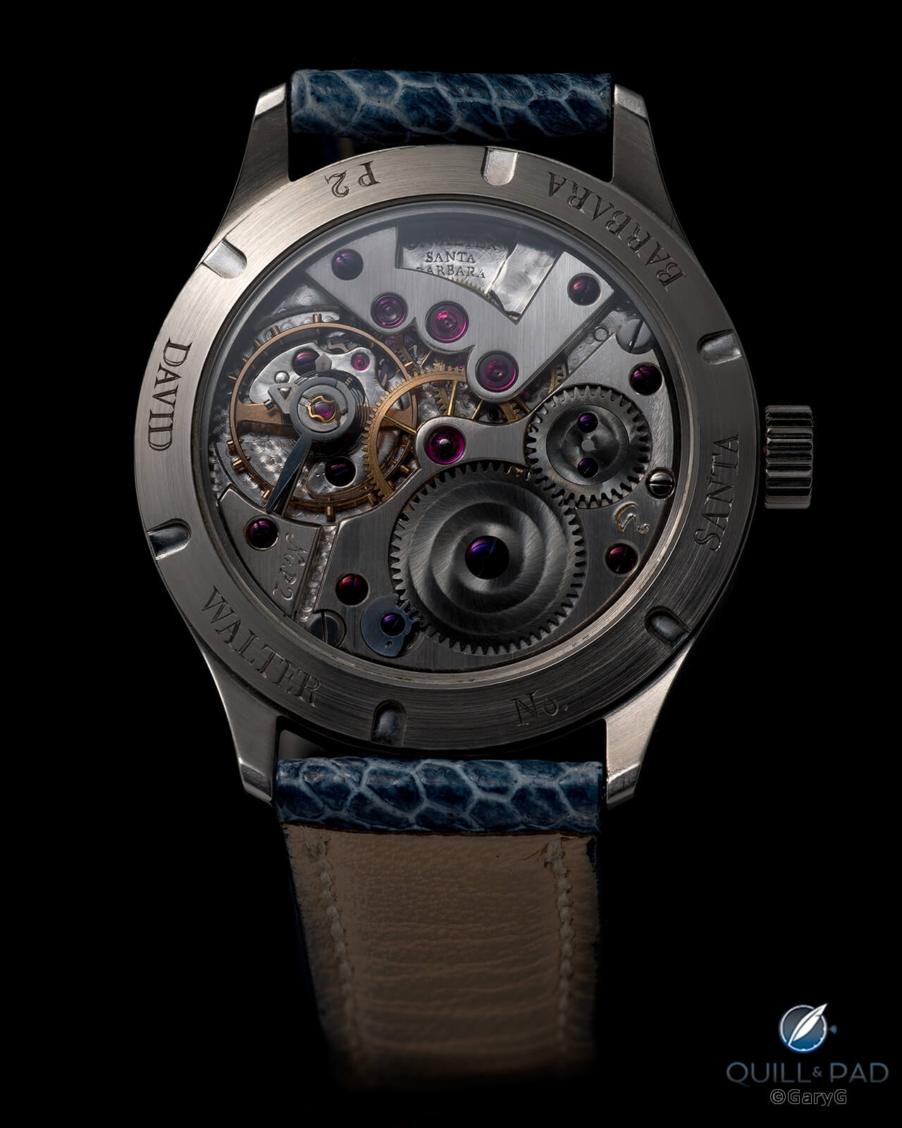
Walter White: prototype movement of David Walter’s latest wristwatch
While this prototype movement doesn’t quite show the finishing finesse of the Voutilainen we saw earlier, it is charming in its own way and definitely shows the marks of extensive hand work.
Next up, another view of the A. Lange & Söhne 1815 Rattrapante Honeygold’s Caliber L101.2 with the diffuse light giving a real sense of what the frosted finishing style, a tribute to early Lange pocket watches, looks like in real life.
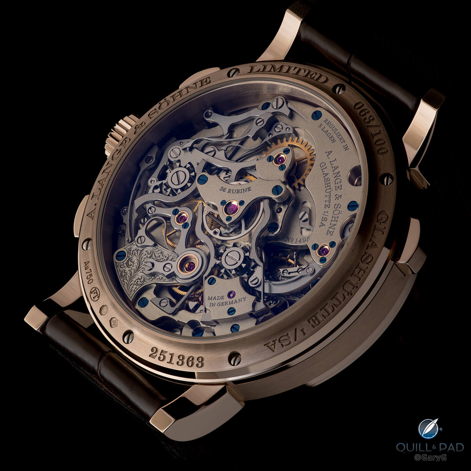
Deep and frosty: A. Lange & Söhne Caliber L101.2 surrounded in Honeygold
We saw Parmigiani’s PF Tonda GMT Rattrapante earlier from the dial side; the reverse is just as impressive to my eye with its vivid striping, crisp perlage, and wavy guilloche micro-rotor.
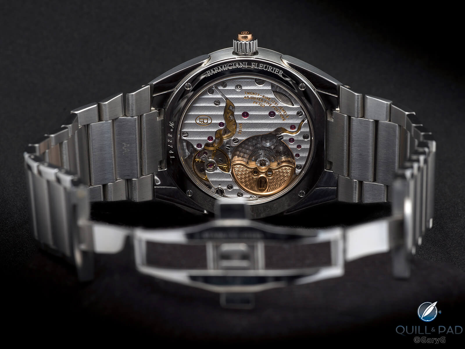
Parmigiani Fleurier Caliber PF702
And, no, I can’t resist one more look at that wonderful Christian Klings pocket watch from a deep angle that shows the tourbillon and those amazing chatons to good advantage and light that penetrates deep into the going train.
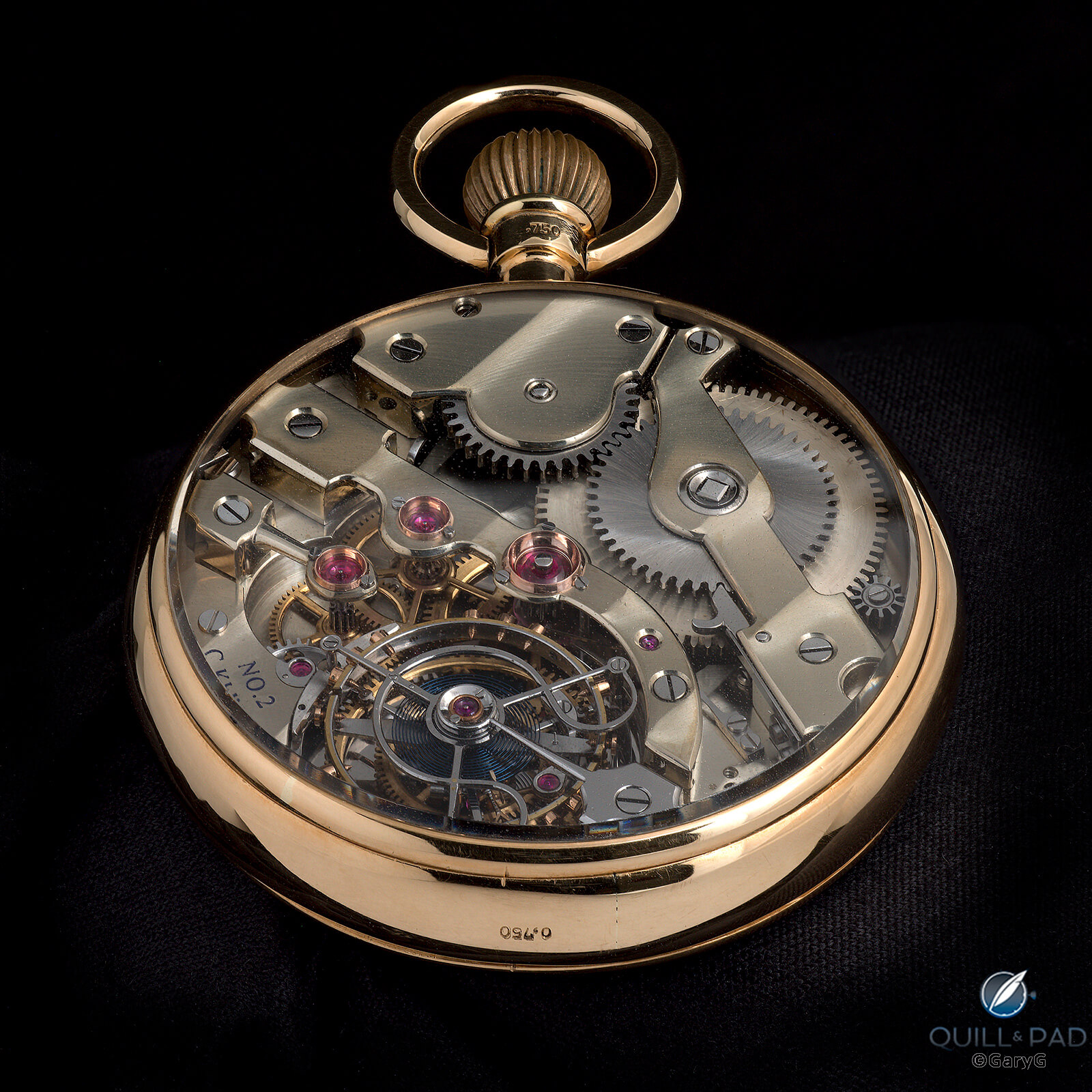
Low angle movement view, Christian Klings tourbillon pocket watch No. 2
Doubles, triples, and quads
A photographic style that I particularly enjoy is that of grouping two or more watches in the same image. My approach differs from many others in that I don’t take separate images and then make a composite: unless I say otherwise, the image you are seeing is of two or more watches from a single camera and lighting setup as they appeared in the light tent. I’ll confess that it’s a bit of a parlor trick, but then again I also enjoy the challenge of capturing multiple watches at once, especially when their characteristics differ.
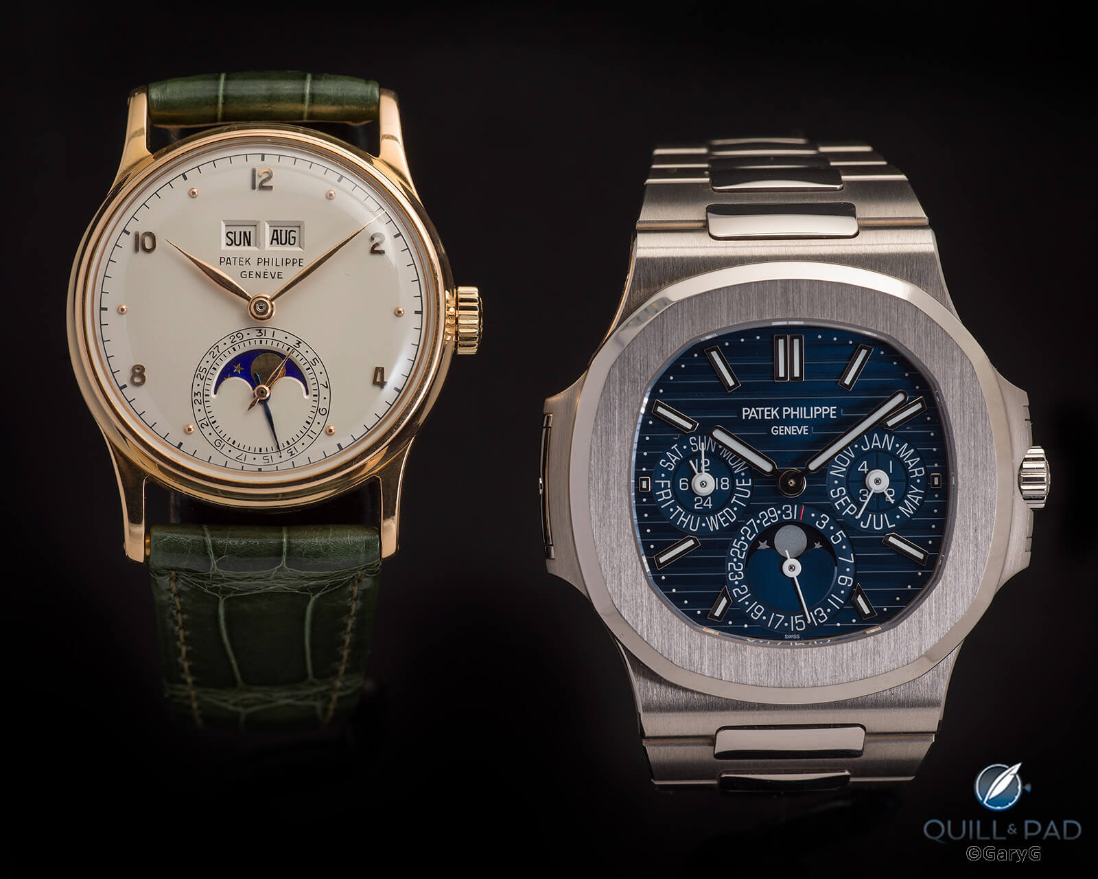
Side by side: Patek Philippe Ref. 1526 in pink gold (left) and Ref. 5740G
These group shots typically have a theme: in the above image, the obvious connection is that of two Patek Philippe perpetual calendars, Reference 1526 in pink gold and Reference 5740G, from very different eras with different color schemes, dial layouts, and levels of formality. Just to make the image above a bit tougher to pull off, it is a single exposure rather than a multi-exposure focus stack, requiring the two watches to be set in the same plane relative to the camera’s sensor to be in focus.
The Reference 1526 featured in another favorite group shot this year alongside my Patek Philippe Reference 3940P Vintage Collection perpetual calendar. This time both are dress watches, and Reference 3940 is somewhat closer on the timeline to the 1526 than is the 5740G in the prior photo, but the contrast in colors and dial styles is pronounced. It was no mean feat getting the ivory dial of the 1526 and the brushed dark blue of the 3940 to show well together in a single image, either!
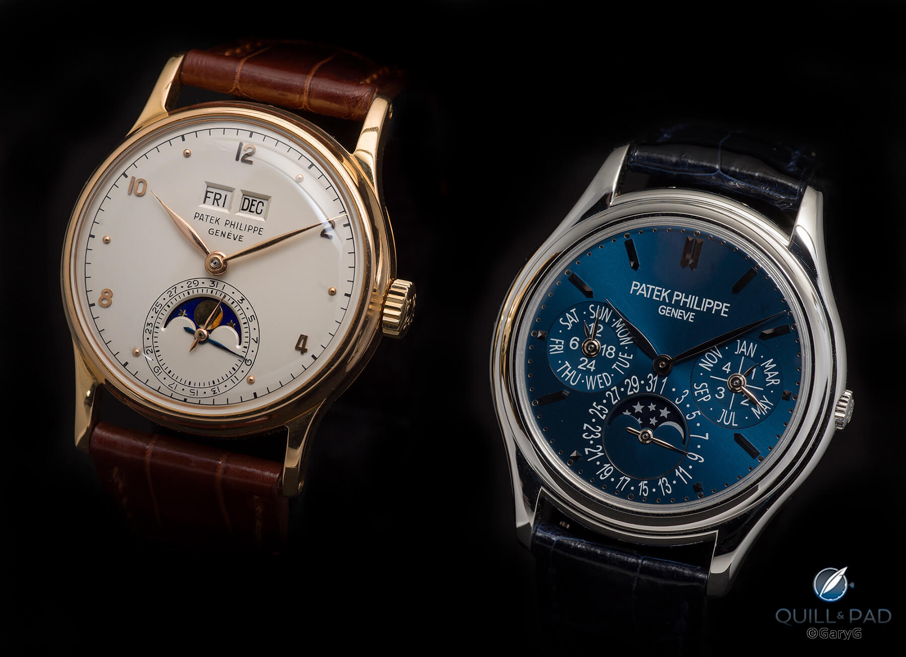
Perpetually classic: Patek Philippe Ref. 1526 (left) and Ref. 3940P-027 Vintage Collection
At this point, the year’s themes begin to run together. Here’s a pair of black enamel-dialed beauties side by side: the Rexhep Rexhepi Chronomètre Contemporain 01 from Akrivia in red gold and the Patek Philippe Reference 2526 “Gobbi Milano” in yellow gold.
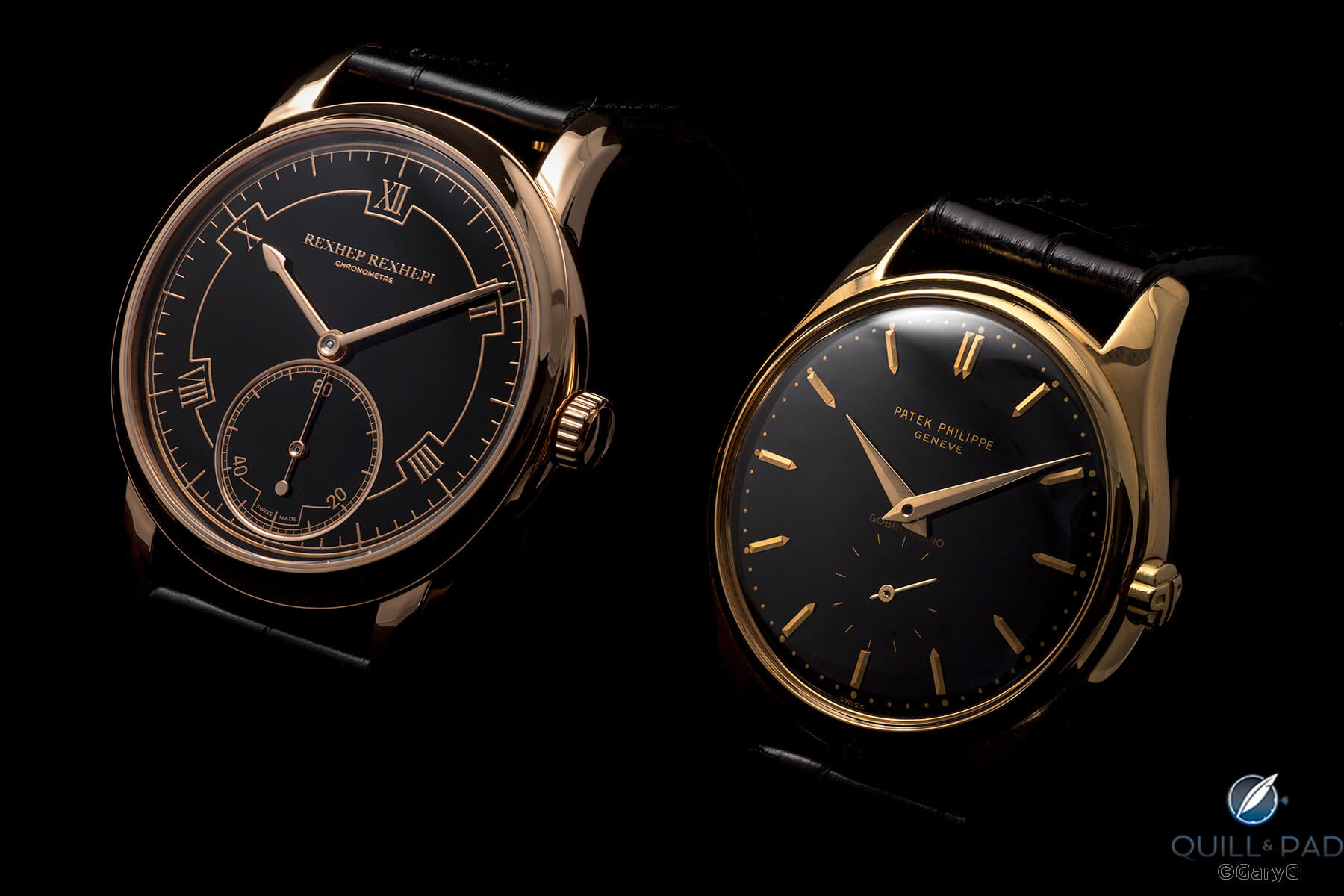
Black and gold: Akrivia RRCC 01 (left) and Patek Philippe Ref. 2526 “Gobbi Milano”
More black on black, now featuring three watches in a soldier formation: the Patek Philippe Reference 2526, the dial side of the A. Lange & Söhne 1815 Rattrapante Honeygold, and the Rexhep Rexhepi Chronomètre Contemporain 01. One advantage of shooting watches together is that it yields a truer sense of relative color: in these group shots of the black-and-gold trio, the color of each gold alloy and its hue relative to the others is easily discerned.
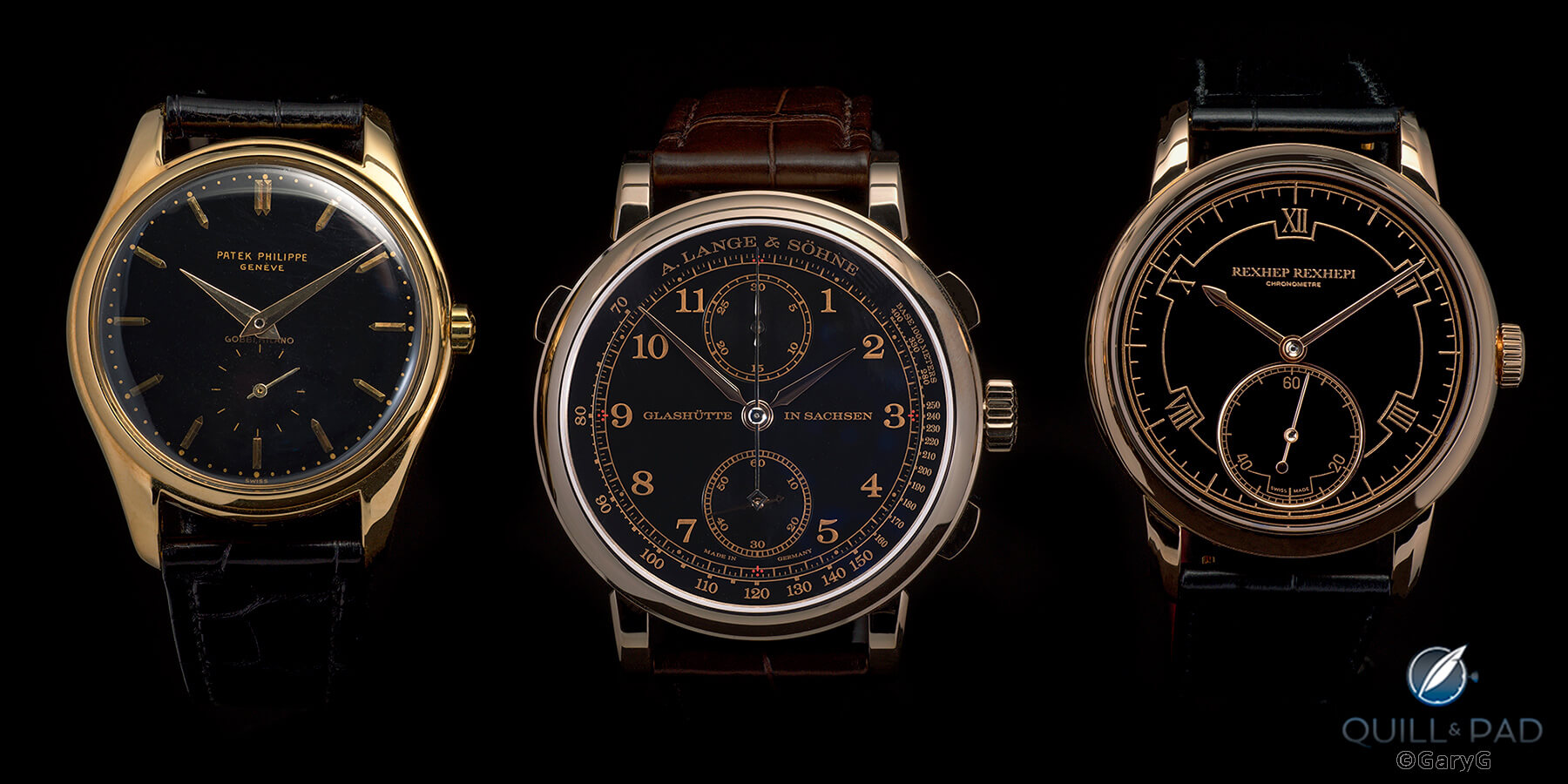
Triple play (from left): Patek Philippe Ref. 2526, A. Lange & Söhne 1815 Rattrapante Honeygold, and Akrivia RRCC 01
Having showcased the front of these three pieces, it seems only fair to feature the movement sides, especially as each movement is mind-blowing on its own, plus we have the benefit of seeing the movement of the Patek Philippe Reference 2526 through its custom Voutilainen-Cattin display case back.
Which is best? You’ll have to tell me, as I am hard pressed to choose.
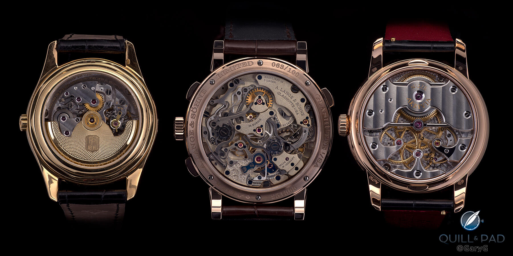
Movement views, from left: Patek Philippe Ref. 2526, A. Lange & Söhne 1815 Rattrapante Honeygold, and Akrivia RRCC 01
And at the far end of my multi-watch shooting spectrum, here’s a quartet of sport (or at least sporty) watches that I’m fortunate to be able to wear whenever the mood strikes. As with the hues of gold earlier, in this photo it’s easy to distinguish the white gold of the Patek Philippe, the different-colored steel alloys, the titanium accents of the Vacheron Constantin, and the different takes on the use of blue
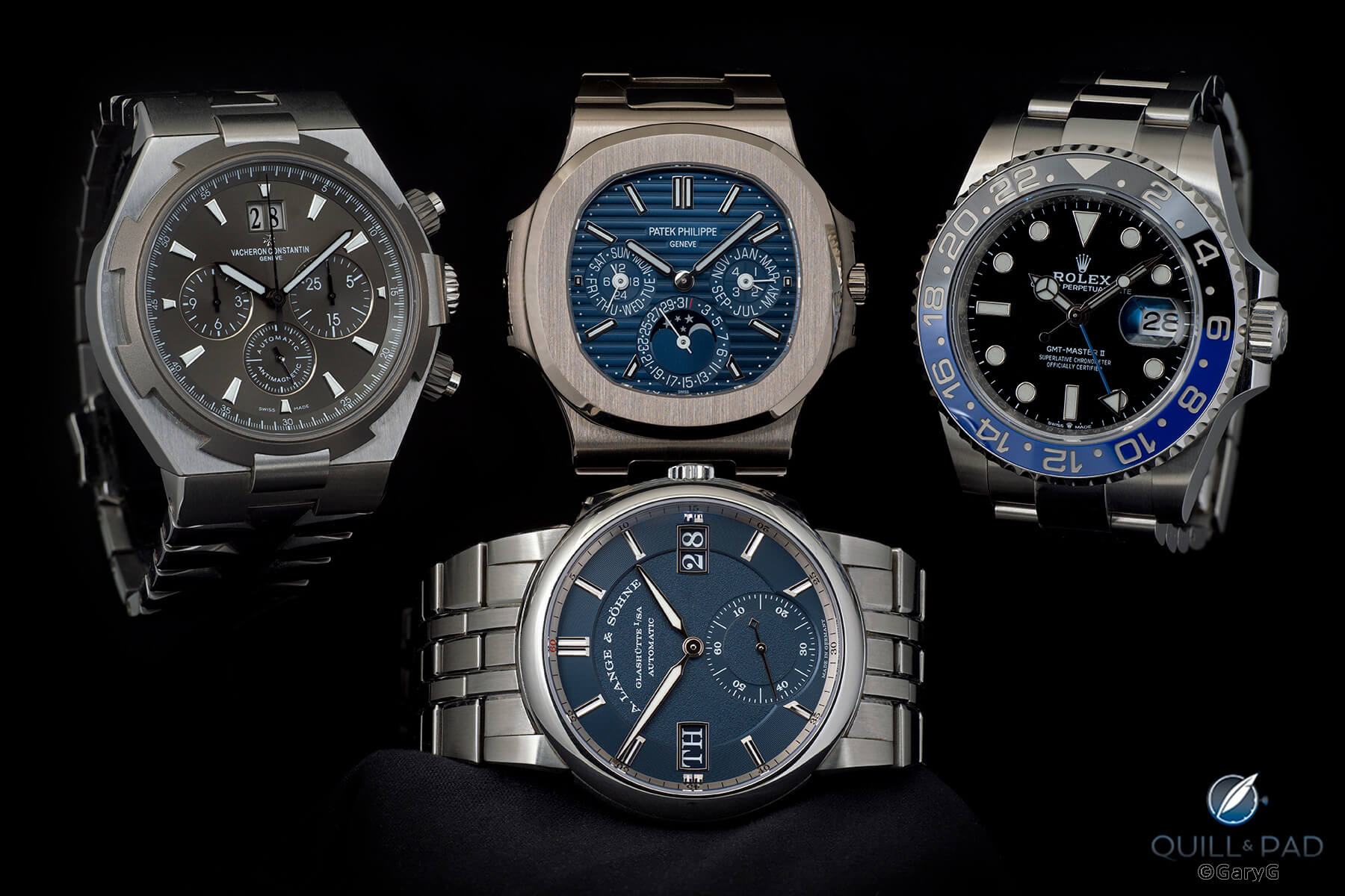
Different metals, different blues, all sporty: clockwise from upper left, Vacheron Constantin Overseas Chronograph, Patek Philippe Ref. 5740G, Rolex GMT Master II, A. Lange & Söhne Odysseus
As a rule, my favorites come much more from formal studio shooting than from informal table shots or wristshots, but a few of the latter type do sneak in from time to time. This year, the ones I’ve chosen both include two watches. First, from my trip to the Breitling Cosmonaute event: vintage Breitling maven Fred Mandelbaum’s vintage Breitling AVI next to my Mathey-Tissot Type XX at the bar before a collector dinner.
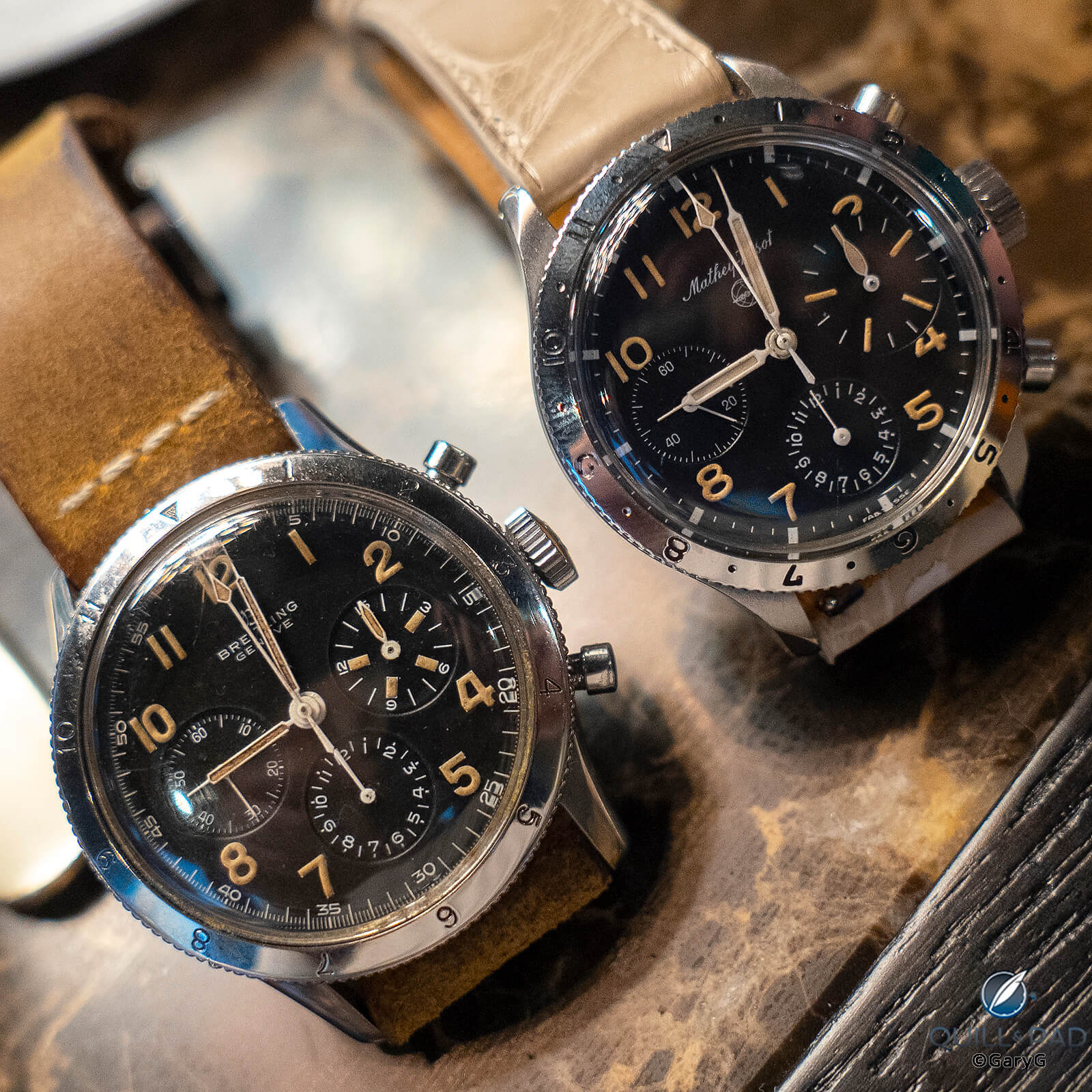
Vintage chronograph couple: Breitling AVI (left) and Mathey-Tissot Type XX
Second, there’s the view from the desk in my Geneva hotel room for Watches and Wonders 2022. Life could be worse!
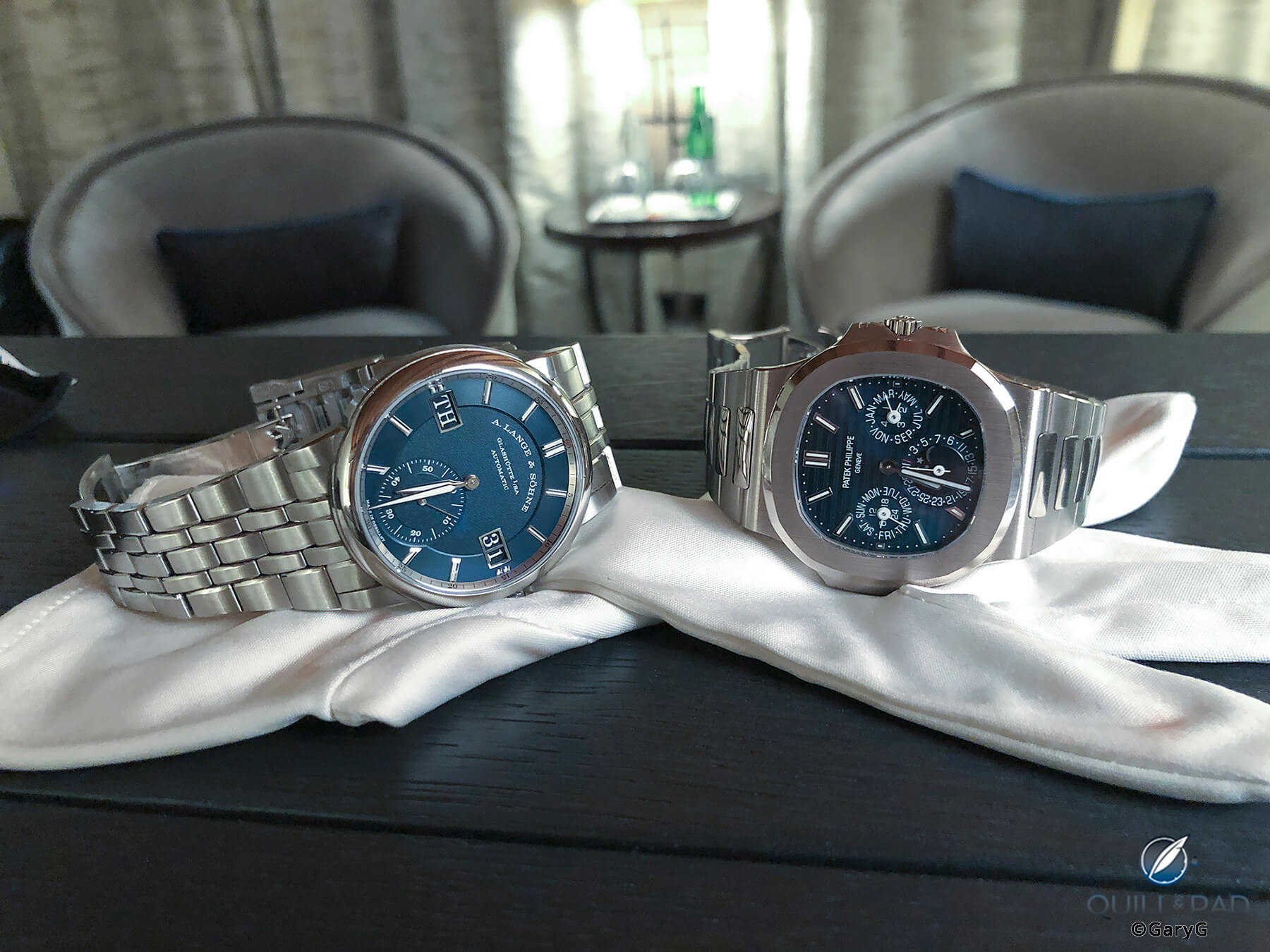
Desk set: A. Lange & Söhne Odysseus in steel and Patek Philippe Ref. 5740G
What viewers liked
I have my favorites and I’m sure you have yours, but at least one measure of enthusiast community response to my images is the annual “Top 9” evaluation of my Instagram page.
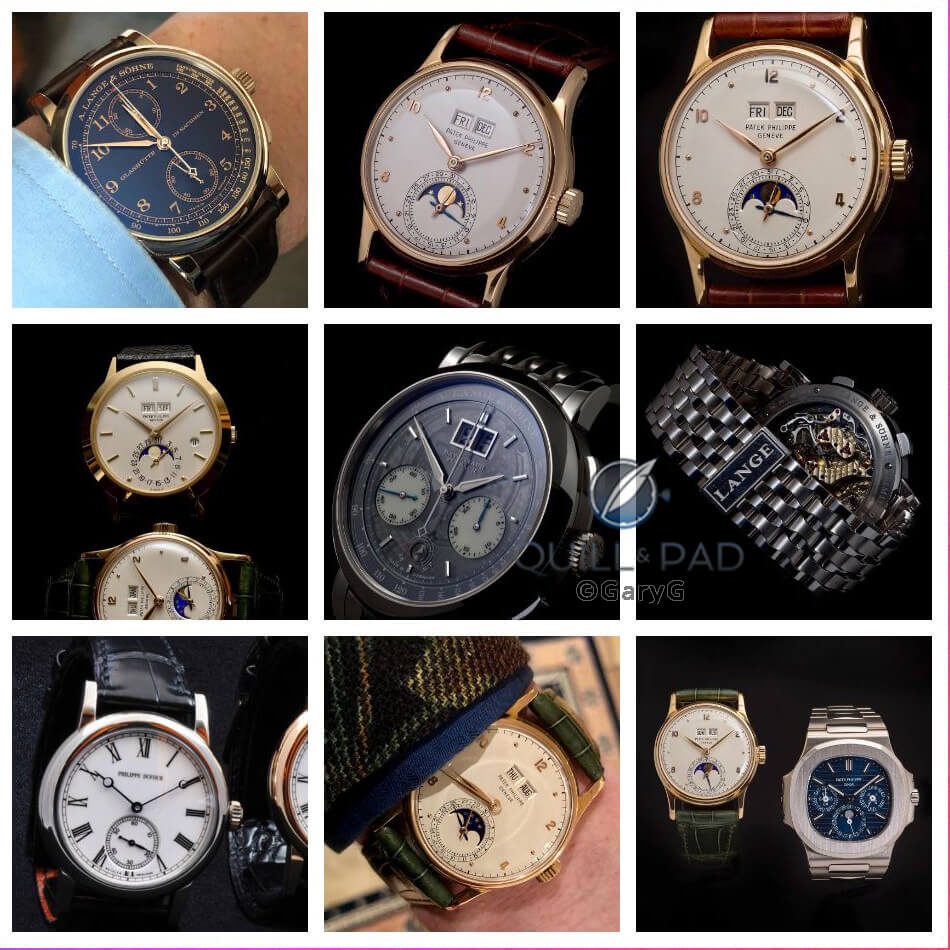
Top 9 most liked images on @garyg_1 for 2022
When it comes to arousing interest, the Patek Philippe Reference 1526 never fails: this year it featured in no fewer than five of the top nine. A. Lange & Söhne showed strongly with three of the remaining four top images, and a golden oldie multi-frame slider of the NorCal Gang’s Philippe Dufour pieces rounded out the voting.
In a nod to public sentiment, I’ll finish up with my favorite photo of viewers’ favorite watch from my collection this year, the Patek Philippe Reference 1526.
I wish all of you a splendid conclusion to 2022 and a wonderful 2023!
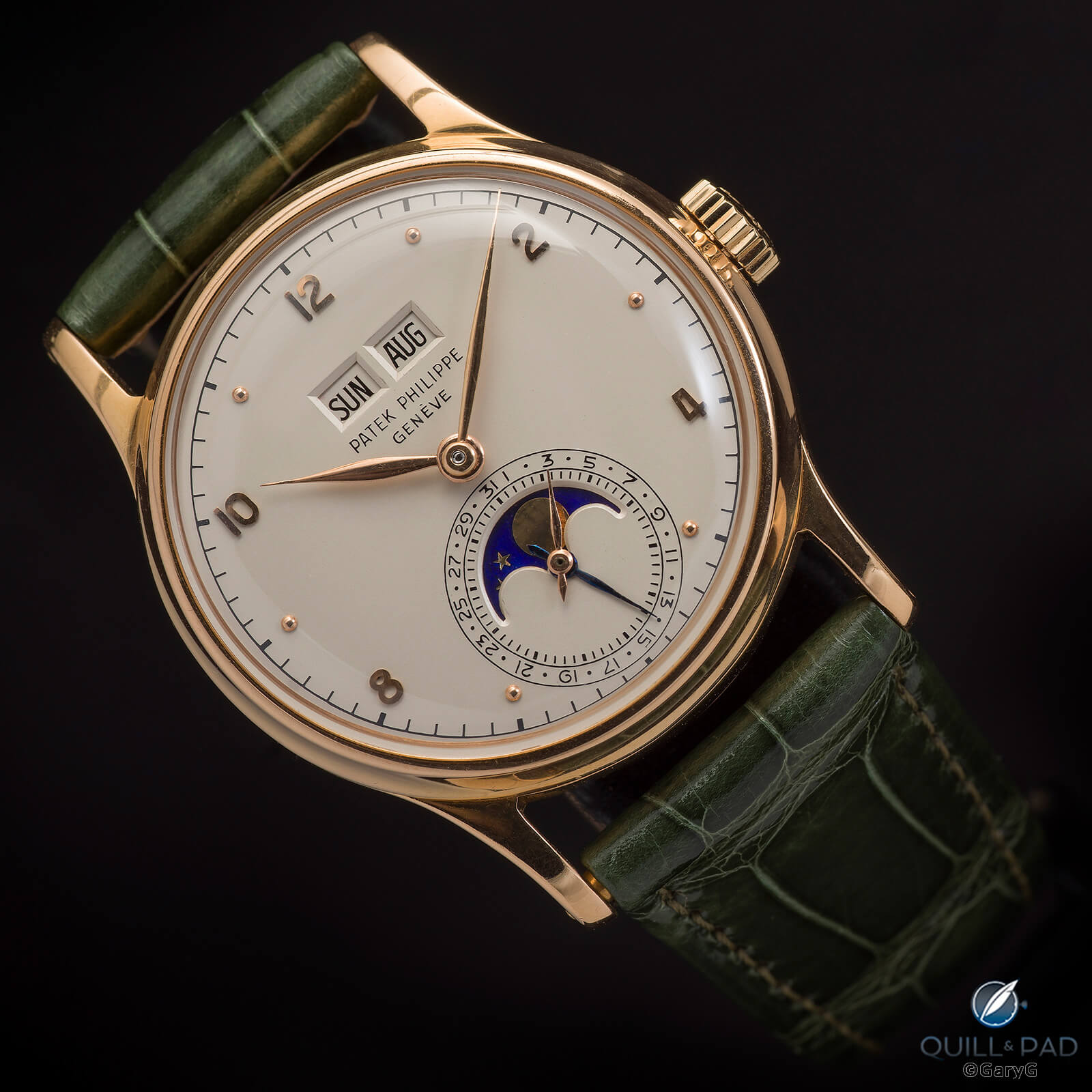
Parting Shot: Patek Philippe Ref. 1526 in pink gold on Patek Philippe green strap
You may also enjoy:
Why I Bought It: A. Lange & Söhne 1815 Rattrapante Honeygold Homage to F.A. Lange
Collecting And Patronage: Two Unique Watches From Independent Watchmaker Christian Klings
Collector Commissions: Two Watches From Independent Torsti Laine For San Francisco’s 49 Crowns
Why I Bought It: C By Romain Gauthier Titanium Edition Two
Leave a Reply
Want to join the discussion?Feel free to contribute!


And the Golden Finger for 2022 Soldier Photo goes to…. Karin INV special 👍
It is a very special piece and was great fun to photograph!
Best, Gary
Danke für Ihre Arbeit, die ich schätze. Für mich sind die Uhren von A. Lange& Söhne etwas zu stark im Fokus bei ihren Berichten.
Translation: Thank you for your work I appreciate it. For me, the watches from A. Lange & Söhne are a bit too much of a focus in their reports.
Thanks for reading and commenting, Didier. I see what you mean about the emphasis on Lange — this article was driven completely by how good I thought the photos looked, but I will certainly continue to pay attention to balance in subject matter.
All the best, Gary
Your articles are pretentious and painful.
Submit an article that you write , I would read it and see how you compare? Have a Happy New Year .
Great idea, Ray!
I’m sorry you feel that way, but appreciate your taking the time to express your view.
Beautiful pictures. The Klings calibres are truly spectacular.
Thanks — as you can tell I was captivated by the Klings watches as well!
Best,
Gary