Ming 37.05 Moonphase: Form Over Function Has Rarely Looked Better
Form versus function is an age-old debate. No matter how far back you go in the human history of making tools and objects, some have chosen to elevate aesthetics over practicality. This is how art was born. Humans first figured out how to make something to do a job and then for some, their inherent creativity took over and objects were decorated and adorned, turning basic items into status symbols.
Pots, jewelry, weapons, clothing, furniture, even tools; all items made by humans have been subject to a design-first mindset at one point. Every significant culture we have discovered has created elaborate art and decorative versions of useful items. Ceremony and ritual were obvious early reasons for this, but it seems art, craft, and aesthetics are built-in to humanity. This was taken so far in relatively modern times that the idea of aesthetics versus functionality became the driver of major cultural shifts around aesthetics and goods around the end of the 19th century.
The Great Exhibition in 1851 in London birthed the Victorian era, as well as ushered in the mass manufacturing age when flourishing decoration gave way to more practical and easier to manufacture goods. This era saw the rapid invention of mass manufacturable designs, meaning simple, easy to duplicate with a machine in very basic processes, overlapping with extensive handcrafted goods with dramatic design elements. The shift was noticeable as designers and artists both lamented and praised function becoming primary in design considerations over pointless decoration.
The next century and a half led to various design movements that simplified aesthetics, sometimes to the extreme, resulting in the current landscape of industrial design that can sometimes be criticized for prioritizing style over functionality. But artists and designers still try to find a balance, a blend of form and aesthetic impact that allows for useful functionality.
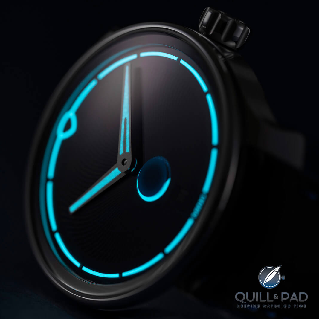
Ming 37.05 Moonphase lume
That brings me to the Ming 37.05 Moonphase, a watch clearly taking form as a priority and pulls functionality from the crevices between design decisions.
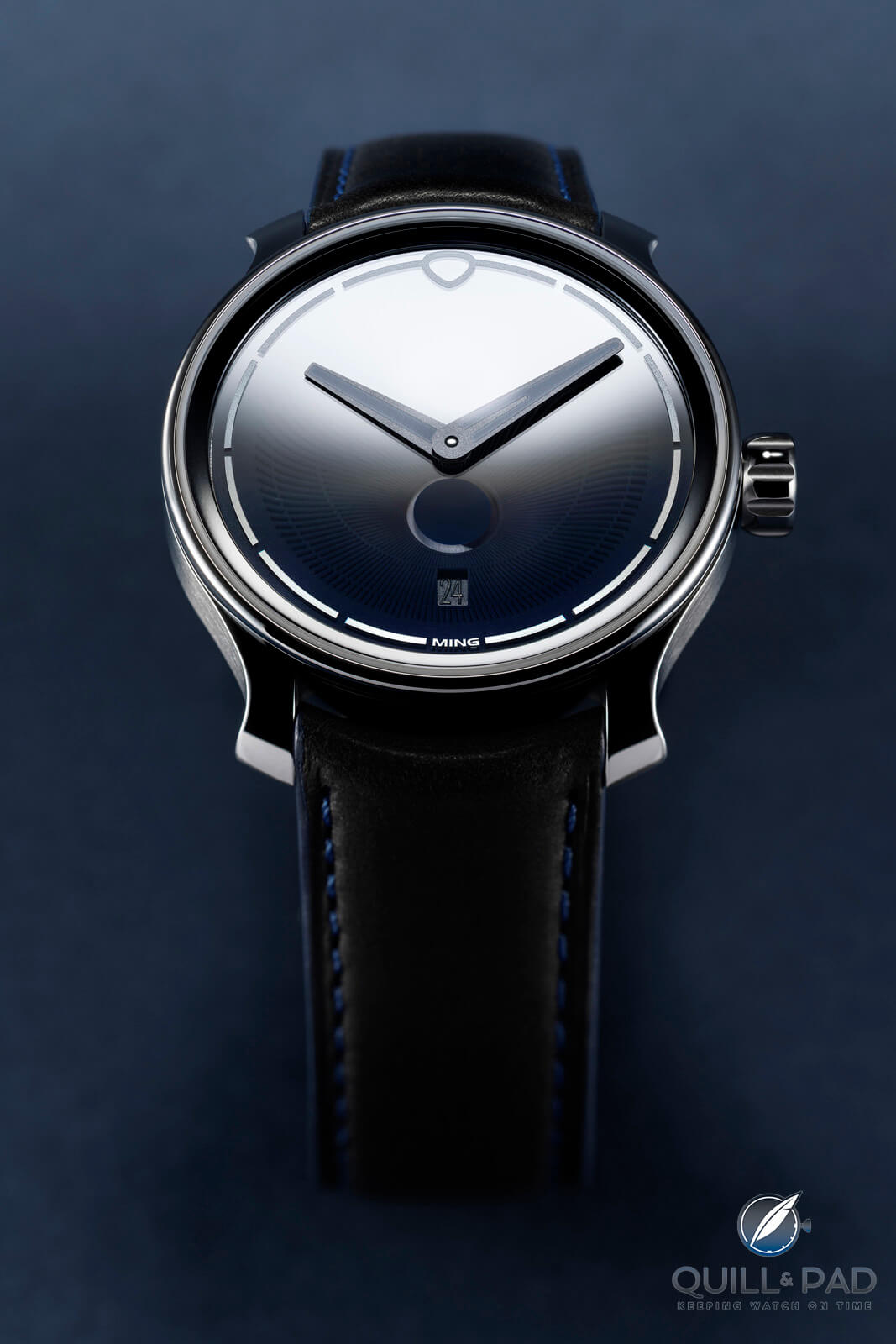
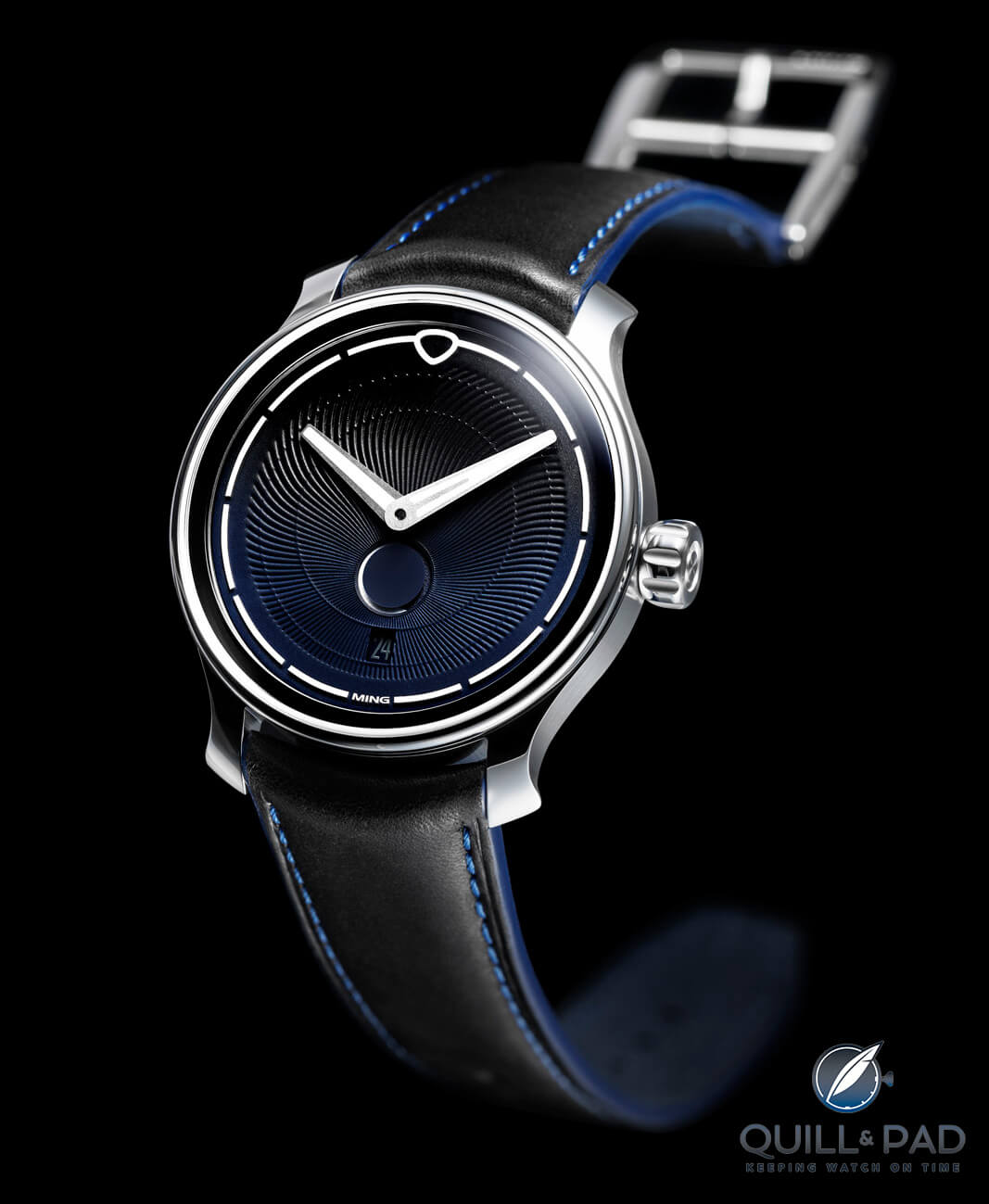
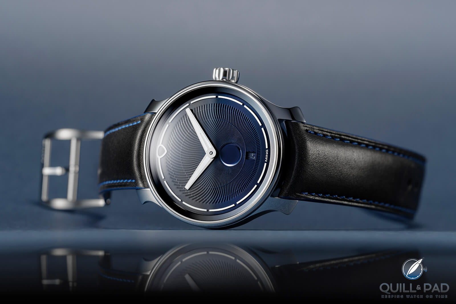
Ming 37.05 Moonphase
It’s been over a year since the 37.05 Moonphase launched and very quickly sold out, but it’s been on my mind ever since it debuted. Ming has been a little powerhouse of a microbrand that often punches far above its weight, and now it is well established as a key player in the independent watchmaking scene.
Launching a moon phase watch was always something I hoped for, but honestly didn’t expect to emerge for a while since moon phase watches are not often collector darlings. That is evidenced by their relative absence from the entry level market while you can get almost every other style of watch well below $2000.
Ming 37.05 Moonphase
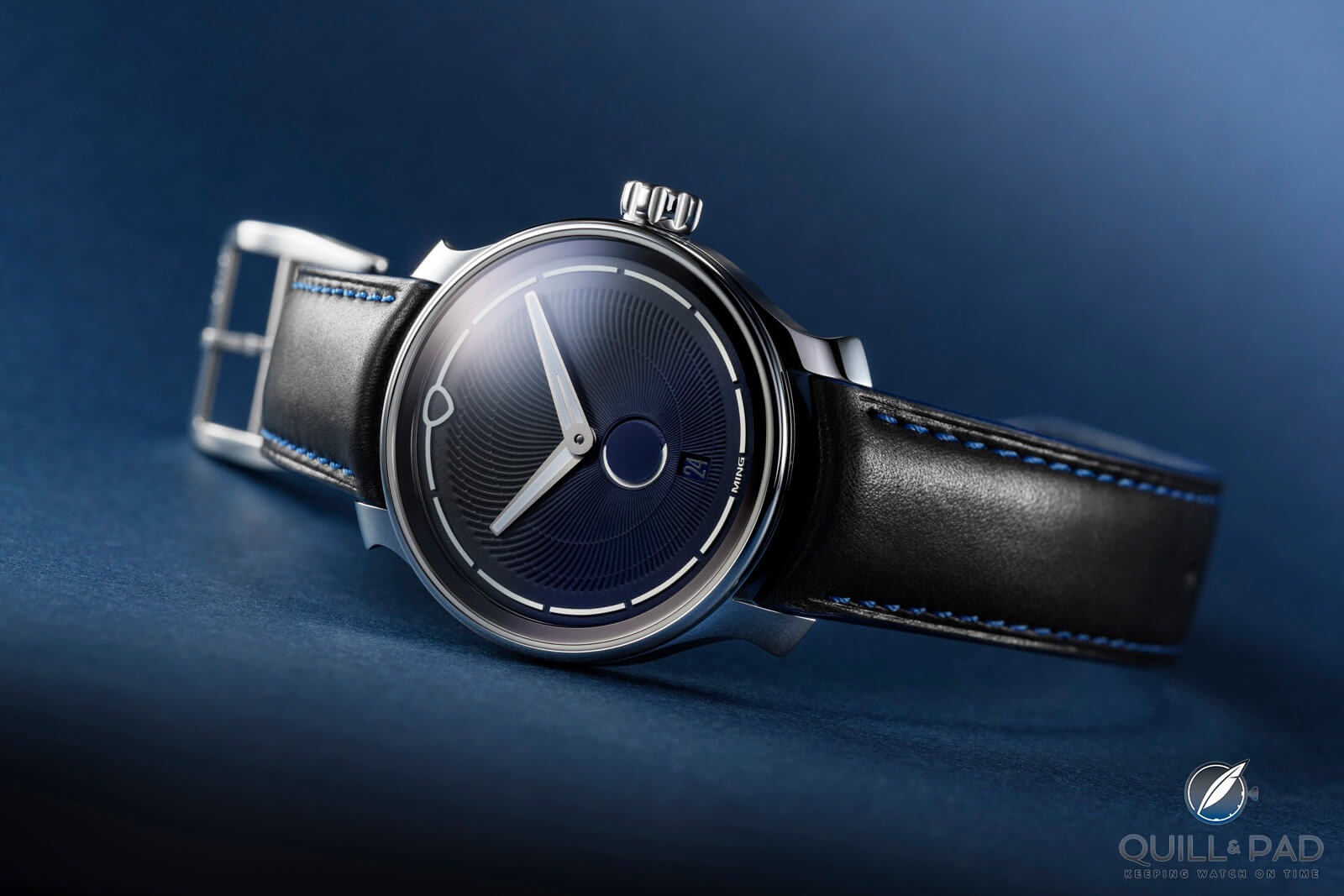
When the 37.05 launched, it also was met with a mixed response due to its departure from the typical aesthetic of a moon phase, a design tactic Ming is usually praised for, but in a way that left some scratching their head. The 37.05 Moonphase sticks to a very minimalistic dial, as usual, and leans on the dial textures and thin lines found on many Ming watches. With only hours and minutes displayed and no numerals around the edge of the dial, it is a very clean aesthetic.
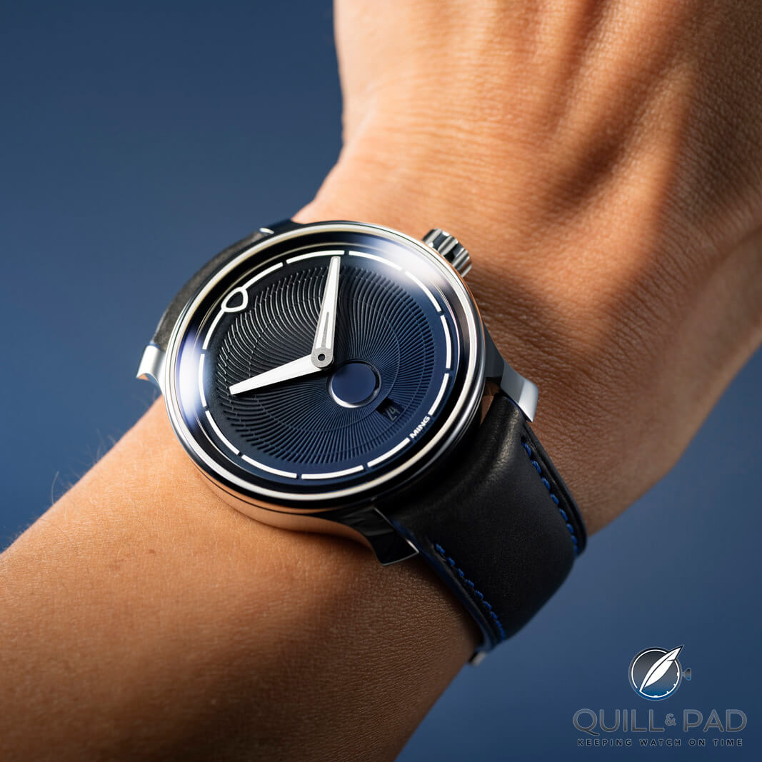
Ming 37.05 Moonphase pn the wrist
The Ming 37.05 moon phase indicator also utilizes the thin line style found along the edge of the dial, and that is where people start to get confused. Not because it perfectly matches the established aesthetic of the brand, but because it is not what people usually imagine as a moon phase display. The lower metal dial has a round aperture filled almost completely on the upper sapphire dial, with a painted disk matching the lower dial, only allowing a thin gap around its perimeter. A luminous moon disk passes underneath and slowly fills the annular ring, creating a very different visual of the moon phases.
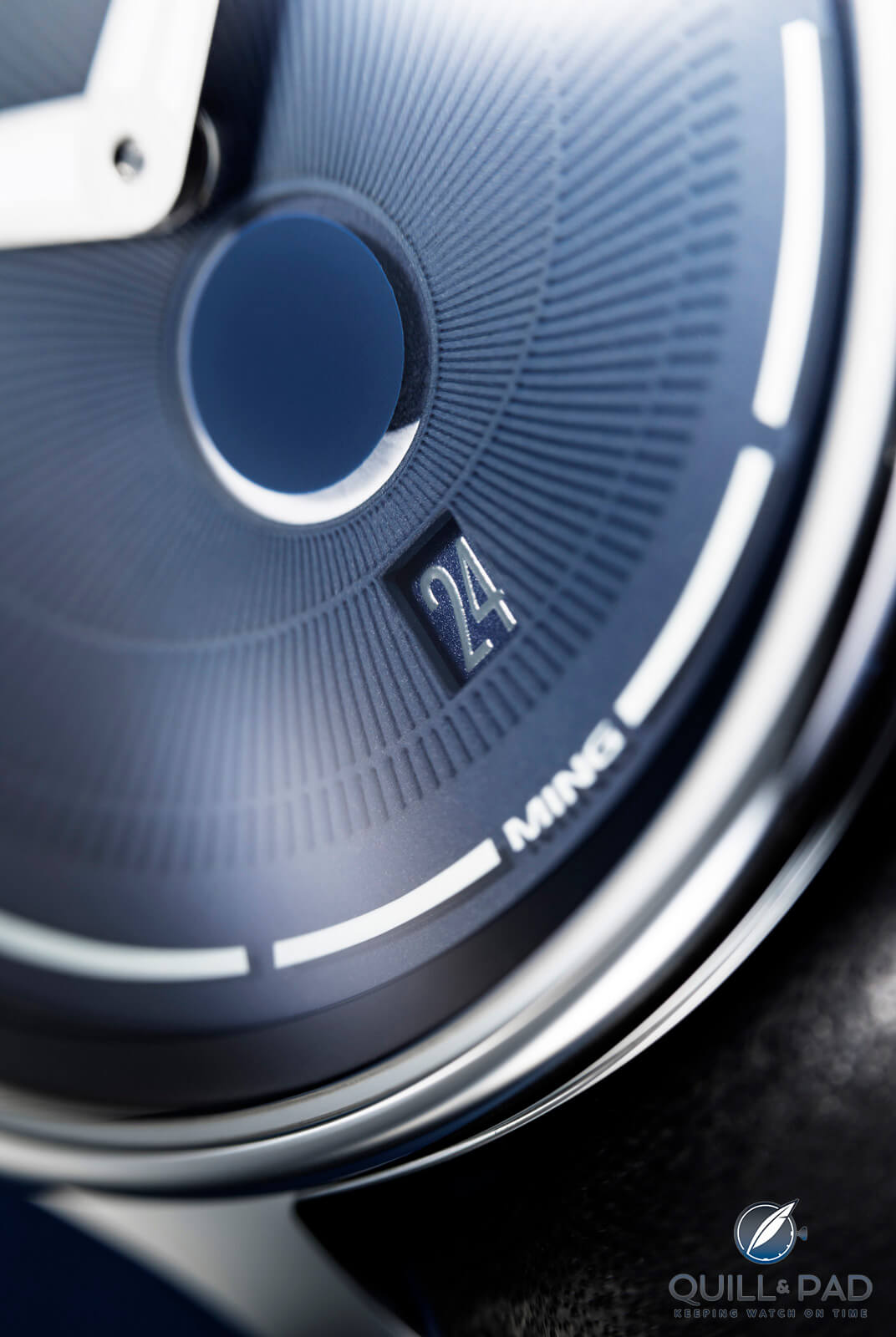
Ming 37.05 Moonphase date
That clear effort to create a cohesive design is then challenged just below the moon phase with a square date window. With the smooth lines on every other portion of the watch, the square date window stands out. It is nestled nicely between two hairline rows that break up the swirling dial pattern, providing an anchor for the window that makes more sense in context with the entire dial, but the squareness of the window is surprising, to say the least. Ming understood when adding a date window that it mustn’t interfere with other details of the dial such as numerals or sub dials, and it needs to blend as well as possible with matching background color.
Ming 37.05 Moonphase
Ming goes a step further and creates a tone-on-tone aesthetic with a slightly lighter shade of blue for the numerals on the date disk, something so many brands could and should emulate. The tone-on-tone date keeps it as subtle as a square date window can be, but it could have mirrored the shape at 12 o’clock in some way, even just becoming a slightly bulging square with rounded corners. That shape is commonly called a “squircle” which perfectly encapsulates MING’s relationship with flat edges.
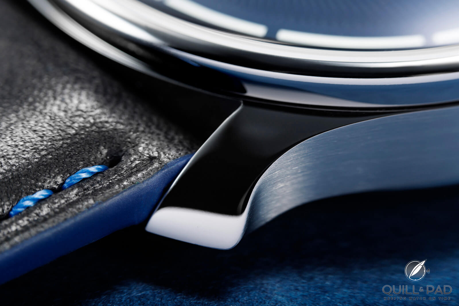
Curved lug of the Ming 37.05 Moonphase
Design over function
But this is where we return to the idea of form versus function, something I would argue is the only thing that makes unique and interesting watches different from each other. Ming has made it clear that designing its watches is a long and precise process, with dozens to hundreds of contrast design decisions and prototype components to compare. As someone that has sketched a bunch of moon phase design ideas, I know there are many paths one can take for displaying the phases of the moon, some are more accurate and some more figurative.
Ming 37.05 Moonphase
Ming seeks aesthetic cohesion, this much is obvious, and the annular moon phase display matches exquisitely with the general design language the brand has created. I don’t think anyone could argue the opposite. Being a small brand that builds in batches, this also creates very specific requirements for development of a new watch, limiting choices of mechanics based on the desired price point. Ming has demonstrated over its various models that price is highly relative to what can be accomplished, but aesthetics can be carried over an entire brand.
Designing a moon phase that is one of the least obvious to read moon phases that I have seen demonstrates that Ming has generally settled on form over function, especially with such a superfluous complication. I love moon phase watches, they are my singularly favorite complication, but even I can’t defend them as being super useful. I am also one that defends the use of style to explore ideas so we understand what excites us.
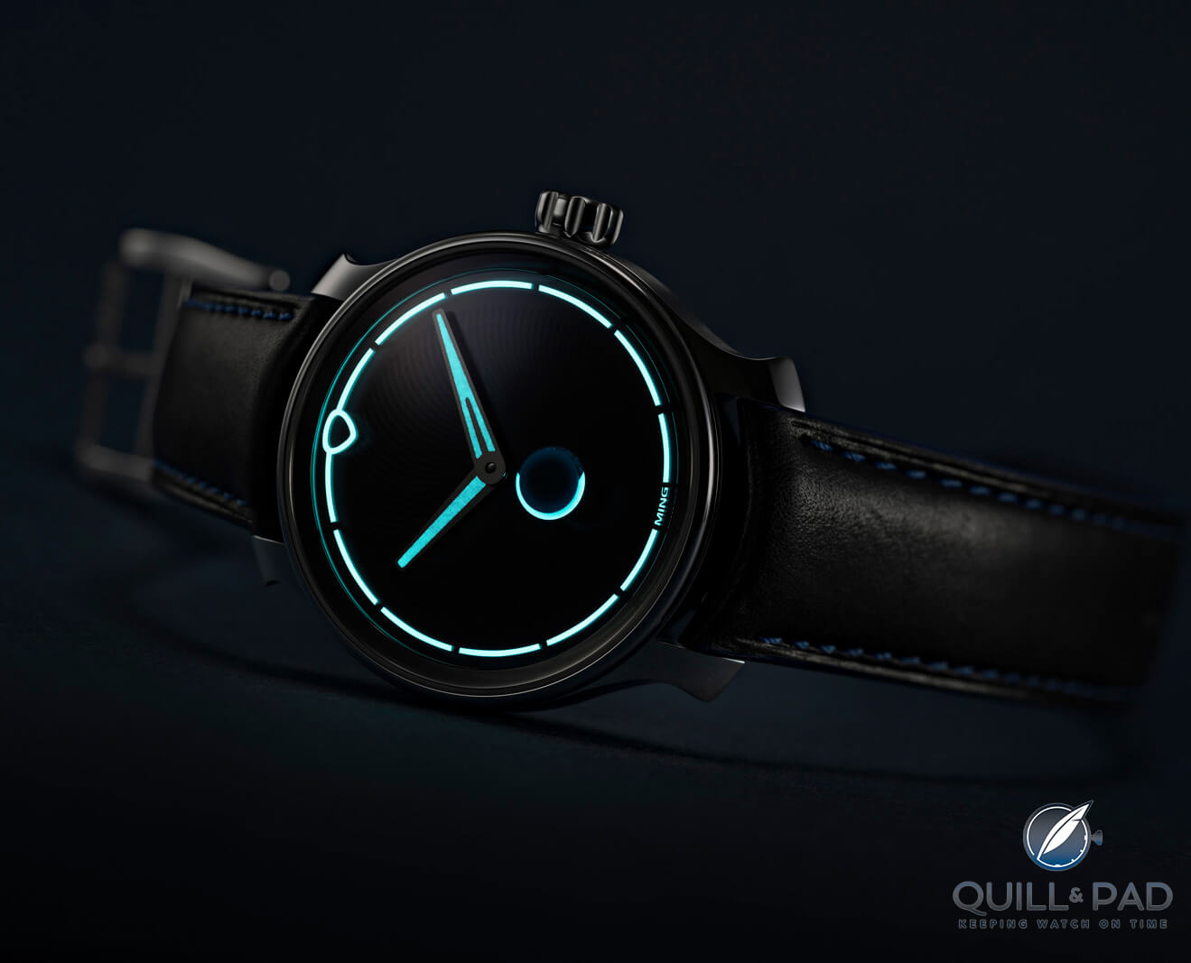
Ming 37.05 Moonphase lume shot
Function still matters
An annular moon phase display is awesomely integrated into the Mingaesthetic, but it isn’t the world’s best moon phase display. A lot of that comes back to practicality as well. Form over function is great, but function is still critical to a project’s success. Moon phase mechanisms are not super common across the industry, so there are a limited number of calibers to begin with before needing to design an add on module for complete customization. Using the Sellita SW288-1M, a manual winding version of the SW288, saved 1.2 mm of case thickness and provided an easy to integrate central moon phase display for a larger impact without needing a whole custom module.
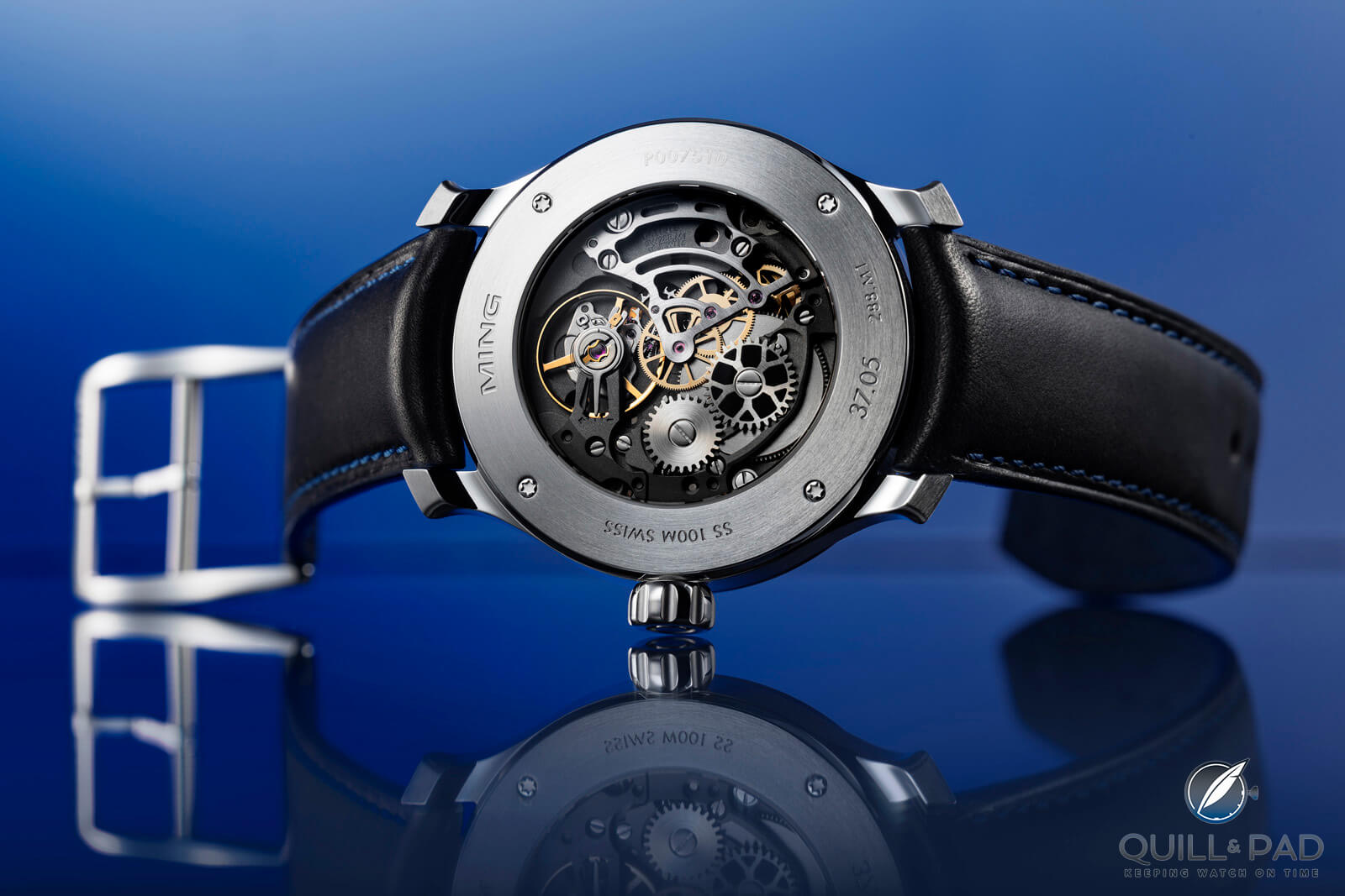
Back of the Ming 37.05 Moonphase
Opting for that movement has tradeoffs, including the need to wind your watch every day to maintain moon phase accuracy and being a fair bit smaller than the eventual case diameter which is a common complaint from collectors about all sorts of watches. But Ming also tried to offset these tradeoffs by having Schwarz-Etienne fully rework the caliber to make it a more refined product, adding value to the off-the-shelf caliber. The design of the moon phase display and the dial as a whole works very well with the spacing of the date and other design elements, working with the fact that the size differential is there.
Brands often tout their moon phase accuracy as impressive, but as the SW288 has the lowest precision of 1 day of correction being required every 2.7 years, maintaining perfect consistency is already more difficult. Even if you wound it every day, and it was your only watch, you would still start to drift. But as the moon phase display is not clearly obvious means that a shift of even a couple days is not a big deal since the visual depiction doesn’t match what you are seeing in the sky anyway.
This is not the moon phase watch you buy for accuracy, nor is any watch with the SW288. This is the watch you buy for the aesthetic, and you get the bonus of a relatively accurate moon phase. For the effort that went into the design of the 37.05 and upgrading the movement, the moon phase is a feature you like for how it looks. Not every moon phase watch will compare to the Ochs und Junior or an Andreas Strehler, because design intent matters just as much as mechanical intent. And this coming from a guy that likes mechanics more than watches.
Things can be grouped in different categories for different reasons, and Ming watches are form over function as they are obsessive about aesthetics. But that doesn’t mean they skimp on the mechanics, it’s all just relative. Never have I wanted a moon phase watch this much precisely for its lack of clearly showing a very accurate moon phase, because this watch is design-minded, and I’m happy that they didn’t skip the moon phase all together. Perhaps they will revisit the complication with a module later and try a different idea — and I will probably adore that one too.
Ming 37.05 Moonphase
As the sun sets and the moon comes out, let’s break this down!
- Wowza Factor * 8.8 MING design always brings a wow, and seeing a moon phase was an extra surprise for me!
- Late Night Lust Appeal * 88 » 862.985m/s2 Of course this is a high late night lust appeal, staying up to see the moon and share in the luminous display is what this watch is about!
- M.G.R. * 56.4 The Sellita SW288 is a solid hand winding movement that Schwarz-Etienne put some very nice rework into to make a pretty cool moon phase watch!
- Added-Functionitis * Mild Given that the moon phase is a tish more aesthetic than precise, the added date keeps this functionitis mild enough you can get children’s strength Gotta-HAVE-That cream while taking it for a spin in the moonlight!
- Ouch Outline * 9.7 Twisting your ankle running with your dog! Empty fields are not level fields, and it is very possible both you and your canine friend could step into a gopher hole and end up with a limp for a week. Still, if I was running to catch the 37.05 I’d happily take the risk!
- Mermaid Moment * A unique take on a moon phase! Precision sometimes can’t compete with aesthetics and with this piece it’s enough to have you writing your vows!
- Awesome Total * 888 Start by taking the number of pieces in the limited edition (500) and add that to the depth of water resistance in meters (100) as well as the caliber number (288) to end on a beautifully balanced awesome total!
For more information, please visit www.ming.watch/products/ming-37-05-moonphase-2.

Quick Facts Ming 37.05 Moonphase
Case: 38 x 11.9 mm, 316L stainless steel
Movement: manual winding caliber Sellita for MING SW288.M1, 38-hour power reserve, 28,800 vph/4Hz
Functions: Hours, minutes, date, moon phase
Limitation: 500 pieces, sold out
Price: 4,950 Swiss francs
You may also enjoy:
Creator Conversation: An In-Depth Discussion With Ming Thein Of Ming Watches
Why I Bought It: Ming Watches Model 17.06 Monolith
Ming 18.01 H41 And 27.01: Revolution And Evolution
The 10 Most Accurate Moon Phase Wristwatches Today, Plus Honorable Mention


Leave a Reply
Want to join the discussion?Feel free to contribute!