GaryG’s Favorite Watch Photos of 2021
by GaryG
With another year in the history books, it’s time for me to move my prior year’s photos from my desktop computer into backup storage while scanning through them to pick out my personal favorites from the past 12 months to share with you. Some have appeared in articles here on Quill & Pad; others have featured on my Instagram page, @garyg_1.
Out of the darkness, brightly lit
Once upon a time, almost all my photos were in a hallmark “moody” style – I’ll come back to some of those later – but more recently, both due to an evolution of my personal preferences and the capabilities of the Hasselblad X1D II versus my older Nikon D810, I’ve been featuring a higher-key look. In many cases, the result gives the impression of a spaceship emerging from the darkness, as with the image of my Greubel Forsey Invention Piece 1 below.
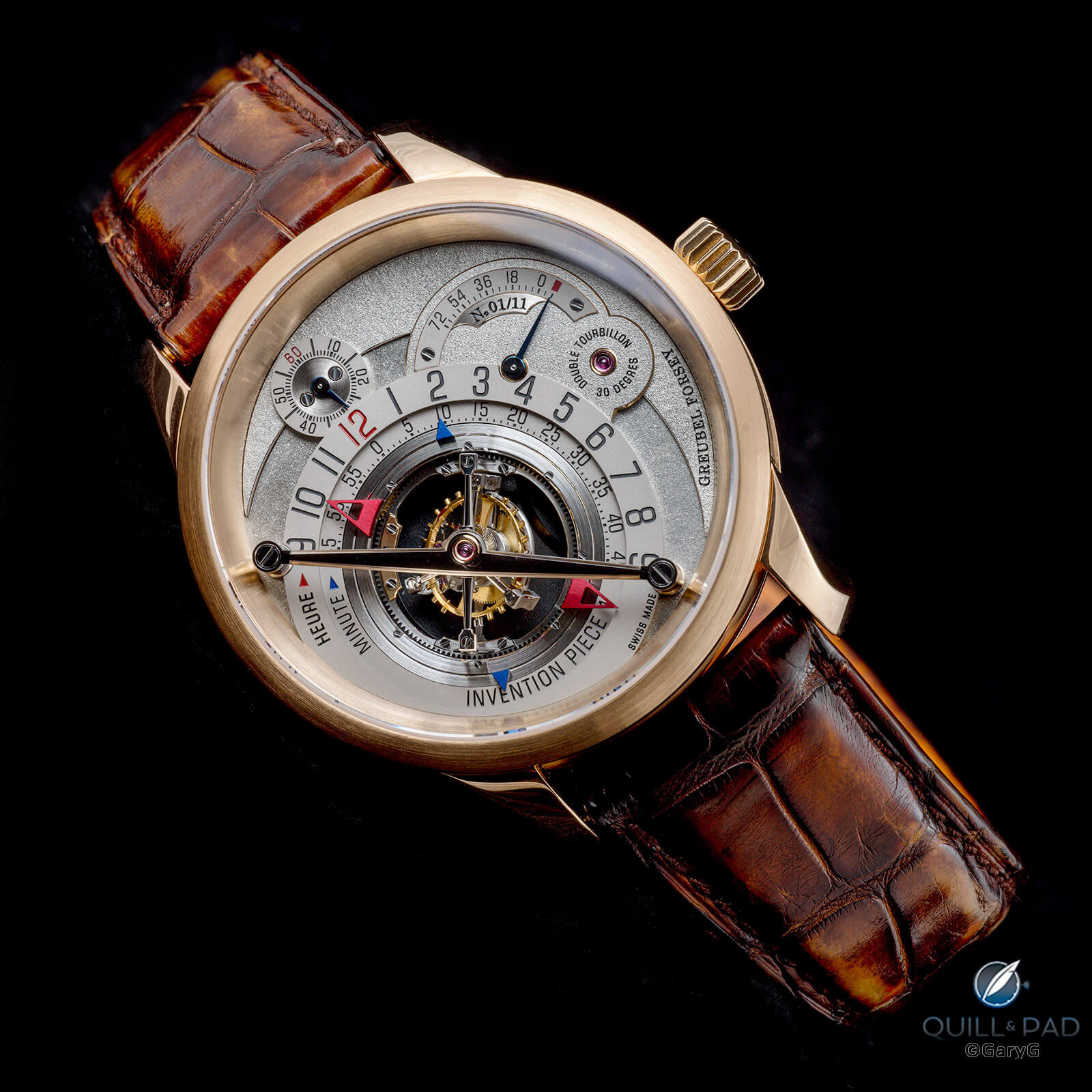
Vivid look: Invention Piece 1 in red gold by Greubel Forsey
Other favorites of mine in this style from 2021 include the following.
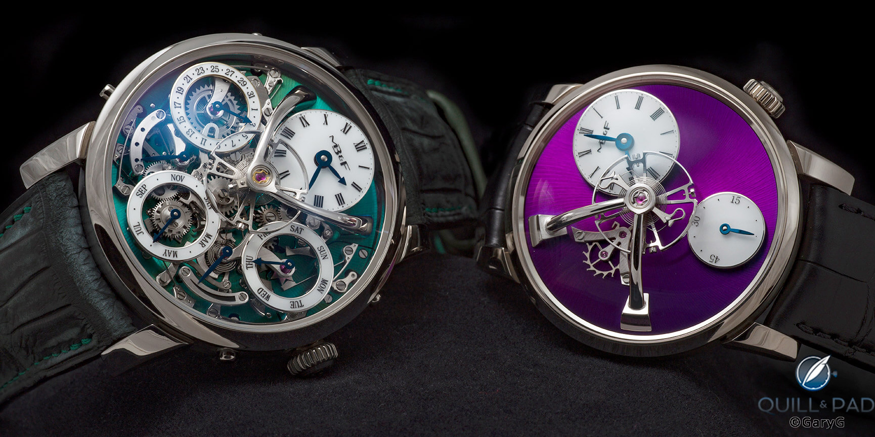
A good friend’s Legacy Machine Perpetual from MB&F with a tasty green dial.
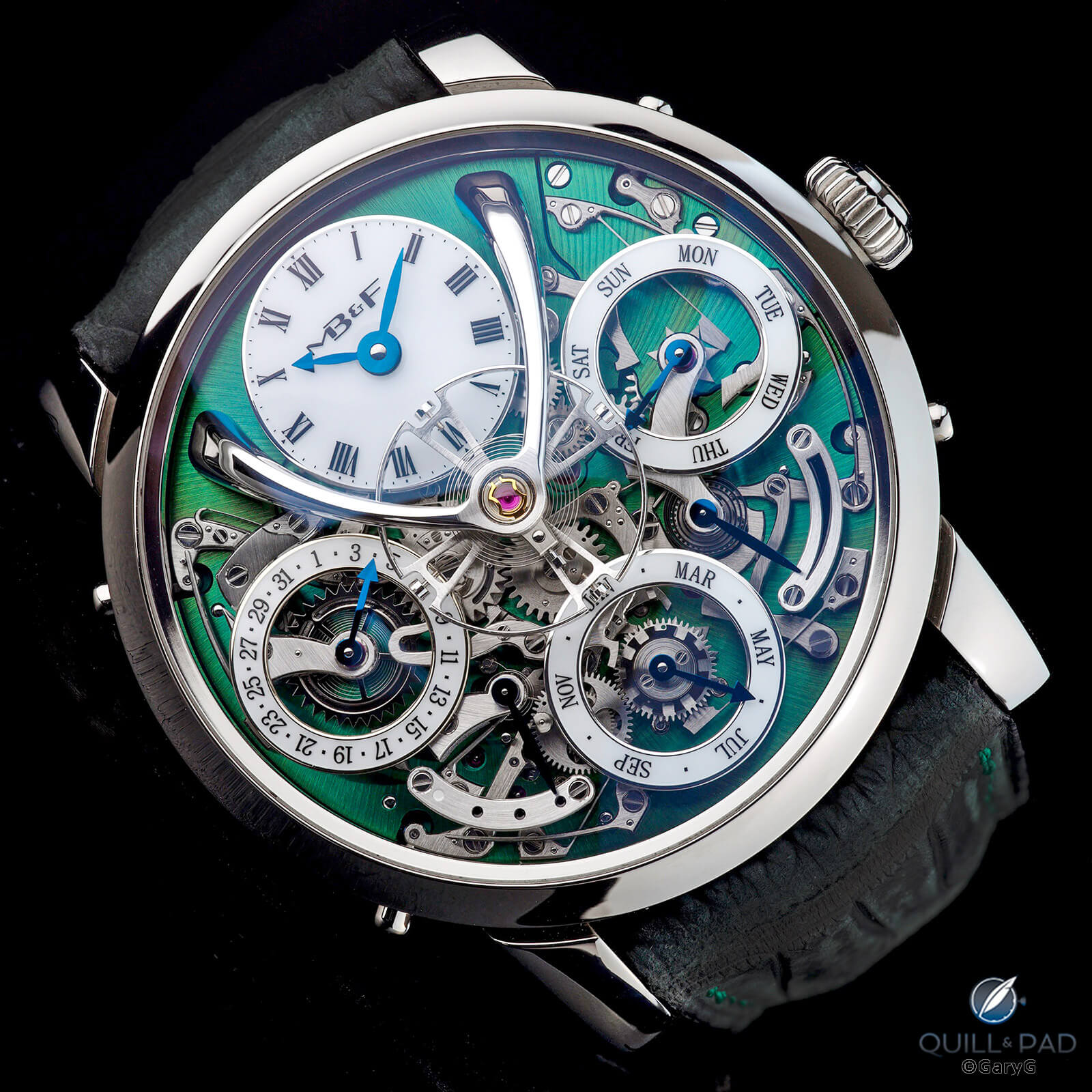
MB&F Legacy Machine Perpetual
My own MB&F piece, the 2021-edition LM101 in white gold with superb (but hard-to-shoot) purple dial.
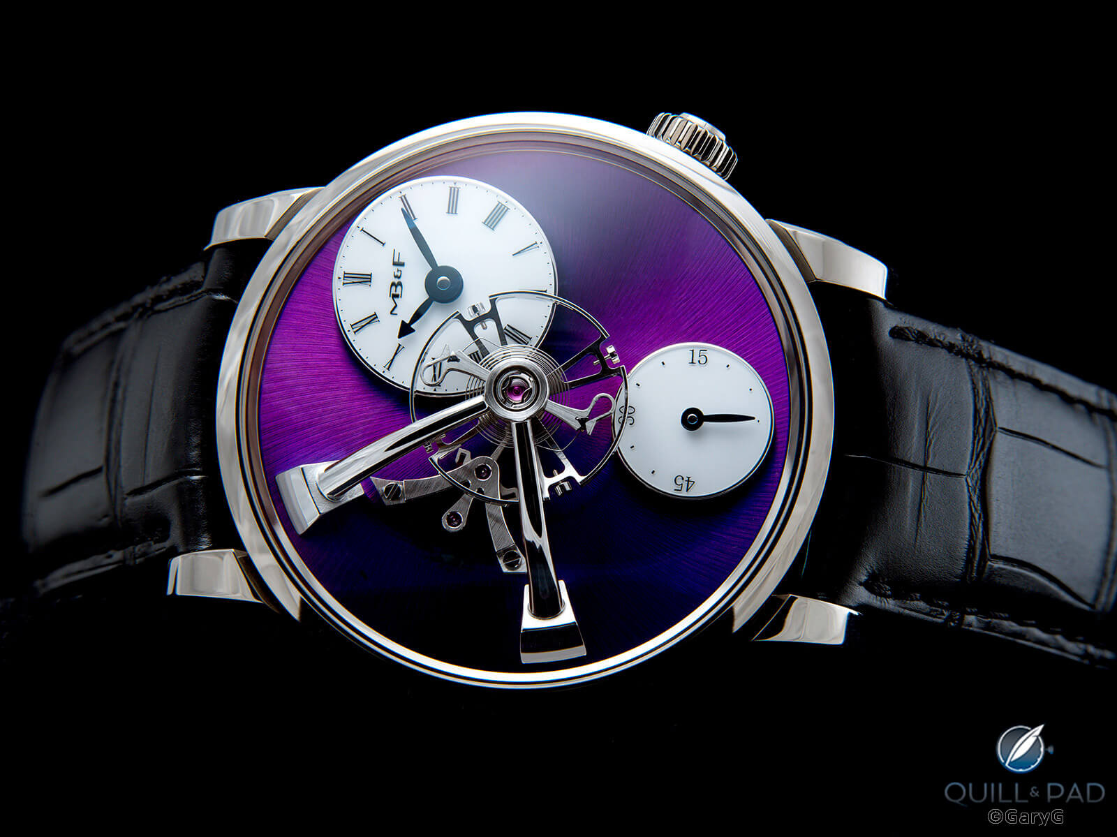
Pure purple: MB&F LM101 in white gold
A back-of-the-safe favorite, my vintage Omega Ploprof with just enough flex in its original shark mesh bracelet to allow for an attractive S curve positioning.
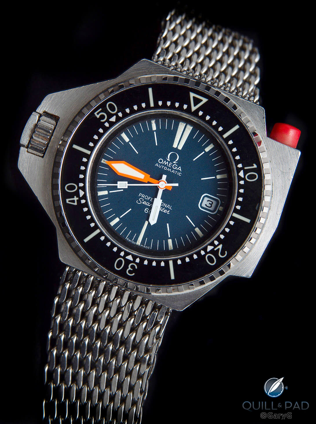
Vintage goodness: Omega Seamaster 600 Ploprof
A friend’s Kari Voutilainen 28SC with vivid blue dial. Having looked multiple times at both the image and the watch itself, I’m still not certain whether the slight apparent difference in hue between the central dial and surrounding ring is due to an actual color variation or to the way the light catches the two guilloche patterns.
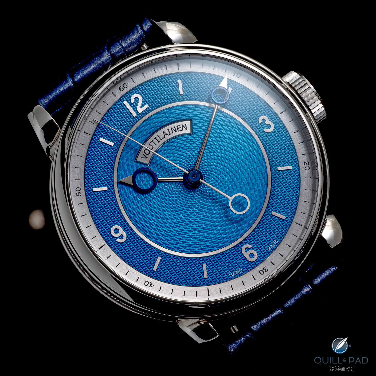
Am I blue? 28SC by Kari Voutilainen
One more note about the shot above: I used a bit of light scatter on the crystal to add depth and make the hands more easily visible, a topic I’ll come back to below.
The vivid style works for movements as well, as with this image of the back side of my A. Lange & Söhne Odysseus. One indication that a photo is a keeper is when the colors of the “white” metals are clearly distinct from each other: you see that here with the German silver vs. steel components of the movement, case, and bracelet.
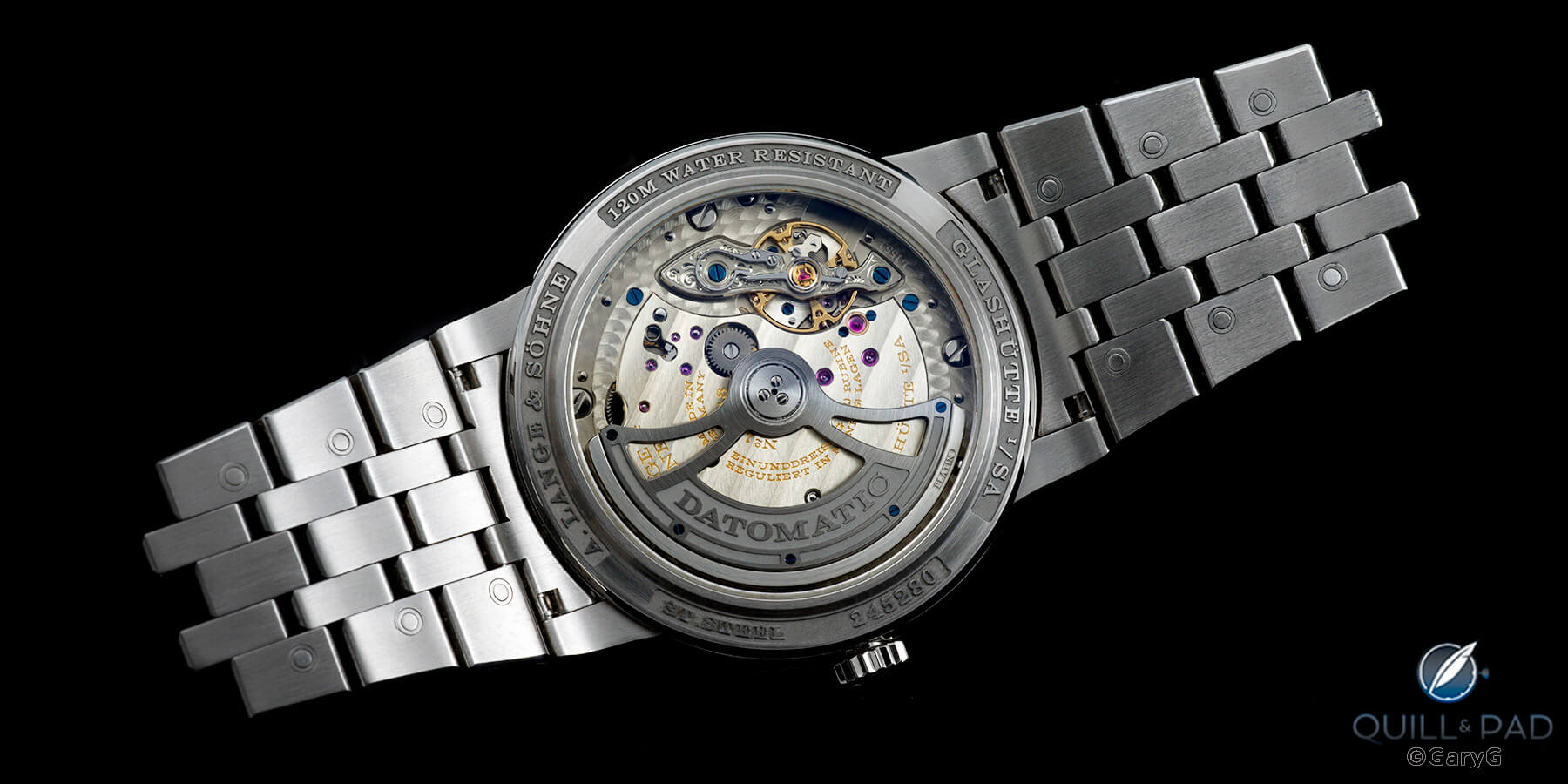
Movement view, A. Lange & Söhne Odysseus
While we’re with A. Lange & Söhne, here’s a photo of one of my top additions of recent years, the stunning 1815 Rattrapante in Honeygold Homage to F.A. Lange showing the lightly textured black dial and grooved subdials along with the pink gold accents that for me bring the Honeygold case more to life.
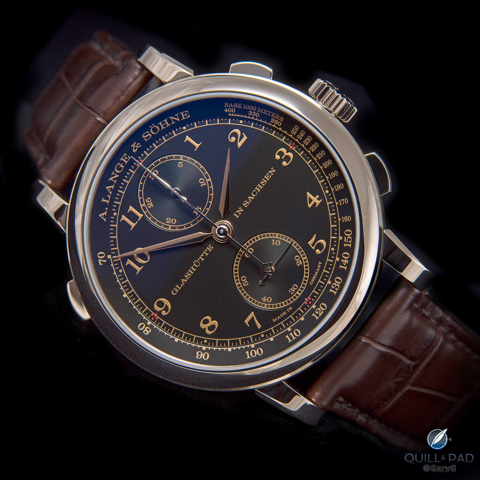
A real honey: A. Lange & Söhne 1815 Rattrapante Honeygold Homage to F.A. Lange
And continuing the black-with-gold theme, my other big incoming of 2021, the Chronomètre Contemporain from Rexhep Rexhepi and Akrivia in red gold with enamel dial.
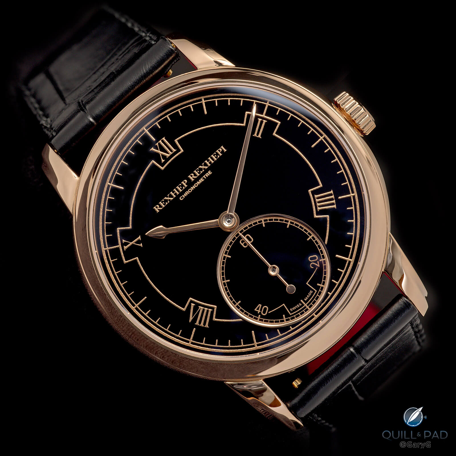
A dial darker than Satan’s basement: Rexhep Rexhepi Chronomètre Contemporain
Later in the year, I had the opportunity to photograph the prototype “Old School” watch from Massena Lab co-developed with watchmaker Luca Soprana. Challenges included capturing the grained surface of the central section, communicating the visual interest of a very simple-looking dial without creating an image that doesn’t look like the watch itself, and getting enough light on the dark blue hands to make sure they didn’t appear black.
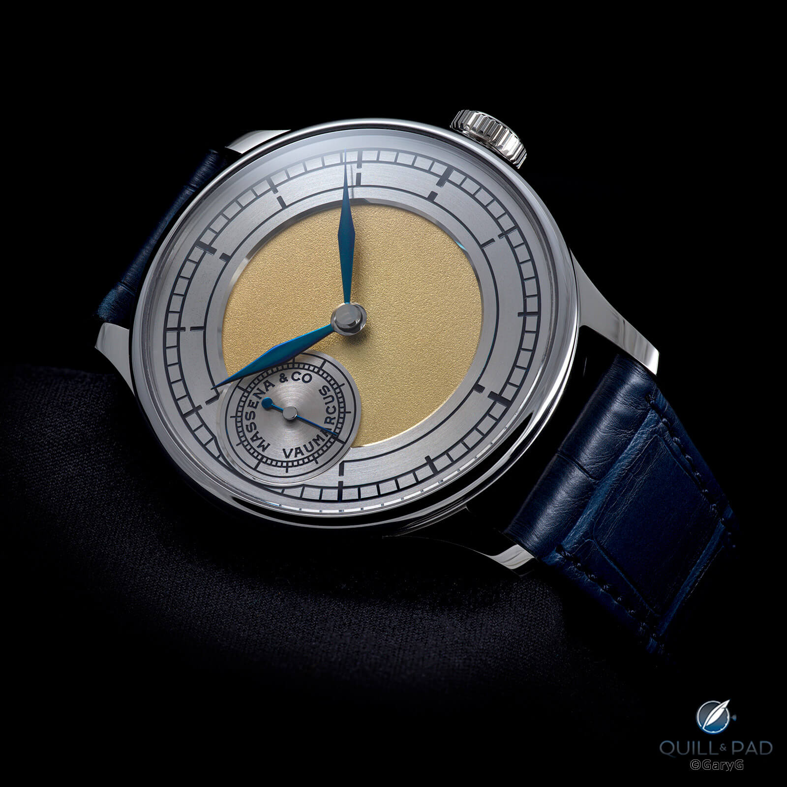
Simple yet striking: Old School by Massena Lab x Luca Soprana
In December, a friend loaned me her treasure, a unique The White watch by David Walter with dial by Joshua Shapiro and classical characters penned by a Chinese calligrapher and engraved by Artur Akmaev. The brushed and guilloche surfaces caught the light beautifully, and Walter didn’t protest when I proposed renaming the watch “the Walter White.”
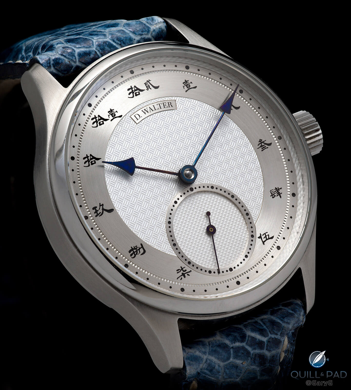
Heisenberg? The White by David Walter in custom prototype form
A final shot in the vivid category before moving on: my Journe Society watch in straw gold. That dark blue disk with the moon and stars is incredibly difficult to light without blowing out other areas of the watch; I’m pleased with the way this shot turned out, including giving a true impression of the cream color of the hands and indices and not-quite-yellow gold case and the two blues of the moon phase and main dial.
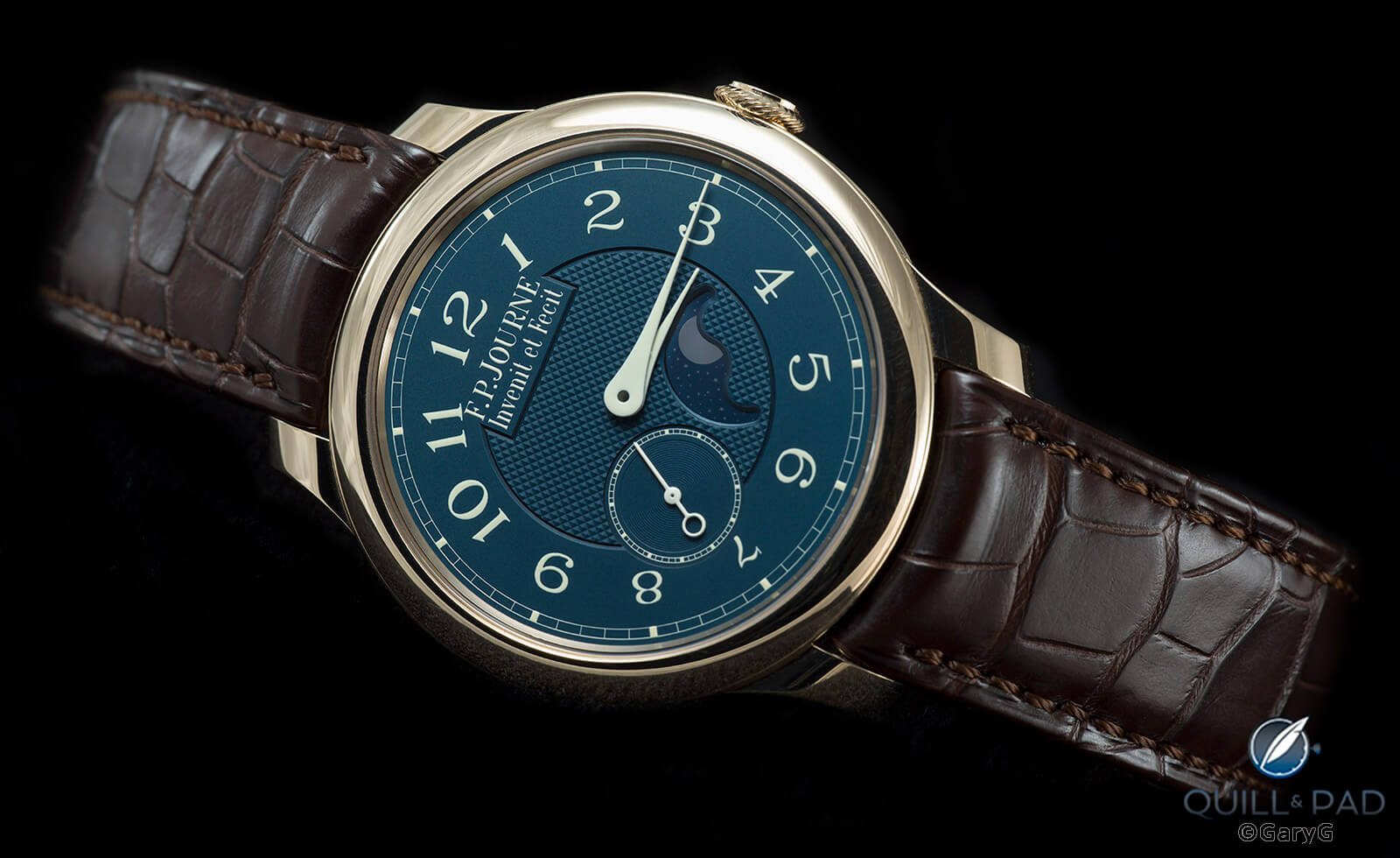
F.P. Journe Society watch, property of the author
Getting moody
I didn’t forsake my traditional moody look in 2021, however! I really enjoyed shooting in that style from time to time and reminding myself that achieving this effect requires a lot more than underexposing the image as so many other folks posting these days seem to do when they attempt this approach.
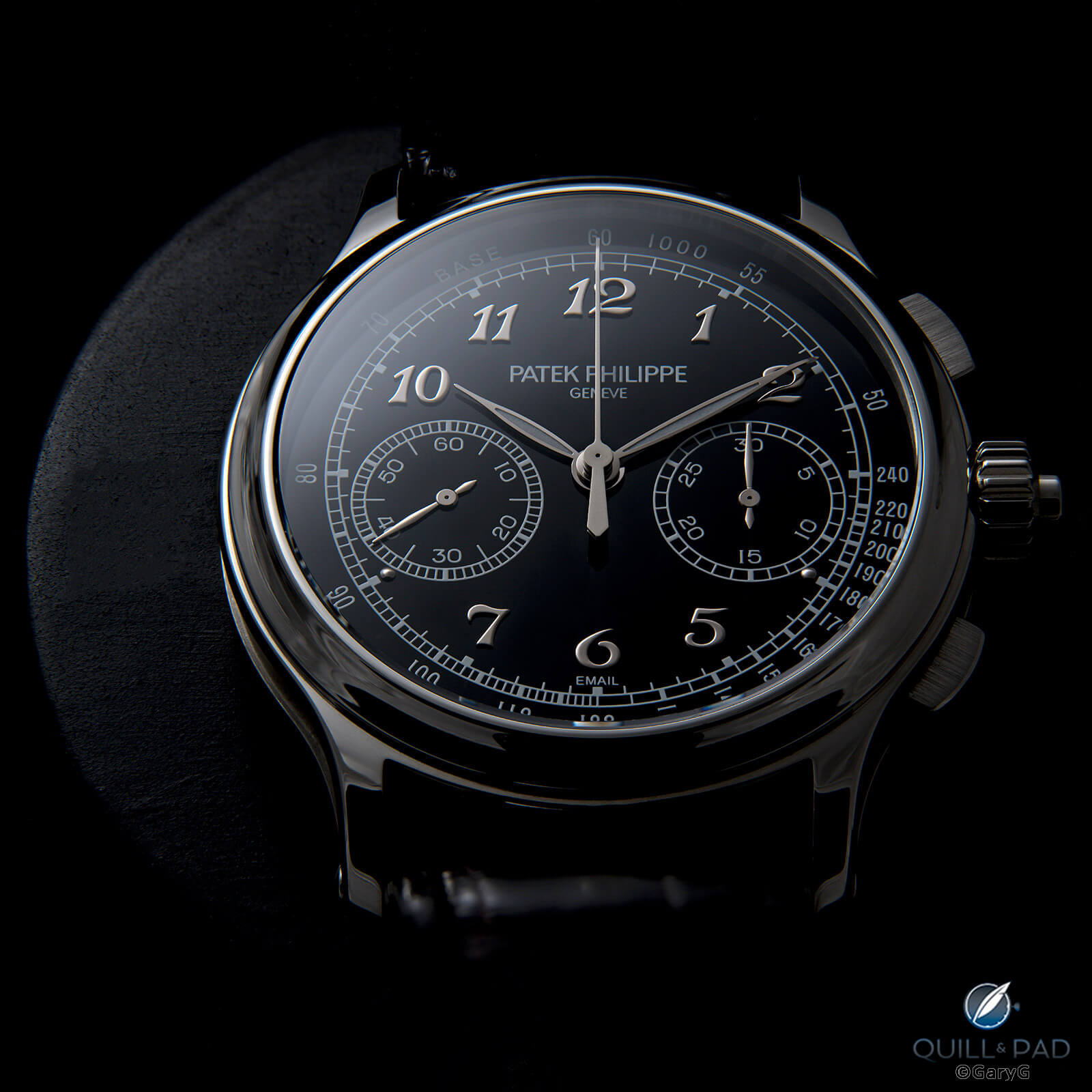
Moody view: Patek Philippe Reference 5370P split-second chronograph
In making the photo above, the key was using highly directional light to throw deep shadows while keeping the bright bits bright – in particular illuminating the contours of the platinum case and white gold hands and indices. There’s always the risk of blowing out polished areas; I had to work hard to achieve the Goldilocks balance of not-too-bright, not-too-dark with the small hands, applied numerals, and leading left edge of the bezel.
A second moody image, this time with considerably more light on the dial, was part of my series with a good friend’s Patek Philippe Vintage Collection Reference 5059G salmon dial.
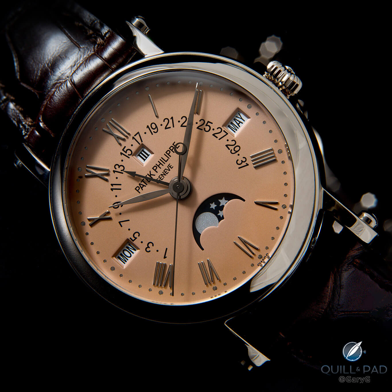
Dark look at a rare classic: Patek Philippe Reference 5059G salmon dial Vintage Collection
As with the Journe Society watch, getting enough light on the moon phase was not simple, nor was making the hands and applied indices appear without blowing them out. Unlike with the shot of my 5370P above, where I used light scatter from the bezel to do the trick, here I used a bounce card in front of the watch to throw just a bit of light on the indices and hands.
I could shoot the MB&F HM4 all year long! A photo session with a friend’s piece yielded many of my favorite shots of the year, but I’ll just share one here that for me gives the impression of a spaceship lurking just off the port side.
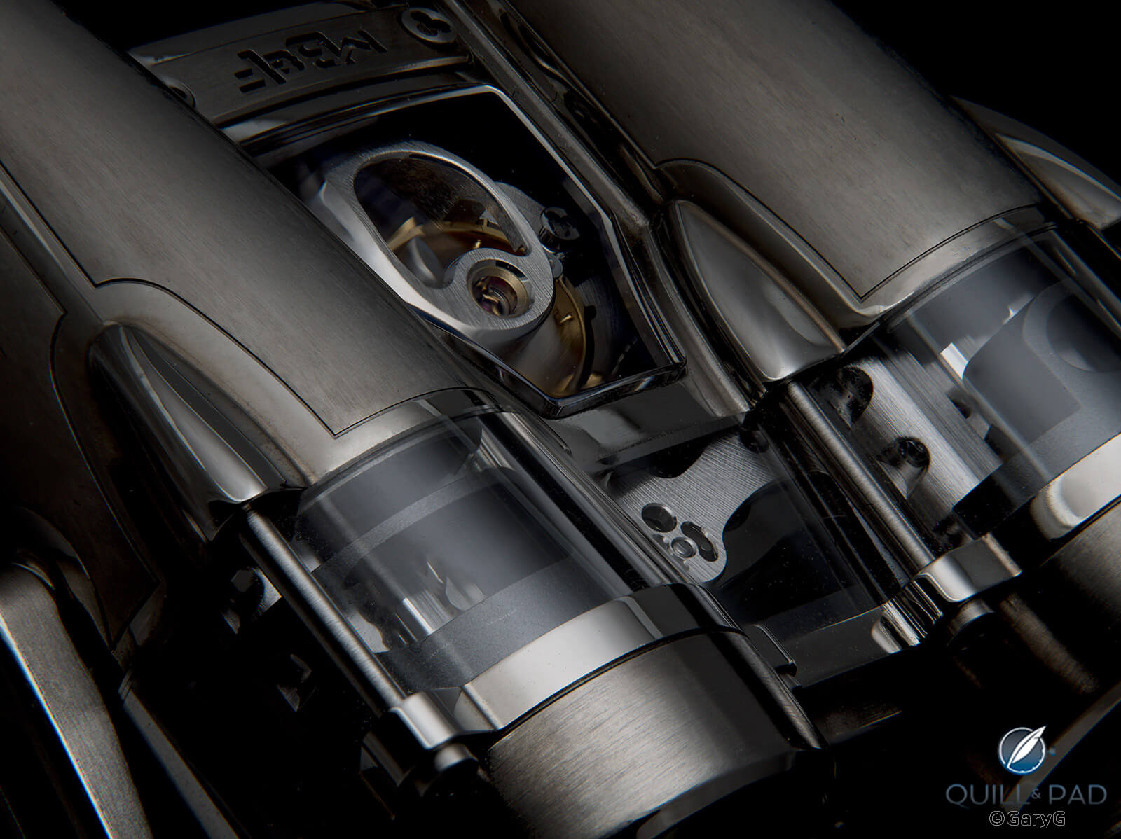
Energize shields: MB&F HM4 profile
Scatter shot
I’ve mentioned the use of scatter – intentional diffraction of light through the crystal – a couple of times already. As a rule, I don’t use much scatter, both because I really like an ultra-clean look and because too many other folks who haven’t learned how to eliminate reflections tend to overuse it.
Still, there are occasions when it’s useful! A case in point: my photo shoot with the H. Moser & Cie Swiss Alp Final Upgrade when it served well to show the hands and seconds subdial properly against the light-sucking Vantablack dial.
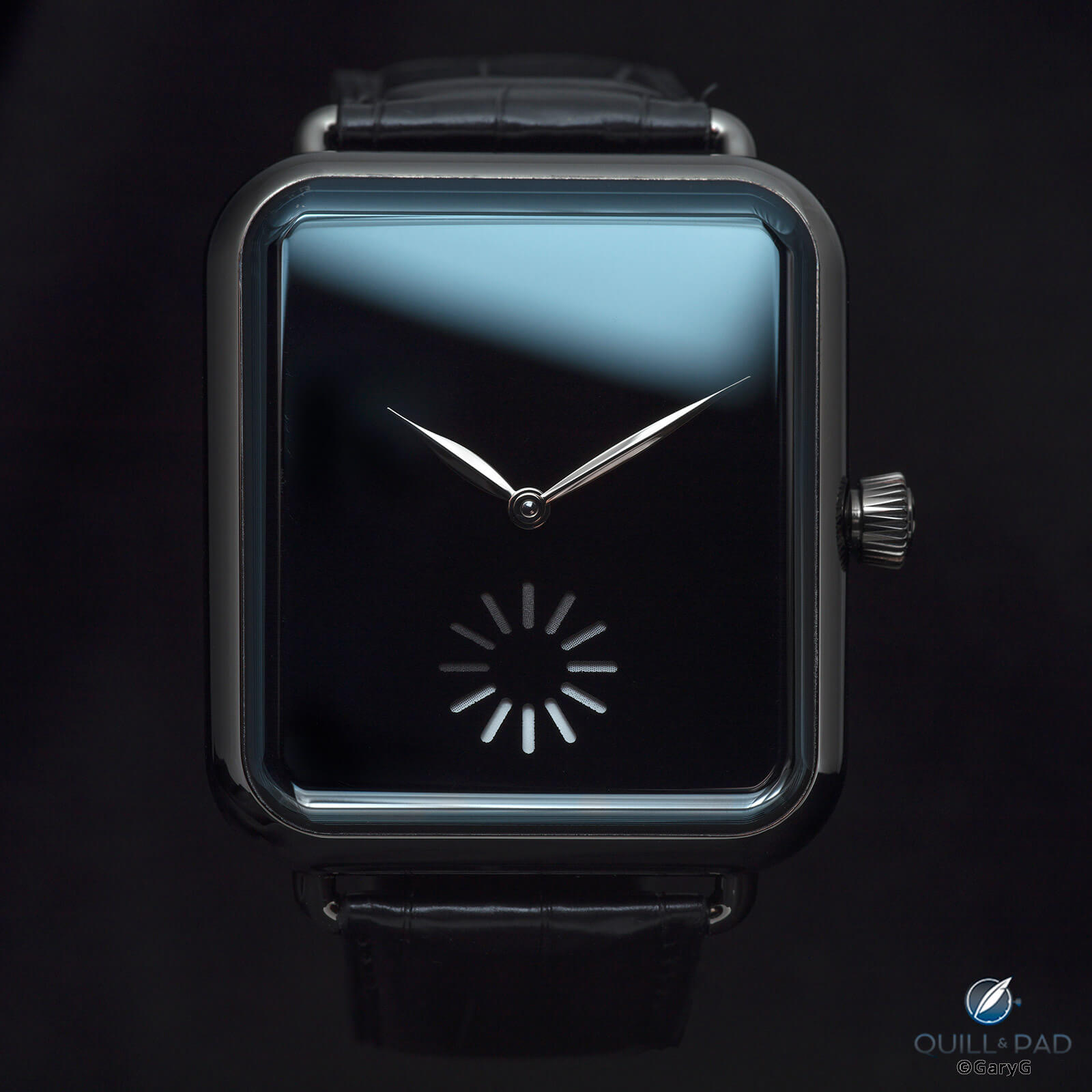
Swiss Alp Final Upgrade from H. Moser & Cie: using scatter to reveal highlights
Other black-dialed watches also benefitted from the application of scatter, including the Kurono Chronograph 2 and Massena Lab Archetype 0.0.
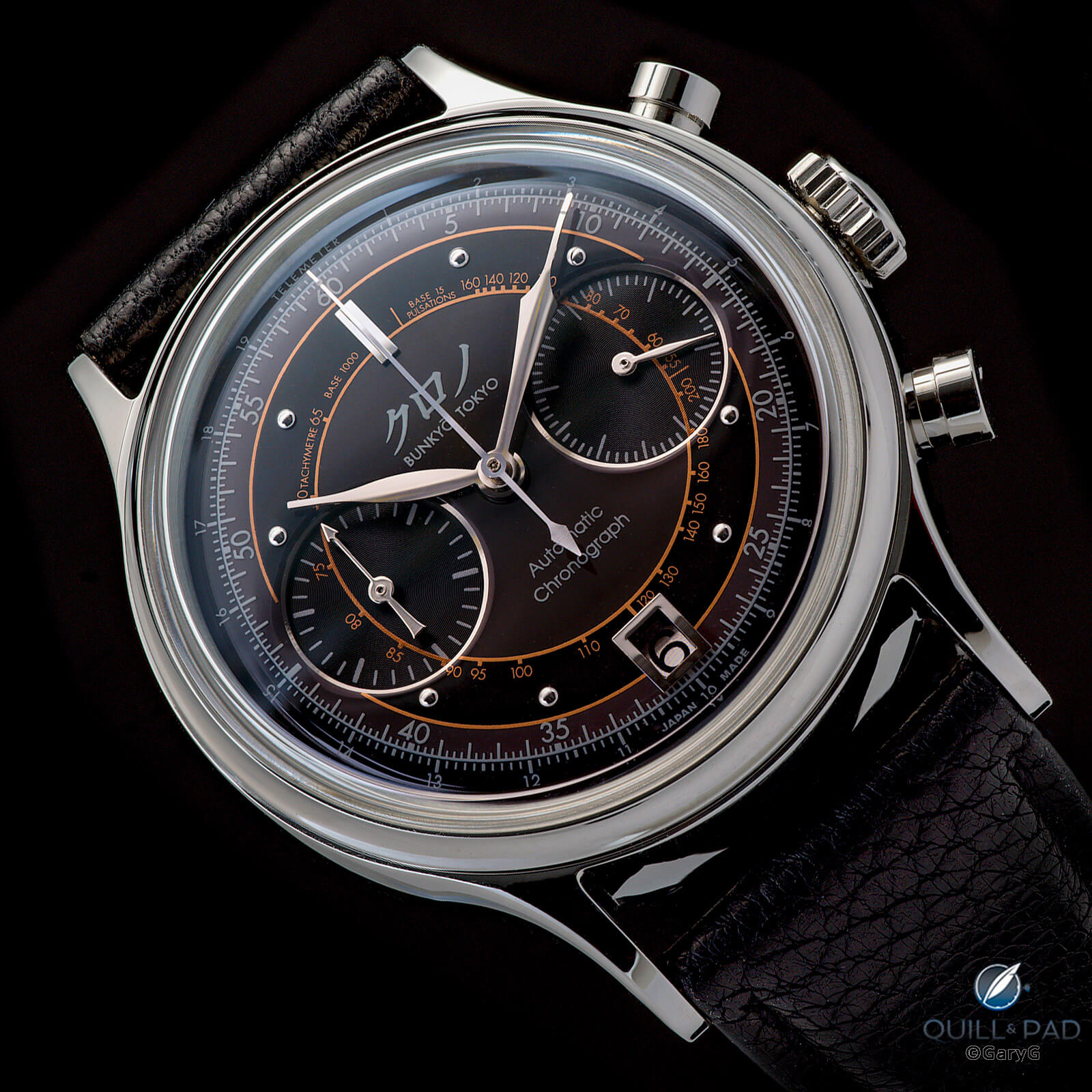
Illuminating case, dial, indices, and hands: Kurono Chronograph 2 by Hajime Asaoka
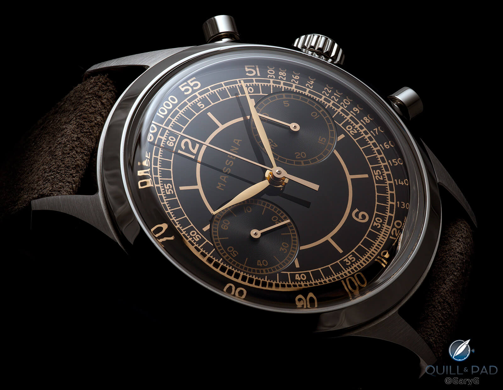
Bringing out gilt details: Massena Lab Archetype 0.0
And for the unusual brown stone dial of the H. Moser & Cie Tiger’s Eye, a subtle low-angle splash of light on the crystal was exactly what was needed to give some life to the stone, illuminate and show the profiles of the hands, and make the exposed tourbillon pop.
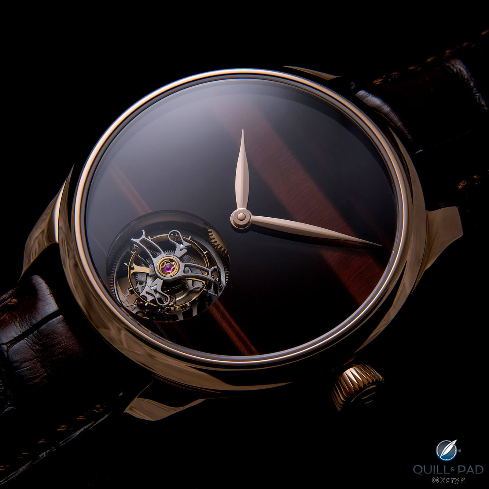
Eye of the tiger: H. Moser & Cie Endeavour Tourbillon Concept Tiger’s Eye
One of my most well-received shots of the year was one in which moody met scatter: a low-profile image of a friend’s unique 41 mm 28Sport from Kari Voutilainen. The perfection of the onyx central dial draws us in, but the light allows us to see critical details including the lume-filled hands with blued rings, guilloche, and brushed chapter ring.
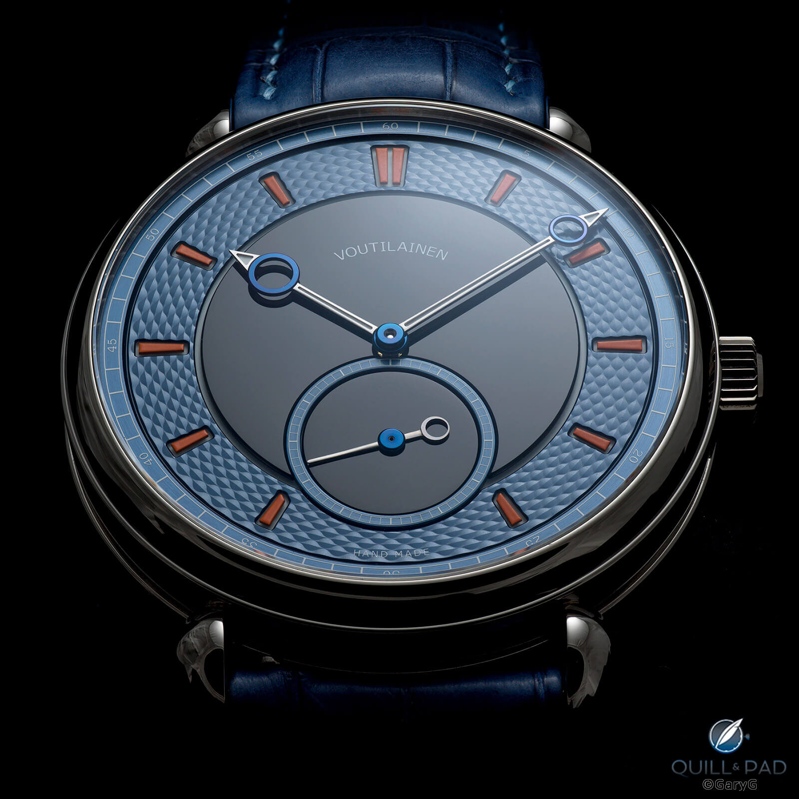
Moody blue (and black): Kari Voutilainen 28Sport
Variety is the spice of life
It’s nice to shoot in an easily recognizable style, but I’m always game to try alternative setups and techniques, too. Here are few examples from this past year, starting with a profile shot of the MB&F LM Perpetual.
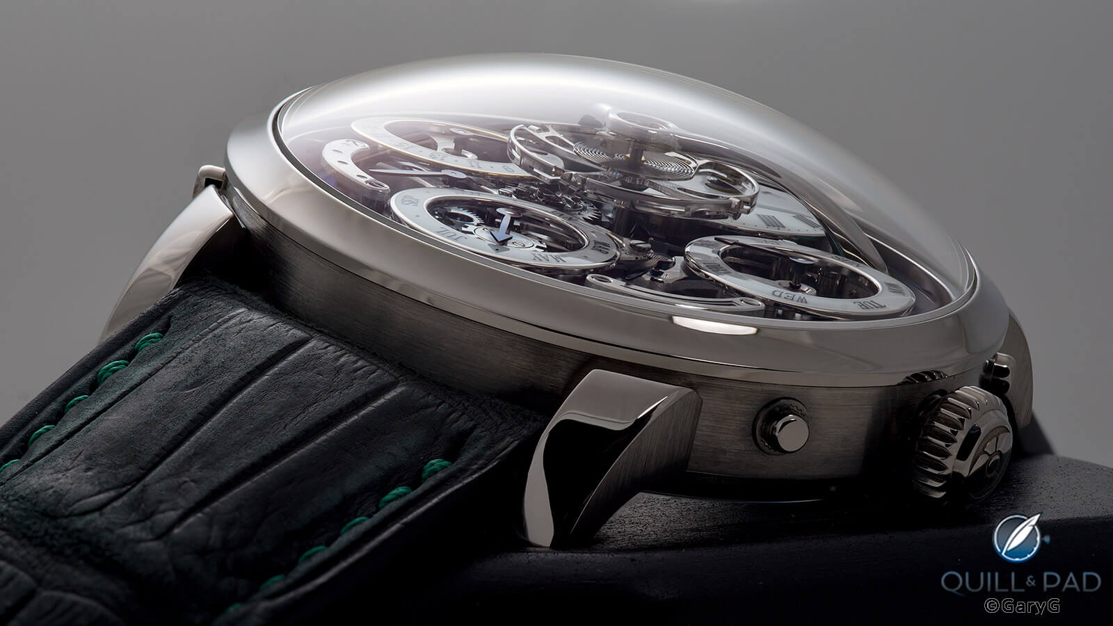
Exposing the layers: MB&F Legacy Machine Perpetual
The movement side of my pal’s unique Voutilainen 28Sport looked good against my usual black background, but I thought it popped even better using a glossy white base.
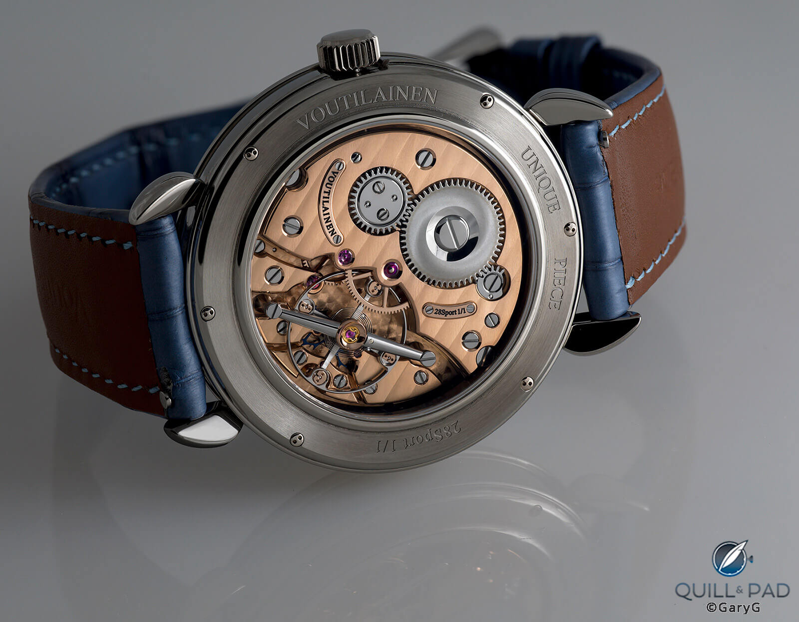
One of a kind: 44 mm Voutilainen 28Sport, movement view
I like to observe Greubel Forsey’s request not to show the detailed inscription on the reverse of the Invention Piece 1, but I also like shooting the watch and want to share it! A few post-processing tricks played a role, but I believe I met both goals with the image below.
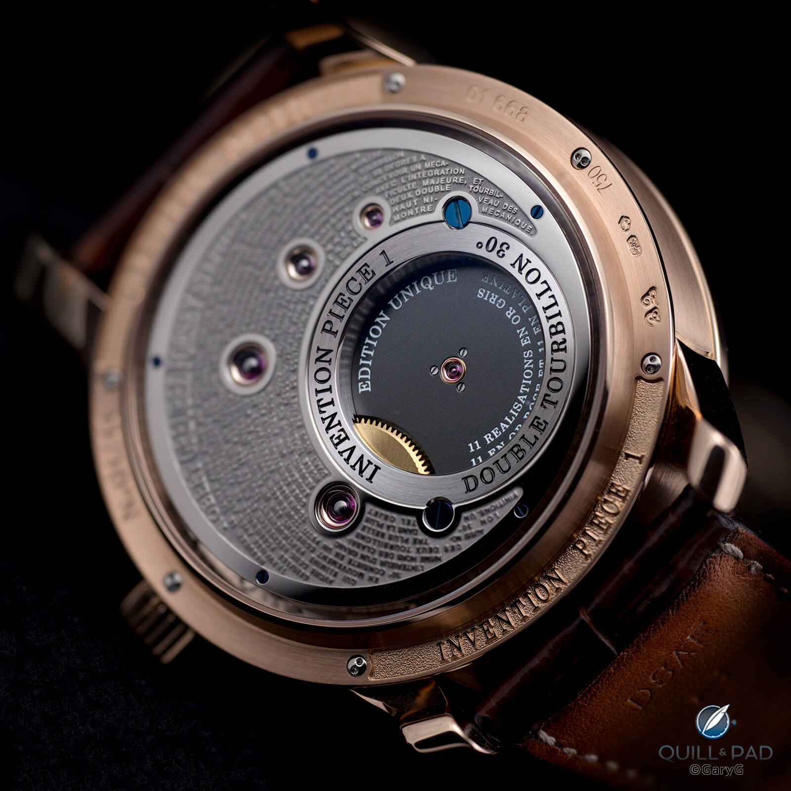
Don’t read this: reverse of the author’s Greubel Forsey Invention Piece 1 with etched inscription
I like shooting case profiles, and this year none was more notable than that of the M.A.D.1 from Max Büsser.
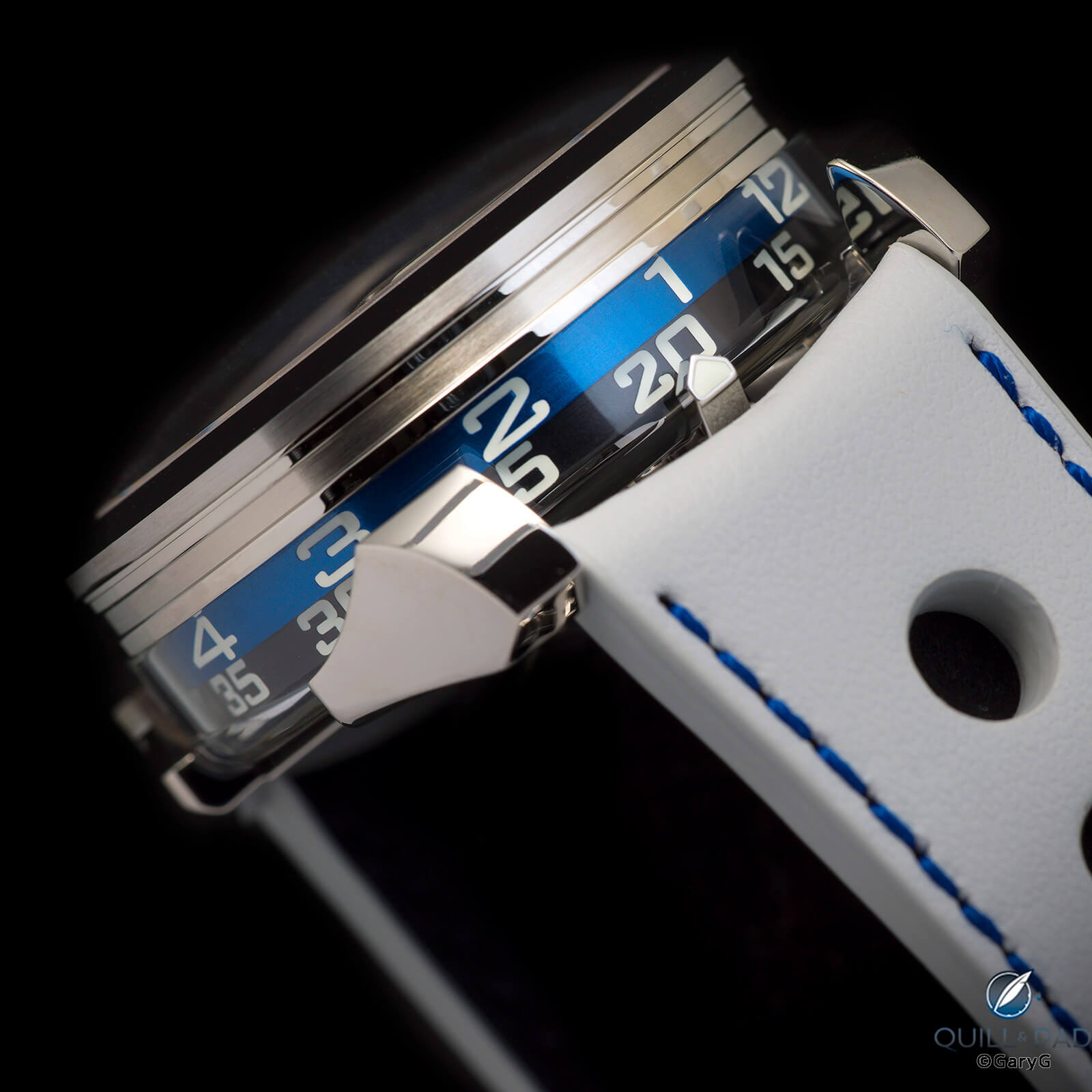
Time on the edge: peripheral time display, M.A.D.1
Speaking of Mr. Büsser, he was kind enough to compliment this shot of my MB&F LM101 in its distinctive presentation box cum desk display case.
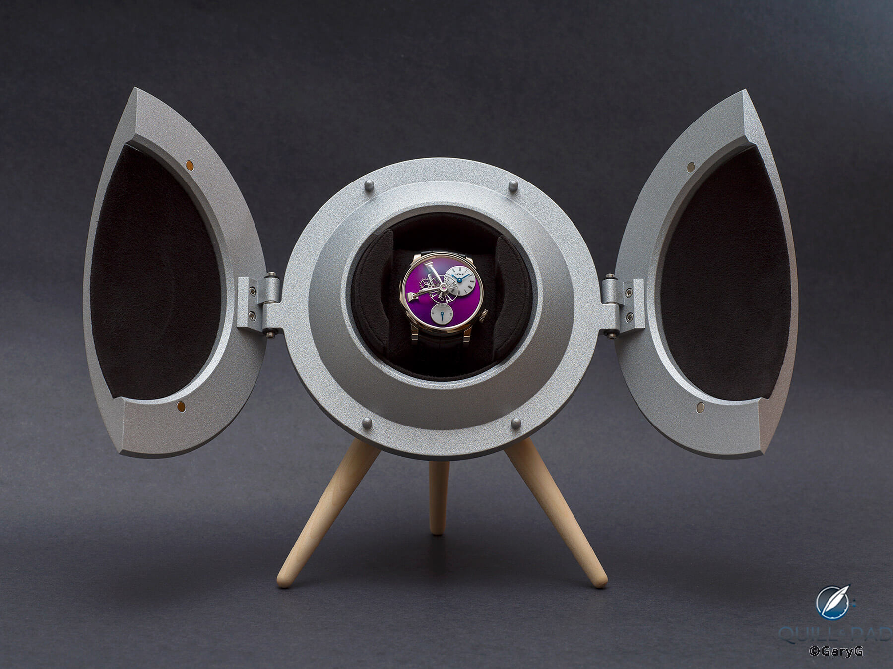
Earth to Büsser: presentation box containing MB&F LM101 2021 Edition in white gold
And sometimes variety is in the use of positioning and reflections as with this case back shot of a friend’s salmon-dialed Reference 5059 Vintage Collection from Patek Philippe.
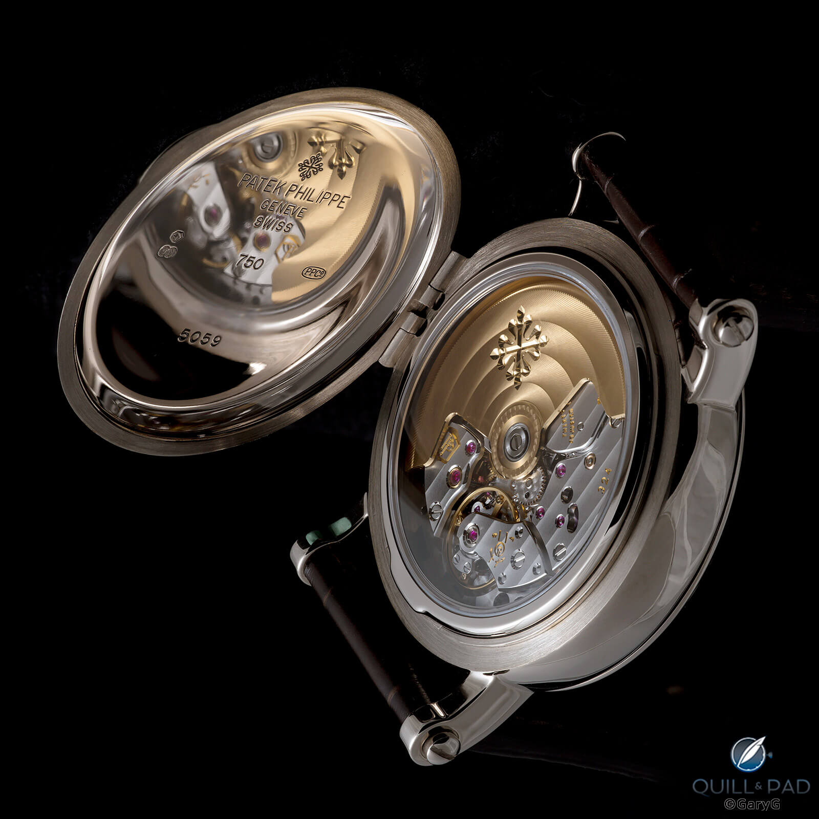
Rotate and shoot: movement view, Patek Philippe Caliber 324, Reference 5059 Vintage Collection
Joining the movement
Other movement shots figured among my personal favorites this year, none more than one of my first captures of the glow of the Akrivia RRCC 01 caliber.
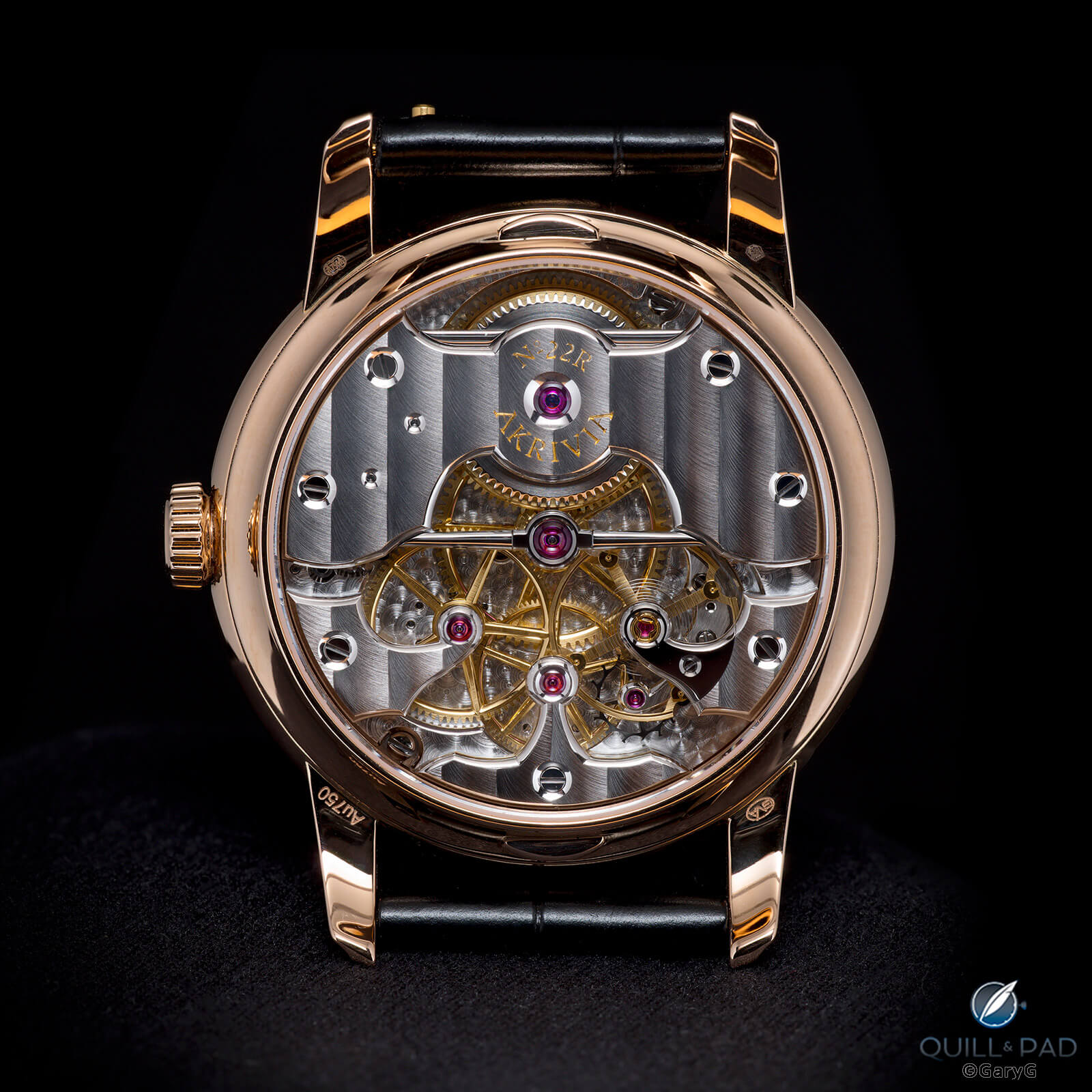
It glows: Caliber RRCC 01, Akrivia
Ruthenium and other darker movement coatings seem to be in vogue recently and can be a challenge to shoot without making them look darker than they are in real life or just catching a bunch of bright reflections. Two images from 2021 that did the trick for me were high-contrast shots of my friend’s platinum Voutilainen SC28 and my own MB&F LM101.
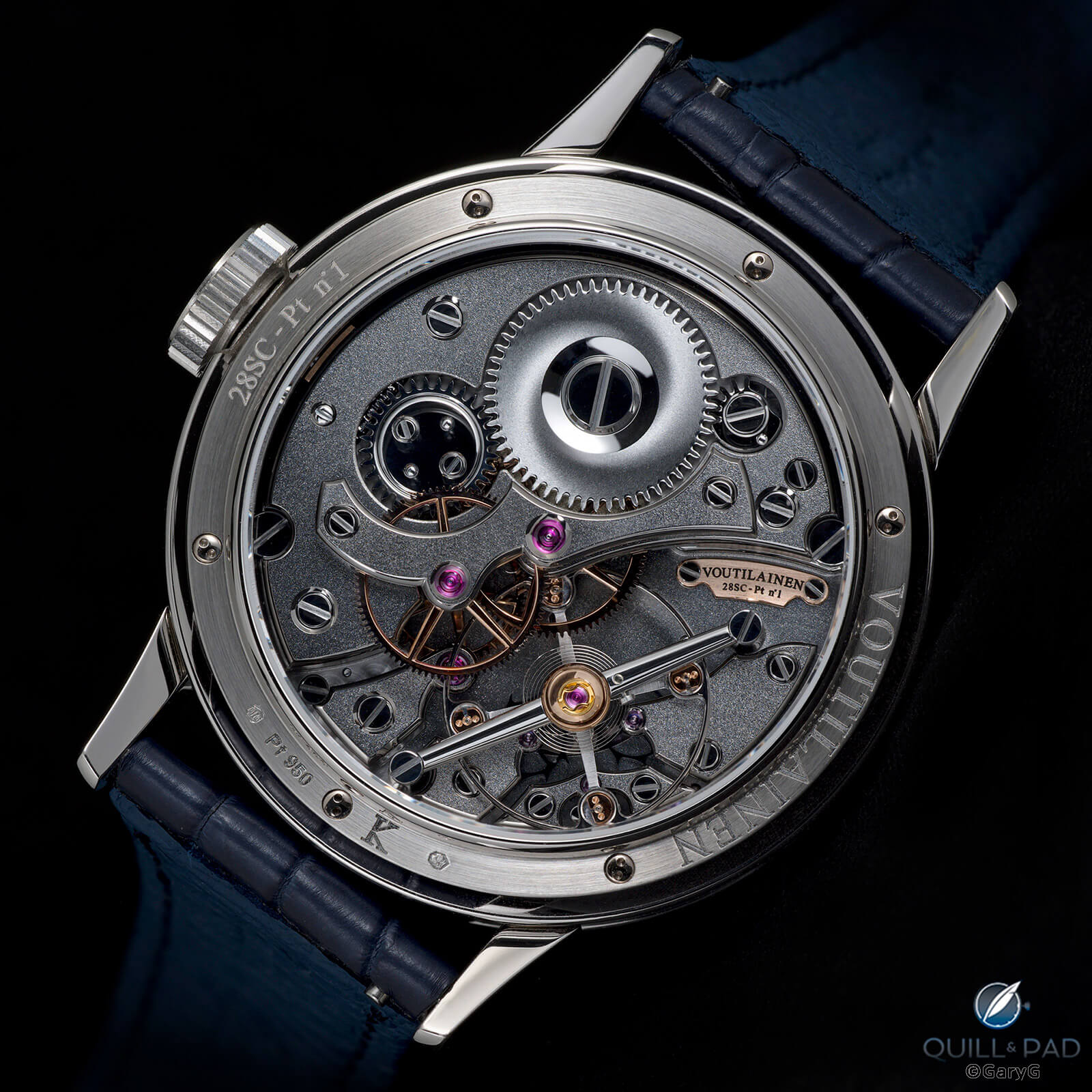
Superb Voutilainen finishing: 28SC in platinum
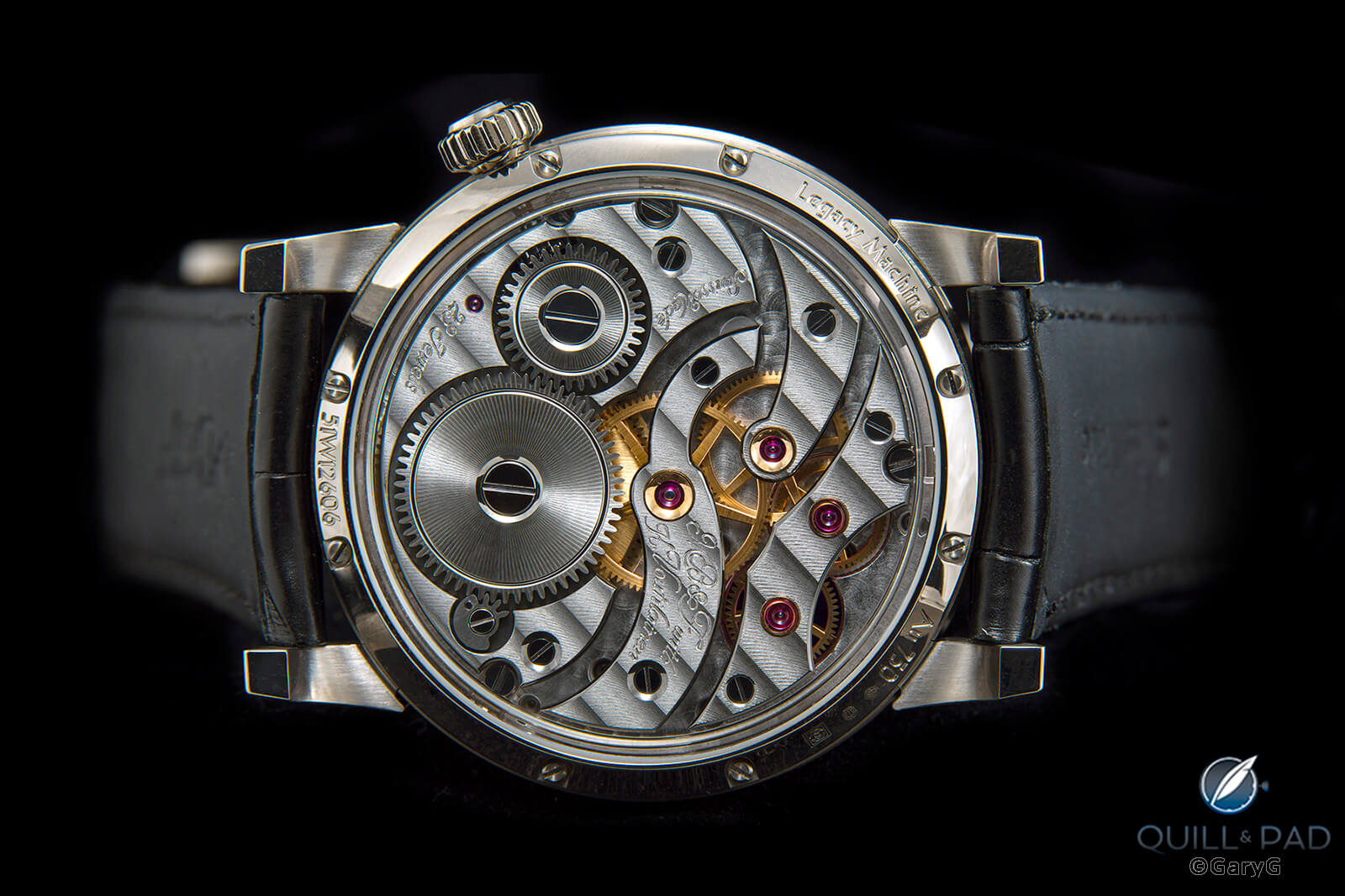
Darkness and light: movement view, 2021 edition LM101 from MB&F
I didn’t do an immense amount of gnat’s-eye macro shooting this past year, but I did get close enough to the movements of my A. Lange & Söhne 1815 Rattrapante Honeygold and Patek Philippe Reference 5370P to capture side-by-side closeups.
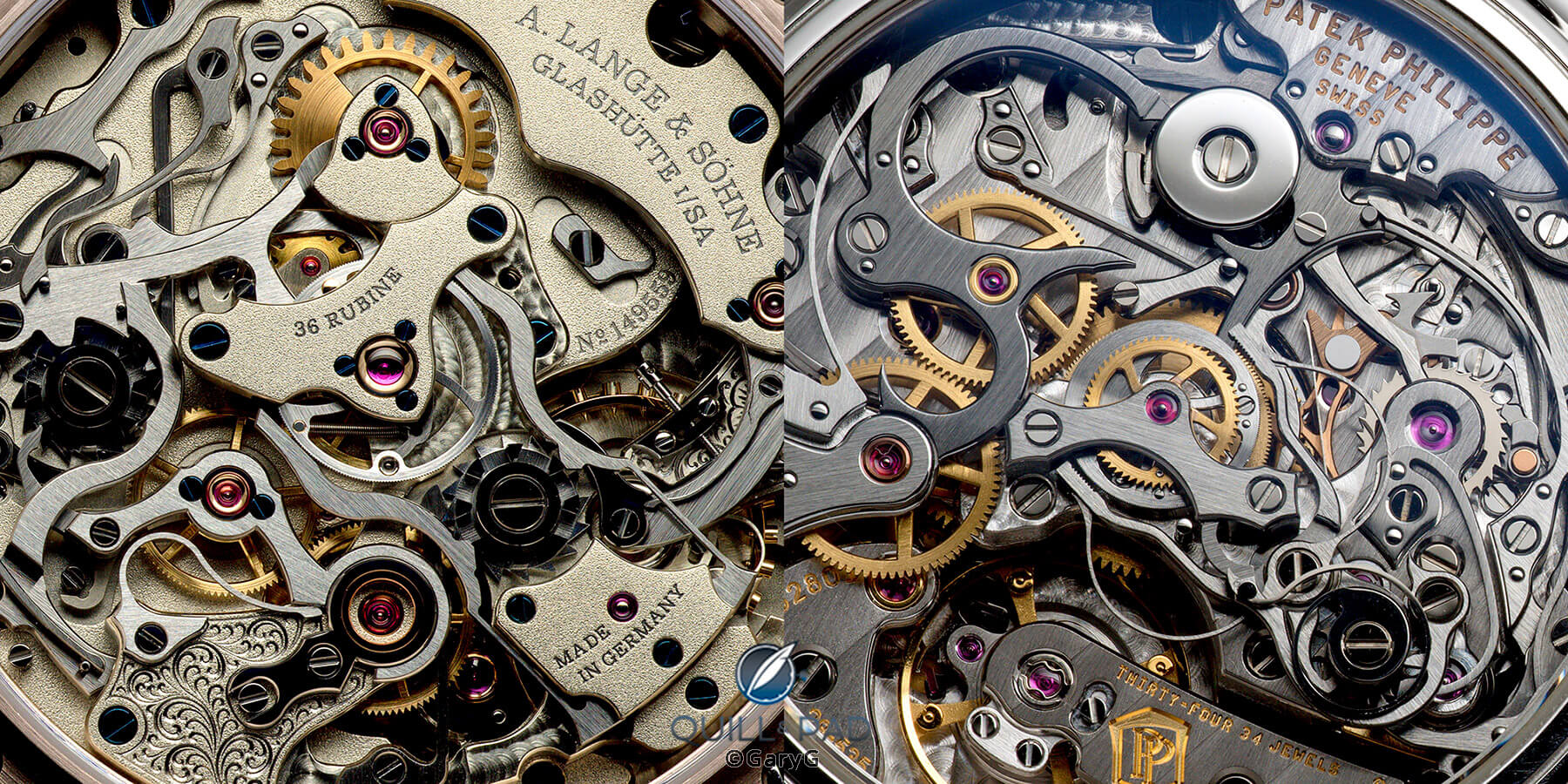
Compare and contrast: A. Lange & Söhne Caliber L101.2 (left) and Patek Philippe Caliber CHR 29-535 PS
If two’s company and three’s a crowd . . .
You don’t see that many true side-by-side group shots of watches online, and one primary reason is that they are very difficult to execute! Positioning two or more watches in a single frame and then lighting them so that each is clearly presented within a harmonious overall scheme is by no means easy. That said, these images are somewhat of a specialty of mine, with my pleasure at the results (when I can attain them) overwhelming the deep frustration of getting there.
When a friend loaned me his vintage Patek Philippe Reference 3450 for a “Behind the Lens” feature here, I immediately thought to pair it with its forebear, my Reference 1526.
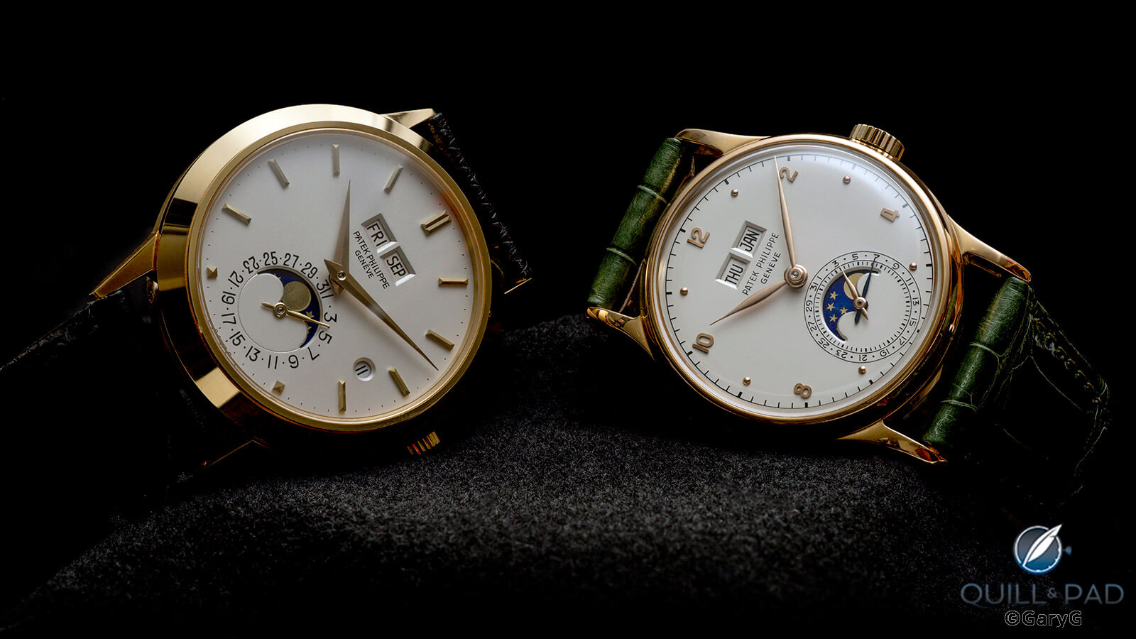
Two generations: Patek Philippe Reference 3450J (left) and Reference 1526 in pink gold
The Split Decision article comparing the Patek Philippe Reference 5370P and A. Lange & Söhne 1815 Rattrapante Honeygold pretty much demanded a direct faceoff between these two heavyweights, and I think that this capture does a good job of showing the comparative strengths of each.
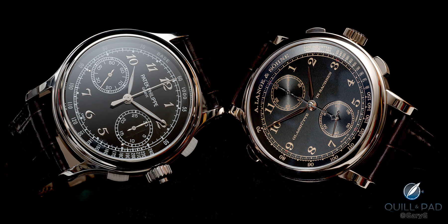
Heavyweight bout: Patek Philippe Reference 5370P (left) and A. Lange & Söhne 1815 Rattrapante Honeygold
Which would you pick: the MB&F Legacy Machine Perpetual or the LM101? I bought the LM101, but there’s nothing bad I can say about the LM Perpetual, either. With all the lacquered surfaces, shadowed recesses, and colors this image was a bear to execute.
Shooting movement group shots can be even tougher than working with the dial sides, especially when one of the watches boasts an officer’s case back with a highly reflective inner surface as seen on the Patek Philippe Reference 5059 in the image below. For me this image appears three-dimensional, owing to both the depth of the movements and the positioning of the three pieces.
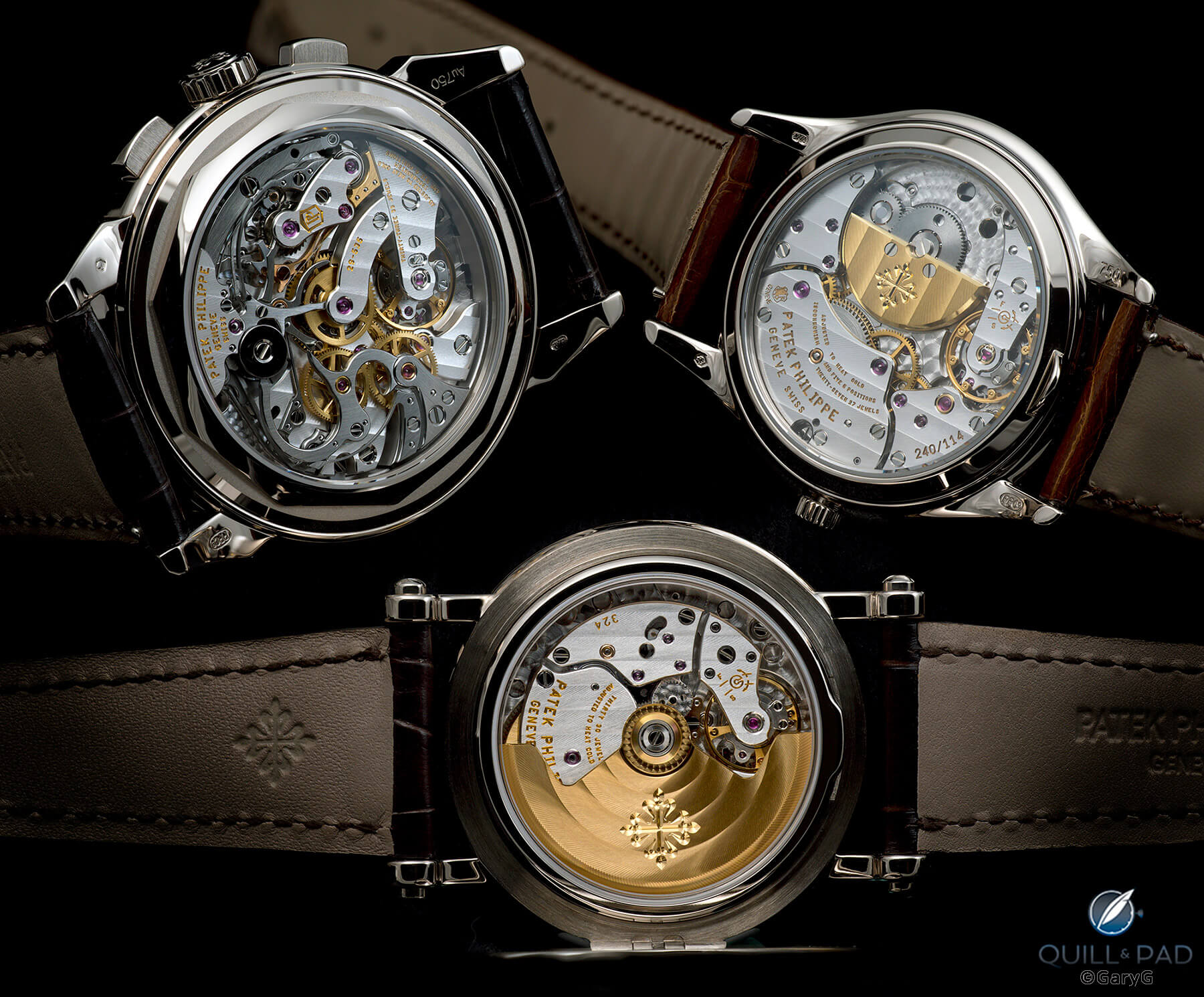
Movement view, three complicated Patek Philippe wristwatches
Last but not least, how about a four-in-one? Here are four rare salmon-dialed Patek Philippe watches, including two Vintage Collection watches, a unique Reference 5270G with baton indices and Dauphine hands, and a ten-day tourbillon Reference 5101P. It was great of my generous friends to allow me to assemble all of these in one place, and I really enjoyed comparing the different “salmon” colors ranging from almost-gold to copper to pinkish.
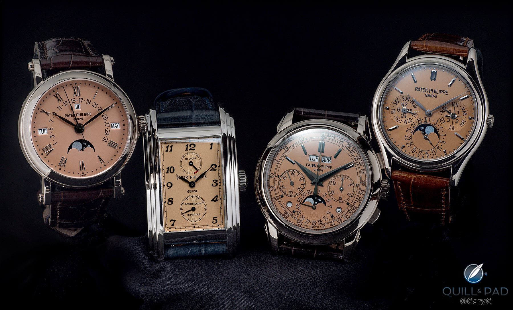
All in one shot: four rare salmon-dialed Patek Philippe watches
One just because
You may have noted that I didn’t include any wristshots in this assortment. In general, I prefer my studio shots, and if I’m totally honest I lacked the patience to scroll through the zillion photos on my phone from 2021 in search of one or two unicorn wristshots to include.
I will, however, add one in-hand photo that may not be the greatest technical image, but shows a watch that I would dearly love to own: the Grande et Petite Sonnerie pocket watch No. 1 by Philippe Dufour. It’s now well beyond my means to acquire, but at least I have this record of holding it in my hand!
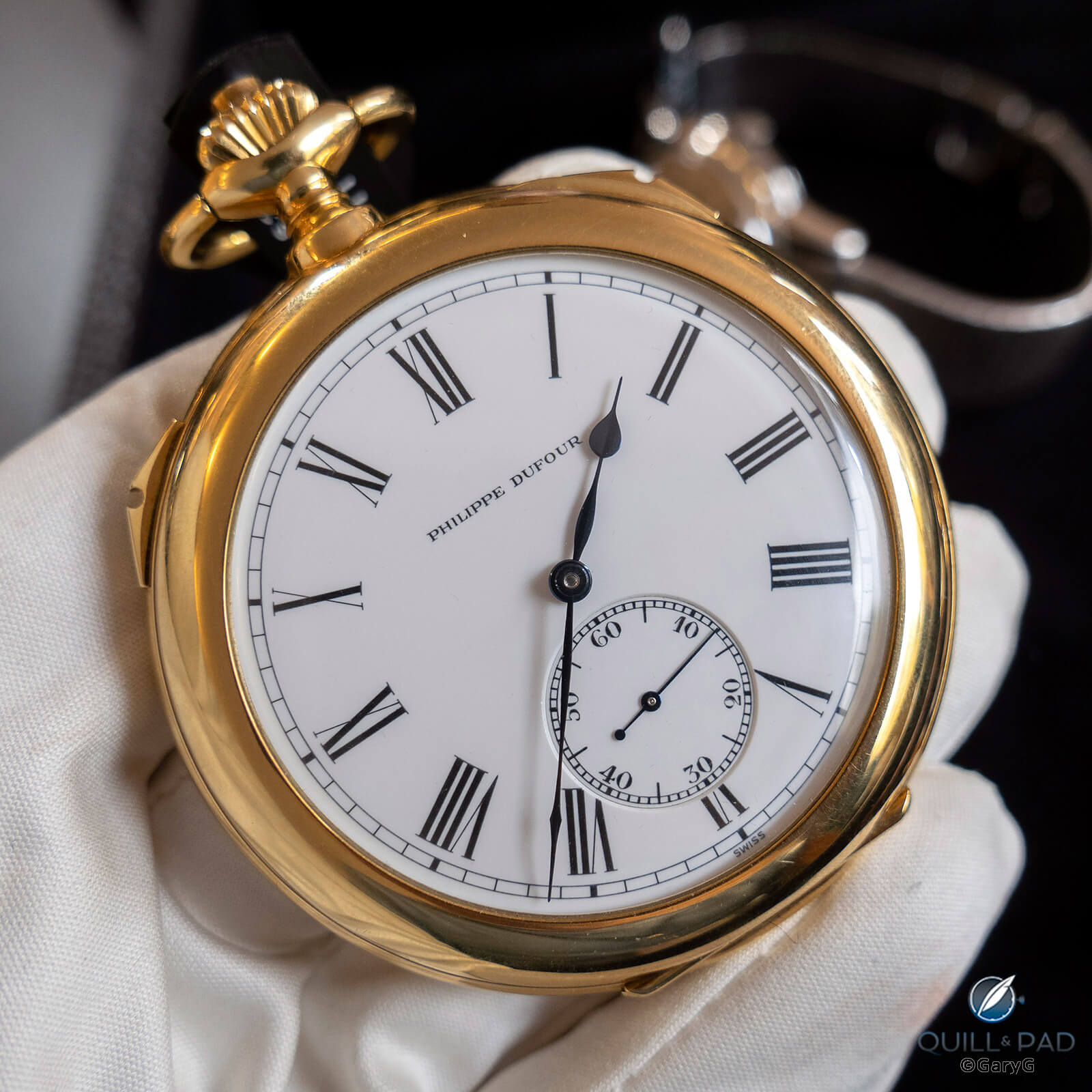
Grande et Petite Sonnerie pocket watch by Philippe Dufour
What the people said
Like many folks who are active on Instagram, I participate in the annual practice of building a grid of my Top 9 images that garnered the greatest number of likes during the calendar year. Here’s what the viewing public liked in 2021.
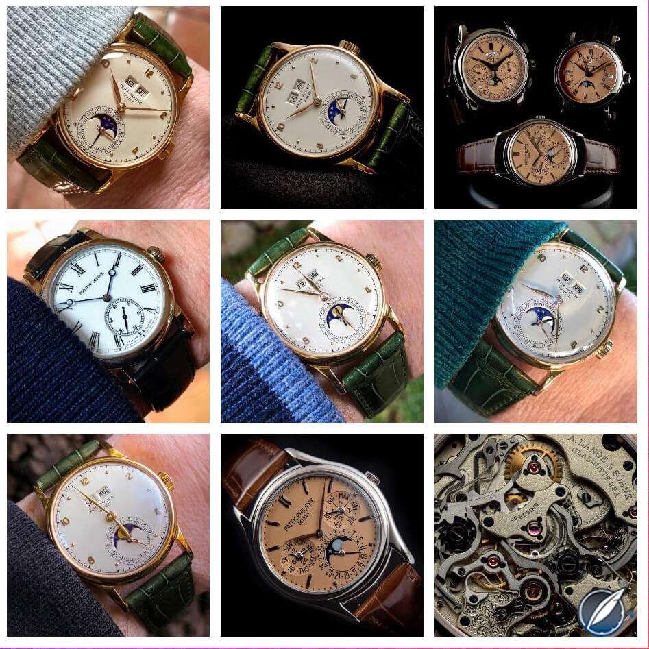
Top 9 most liked photos on @garyg_1 in 2021
My main conclusion: people just love that Patek Philippe Reference 1526! Other notes: ultra-rare pieces including the Philippe Dufour Simplicity and salmon-dialed Patek Philippe models generate substantial interest, and A. Lange & Söhne’s movement designs continue to enthrall. Even though I love taking movement shots, I’m not surprised that only one movement made the top 9; in general, a high-quality dial shot will pull in a substantially greater number of likes than a great movement shot.
My personal favorite of 2021
In some ways, this last image doesn’t really qualify as it’s not a photograph of a physical watch but a photo of a signed set of six watch renderings: the working visuals used by Kari Voutilainen to create the dials of our gang’s six Masterpiece Chronograph IIs autographed by the members of our group and now hanging on the wall at the Voutilainen atelier. All of us in the group have agreed that this is our favorite shot of the year, and I’m enthusiastically of the same view.
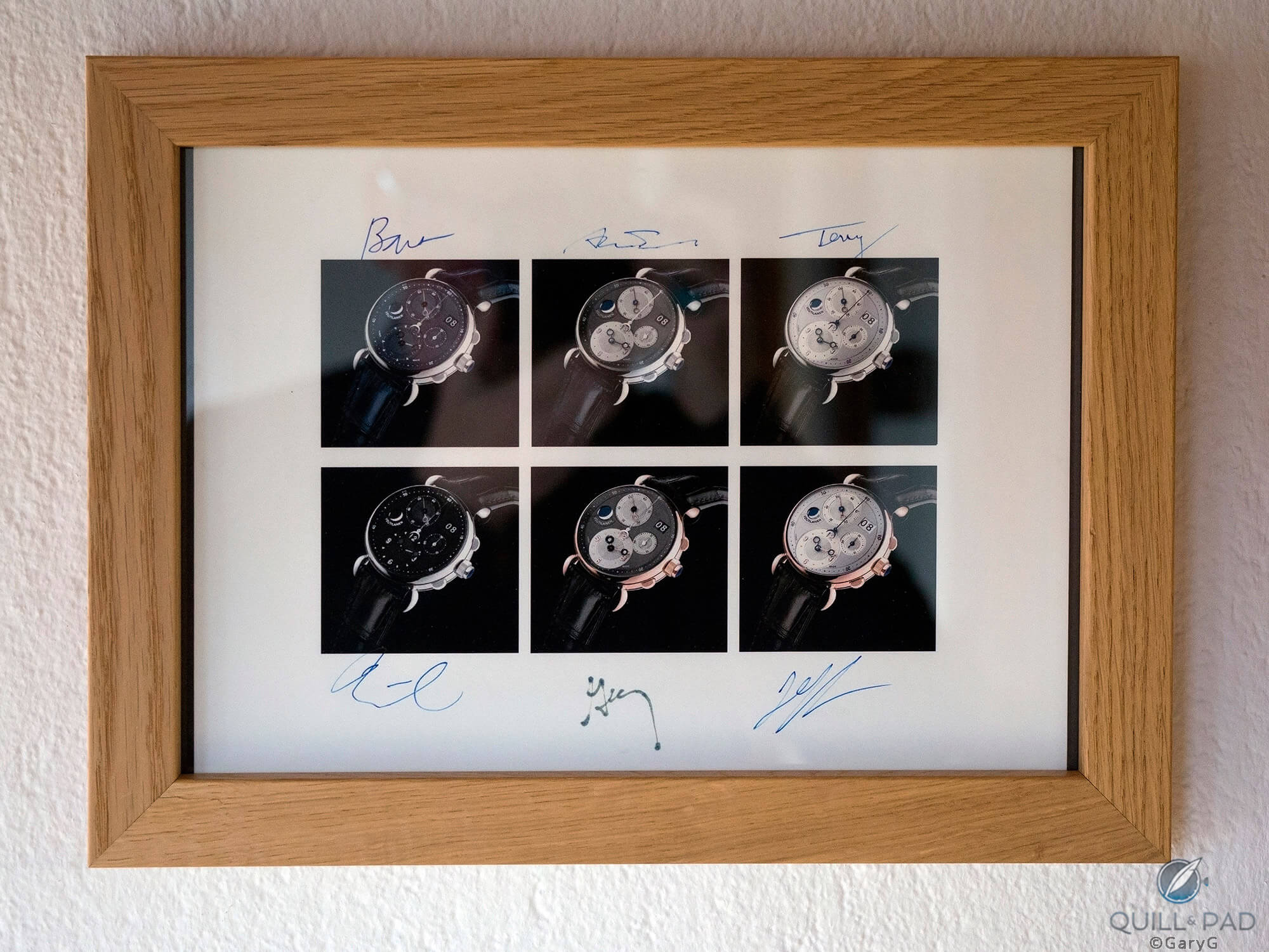
It’s all about the people: NorCal Gang rendering composite, Voutilainen atelier
Remember: there are watches (and photographs) involved, but it’s all about the people!
For more of GaryG’s photos on Instagram, please visit www.instagram.com/garyg_1.
You may also enjoy:
GaryG’s 2021 Year In Review: Acquisitions, Events, Trends To Watch, And Even Some Swag
A Contemporary Watch Collector Goes Vintage
Why I Bought It: A. Lange & Söhne Odysseus (A Photofest!)
Why I Bought It: A. Lange & Söhne 1815 Rattrapante Honeygold Homage to F.A. Lange
Why I Bought It: Rexhep Rexhepi/Akrivia Chronomètre Contemporain
No Secret: The Journe Society Chronometer From F.P. Journe
Big Fish: Behind The Lens With Unique And Rare Salmon-Dialed Patek Philippe Perpetual Calendars
Leave a Reply
Want to join the discussion?Feel free to contribute!



Simply CONGRATS!!!
Thanks, Dimitris!
Well, we’re just in the second decade of the year but in my opinion this is a really strong candidate for the post of the year. Amazing pictures as usual but, more important IMHO, your great passion is absolutely evident in this post. Congrats and happy 2022 Gary.
Many thanks for your kind words, Fabio — It pleases me no end to read that my excitement about watches and the people behind them is evident in my writing here.
Happy 2022 to you!
All the best, Gary
An impressive portfolio of 2021 pictures, Gary. Let me make just a few comments.
As beautiful as the black enamel dial is on your Rexheppi, the movement side is perhaps more incredible. I really like the symmetry and finishing. Did you figure out what those little thumb-tab like outpouchings are at the top and bottom of the case?
The four salmon dialed watches together could be stared at for quite some time. I used to think that a hidden tourbillon was a waste of a tourbillon but the 5101P changed my mind. It’s like a secret for you and your friends.
Even the aardvark of the bunch, the Proplof, that only Mom Proplof would find handsome, is imaged so nicely that I am beginning to warm up to it.
My family had the privilege of visiting Napoleon, Kari’s new hilltop atelier, with its commanding view of the valley below. The Voutilainen-guided tour ended in the viewing salon where we were able to admire some forthcoming deliveries and get pictures with him. And, of course, on the wall was the very special framed image of the signed renderings of your NorCal’s buddies’ Masterpiece Chronograph II. How cool is that?! Horological connoisseurs from around the world will see that.
Finally, perhaps the most impressive conclusion to draw is that you are a wonderful ambassador for the watch community. In addition to sharing these wonderful images and stories, you have forged friendships with folks who let you borrow and photograph their truly remarkable (and valuable) watches that most of us will never be able to see in the metal.
Thank you and I’m looking forward to the photos and stories of 2022!
Bill
Thanks very much for these detailed remarks, Bill! To respond to a few: first, my more informed friends confirm that the “tongue” on a caseback is indeed there to facilitate the removal of a snap-on back with a case knife. Glad we chased that one down!
The Ploprof is clearly not for everyone — as you say, though, I found that the image (somewhat unexpectedly, to be honest) popped so much that I had to include it here.
Thanks for sharing the story of your tour at Kari’s — quite a place and experience! I’m glad that you were able to see the framed renderings and proud that (as you note) others from around the world will see them (and perhaps hear their story) as well.
Finally, thanks very much for your kind words on my role within the community — as is plainly evident I have many very generous friends and I count myself fortunate to have met each of them.
All best to you for 2022!
Gary
Mr G, I would be sick with envy if it weren’t clear that you have exemplary respect and appreciation for this craft.
The photography in this article is crisp, natural and has a tasteful degree of saturation. I instinctively looked for reference points for white balance, which seems spot on again and again. Not necessarily straightforward when dealing with speedlights and subtle metallurgy. I assume that you also merged multiple focus bands?
This article proves that your decision to develop this website was both wise and inevitable.
Thanks for your kind observations on the photos and my technique — makes me happier to have slaved over the sorts of details that your educated eye recognizes.
I do spend a fair amount of time, especially when it comes to white balance, comparing the image on my screen to the actual watch (unless I’ve already returned it to its owner). My teacher Ming made a big point with me that once you can represent something as it actually is in life, you can then take some license to modify it visually to your tastes — but if you shortcut the process before you achieve some skill with accuracy, that’s just lazy. I do take pride in making the image “transparent” in a way that gives the impression of seeing the actual object — thanks for noticing and mentioning it.
I do make liberal use of focus stacking, and while I find that images from a single exposure tend to have a bit more life to them, at this point stacking figures in a great majority of my work.
Finally, credit for developing this website must properly go to Elizabeth and Ian — but I am grateful that you find my contributions valuable!
All best, Gary
I have yet to venture down the focus stacking or pixel-shift route. I try to use as little processing as possible. Concentrate on the original exposure. I am being more picky now with my shots, trying to let nature do the work. Who can resist a “dapple-effect” from water or trees, eh?
For a very long time Street Photography was my genre- an extremely maligned and underestimated discipline…. even by most people who claim to do it!
It’s very difficult to get it really right, but worth the effort.
Of late I have been learning not to trust my camera’s metering and my shots have become better as a result.
Ah! Too much talk! 😁
I assume that someone with good taste like you, Gary, is not a fan of Jacob & Co. But when I look at these MB&F timepieces, there is something Jacob and Co about them. My own esthetic is that the dial is a holy and tranquil place that can only be used for time or date telling and no room for any cheap tricks or showmanship. I am yet to develop any appreciation for such MB&F time pieces, but perhaps you can enlighten me please.